An introduction to Clip Studio Paint
Clip Studio Paint is a versatile illustration software that can handle vector data. It is an essential app for creating digital art. It's best known as a painting app, but it can also be used for graphic design and is a favorite among experienced designers.
Here you can learn about the tools you can use to customize your workspace and vector drawing.
Fully customizable workspace
You can switch the interface color in Clip Studio Paint between black and gray. Additionally, you can adjust the color density, so you can make the interface a bit easier on your eyes.
See Checking Preferences for how to change the interface.

On top of that you can also customize your workspace. You can set up an easy-to-use user interface so that various tools can be placed within reach, like a real work desk.
You can save your own workspaces or use workspaces created by other users. Also, with Clip Studio Assets, you can download and use your favorite workspace from over 1,700 user-created workspaces.
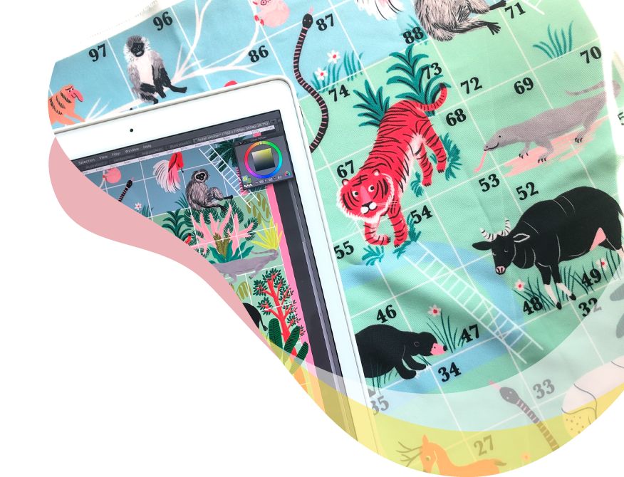
Vector layers that can handle vector data
By creating a vector layer, you can save lines as vector data, even painterly lines made in a paint app.
Lines saved as vector data can be changed not only in line thickness and shape, but also can be changed to watercolor or airbrush style strokes. This is useful when you want to use illustrations in graphic design.
And another main appeal of vector layers is that line drawings do not deteriorate even when enlarged or reduced, so you can handle everything from small data for the web to high-resolution data for printed materials.
Bezier curve tool
You can also draw shapes and Bezier curves, just like with other vector drawing apps. It has all the functions necessary to draw logo marks and icons.

Design principles and elements
Graphic design is a visual language of principles and elements that come together to convey a message to the viewer. Advertisements such as posters must convey the allure of the advertised product.
Colors, typography, and other design elements should be arranged according to principles to best convey your message.
The elements of design
Design elements include lines, colors, shapes, textures, spaces, and typography.

Line
Lines can give different impressions by changing their thickness, length, angle and color. Lines themselves are simple, but they can be used to guide the eye, such as in separating sentences.
Color
Colors are not just beautiful, but also have a role to clearly express the message. To use color effectively, it is useful to know color psychology and color theory. This will be explained in a later section.
Slant
Shapes composed of different lines and colors can greatly change the impression of a design. For example, a design with many curves gives a softer feel, while a design with many straight lines and corners gives a more rigid feel.
Texture
If printed on paper, it refers to the material of the paper. For example, rough paper and glossy paper give different impressions. You can also visually express textures by drawing your own patterns.
Space
Lines and typography where you want to convey a design are called positive space, and the other parts and the background are called negative space. In design, it is necessary to make use of negative space to draw attention to positive space.
Typography
Text is a concrete way of conveying information. Even just adjusting the font type and size can change the impression of the design. The basics of typography are covered in a later section.
What are design principles?
Arranging design elements based on rules can make your design more effective. Seven major design principles are emphasis, hierarchy, contrast, repetition, proportion, rhythm, and white space.
Emphasis
This highlights and draws attention to the most important information you want to share. For example, if you were creating an advertisement for a toy featuring a popular character, placing the character larger than the product name would better attract the attention of the target user. If you want the product name to be remembered, you would change the design depending on the goal and enlarge the product name.
Hierarchy
Visual layering of information is used when showing a lot of text such as on websites. Emphasizing every sentence makes text very difficult to read. Create a hierarchy in your design to emphasize the parts you want to stand out. Even just using a larger, bolder font for the headings and a smaller font for the body text will make your website more organized and easier to read.
Contrast
We introduced emphasis and hierarchy as techniques to highlight important parts, but contrast is also important. For example, if you place light-colored text on a white background, depending on the color, the text may not stand out and be difficult to read. It's also a bad design for accessibility.
Contrast for each element is important to make the elements placed recognizable.

Repeat
By unifying the colors and fonts used for related elements and using them repeatedly, you can create a sense of unity and stability.
In a company brochure or website, you can use the default corporate color on all pages to create a sense of unity and acknowledge the company brand.

Proportion
Proportion is a design principle that considers the relationship between multiple elements and adjusts the visual size to show them effectively. It is a concept that also affects emphasis and hierarchy.
This is done by adjusting multiple elements, such as making other elements smaller and the background margins smaller, in order to make the things that you want to stand out larger.
Rhythm
Rhythm is created by repeating the placement and spacing of multiple elements. Random placement and measured placement give different impressions even if they are repeated.
Rhythm can be flowing, where you can see it going in a certain direction, progressive, where elements change as they progress, and random, where there is no discernible pattern.
White space in design
White space in a design is any area that does not contain any design elements. This is also called negative space.
Design elements need to be seen. If you squeeze in a bunch of design elements, no one element will stand out. Placing white space between elements makes them easier to recognize and improves the design.
Fundamentals of typography and color theory
Typography and color theory are very important elements of graphic design. Here we will go over the basics of typography and color theory.
Discover how to effectively communicate your message through design.
Typography basics
Learning about basic typography knowledge such as font families, styles, and pairings will help you use fonts effectively in your designs.
Typeface and font
A typeface refers to a whole group of fonts unified by the same concept. It is also called a font family. A font refers to a typeface whose weight has been changed.
For example, Helvetica is a typeface, Helvetica Light and Helvetica Bold are fonts.
Font style
Basic font styles include serif, sans serif, script, and display.
Serifs are typefaces with trailing marks at the ends of the letters. It gives a traditional and calm impression. Sans-serif is a typeface without serifs marks. It gives a contemporary and modern look. Script is a hand-drawn typeface. It gives a warm impression. Display is a typeface with many decorations that does not fall under the above three types. There are many unique ones.

Font pairing
There are many ways to pair fonts. Serif and sans-serif fonts are simple and easy to read, and are ideal for when you want your text to be read.
You can create a sense of unity by combining the same typeface, such as bold for headings and lighter for body text.
In addition, scripts and displays are suitable for parts that you want to draw attention to, such as headlines and catchphrases. You can choose a font that matches the atmosphere according to the purpose of the design.
Some fonts match and some don't. Experiment to find the perfect combination.
Basics of color theory
Design principles are important to help convey the message of your design, but don’t forget about color combinations.
Color theory is a basic guideline for effective color schemes in design. Also, be aware of the impression that each color brings. The intention of the design changes depending on the color scheme. By learning color theory, you can better get your message across properly. Below are some of the basics of color theory.
Hue/Luminosity/Saturation
First, let's briefly learn about hue, saturation, and luminosity in order to choose a color. Hues are shades of color, such as red, blue, and yellow. On the color selection screen in graphic software, it corresponds to the color circle.
Saturation is the vividness of a color. The higher the saturation, the brighter the color of the hue. When the saturation is reduced, light colors become closer to white, and dark colors become closer to black.
Luminosity is the brightness of a color. Black is unaffected by hue or saturation, but increasing the luminosity will turn it into white, and decreasing it will turn it into black. Intermediate tones are gray.
Luminosity is determined by the brightness of each color regardless of its hue. For example, when comparing red and yellow, yellow is a more reflective color, so it is more luminous than red.

Color scheme
Color schemes are very important in graphic design. But be careful not to go overboard with too many colors. Choosing too many colors can be distracting and may not convey the message of the design.
Here, we will introduce how to choose a basic color using the color wheel.
Monotone is a color scheme that selects a key color from the color wheel. Based on the selected color, combine colors with different luminosity and saturation. The overall tone of this color scheme will be subdued.

For an analogous color scheme, select a key color from the color wheel and combine colors adjacent to the selected color. Because there is little difference in color, the tone becomes uniform.

For complementary colors, select a key color from the color wheel and combine colors that are opposite each other. This is the combination with the highest contrast. Suitable for emphasizing areas that you want to stand out.

The triad color scheme selects a key color from the color wheel and combines the colors at the positions where the color wheel is divided into three. It increases the contrast while creating a well-balanced and stable tone.

Color psychology
Color psychology is the study of psychology and behavior analysis using colors. It is also important to consider the meaning and effects of colors based on color psychology, when choosing colors.
For example, if you want your design to have a bright feel, use warm colors like red, orange, and yellow. These colors also have an uplifting effect. Red and yellow are good at attracting attention, so they can also be used to alert your audience.
On the other hand, if you want your design to feel calm and quiet, use cool colors like blues, greens, and purples. Blue in particular has a calming effect and can be used in designs that convey a sense of trust and stability.
CLIP STUDIO PAINT PRO
for character art, concept art, illustration
CLIP STUDIO PAINT EX
for comics, manga, webtoons & animations
PRO
EX
Single-page illustrations & comics
Multi-page comics/manga & illustrations
Up to 24 frames for gifs or short animations
Unlimited frames for professional animation
Natural, customizable pen and brush tools
Vector layers
More than 10,000 free downloadable brushes and materials
3D models and drawing figures
PSD compatibility
RGB and CMYK compatible
For macOS and Windows
-
Export and print multi-page files
-
Convert images and 3D models into lines and dot shading
Free technical support
Free web services & community
Clip Studio Ask / Assets / Tips / Share
Learn more about other genres!