Creating a Dynamic Landscape Composition with Silhouette
The Etherington Brothers show how to create dynamic landscapes with silhouettes & provide multiple foreground, midground, & background scenery composition ideas!
Learn how you can draw… or learn how to THINK when you DRAW with the Etherington Brothers!
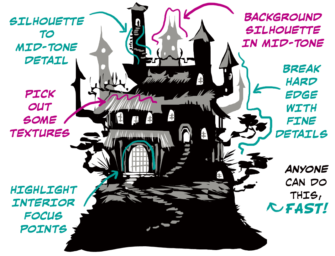
Silhouette Thumbnails
A useful technique for getting your brain generating endless design variations is the silhouette thumbnail. A silhouette thumbnail is a quick way to establish the overall form of your design and see if it reads well.
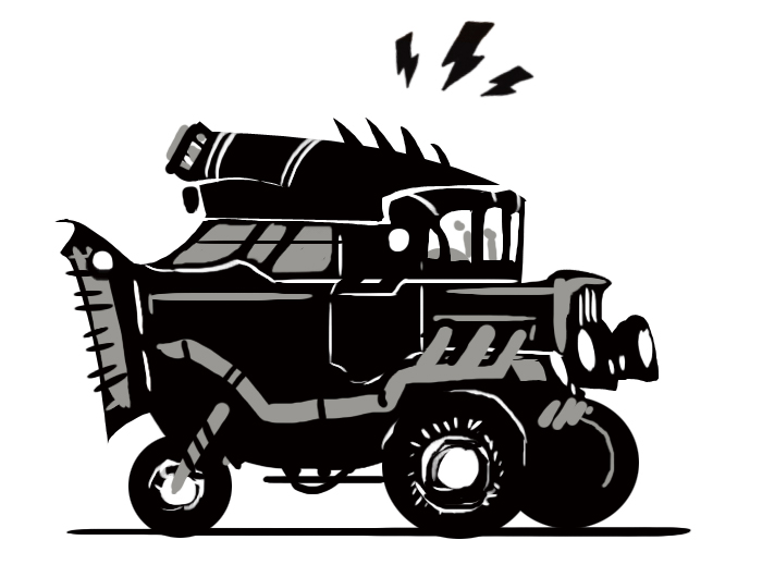
Before we get to all of this…
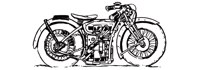
…we start with this:

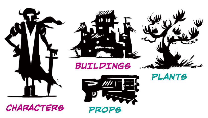
Thumbnail Silhouettes can be used to design anything: Characters, buildings, plants, props, etc.
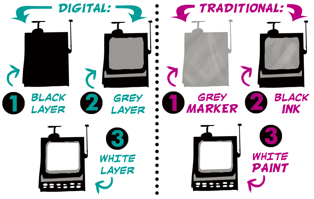
There are two easy 3-tone methods based on the media you use to create them: Digital & Traditional.
Practicing Silhouettes
But before we jump into using all three tones, let’s do a single color exercise to loosen up.
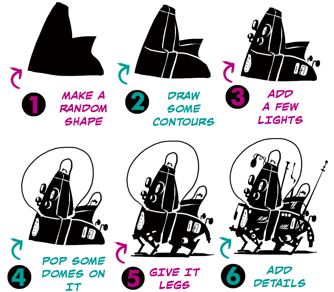
Draw a random shape. It doesn’t matter what the shape looks like. Just play around and have fun. Then draw some contour lines. Maybe then add a few lights and dome. Now, let’s go crazy and add some legs! Now finish up with some final details and, viola! We’ve turned a random shape into a fun and futuristic mobile item.
It helps to think of your base shapes like blocks of clay that you can carve into and add onto instead of just a flat shape of color.
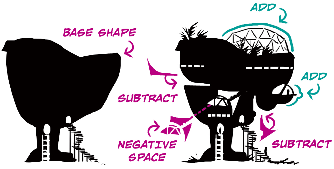
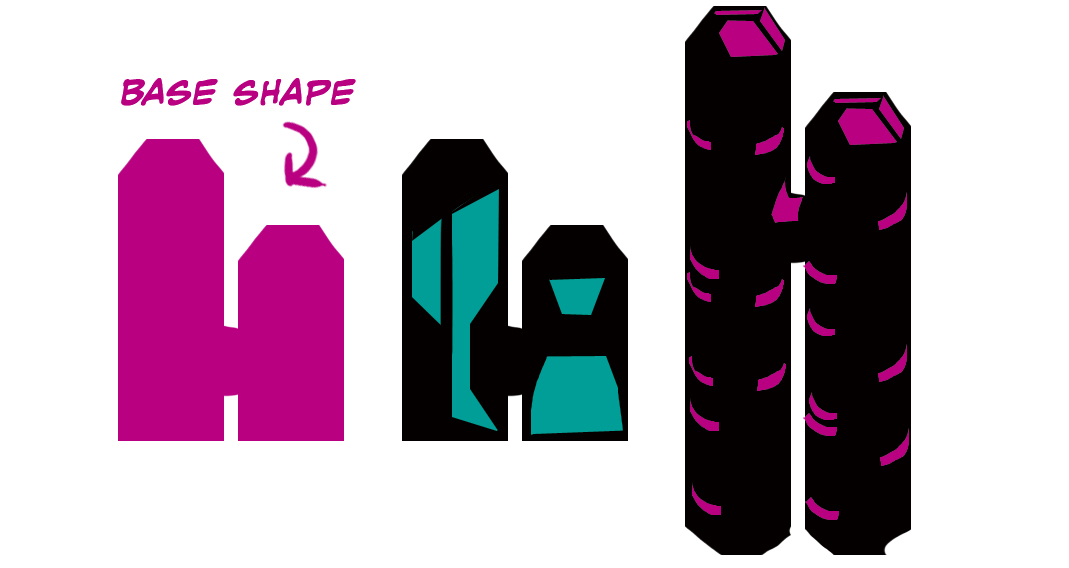
Adding Mid-tones
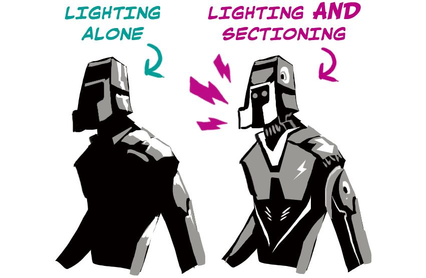
Now, let’s talk about mid-tones. When you add a mid-tone, you establish two new elements – sectioning and dimensionality. The first pink shape in the image below is the base shape, and the others are examples of sectioning by creating shapes within the base shape. Notice how the sectioning can define the shape of the base shape.
When you add a mid-tone, the white can now become a highlight.
Very Important! Don’t use your mid-tone and white just for implying lighting. Use them for lighting and sectioning.
The silhouette thumbnail approaches highly versatile and works for both small and large scale concepts.
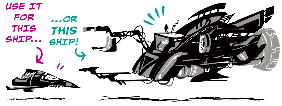
With this approach, you can achieve a huge amount of depth and detail very quickly.
So go ahead play around with silhouette thumbnails a bit until you get the hang of them as they will prove very useful for the next part of this article, creating dynamic background compositions with a foreground and a midground.
Dynamic Compositions with Foregrounds, Midgrounds, and Backgrounds
By far, the most effective way to create really dynamic compositions is to think about the shape of your foreground, midground, and background elements and how they complement or contrast with each other.
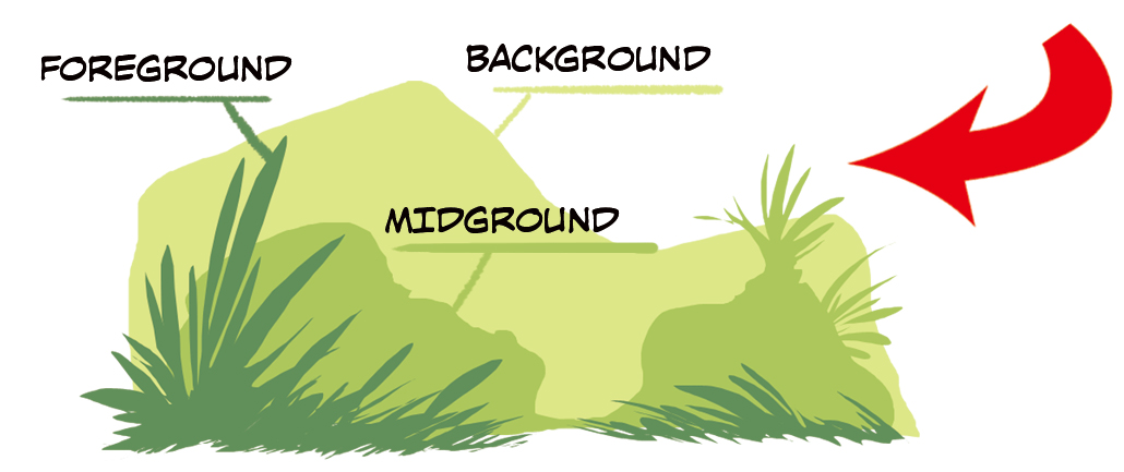
Building on our silhouette thumbnail technique earlier, we will now apply it to background compositions to supply you with an abundance of ideas for your comics and illustrations.
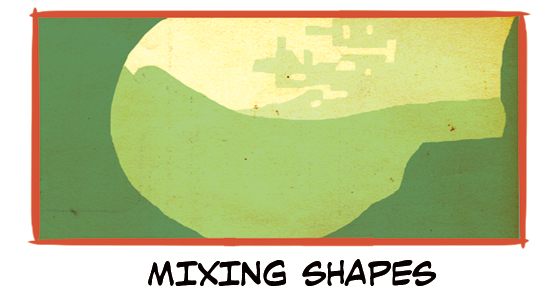
Mixing Shapes
Mixing up the shapes used for each layer can lead to unique compositions you might not ordinarily create on your own.
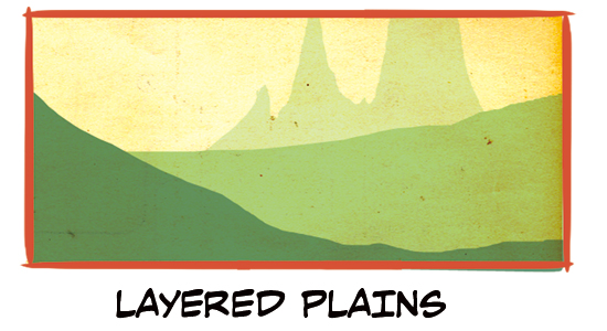
Layered Plains
Adding mountains as the background of a layered plains composition adds more depth, disrupted the double horizontal lines of the foreground and midground, and allows your eyes to follow up the image.
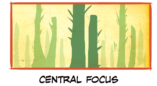
Central Focus
When you create an eye-level environment with many of the same objects in the foreground, mid-ground, and background, you can use their placement in the panel to tell the reader’s eye where you want them to focus. In this case, we use the foreground to bring the reader’s eyes into the center of the image and then gradually out to the panel’s edges with the midground and background.
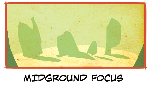
Midground Focus
This is an example of letting the midground grab the reader’s focus. This is achieved by limiting the amount of foreground shown in the lower corners of the image, with the midground taking up most of the composition.
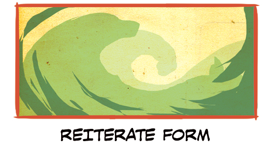
Reiterate Form
Reiterate Form is a composition that layers multiple shapes to create one overall shape. In this case, we layered curves to form a wave/spiral.
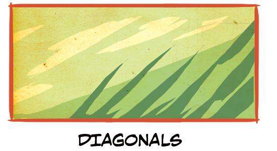
Diagonals
Here’s an example of a diagonal composition where each of the background layers is a different form in the environment, but all follow the same diagonal. However, notice that each diagonal is slightly different, which helps keep the composition interesting to the eye and prevents forms from blending into one.
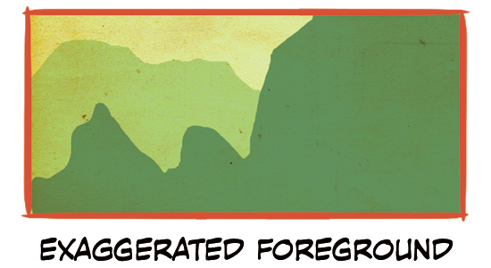
Exaggerated Foreground
Use something like this when you want to put emphasis on something in the foreground. The foreground should take up at least 60% of the panel.
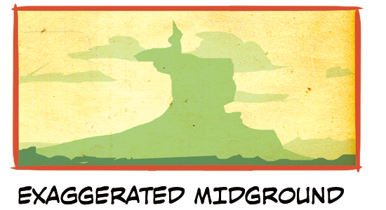
Exaggerated Midground
And for something you want to emphasize in the midground, this. Note that because the midground is farther away, it doesn’t have to take up as much as the foreground in the last example to achieve a similar effect.
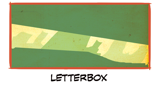
Letterbox
This is a good go-to option for a character’s point of view, looking at something in the environment while hidden.
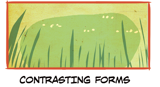
Contrasting Forms
Contrasting forms is a composition type that purposely chooses varying forms to keep the composition interesting. As our first example, Mixing Shapes, purposefully choosing shapes that contrast each other, can lead to unique compositions you might not ordinarily create.
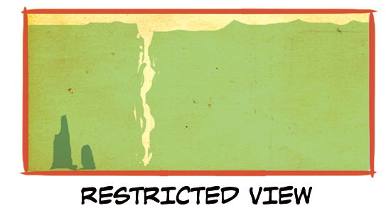
Restricted View
When you want to limit the space within a panel, you can use the midground to restrict the background. The sliver of background indicates something beyond the midground, but we are forced to limit our focus to space between it and the foreground.
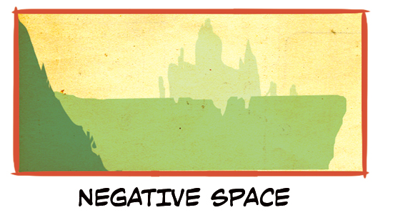
Negative Space
If you fill in every empty space, challenge yourself to purposefully leave negative space in some of your panels. Using negative space in this way helps to create an exciting and unique-looking scenery.
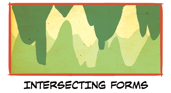
Intersecting Forms
Backgrounds don’t always have to be open skies; caves and other enclosed spaces can also benefit from the depth of space created with have a dedicated foreground, midground, and background.
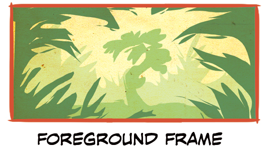
Foreground Frame
Another way to draw the reader’s gaze to a specific part of the image or comic panel is by using the foreground as a frame for the object you want their eyes to settle on. This composition also lends itself well to creating a sense of dynamic depth within the panel.
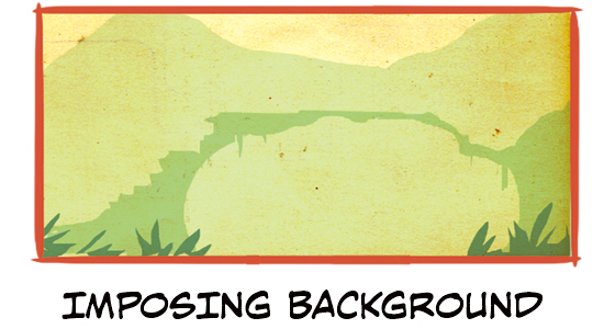
Imposing Background
You can use motifs that make the viewer feel uneasy such as looming mountains or thin bridges, to create imposing backgrounds that eat up most of the image. Other ideas include large gates and stormy skies. This is also a good example of a composition that leans heavily on negative space.
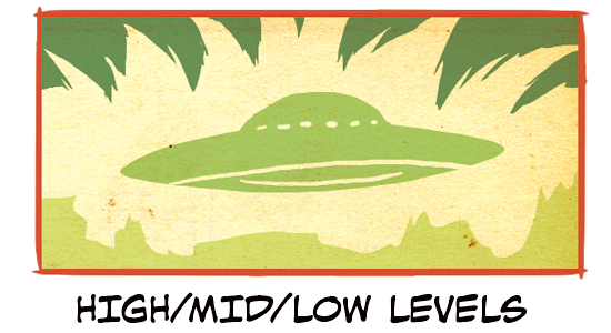
High/Mid/Low Levels
Invert the common placings of the foreground, midground, and background to create a dynamic scene.
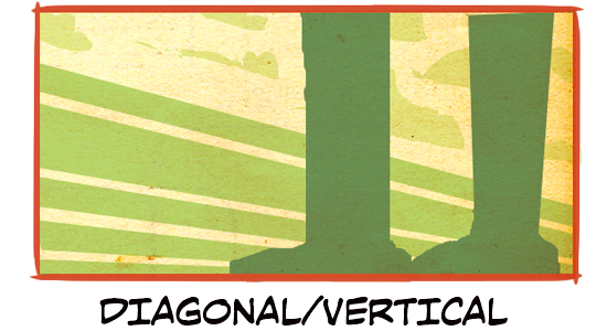
Diagonal/Vertical
Use diagonal and vertical lines on different background levels to help guide the reader’s eye around the image and create an eye-catching composition.
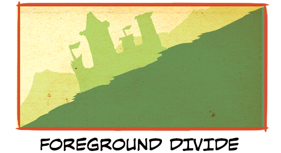
Foreground Divide
In this example, we also see diagonals, but instead, it’s from a low camera angle, suggesting that the character is climbing over the side of a hill. This is also a very dynamic shot for characters that move with great speed.
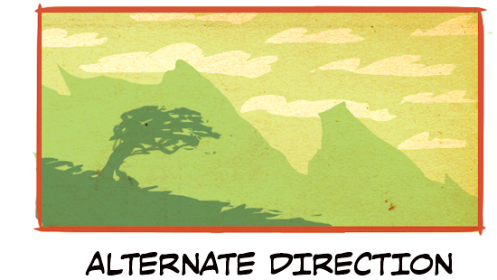
Alternate Direction
This uses the above Foreground Divide but purposefully shapes the foreground, midground, and background into different directions. This kind of zigzagging pattern is both dynamic and can be used to insinuate a tumultuous journey ahead of the character.
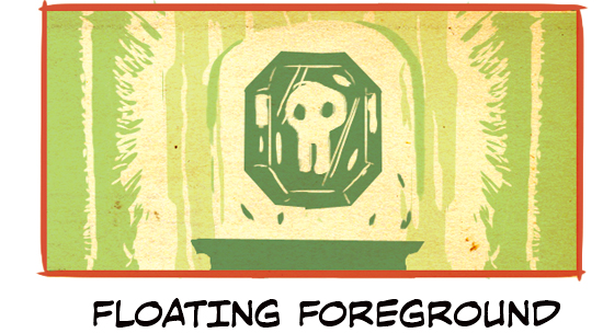
Floating Foreground
Floating objects are a good way to give a scene a magical or otherworldly feeling. Use this example for an up-close view of an object.
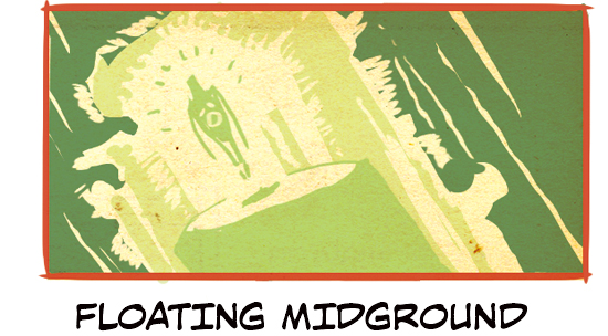
Floating Midground
Use this example for something floating that’s farther away. This version allows you to take in the surrounding along with the floating option.
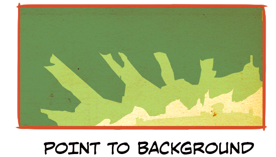
Point to Background
This is a good option to use when your characters are emerging from a forest or a cave and proceeding to a destination that’s on the horizon.
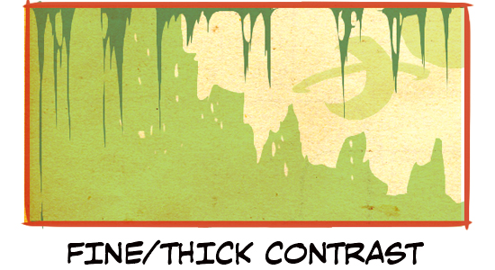
Fine/Thick Contrast
Fine/Thick Contrast is also good for characters emerging from a cave or a forest but in this version, we see the destination in the midground rather than the background.
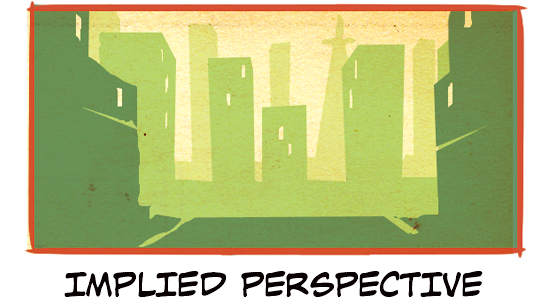
Implied Perspective
For cityscapes, buildings do a very good job of implying perspective in a scene leading somewhere into the city. An implied perspective can be created with any forms.
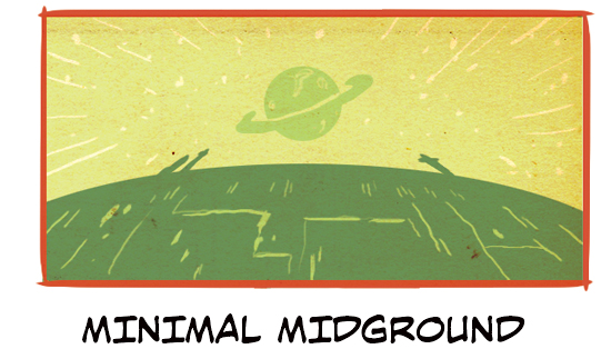
Minimal Midground
Sometimes less is more. A minimal midground can create a dynamic composition as well. This is also a good example of how to apply the preceding Implied Perspective to environments other than a cityscape.
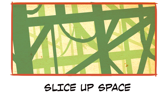
Slice Up Space
We recommend this kind of composition when you want to express complicated background motifs that fill up the environment, such as vines, electrical wires, scaffolding, etc.
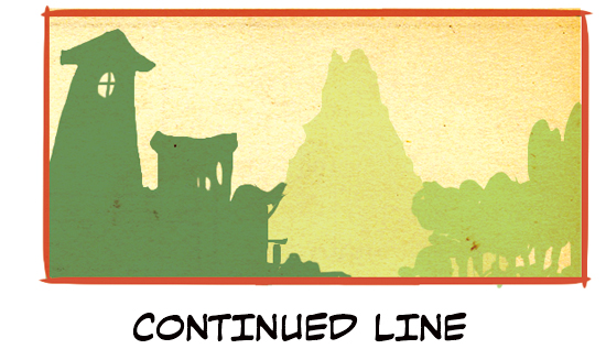
Continued Line
Something we haven’t seen yet is the continued line where the foreground, midground, and background line up in a row while also leading back into the environment. This is a fun option for any kind of story.
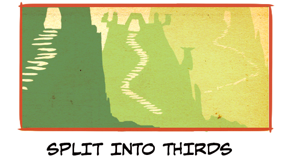
Split Into Thirds
This set up does exactly as in its name. It divides the foreground, midground, and background into equal thirds. Although not like in the example above, notice how the added touch of the three staircases allow your eye to travel through each section of the composition.
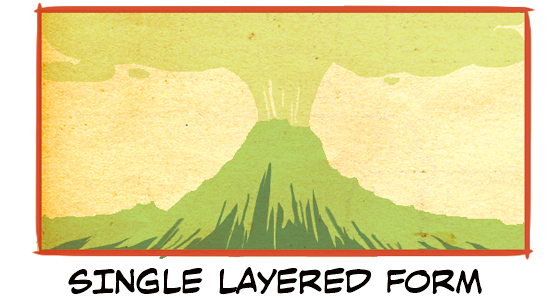
Single Layered Form
This is good for when you want a single subject to take up a whole pattern. Depending on the subject used, such as the erupting volcano shown, this can shift the mood very suddenly.
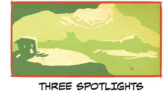
Three Spotlights
This highlighting technique can be used with many of the preceding options. It serves to highlight certain areas in both the foreground, midground, and background simultaneously.
About The Etherington Brothers
The Etherington Brothers are the creators of WORLD’S MOST SUCCESSFUL ARTBOOK & UK’S MOST SUCCESSFUL BOOK of ALL-TIME on Kickstarter. Book makers, idea sharers. Disney, Dreamworks, etc.
https://theetheringtonbrothers.blogspot.com/