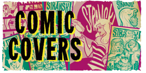
How to Draw Comic Covers
Here are some different composition ideas for comic covers by The Etherington Brothers! There are many composition ideas from characters, items, & environments!
Learn how you can draw… or learn how to THINK when you DRAW with the Etherington Brothers!
Collection of cover compositions that always work!
When composing comic covers, it’s useful to have a roster of design concept at your fingertips which you can mix and adapt. To help with this, I’ve put together a selection of visual approaches that always work, in case you ever get stuck for ideas…
Comic covers should include at least two main elements: a logo and a dynamic composition, but this is easier said than created. So let’s take a deeper dive into the covers in this collection and why they work.
Character-centric
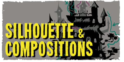
Head Profile, Straight On, Invert Silhouette, Foreshortening, Roundel
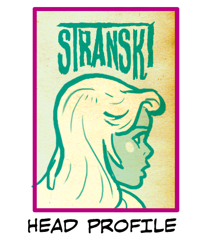
The traditional Head Profile shot with a floating logo on top is a simple, straightforward design. Its benefits are a close-up shot of the character of your choice along with your story’s name. The profile could be of the series main character, or even who these specific chapters highlight in the story.
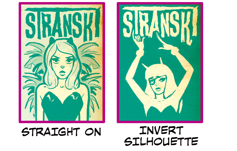
Straight On & Invert Silhouette are compositionally similar in how the character is placed: a half body facing forward. Straight On features a background element that fans out from behind the figure. It’s particularly impactful because the character’s emotions also seem to be bursting forth. Invert Silhouette also has a high visual impact, but instead of that coming from the character or background elements, it comes from the high contrast background that pushes the eye in towards the character in the center.
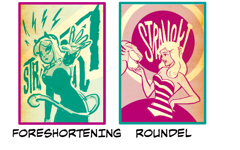
Foreshortening & Roundel are also compositionally similar in how the character is placed: hips up half body facing forward on an angle. The logos are also the same in that they are integrated into each cover’s composition in a way that works with the figures and elements around them. Foreshortening’s logo follows the line of action that goes through the character’s extended arm. The tail coming around the front and the lightning bolts are also good ways to balance out negative space above and below the character & logo combo. Roundel’s character and logo combo complement each other in terms of contrast and design. The logo is also somewhat obscured by the character’s head, which makes you take both of these elements together.
Inked/Sketch, Central Divide, Look Down, Shadow
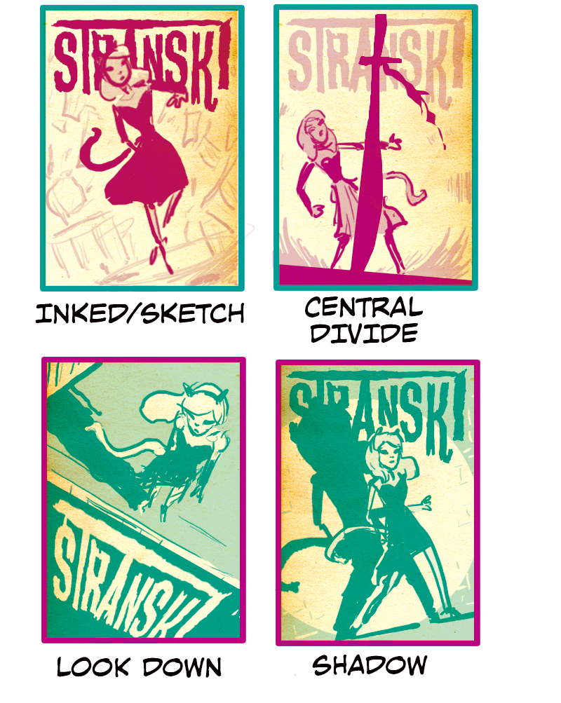
Inked/Sketch, Central Divide, Look Down are examples of full body characters in a simple background or with simple elements that give you a sense of what could be happening overall or in the current chapter of your story. The composition in Inked/Sketch is perfect for surrounding your character with items related to the story. Be sure to keep these items rough and more faded than the central figure so that the focus of the image is still properly highlighted.
Look Down & Central Divide are both excellent examples of covers when your story is starting or amid a tense battle/moment. Look Down is an offensive stance. The character literally has the high ground. Notice how the logo has been cleverly placed on the side of the building like an advertisement. The logo proportions also help to emphasize the dramatic lines of the building. In contrast, Central Divide is a defensive stance. It hints that we could be in the middle of an unexpected battle in the following chapter of our story. The central line, in this case, is the silhouette of a sword. The character behind it looks surprised, and the elements at the bottom in the background help us feel like this is an active scene and that the sword just suddenly landed in front of the character. Also, notice how the decorations of the hilt are curved. This, along with those lines in the background, help your eye travel around the cover. Shadow is unique in that the item making the most impact in the image is invisible to the human eye, light. Take note that the logo blends with the shadow cast by the figure, further pulling focus in on the figure.
Upside down, Foreground, Reflection
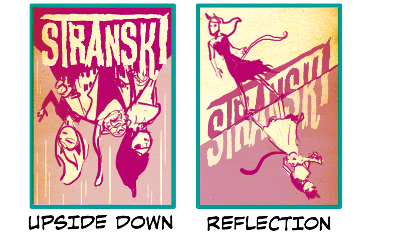
Upside down & Reflection are covers that are good for calling attention to the duality of two characters in your series. Reflection is the most direct representation of this. The composition is set up in a way the characters are mirror reflections of each other. The logo also follows this centerline, and the coloring is flipped with the background to cement the mirror analogy further. Upside Down is a dynamic composition that suggests action and perhaps two characters either fighting one another or working together to face a common enemy.
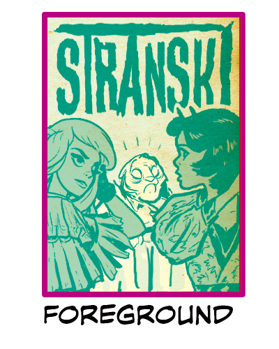
Foreground is a good composition that can show multiple characters but focus on the expression of a central character. It’s a good comic cover choice when you want to hint at a character’s emotional state in the story or perhaps as a daily slice of life themed cover. For this composition to work, you need to make sure that the characters in the foreground are shaded, thus guiding your eye to the brighter character in the center of the cover.
First Person, In Hand, Scale
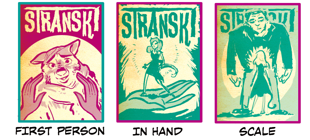
First Person and In Hand both use hands in unique ways to create each cover composition. First Person is direct. The character we see is presumably a main character. Alternatively, it could be a character that the current chapter is about. Either way, we gain insight into the character’s feelings, which could reflect a particular point in the story. As for In Hand, you might think you can only use this type of composition in a limited set of circumstances. After all, it’s not every story that a character can fit in the palm of another’s hand, right? However, if there is a character that feels metaphorically small, or if you want to insinuate that the characters are in the palm of your (the creator’s) hand, this composition swiftly becomes a good option.
Scale possesses similar energy to In Hand. It uses the same size contrasting motif; however, you can see both characters, and their difference in size and stature conveys a stronger emotion than In Hand. It also hints that action is about to go down as one of the main characters is about to face a big problem looming over them.
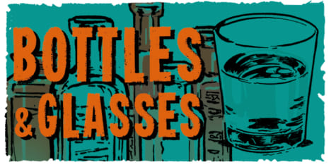
Fabric/Ribbon, Stack, Negative Space
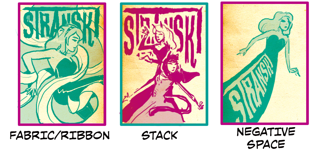
Fabric/Ribbon uses a piece of cloth flowing through the image to guide the viewer’s eye from the logo and on through the figure. The curve of the ribbon doesn’t have to look exactly as in the example, just make sure it guides the viewer through both the logo and the figure. Furthermore, the example here was created for an audience whose native language reads from upper left to bottom right follows an upper left to the bottom right, as in English. If you are creating for an audience whose native language uses a different pattern, you should adjust the ribbon to mimic that flow to keep the same dynamism as in the example. Stack uses a similar composition idea as in Fabric/Ribbon only with multiple characters. If you imagine an invisible ribbon in Stack, you can see how the composition functions in a similar way. As with Fabric/Ribbon, we suggest following the natural flow of your intended audience’s native language as a guide.
Negative Space shows how a composition can work even when not following the native language direction guideline. The logo is written purposefully in a different direction within the central figure. However, the main characteristic of this cover option isn’t the language flow; instead, it is how it uses negative space to allow the figure/logo to stand out. You don’t have to fill every area of your composition for it to be impactful.
Montage
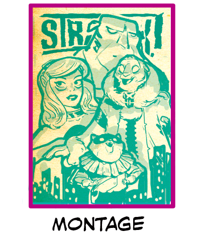
Montage is probably one of the more recognizable compositions in this batch, as it is commonly used for comic book covers. However, it’s worth noting some of the techniques that make this composition work. The composition includes three main elements: a logo at the top, characters in the middle, and an environment at the bottom. The characters are the focal point and are surrounded by bold lines to set them apart from the other elements. Note how the bold lines also separate each character. This can communicate that while all of these characters are in this city, they are not necessarily on the same team. Also, note how the camera angle each character is drawn from also differs further separating them. In Montage, the logo is present but is treated as the background and partially obscured by the central figures.
Item-centric
Crosses, Block Silhouette, Giant
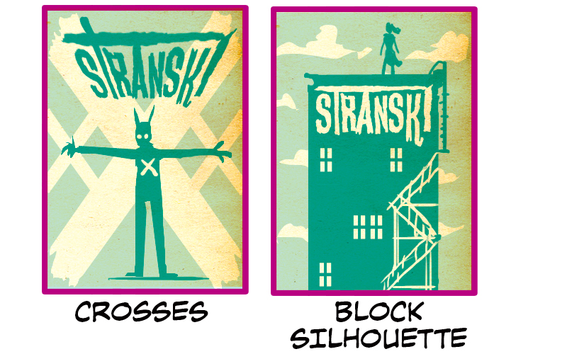
Crosses & Block Silhouette are examples of simplified silhouette compositions. Crosses has an abstract element (a cross) echoed in both the background of the cover and the pose of the central figure. It’s a vague enough symbol that can be applied to many elements of a story, especially when a character is at a crossroads. Notice that the logo is stretched to fit the angles of the cross element as well. In Block Silhouette shows a composition that many comic book cover creators are no stranger to, the dark figure on top of a building. Again, note how the logo is integrated into the design of the cover and helps to balance out and complement the overall composition.
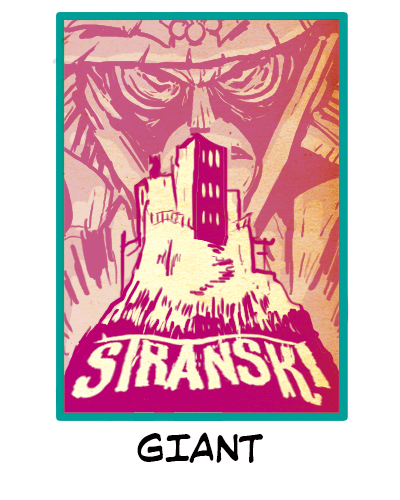
Giant also sports a building in its center, but the muted face behind it and the explosion give us a very different narrative. Most likely, the person in the background is the one who is blowing up the building. The logo has been cleverly incorporated into the summit of the ground the building stands on.
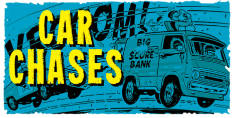
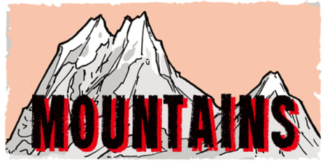
Day/Night, L-Shape, Cascade
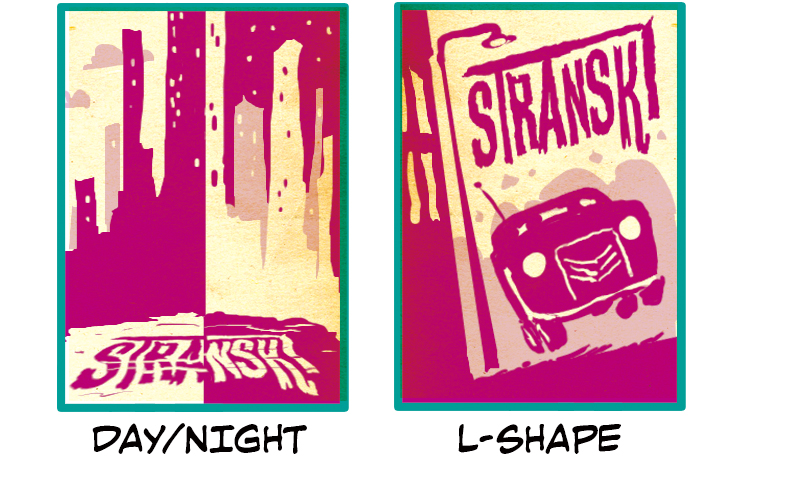
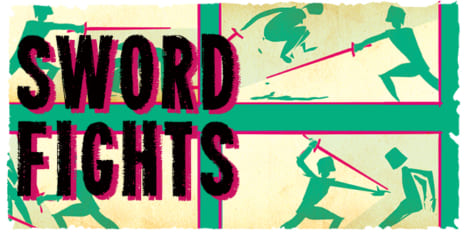
The last three covers we will look at are unique in that they have no figures but still give us a narrative or a unique composition. Day/Night & L-shape gives us the most story information in one image. Day/Night is reminiscent of Reflection and uses high-contrast to talk about the change in a city from day to night. The logo is also seamlessly included in the cover. L-shape uses the shape of an L to create an angle in the image that simulates motion. The choice of car is excellent and could be hinting at a car chase in the story or a character’s urgency to get from point A to B. However, the central element could be anything.
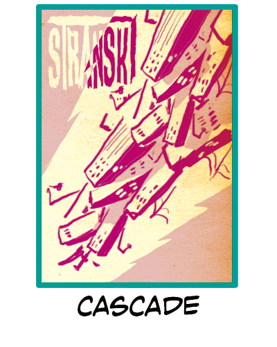
Cascade echos many of the features found in Central Divide, The obvious being the central line that runs through both covers, the other is how the lines of the background emphasize the action of the line in the center of the cover. Like in all of these examples, the logo is placed and colored in a way that doesn’t detract from the cover.
Spotlight, Logo
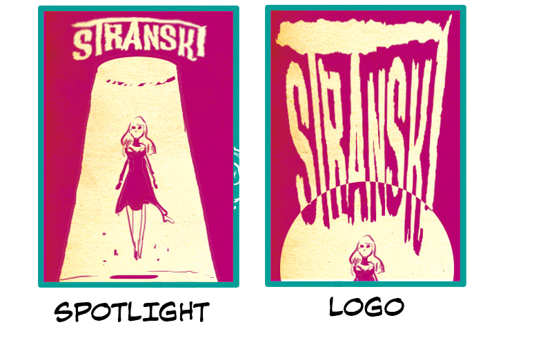
Spotlight and Logo are introduced together because, while Spotlight is figure-centric and Logo is item-centric, the two covers are examples of the same scene from different perspectives and use two contrasting colors to make up their compositions. With Spotlight, the cover’s central focus is the central floating figure with the logo floating above it. With Logo, we are looking down at the character, and about 80% of the cover is taken up by the logo. It is also stylistically stretched to match the direction of the spotlight down to the figure at the bottom.
Pathway, Perspective
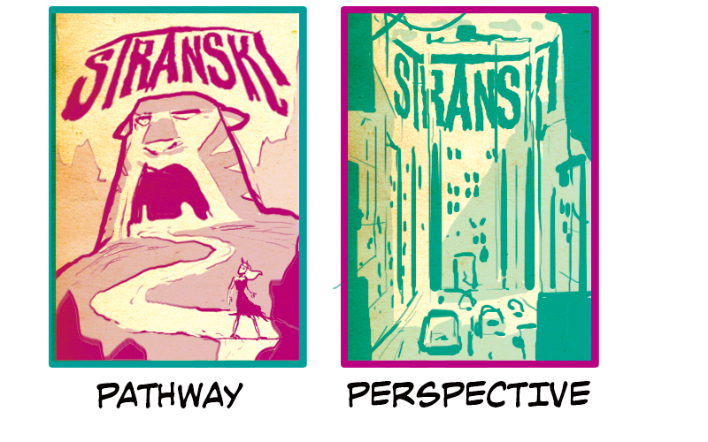
Pathway and Perspective are environment focused covers. Pathway uses the familiar long-winding path that leads a character up towards a looming structure in the distance. While this could be entirely hypothetical, it could also be a very real scene if your protagonist is embarking on the final leg of their journey with the structure in the distance, symbolizing an antagonist or a final destination. Notice how the structure takes up almost half of the page and sits just above the center. If we start down by the figure and move our eyes up along the path, we run into the structure with the logo sitting just above it.
Perspective uses the environment to create a much different mood. If Pathway is leading toward a climactic moment, Perspective feels like a midpoint in the story. It incorporates the logo, which falls along perspective lines, into the environment to not detract from the mood of the scene.
Pattern, Symmetry
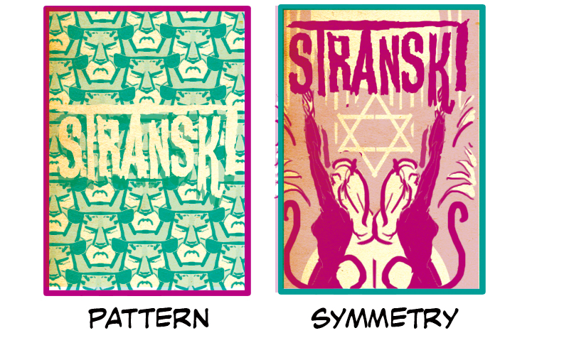
Pattern and Symmetry are good decorative alternatives to traditional cover motifs. Seamless repeating patterns can be quite busy, so the logo in Pattern is simply in white. This helps it not distract from the pattern but also stand out enough to be readable. Symmetry allows for a more traditional comic book cover that includes figures as in the other examples. Still, it keeps the decorative touch found in Pattern while offering something visually different to your audience.
Prop
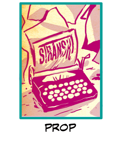
Prop is a unique cover choice that, like Pattern and Symmetry, breaks from the traditional comic book cover mold. In this case, the prop is a typewriter with the Logo is cleverly incorporated on the page coming out. The prop and the logo are both front and center in this composition with a relatively simple background. We recommend choosing a prop that is a central or common theme throughout your work so that it further solidifies your logo with your story.
Panels
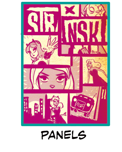
Panels uses a comic panel themed composition that is always a good stylistic go-to cover choice. You can show multiple ideas in one image that are loosely connected. Think of each panel as a scene you would include in a movie preview of your story. This option is very good at conveying a sense of action that leaves the viewer wanting to know more, enticing them to turn the page.
About The Etherington Brothers
The Etherington Brothers are the creators of WORLD’S MOST SUCCESSFUL ARTBOOK & UK’S MOST SUCCESSFUL BOOK of ALL-TIME on Kickstarter.
https://theetheringtonbrothers.blogspot.com/
https://www.instagram.com/etheringtonbrothers/
https://twitter.com/etheringtonbros