Simplifying Characters for Webtoons
Webcomic artist Stephinni covers techniques you'll need to design your own stunning webtoon characters. Draw complex armor & accessories with ease using features only digital art apps can provide!
Index
2. Simplifying a complex character: Tools of good character design
-
- Choosing the main features
- Creating a strong silhouette
- Tricks and tools for colors
- Tips
3. Creating brushes for common use (Agree, I can create 2 brushes for details)
-
- Basic step by step
4. Application in character panels
1. Introductions
We all want cool character art for our Webtoon, however, we need to work fast too! There is a way to create attractive designs without spending too much time drawing each panel and each character in detail. This time you will learn about efficient character design for your comic.
Even if you are not the type of person that likes complex designs, this is still a tutorial for you, for when it comes to simple but nice details that can be added to your characters, which will make all the difference.
I must admit that this is my favorite part and hopefully the following tips will be helpful during your creation process.
Let’s start!
2. Simplifying a complex character: Tools of good character design
I am going to take a complex character and turn it into a simpler one for a Webtoon story.
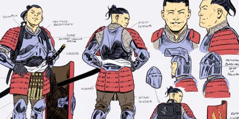
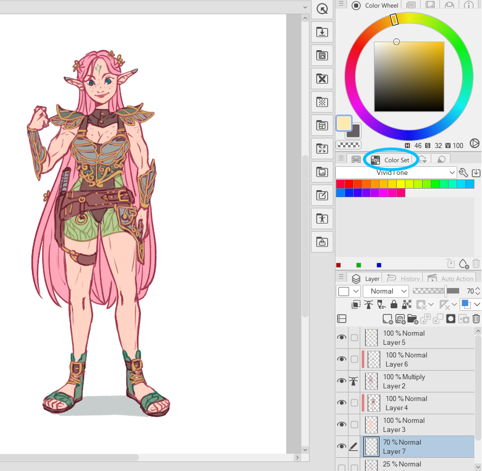
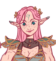
For this tutorial, I designed an elf using practical armor for battle. Here is some context for the character: Lives in the woods, strong female, hand-to-hand combat, uses nature to her advantage, kind face.
I wanted this character to be a lovely female elf, but with a strong energy and appearance.
Choosing the main features
We cannot create all the details and draw them for each panel, so we need to choose wisely what the features are that give the personality to your character.
In this case, we must take the following:
- Short
- Soft colors
- Cute smile
- Long ears
- Strong body
- Leaves patterns
- Metal and leather outfit
Creating a strong silhouette
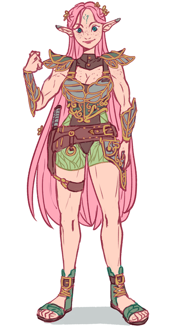
This is the character reference that we will use to draw the character in action. As you can see there are some details that can be difficult to recreate in each panel, such as the leaves, freckles, hair flowers, and golden details. If the armor has many details, it is much cooler, so for any character that has it, you will spend a lot of time drawing.
Quick tips for designing your character for webcomics:
- Write the character description and be very specific as possible. I personally use the following:
- Name
- Age
- Height
- Weight
- Gender
- Species
- Job/activity
- Weapons (if needed)
- Abilities (if needed)
- Personality
- Appearance
- Background story: Where they belong, where they live, how was their childhood, important facts about them
- Relationships: This is optional but important for the plot
Look for as many references as possible, collect photos of clothing, accessories, and maybe scenarios or places where the character will live or develop their story. Every detail of their background story is helpful to choose the right outfit and design for your character. Don’t forget their personality and current job/activity. I love using Pinterest and then mixing all the different elements. It doesn’t matter if you don’t use all of them, but it will bring life to the concept.
Try to keep it simple for coloring. I strongly suggest using a basic coloring style without shading or only simple shading. Just focusing on line work, shade tones, textures, and details that can be easy to recreate for each panel.
For this reference I didn’t use any special brush to do them. Keep reading and you will learn how to create the brushes and extra tools you may need, using Clip Studio Paint.
Tricks and tools for colors:
a) Picking the main colors to create color palettes
In the window called “Color Set” you can find default color palettes to use, however, you can use it to create your own as well.
Note: Please be aware that I set my workspace this way. To find the option, go to Window > Color Set.
Click on the “edit” button, then create a new color set and give it a name.
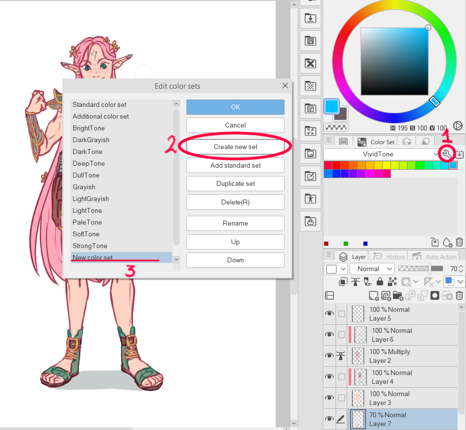
It will look like this. I named it after the character.
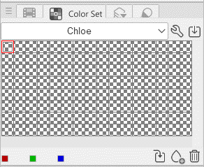
To add the colors, you must pick up the color from the canvas and then add it to your set.
The color will be added automatically to the set just by picking it and then clicking on “add”. You can do it in any order needed and create as many color sets as you need for the characters. That way you can color without needing a reference to pick base colors.
This is how it will look in the end:
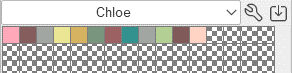
Tip: You can name each color depending on what it is used for. It’s very easy, just right-click on the color, then you just put the cursor over the color and it will show the name.
b) Color history
If you don’t feel comfortable using color sets, there is the “Color History” window.
I usually start with using color sets and end up using this one because of my personal coloring style.
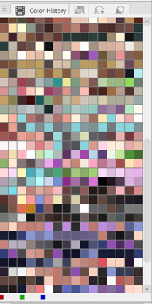
If you pick any of the colors stored here, now you will be using that one for your brush. So before you start coloring the panels, you can store the base colors needed. Like this:
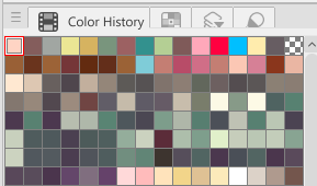
If you look carefully, the first row contains the colors we stored on the color set.
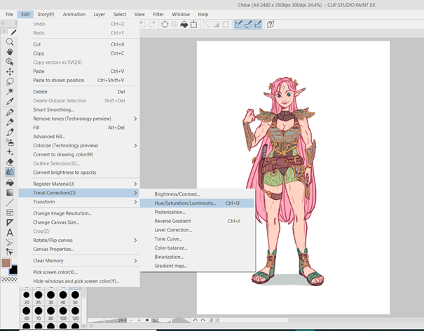
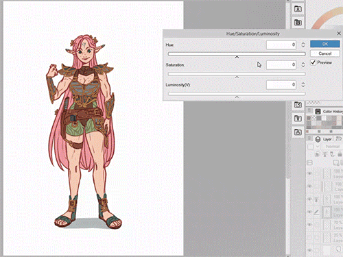
c) Formatting and color settings
Color settings are incredibly important if you need to play with colors without changing them one by one. This is a tip from professional artists that I personally don’t use often, however, it can be very helpful.
The most common adjustment to change colors is the Hue setting. You can try out different colors or select specific layers with the elements to match the design in case you are not sure about the combinations of colors and how they harmonize.
Tips:
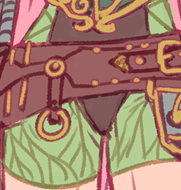
a) Border effect for details
This is my favorite for detailing drawings in an easy way, but why? Sometimes details need extra line work, so when you use the “Border Effect” layer property it will save you time and effort.
Make sure to have the “Layer Property” window in your layout:
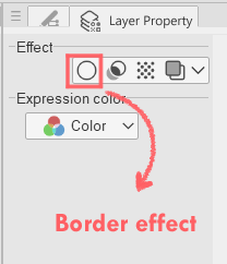
How to use it:
- Set the same edge color as the lines you are currently using.
- Set the thickness, try to not make it too much thicker or thinner than the rest of the linework.
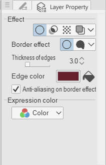
- Start! Anything drawn on a layer will now have the set outline.

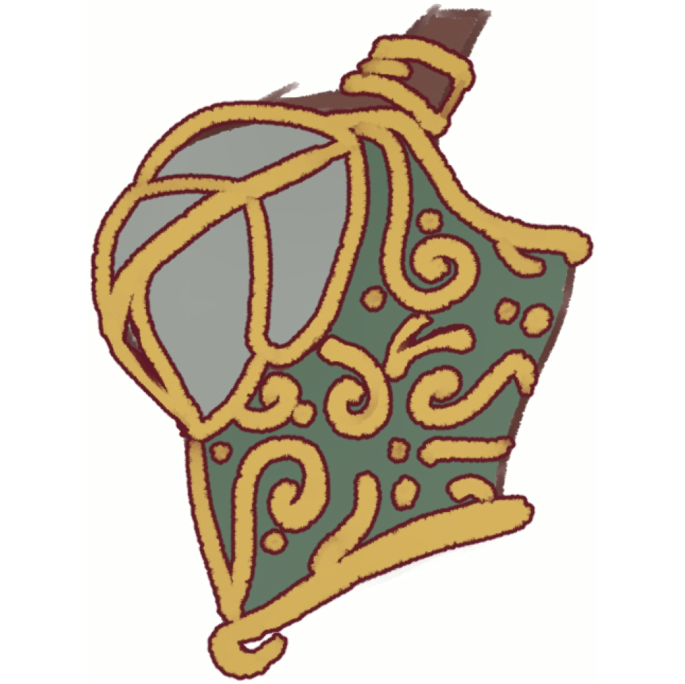
Result:
Tips:
- Please make sure to use it after you have already drawn the base colors of the items (in this example, the gold details)
- Make sure that the brush you are using for the base colors on the layer is dense or solid enough for painting, so the colors of the edge and the brush don’t blend.
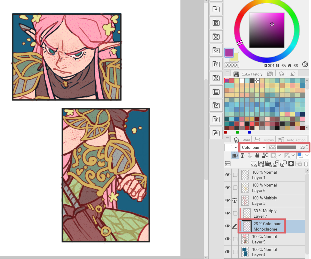
b) Textures:
This is something very simple but will bring a lot of “personality” to your characters and basic coloring.
Look into the assets and the textures available and find the most suitable for your webcomic style. Be careful, choosing the right one is very important for the story you want to tell. Do some testing, ask friends, do a poll on your social media, or during the process of the webcomic ask your audience.
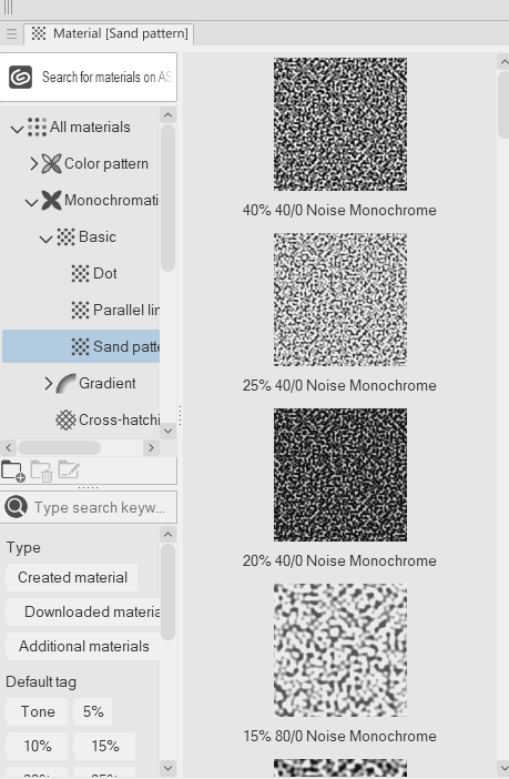
Once you have chosen the texture, drag and drop it into the drawing.
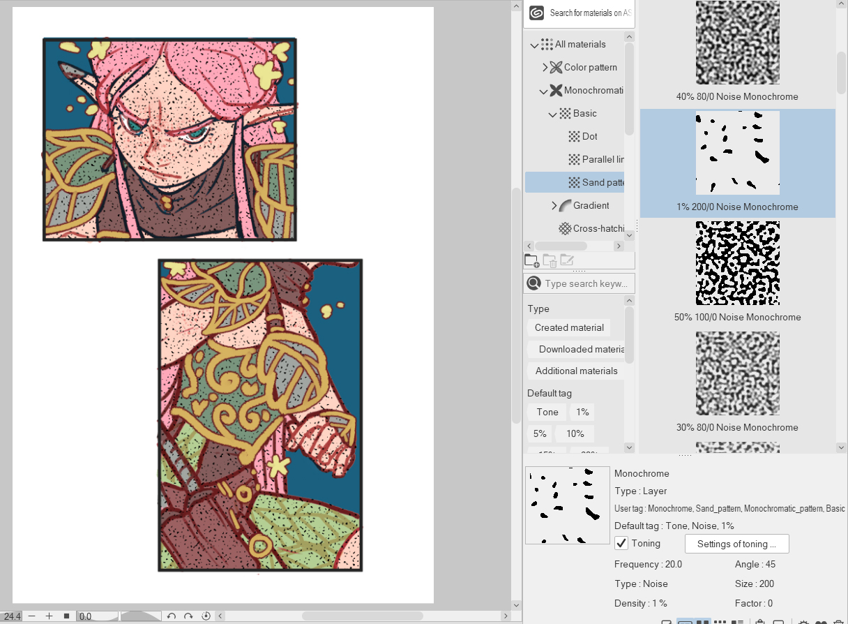
Then choose a layer mode to blend into the panels. For this case, after testing many of them I chose “Color burn”. It gives a little vibe like painted over a textured paper.
3. Creating brushes for common use (Right, I can create 2 brushes for details)
Sometimes we need an exact brush that may not be in the Assets-store, but to work even faster, we can create our own brushes!
Basic step by step:
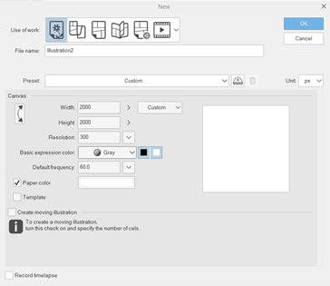
- Create a new canvas in grayscale (this will allow you to use the main and sub-color for the brush).
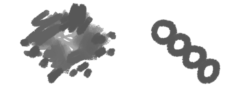
- Draw the shape of the brush. It can be a random or a specific shape.
- Go to Edit – Register Material – Image.
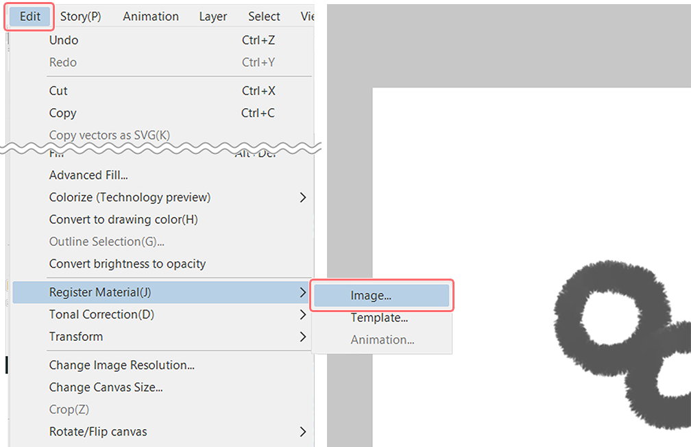
- Register the material:

Give it a name so you can identify the brush. Then make sure of checking the box “Use for brush tip shape”.
Choose the location to save the brush tip and add a tag it to find it faster in the Material palette.
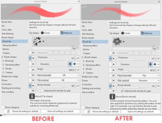
- Duplicate a similar sub tool to what you want to use the brush tip for. In this case, it can be a painting brush. Then change the brush tip shape to your newly created material.
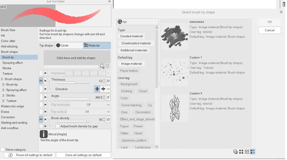
- Don’t forget that you can modify the individual brush settings.
For this tutorial I created these two:
The leaves pattern
Freckles
Check out the video tutorial to learn how I did them!
▼BRUSH CREATION
https://youtu.be/tAsDkL3cnzk?t=171
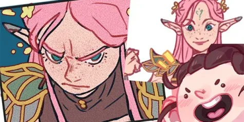
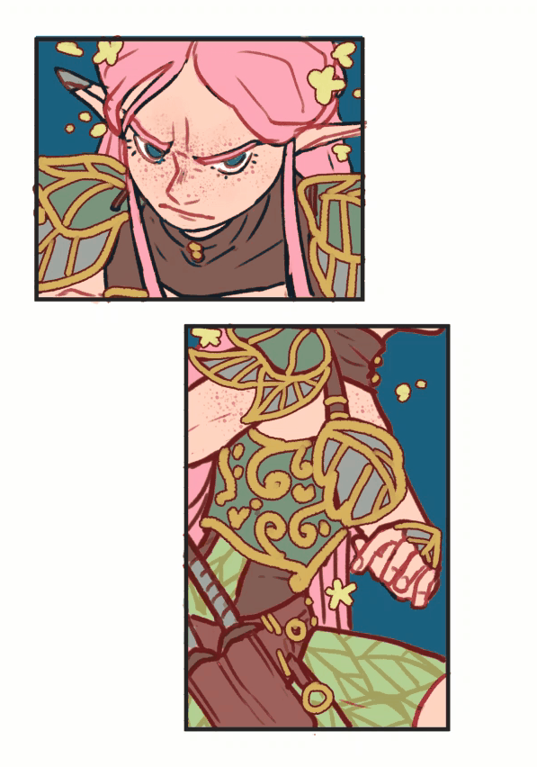
4. Application in character panels
Let’s see how we can use some of the tools we learned to create these panels: Color set and brushes. Check out the video tutorial to see other tools in action.
Drawing time: 13 minutes
My social media:
- Facebook: facebook.com/stephinni
- Instagram: instagram.com/stephinni
- Twitter: twitter.com/stephinni
- Also my Patreon where I do mini mentorships monthly: patreon.com/stephinni
- Find my work here: www.stephinni.com
Stephinni