Digital Self-Portrait Oil Painting Tutorial
Artist Laurent Grossat paints a caricatured self-portrait in this traditional oil painting tutorial using only digital painting software.
Index
How to paint a caricature with Clip Studio Paint
Introduction
This tutorial aims to show the tools of Clip Studio Paint and how I create a painted caricature from start to finish.
I quickly took a liking to draw the faces of my models during my life drawing sessions. Caricature just came naturally to me. I noticed that emphasizing someone’s features made their portrait more “accurate.” This is also an excellent practice to stylize and simplify your illustrations. I paint my caricatures with Clip Studio Paint, but I use an approach closer to traditional art as I do not use many layers. Digital tools have the advantage of making the workflow easier as you don’t have to deal with problems like waiting for the paint to dry. It is also easier to erase mistakes halfway through.
Tool Introduction
1. The brushes
There is no magic solution in my eyes when it comes to using Clip Studio Paint‘s brushes. I like to alter my tools regularly when painting because it allows me to create happy little accidents or render a specific type of texture. Clip Studio Paint allows you to adjust the settings of your tools as needed. The tool’s preview makes it possible to anticipate what kind of settings to use or how to draw the painting to get the wanted result.
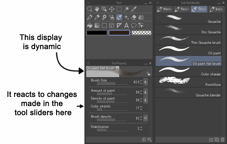
Everyone has their preferences, but here is a selection of some of the Clip Studio Paint tools I used to create this painting. In particular, I used the Pastel, Crayon, and Rough pencil sub tools located under the Pencil and Pastel tools. These are useful when sketching and adding details when painting.
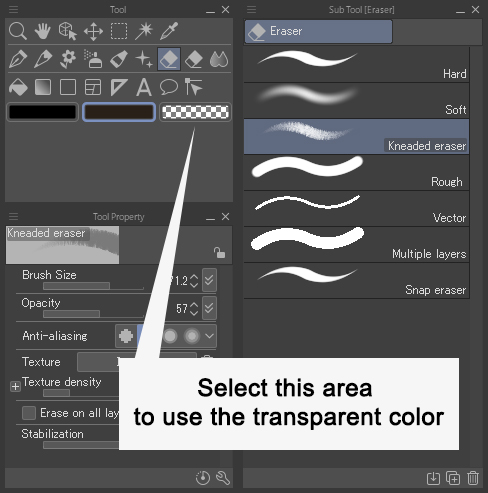
I use the following two methods when I erase something when sketching:
- [Eraser] tool > [Hard] and [Kneaded Eraser] sub tools.
- [Pencil] with Transparent color, which allows me to erase things while still maintaining its texture.
When painting, I mainly use the [Oil paint flat Brush] and [Thin Gouache Brush] under the [Oil Paint] tool. I also use the [Hard] brush under the [Airbrush] tool, as the blending mode can be adjusted according to my desires and needs when painting. I use the [Diagonal Line] brush under the [Decoration] tool for painting as well. I set the brush size small to create texture and adjust it to a bigger size to create graphics. Finally, I use [Running color on fiber] and the [Fingertip] sub tool under [blend] to smooth the edges.
*Note: The [Soothing watercolor] and [Running color on fiber] sub tools have been moved from the [Blend] tool to the [Brush] tool > [Watercolor] group.
2. Time-saving tools
These tools allow you to create shortcuts to ease the process of creating a picture and simplify the mandatory but less creative steps of traditional drawing:
- To keep a fresh eye on the drawing and spot mistakes, you can flip the paint. This can be done using the [Edit] menu > [Reset Rotate/Invert] > [Flip Horizontal].
- Similarly, the [Zoom] tool allows you to quickly zoom out and take a step back.
- To isolate and widen a particular sketch use the [Selection] tool then the [Edit] menu > [Transform] > [Scale up/Scale down/Rotate].
- You can easily adjust the colors, increase the contrast, etc., using the [Edit] > [Tonal Correction] menu.
- To revamp or strengthen the composition, you can select the area you want to keep with the [Edit] > [Crop] menu.
- The point is not to rely on these tools for everything; they can’t replace you. Your eyes remain an essential tool to judge your work, but these techniques can be of great help and a time-saver to make up for a mistake.
Process Steps
1. Sketching
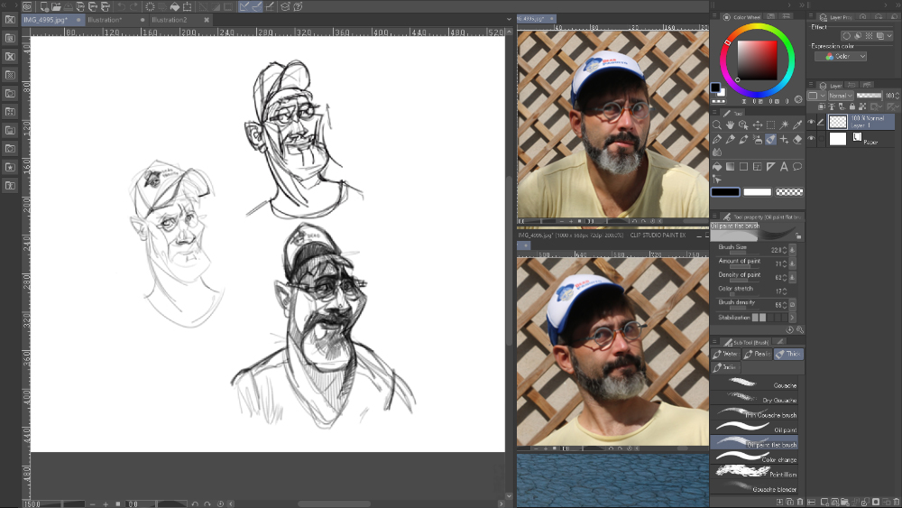
Sketching allows you to explore several possibilities and make sure you can draw the portrait as accurately as possible. It’s the first time I’ve drawn a caricature of myself, and it’s been an interesting exercise. I chose the sketch in the bottom right, which highlights the feeling of anxiety that I feel during this painting process and that I tried to convey in the original picture. In addition, it seems to me that this sketch is the better one to show the shape of my face, the small distance between my eyes, the broad cheekbones, and the small size of my skull. I’m most interested in the bottom sketch below that I added more details to. You can also see the pencils I used and how I organize my workspace.
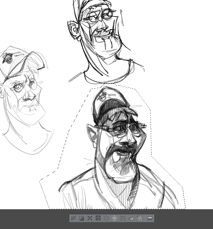
2. Cropping and zooming
Using the [Selection] > [Lasso Polygonal] tool, I set the chosen sketch apart from the others.
I copy-paste the sketch, which with Clip Studio Paint, automatically places it in a new layer. Then with the [Transformation] tool, I can make it bigger and fill the screen with it.
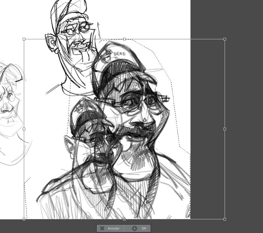
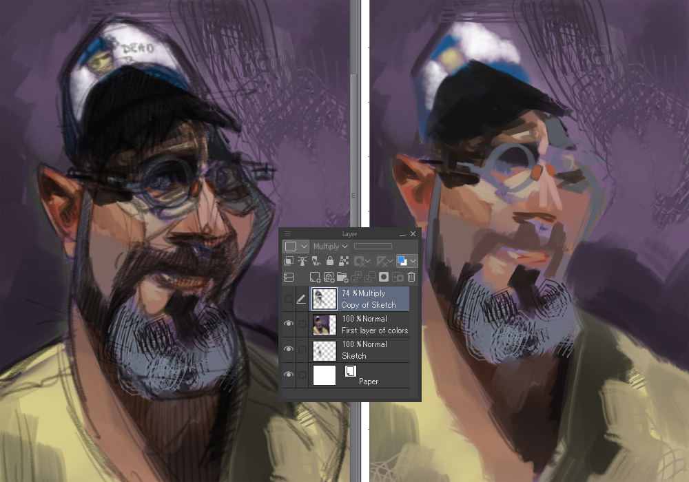
Finally, I set the new layer’s blending mode to [Multiply] and reduce the opacity. I hide the sketch layer because I don’t need it anymore. However, I don’t delete it and keep it in a file as a backup.
It is sometimes necessary to use secondary tools like the [Mesh Transformation] tool during this step. It allows you to rework/adjust a part of your drawing.
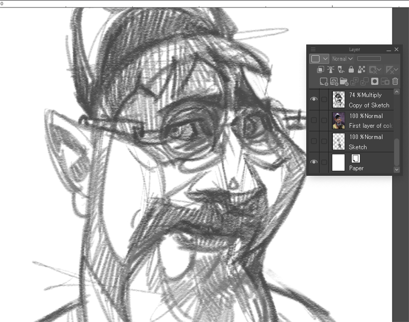
3. First layer of colors
Below the sketch layer, I put the first touches of color with various [Brush] tools on a new layer with its blending mode set to [Normal]. The goal is to quickly establish the colorful atmosphere of the image. Since I want this colorful atmosphere to stay personal, I don’t use the [Eyedropper] tool on references to choose my colors. Even if the colors end up being close to what the photograph looks like, I prefer to choose them myself with the eyedrop tool’s color wheel. Since the original background is a bit distracting and not really interesting, I paint a simple color that contrasts with the shade of my skin and T-shirt. I choose purple because yellow and purple are complementary colors.
At this stage, I mainly use the [Oil Painting], [Diagonal Line], and [Crayon] brush tools, and a little bit of the [Blend] tool. The brushes’ size is usually set to a large value, but it changes depending on what I’m painting. I then add a few small brush strokes to add little details and diversity in my painting.
When I hide the sketch layer, you can see how sloppy my work is, as shown in the picture below. However, this is done on purpose, as I will add details later.
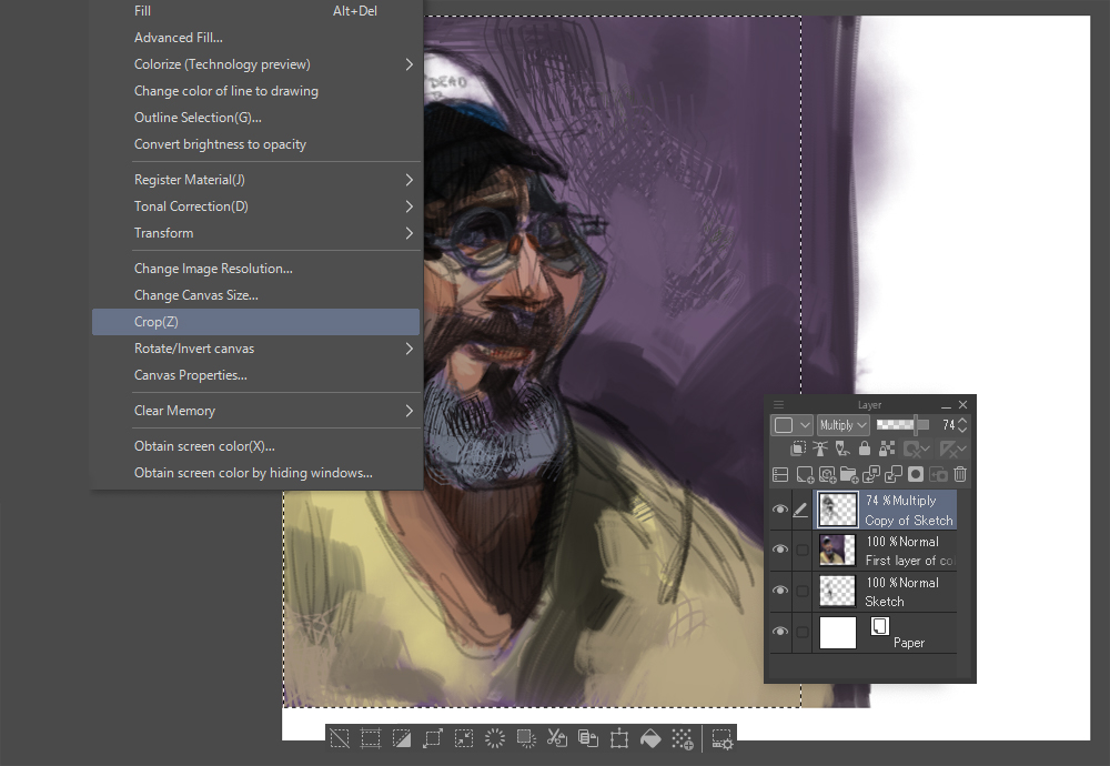
4. Crop the image
Before I start adding details, I crop my drawing. To do this, I select the area of the document that I want to keep and select the [Edit] > [Cut] menu.
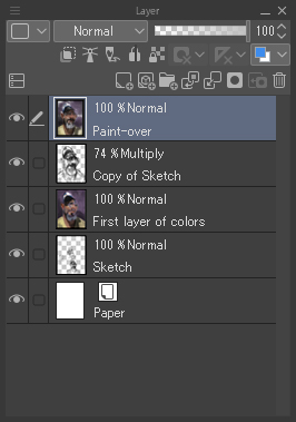
5. Paint over the sketch
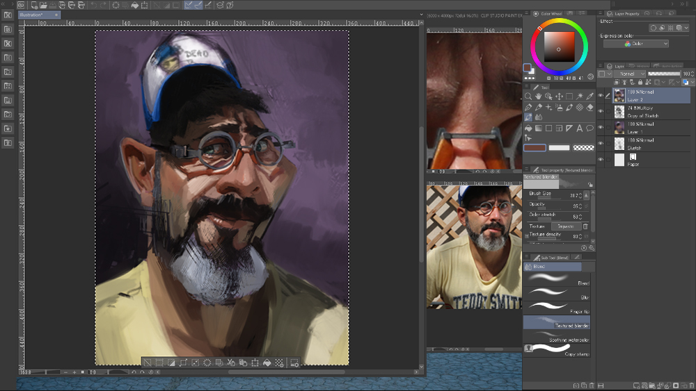
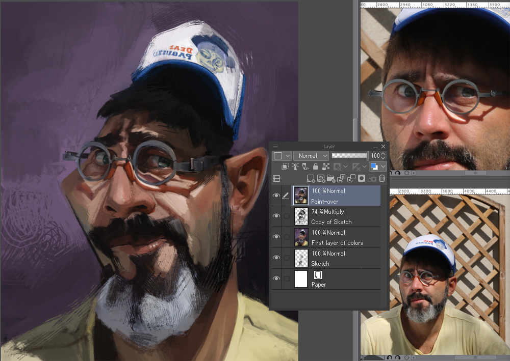
At this stage, you have to define the shapes, texture, details, etc. However, be careful because this part takes time, and you should not rush into it. If the previous steps have been neglected and you start this step too early, you risk spending a lot of time building a rendering that could be poorly built or a portrait that doesn’t look like the model. The result will be unconvincing. To do this, I create a new layer that I place on top of the old layers, with its mode set on [Normal]. (If you own a low-end PC, you can delete/merge the old layers before drawing on top of them, so the file doesn’t become too heavy.)
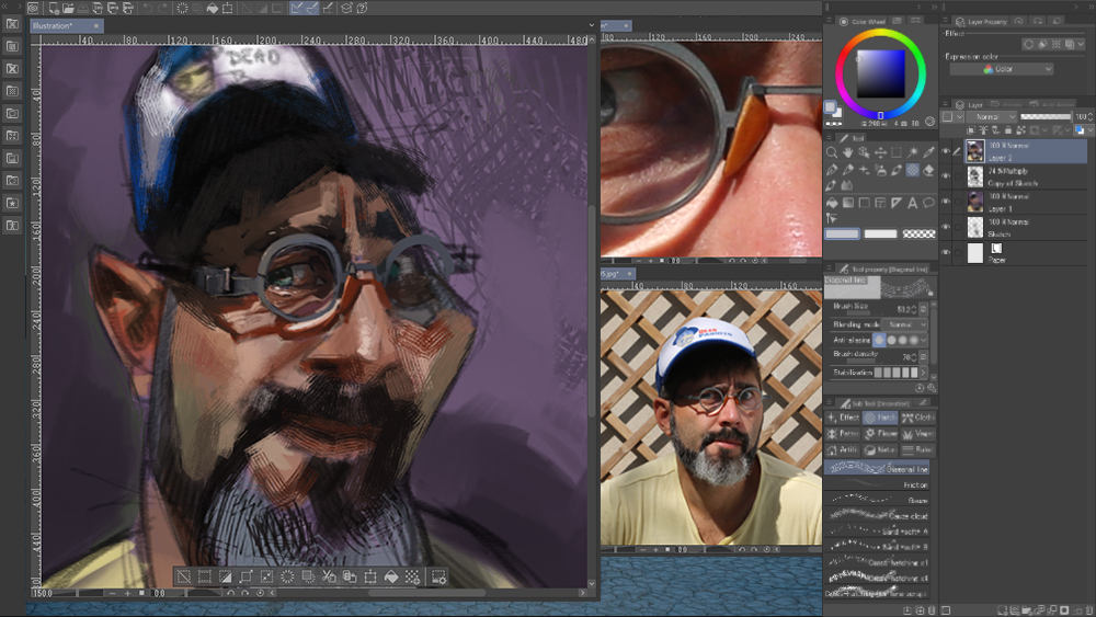
Now, I can zoom in to work on the details. I reduce the size of the brushes accordingly. Be careful not to do too much, or you might take too much time and lose consistency between each part.
For this picture, the tools that I used are:
- [Oil painting] and [Blend] to define the shapes
- [Pastel] > [Crayon] and [Flat oil paint brush], all set to a small value when adding details and as large as possible when working on the shapes
- [Diagonal Line] to merge graphics and texture
To maintain balance, I prefer to work on all the areas of the painting at once rather than finishing one area and moving on to the next.
The start of the painting process of the eyes.
I try to keep the brushes size as large as possible. When the whole picture is practically defined, I know it is time to decrease the brush size again and zoom in a little more if necessary.
Example of maximum zoom during the painting process.
As previously stated, it is important to zoom in/out so as not to lose consistency, like taking a step back from a canvas when painting in real life. There’s no point getting lost in the details if the basics of the picture don’t work.
To make the painting look more alive, it is interesting to regularly switch tools (different brushes, adding blur, diagonal lines, different sizes, different opacities, etc.).
The picture at the end of this step of the process.
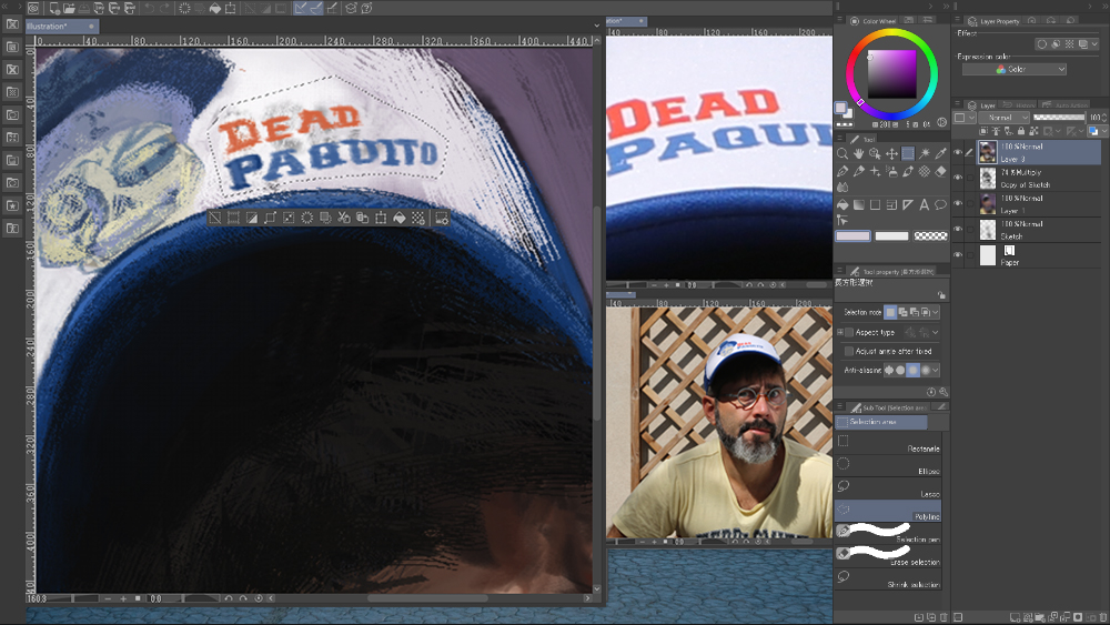
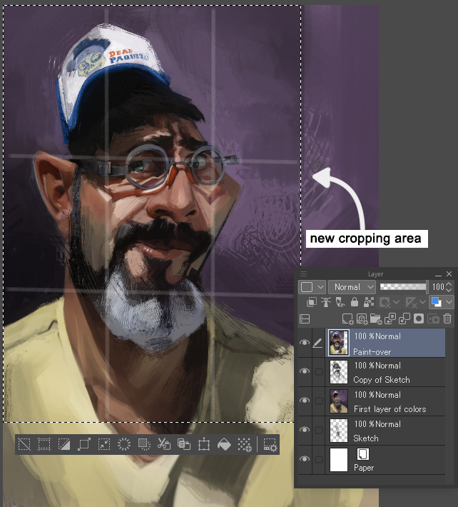
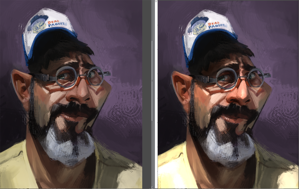
6. Strengthen the focal point
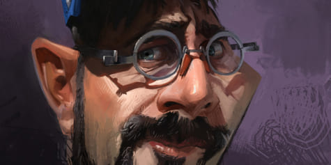
To make a picture have more impact, I advise you to create a focal point. To create one, you can add more details to one specific area. In my opinion, the further you are from this area, the less the details need to be worked. For example, the logo on the cap is simple, while the area around the eyes and glasses is painted more carefully. You must focus and add details to what feels like the strong point of your picture to have a balanced composition. When zooming in and out, it seemed to me that the composition was not right. So once again, I cropped the picture.
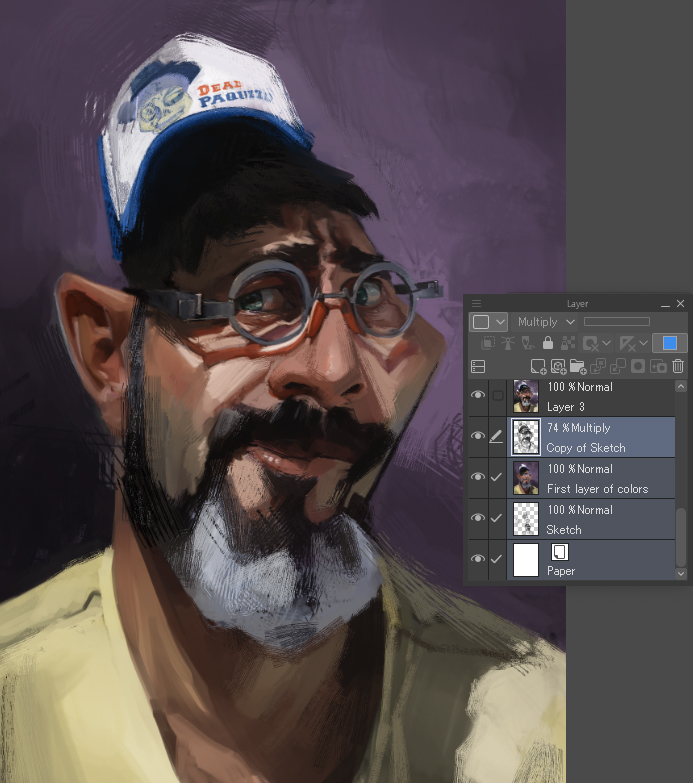
7. Corrections of values and colors: use of two layers of corrections
Painting details can be time-consuming and tiring. When working on your painting, the repetition of some steps can be boring, and it can be difficult to realize where are the weaknesses of your drawing. You can break this weariness using the [Mirror] function via the [Edit] menu > [Reset Rotate/Invert] > [Flip Horizontal].
I noticed that the painting looked a bit flat. The lights aren’t strong enough, and there’s an imbalance between dark lights and soft shadows.
There are several different approaches to solve this problem. When painting traditionally, I would repaint the weak lights, readjust the colors where they are too pale and repaint the soft shadows to make them more intense. With Clip Studio Paint, I use the tools in the [Edit] > [Tonal Correction] menu.
I opt for a two-layer solution: one layer with the blending mode set to [Glow dodge] to strengthen the lights and colors, and another layer set to [Multiply] to correct and deepen the shadows.
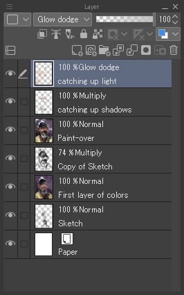
I color the shadows on the [Multiply] layer with the airbrush tool. I chose a color that is close to the shadows that are already painted. On the [Glow dodge] layer, I then use the [Oil paint flat brush] and [Airbrush] tools to paint brushstrokes on the lights with a bright and warm color, similar to the ones already established in the picture. I then blend them with the [Finger tip] and [Running color on fiber] sub tool’s under the [Blend] tool and adjust the opacity of the layers by playing with the settings until I get a result that I’m satisfied with.
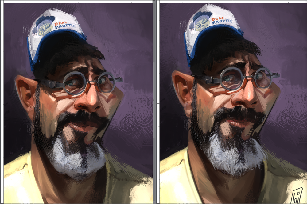
8. Finishing touches
After adjusting the brightness settings to add a bit of life to the painting, I then save the file in JPEG format. Merging all the layers into one allows me to add the finishing touches. I add last-minute details such as hair, reflections of the glasses, and highlights on the glasses’ frames and the skin.
During this step, I sometimes “break” some aspects of the picture. Every now and then, when I work too much on the model, the result seems a little too soft for my taste. Thanks to the work I’ve done so far, I can freely place loose brush strokes to add texture. They give energy to the painting. You can see it here in the nose area, thanks to the [Diagonal Line] tool.
To finish, I sign my work.
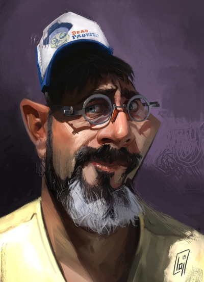
Before/After the finishing touches
You will find below the finished painting in a large size. Thank you for reading! Do not hesitate to send me your feedback in the comments.

Check out my website if you want to look at my work, whether it be illustrations, designs, caricatures, etc.
https://laurent-grossat.jimdo.com
on ArtStation:
https://laurentgrossat.artstation.com
and of course, on social media:
https://www.instagram.com/laurentgrossat/
https://www.facebook.com/GrossatLaurent/
– Laurent Grossat