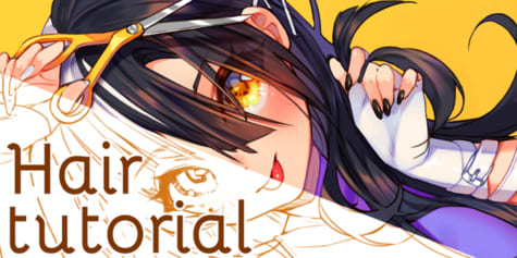
Designing a Dragon-Themed Character
Learn how illustrator Tan Zhi Hui(Kudaman) uses unique features of digital painting, such as brush blending modes and color correction, to draw a human-dragon!
Starting Out and Idea Development
For this tutorial, I am going to draw a dragon-themed character.
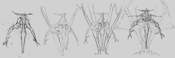
Starting out, I am more comfortable using lines (small brush size) instead of larger brushes to construct my ideas. This way I get to explore some details and stories of the characters at the same time. However, it is still better to prioritize on getting an ideal silhouette at this stage. Try not to spend too much time on the tiny details.
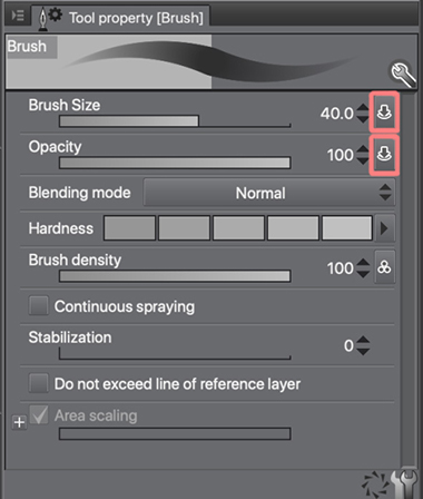
The brush I am going to use in most parts of the painting process is a default round brush with Brush Size and Opacity controlled by pen pressure.
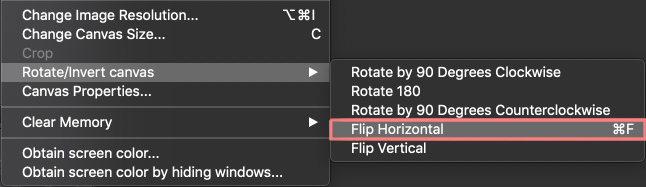
Don’t forget to utilize tools like Rotate/Invert Canvas > Flip Horizontal to check on your sketches and proportions.
Refining and finalizing sketch
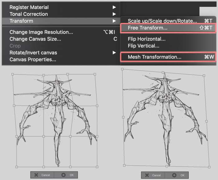
Transform > Mesh Transformation is a tool I use a lot to refine my sketch and making big adjustments. For adjustments on areas with straight lines I want to maintain, I use Transform > Free Transform instead. I tend to spend a lot of time (30%-40% of the whole painting process) on getting a sketch I am very happy with. For me, it is important to have the silhouette of the character locked down at an earlier stage so that I can focus on other parts like the details, lighting and rendering later on.
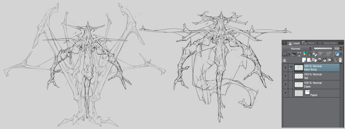
After I have decided to move forward with my sketch, I use a smaller brush to clean up the Line art and apply smaller details like dragon scales. After having the Line art layer all cleaned up, I separate parts of the character into different layers, in this case, they are the Main Body, it’s Cape and its Tail.
Selection
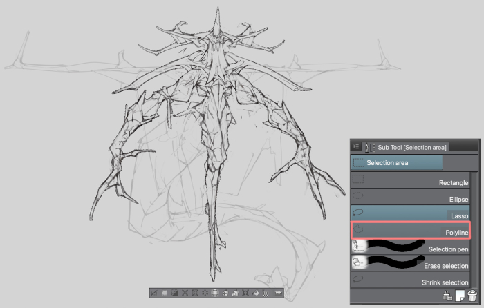
Before applying colors to the character, I have to make a selection on my character sketch. Feel free to use any selection tool you are comfortable with (Polyline, Lasso or Auto select). In my case, I use Polyline because I want to retain the straight lines and sharp edges in my sketch.
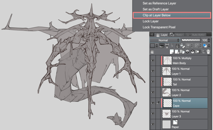
After I have done with the selection, I created a layer under the Line art layer and filled the selected area with a lighter color. Then I proceed to clip the Line art layer at the flat color layer (by Right Clicking the sketch layer, Layer Setting > Clip at Layer Below). To make the Line art layer more visible, I set its blending mode to Multiply. Repeat the same process with other Line art layers.
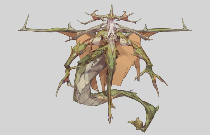
Base Color
Under the Line art layer, I created multiple layers for the base colors (these layers will also be clipped at the flat color layer). In most cases, I keep the number of Base color layers below 5, so that they are not too tedious to manage. For this particular piece, I have yellowish green color for the scaled areas, beige color for claws and exposed bone areas, orange color for the Cape, light yellow for body parts that are not covered by scales, and last but not least white color for its beard. Feel free to lighten or add a hint of other colors to the Line art layer if you think it is covering up too much of the base color layers.
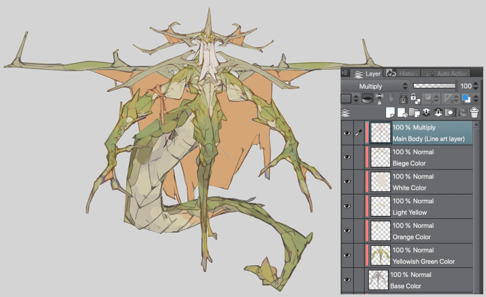
Shadow
The reason why we define the shadow area on the character at this stage is mainly to decide the main lighting source. Create a new layer with Multiply Blending Mode on top of the base color layers. On that layer, I use a 50% lightness grey color to paint the areas where lighting couldn’t reach. With the brush settings I showed earlier, I can control the opacity and size with pen pressure, it is very useful when I want to create depth on the shadow parts.
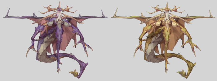
Color Variants and Color Adjustments
After I have my first color draft, I will proceed to create color variations for the character. With my earlier setup (5 base color layers and one shadow layer), I can create different color combinations just by making adjustments to each layer (including the Line art layer). Applying some colors to the line art layer could be really beneficial, as it adds some richness to the base colors when we merge them together. The color adjustment tools I use in most cases are Hue/Saturation/Luminosity or Color Balance. For me, this would be the most fun and enjoyable part of the painting process.
After some exploration, I came out with two more color variants; an elegant golden version and an evil purple version. For the golden version, I lightened the Line art and Shadow layer to match the theme.
Rendering: Part 1
The Golden version was my favorite, so I decided to move forward with it. Before merging the shadow layer, line art layer and color layers, be sure to keep a copy of them in case we need to make any big changes.
I think a character’s head is where it gets the most attention, so that would be where I am going to start my rendering process. The rendering process could be quite simple and straightforward if you have the light source, shadow and details figured out earlier. The process would mostly be cleaning up the lines. Blend tool comes in really handy when I want to blend or smoothen areas with two or more colors.
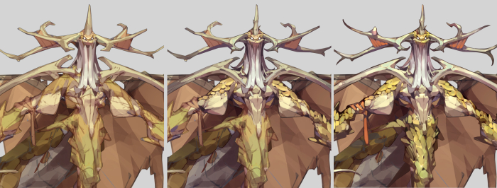
Rendering: Part 2
Throughout the rendering process, parts with Foreshortening are worth spending more time on. Getting those parts right really helps with the readability.
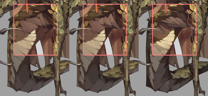
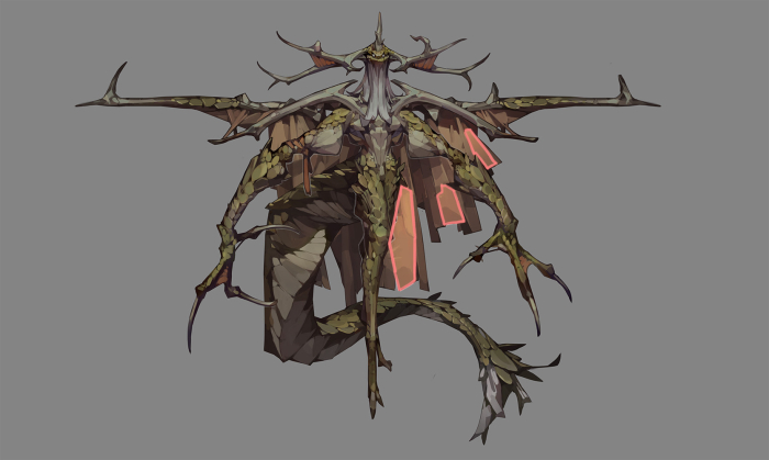
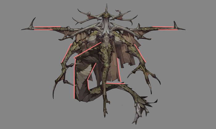
Another thing to watch out would be the shape distribution among our design. It is always good to have some empty spots among the small details. For example, while adding details like wrinkles and stitches on the cape, try not to go overboard, leave some areas on the cape empty. The same concept applies to the outline/edges of the design. It is ideal to have long straight lines on the character’s silhouette; they complement the smaller details on the design.
Useful tools for color adjustments
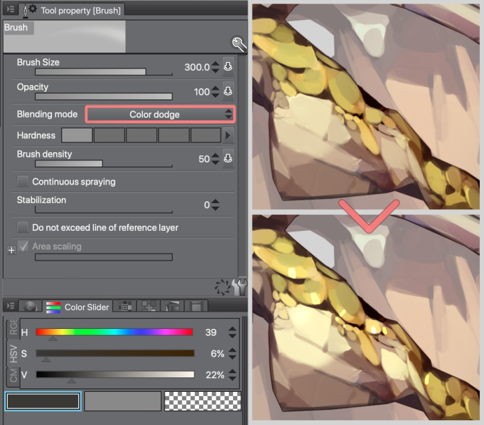
There are a few blending modes on the brush tool I find really useful, especially for applying details and adjusting brightness/saturation in certain areas.
Color Dodge – This is pretty common, I use it to apply highlight on glossy and metallic surfaces. Try to pick a darker color or lower the opacity, so it would be easier to control, and the drawing doesn’t end up overexposed.
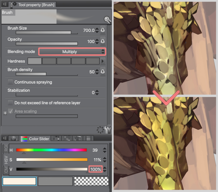
Multiply – This blending mode is commonly used to apply shadow or darken certain areas. Another way of using it would be setting the Luminosity value to 100, this way it increases the saturation value of the area without darkening it.
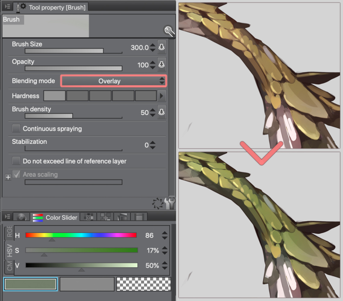
Overlay – This tool allows us to control the saturation and lightness at the same time. If you have a luminosity value above 50, it is going to lighten the area, lower than 50 is going to darken it.
Try using soft edged brushes for these tools, for smoother transitions.
Final Color Adjustment and Final Touch Up
For better readability, I added a white outline around the character to separate it from its tail and cape. A simple gradient is also added to the background.
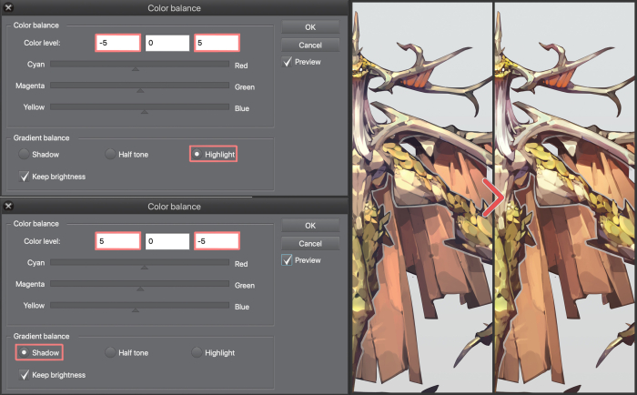
To wrap things up, I use Color Balance for the final color adjustment. On the Highlight tab, I go with cool colors, and on the Shadow tab, I go completely opposite. The reason I make the adjustment is to unify the overall color scheme and create some contrast on the image.
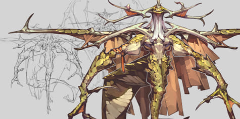
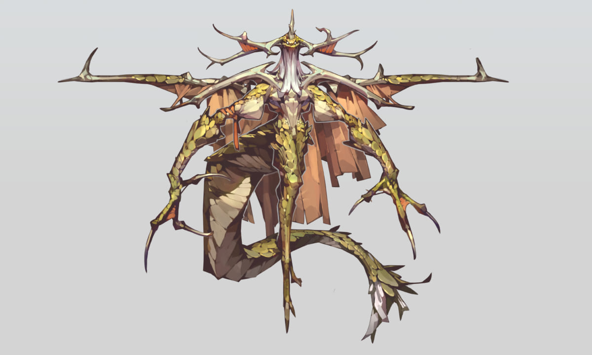
Final
About Tan Zhi Hui (Kudaman)
Zhi Hui is a freelance artist based in Malaysia. He provides various illustrations services to the biggest clients in the industry like Capcom, Blizzard Entertainment, Wizards of the Coast, Tencent Games and NetEase Games.
Portfolio: https://www.artstation.com/kudaman
Twitter: https://twitter.com/Kudaman_89
Instagram: https://www.instagram.com/kudaman_89/
Interested in concept art or what it takes to become a concept artist?
Check out the link below!