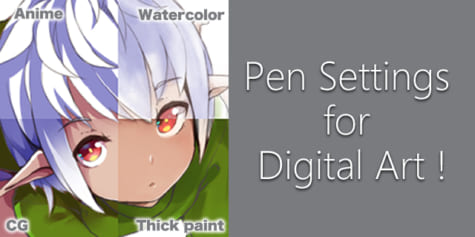
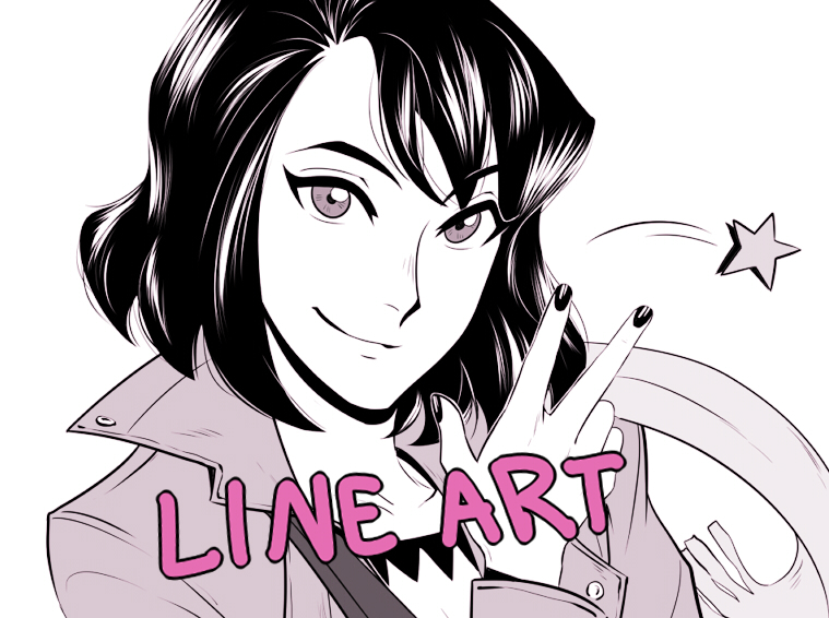
Tips for Drawing Digital Anime Line Art!
Artist Eridey explains how to create compelling line art for anime-style character drawings! Learn more about how to draw dynamic lines, techniques for drawing eyes and hair, and useful digital art software tips and tricks and features. This tutorial is packed with simple, easy to understand information for how to outline and draw in the anime style!
Index
The outline is a fundamental part of the illustration and sometimes it can get frustrating, especially when you see that your sketch looks better than the final line art. But your lines can have as much personality as your characters, so it is very useful to emphasize or highlight parts of the illustration, direct the viewer’s gaze, and create movement. Here are some tips to give more character to those lines. Let’s start!
What brush should I use?
Obviously, there are millions of digital brushes, and each one has a different function, so there is no correct answer to this question. I could say “It depends on what you want to do,” but that’s not good enough, right? The good thing is that they all share more or less the same configuration panel. Let’s take a look at a couple of basic Clip Studio Paint brushes: the Darker Pencil and the G-Pen.
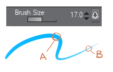
* Brush Size: The thickness of the line varies depending on the size of the brush and the pressure we exert on the pen of our graphics tablet. (A) Maximum size, (B) thickness with the minimum pressure.
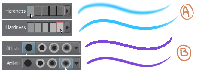
* Hardness / Anti-aliasing: This softens the edges for your lines. You can see how it affects the strokes in both cases. (A) Hardness / (B) Anti-aliasing.
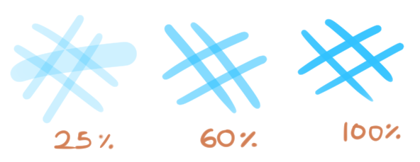
* Density / Opacity: With less density or opacity the lines become more transparent. Here I increased the density progressively until we get to 100%.
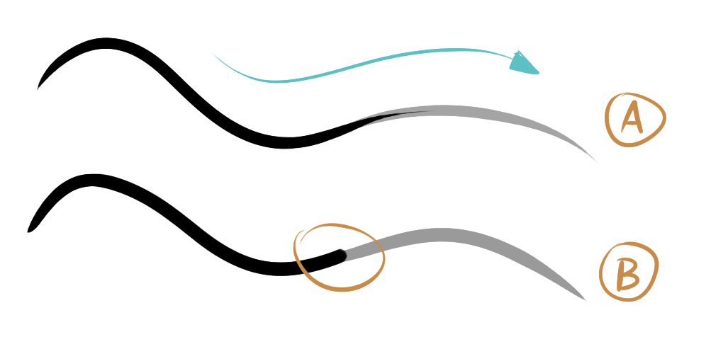
* Stabilization: This bar is a life-saver! It makes small adjustments in the line to avoid shakiness, so it is great for when you want to make long, smooth, and uninterrupted lines – you only have to increase or decrease the value as much as you need. (A) 0 stability, (B) 10 stability.
What idea or feeling do I want to create?
Maybe I want my drawing to look aggressive, to show speed, power and strength …
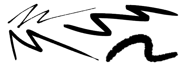
Perhaps calmer, more delicate, clean, and fluid…
Or even a little undefined, confused, or dirty with a bit of texture!
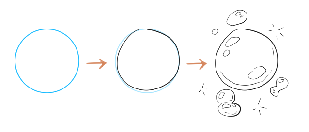
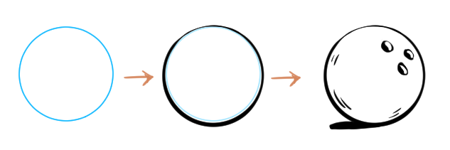
Lines are capable of representing any type or volume of materials, so you only have to vary their thickness, direction, and attitude. For example, if you want this circle to look like a soap bubble, then thin and imperfect lines (which have the attitude of a bubble) are what you are looking for. You know that it is a fragile, trembling, transparent figure and that at any moment it could… Poof! Burst!
And if you do the opposite, it may look like a bowling ball. Notice how the thickness of the line at the bottom is accentuated to simulate some shade and give it some more weight.
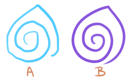
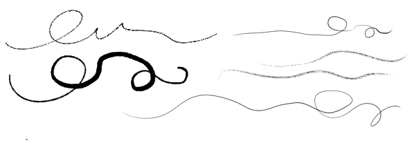
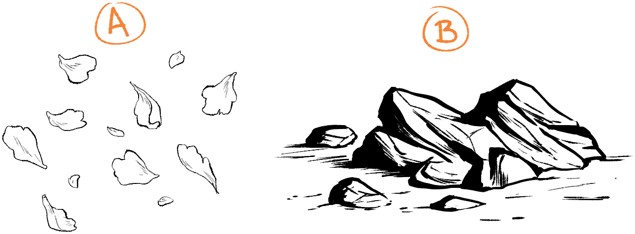
Lines can give a worn look (A) or a new look (B) so it is important to keep in mind what you want to represent and make them act in such a way.
The petals are delicate and light (A), the rocks are rough and heavy (B). There are countless other objects you can do this with…
Represent light or shadow:
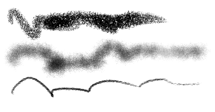
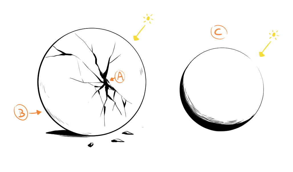
Strong strokes in certain areas of your figure will create the feeling that light does not reach this point (A).
Also, vary the thickness of the lines on one side of the figure to suggest shading (B).
For light, we use fine lines or open spaces. Keep in mind that the thinner the line, the more intense the light feels (C).
Perspective and emphasis:
We can use the composition to help highlight an object. If the lines are slightly more defined or thicker, you can guide the eye directly where we want it to go (A); or if you want to create perspective, similarly, a heavier and more defined contour will give a sense of closeness (B).
Conversely, diffused and thin lines for the objects that accompany the composition indicate to the viewer that they are not your protagonists (A); or represent things far away (B).
Let’s put it into practice!
I will go step by step explaining the process of this drawing and the CSP tools that I used to solve certain problems.
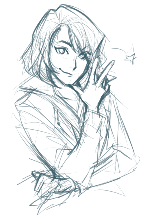
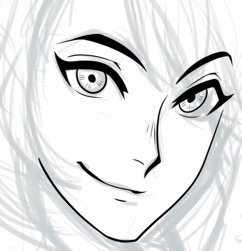
In my mind, this drawing is full of energy, and maybe a little rebellious, because she looks like a bit of a bad girl, right? So let’s give the lines the same attitude.
I start off by lowering the opacity of the sketch and creating a new layer. I usually start with the features of the face, but this sketch isn’t very clear so I have to find a line that works. If I find it difficult to start with the jawline, then I start with the nose. Normally when I figure out how to draw one thing, it is easier to draw the next one – there’s no strict order when you draw!
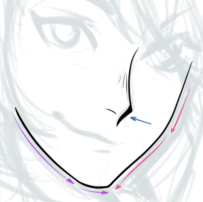
I accentuated the outline of the nose with different line thickness to give it some relief and shading, then moved onto the jaw.
Eyes
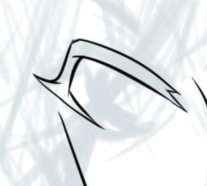
I want her to have a gaze with some weight to it. To give her a strong look and highlight the eyes, we should make the eyelashes nice and thick. It probably won’t look great if you try to draw the whole of the lashes with single strokes, so to help yourself out: draw the outline of the lashes and fill them in with the Fill tool (the one that looks like a paint bucket).
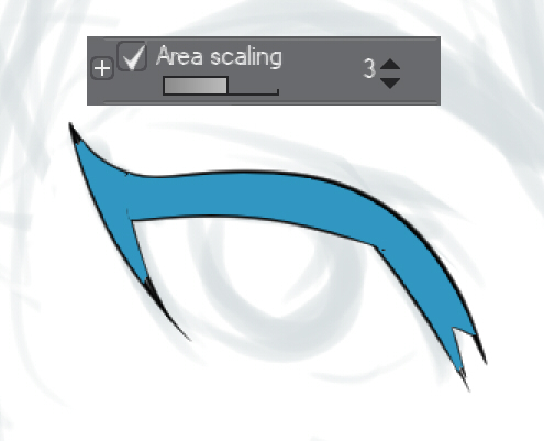
![]()
Sometimes this tool leaves blank pixels on the edges, which don’t look great. To fix this problem, you can change the levels in “Area scaling” a few points above 0 and this will make sure that the fill tool will cover part of the outline and reduce the number of blank pixels when filling.
I’ve just realized that one eye is bigger than the other. The stroke on the outline is decent, though, so instead of erasing and redrawing it, let’s save a bit of time!
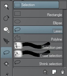
* Transformation tool: I used the Lasso selection and selected the eye I wanted to modify. Then, by pressing Ctrl + T and holding the Ctrl key, I move the corners of the box to get it to the shape I want. Finally, I confirm the changes by clicking OK.
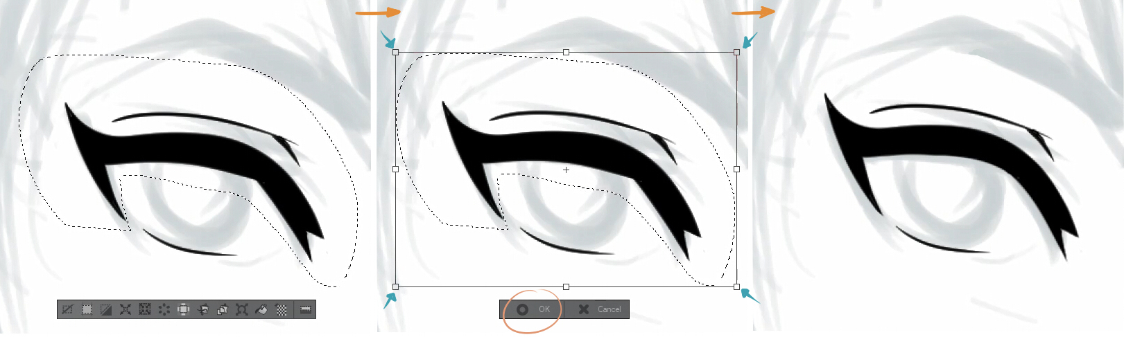
It is a good common practice to look at your work from another point of view to detect these kinds of drawing errors as soon as possible. Flipping the canvas horizontally as you work is really helpful:
![]()
* The iris: The curve of the iris is really difficult to draw – I’ve never gotten it right the first time. To help things a bit I adjust the line stability level, which I mentioned before, until I get the perfect curve. Don’t suffer without line stabilization when you draw!
Here I’ve gone ahead and finished the eyebrows, mouth and pupils, so now I can go and add small details to flesh it out…
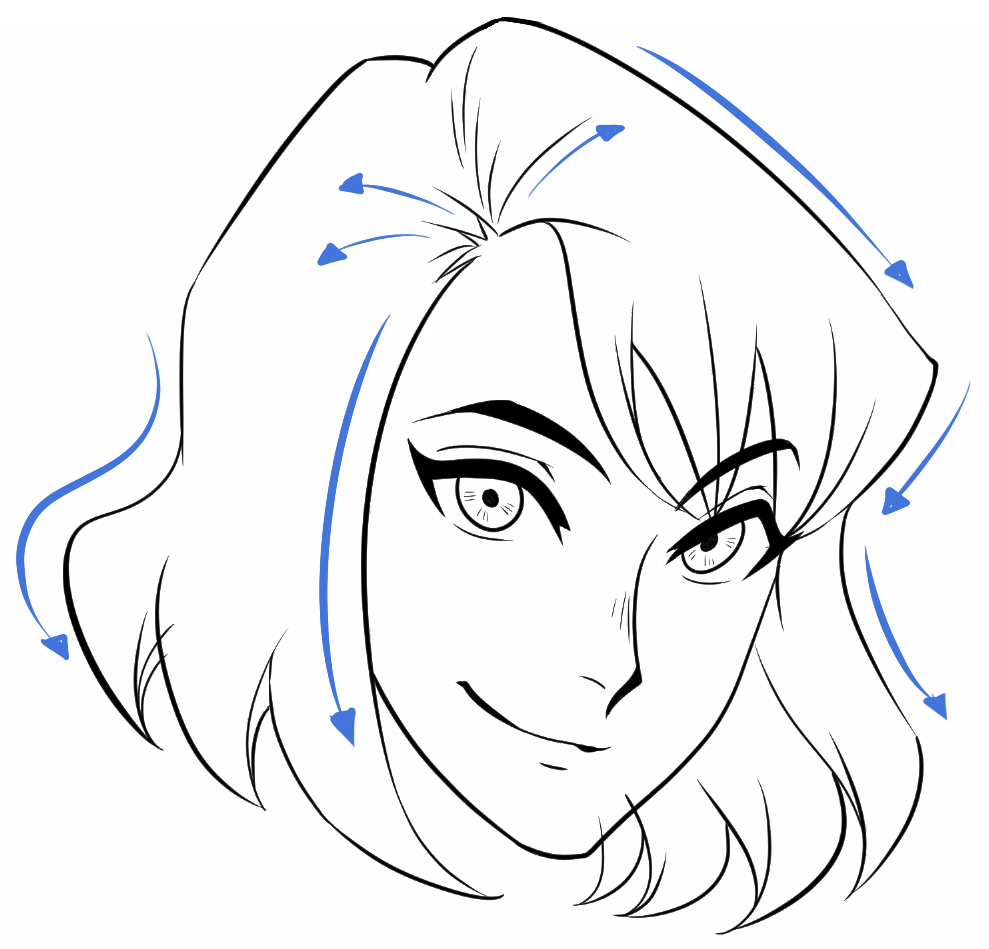
Hair
In a new layer, I define the outline of the whole head of hair, starting from the forehead. From the root to the tips, from top to bottom, from one point to another – do it however you like! The important thing is that your line flows with how the hair moves.
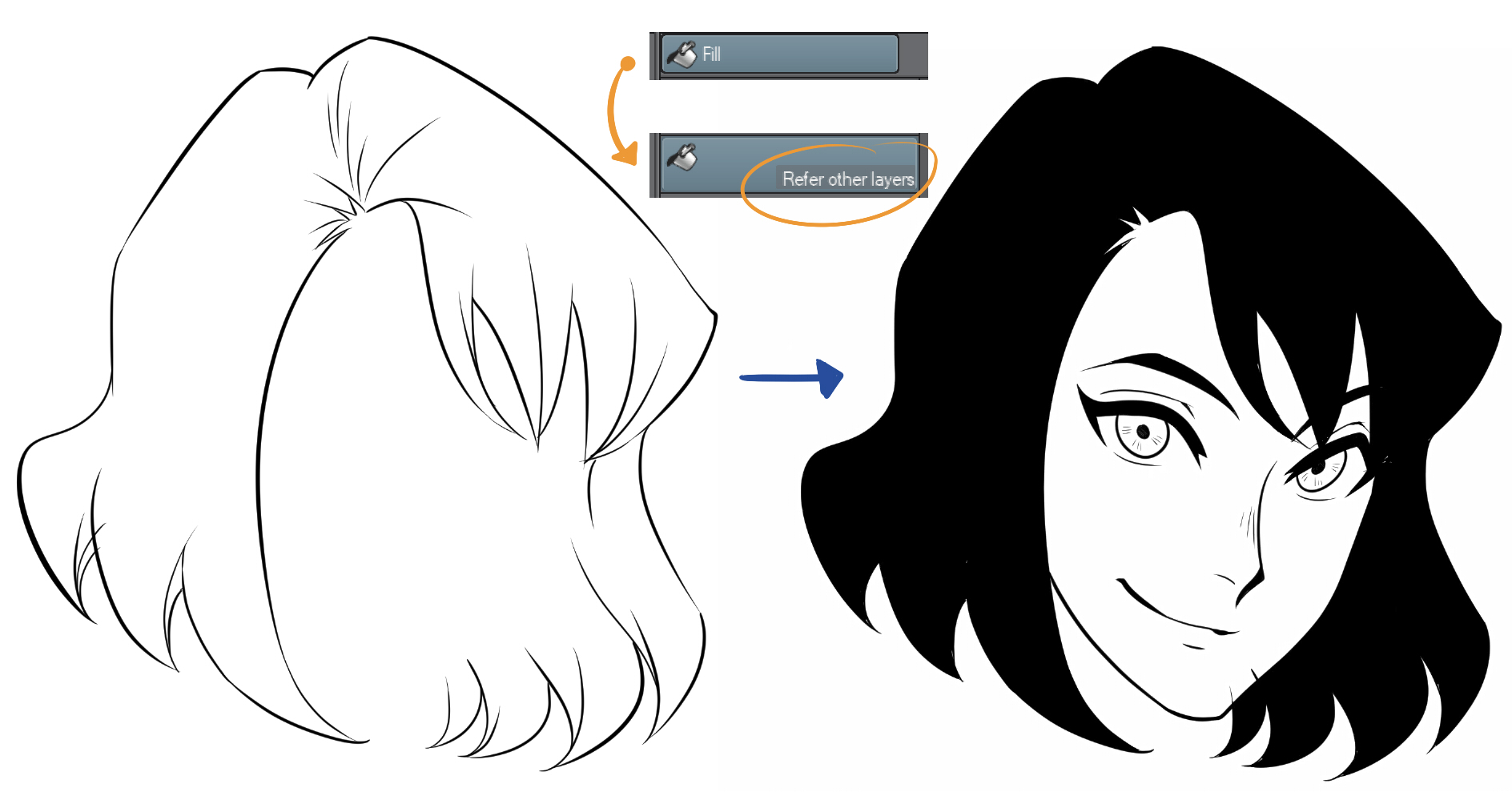
I use the same trick with the paint bucket as before. Remember though, you’re working on a different layer – if you hide the face layer you’ll see that the lines of the hair are not closed, so the fill tool will spill over and fill the entire canvas. To avoid this, click on “Refer other layers” and the program will take into account the other visible layers.
Once you’re done with this, cover any blank pixels with the brush or erase any imperfections that may have been left over.
* Details: This is my favorite part for drawing hair! I add small strands to give it a more natural, relaxed look!
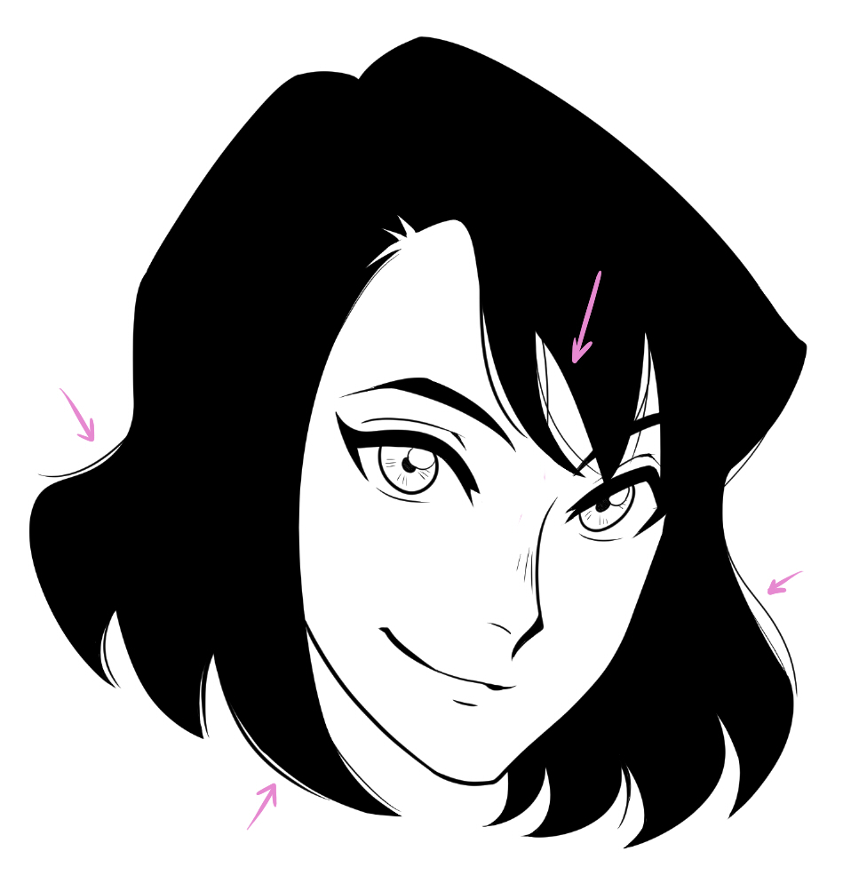
You can see how it comes to life, right? But there’s still something missing – the light. For that, I have another trick that I like to use. Almost all the tools in Clip Studio Paint can act as a “draft”.
This box (A) will make our brush “transparent“. The light will highlight particular tufts of hair and will give the image depth. In the same way, keeping in mind the curved shape of the head and the direction and movement of the hair are key to prevent the figure from looking flat.
(B) Here are the kinds of strokes I tend to use to draw hair highlights
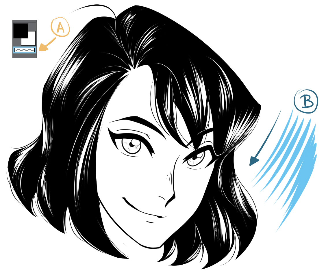
Clothes
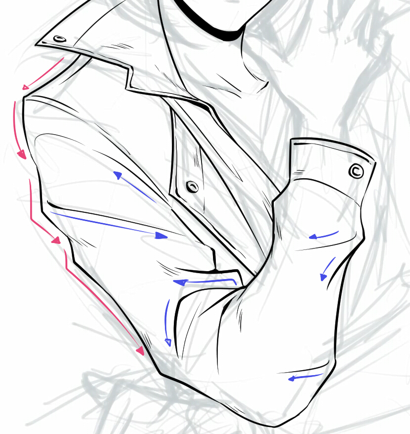
In general, drawing long lines in one continuous stroke is a detriment to the line, because your hand has a limited range with which it can make a fluid line, which shows more when you work with digital media.
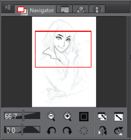
* The Navigator panel: When I draw, I find myself drawing the same line countless times, zooming in and rotating the canvas to draw more comfortably. For lines that cover a lot of space, I zoom out and for short lines or lines that require more detail and precision, I zoom in as much as I can. Of course, I make sure to rotate the canvas to help free up my range of movement of my wrist, and produce the most natural lines I can.
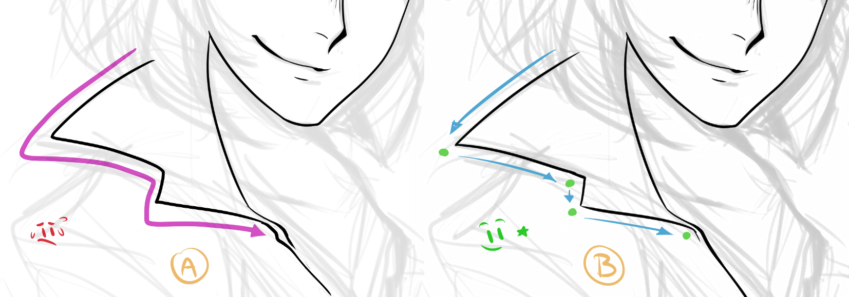
There are always rest points when drawing. These happen naturally when one line finishes and another begins. (A) Here is one continuous line. (B) And here is another where I have stopped one line and started another at the natural rest points. The difference is slight but it clearly looks better.
If you have to stop in the middle of a long line, having a thin tip at the end helps blend it together, so you can continue the line smoothly.
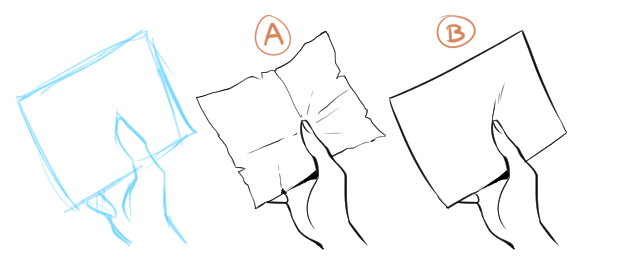
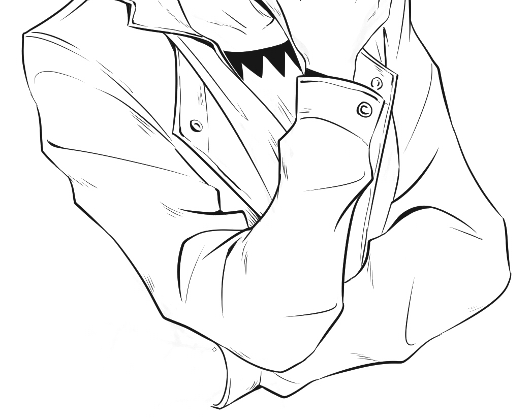
* Folds: These all go in different directions and some are more pronounced or distressed than others. A lot of it depends on the fabric. In this case, I want to show that the fabric is thicker, and so I make sure to show that by drawing more pronounced wrinkles. If you do not know how to represent a particular material, you can always use reference photos on the internet. Don’t draw blindly – it’s a good habit to make use of references!
Hands
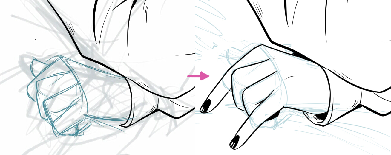
So far the sketch has been a good reference to work from, but it doesn’t work in some parts of the drawing. For example, I’m not convinced by this hand – I tried to draw something decent but … no, it really was not good.
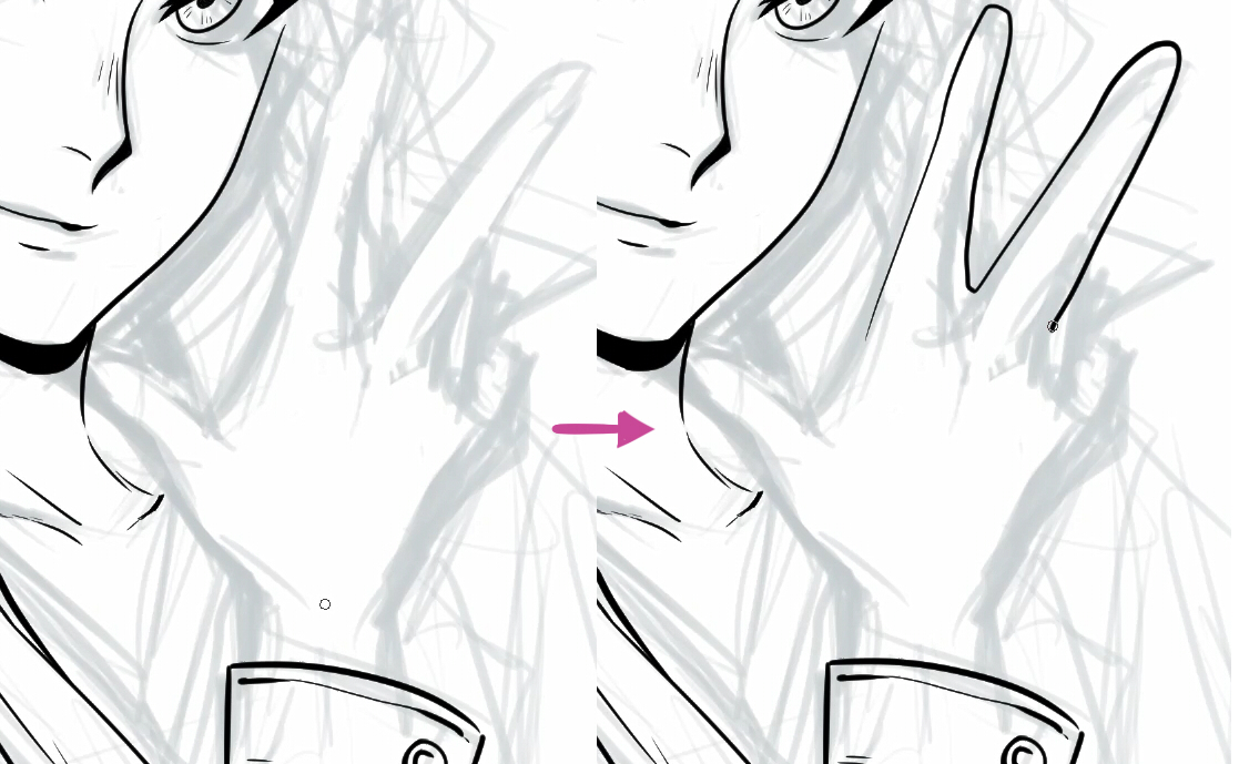
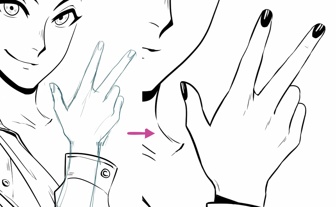
So I drew a new sketch of it and took the opportunity to adjust its position and size. I like the hand shape more now, and I also liked the idea of painting her nails black.
But now I have this problem:
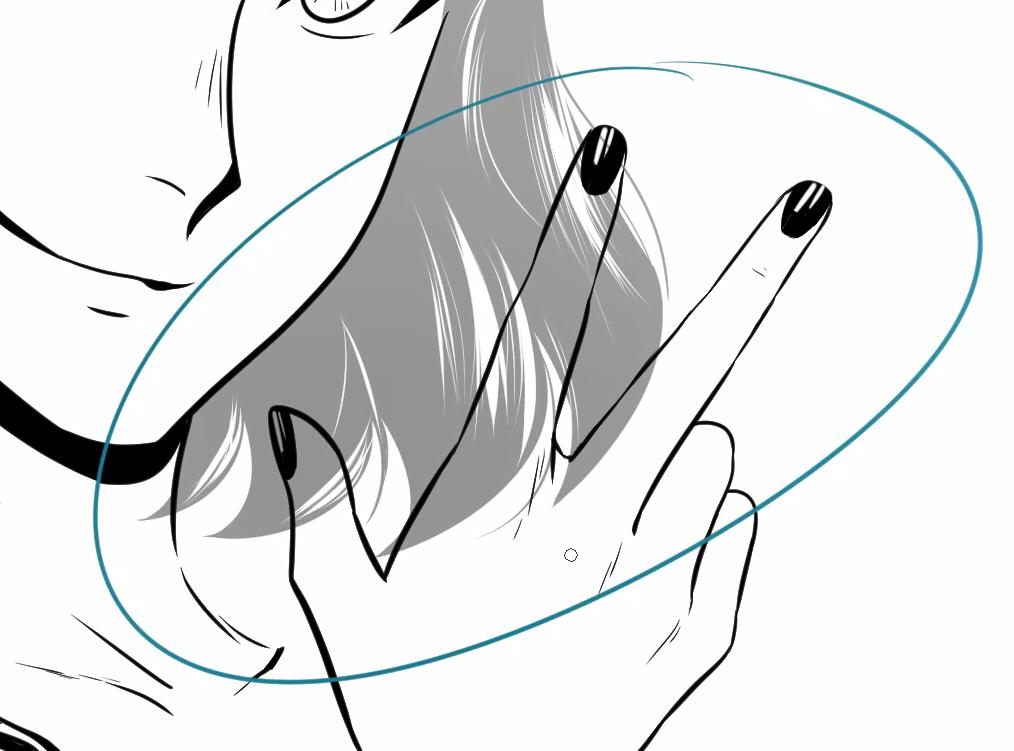
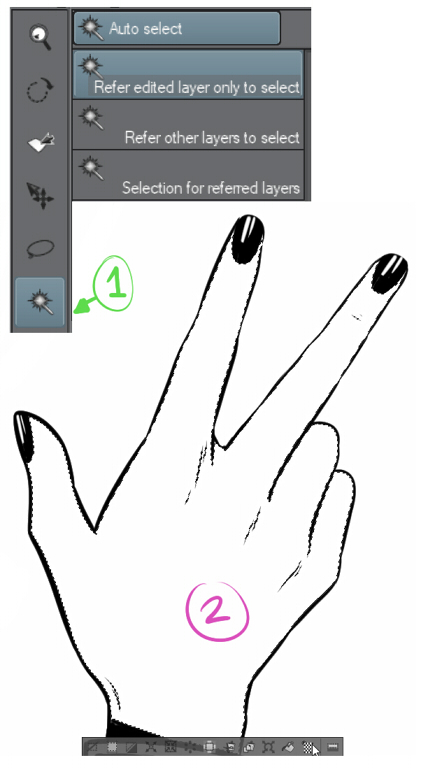
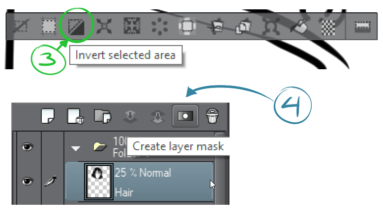
* Layer Mask: with this it’s easy to hide the area of the hair that interferes with the hand, without needing to erase it:
(1) Click on the Auto selection tool > (2) Click inside the hand – a dotted outline will appear for the area selection > (3) Invert selected area > (4) select the hair layer and Create layer mask .
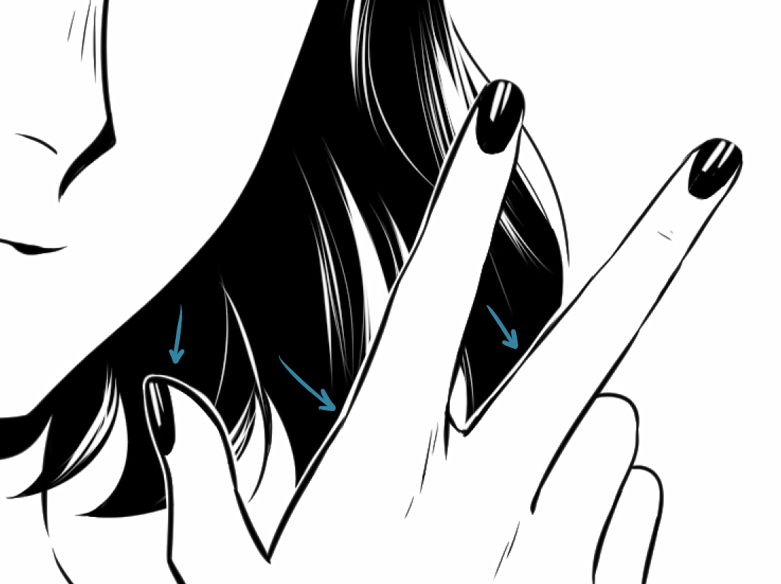
To highlight the hand, I left a small white outline.
I finish delineating the remaining areas, add some details to the blouse, and draw the other arm and hand (which I re-sketched and changed the pose for).
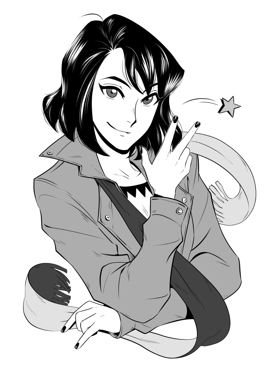
All done!
For my final touches, I added a little lift to the scarf to make the composition more dynamic and fun, a nice star to accompany her gesture and some grey tones.
I hope it is not too much information to digest, but you can always jump to any section that interests you.
Clip Studio Paint has incredibly flexible tools for drawing and illustration, please do not hesitate to explore them in-depth.
And finally, practice a lot!
If you like, you can check out my social media and portfolio to see some more of my work.
https://www.instagram.com/eri_duh/
https://twitter.com/eri_duh
https://www.artstation.com/eridey
Thank you for reading!
– Eridey
Interested in character art & design or what it takes to become a character designer?
Check out the link below!