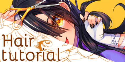
How to Draw Hair in Manga and Semi-Realistic Styles
Learn how to draw hair with Esseyli in this tutorial. He will guide you on how to add highlights to manga-style characters, how color choices differ when drawing realistic illustrations, and how to add details for semi-realistic characters.
Index
-
- 2.1 Sketching Hair
- 2.2 Shadows and Highlights
- 2.3 Correction Layers
-
- 3.1 Sketching Hair
- 3.2 Painting the Overall Shape
- 3.3 Adding Details
- 3.4 Background and Finishing Touches
Hello everybody!
I am the Belgian illustrator known as Esseyli. My specialty is to mix the world of realism with that of manga and make it my own style while still being visually coherent. I illustrate characters in manga styles as well as semi-realistically, complete with backgrounds to stage them. I sometimes even draw hyper-realistic portraits.
1. Introduction
When you start out drawing, one of the trickiest things to get right is hair.
Either it isn’t proportioned or colored well, despite all the hours spent on it, the result can be disastrous. And although some can get by fine with drawing in a manga style, others struggle to make the transition from manga to realism without really knowing why. Today, we will try to sort it all out by comparing the two styles, with Clip Studio Paint, the illustration and animation software. You will see that there are some things to keep in mind during the process to avoid mistakes!
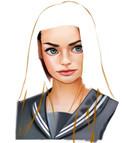
2. Manga
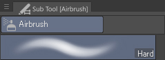
Let’s start right away with the manga style! Just to clarify, I use the “Hard” airbrush, which is a good equivalent to the traditional brush found in other software.
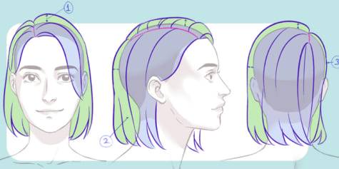
2.1 Sketching Hair
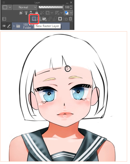
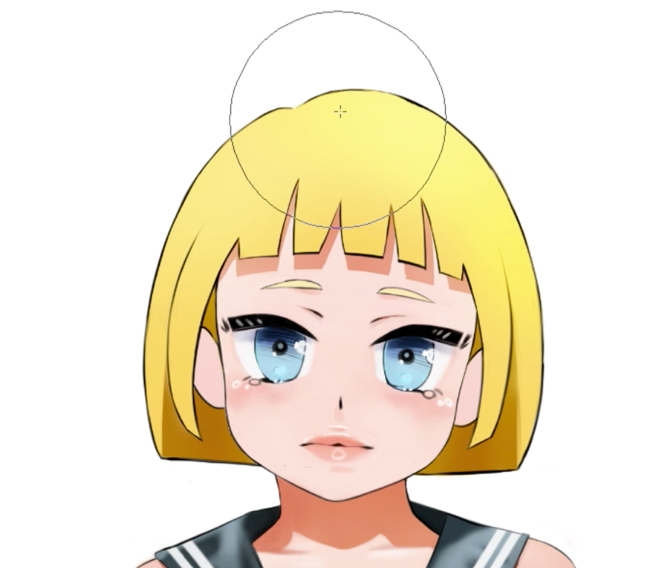
First I open up a new layer so I can draw the hair.
The shape of the sketch should be as symmetrical as possible, especially since the portrait is face-on. Otherwise, it will look like the skull is deformed.
Since we’re not going for realism, I can exaggerate the proportions a bit. Generally, in manga, the size of the skull is larger than a real skull, as are the eyes. But depending on your style, it’s up to you how you want to proportion things.
Finally, with the contour line, the skull and the thickness of the hair is taken into account. If you’re unsure about the haircut at all, it is better to create another layer in order so you don’t end up spoiling the face when all you want to do is adjust the hair.
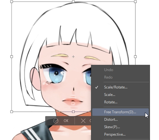
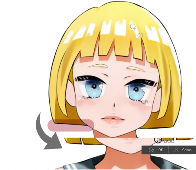
Once I’ve zoomed out, I realize that the whole sketch is not long enough, so I decide to select with the “lasso” tool (L key) then Ctrl + T to choose the “Free transformation” option, which will allow me to lengthen, move and distort the sketch.
Once I am satisfied with the sketch, I create a new layer that is placed just below the sketch layer so I can color it. To speed up the process, I press the [G] key (the keyboard shortcut for the “fill” tool) and with one click I fill in the entire area inside the sketch.
I often merge all my layers instead of leaving several as I prefer to draw that way, but it is best to keep all your layers separate. Keeping them separate will make you more methodical and, more importantly, allow you to go back if you feel that you made mistakes during the process. People often prefer to have a specific part of the drawing in each layer. For example, a layer with the finished lines just below the layer with the base colors, a layer for the shadow, a layer for the light, etc. Choose the method you feel most comfortable with.
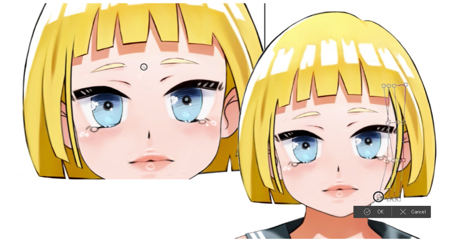
Here I notice that I still don’t really like the shape of the hair. To adjust it, I go back to the “lasso” tool, copy and paste the area I want to modify and with the “Mesh Transformation” tool I play with the shape of the selected area to get it to a point that I feel is right. Then I erase the unnecessary parts before merging the hair layer with the layer of the main part of the drawing containing the face.
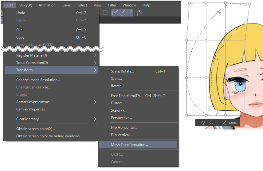
The “mesh transformation” can be found in, [Edit] > [Transform] > [Mesh Transformation…].
2.2 Shadows and Highlights
Once you’re happy with the overall shape, it’s time to add some highlights and shadows.
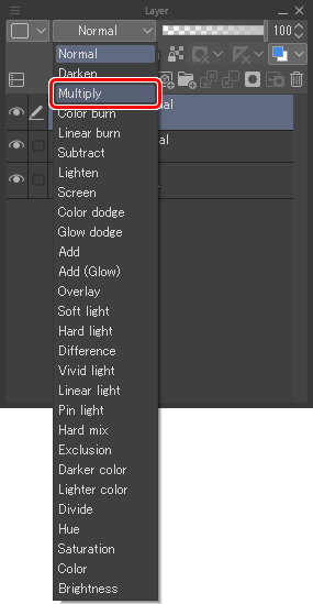
I like to start with the shadows. First, I create a new layer that I switch to the “Multiply” blending mode from the drop-down list, and paint in the area I want the shadows to appear. This is the best way to darken a drawing because when painting, because it doesn’t hide the drawing below it as it would with a normal layer. This is because “Multiply” mode overlays the colors while darkening them.
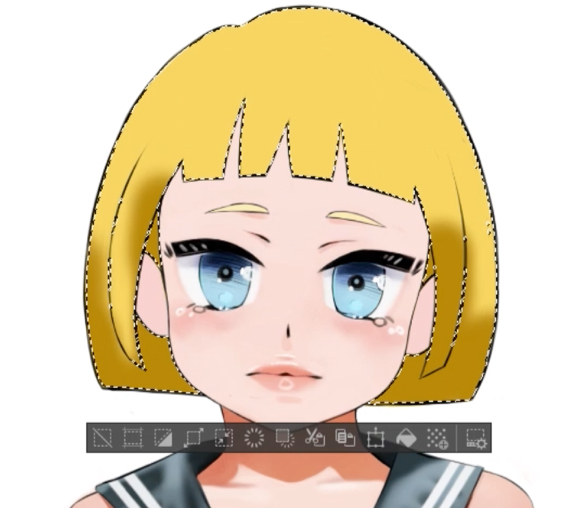
With the “Auto select” tool, I select the area I want to paint so that it doesn’t go outside the lines. I also erase the front strands because they will be exposed to the light.
Quick tip – I want to draw shadows on the character’s forehead, formed by the bangs. How do I do it? I create a layer just above it and select a darker color. With the “fill” tool I fill in the hair. Then, I get rid of the colored part at the bottom and move the shape down. Then, I make the “Multiply” layer invisible so that I can select all the hair without being hampered with the selection tool, which will select the area automatically. I make the “Multiply” layer visible and I erase everything inside the selection.
And at that point, I realize I don’t really like the color of the shadow. No problem! I lock the layer so it doesn’t move outside the frame and I go over it with another color.
Now, unlike the Multiply layer, this time we will use the “Overlay” layer which will serve to lighten the piece. I’m using the light yellow color and brightening up the top area because I’ve decided that the main source of light will come from above.
Before you start painting, It is always important to know where the main source of light will come from because if we know that, we will be able to place the shadow and the light in a way that makes logical sense and not have any point that makes the drawing appear weird.
I accentuate the highlighting with the little white squares that you often see in manga and I erase a few areas at the bottom to make the hair less heavy-looking.
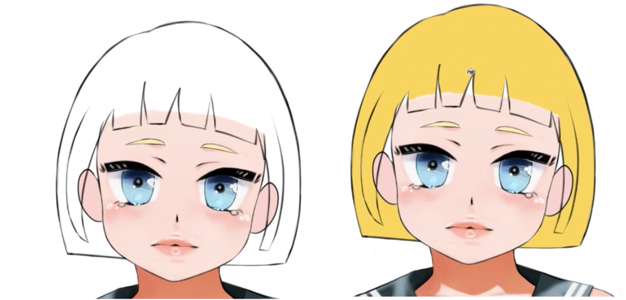
At this point, I feel like the hairstyle is too simple and think adding more strands will make the hair more interesting to look at. I only draw one, but then to save time I copy and paste the bit I just drew, and use “Flip horizontal” to place it to the right of the drawing. I do a mesh transformation to break up the symmetry and make it look more dynamic.
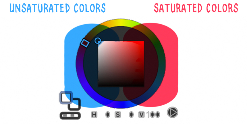
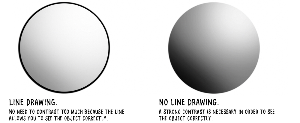
The difference with realistic or semi-realistic styles is in the contrasts. When drawing in a manga style, we often avoid using shades that are too close to black.
Because the higher the contrast, the more the drawing will give an impression of photorealism. On the other hand, manga-style art is more tolerant of very saturated colors – bright, “flashy” colors. Those colors tend to be ones you want to avoid when drawing in a semi-realistic or realistic style.
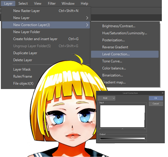
2.3 Correction Layers
If you feel like your colors are dull, then go to [Layer] > [New Correction Layer] and choose the “Level Correction” option. Then, with slide in the new window, you can saturate the colors as much as you want.
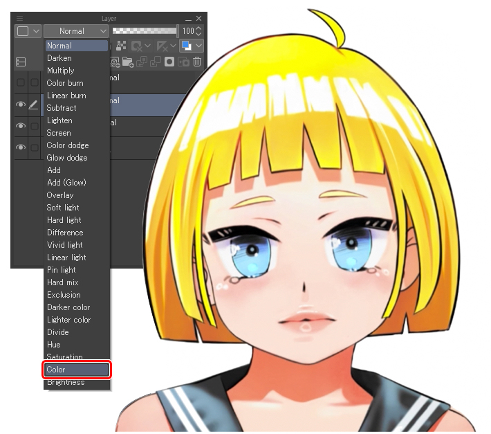
Then if you change the layer’s blending mode to “Color”, you lower the opacity so that the drawing is less saturated, thus obtaining more vibrant colors.
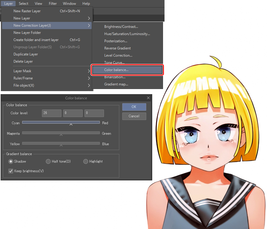
The second trick is with “Color balance“, which is in [Layer]> [New Correction Layer]> [Color balance…] and which allows you to adjust the cyan, magenta and yellow tones with sliders. I spend time playing around with the settings until I find a balance that works for the illustration.
Even if you feel like already satisfied with the drawing, it is always interesting to mess around with the correction layers. Often, this gives quite surprising results. Be careful with it, though, because it can quickly distort your illustration beyond recognition, so make sure you use it in moderation.
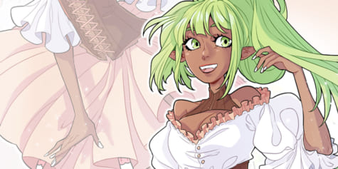
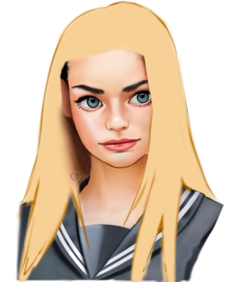
3. Semi-realistic
3.1 Sketching Hair
Let’s move onto the semi-realistic style. Just like with the manga style, I start by creating a new layer on top of the main drawing and draw the outline of the hair.
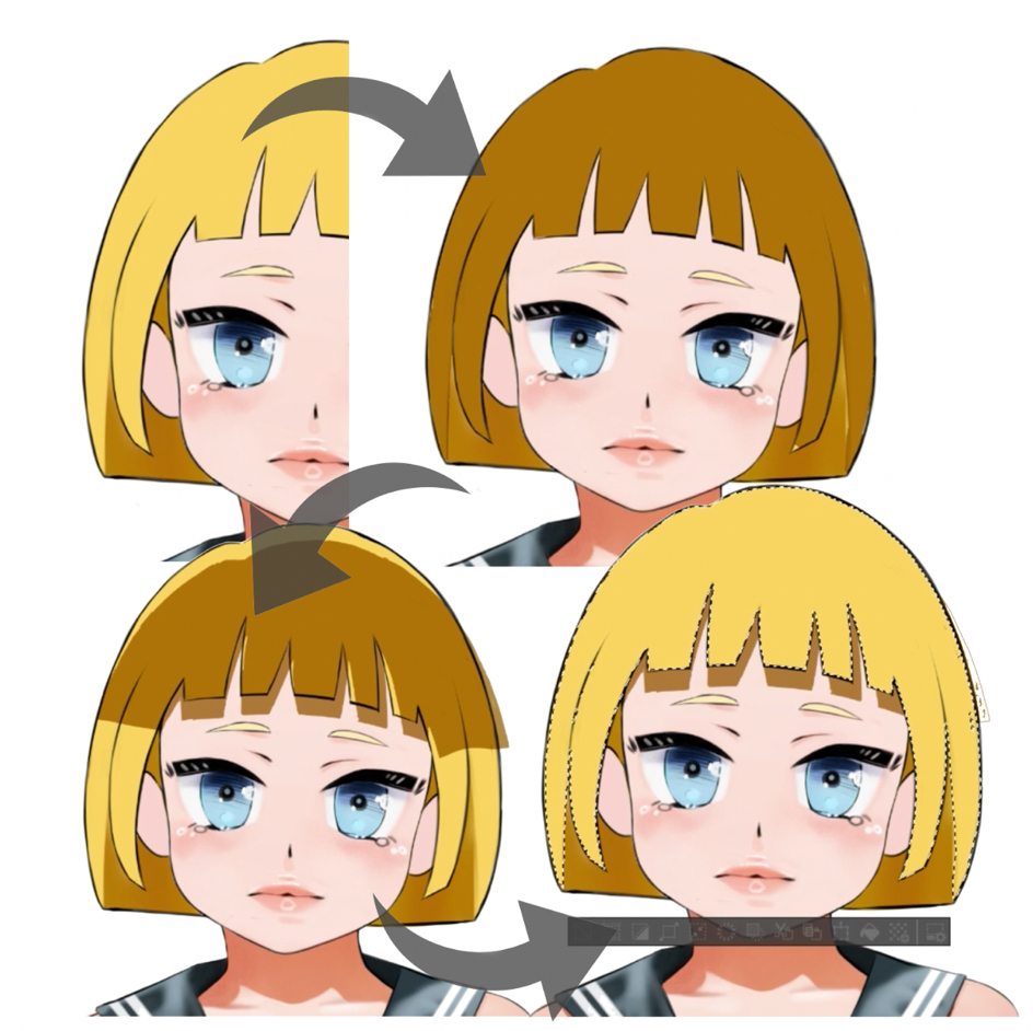
This time around, I’m going to spend less time refining the sketch lines, since they’ll disappear when I start painting the hair. Unlike manga style, I don’t always want the lines to be visible. When I’m finished, I change the color of the sketch to dark orange. This will allow the outline to blend more easily with yellow tones of the hair, as opposed to the original black lines.
I color in a pale yellow and gradually start to paint the shades of light and shadow using the multiply and overlay layers.
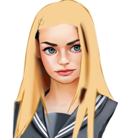
3.2 Painting the Overall Shape
The mistake that beginners often make is to paint the details of the hair in the beginning stages, zooming in very close to the design and expanding the work area as you go, just like with traditional design. This is, in my opinion, the main reason why things don’t always turn out well. This may seem counterintuitive because when we think of hair, we think of small strands. But, you have to paint the overall shape first. In fact, when I do, I turn off the pen pressure sensitivity completely so I can paint as evenly as possible.
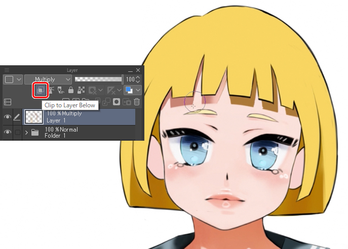
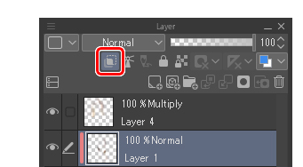
Since I am drawing on another layer, and do not want to spill over onto the drawing below, I use the “Clip to Layer Below” function by clicking the icon and I make sure the little red light comes on indicating if the layer is in fact clipped.
So initially, I paint the overall shape and then gradually I reduce the size of the brush to make more precise changes. Think like a sculptor! Chisel out the general structure of your sculpture with a large hammer, then gradually start to refine the details with smaller and smaller tools. It’s exactly the same here!
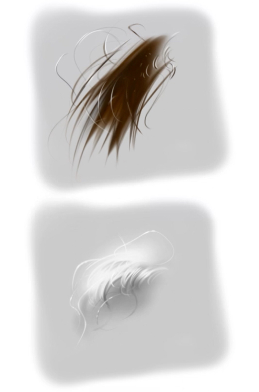
Hair creates waves and therefore areas of light and shade. And it is thanks to this wave that the strands of hair appear. It is with the variations of light and shadow that we perceive different objects, because they stand out from their background.
Whereas in manga style it is the lines, the strokes, which distinguish objects from one another, there is no need to emphasize things with color as much. The main reason that I made the original sketch outline disappear is simply because I do not need it. But in fact, I like to add lines because it gives the impression of being between manga and realism – that sweet spot of semi-realism.
At this point, sometimes I make adjustments to the face. Now we have the hair to complete the drawing, I have a clearer view of the whole portrait and notice that some parts that don’t quite fit and need adjusting. For the purpose of the tutorial, I have already drawn the faces, so we can focus only on the hair, but the most logical way is to draw the whole portrait together from the start.
3.3 Adding Details
Here’s a quick detour to show you how I draw the details. I always create a layer, sometimes even one for each strand of hair, which allows me to erase it to make it more fluid, or blur it to give a small photo realistic effect or distort it. I have perfect control over each strand since I am not bothered by the other strands of hair. I also add light points in certain places to make them stand out and highlight specific strands.
Most people think that drawing the details is the hardest part, but I don’t think that’s really the case. It does take time, but it’s not that difficult itself. If, despite the time spent on it, you feel that the details don’t look as good as you hoped, it is probably because of some problem with the foundation you drew in the previous steps, rather than the details themselves. That is to say, usually it’s because you haven’t spent time to decide the light source, the shadows aren’t drawn well, or the shape of the hair is not light enough, etc…
You must be able to take care of those parts before you get to drawing the details. You can even stop before the details and still have a very interesting drawing! The details can make a good illustration even more beautiful but cannot hide the defects that are already there.
3.4 Background and Finishing Touches
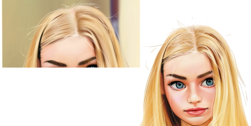
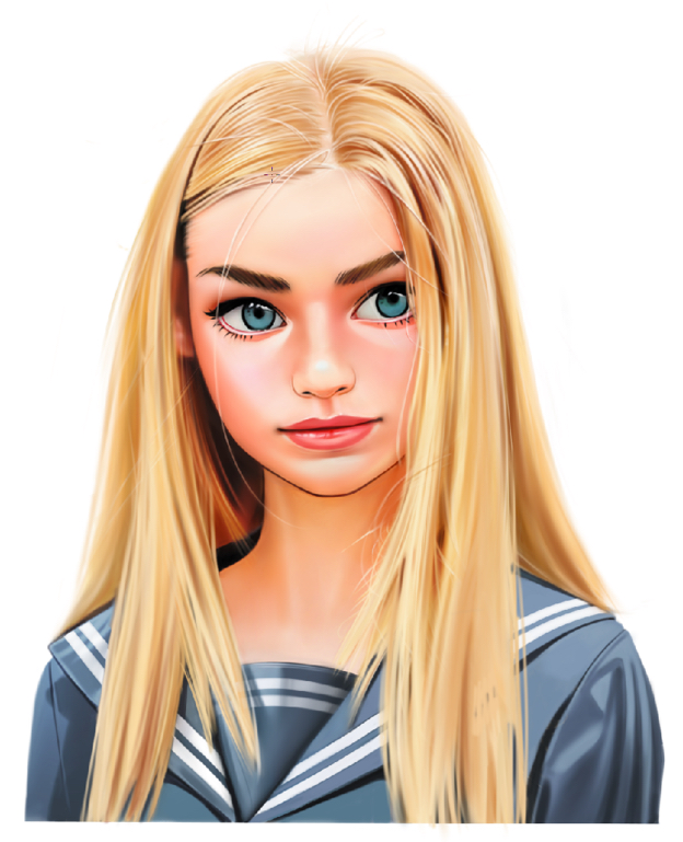
Before, I created a background for the portrait. It allowed me, for example, to draw small, light, white strands around the hair, which wouldn’t show up on a white background. But in the end, I decided to remove the background because I think the portrait works better without it. In fact, it was because the face was lighter than the background they didn’t go well together. Instead of darkening the whole portrait, I just decided to keep the background white. Because of the white background, though, all the little hairs are gone, so I take a slightly dark color and redraw them again to bring them back.
After talking to some other people, I decided to straighten the hair and redesign the uniform to complement it. It just goes to show that you should always ask those around you for advice!
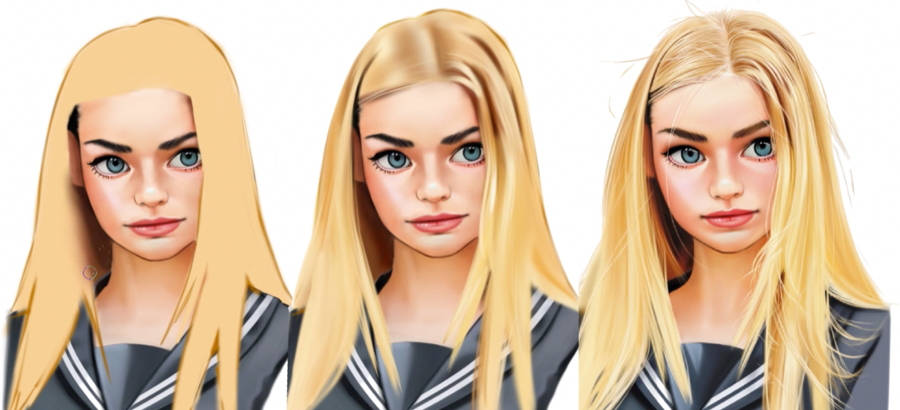
4 Conclusion
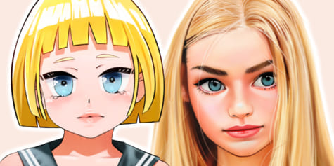
Here we are at the end with the two drawings next to each other. Here we can understand clearly the similarities and differences between the two, such as shape, proportions, contrast, details and so on.
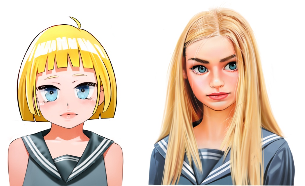
Do we have to follow these rules no matter what? Of course not, it all depends on what you want – I am the first one to break the rules by mixing the two styles. But you have to keep in mind that in order to break the rules, you must first learn and master them.
I hope I have taught you something useful about Clip Studio Paint. It really is full of features and helps you progress very quickly once you have learned all the tools.
Above all, I hope I made you want to draw! Don’t worry if you don’t put my advice into practice right away, remember to give yourself time to learn!
Good luck!
https://twitter.com/esseyli
https://www.instagram.com/esseyli
Interested in character art & design or what it takes to become a character designer?
Check out the link below!