Hints on How to Improve your Line Art and Line Quality

Line quality is essential for engaging line art. Learn simple yet effective tips to improve your lines in your artwork, from manga artist Jose Fernandez.
Line quality is one of the most important aspects of anime, manga and comic storytelling, but often forgotten about. Making your manga read clearly is crucial. It can mean having someone continue reading or quickly walking away. Whoever is reading your manga, they should be able to grasp what’s going on instantly, especially since the majority of the readers will look at the panel for just a few seconds.
So, if we can improve clarity with just line quality, why not! Let me show you how you can improve your lines to help tell an engaging story.
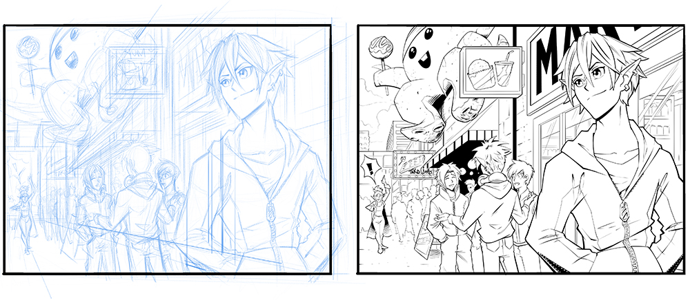
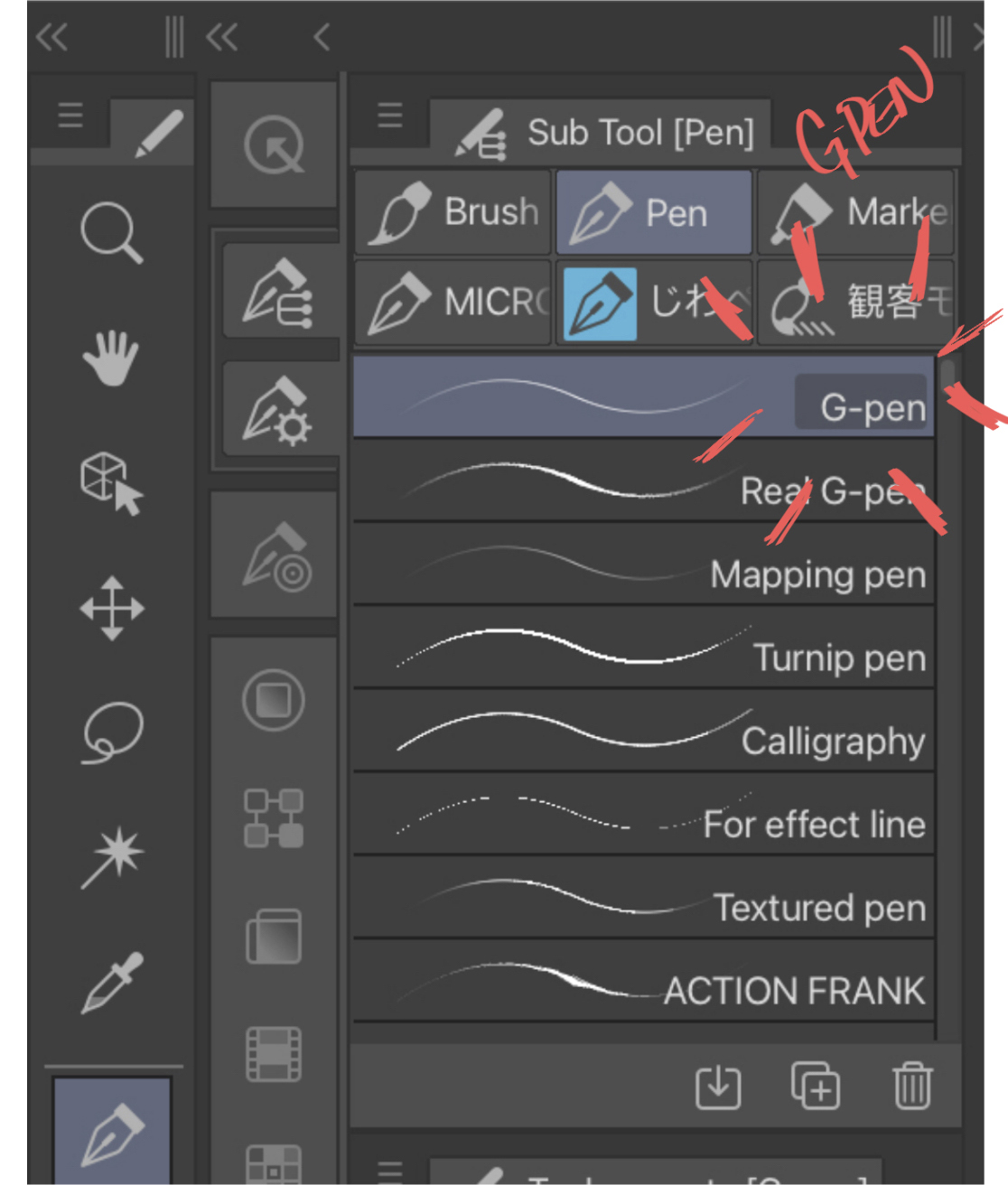
In this tutorial, I will be using the G-pen brush that comes stock with Clip Studio Paint on my iPad with the Apple Pencil. You can use other brushes, but if possible, use one where you can vary the size with pressure sensitivity. I am also working on a canvas at 600 dpi.
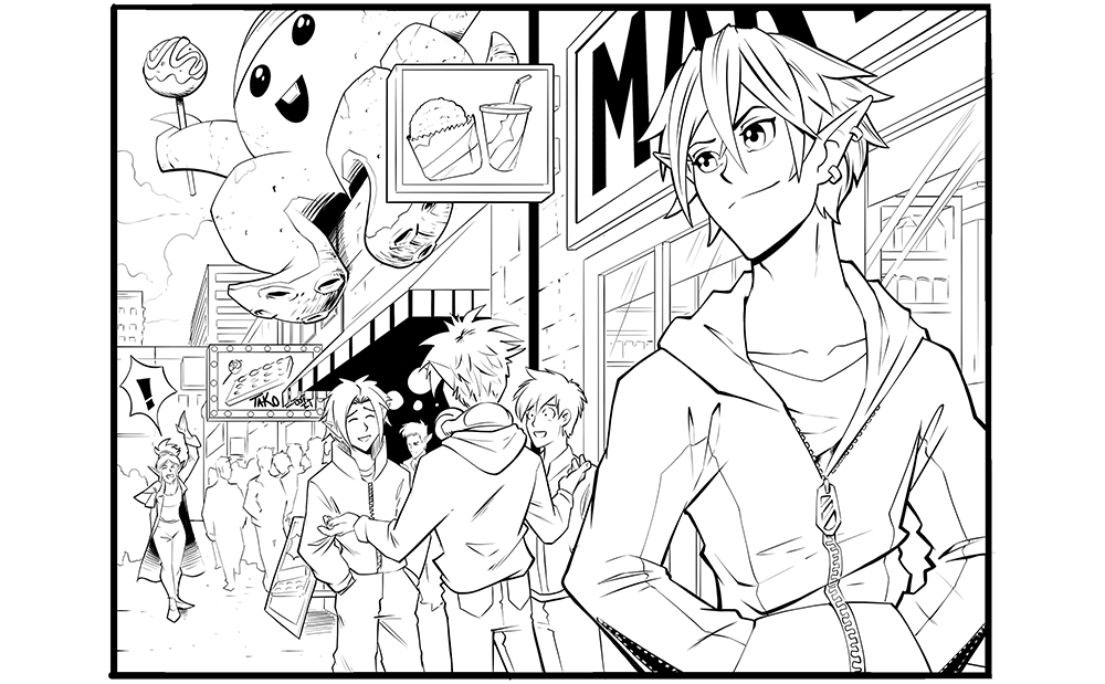
Step 1: Figure out what is close vs. far
Determine your point of focus and the different layers of your composition, like your foreground, middle ground and background, as each of these aspects will differ in line thickness.
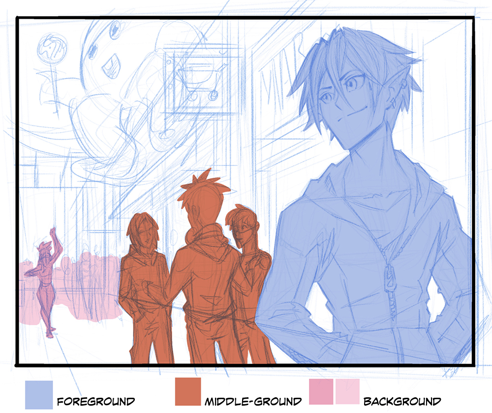
Step 2: Ink the foreground
Begin inking the outline of your foreground characters and objects. Since the foreground is the closest to the reader, we want the outlines to be bolder and thicker! Subconsciously, the reader will think the thicker outlines are closer, and the thinner lines to be further away.
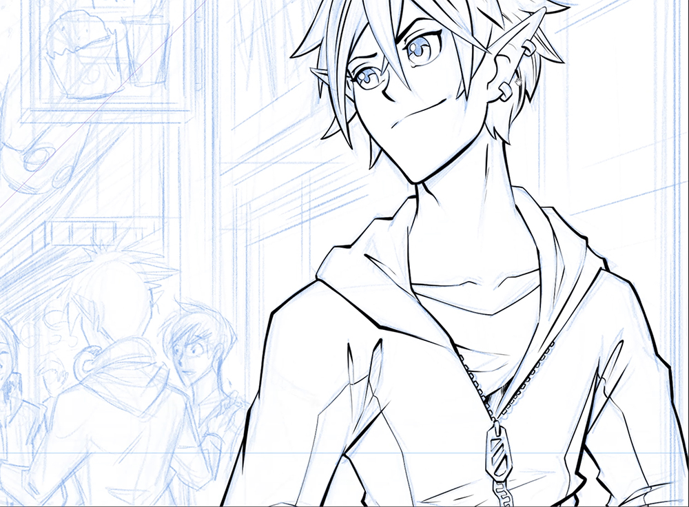
Try to keep the lines inside the outline thinner as well. The outline of the character is sometimes called holding lines, because they literally hold the characters and objects’ details together, giving it more solidity and making it easier to read.
Step 3: Inking the middle ground
Once you’re done inking the foreground, you can start inking the middle ground. What we have to keep in mind now, is to make the lines of the middle ground thinner than the foregrounds. This gives the illusion of depth and atmospheric perspective in your manga panel. It also separates the foreground and middle ground. The reader will be able to distinguish that the closest character is in a different plane than the group of guys behind him.

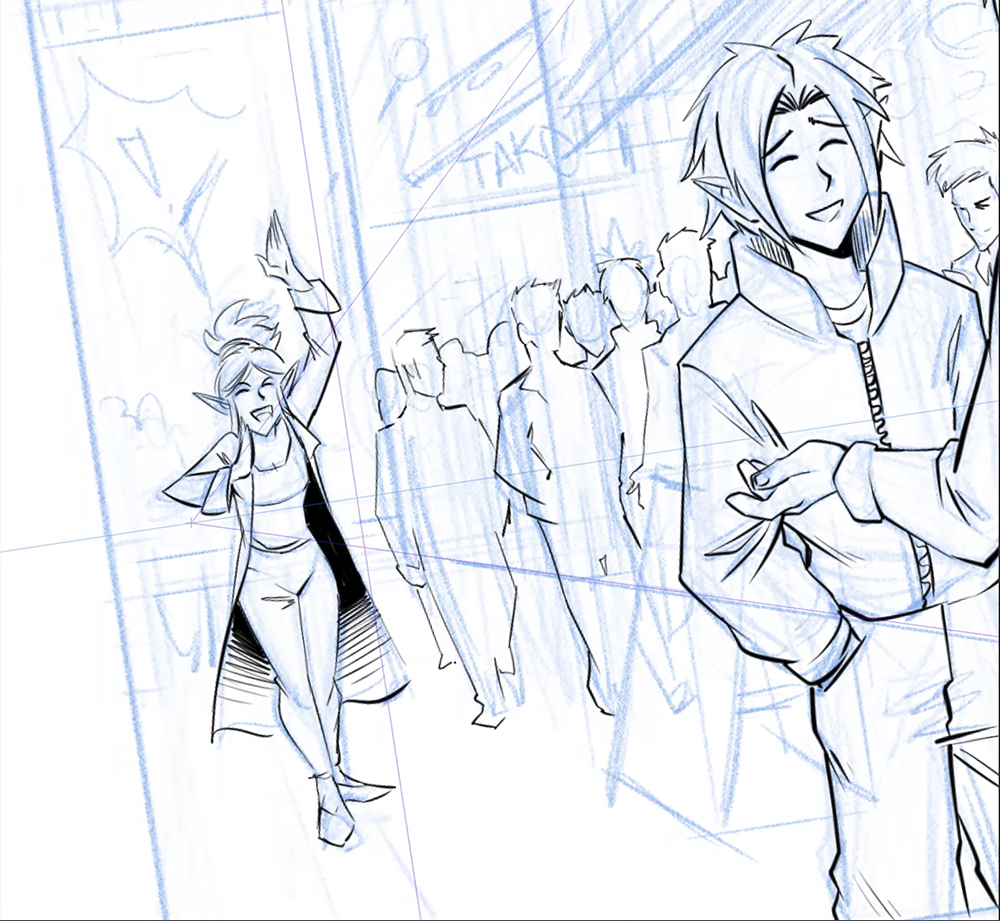
Step 4: Inking the background
When you’re done with the middle ground, you can start inking the background, and the same rule applies. Thinner lines the further people and objects are. But! You can also make exceptions… for example, in this illustration I want to bring attention to the young woman in the background shouting. So, I will make the character line art just a bit thicker than the characters and objects around her. Not too thick though, as we still want to keep her in the background.
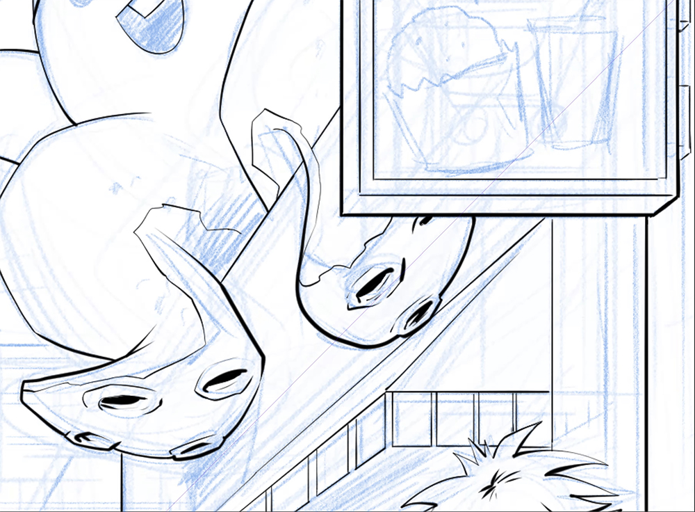
Step 5: Remember your light source
One thing you want to keep in mind, in order to keep your characters and work more believable, is to remember your light source direction.
I have the light source located in the upper left of the scene, so I make sure to make the outline thicker on the areas that wouldn’t get hit with light as much. This gives the illusion of shadow and helps give objects more volume. Take for example the tentacles of this cute octopus. I have thicker lines on the underside of the tentacles, and lighter lines on the top.
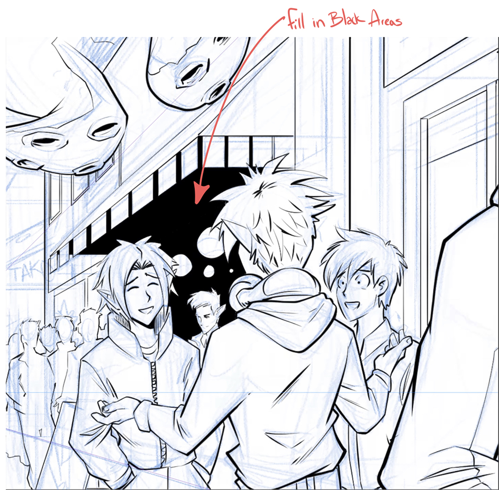
Step 6: Filling in the black spaces
After you’re mostly done inking, you can start filling in the blacks.
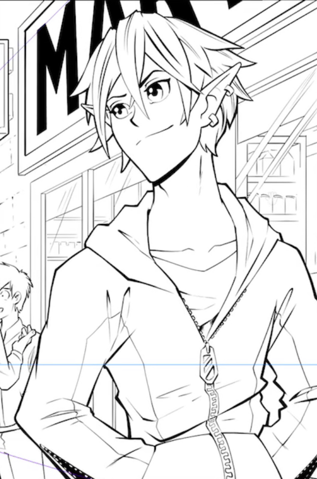
Step 7: Adjust line weight
Look over your illustration and adjust your line weights accordingly. A lot of times I find myself jumping around a piece and may not remember to thicken some of the lines. For example, the main character of this shot, in the foreground, I thickened up the lines to make him pop a bit more, and really separate him.
Final step: Cleaning up your drawing
Now it’s time to clean up, look over everything and clean lines that shouldn’t be intersecting or are just not supposed to be there.
That’s all for that illustration, but here are some quick tips for inking your line art.
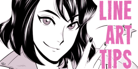
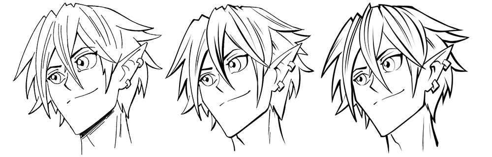
Tip #1: Find your inking style
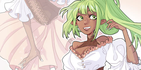
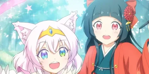
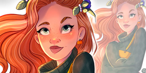
Every artist has their own style, that goes for inking style as well. Here are some examples of different inking styles for line art.
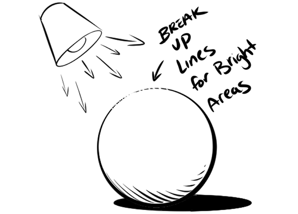
Tip #2: Use light in your line art
You can depict a bright light hitting an object or person by breaking up the outline.
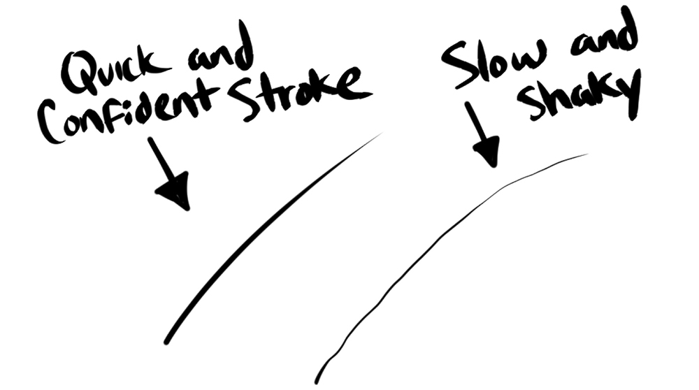
Tip #3: Draw confidently
Keep your strokes quick and confident, this is how to achieve a smoother and cleaner line. A lot of us will have a slight shake or wobble to our hand when drawing a line slowly, and we want to avoid those wobbly lines!
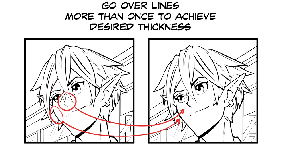
Tip #4: Three times or more is the charm
Don’t be afraid to go over lines again to get the look you want, not all lines need to be done in one stroke.
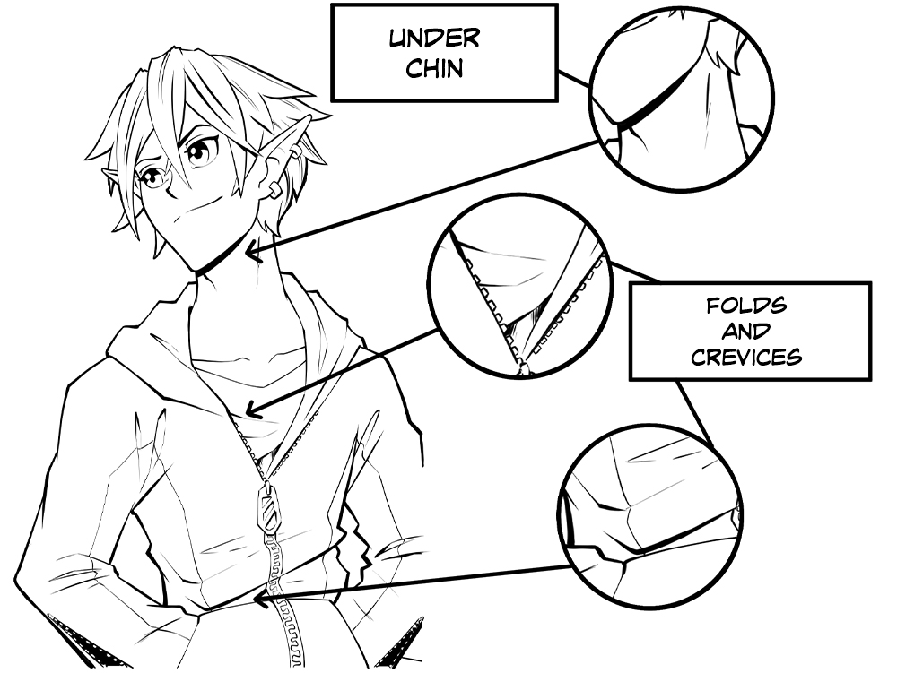
Tip #5: Express shadows in your lineart
Thicken up lines in small crevices of folds, cracks, or even areas like under the chin, to create more depth and make the art more 3D! These thick lines or areas filled in will usually be in areas getting little to no light.
Tip #6: Use variety in your lines
Make areas of your drawing stick out more by adding sharp edges to your lines or by making the line gradually go from thick to thin in the direction of the light source. This can give the illusion of something bulging out.
Conclusion
Thank you for taking the time to read this tutorial, I hope this helps you ink your manga or comic more effectively whether on the computer or iPad. You can now see how just the outline can help tell your story more clearly, and how you can use certain tricks to direct the reader’s eyes.
About the Artist
My name is Jose Fernandez, I have done work in varying kinds of media, but ultimately I consider myself a storyteller. I have storyboarded for animation as well as commercials. I did illustrations for the creator owned manga Dodge as well as an indie comic called The Threat. I also did all of the illustrations for the game Heist. In the end, my favorite thing is to tell engaging stories in the most creative ways. If you’d like to get in contact, Instagram is the perfect place! I also post all my latest works there, so follow for more content.
Interested in character art & design or what it takes to become a character designer?
Check out the link below!