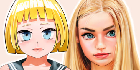
Natural-style Painting Workflow for Character Illustrations
Illustrator Sunako shows how to create natural-style character illustrations! It includes detailed tool introductions and subtle tonal correction that gives a soft, traditional look.
Index
- Preferences
- Shortcuts
- Tools
- Let’s start painting!
- Final Adjustments
- Mesh Transformation Before & After
- Lighten Layer
- Optional Texture
Hello, Sunakoart here, and I’ll be guiding you through Clip Studio Paint today and showing you how I use this program and have everything set up.
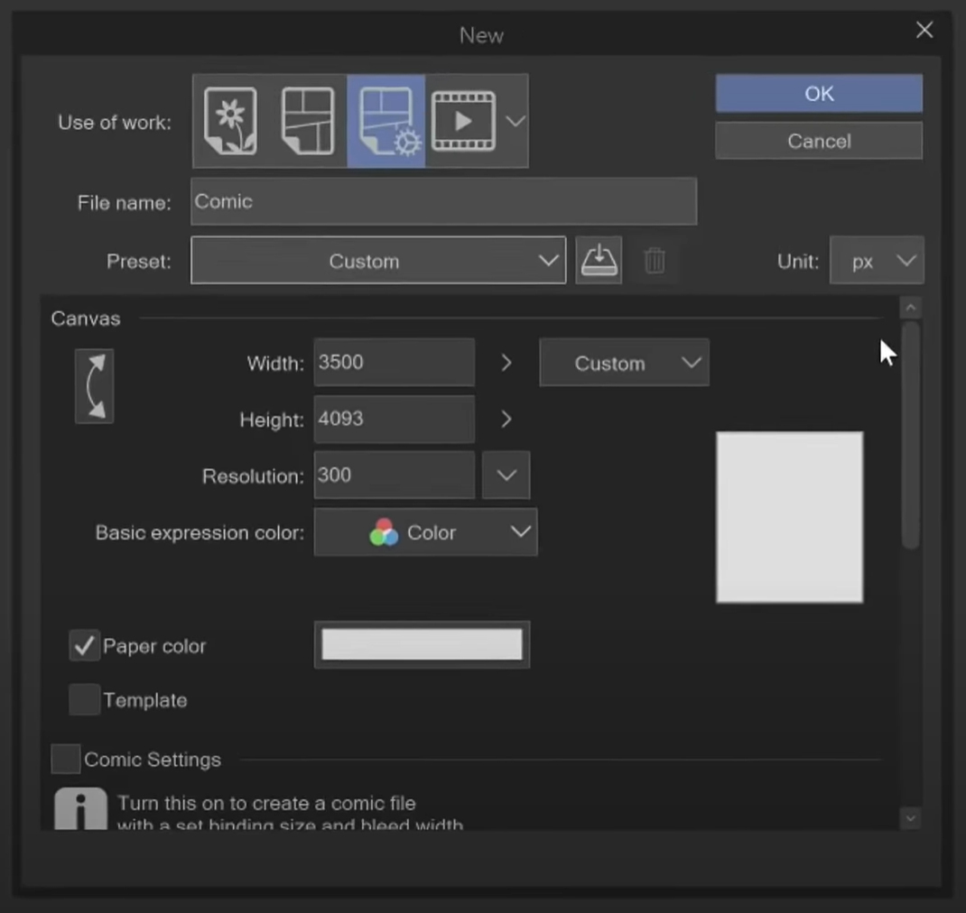
So let’s make a new file. These are the settings I normally start with, and what I’ll use for the drawing I’ll be working on today. Let’s look at the preferences first and then shortcuts.
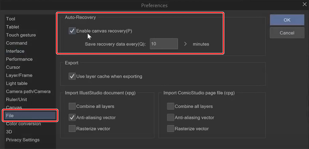
Preferences
There’s a couple of important ones. Under File, you can enable autosave and set the timer to how often you would like your work to save.
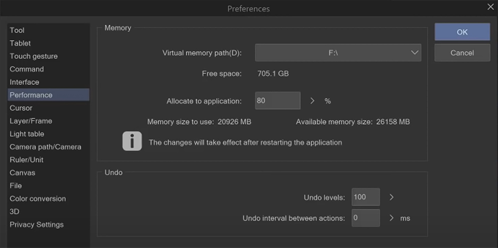
Under Performance, you can check your Free space and how much memory is allocated to the application.
Shortcuts
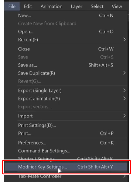
Shortcuts can be found under Shortcut Settings and Modifier Key Settings.
I recommend you get familiar with these as you learn the program and change them to what feels comfortable for you.
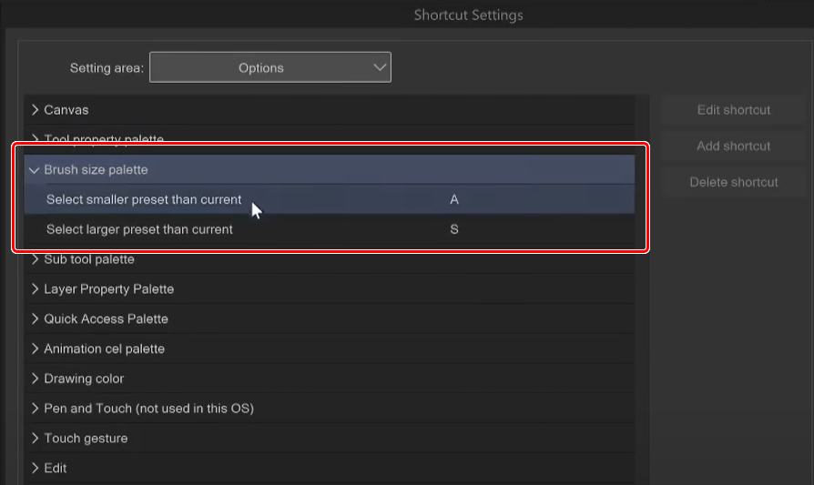
I want to give a special shout-out to a couple of shortcuts, such as shortcuts to change brush size under the brush size palette options and in the pop-up palette.
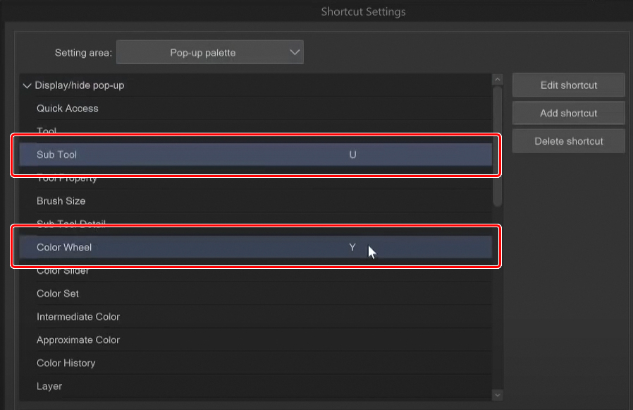
I’ve bound these keys to my tablet pen to call forth a temporary color wheel or a temporary brush window, so I don’t need to move my arm to the side of the screen all the time.
More shortcuts can be found in the modifier key settings. These are only for keys such as ctrl, alt, shift, and so on.
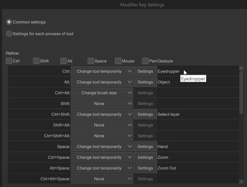
I have swapped out the eyedropper and the object tools from ctrl to alt because I use the eyedropper shortcut a lot, and I feel like ctrl is a lot easier for me to press than alt. Do look through this menu as there are a lot of very useful shortcuts that you might not have known about before.
Tools
So let me go over all of the tools next. Here we have the zoom and the hand tool.

I use these pretty much all the time. The shortcuts for them are Z for zoom and H for hand, but you can also use them with the spacebar and ctrl spacebar.
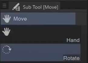
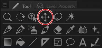
There’s also the rotation tool under the move tool, which is normally bound to R.
The operation tool is primarily for dealing with 3d layers, timelines, or vector lines.
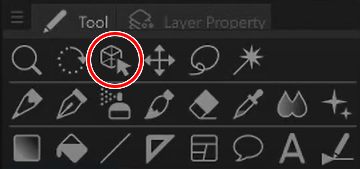
This move tool here is for moving the contents of your layer, but I don’t really use this because using ctrl + T for transform lets you do the same thing except also being able to resize and skew whatever you’ve selected.
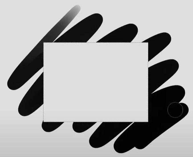
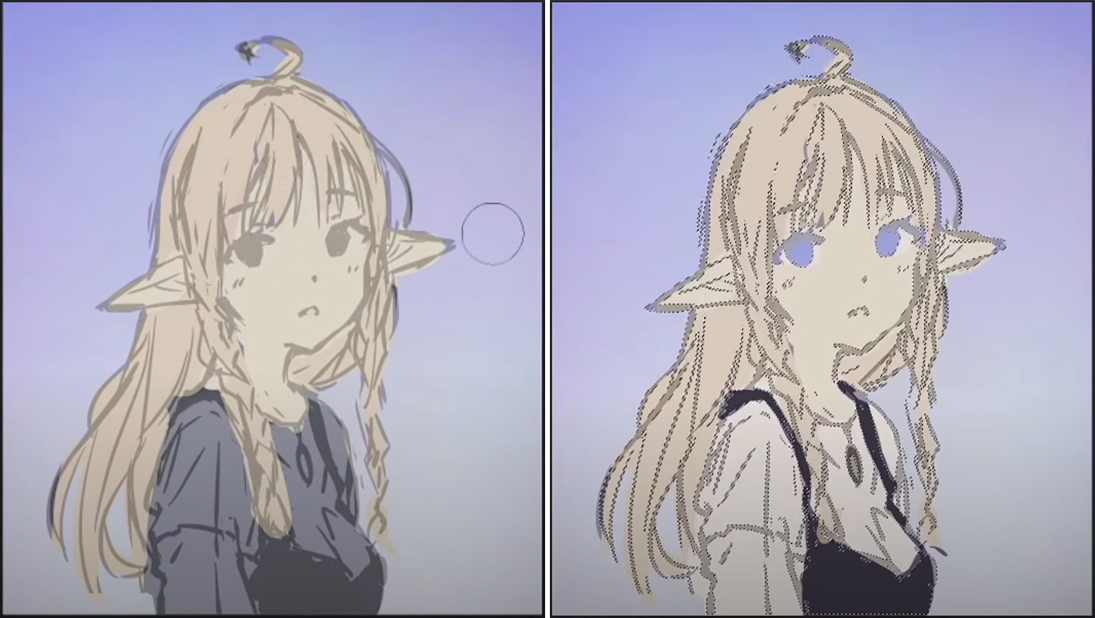
Next are the selection tools. They let you select a certain area, and then you can only interact within that area you selected.
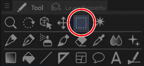
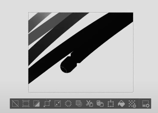
Here you have all the buttons for the things you can do with a selection.
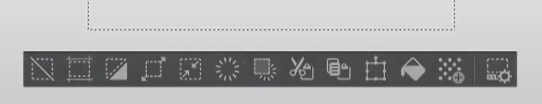
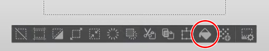
The most useful one is probably this bucket here to fill the selection. Another is ctrl + shift + I to invert the selection, so then you can interact with everything except the part you initially selected.
The auto-select tool is another way to select things, not manually, but it can automatically select a range of colors, for example.
On the next line, we have the pencil, pen, airbrush, and brush tools. These are all your drawing tools.
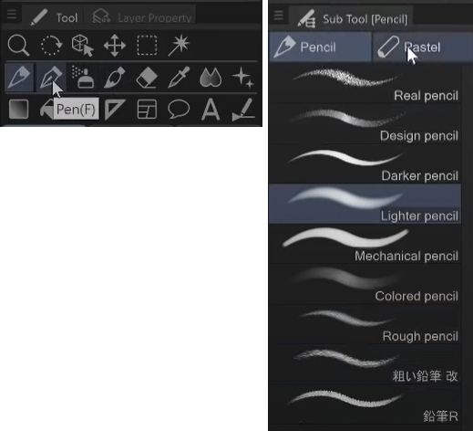
I highly recommend looking through these and the sub tool menus and trying out all the different options to see what the program has to offer and what you like the best. The pen tools are particularly nice for doing clean line art, and the airbrush for really soft shading and gradients. The brush tool has brushes that have a more traditional feeling. The eraser, of course, lets you erase, but you can also erase using a brush tool by selecting the transparent drawing color, which lets you paint with transparency.
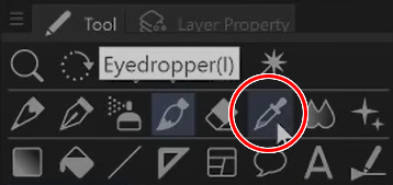
The eyedropper tool can pick any color straight from your canvas, and as I mentioned before, you can hold down alt while you’re using the brush tool to use it.
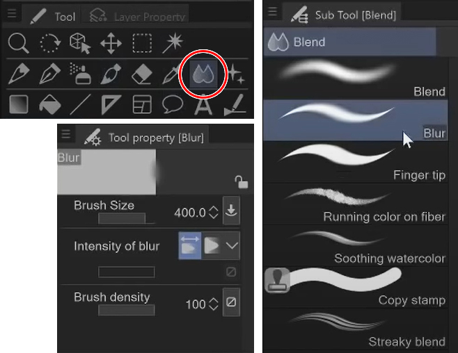
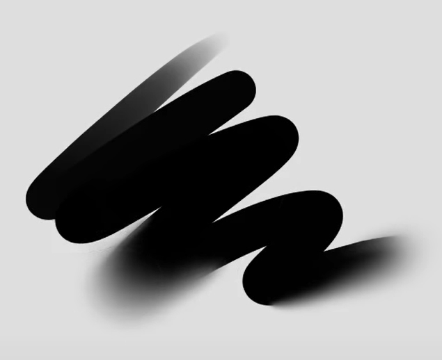
The blending tool, or specifically the blur tool within the blending tool’s sub tools, is my favorite tool within Clip Studio Paint. It lets you make nice soft edges by increasing the intensity of the blur based on how hard you’re pressing down on your pen.
This decoration tool has all the fancy decorative brushes. These are really fun, so do look through these as well. There are all kinds of stuff like plants, special effects, flowers, and patterns.

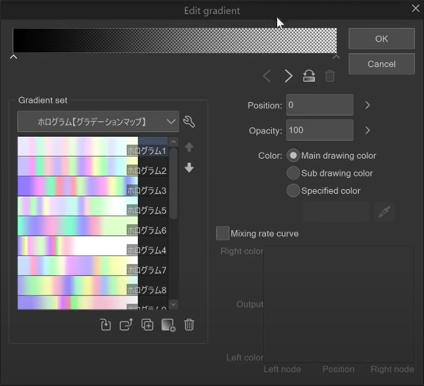
Next up, we got the gradient tool which lets you make nice gradients. You can also customize your own and download other people’s gradient sets and brushes from the Clip Studio Assets.
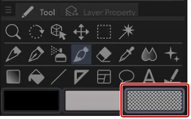
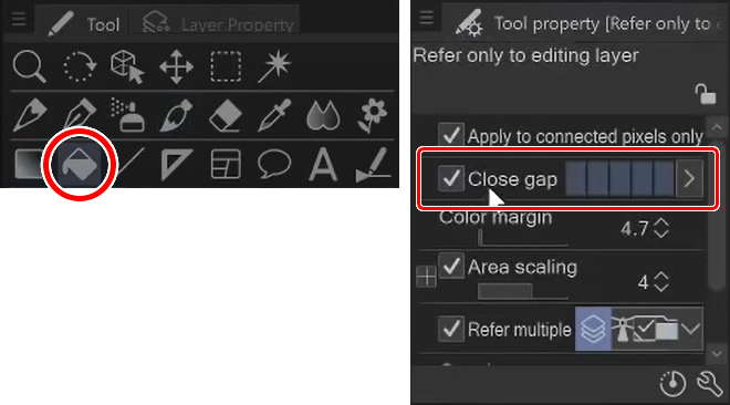
So next is the bucket tool, another one of my favorites. Clip Studio has a feature that even if your line art has a little gap, you can use the bucket tool, and this close gap setting allows you to fill even if there are gaps in your line art without overflowing to the entire canvas.
Let’s start painting!
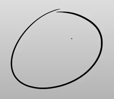
I’ll explain my process as I go and show you the tools and features in action. I’ll start with just a rough sketch of my character.
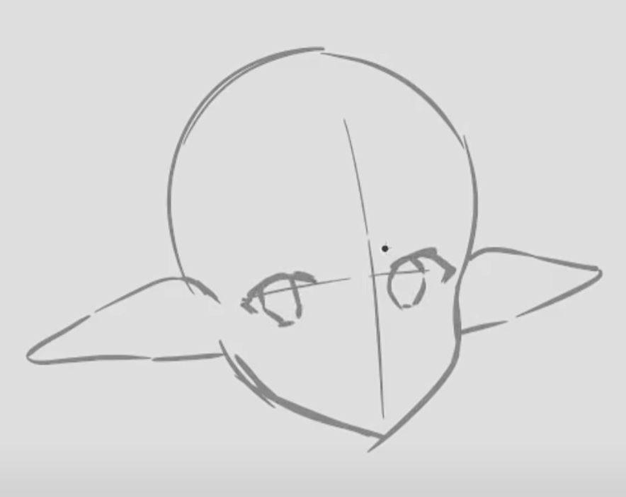
I often use ctrl + T to transform my sketch and move some parts around in this stage. I first pick the lasso selection tool, select an area, circle it, do ctrl + T, and then move it around. If you hold down control while you’re transforming a selection, you’ll be able to skew the selection, not just resize it. Doing this can make the lines blurry, but it doesn’t matter when it’s just a rough sketch.
Make sure to also flip your canvas occasionally so that you’ll be able to spot the things you need to fix in your raw sketch.
Now I’m using the airbrush to color in the background.
To start off coloring the character, I normally make a flat base with a slightly darker gray than the background; slightly lighter would do as well, as long as you can make out the silhouette.
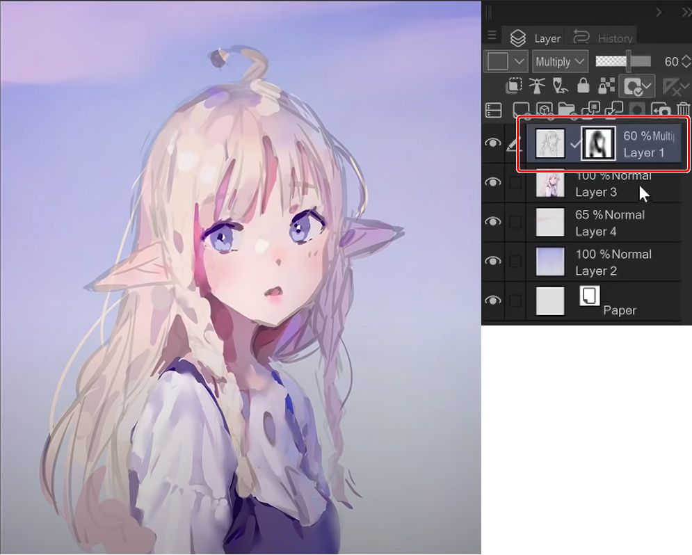
After that’s done, I just start adding in the flat colors. My sketch layer is set to multiply so that the colors from underneath the sketch show through.
Also, here I made a color adjustment layer. You can make those by right-clicking a layer going new correction layer, and choosing one of the different adjustment layers listed. These are not layers that you can paint on but layers that will change the look of the existing painting.
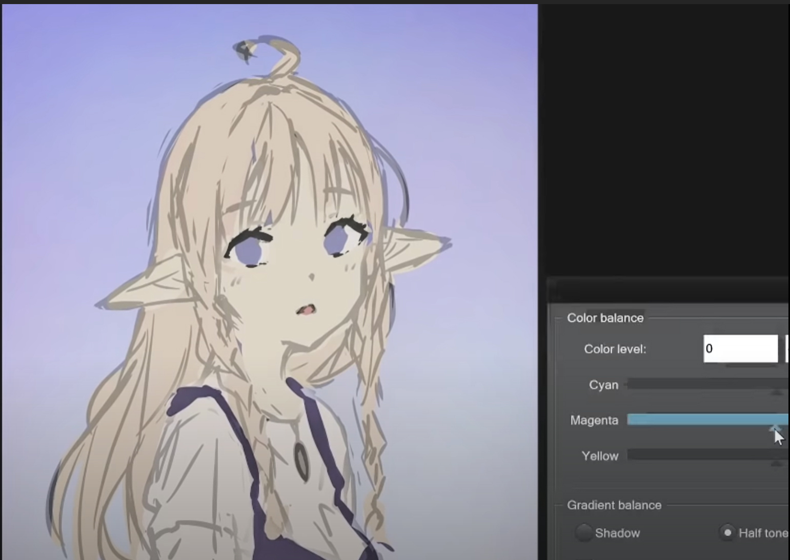
Using the color balance layer, I added more blues and magentas to my rough color sketch to work better with the background.
And then it’s painting time. This part is where I consider the rough sketch to end and the polishing part to start.
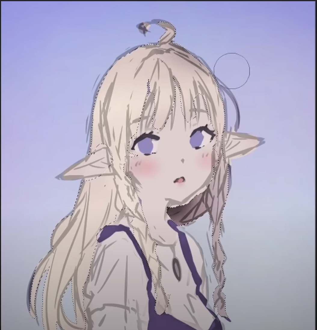
I make a mask on the sketch lines layer and use the airbrush to softly fade out some parts that I felt were too strong. Then I merged the entire character, so the lines and the colors are on one layer, and I start working on top of that.
This part where I’m starting to polish the drawing is so much fun! I recently moved to this kind of workflow because the traditional way of going from sketch to line art to flat colors, to shading, with tons of layers, felt too restricting and slow.
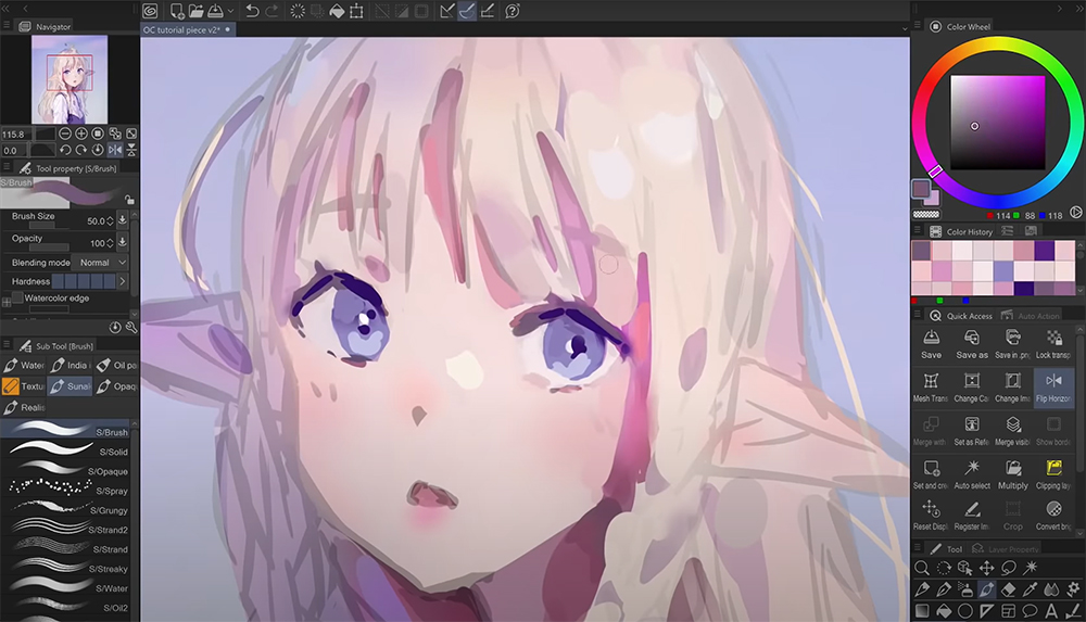
This method is more difficult because you’re basically doing everything simultaneously, but I find it a lot more enjoyable.
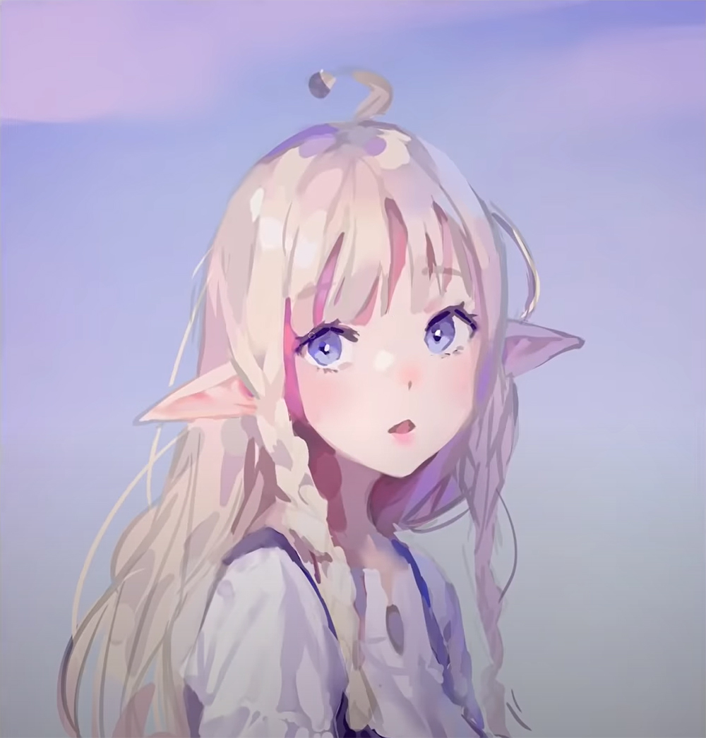
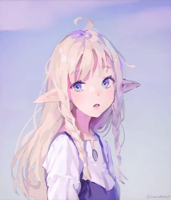
From this point, I kept going for another hour and a half due to my perfectionist self being hard to satisfy with something rough and painted like this. Looking back at it now, I really should have just stopped right here.

The progress after this point doesn’t improve the art anymore, even though I do still like the final results. Next, let’s look at the final adjustments I made to finish this drawing.
Final Adjustments
Whenever I’m done rendering a character, I usually pile these adjustment layers to fine-tune it. As I mentioned before, you can make adjustment layers by right-clicking on a layer, going to new correction layer, and then picking the one you want from the menu below.
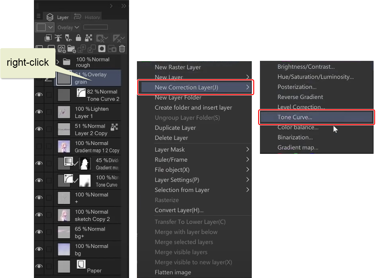
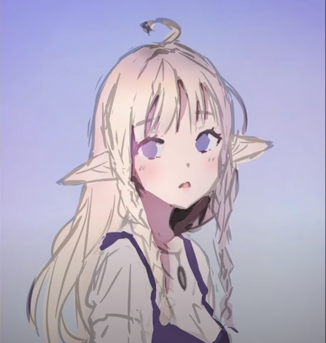
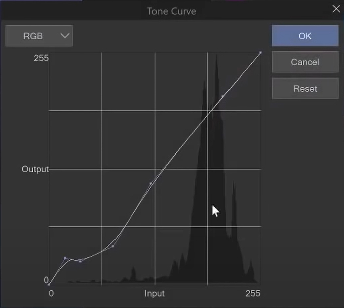
So the first one I have here is a tone curve. With it, you can increase or decrease the values in your drawing. Those closer to zero are the darker values, and on the other end are the lighter values. I made the dark parts of my drawing a little darker to create more contrast.
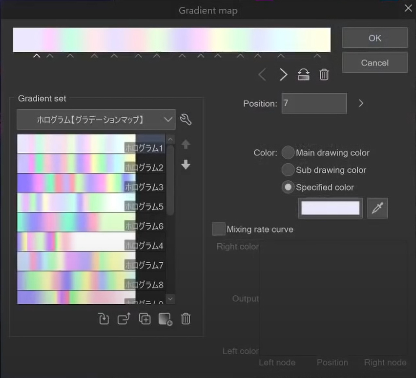
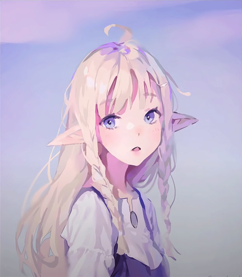
Next is a gradient map. I like to use these to unify the colors a bit more. Here are some gradients that I’ve downloaded from Clip Studio Assets page. I usually try out random gradients until I find one that looks nice. Then I decrease the layer opacity, so its effect is not as strong.
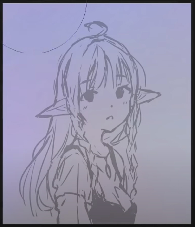
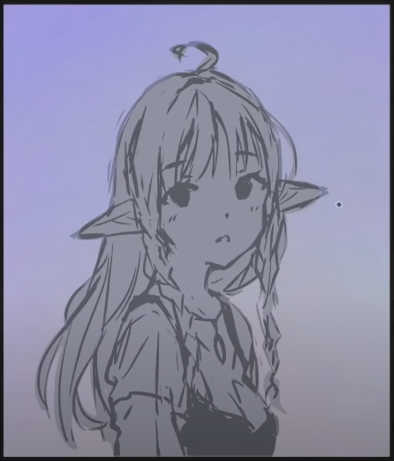
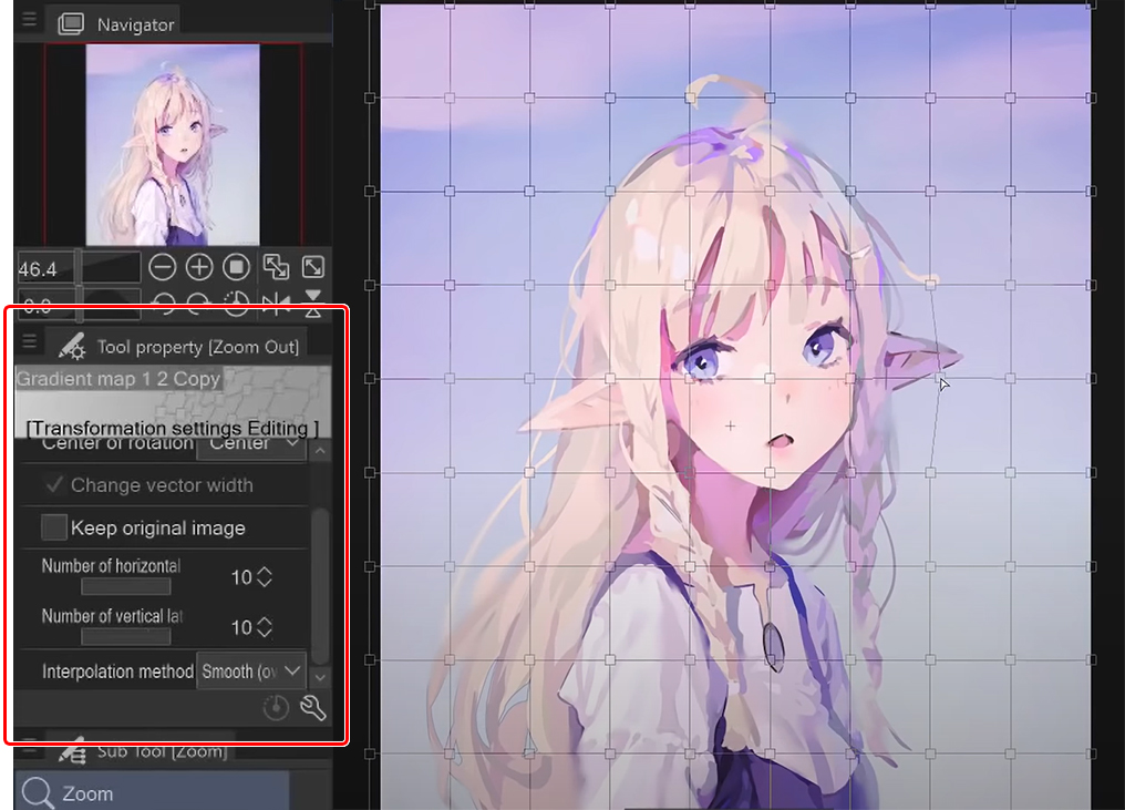
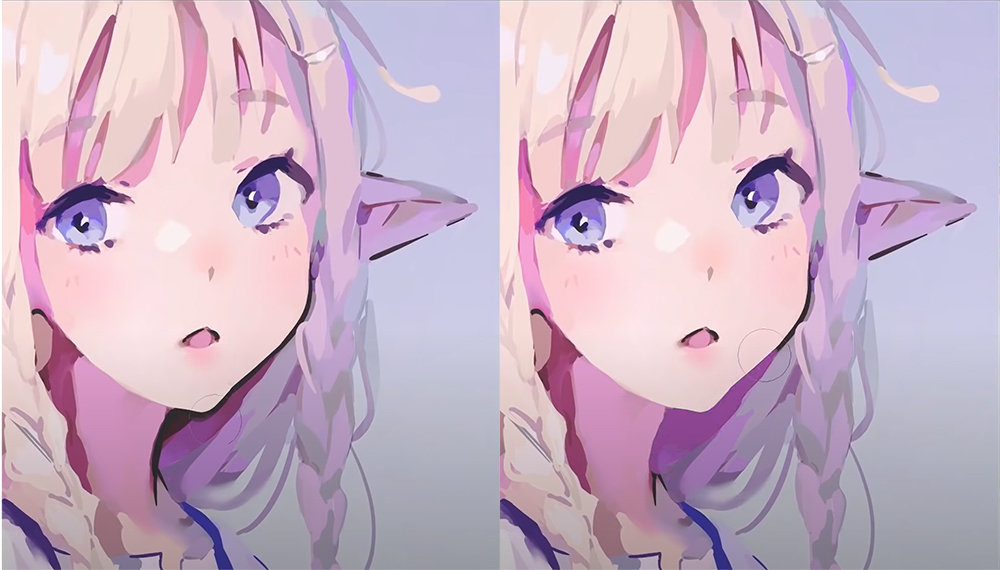
After these two layers, I flatten the entire drawing into one layer to use the blur tool selectively over the whole drawing. I also used the mesh transformation tool to tweak some parts of the drawing that were out of place.
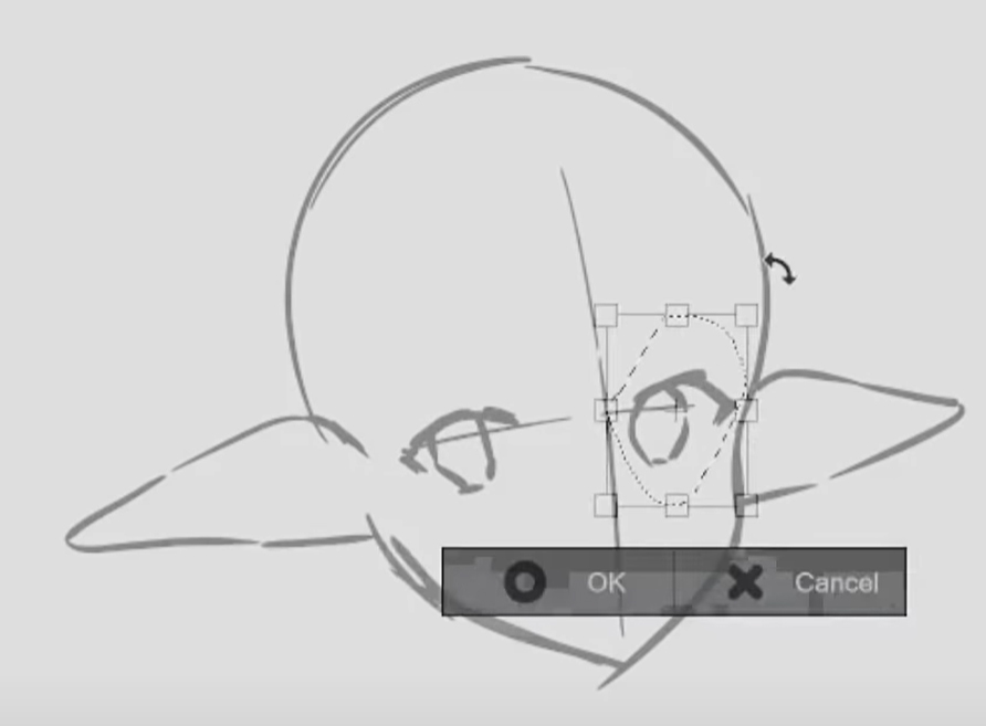
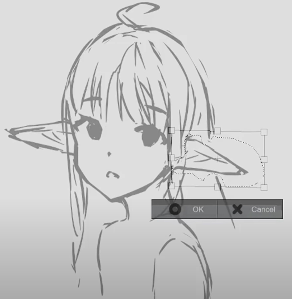
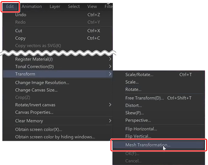
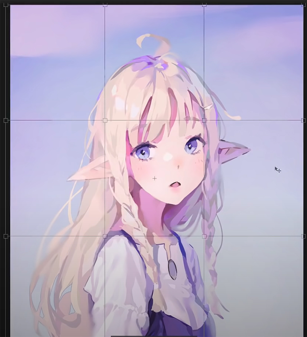
Mesh Transformation Before & After
To do this, select edit > transform > mesh transformation, and you will get the grid as in the image below.
I recommend increasing the number of draggable squares on the grid. To do this, set the maximum amount of vertical and horizontal points from the tool property palette and then drag them around as needed to adjust your drawing.
Lighten Layer
Next, this lighten layer is just here to make things lighter, as the name implies.
It’s a bit hard to explain. For example, I pick this magenta color from next to the jaw in the first image, and then if I paint with it on this layer, it will only paint this color on top of the darker colors. It will not affect any colors that are lighter than the one I picked.
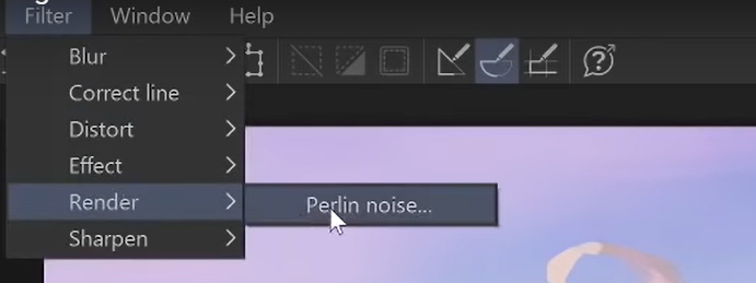
Optional Texture
I also tried to add some grain from Filter > Render > Perlin noise onto a new layer.
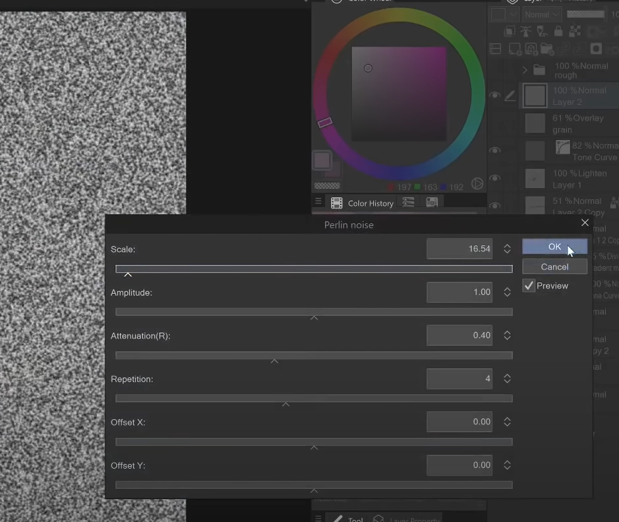
Set the layer’s blending mode to Overlay, and then reduce the opacity, making for a pretty decent grain filter.
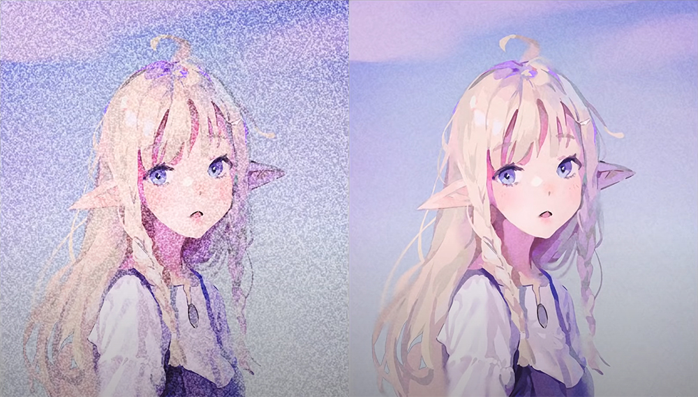
I didn’t like the look of it for this drawing, but I recommend trying it out on yours.
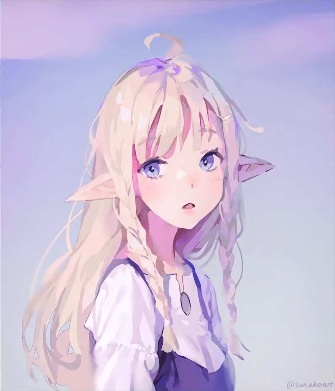
And that’s it for this drawing. I hope you have a great day and have fun creating art!
Sunako
Artist from Finland.
- Twitter: https://twitter.com/sunakoart
- Instagram: https://www.instagram.com/sunakoart/
- Discord: https://discord.gg/PaFr4Dk
- Twitch: https://www.twitch.tv/sunakoart
- Pixiv: http://pixiv.me/sunakoart
- DeviantArt: https://www.deviantart.com/sunako-art
- Gumroad: http://gumroad.com/sunako
- Patreon: https://www.patreon.com/sunakoart
Interested in character art & design or what it takes to become a character designer?
Check out the link below!