Guide to Creating Color Schemes
Struggling with colors and color schemes in your art? In this article, comic artist Ann Maulina explains how to use local and environment colors along with other color theory tips for creating harmonious illustrations!
Index
Introduction
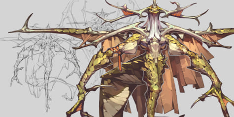
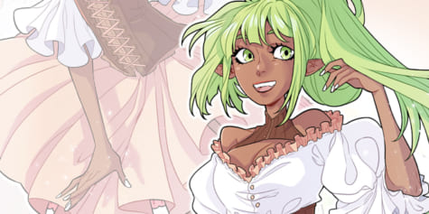
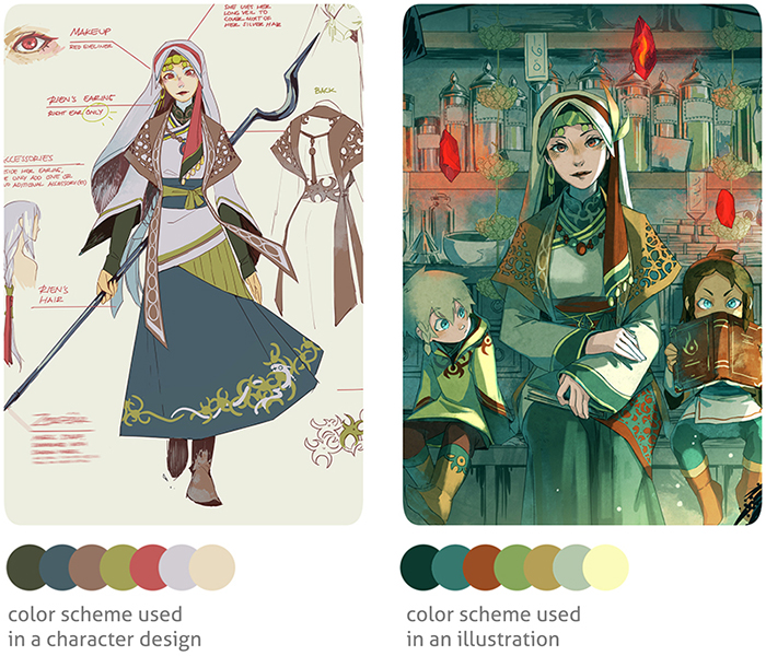
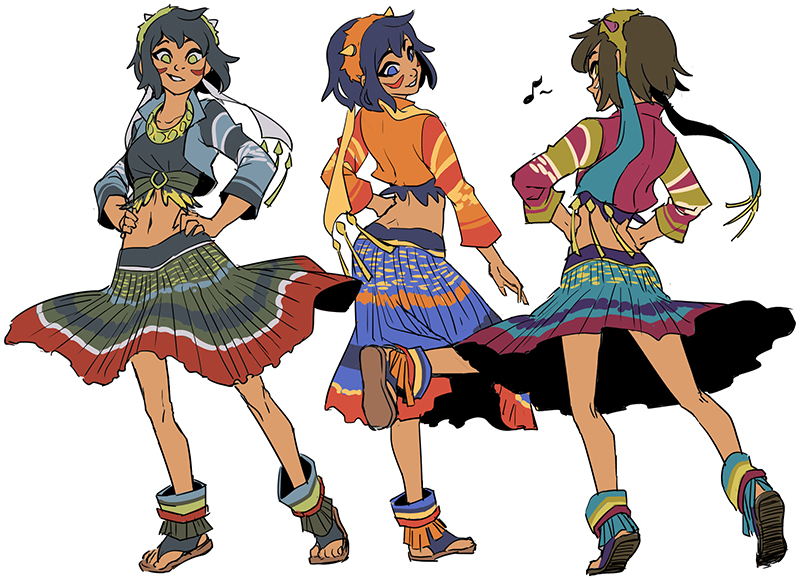
Color Schemes are arrangements or combinations of colors used in illustration and design. When used on a design, color schemes are mostly used to describe local colors (colors of objects or material under neutral lighting). Meanwhile, color schemes in illustrations are used to express mood or ambiance. Local colors in an illustration are all affected by the ambient colors. For example, Rien’s blue-grey skirt on her character design (left) appears dark turquoise on the illustration (right) because it was affected by the green ambient light.
Digital artists are blessed with thousands of colors that are available with just a click. And don’t forget the almighty adjustment layers that we all think can solve every coloring problem. While it is encouraged to use those handy features for efficiency, there are actually rules to follow and ignore. Here, I’ll explain some basic knowledge of colors that can help you choose better color schemes for your art.
Usages
Harmonious color schemes help us show pleasing color combinations. Color schemes can also help us describe a certain mood to the viewer.
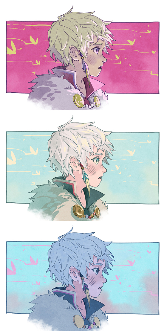
Can you feel different moods in these similar comic panels?
Color Theory
Color theory is about understanding how color combinations work and how colors are not always how we perceive them to be.
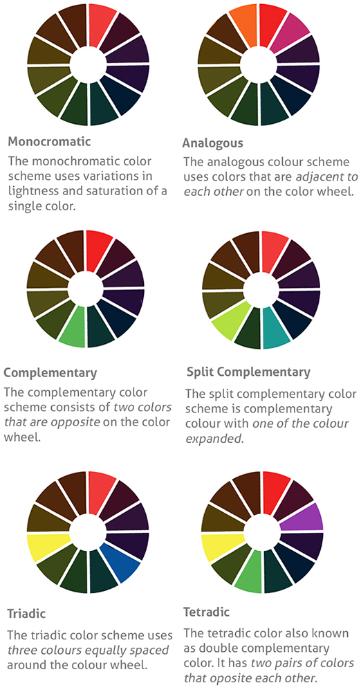
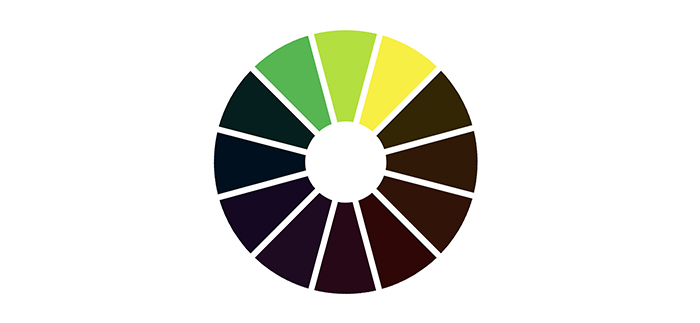
When placed close together, colors communicate with each other. Some are complementary, some make other colors pop, while some colors don’t go well together, making both appear dull as a result. Color theory shows us that there are certain color arrangements in a color wheel that can become harmonious if put together in an artwork or design. Below is a familiar graphic showing color combinations that are harmonious based on color theory.
After looking at this graphic, harmonious color combinations seem pretty limited with 6 different main arrangements: monochromatic, analogous, complementary, split complementary, triadic, and tetradic.
But don’t forget, color schemes are not only made of combinations of hues, but also combinations of different values and intensities. These three variables are known as the three properties of color.
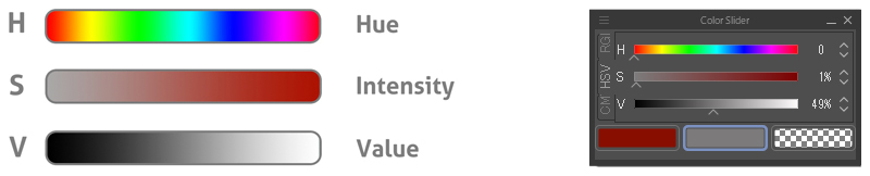
HUE is the traditional color “name”, such as “blue” or “yellow”. The hues in the spectrum are traditionally listed as ROYGBIV (red, orange, yellow, green, blue, indigo, violet)
INTENSITY refers to the purity of a hue. We also call it saturation or chroma.
VALUE is a degree of lightness or darkness. Every color has value, e.g. high-valued red will show as bright red or pink (if it has less intensity)
With these three variables, there seem to be infinite possibilities for creating various color schemes. But is there really?
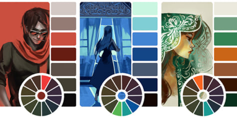
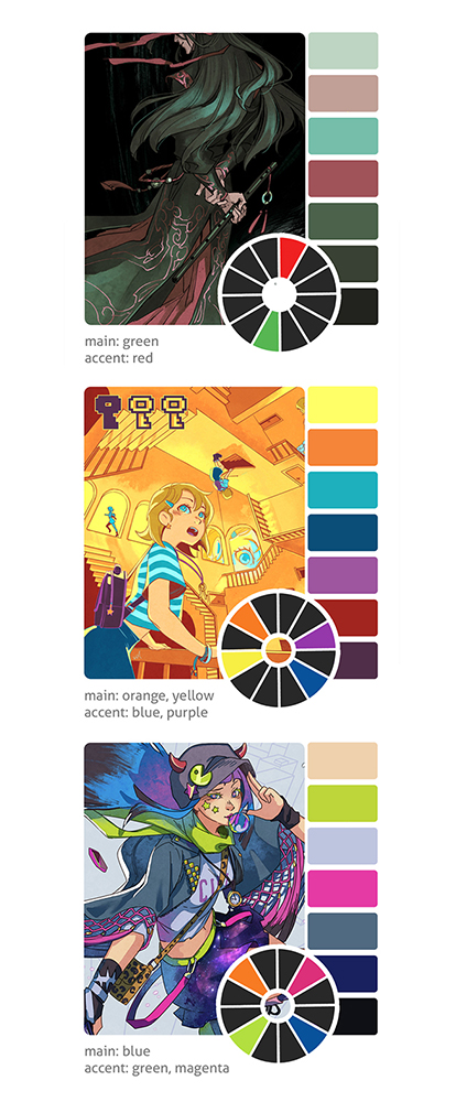
These are some color schemes I’ve used in my illustration with different harmonious color combinations based on the color theory graphic above.
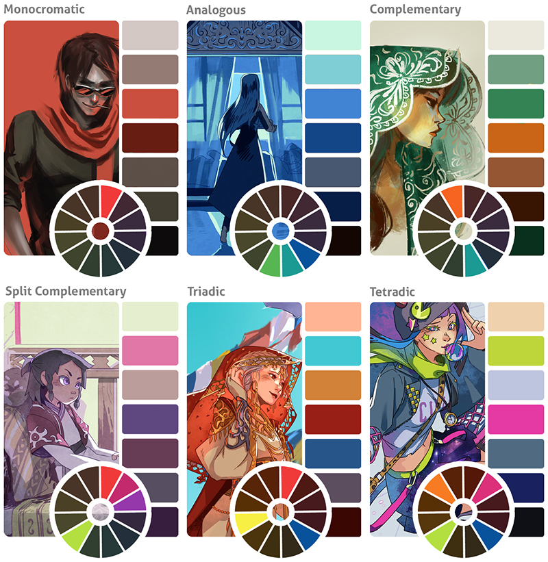
As you can see, besides the different color combinations, I also played with color intensities and values. But there are certain rules I always follow when playing with these variables. Can you see the pattern before I mention it?
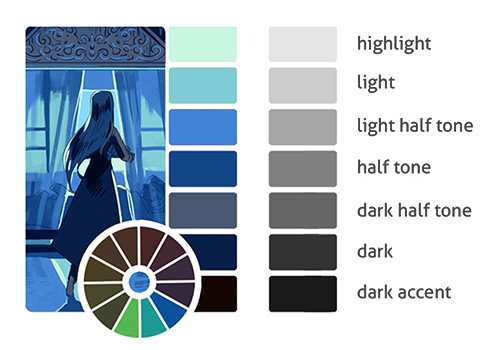
#1 This is optional but I always arrange a color scheme based on their level of values. This way, it’s easier to implement the colors to an illustration or design. For example, dark accent colors are used for line art, and highlight colors are used for sky, light sources or, well, highlights.
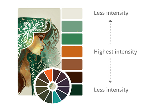
#2 I tend to (but not always) lower the intensity/saturation every time the color moves toward light or dark. This way, halftone colors are mostly the highest saturated colors in my color schemes.
#3 Lastly, the following is the main rule of color. This is a law, not optional:
“If you change the value, shift the temperature (hue)!”
To understand this law of color, let’s try making an analogous color scheme!
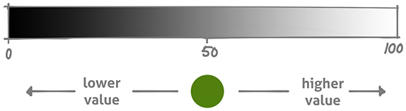
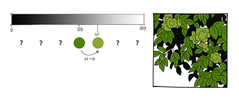
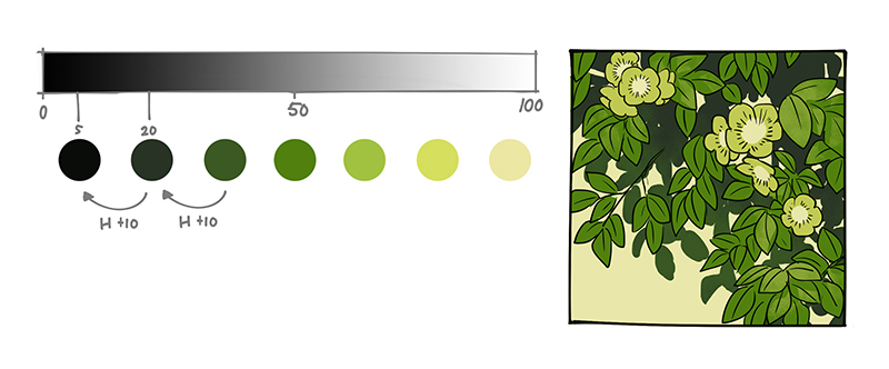
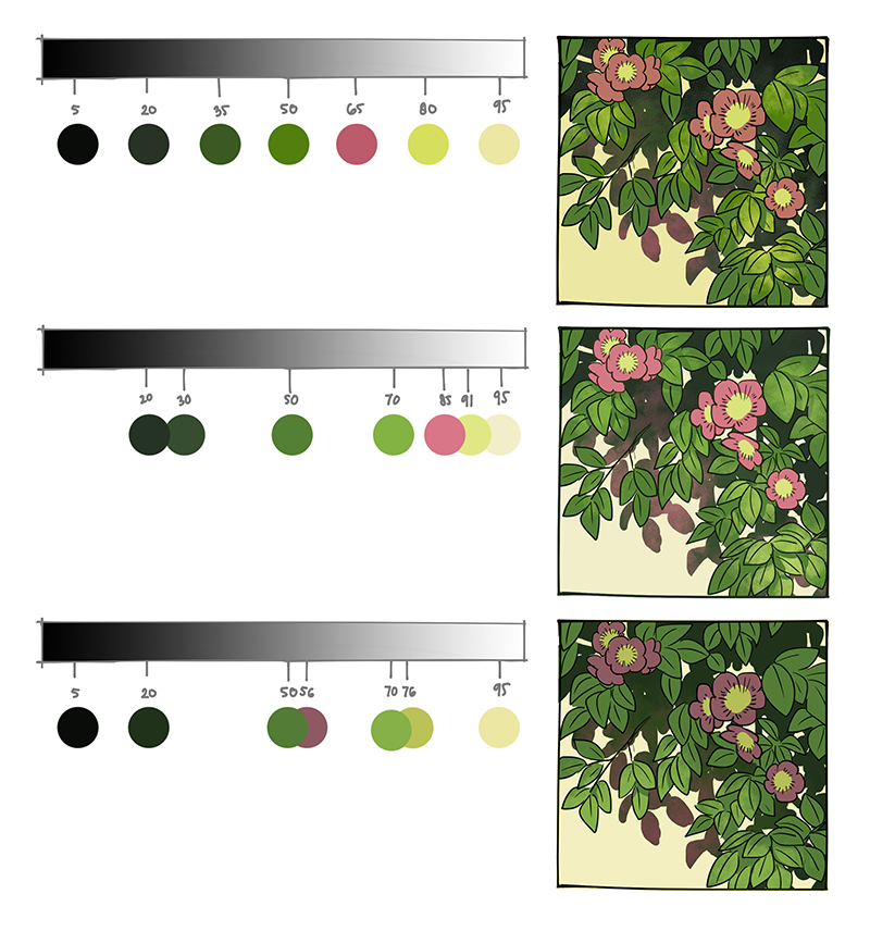
●Let’s start with a green color in a halftone (value 50%).
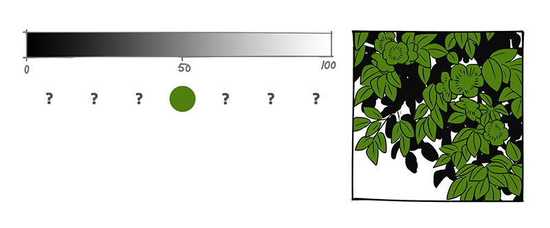
●The colors next to it will have higher and lower values
●Here is the position of the green color on the color wheel and hue bar. Based on the law of color, if there is a value change, we have to shift the temperature/hue. But in which direction?
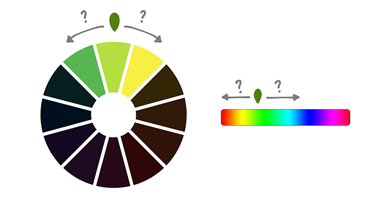
●Whichever direction the hue shifts, make sure that the direction of light and shadow are opposite each other. If you shift the hue for a higher value to the right, make sure to shift the hue for a lower value to the left and vice versa.
●This leaves us with two choices: warmer light with cooler shadow OR cooler light with warmer shadow.
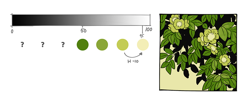
let’s choose warmer light with cooler shadow this time. From the halftone, increase the value, while shifting the hue to the right (color wheel) or toward yellow (on hue slider) and we have a light halftone. Lower the intensity for a natural look.
●Do the same to get light tone and highlight color

●From the halftone, lower the value while shifting the hue to the left, and we have a dark halftone.
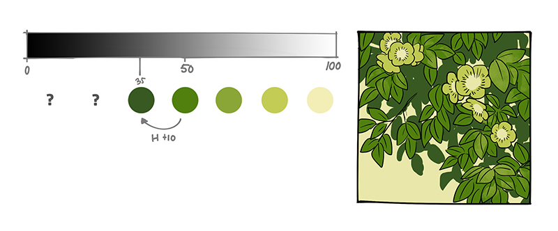
●Do the rest with the same method until you get a complete color scheme.
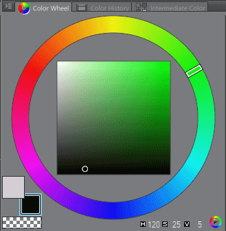
●Value, intensity and hue shift as shown in the CSP color wheel:
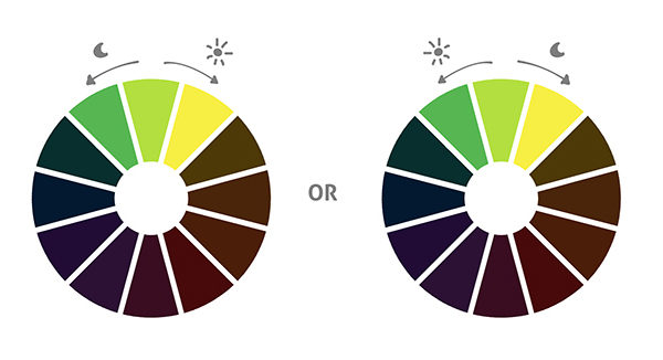
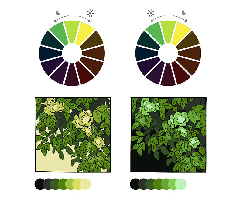
●Compare the color schemes with warmer light and cooler light with the same halftone color. Color schemes with cooler light are more suitable for dark environments.
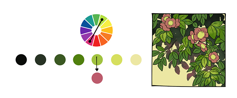
●Complementary colors: Simply replace one color with a complementary color in this analogous color scheme and it will make a good complementary color scheme. The complement of green is magenta.
●Value gaps: I’m using a constant value gap for the step by step color examples above, but feel free to add variation in gaps to get a different mood.
TIPS
#1 Use the RYB color wheel when choosing a color scheme. Color theory is best used with the traditional RYB color wheel. Most color wheels in drawing software are RGB.
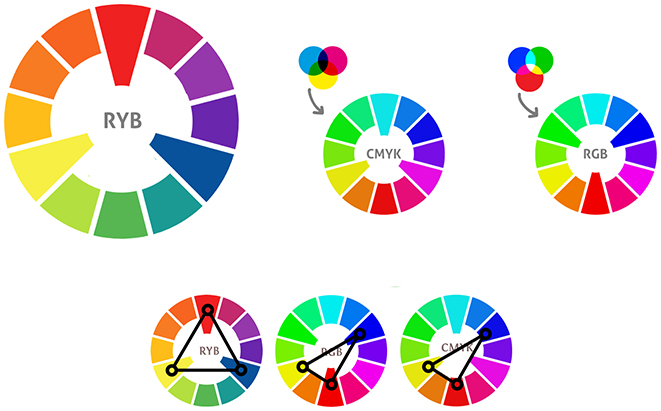
RYB colors are created by mixing three primary colors which are red, yellow and blue. This color wheel is used in traditional painting to mix colors.
RGB colors are created by mixing red, green, and blue light. These colors are often used in lamps, monitors and TVs.
CMYK colors are based on color mixing made by inks used in digital printing.
#2 Don’t use colors (hues) in equal amounts; choose a color to be the main ambient and others as accents or complementary colors for your artwork.
Samples:
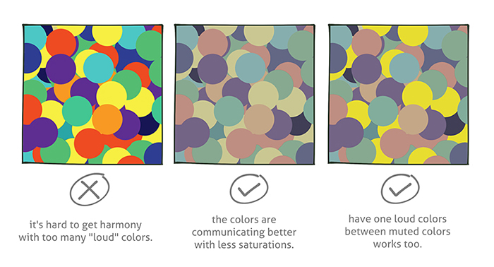
#3 Try imagining colors as voices in a room. If all of them are loud and there are many of them, it won’t be harmonious. Let them be calm with low saturation (low voices). Or let there be one loud voice in with the others muted.
Conclusion
As long as you stick to the basic laws of color, you can make beautiful color schemes for your art. Have fun!
Ann Maulina is a comic artist from Indonesia. Her comics are Raruurien (www.raruurien.com) and Varunair. She also works as a freelance game concept artist at times. She holds a Bachelor’s degree in Visual Communication Design, which gives her a high advantage with art and design projects. She enjoys creating art while exploring some dynamic and harmonic colors. You can find her at:
Interested in character art & design or what it takes to become a character designer?
Check out the link below!