Simply Well Drawn Part 1: Deciding Your Composition

Learn how to draw a dynamic composition for the base of your drawings and how to pose your characters! A 4 part series of how to draw an amazing illustration.
In this tutorial for advanced artists, I dive into drawing digitally, especially my approach, when working only on the computer. In this case, “advanced” means that I pay particular attention to the details and my personal way of thinking during the process, instead of explaining the graphics software itself.
Based on some recently commissioned work I will show you step by step, how I design the cover for a short manga, which will be printed later. This first tutorial is mainly about the search for a motif and requires special attention when designing a cover.
When working with a client, it’s important to always have multiple designs and versions available, as everyone has different ideas about what constitutes a “perfect cover illustration”. If you discuss several image ideas at a time, usually, the image that ends up being chosen, is the one that is most commonly liked, which should be the goal of a cover anyway! A cover needs to be appealing to many and entice the shopper to buy the manga.
So if you are unsure about a motif, it can be helpful to ask other people (including non-artists) for their opinion. However, don’t get too upset if they find your personal favorite silly.
Below you can see my three designs:
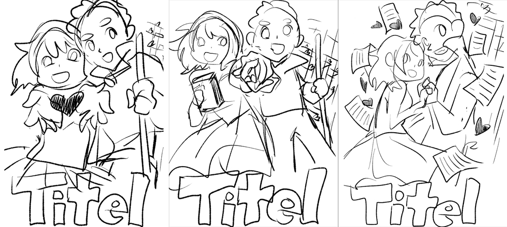
As you can see, my initial designs are drawn very roughly. At this stage, I am not concerned with correct anatomy and I just want to put as many ideas as I can on paper. It may very well be that my client doesn’t like any of them at all.
If that turns out to be the case, I have to quickly draw new designs and the old ones may very well end up in my drawer (or in the trash). It would be a pity if I had spent hours and hours on them already. Efficiently managing time is one of my main principles when working.
When starting the design process, I just doodled in my graphics software at a low resolution (72 dpi). You may notice that the three designs are quite similar in their theme. There is a reason for this: all of them follow certain rules that I usually follow when drawing covers.
My three rules for drawing cover illustrations:
1) The characters should, invitingly, look at the viewer directly. The underlying message is “Come look inside!” and “Buy me!”. This is why both characters are equally important and are looking at us, the viewer.
2) Their facial expressions should reflect the mood of the manga (here: cheerful).
3) Their faces require special attention and definition (they should look flawless when flipped horizontally), however, so does their body language. After all, the cover is what people see of your manga first! If you focus on detail anywhere, this is it!
This time, my client opted for the third draft and now it’s time to refine the sketch a little bit:
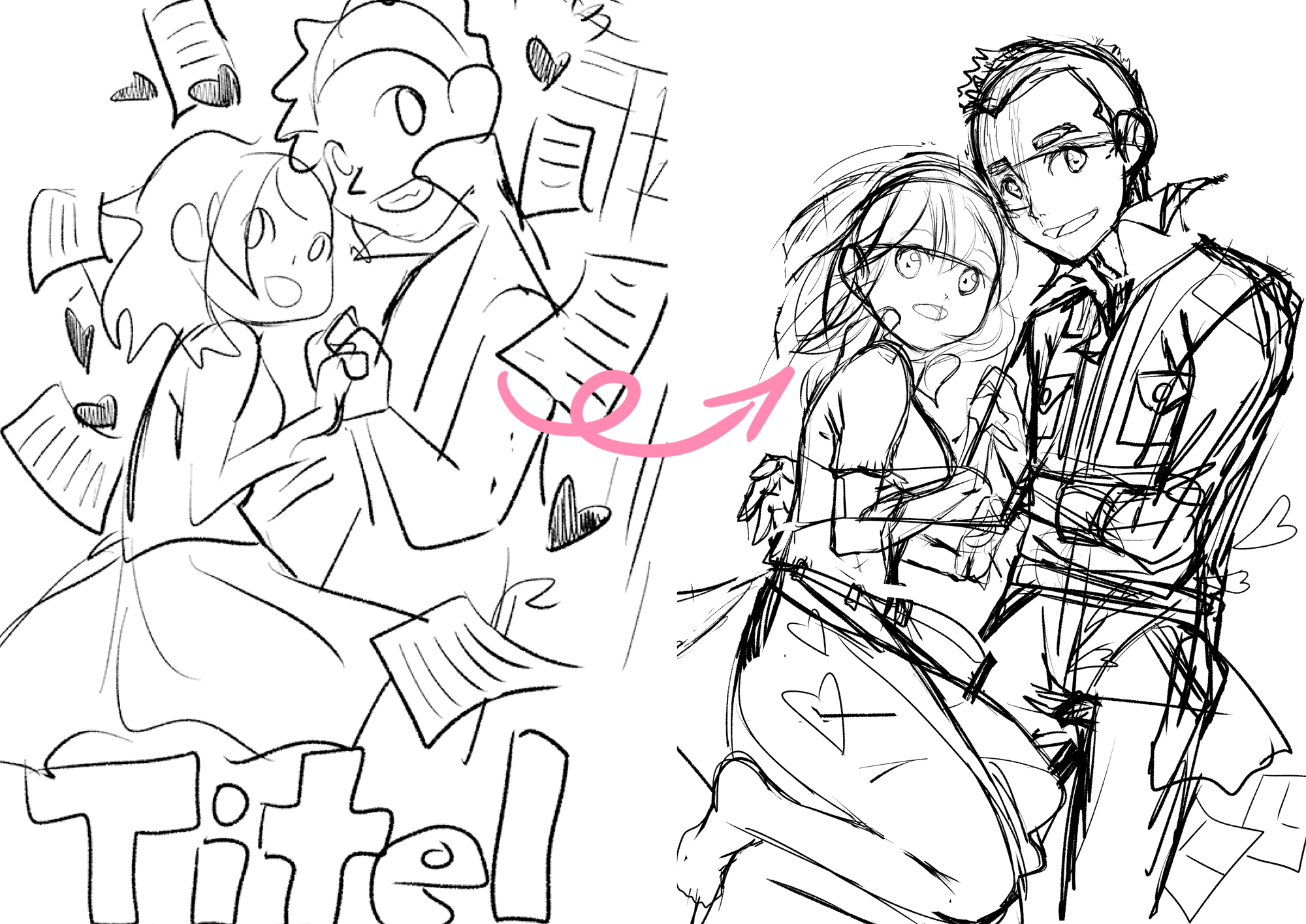
As you can see, my sketches are still very, very rough. It does not matter, however, because the client does not get to see this step anyway. The important part is, that you, the artist, are aware of where which part belongs.
This step is also done digitally and during sketching, in particular, it is quite apparent, how comfortable drawing is, using software. You can flip, rotate and resize the canvas with a click until you have the perfect base for the final drawing. All this is possible without spending any time of scanning. Isn’t it a beautiful world?!
In the beginning, I mentioned that the cover will be printed, so here are a few tips on how to achieve clear and smooth printing results:
Once you know the final format for printing, you should draw in this format. A high resolution and hen a large dpi-number is a must (300 dpi for color images, 1200 dpi for black and white manga pages) as well as the correct image dimensions in cm.
Even if you print the images smaller, for example in A5 or B5 format, the original file should nevertheless be quite large; you never know, if you may not want to print posters of the cover illustration eventually.
Below you can see the clean, digitally outlined illustration. In the next tutorial, I will go more into detail about the exact way of inking on a computer.
As you can see, I stuck to my principles for cover design. For a dynamic composition, I also recommend that your characters overlap to a degree. In the example on the right, I colored them to show the overlap. This also highlights the emotional closeness of the two characters:
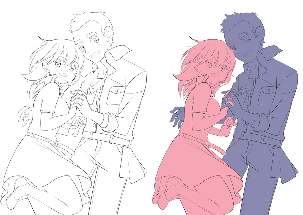
Since the story of the manga is a love story, although one without kitsch or erotic elements, I applied very specific tricks in their body language and facial expressions. Here are some of the key points:
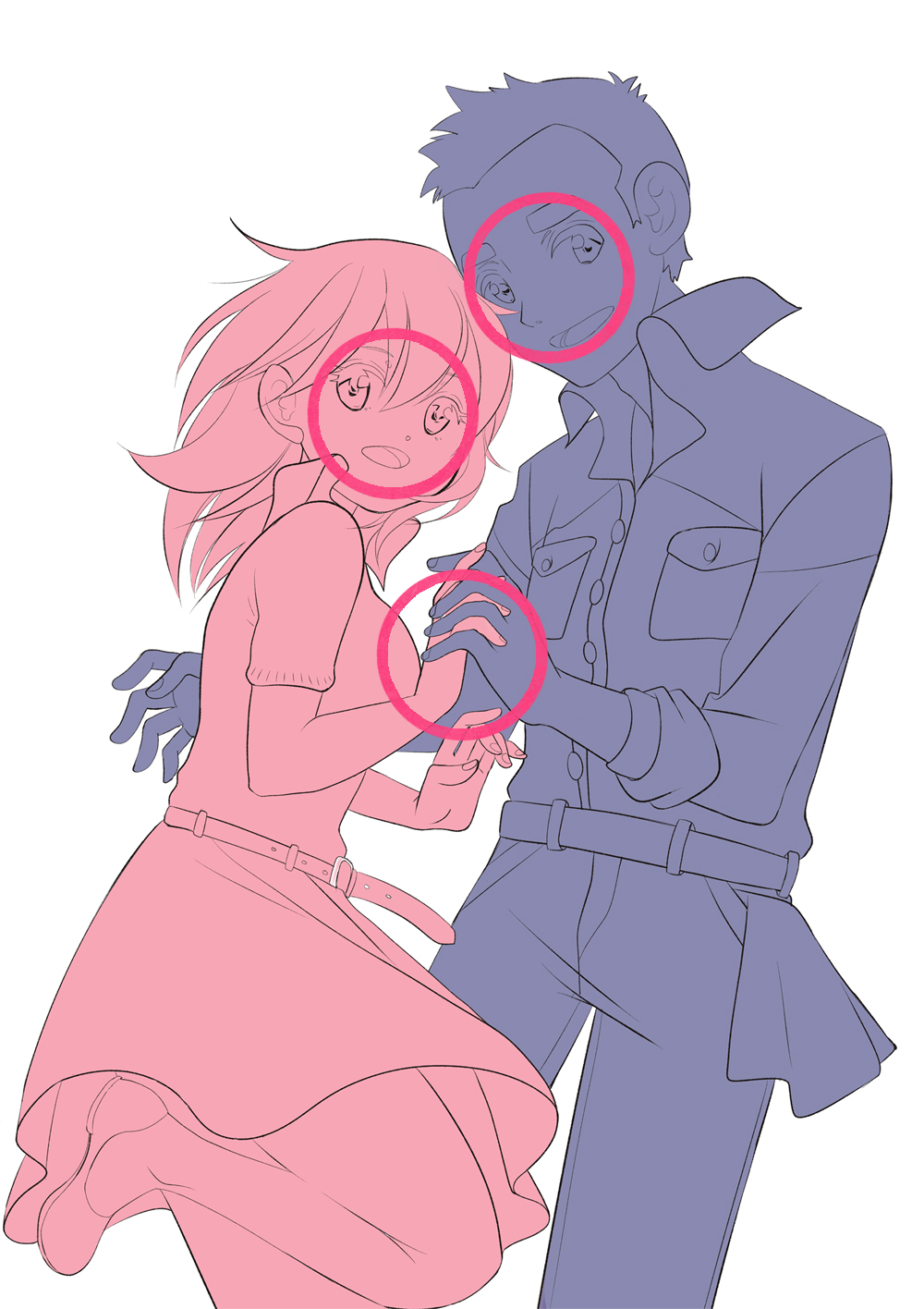
1) Both of the characters look very happy but they do not swoon over each other, as their love is still something that develops.
In addition, both look at the viewer – which tells us that they are both “main characters”.
2) Their facial expressions are the same, which illustrates their bond and their “togetherness”.
3) They touch (which indicates closeness) but only gently with their fingers, which is not sexual (like it would be in case of butt or face etc.) and they aren’t too close to each other either.
4) The male character does not yet hug her tightly, but his hand is reaching behind her back. Like that, he seems rather shy, and like he does not know yet, what he is allowed to do and what not.
Isn’t it amazing? These are all things you can convey by simply planning your design with care. Conscious decision-making is an important part when using body language as part of an illustration!
We have arrived at the end of the first tutorial. See you in the next tutorial, which is about digital inking! See you then!
Inga Steinmetz lives and works in Berlin. She was born in the former GDR and currently lives near the East Side Gallery. At the age of fifteen, she began writing stories and drawing comics.