Simply Well Drawn Part 2: Inking Tips

Learn the ins-and-outs of digital inking and how to do your line art! See examples of different brushes in different drawing apps for your illustration!
Read part 1 here!
This second part of my tutorial series is all about digital inking. At this point, drawing software and pen tablets help to achieve really good results. However, considering the countless brush options, digital inking may quickly become troublesome. What does the perfect brush tip look like?
First: Your personal preference is important! Do you want smooth lines for an illustration? Do you prefer slightly textured lines that imitate ink on paper? Here are a few examples:
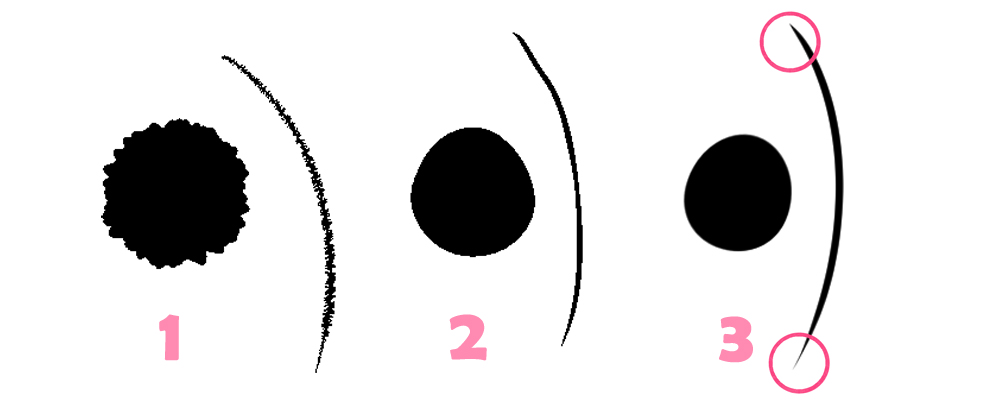
Brush 1 almost looks like a rough pencil, and I personally prefer this kind of brush. I think there is something organic, something flawed to them, which I really like.
Brush 2 has rough “pixelated” edges, but is a little smoother. This brush is probably closest to scanned ink lines.
Brush 3 is super smooth! In fact, it is smoother than you would ever be able to achieve with pen and paper and is perfect for people who prefer clear, sharp lines. Also clearly visible: This brush, in particular, has beautifully tapered beginnings and ends. I’ll talk about that in more detail later.
The picture used as an example here was inked with brush tip number 1. don’t believe me? Take a look at this zoomed-in version:
When zooming in it becomes apparent how rough this brush tip actually is. However, since I inked the image in a very large format (larger than DIN A3) and we only look at it at screen resolution for this tutorial, the lines look smooth and very clean.
Which brush tip you eventually use is up to you. The important part is the final overall impression and your level of satisfaction.
It’s time to draw the rough sketch! For this, I create an extra layer (here blue) underneath my ink layer and here we go:
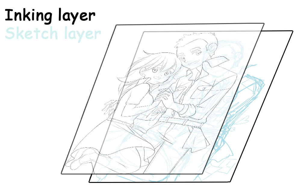
Think of it as a lightbox: On top, you have the sheet of paper you want to ink on, and below you have the sheet of paper with the rough sketch shining through.
This, however, raises an important question: What is the best way of inking to get great results? Where should the lines be thicker or thinner? What does this have to do with tapered ends, which I mentioned briefly?
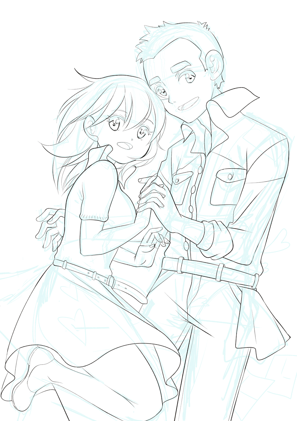
That’s exactly what we’re going to talk about now. For once, here’s the finished picture:
Over the years, I have studied the line-art of famous manga artists and talked to Japanese artists about painting. It is good practice to keep the following principles in mind when inking:
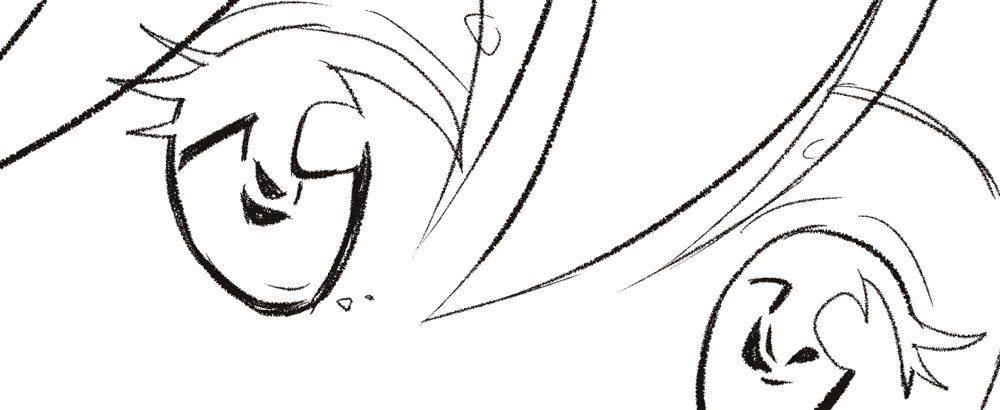
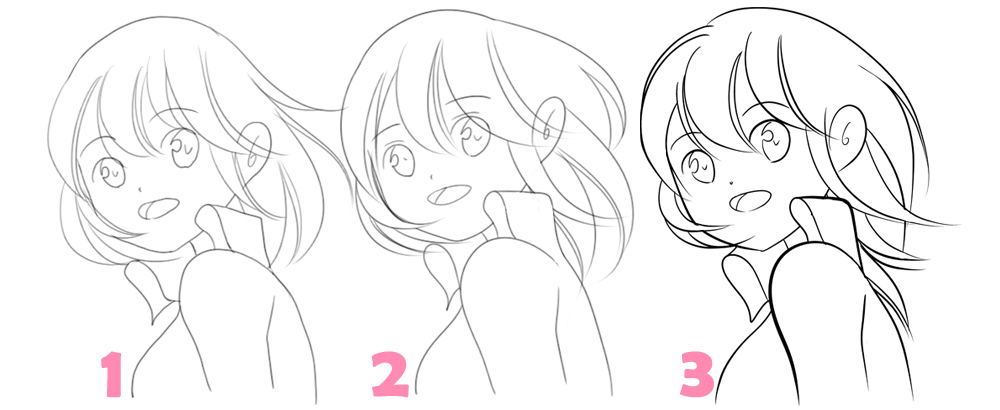
1) Ideally, the lines begin thinly, become thicker over their course and narrow at the end again.
2) If the lines follow a curve, they should also be at their thickest along the arches.
3) The outermost lines of an object should always be the thickest. Especially objects that are close to the “camera” should be drawn thicker, like for example an outstretched hand.
4) Different materials require different lines. Skin and hair should be drawn with soft, curved lines, but thicker fabrics (like jeans) can be drawn with stiff, rather straight or even jagged lines.
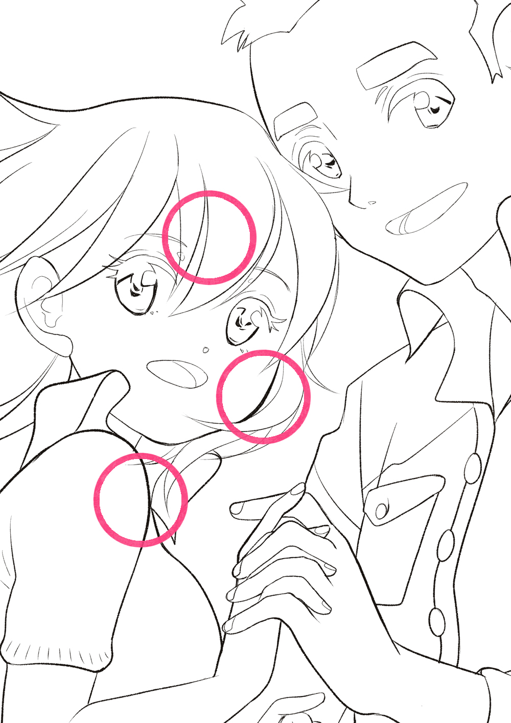
For our lovers, I was careful that the girl’s line-art consists almost entirely of soft lines, while the boy has straighter or more jagged lines.
I used to find it very difficult to ink digitally respecting these “rules” in the past, but nowadays software usually comes with different options to help you out, such as the “stabilization” function.
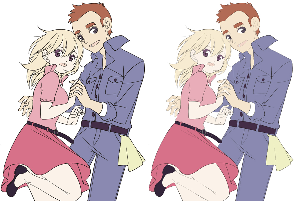
Here is another example:
Example 1 was inked in Photoshop. Look closely at the shaky lines of the mouth and the line of the back.
Example 2 was also inked in Photoshop, however, this time I used the “stabilization” function provided by the add-on “Lazy Nezumi”. Especially the lines of the body seem to be much smoother and more confidently drawn.
Example 3 was inked in Clip Studio Paint. I used stabilization and the tapering function for smooth lines. It’s really amazing what can be done with software these days.
If you need tips for drawing with pen and ink, I recommend you watch this video on my YouTube channel:
https://www.youtube.com/watch?v=Bb27aTXtANg
Incidentally, when I color my illustrations, I try to reduce the thickness of my lines. The thinner the lines, the more elegant the result:
And with this small preview of the colored picture, we arrived at the end of the second tutorial. See you in part 3, where we’ll talk about coloring the characters.
Until next time!
Inga Steinmetz lives and works in Berlin. She was born in the former GDR and currently lives near the East Side Gallery. At the age of fifteen, she began writing stories and drawing comics.