Inking Superhero Comics in Clip Studio Paint
In this article, American comic artist Scott Drummond explains how the professionals ink their comics and how you can set up your digital inking tools to reproduce traditional tools and techniques!
Gather ‘round, children, and I’ll tell you a tale old as time. When I was a young lad, I wanted to make a superhero comic, and I thought at the time there was only one program that was capable of digitally replicating the real pens that liked to ink with. Then I heard of a little program called Manga Studio. “But wait,” I thought. “This couldn’t be for me!” I wanted to make superhero comics. Those classic American comics with good versus evil, strongmen in tights, all that stuff! Not manga!
Well, boy was I wrong. Manga Studio or, as it’s now known, Clip Studio Paint is actually built to be completely style-agnostic. Style, it seems, comes from the artist, not the tools, and Clip Studio Paint has a wide variety of fantastic tools that you can use to make comics.
In this article, I want to talk about the three tools most American comic creators use to traditionally ink their comics, and how you can use Clip Studio Paint to replicate those tools digitally.
Tools of the Trade
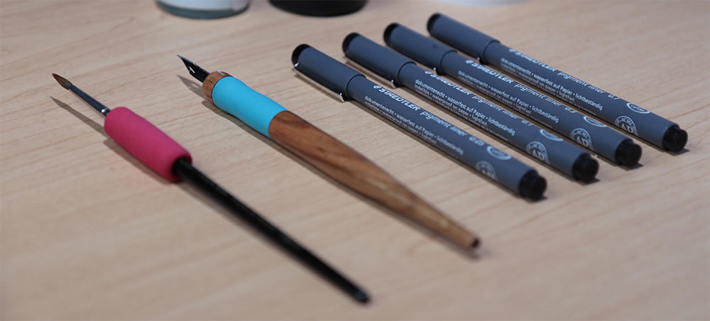
Obviously, any tool that transfers ink onto paper is a viable way to ink your comics, but there are three types of tools that (in my experience) American comic book creators use to ink their superhero comic work.
Firstly, you have a Brush. Most comic creators I talk to that use a brush will use a Kolinsky sable-hair brush, sized 1, 2 or 3. A Kolinsky is a type of weasel, whose hair is very fine and, when put into a brush, forms an incredibly fine tip. These brushes are able to create very thin lines as a result, but can also spread out to very thick lines, especially if you’re using a Size 2 or 3 brush.
Brushes have the widest range of all the tools we’re going to talk about today, and, although that can be very handy in an all-in-one tool, it can also be very difficult to control and create consistent line weights.
Second on the list, we have the Dip Pen. Most often, I see American comic creators using a G-Pen style of dip pen. The G-Pen consists of a nib holder and a replaceable metal nib that is dipped in ink. The nib is split at the end, so that when pressure is applied, that split widens and more ink goes onto the page. Because of the metal build, pressure won’t widen the stroke as much as a brush, but you can still get a good amount of size variance. And nibs that haven’t been used very much can get some very precise thin lines, as well.
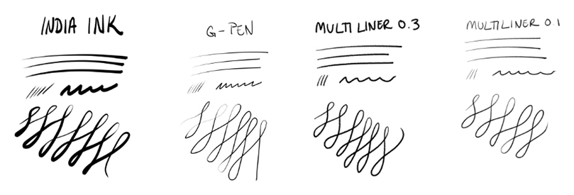
Lastly, a lot of comic creators will use Multiliner Pens for their superhero comics. These pens are based off the old cartridge-based metal multiliner pens, where a metal tip would be pushed into the pen opening, allowing ink to flow out at an even rate, theoretically creating even lines.
These pens are pretty famous for being finicky, though, so there is a wide variety of felt-tip multiliner pens that create fairly consistent lines without the risk of ink rushing out or splattering everywhere. These are set at certain sizes, like 0.1, 0.3, 0.5, etc., with each number relating to the millimeter size of the line it creates. While these pens do have a slight variance, it’s not nearly as much as a G-Pen or Brush.
These tools are all fantastic… until you want to hit the Undo button. Luckily, they all can be easily replicated in Clip Studio Paint!
About Clip Studio Paint
For this tutorial, I’m using Clip Studio Paint, a versatile software for illustration, comics, and animation. It comes with a range of digital art tools and brushes so you can start drawing with it right out of the box. There is also a version available on the iPad.
https://www.clipstudio.net/en/purchase/trial
Inking with a Brush
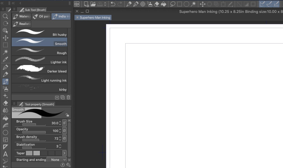
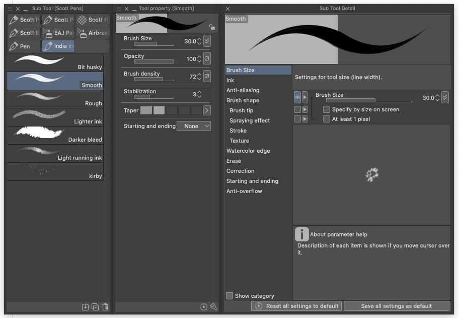
Right out of the box, Clip Studio Paint has a number of India Ink Brushes that work great for making superhero comics. Personally, I’m a big fan of the India Ink Smooth, because of its clean lines and subtle texture.
I would encourage you to see what the default settings of these tools behave like in a few drawings before digging in to customize them. Sometimes knowing what a tool behaves like helps you figure out what you really wish you could change about it.
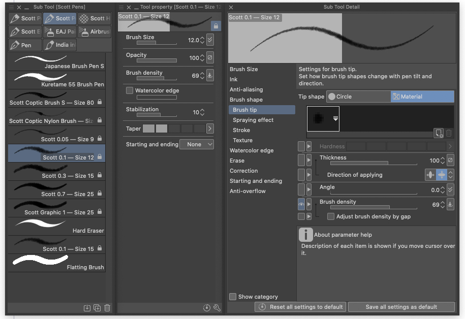
Once you’ve had some practice, though, feel free to hit the wrench icon on the Subtool Palette with the Tool you want to edit selected.
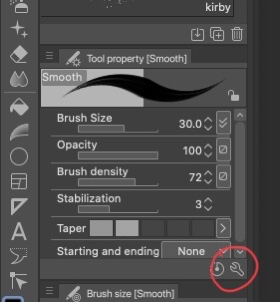
In the Subtool Detail panel you’ll find all sorts of ways to customize your brush, including the Brush Size Curve, Opacity, and some helpful line-correction settings like Starting and Ending.
Setting the Brush Curve like this could get you some nice fine lines at low pressure, but really expand out if you push hard! Play around with this and customize it to get a tool that works for you.
Inking with a G-Pen
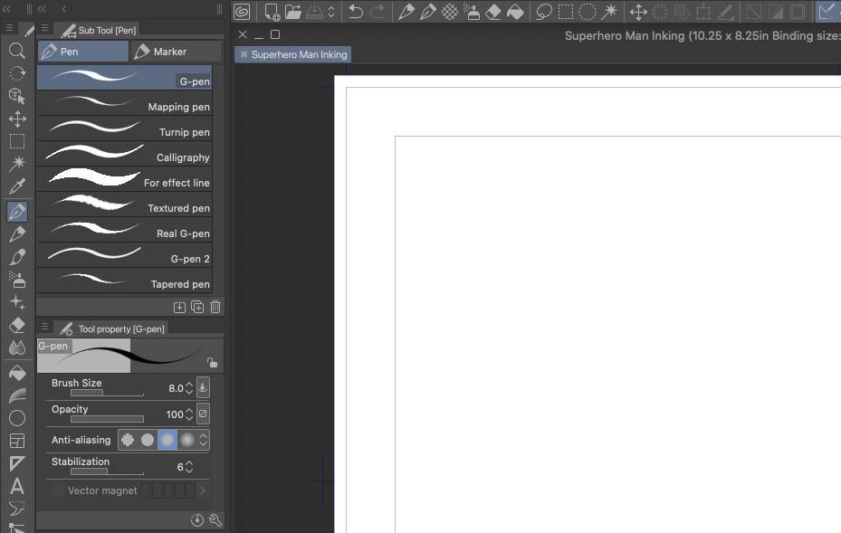
To get the look of a G-Pen, look no further than the built-in G-Pen in the Pen Subtool. This tool will give nice and thin lines if you apply light pressure, but will still expand out if you push down hard, although not as far as the Brush. But that’s what you want, since G-Pens behave that way in real life!
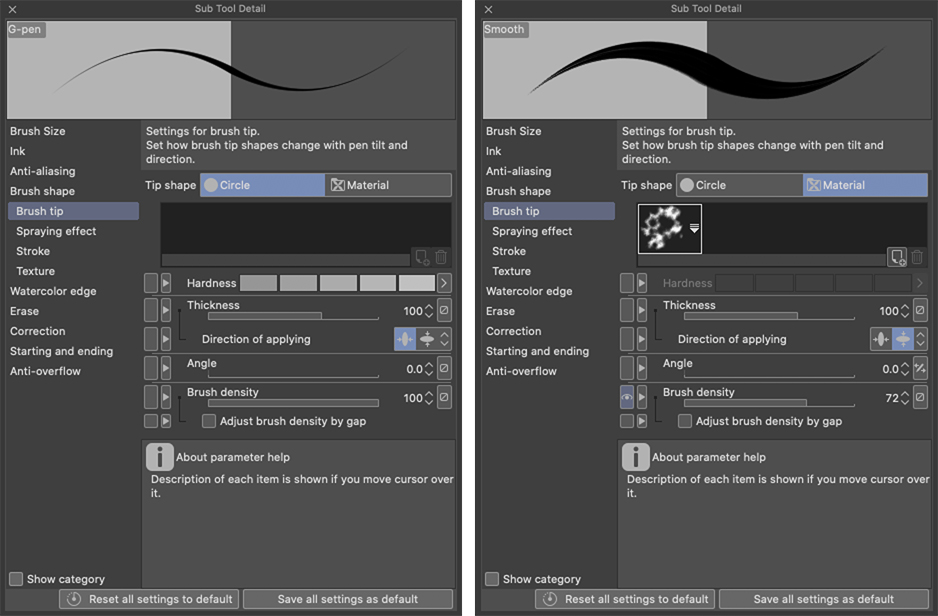
This particular tool uses a Circle Tip to create even smoother lines, as opposed to the Smooth India Ink Brush, that has a bit of texture to its tip. This makes for very crisp and precise lines, but can feel artificial if sized up too far.
So, when using this G-Pen, I’d recommend keeping it sized relatively low. The default is 5 pixels, which might be a bit small (more of a Maru nib than G nib), but I wouldn’t push it past 12 or 15 pixels on a 600 dpi canvas. In the demo below, I used an 8-pixel version, and it got a good amount of line variance.
Inking with a Multiliner
Lastly, let’s talk about Multiliners in Clip Studio Paint. These aren’t built-in by default, but I made my own, since I use these types of pens pretty often in real-life inking. You can download them on my Gumroad site here.
These are made to emulate the consistent width of real-life Multiliners. They have a texture for each tip that I scanned from the real-life tools and tried to size according to real marks that I made on a scrap piece of paper. So the 0.1 will have a much thinner line than the 0.3, but also note how the 0.3 won’t get quite as thin a line, even with light pressure, like the Brush or G-Pen.
That’s the main difference between the Multiliners and the Brush or G-Pen: with the Multiliners you choose the right size for the lines you want to make, as opposed to trying to use pressure to get consistent sizes with the Brush or G-Pen.
Neither is better than the other, though! It’s all about using the right tool for the right look. And when inking superhero comics in a classic American style, there are a few things that I always try to keep in mind.
Tips for Emulating an American Style
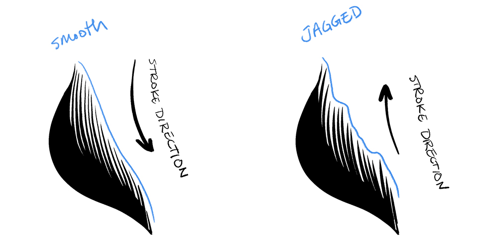
Tip #1: Keep your light source in mind at all times.
It’s easy to think inking should be just like penciling, where you just draw the shapes as they are. But really dynamic inking is set apart by making sure your line thickness relates to the amount of light that is hitting that side of your subject.
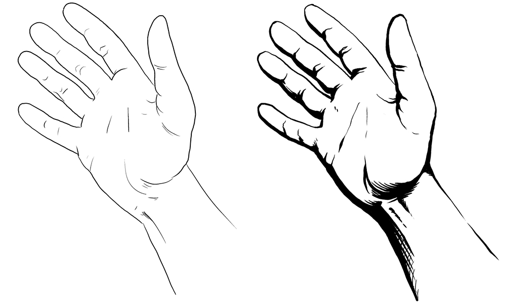
You can see in the above example, on the left the hand is inked evenly, so the viewer has no idea where the light might be coming from. The hand on the right, however, is inked while keeping the lighting in mind. You can tell by the thin lines facing the light and the thick lines facing away from it where the light source is coming from.
Tip #2: Push your Spotted Blacks
Similarly, when inking your superhero comics, try to push the amount of spotted black you have in your finished piece. Spotted blacks can be scary when starting out, because you think, “I spent all this time figuring out where things go, and you just want me to cover it up!?” But when used well, spotted black areas can create some really dynamic values to push your inking to the next level.
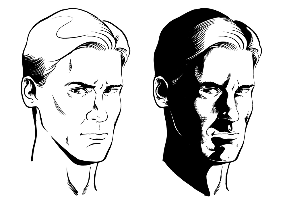
Spotted blacks really help show the value of objects at the inking stage, in a way that will enhance colors later on. If a character’s hair is dark brown, don’t outline the hair and then fill it in dark brown later! Your colors will end up too close to your inks and it will look incredibly muddy. Instead, use some spotted blacks in the hair to show the values (and the direction of the light), so when you get to the color stage, you can use lighter colors that will compliment your inks.
If you’re a bit hesitant to ruin your drawing, you can always put your spotted blacks on a different layer than your regular inks! That way, you can test out some different ideas while saving your initial drawing. Sometimes more spotted blacks are better, since the old inking adage is “when in doubt, black it out!”
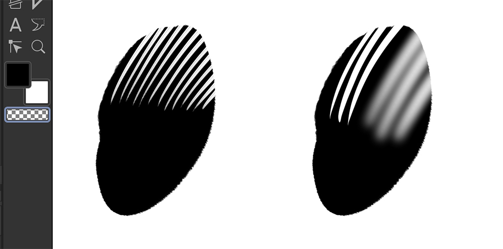
Tip #3: Pull your feathering into your spotted blacks, not out from them.
I got this tip from a pro inker at a New York comic convention, and it was like a light bulb flared on in my head!
Feathering is the process in inking where you have a bunch of lines that go thin to thick that, from a distance, end up looking like more of a tone than a full black or white area. This is used a lot to show gradation, since ink is really just either black or white.
When you’re doing this, start from the furthest part of the feathering and ink into the darkest part. A lot of times new inkers (myself included!) will start at the darkest part and flick the pen outward to get dynamic lines. While this may have a lot of energy, it makes it nearly impossible to have the ending points of those feathering lines consistent.
Instead, try starting at the thinnest point and working back into the spotted black area. This way, you can have a consistent fall-off for your lines and they will look much cleaner and more professional.
Tip #4: Keep Inking Brush Textures Consistent with the Transparent Swatch
The best part about working digitally is that Undo button, but sometimes you just want to carve out parts of your drawing without going back a ton of steps and doing a lot of rework. Sometimes switching to the eraser makes sense, but a lot of erasers don’t mimic the texture of your inking tools, so this doesn’t look nearly as clean.
To avoid this, I often use the Transparent Swatch with my inking tools. This way, it erases the black parts of my drawing, but the edges still feel like they were inked.
On the far left, you can see that I’ve selected the Transparent Swatch under the Foreground and Background Swatches, which are black and white.
In the dot on the left, I’ve cut back into it with the Smooth India Ink Brush, so those ink lines retain the texture of the brush. On the right, I’m using the Hard and Soft Erasers, which don’t have that texture and don’t quite fit, giving it a little bit of a mechanical look. See the difference?
Putting It All Together
What kind of article would this be without a demo?
Let’s put my brush where my mouth is (hopefully without getting ink everywhere) and see what these tools can do on the same pencil drawing. If you’d like to see timelapses of these, check out the accompanying video on YouTube.
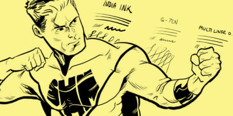
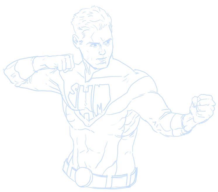
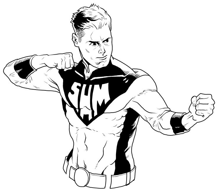
So, here’s Super Hero Man, just your classic superhero guy in tights, ready to be inked up. I’ve drawn him on a 10.25” x 8.25” canvas with a 10” x 8” Binding Size at 600 DPI.
For the Pencils, I used a Grey Layer, and my Perfect Pencil. I then set the Pencil Layer to Blue using the Layer Properties Panel and decreased the Opacity to 30% so I could see my inks a little better.
Here’s the first inking example! This one with the India Ink Smooth Brush. As you can see, this brush has a ton of line weight variance, which works great in some areas, but can be harder to control in tighter detail areas. This brush really sings in the broad strokes, and gets nice variance on the side facing the light.
Speaking of which, you can tell that I’ve tried to establish a light source at the top right of the drawing, since the lines on the right of his face and arm are much thinner than the lines on the left of his face and under his arms.
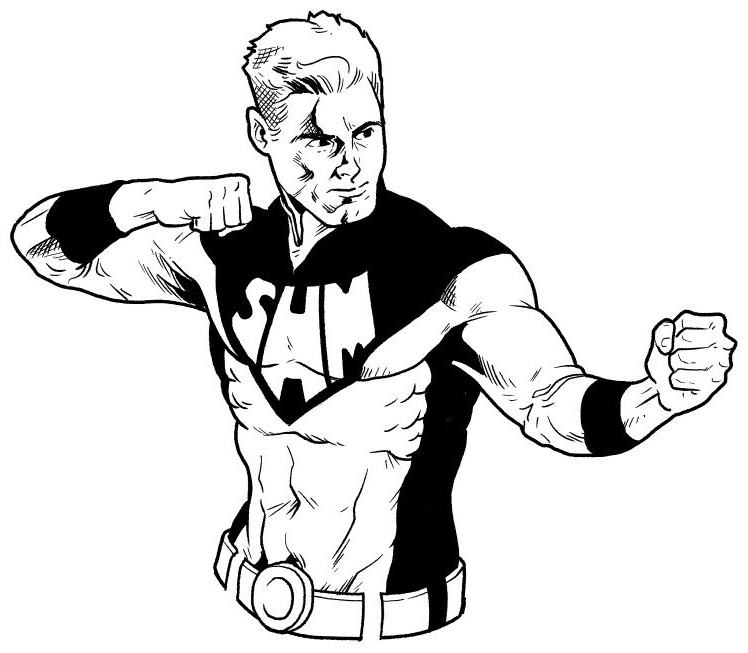
The G-Pen, on the other hand, has some really nice crisp lines. The feathering here is much smaller and tighter than the brush. Notice also, how I’ve spotted the blacks on the left side of his hair, so you can tell that it’s dark. I’ve also left a space at the far left side of that hair open for some nice rim lighting.
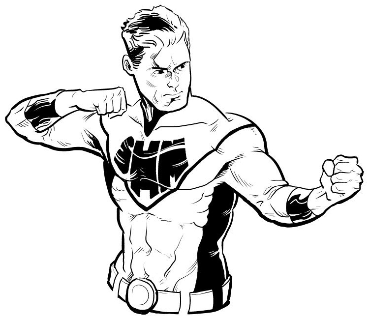
With the multiliners, I tried to use a few different tools to get the results I was looking for. I did an outline around the entire character first, in the 0.3, then switched to the 0.1 pen to do some detailing work. I tried to focus on hatching in this one, really getting some deeper shadows in his armpits and on one side of his face.
I also completely blacked out the black parts of his costume for a more iconic look, as opposed to rendering the light reflecting off of it.
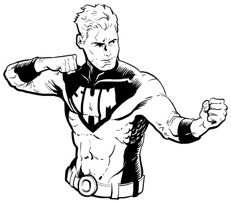
And finally, these tools are really just that: tools! You can absolutely mix and match them, like I did in this last version. I liked how the India Ink Smooth Brush was able to get nice sweeping lines, so I use it for the outlines of his body. The G-Pen was able to get me some great details, so I used that for a lot of his face and muscle rendering. Then I used the Multiliners for different parts of his costume, so that would have a little more manufactured feel, since the lines were more even.
Each tool has a different feel, creating a different look in your final drawing, which is really interesting! How you use them is up to you!
If you want a deeper dive on this, be sure to check out the video I’ve made to go along with this article, with some tips and timelapses of the inking demos.
Now, get out there and make some great comics!
About Scott Drummond
Scott Drummond is an American comic artist and illustrator. He is the creator of the superhero webcomic NIGHTSMOKE and has worked on projects for Marvel, Image Comics, Fantasy Flight Games, and Atomic Mass Games.
https://twitter.com/scottdrummond
https://scottdrummondart.com/