Digital Coloring Book for Beginners – Digital Coloring Explained
Graphic designer JudithzzYuko explains how to create a simple coloring book with digital painting tools. With downloadable cupcake lineart, learn how to color using layers and brushes with fab color schemes and shading to make your artwork delicious!
How to color
Let’s Practice!
Final thoughts
How to color
1. Introduction
Recently, coloring books for adults have become very popular – they are a nice way to relax and take a load off your mind. No previous knowledge is required to color them at all – all you need is to time and the mood for coloring. Even professional artists have moments of creative block, and this type of exercise can help get the creative juices flowing again. So, whether you are a professional illustrator, or you haven’t used a color pencil in years, this is a good exercise to have some fun.
So, go grab your tablet, open Clip Studio Paint, and get ready to color and have a good time!
2. Styles
When it comes to coloring, there no single way to do it. I will explain three main approaches:
If you’re looking for simplicity, you may simply use flat colors (1). That means no shadows and no highlights. Just add the color on the object using your favorite color palette.
If you want to do something more elaborate, you may want to use shadows and highlights. In this case, here are two main approaches:
Cel shading (2) or toon shading consists of applying flat shades. It creates depth, but the style is that of a cartoon or traditional animation.
Soft shading (3): gradual shading that you can create with a shade gradient. In this case, the contours of the shades are much softer, and your rendering becomes more photorealistic.
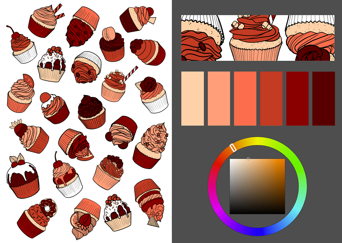
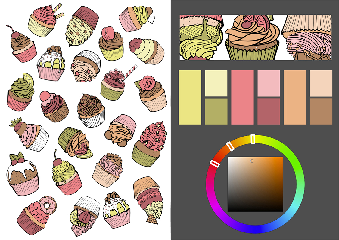
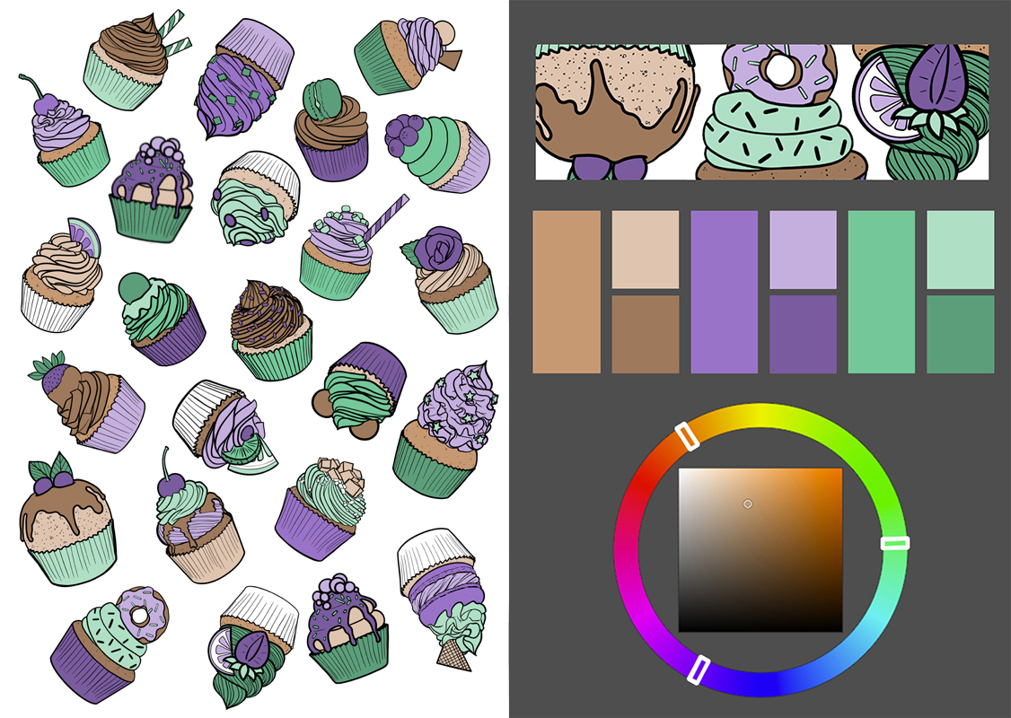
3. Color Schemes
There are many options when choosing a color scheme.
You can simply color to mimic real objects, even if they do not have any kind of chromatic harmony, or you can use a color scheme that is much more pleasing to the eye!
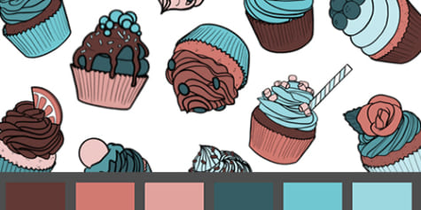
Using a monochromatic color scheme, you get a single base hue and all its variations. By editing the saturation and the luminosity, you get many other shades. Remember not to change the hue or the color too much.
If you use an analogous color scheme, you’ll get a wider variety of colors, and you can still use variations in their saturation and lightness. This scheme allows you to use a color and its adjacent ones in the color wheel. In terms of tone variation, this is a subtler color scheme.
To achieve a bigger contrast, you could use a complementary color scheme, which consists of two colors that are on the opposite sides of the color wheel. You can still use all their variations, but don’t overdo it. Try to limit yourself to a couple of variations per color.
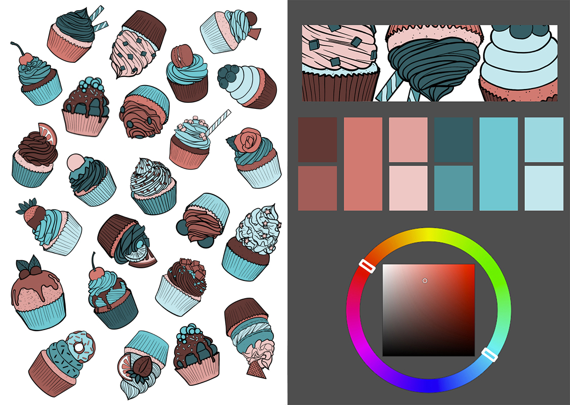
You can also use a triad or one of its variations to obtain a wider range of colors. The triadic color scheme consists of three colors equally spaced around the color wheel.
Once you have chosen the right color scheme for you, it is time to move on to the coloring technique.
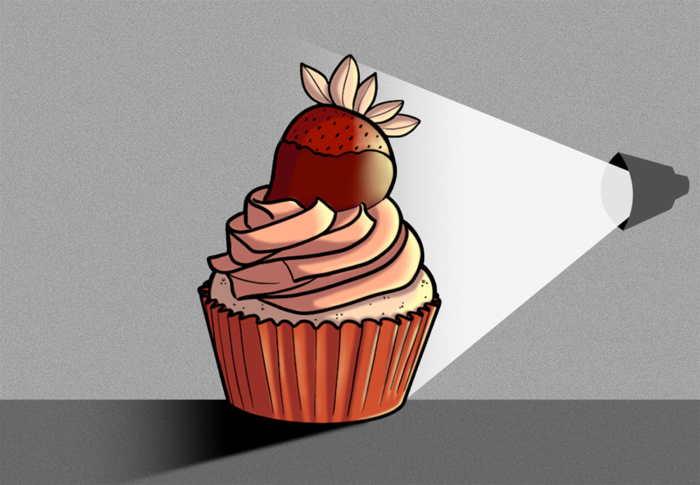
4. Lowlights
If you are not sure where to place the shadows, pick a light source for the illustration first. Then, add the shades on the opposite side.
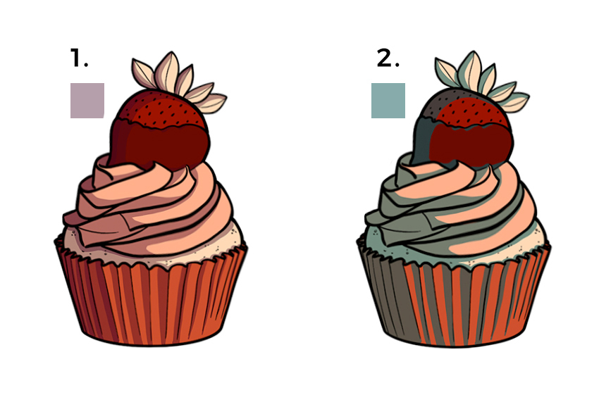
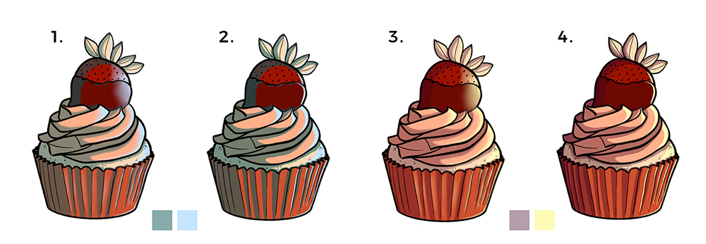
How do I choose the color of the shadows?
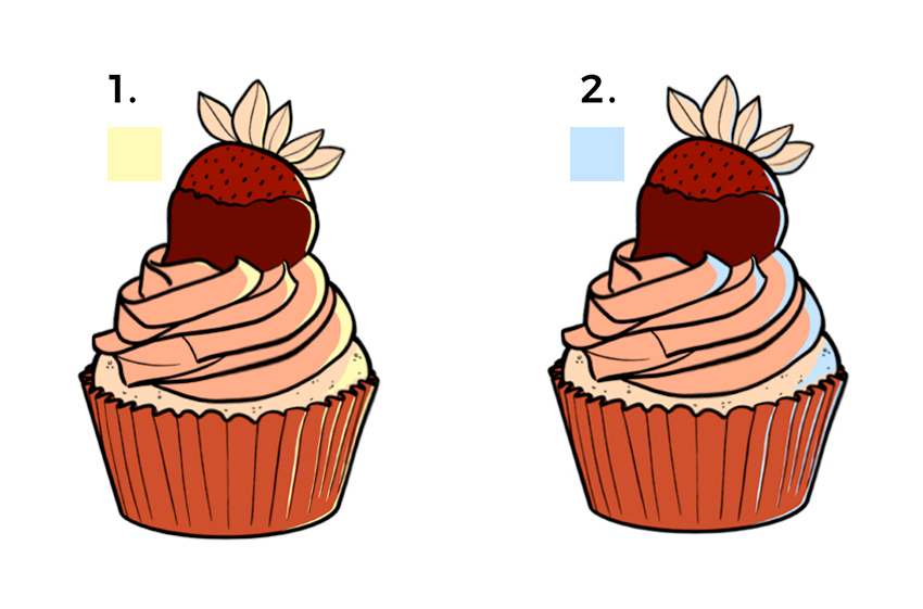
If you’re using an analogous color scheme (1) (as previously explained, colors which are adjacent to the base color), or a complementary color scheme (2) (colors on opposite sides of the color wheel), see the examples below.
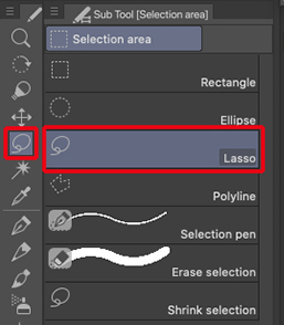
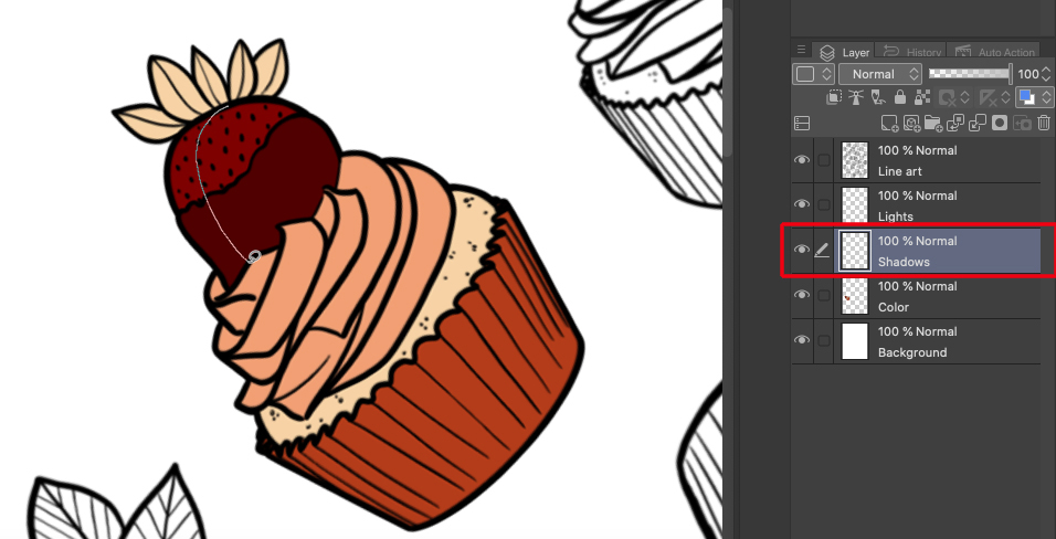
A quick technique to add shadows: Use the Selection area > Lasso tool to create a selection on the opposite side of the light source. Pay attention to the shapes of the different objects.
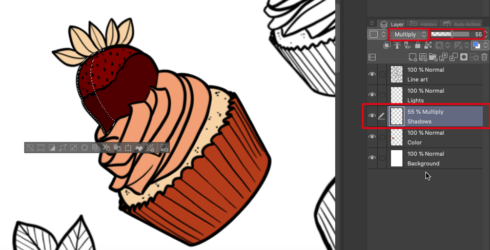
Once selected (making sure you have your previously chosen color selected too) press Alt + Delete on the layer you want to color the shades. This shortcut will automatically fill the selected area. Instead of using this keyboard shortcut you can simply use the Fill tool > Fill from the menu, as shown below:

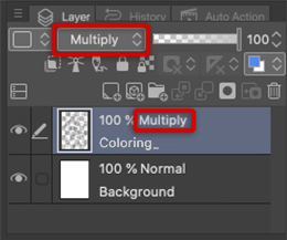
Set the layer mode to Multiply and lower the opacity if it is too dark.
If you prefer a softer shading, try using the Gaussian blur filter or the Blend tool to blur the edges of the shadow. It all depends on the style you’re going for.
5. Highlights
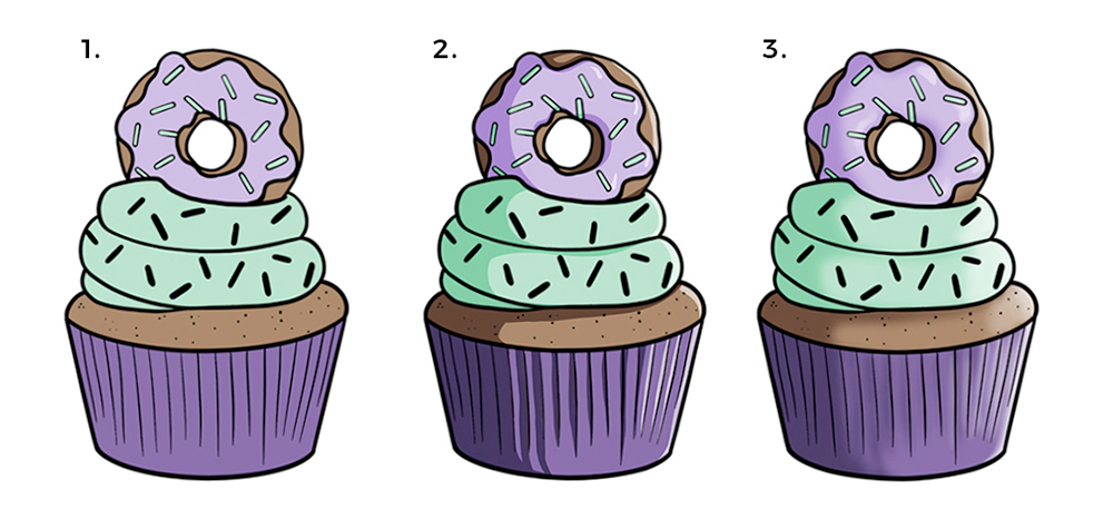
To add highlights, follow the same process as you did with the shadows. In this case, you can choose either a warm (1) or cold (2) hue and, in a new layer, start adding the highlights on the side of the previously decided light source.
In either light or shadow, you may add more levels to increase the light or the shading. It works for both cel shading (1) or soft shading (2). If you chose soft shading, it is not really necessary to add more layers, since you can simply increase the strength with your brush.
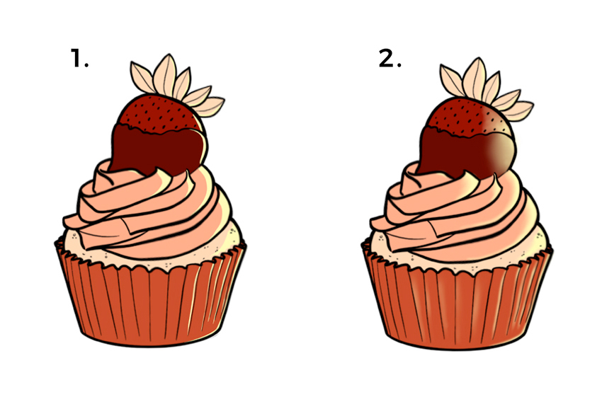
In order to get a flat highlight or shading, the best tools are either a hard brush or by filling a selection. On the other hand, if you want to go for a soft shadow or soft light, it’s better to use a soft brush or, alternatively, select the area as you did with flat/cel shading. Once the shading is done, apply Gaussian blur to the layer. This will blur and blend the edges, resulting in a more subtle effect.
Once you have your highlights and shadows, you’ll get something like this. 1 and 3 are the result of soft shading; and 2 and 4 are cel shading. You can see the effect with complementary colors (1, 2) and analogous colors (3, 4).
Let’s practice!
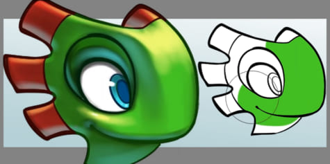
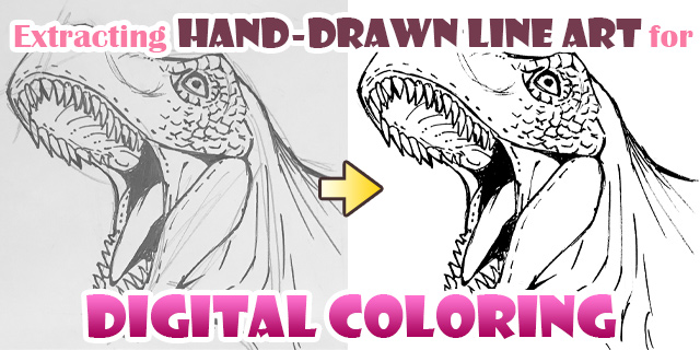
6. Lineart

For this exercise, I have provided this PNG image with a blank background. These types of images are perfect for practicing coloring, since you can see the layers below the lineart.
To save the image to your device, simply drag it to a folder or press Ctrl + Click on the image or right-click, then select “Save image as” and choose a folder. At this point, you can also change the name of the file.
7. Opening the image with your graphics software
This time, I will use the painting software Clip Studio Paint, but everything explained here can be done with other software, including Photoshop, etc.
To open the picture, you can drag it to the software icon.
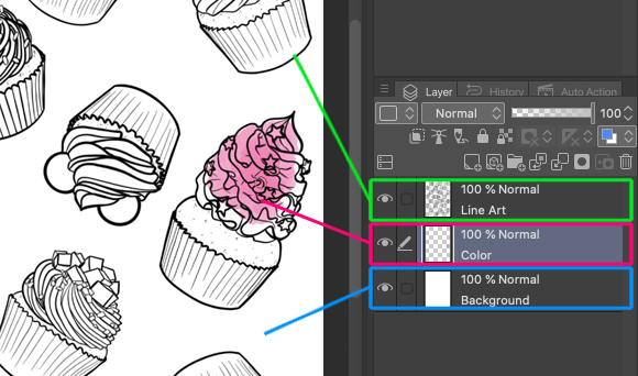
Once the file is open in your software, create a white layer (white background) to make coloring easier.

Although it is not totally necessary to create this layer, it is recommended.
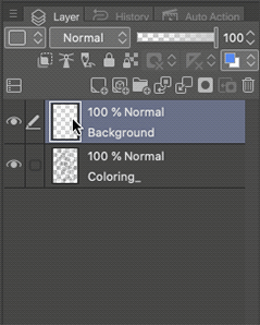
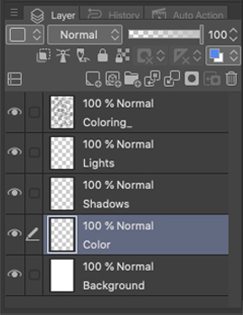
To create a new layer, just click on the icon [New Raster layer] (see below). A new layer will be created above the current one. To avoid confusion later, you’ll want to rename the layer. Double click on the Layer name to rename.
Next, move the newly created layer below the layer containing the lineart. Just click on the layer you want to move and drag & drop it below the lineart layer.
To fill this new layer, first choose a color, then select the paint bucket icon [Fill], making sure that you have the correct layer selected. This will fill the entire layer in the selected color. A shortcut for this action is Alt+Del, which is the action in the [Edit] menu > [Fill] function.
To keep the line art visible, make sure your lineart layer is always on top of the others, and set the blending mode to Multiply. This will ensure both the lower layers and lines will be clear to us.
8. Step-by-step coloring
Once you’ve made your choice and have decided on your color palette, create a new layer above the white background one. Use this new layer for your base colors. To make it easier, put all your base colors in the same layer. Then, create a new layer for the shadows and another one for the highlights. Now, let’s start coloring.
One of the many ways to do this, it is to use the brush tool and start applying color on the layer above the background layer.
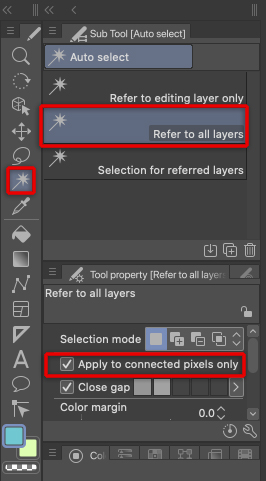
If you want to use the [Fill] too, remember to have the [Refer to other layers] option ON, so you don’t accidentally fill the entire layer.
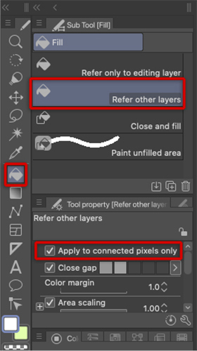
You can also use the [Auto select] tool, set [Refer to all layers] ON, select a color and fill in using Alt+Del (or using the [Fill] tool). This will fill the selection area with color.
Changing the line colors
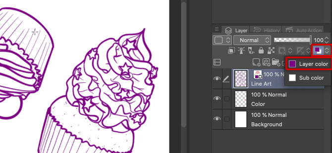
Once you have your colors, how about changing the color of the line art?
To change all the lines to one color, go to the Layer palette, and select Layer color. This will open the Color settings tab, where you can select any color.
Alternatively, if you want to use multiple colors for the lines, you need to lock transparent pixels first. Simply set Lock transparent pixels icon ON and apply your colors.
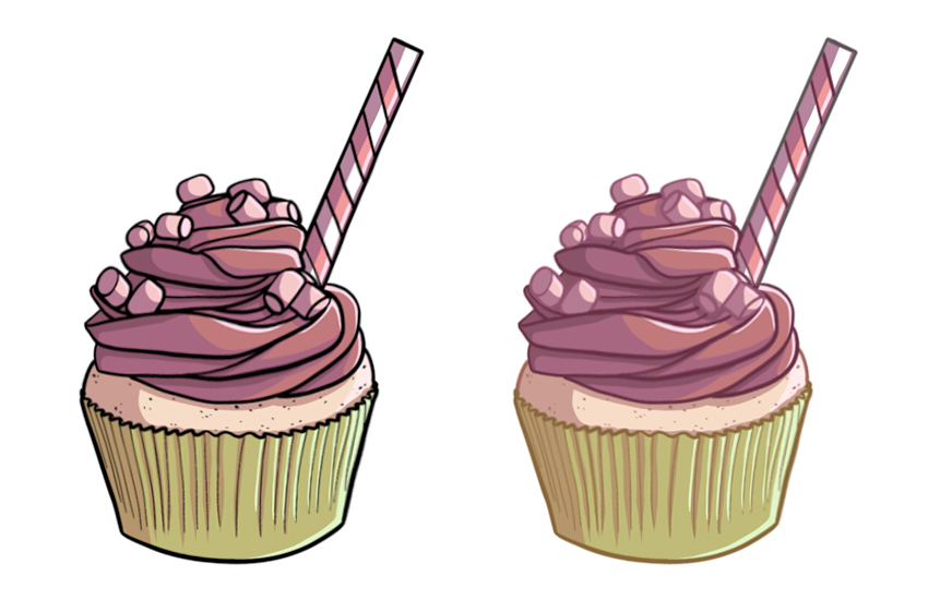
If you want to try different color combinations, how about this?
When you’re done coloring, merge all layers (Layer > Merge layers) and click Ctrl+U ([Cmd+U] for Mac). This will open the Tone/Saturation/Luminosity dialog box. All colors will change at the same time, thus keeping their harmony (meaning, they will still be complementary colors).
Final thoughts
9. Putting your artwork to use
What to do once you have a finished piece of art?
Keeping in mind the size of your phone’s screen, you could use your illustration to create a mosaic or wallpaper for your phone.
How about printing it as a notebook or sketchbook cover? You can print it and then keep adding details with real-life tools like markers or color pencils. Or you can just print the black and white drawing and try out different traditional media on it.
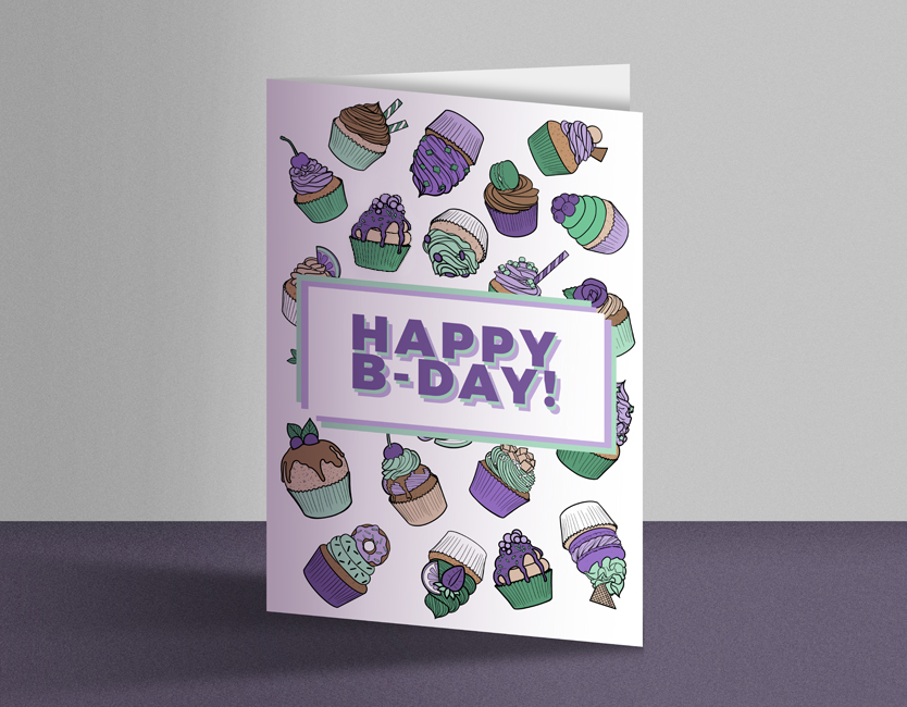
Why not turn it into a birthday card? Just add some text and print the image on one half of a sheet of high-quality paper.
You can even make a matching envelope, with your illustration all over it.
Also, if you want your own personal wrapping paper, you can print your illustration and use the paper to wrap your presents.
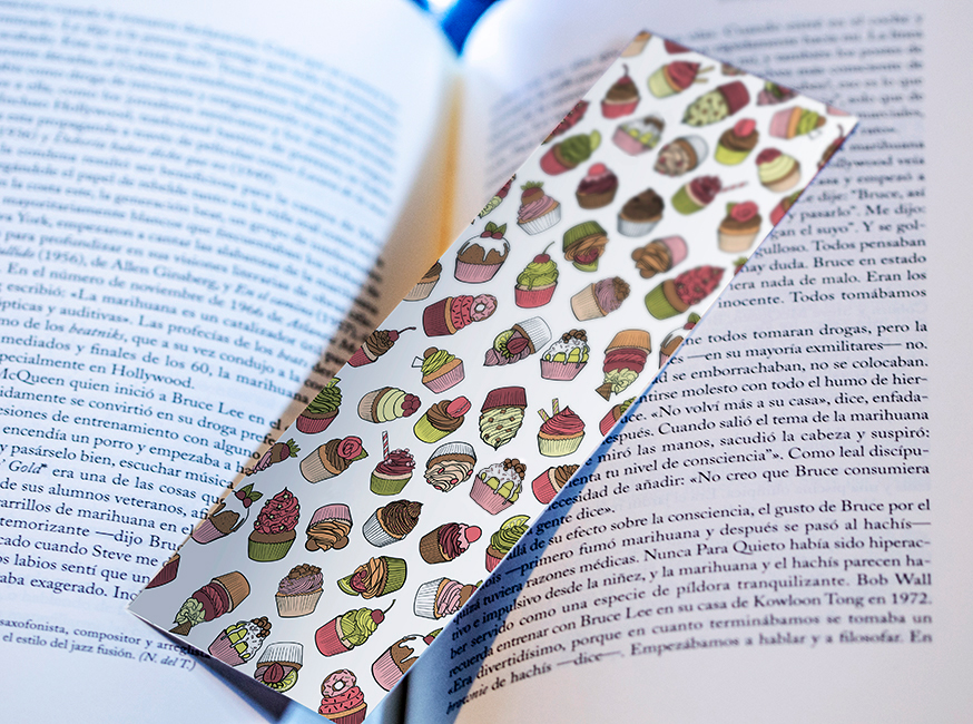
Or, even easier – print the image on cardboard or hard paper and you’ll be able to make a bookmark for yourself or to give to friends.
JudithzzYuko was born in Barcelona and works as a graphic designer and illustrator. In the world of design, typographic compositions and vectors are her favourite themes, whereas when illustrating, she prefers a more realistic approach. Don’t miss her nail art designs!
Web: https://judithzzyuko.wixsite.com/judithzzyuko
Instagram: https://www.instagram.com/judithzzyuko/