Tips for Digital Coloring and Shading
Join artist David Cumbo to learn some useful tips and techniques when painting color flats and light effects! In this tutorial and webinar, he demonstrates coloring tips, including the anti-overflow and area scaling features for coloring line art with digital drawing software.
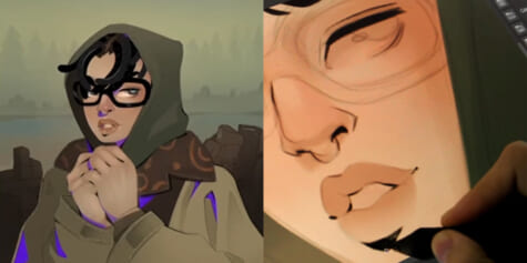
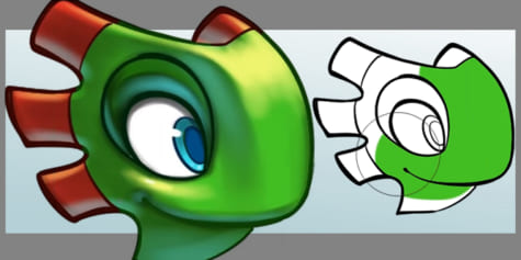
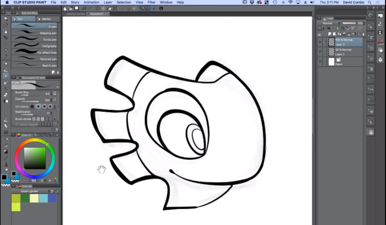
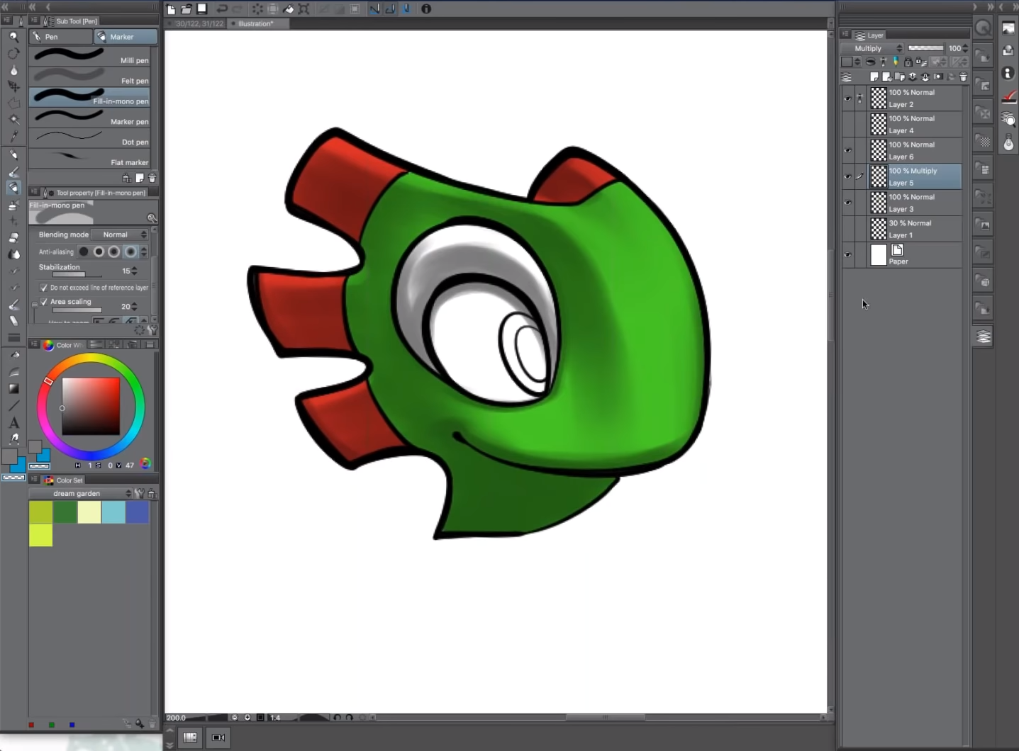
For this tutorial, I’m going to demonstrate how to use Clip Studio Paint’s Anti-overflow and Area Scaling functions. To do this, I will use the linework below of the character Yooka from my full-color graphic novel Yooka-Laylee and the Kracklestone based on the video game Yooka-Laylee.
1. Coloring Flats
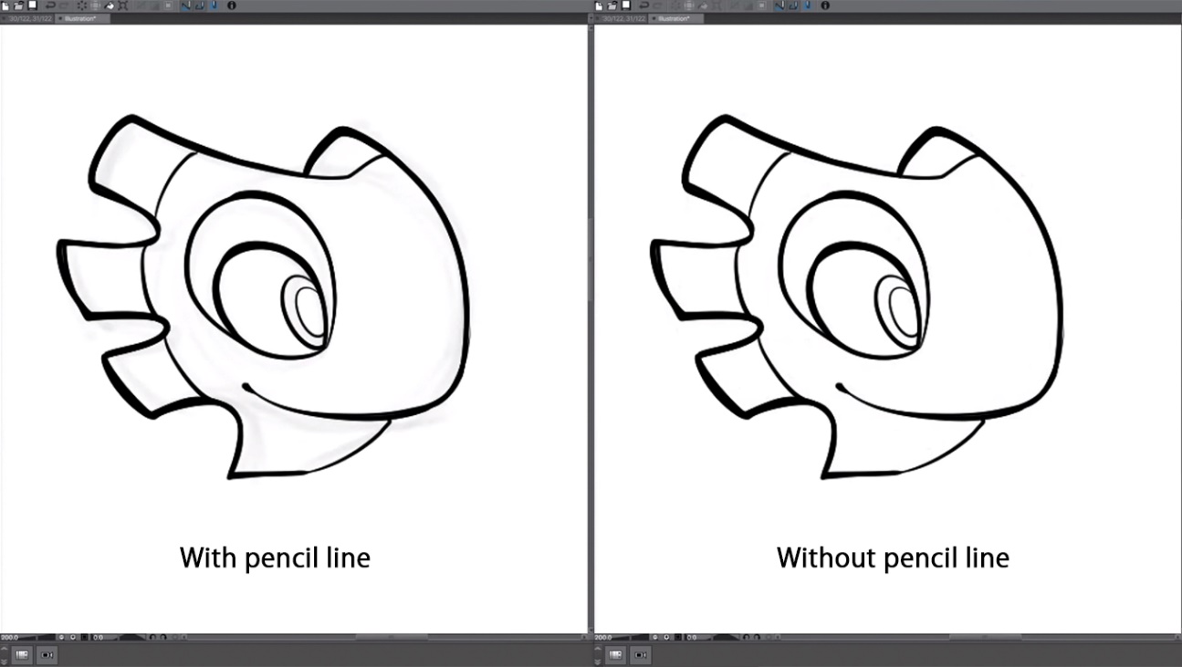
I’ll start by cleaning up the canvas and getting rid of the pencil lines on the layer underneath the linework. Then, I’ll make a new layer over top of the linework layer for coloring.
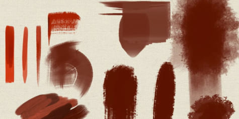
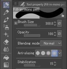
Next, I switch over to Marker located under the Pen sub tool palette and select the Fill-in mono pen tool option as shown in the image below. Personally, I keep this pen anti-aliased when I draw. I don’t worry about aliasing because I create full-color comics, so it’s not terribly important for me.
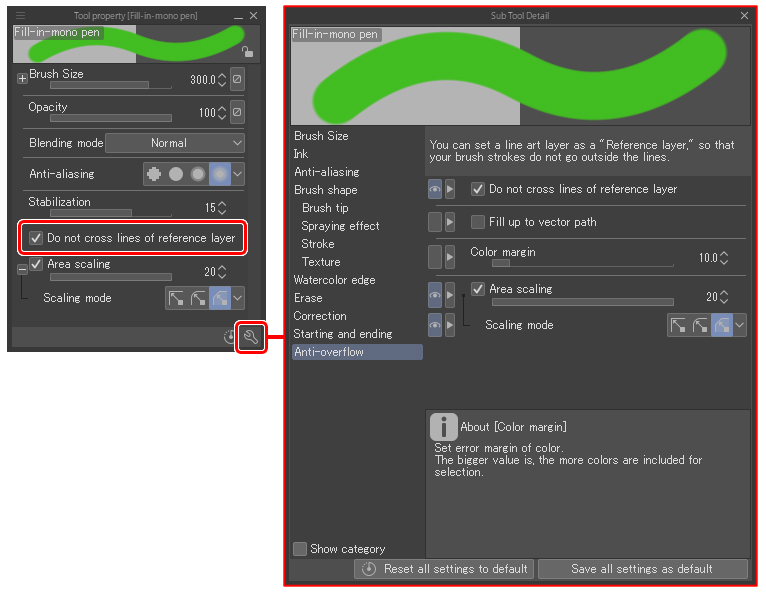
Next, with my colors roughly selected for my line art of Yooka, I will go over how to take advantage of Clip Studio Paint’s anti-overflow feature. First, we will need to scroll further down the tool’s property palette of the Fill-in-mono pen tool located on the left side of the screen and select the “Do not exceed line of reference layer” option located just under “Stabilization.” Checking the box next to it turns it on. Additionally, clicking the small wrench icon in the bottom right corner of the tool’s property palette will open the Sub tool detail window. In this window, we can find the same “Do not exceed line of reference layer” option under “Anti-overflow” which is located at the bottom of the left side of the list.
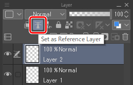
Once I have confirmed that it’s turned on, I’m going to select the linework layer from the layer palette. With it selected, I will then click the lighthouse icon on the upper part of the layer palette. This is the “Set as reference layer” icon. When I click this icon, the selected linework layer becomes a reference layer that the color layer will refer to as I block in the color.
Next, I will use the marker tool to color in the head. We can see that the color will now not exceed the linework even if my cursor paints past it.
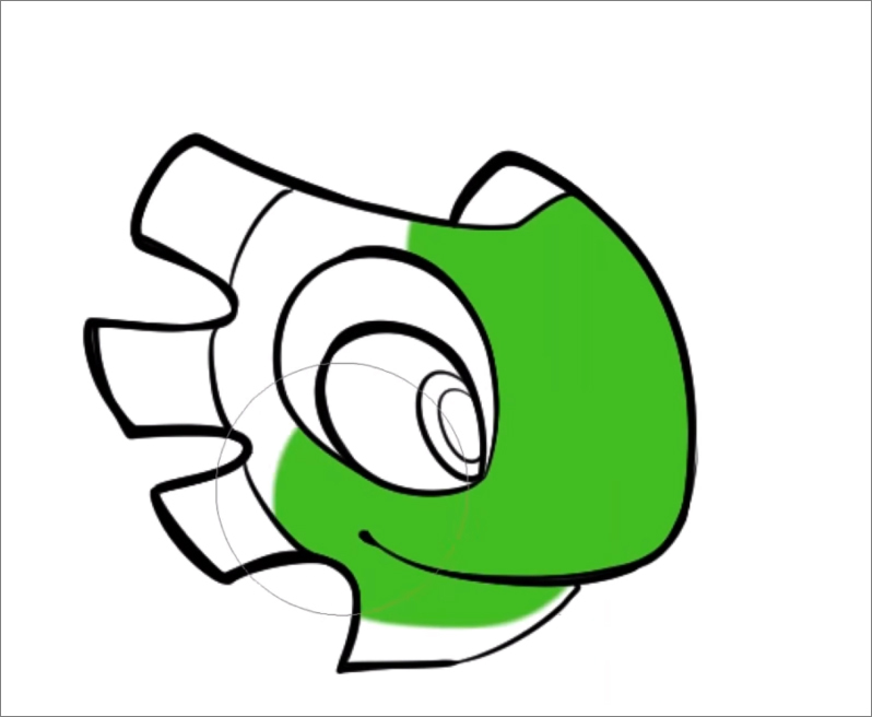
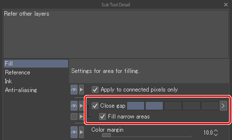
We could use the paint bucket tool here as well to fill in the color, but I use the marker instead. Sometimes line work will have gaps that are a little bit bigger than the paint bucket tool’s Close gap feature can accommodate. As a result, I don’t rely on it too much because often when I work with line art, I only want to color a portion of it and not a whole enclosed area. For example, maybe I only want to color half of his head green and then use a different color on the other side. Using the marker allows more control and flexibility to color the same area with multiple colors as I go, while still limiting the color to within the line art.
*The Close gap feature is located in the Paint bucket sub tool detail palette under Fill.
With Yooka’s face color complete, let’s move onto his crest color. I color them using the same method as before. You can see in the images below that there is a little bit of white coming through at the corners of the line work here and there. In this case, we can just switch over to the Pen tool and color those areas in.
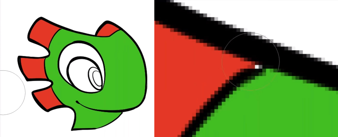
Another feature I would like to cover is the Area scaling feature, which can be found in the sub tool settings. When using this feature, you can scale up the area you are coloring so that you are also coloring underneath the line art.
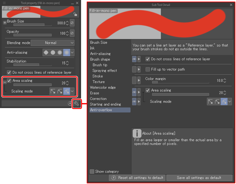
Here, I have the Area scaling set all the way up to 20. If I hide the line art layer, I can see that the color is indeed going all the way up beyond, but within, the boundaries of the line itself. In the image below, I have lowered the opacity of the line work. The grayed-out area shows the edges of the line, so you can see how far the green goes under it.

Next, I want to show you what happens when we don’t use that feature. I will make a new layer and fill in the crests again.
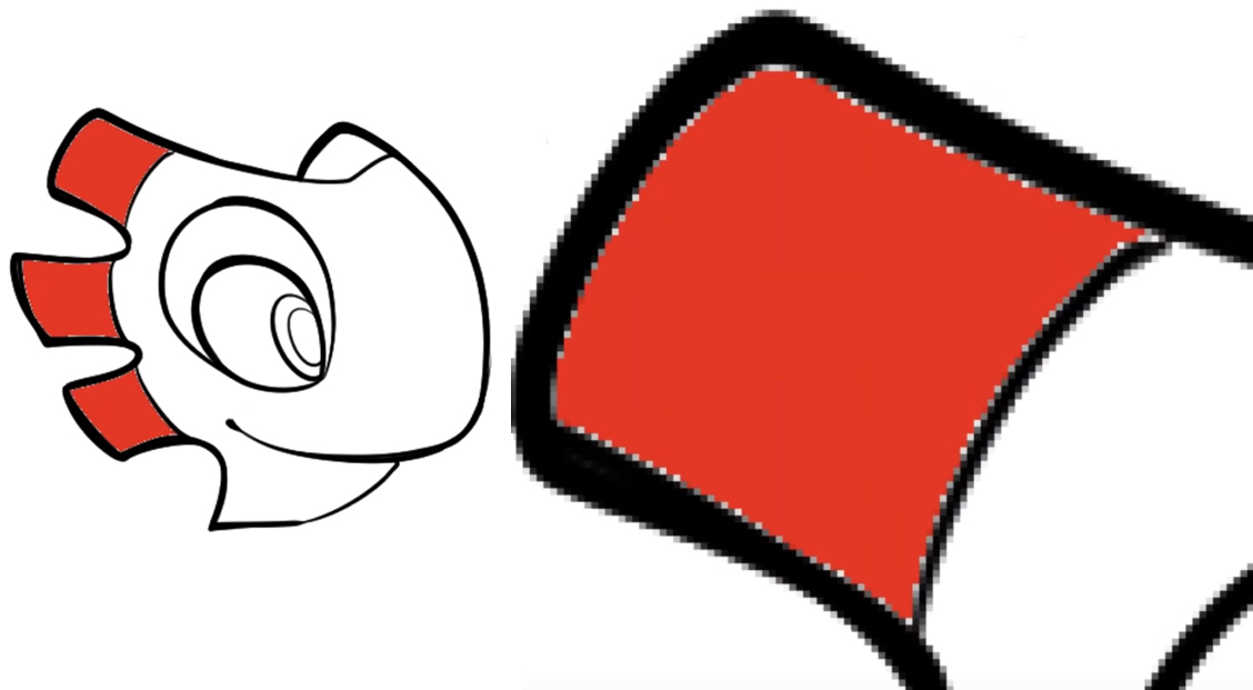
Do you notice in the image above, there is a white ghosting edge around the line work? This is a really big problem for printing. Sometimes the plates get a little offset, so using Area scaling takes care of that potential printing issue.
After adding the flat colors, I move on to shading. A technique I find especially helpful is to adjust the maximum size of the brush itself while you paint. For example, when shading around the eyes, I’ll shrink the size down of the brush to fit in the hard to reach areas.
Note: The default brush size adjustment shortcuts are the left and right brackets (“[” and “]”.)
2. Bounced Light
Next, I’ll show how I do bounced light. Let’s imagine that this is a sunny scene, maybe he’s standing over a pool of water that’s reflecting a bright blue light back up to him. Creating a new layer above the shading layer (“Layer 6” below) with the Blending mode set to Screen and changing the color to aquamarine, I start painting the underside of the character.
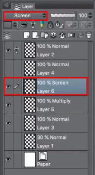
Because the layer is set to Screen and is placed over the shade layer set to Multiply, the brush color is added to the shading. While painting, I think about light that’s shining upwards. This is basically what bounced light is. You can see this easily as well: if you were to enter a very brightly lit room or a sunny day and hold your hand over something, you’d see some light reflected from the ground on your palm. I like to exaggerate bounced light a little, to get as much as an effect as I can while also creating a very realistic environmental illumination.
3. Ambient Occlusion
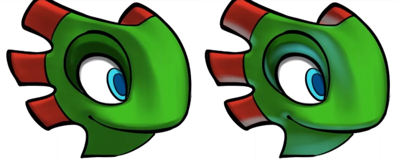
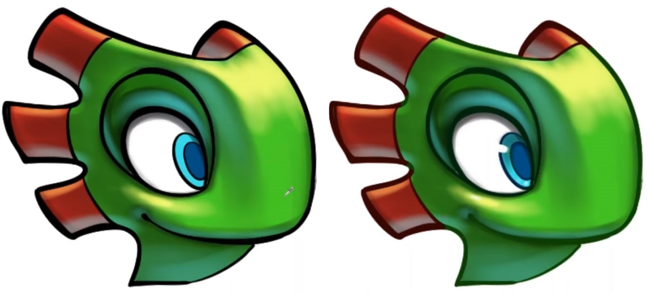
Ambient occlusion is a CG term and normally doesn’t apply to traditional art. However, it is applicable when working in 3D space, and is an extremely cool effect if done right. The idea of ambient occlusion is that there’s a deeper shadow where objects are close together. Imagine the corner of a room; the corner of the room will be darker compared to the rest of the room, as if light can’t really get into the crevice as tightly as it could otherwise. Often, I’ll do this on a multiply layer, adding in shadows that go over the line art to intersections, which add just a little more realism to the piece. Even if it’s using cartoony shapes, it’s good to increase the realism because you won’t have to limit yourself to the flat effects that you get with traditional comic shading. Just by adding ambient occlusion, you can add hints of realism to the coloring.
Above: You can see additional shading, or ambient occlusion, in the right image around the corners of the eyes, the mouth, and along the eye socket.
Creating a screen layer, I’ll paint the highlights with a harder brush with low density. Painting the reverse of a bounce light; that is, painting highlights where sunlight will hit, I adjust the size of the brush to create hard, sharper lines.
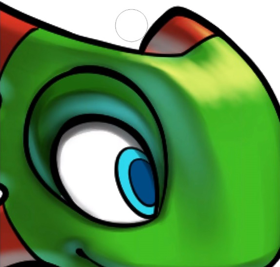
With these lines we can indicate texture, as the texture of the eyeball should be different from his skin. Similarly, we can add harsh highlights to the skin below his eye to make it shinier, indicating perspiration.
Finally, I’ll add color to the lines. If you look in the layer palette, you’ll see an option called Lock transparent pixels. If I click on that option, any painting applied to the layer will be limited to the line itself.
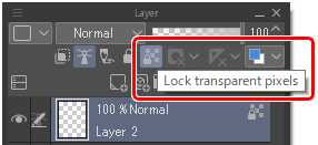
First, I’ll select a color that’s like the main fill color. I’ll than darken that color and go over the whole layer with a large pen brush to apply the color evenly and create a base color. After that, I’ll go into individual sections and color the lines to match the surrounding area. For example, the red of the crest and blue of the eyes would be used as a base to color the surrounding lines.
That’s pretty much how it’s done!
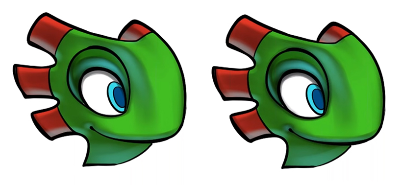
You can apply the same technique to the background as well: putting flats in, adding shadows and ambient occlusion, and adding highlights.
Watch David’s webinar for the full live drawing!
ABOUT THE ARTIST
David (D.M.) Cumbo is a professional artist and illustrator with experience in the animation and video game industries. He’s worked with companies like Fisher-Price, Insomniac Games, and WayForward Technologies. David’s first graphic novel based on the characters of the game Yooka-Laylee, “Yooka-Laylee and the Kracklestone” was successfully funded on Kickstarter by more than 1,000 backers.
Dream Prism Press: https://www.dreamprismpress.com/
instagram: https://www.instagram.com/dreamprismpress
Facebook: https://www.facebook.com/dreamprismpress/
Twitter: https://twitter.com/dmcumbo