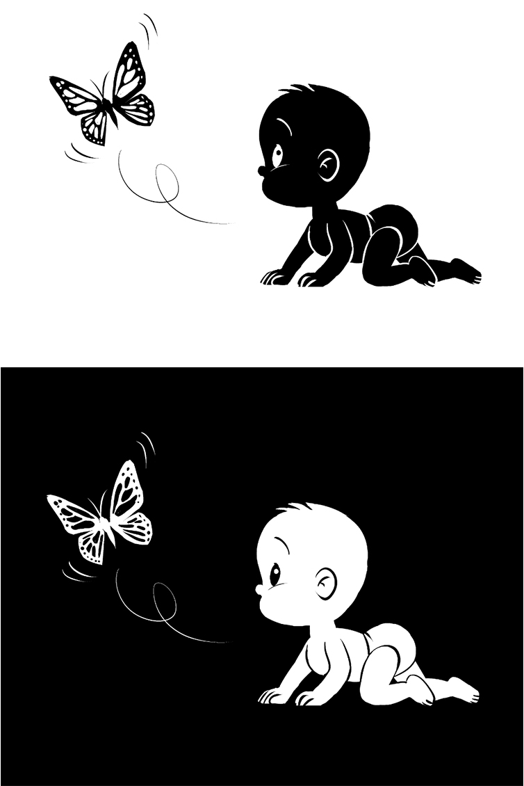
The importance of the Silhouette when drawing in black-and-white
Illustrator Julio Robledo explains how to draw, using only black-and-white, using the concept of negative space. Learn how to carve out shadows in monochromatic illustrations using a reference photo as a guide, too.
Are you tired of drawing lines? I’ll let you in on a secret – there is a faster way to paint than starting with line art.
Faster, more effective, more imaginative, more creative, more powerful. Today, I’ll to teach you to paint using only two colors, black and white, in a way that intertwines the two colors, like yin and yang.
If you are a beginner, pay attention. Forget everything you’ve learned so far. Take the stylus from the tablet and forget about using it as a stylus, but as something to block paint with. A brush loaded with ink.
It is an old trick all old painters know – block in shapes to define the volume of the objects in your piece.
The quickest way to define a character is by its silhouette; it’s a technique that also applies to the backgrounds.
So, don’t waste your time sketching – block it all in!
We’ll be finding our silhouettes by painting everything in black. Or white, if you want to paint over a black background.
CONTENTS
- Preparing the canvas using the Monochrome Basic expression color
- Choosing a pen sub-tool and setting up X & C shortcuts
- Blocking in negative shapes using white or black to define the object’s volume
- Working on negative space using a reference photo
- Silhouette of a tree
- Recap
1. Preparing the canvas using the Monochrome Basic expression color
The Clip Studio Paint app offers a quick way to do this:
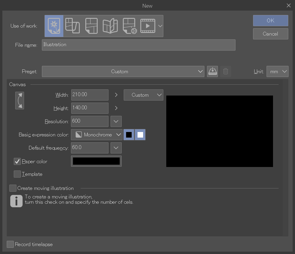
Let’s create a new canvas. Go to File > New and select Monochrome as the Basic expression color. Check both options; black and white.
(In the Layer Properties palette, once the file is created, both the black and white will be activated, which you can tell because they will both be highlighted in blue). With these settings, you will only be able to paint in black or white.
Choose a resolution of 600 dpi, which commonly used for printing manga or comics in black and white.
2. Choosing a pen sub-tool and setting up X & C shortcuts
Once the canvas appears you can go ahead and choose your favorite drawing tool.
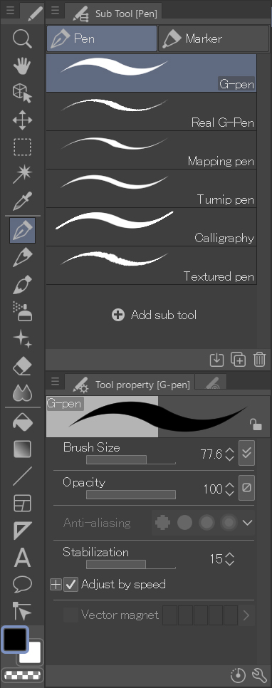
I use the G-pen to draw outlines. Here are some shortcut settings that you may find useful:
“X” toggles the drawing color and the sub color. (In this case, black or white).
“C” toggles the eraser.
Use black and white together. As if you had a brush with black ink or a black marker in one hand. And a white correction fluid, a white marker, or white gouache, in the other.
The best thing about doing it digitally like this is that you don’t have to wait for the ink to dry!
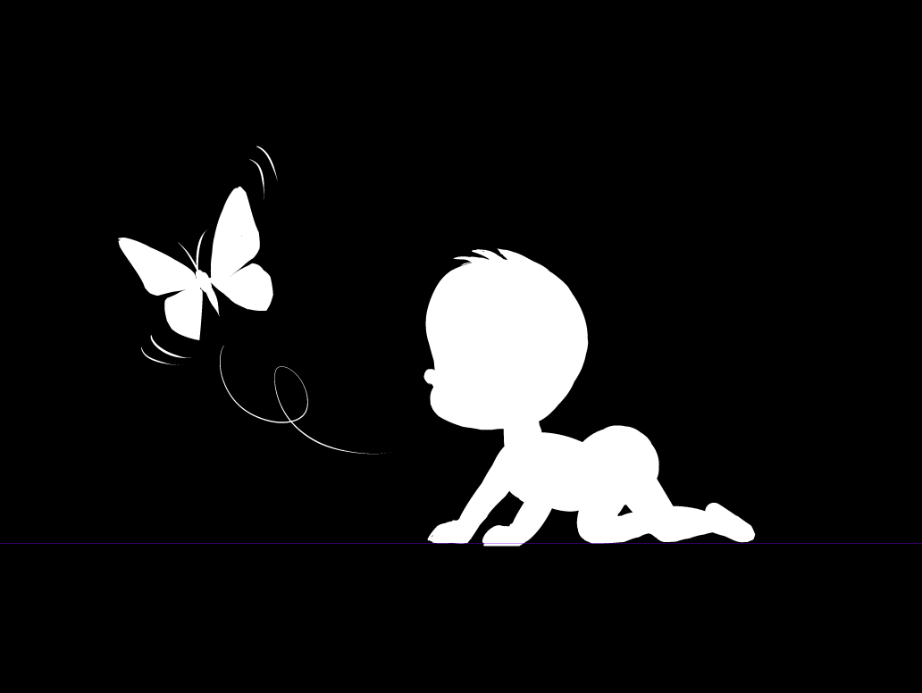
3. Blocking in negative shapes using white or black to define the object’s volume
What is negative space?
Negative space is an area within the image that is around and between the parts of the subject. In this example (please feel free to copy it!) the negative space is everything that is painted black.
- Painting with a white brush on a black background.

- With the white brush, you can add areas to the characters and remove them with the black brush. It’s just like sculpting with clay. You add clay to the sculpture, or remove it with a spatula.
- Now, invert the image. Go to Edit > Tonal Correction > Reverse Gradient, or CTRL + I. What was white before is now black, and vice-versa.
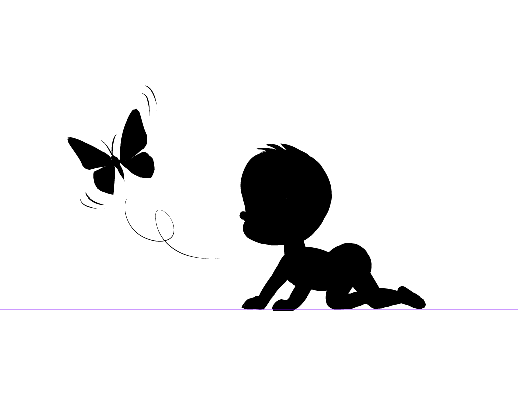
- Now, let’s add some lines and details to the character. It can be done both “positively” and “negatively”. On this piece, it’s more effective to outline the contour lines.
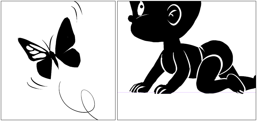
- Let’s invert again (CTRL + I) and define the lines even more.
This image works well with both positive and negative shapes.
Remember that you created this without any sketching done beforehand, you just filled out the shapes based on volume, not the contour lines. By working on the silhouette, you ensure that the character as a whole is understood by the viewer, and that the individual parts (hand and feet) of the character, as well as what they are doing, are easily recognizable.
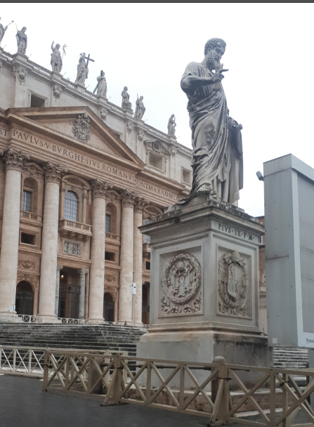
4. Working on negative space using a reference photo
Let’s try something a little more advanced.
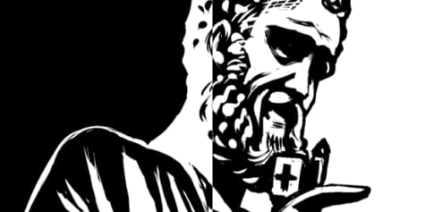
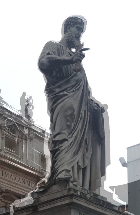
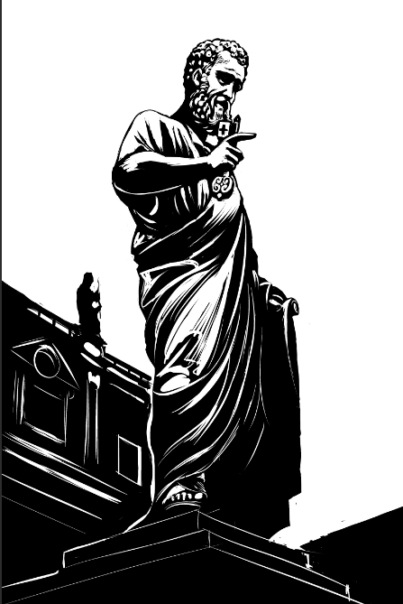
Now we’ll try to copy the photo using the silhouette technique. This is a photo of the Saint Peter statue in Saint Peter’s Square, Rome.
I am going to create another file now, again with a black background. This time I’m going make it so the negative space is white.
The challenge with this one is to form the silhouette by painting the negative space that surrounds it.
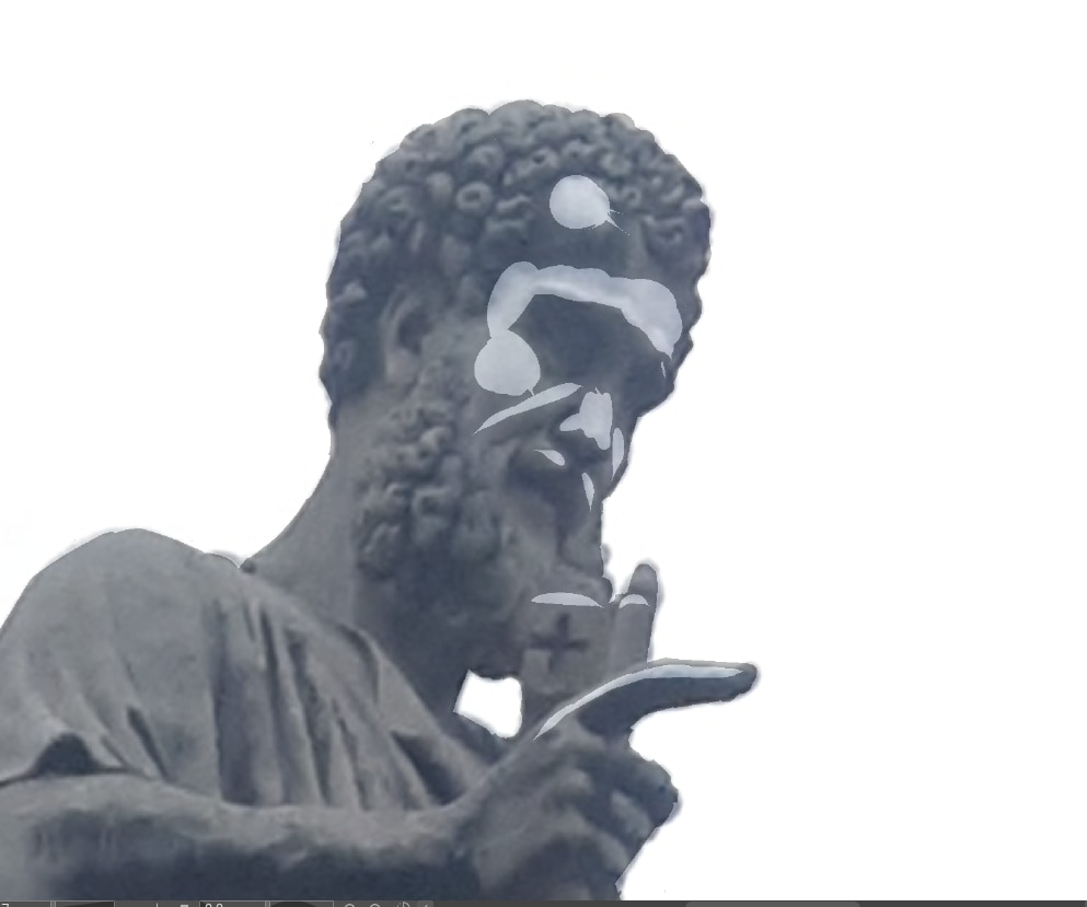
Place this photo in your Window > Sub View and follow along with me. This technique is like whittling. First, we’re going to define the general shape (silhouette) and then go inside the silhouette and mark the points of light with white. Here, you’ll be work with both white and black at the same time, adding one or the other as necessary. You can switch between them quickly by pressing “X”.
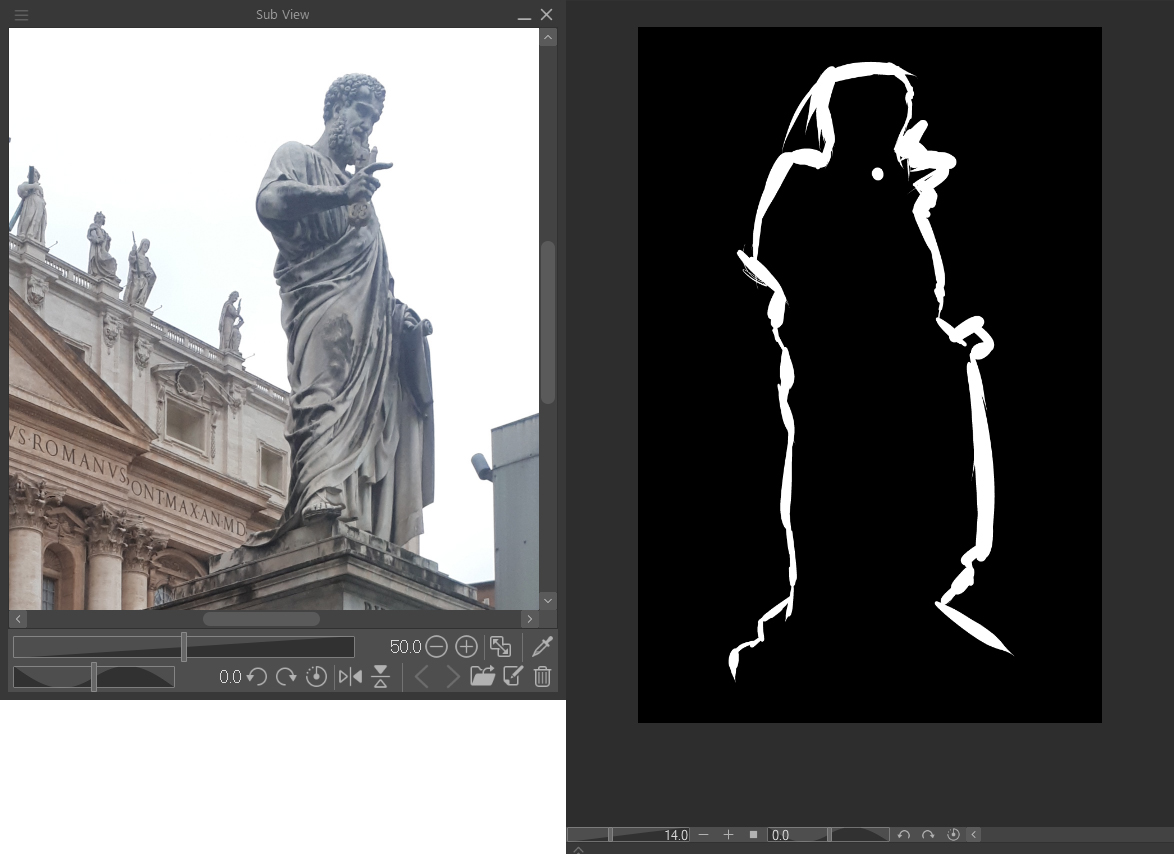
First, focus on defining the silhouette.
One tip: forget what you are drawing. For example, don’t think “I’m drawing a hand.” Focus on the contours for what they are: a series of ins and outs.
Add, remove… some of you will lose patience like I did. But those who persist will learn much from this experience. If you are a beginner, trace the silhouette in black.
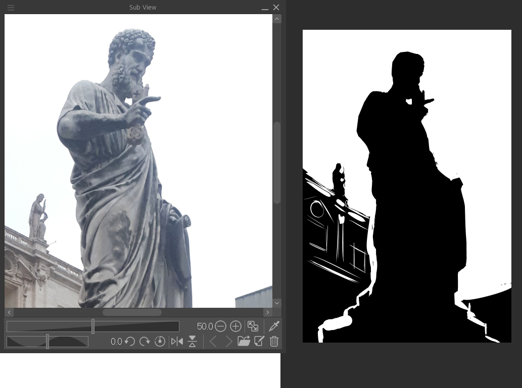
In fact, I will take this shortcut myself, so none of you feel bad about it. Let’s check how close we got. Place the photo on a new layer on top of your silhouette and adjust it (CTRL + T). By reducing the opacity of the photo a bit, you can check your progress.
Correct the silhouette as necessary and move onto the second part of the process: working on the highlights. Paint the areas that the light hits in white. Feel free to use the photo as a reference to find the most illuminated areas.
We need to lighten up our figure now. In fact, now is good to think with words about what is in the reference while we draw. Just in case it’s not clear in the photo: the Saint is carrying a key in his right hand, and parchment in his left.
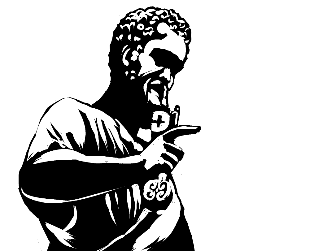
But as anyone with experience knows: to trace, you must first know how to draw. Here comes the difficult part – ordering the shapes to make sense of them. Let’s try and bring focus to the key. And most importantly, recreate the expression on his face.
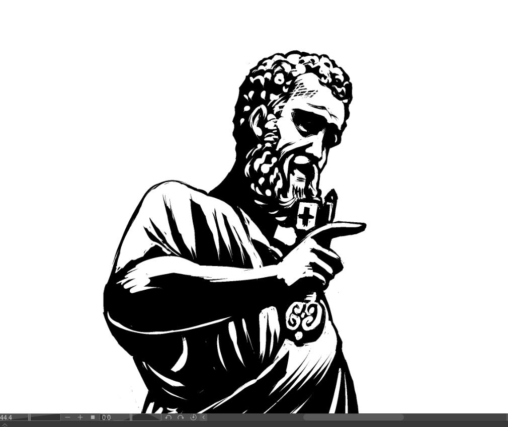
Et voilà.
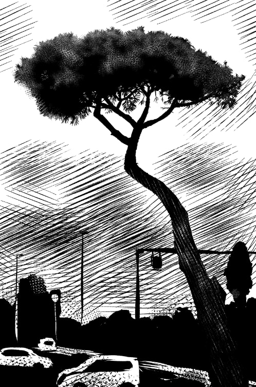
5. Silhouette of a tree
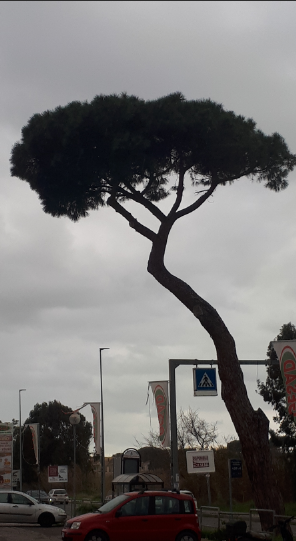
Finally, something a little simpler. Let’s apply the silhouette technique we learned to create an illustration of a tree. Here is our reference.
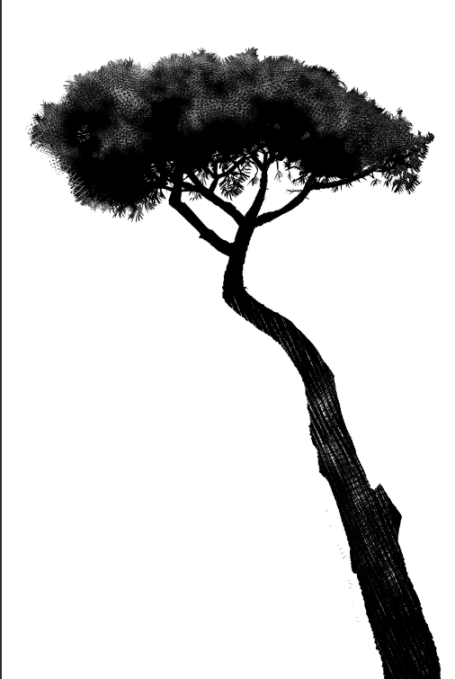
Start by creating a silhouette in black of the tree. For this one, I used the Tapered Pen, which offers a bit of a textured stroke.

In the silhouette of a tree, we can understand its history. Since it was just a sapling, its trunk has grown thicker from the bottom as it grew, always reaching for the sunlight. Its branches give it balance, a counterweight to the trunk that causes it to lean to the left. Near the base, a branch has been cut off. That gives us a clue as to why the main trunk leans too far. It must be counterbalanced.
Go over the silhouette from the trunk to the branches, and vice versa.
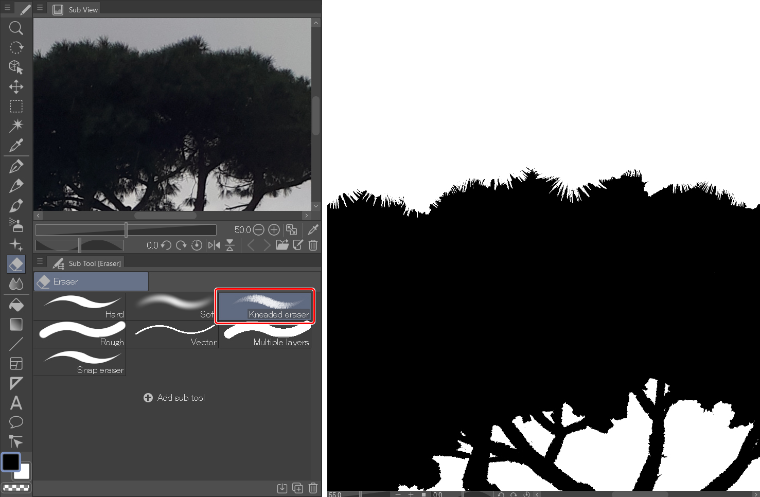
Now, with the Kneaded eraser, let’s go beyond the silhouette and give it detail!
And with the Pen, add black and white leaf details.

It does not matter what technique you use, color or black and white, if you work on the silhouette, you can always add lights and shadows to it. As with the old Schwarzkopf silhouetted portraits, the silhouette is the character.

Once you have a black silhouette, work on the light that hits the trunk and the leaves. To get the textures or patterns, just have fun using the brushes that the app has to offer:
You will find some good ones under the Decoration tool > Hatching and sand pattern sub-tool.
For this guide, I used Gauze cloud, Cloud and Cross-hatching x1 for the foliage. And the latter one for the trunk.
You can also download other brushes here:
CLIP STUDIO ASSETS
https://assets.clip-studio.com/en-us/search?word=cross%2Chatching&pay=free&order=new
For the background, I followed the same technique of blocking in large areas of black, and then blocking out areas of white to give definition.
6. Recap
In short, we have learned to work with silhouettes, to draw objects as blocks instead of sketches and structures. And, to find the silhouettes, using the negative space that surrounds them.
I hope you enjoyed this tutorial!
Julio Robledo Illustrator and cartoonist.
Julio Robledo (carbonmade.com)
https://juliorobledo.portfoliobox.net
JUNIUS JULIUS | ILUSTRACIONES y ARTÍCULOS. DIBUJOS y ESCRITOS (wordpress.com)
Interested in concept art or what it takes to become a concept artist?
Check out the link below!