Sci-Fi Environment Tutorial
In this tutorial by illustrator Diego “Novanim” Zúñiga, follow a step-by-step guide to creating your own fantastic sci-fi concept art, making full use of digital tools such as perspective rulers and 3D models.
Introduction
Hello, and welcome! My name is Diego “Novanim” Zúñiga, and today I’ll show you my entire process on how to construct a sci-fi environment in Clip Studio Paint, using the different perspective and painting tools found in the software.
Ready? Then let’s start!
This tutorial is split into three main sections:
-
- Idea generation
- The first rough
- Creating thumbnails and composition
- Using perspective rulers to create depth
- Establishing the color palette
-
- Designing the elements of the scene
- Using 3D Shapes and Rulers
- Sketching the scene
- Refining lines
-
- Adding grayscale to the lineart
- Creating volume within the grayscale
- Adding colors
- Adding final effects (blending modes, filters, etc.)
1. PLANIFICATION PHASE
Idea Generation
Every artistic piece starts with an idea. However, when we say, “Let’s create a sci-fi environment,” the idea is still too broad to even start sketching something. So we need to narrow it down. I believe it’s important that artists can nurture their creativity by mixing together things they like. In my case, I started thinking about research facilities, laboratories, nature, plants, museums, etc. How about we create a story around these elements?
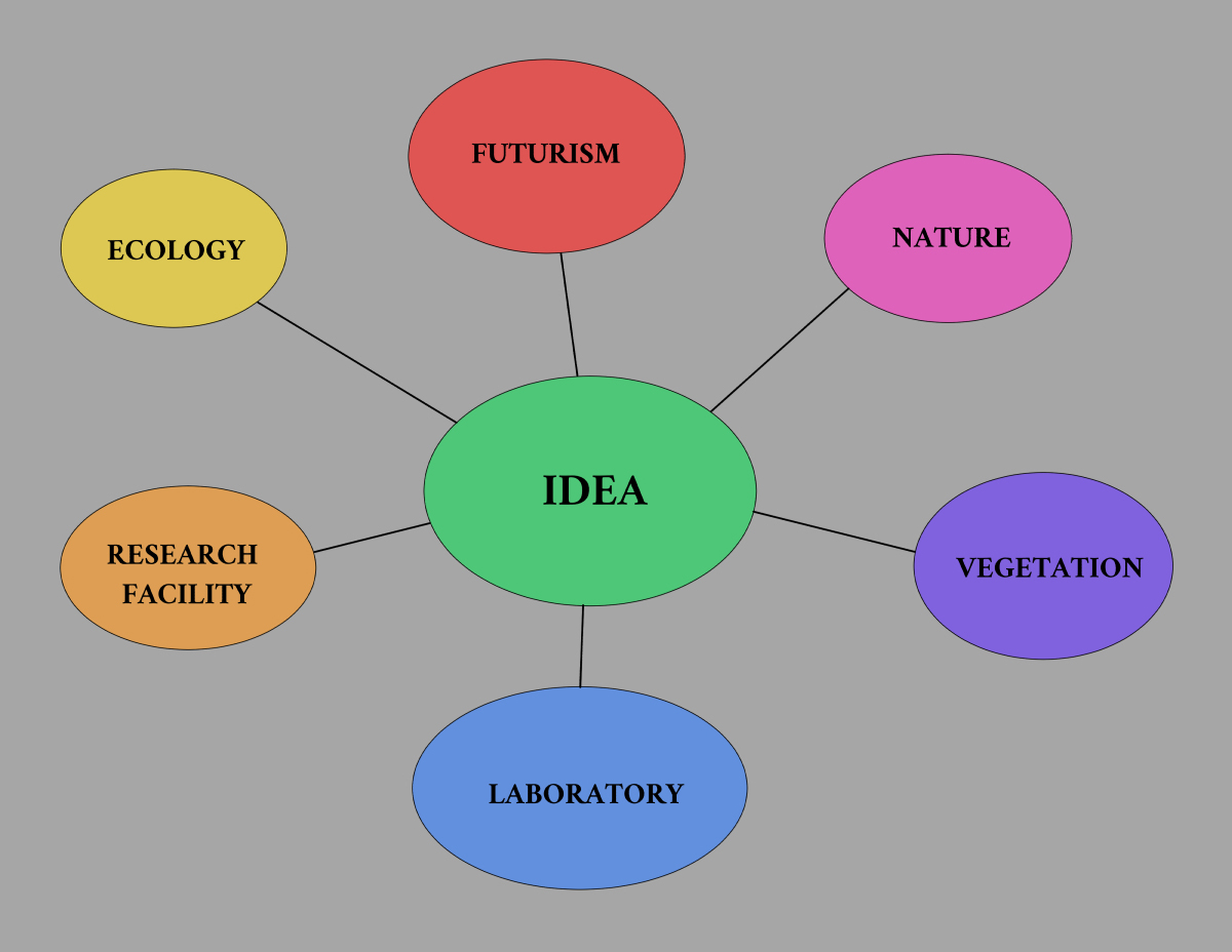
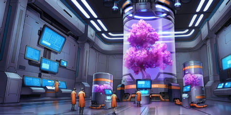
That is how I came up with a concept: The last tree on Earth. A future where all trees have disappeared, with the exception of one. This tree has been studied by the scientific community for decades, protected and nurtured, with the hope of once again populating the Earth with plant life.
So, now that we’ve got this idea, let’s develop it further. I imagine the setting to be a big laboratory, with the tree as the protagonist of the scene. A group of scientists is studying the tree, which is being kept stable by a whole computerized system around it.
Great, we have our idea! Now it’s time to start planning.
PROTIP: References and more references
Before starting to throw the first lines, I highly encourage to gather all the reference possible. Why is that? One mistake I’ve committed during my years as an artist was to overestimate my capacity to create objects from imagination. Your visual library might be bigger than the average person, yes, but there’s no way we can possibly know how to draw everything. That is why, before starting, I search the internet, or my own folders, for pictures that might resemble my idea. In this case, I looked for images of sci-fi laboratories from movies and videogames, along with references of trees, scientists, etc. This way, I can see how other artists solve a scene in many different ways. It is also a good exercise to look for effective value structures and color palettes. In my case, I ended up with a collection of 30–50 images that will go in a reference folder.
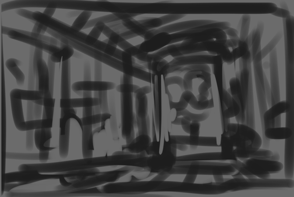
The First Rough
First of all, we have to define how our overall composition will look. There are some questions you can ask yourself before doing the first draft:
What is the most important element of the illustration?
I want the tree to be at center stage. Possibly in a futuristic container.
What are the emotions I want to convey with my piece?
I want to convey hope, curiosity, and stability.
What kind of shapes will dominate my scene?
Since it’s inside a laboratory, everything must look synthetic, angular, artificial. However, I’d like to create some contrast using some rounded shapes so it won’t look too sterile.
What is the distribution of values in my scene?
I want my scene to be medium-key or high-key regarding values. This means the scene will be dominated by light values instead of dark.
Once all these questions have been answered, I create a first rough, trying to translate what’s in my head onto the paper/screen.
From this point on, I work this rough further thinking about three elements: Overall Composition, Shapes, and Values. For composition, I used the “Rules of Thirds”, placing the main subject near the right vertical line. Most of my shapes are rectangular, contrasted by the cylinders on one side. For values, I try to keep everything in “medium key”, not too bright, not too dark, with the tree container creating contrast with the background.

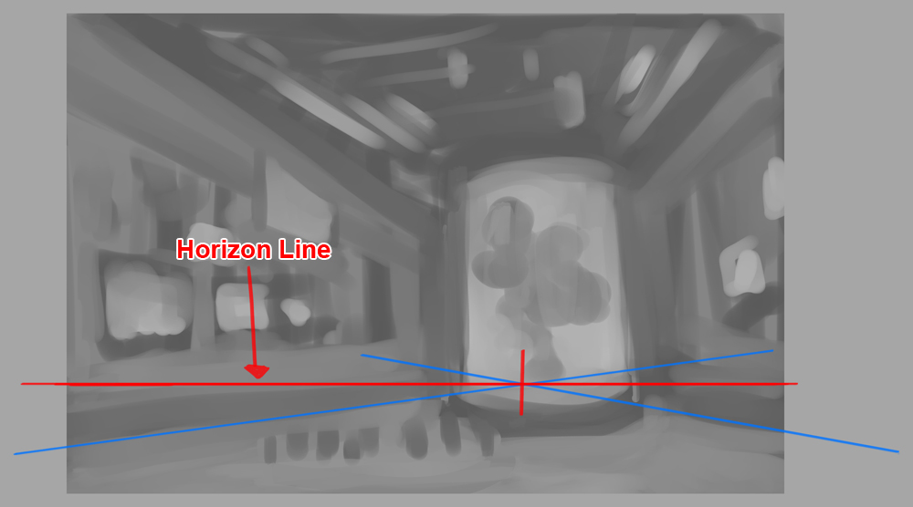
PROTIP: The importance of the horizon line.
As you might have noticed, the drawing has some elements of perspective. When we work in perspective, it is important to consider where your horizon line will be. Depending on the horizon line, your objects will distort accordingly. For concept art and illustration, one of the easiest perspectives is putting the horizon line on the lower third of your canvas. This perspective is perfect for making objects look big and powerful.
Creating thumbnails and composition
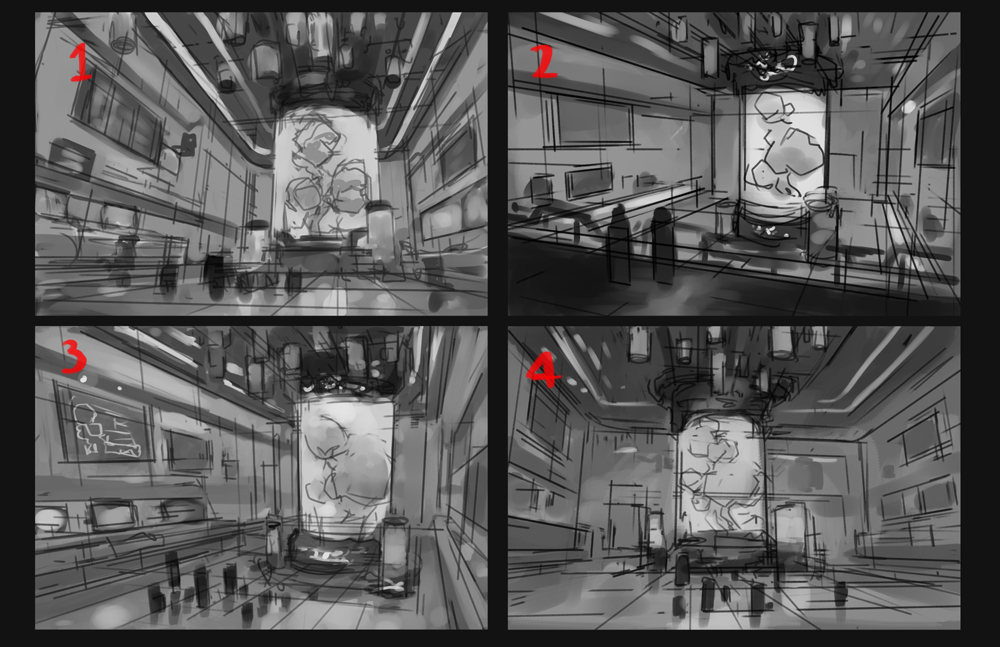
Thumbnails are a valuable tool when you need to create fast and simple iterations from an initial design. I like this step because it allows me to set my imagination free, testing different compositions and angles before deciding which one is the most effective. How many of these thumbnails should we create? It all depends on the time you have available. Sometimes, you might find that the best iteration is your first one, or even your 100th one. Set yourself a limit and choose wisely from there.
For this tutorial, I created four different thumbnails, working with a maximum of 3–5 different values in this step. The idea is to keep everything simple at this stage. Also, be wary of using values that are too similar to one another. Remember, your mission as an artist is to give a sense of place and emotion, so use values to your advantage.
PROTIP: Squint your eyes from time to time. If your composition is still readable, you are going in the right direction!
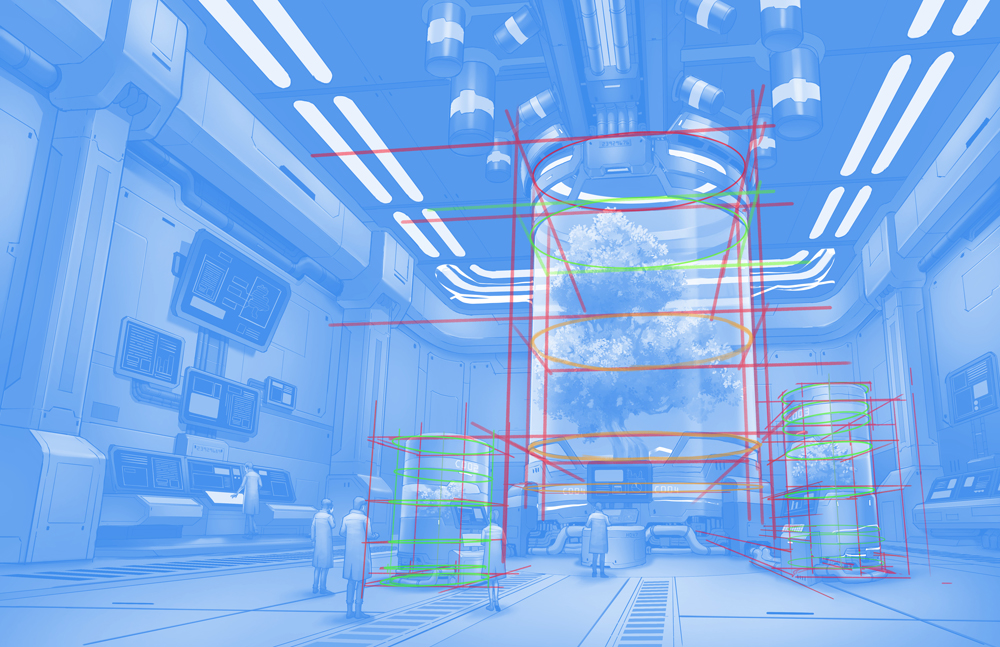
Let’s play with perspective rulers!
From this first concept, I’ll create a new sketch using the perspective rulers that come by default in Clip Studio Paint.
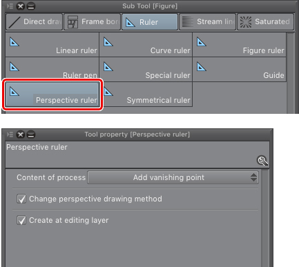
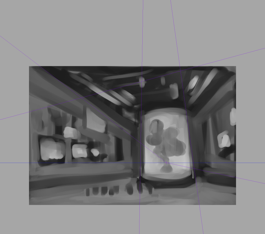
The first step is to set our vanishing points, following the horizon line of the initial rough. With my perspective ruler selected, I click and drag a line that follows this horizon (you can press SHIFT to keep it completely horizontal). Once this is done, click and drag a second line that intersects the first one, following the lines of your drawing, and voila, you have your first vanishing point.
Adding the first vanishing point
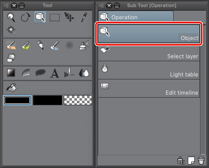
PROTIP: If you want to modify your vanishing point in CSP, use the Object tool located under Operation > Object. This way, you can select and move your vanishing points to your liking.
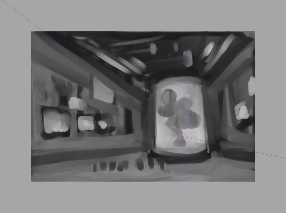
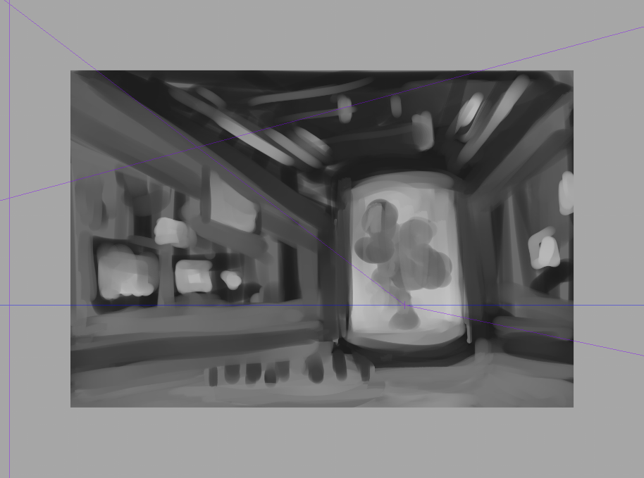
I repeat this process for the second vanishing point. The third vanishing point is a little trickier since it doesn’t intersect the horizon. In fact, this third vanishing point is way out of the canvas, but you can set it anyway, following the vertical lines found on the tree container. As you can see in the image below, I have slightly changed the perspective to give the tree a more grandiose look.
Adding the second vanishing point
Adding the third vanishing point
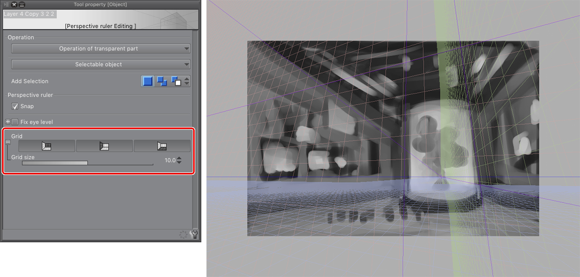
PROTIP: In Clip Studio Paint, you can choose to see a perspective grid once your vanishing points are set. To do this, with the tool Operation > Object selected, press the grid buttons on the tool property window.
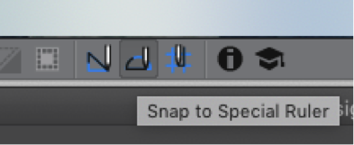
Now, with my perspective rulers ready, I start sketching on a second layer a more defined drawing. For this process, I like to use the “Lighter Pencil,” which comes by default in the program. Be sure to click on the “Snap to Special Ruler” button so your lines will follow the perspective you previously created. If you want to toggle this function on and off quickly, the default shortcut is Ctrl+2 on Windows or cmd+2 on Mac.
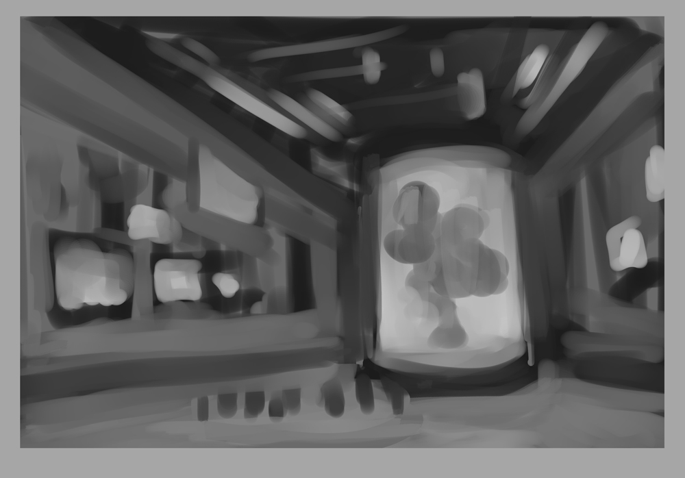
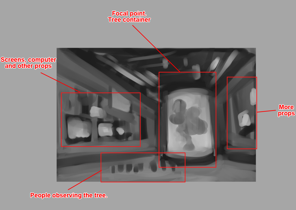
Now, with these new lines defined, I get a clearer vision of the illustration. Once again, using a soft brush, I distribute values on a layer below, using the sketch as a base. With this, I have my very first thumbnail. From this one, I created three more iterations of the same concept, playing with different camera angles and compositions.
My objective here is to explore options I didn’t consider before. Notice how the horizon line (in red) changes on each iteration.
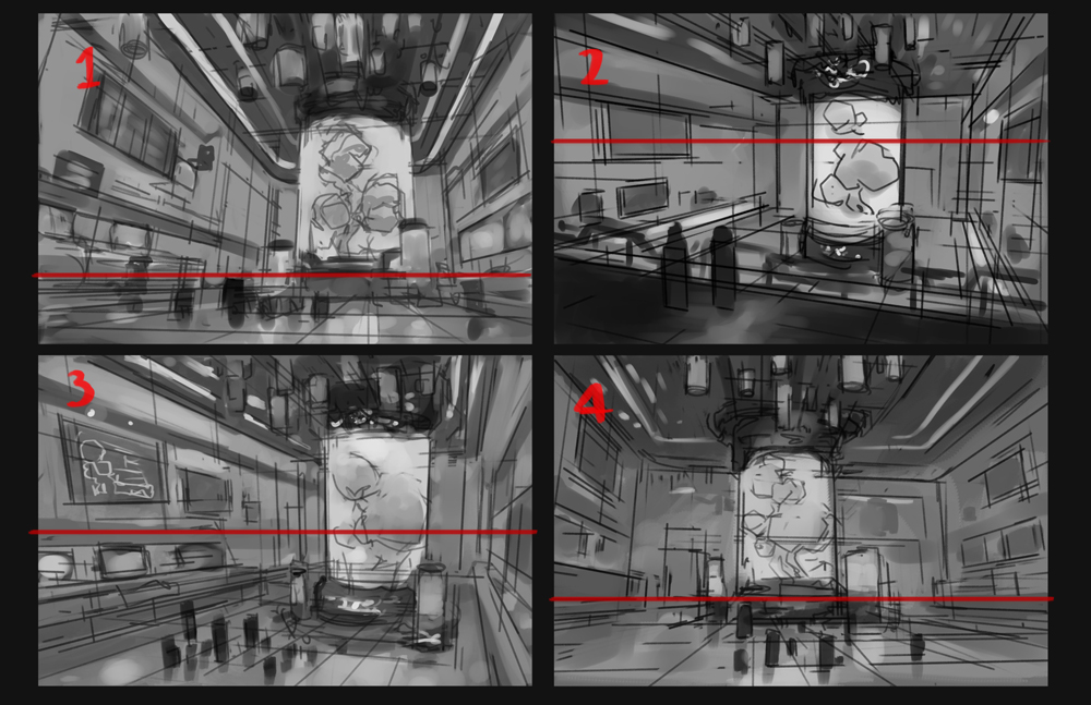
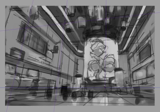
My favorites from these four are numbers 1 and 4. I like the angle and distribution of number 1, but I like how 4 leaves us more space in the rest of the scene, so I decided to mix the better elements of each scene. I refine the line and values a bit more to get this result:
Establishing the color palette
We now have our overall composition and value structure! However, how do we know what colors to use? Personally, I like to create color thumbnails so that I’ll have an idea of how the final image would look.
Using the design principle of “Big, medium, and small,” I think of three different colors or a triad. The first “big” color will occupy most of my picture, the “medium” must be a similar color to the first one, and the “small” will be a complementary color of the other two, used only in small areas. Of course, this is not the only approach to color that exists; so don’t hesitate to experiment with other combinations. Below you can see some examples of triads that I chose.
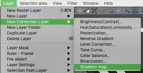
First, I put a gradient map layer above my value structure. For this, go to Menu> Layer>New Correction Layer>Gradient Map.
The advantage of using gradient maps is that you can apply different colors to certain value ranges. For example, if I want my scene to look blue on the shadows and more cyan on the lights, I modify the sliders as shown in the image below.
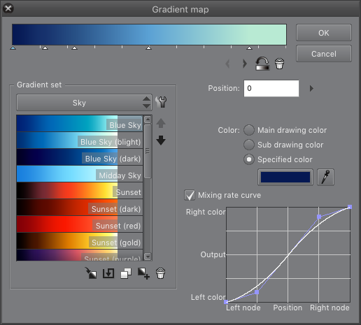
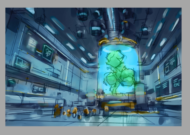
Make sure to click Clip to Layer Below so that the colors will only affect the layer that is immediately below. Afterwards, I create another layer in Color mode, and I start applying the little details and complementary colors. I then apply an additional layer in Overlay mode to adjust certain values and colors and the same time. The result is shown below.
PROTIP: Color contrast can be produced using complementary colors, but also with color temperatures. You can make a warm subject stand out against a cold background, and vice-versa.
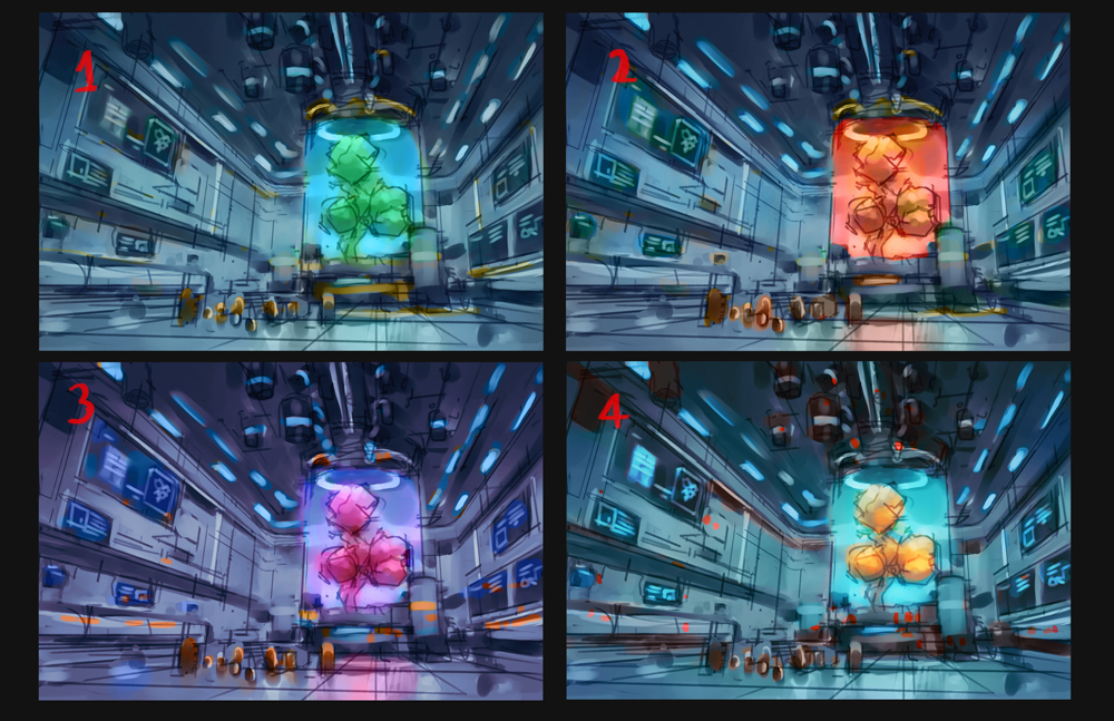
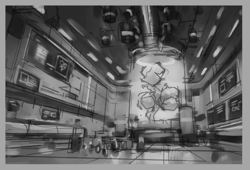
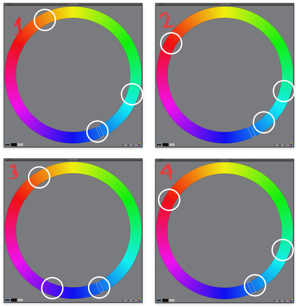
So after applying different palettes, this is my end result. All these four could work well. Personally, I picked combination number 3, because it has some magical component to it, which contrasts with the scientific themes.
I make sure to save the value and color thumbnails to a JPG so I can use them later on the process as my blueprint.
2. LINE ART PHASE
Designing the elements of the scene.
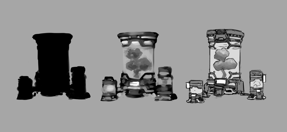
As an artist, I like the elements of my illustrations to have have a good sense of design. In this tutorial, I’ll put some thought on the design of the tree container. Since there’s already a sketch, I’ll base my design on that, as well as the many sci-fi references I previously gathered. In this case, I want my design to look futuristic, but safe to use. For that reason, I try to use also curved forms and edges. I start with the overall shape and silhouette, and then I start to iterate over it. I always keep in mind the principle of “Big, Medium, Small” for shapes, patterns, and values. Below you can see the final design of this element.
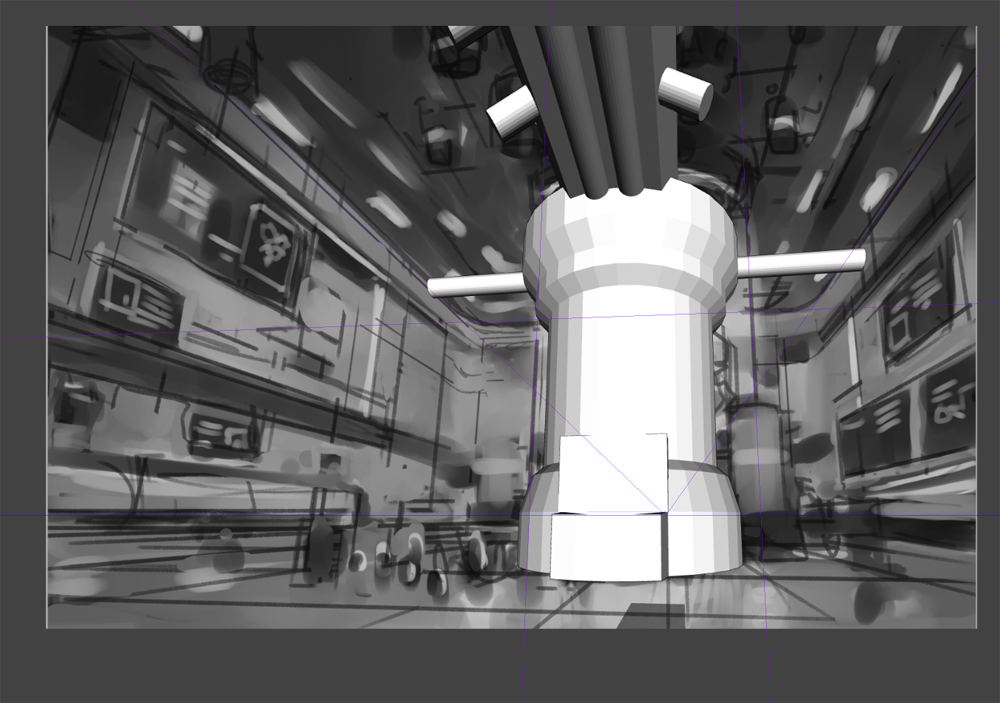
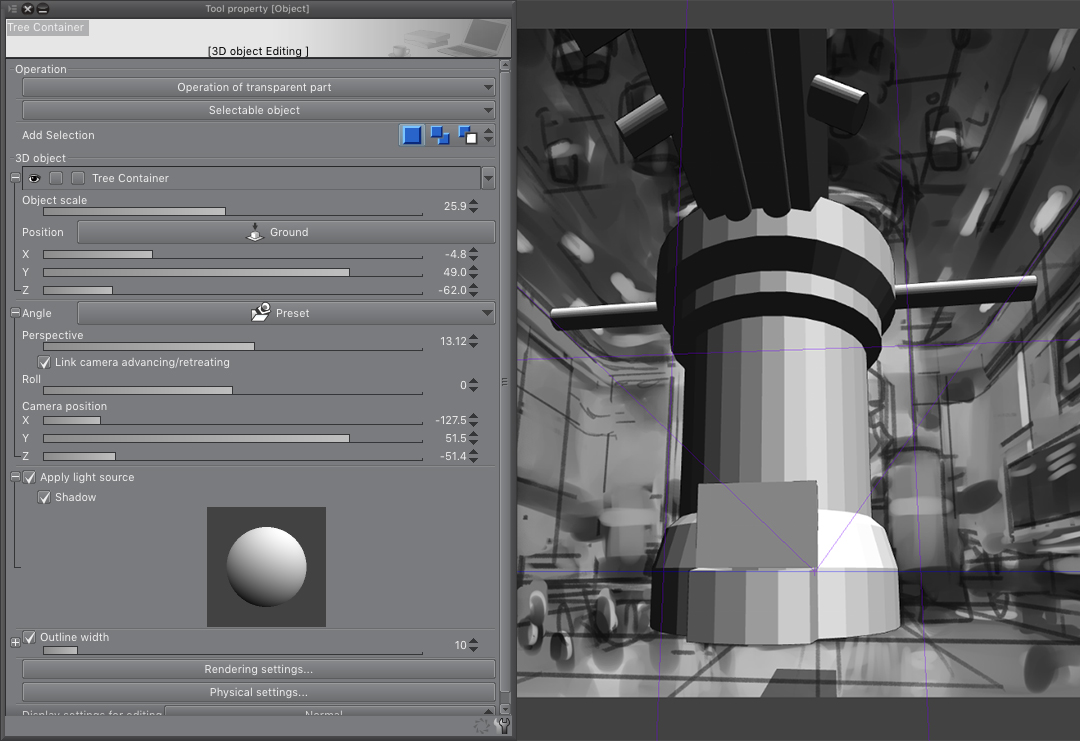
Using 3D Shapes and Rulers
One thing I love about CSP is the ability to import 3D models into your scene. For this illustration, I created a basic mesh based on my design, and saved it in OBJ format. You can just drag and drop this file in your canvas, or go to File > Import > 3D Data. With my 3D object in the scene, I make sure to place it on the correct spot with the correct perspective. You can even modify some parameters of the model, like perspective distortion, light and shadow, outline, etc.
Sketching the Scene
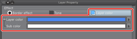
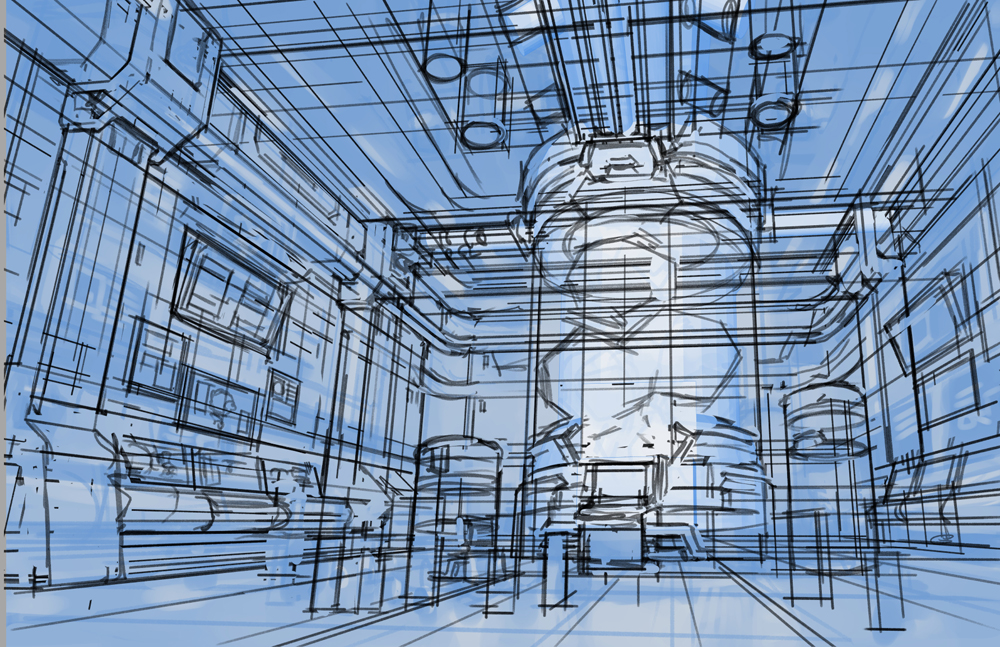
Now that the foundation of my illustration is ready, it’s time to add more defined lines. I want my piece to have a comic book look, with strong line art and soft brushstrokes. To start, I put all my previous layers into a single group. For this, I create a New Layer Folder, then I move all my previous layers to it. Now, I select the layer folder, and in the Layer Property palette, select Layer Color. With this, the layers will be colorized.
Then, I create a new layer to start working the “pencils.” I use the default pencils of CSP for this task. But how to follow the perspective? Well, you can Alt+Click the original perspective ruler, and copy it on the new layer. This way, you can keep working with the original perspective. Remember to toggle the rulers off and on depending if you want to draw freehand or follow the vanishing points respectively.
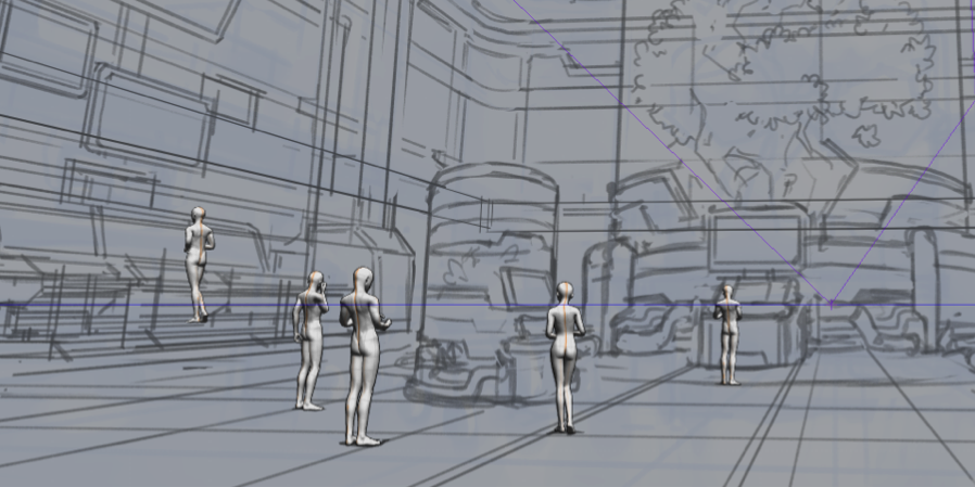
PROTIP: Remember that in my thumbnails I added some people in the scene? Well, you can actually use 3D models for this purpose as well. In this case, I dragged and dropped the 3D human models that come with CSP by default, putting them in the correct perspective and pose.
I do a second pencil pass, using the same method of putting the previous layer to Layer color, now with more precise detail.
Refining the Lines
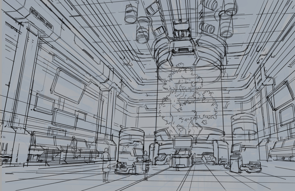
Following the same logic as the previous steps, I create a new layer for the final line art. For this, I used the G-Pen, which comes with the program by default, but feel free to use whatever brush or pencils you feel comfortable with.
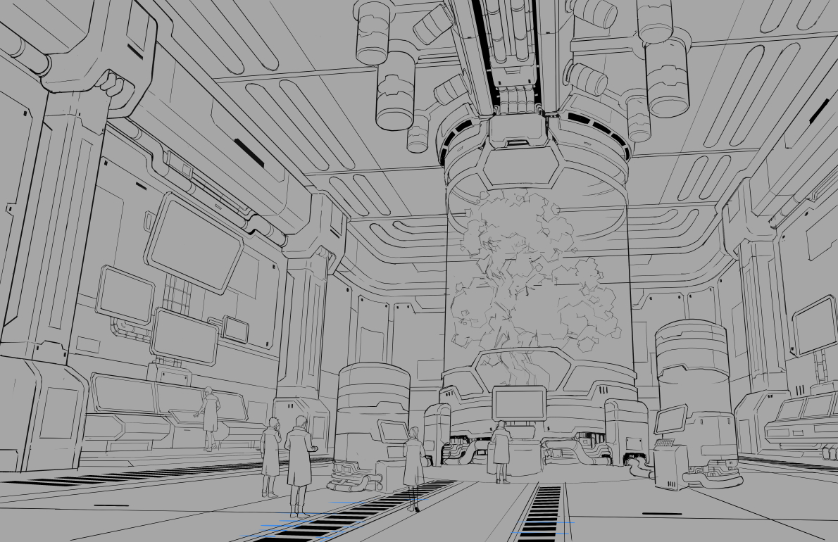
3. COLOR PHASE
Working the grayscale composition
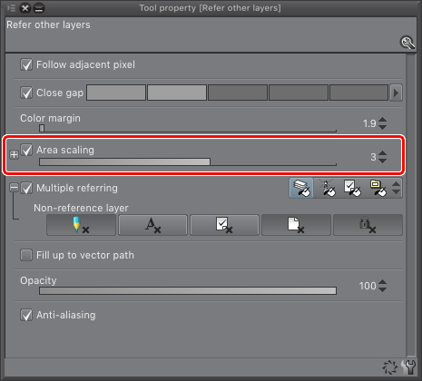
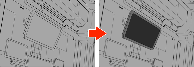
My goal here is to add the “local value” for the different elements in the laboratory. For this step, I use the Fill tool (G) with multiple referring on. This means wherever I click, CSP will consider all layers during this action. I also apply Area Scaling so every time an area is filled, it will go a couple of pixels beyond the boundaries created by the line art, just to avoid gaps.
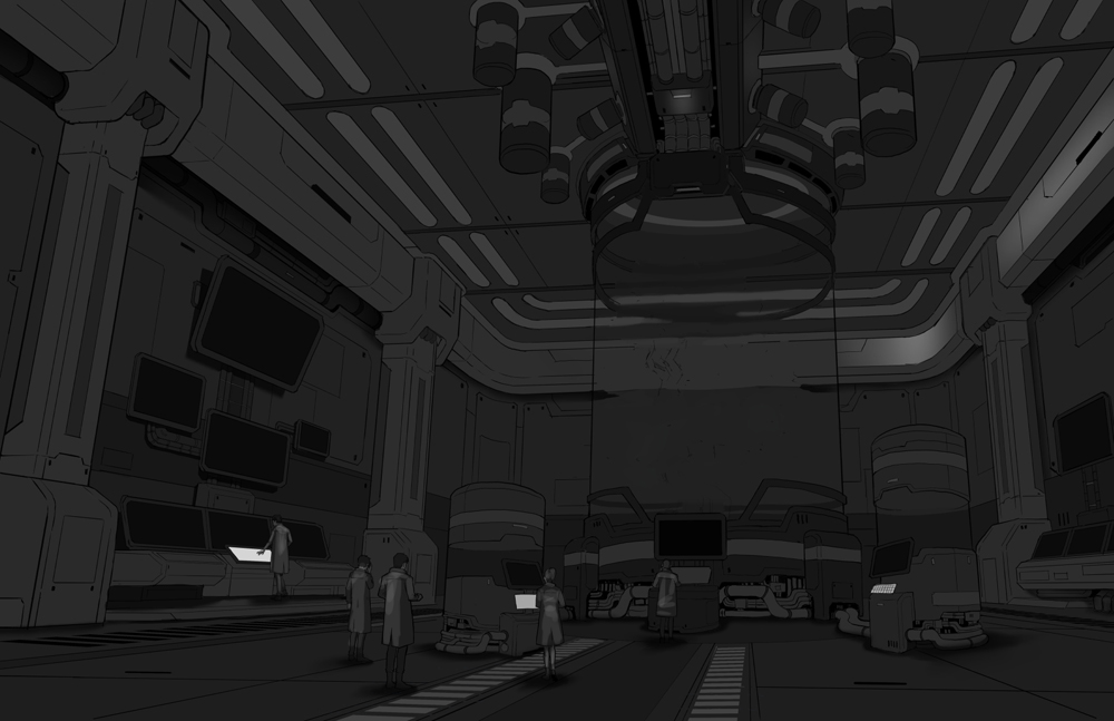
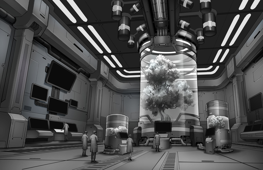
So here’s the whole scene with all the local values applied. Now, it’s time to create some volume within the forms.
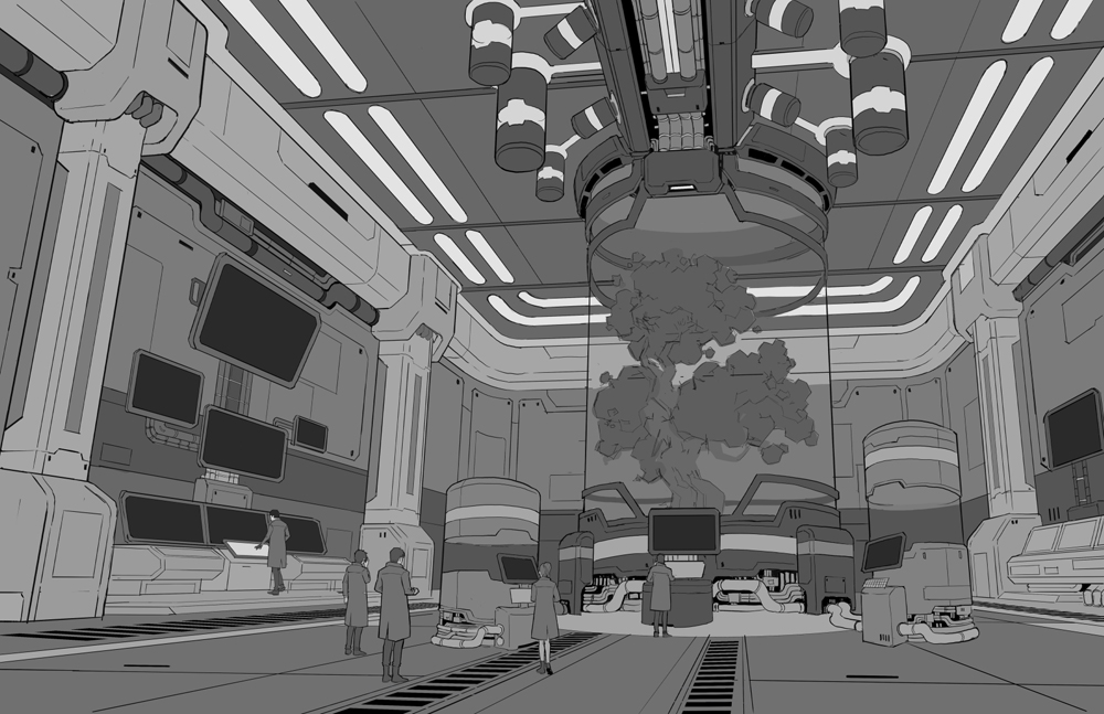
Adding volume to my grayscale
To add volume to an object, you need to understand the nature of light, and how it interacts with different surfaces. One way to look at it is that most things in our universe are dark, and light is just an energy fluctuation that lightens a surface. So, in this case, we have to consider the intensity of the light source, distance from the source, and angle of incidence. Where does the light come from?
In this scene in particular, we have three distinguishable light sources, from strongest to weakest: The lights from the ceiling, the tree container, and lastly, the computer screens.
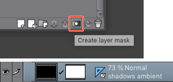
Understanding this will give us an idea of how the different surfaces will be lit. So I add a shadow layer to the scene, completely black, and put it on “Multiply mode” with an opacity of 70%. Then I create a layer mask for it, and then, using the lasso tool, with the mask selected, I start erasing the shadow with a soft brush.
Even if I’m using the lasso tool to erase the shadows from the planes, sometimes I must use the blur, blend, and finger painting tool to soften or modify certain shadows as I see fit.

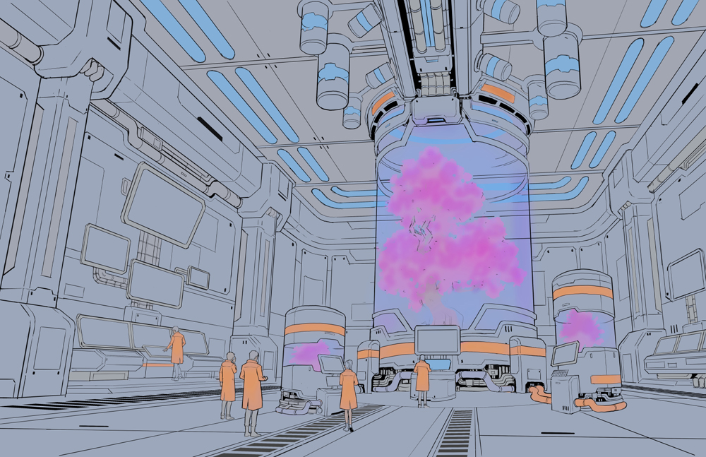
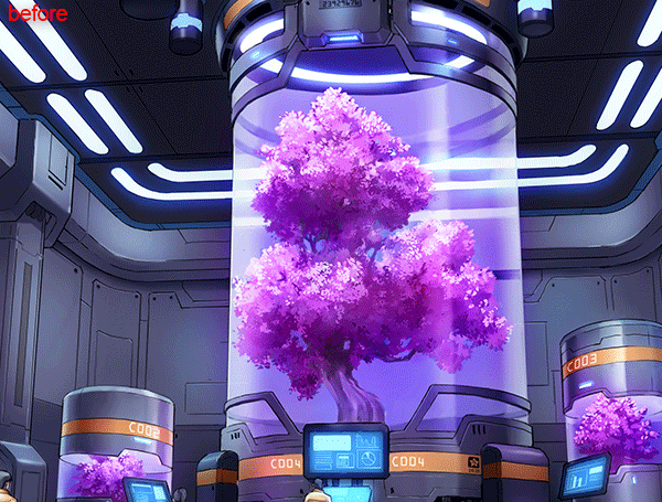
After some polishing, this is the result. Notice how the tree is lacking any line art. I did this so that the contrast between the natural and artificial would be even greater. You can see the result in the image below.
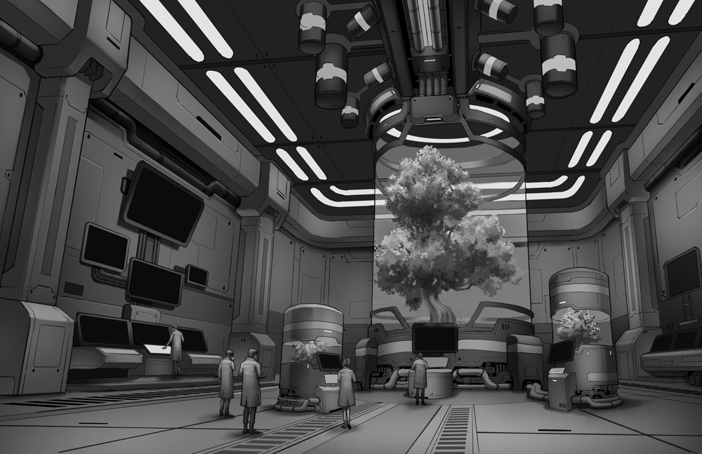
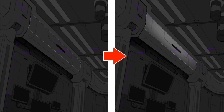
Let’s not forget that certain materials, like polished metal or glass, have reflectivity properties, similar to mirrors. For this effect, I think to myself, “what lights are being reflected on these surfaces?” I then create a new layer in screen mode, and with a neutral gray, I start painting on top of the reflective surfaces. Just like in the shadow layer, I apply a layer mask and erase the borders softly.
Adding color
Remember how we created a gradient map for our colored thumbnails? Well, it’s time to reuse it over our final grayscale. Just duplicate the gradient map layer and put it on top of the grayscale layers. Don’t forget to put it in Color mode and from there, control the opacity until you find a good balance.
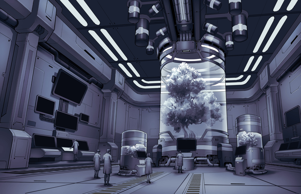
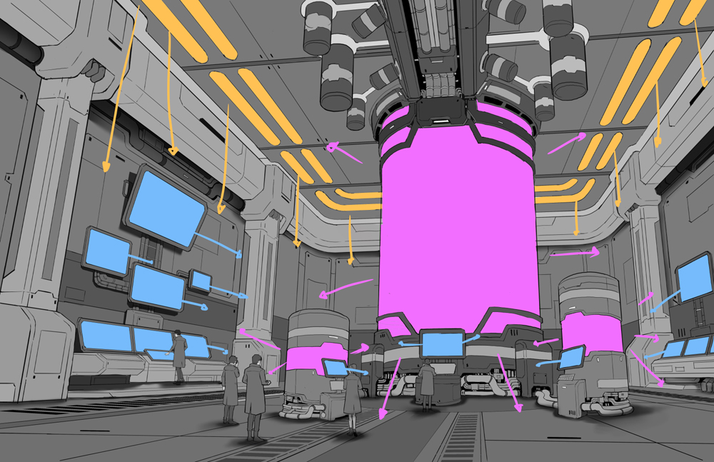
Now it’s time to add some local color. It’s easier if you hide all the grayscale layers so that only the line art remains. Then, I use the Fill Tool to replicate what’s on my original colored thumbnail, on a new layer in Color mode. If I find my colors are lacking “edge,” I create a second layer in Overlay mode where I’ll apply extra saturation and contrast. In this case, I added extra saturation to the pink tree and the orange bands found in the machinery and scientists.
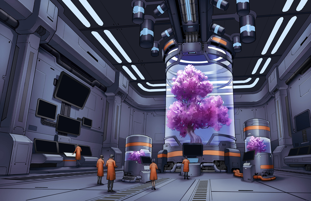
The image looks good, but we can push it even further! I use a combination of layers in screen/color dodge mode, to simulate the glow created by light sources such as screens and lightbulbs. For this, I use a soft brush/airbrush in a new layer in either Add mode or Color Dodge mode. I apply this not only to the sources, but to certain surfaces also, like the floor directly below the container, or the surrounding canisters or scientists.
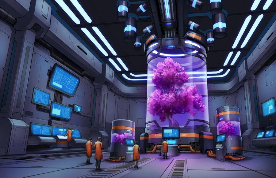
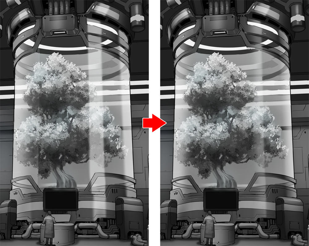
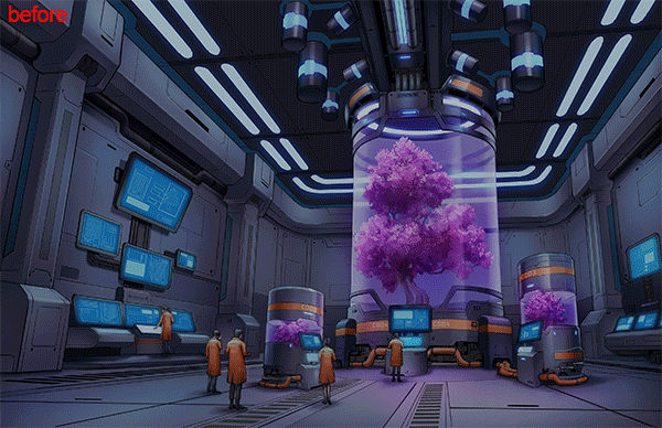
Before adding the final touches, I do a double check on the perspective for certain elements. After throwing some perspective lines (using the original perspective rulers), I notice some of them look a bit warped. In this case, I go to Layer > Merge visible to a new layer, so I won’t modify my original layers by mistake. Then, with a combination of free transform, mesh transform, and some overpainting, I fix some of my mistakes with the perspective.
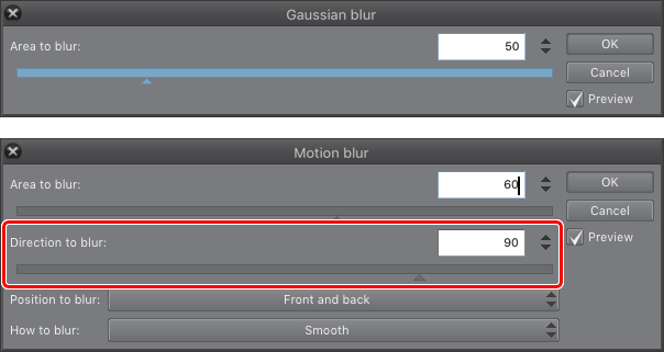
To add floor reflections, I go to the Layer menu > Merge visible to new layer. From this newly created layer, I cut and paste certain areas that I know will reflect on the floor. After I cut them, I flip them vertically and apply two different filters: Gaussian Blur and Motion Blur. For the latter, I must be sure that the direction of the blur is 90º as shown in the images below.
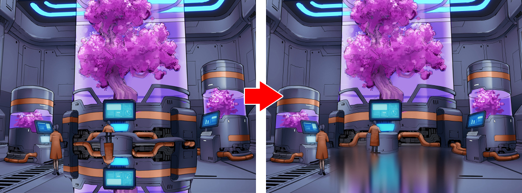
Then, I reduce the opacity of these reflections to 50% and make sure to mask out any parts that aren’t directly on the floor.
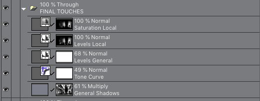
Adding focus through masking
We are at the final step of the illustration. Here I add certain adjustments layers to make elements pop out a bit more. First, I create a new shadow layer on top of it all, and using layer masking, I start erasing the shadows on the most important areas: The tree containers, the screens, and other light sources.
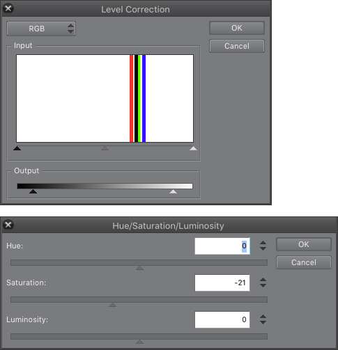
Adjusting levels, saturation, and contrast.
Now, for the final touches, I add a combination of correction layers through masking, to increase/decrease saturation and contrast in certain areas.
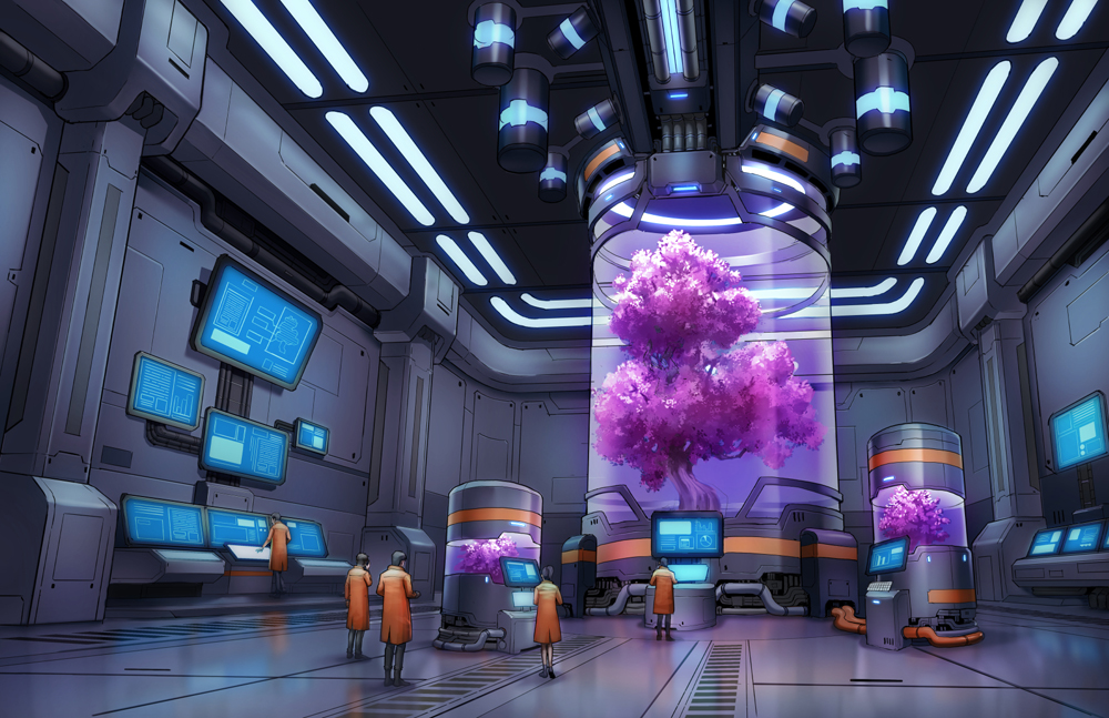
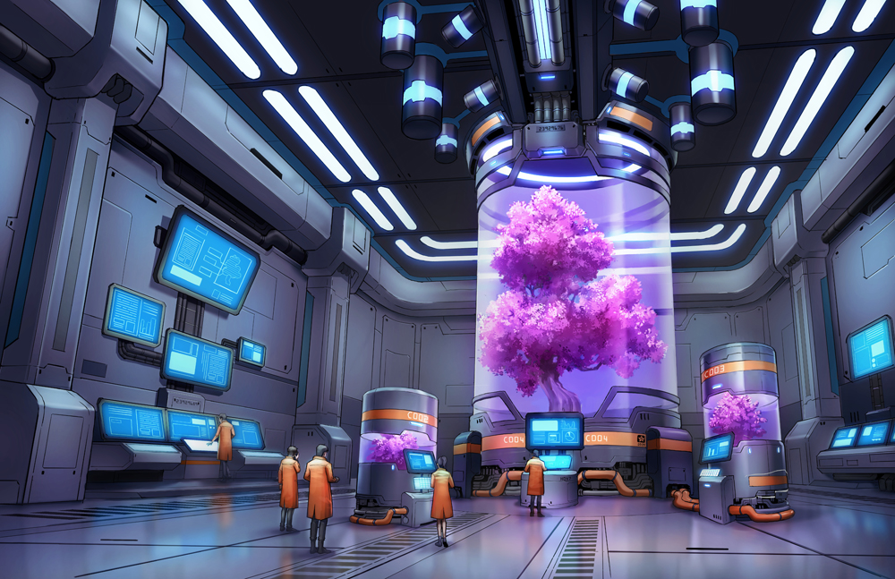
And this is the final image! Thank you so much for reading this lengthy tutorial to the end.
About DIEGO “NOVANIM” ZÚÑIGA
I’m a video game illustrator, comic penciler/inker, and art teacher since 2009. After finishing my degree in Biomedical Engineering, I pursued my goal to become a professional visual storyteller.
I’m passionate about creating characters, worlds, and stories that will captivate my audience through visual impact, especially in the genres of sci-fi and fantasy. I greatly enjoy working on stories that explore human nature, relationships, technology, and a search for purpose.
Interested in concept art or what it takes to become a concept artist?
Check out the link below!