Making Images for Trading Card Game Clients
Learn how to create illustrations for trading card games with concept artist Titus Lunter! See how you would make art that matches a setting and tells a story through composition, contrasting light, and shadows, along with specific advice for TCG client work.
Design
When working for most TCG games one of the biggest benefits is the Style Guide. This is a document that has sketches, designs, and notes on how any given part of the world needs to look. This not only saves time in coming up with designs for the illustrators but it also helps keep the world look and feel consistent across many different illustrators and illustrations. When working on your own project it is always a good idea to create concepts and designs of the things you want to illustrate before you start your painting. The difficulty with designing while you are painting is that both processes require your full attention and doing them at the same time splits that attention up into smaller parts. Good preparation goes a long way!
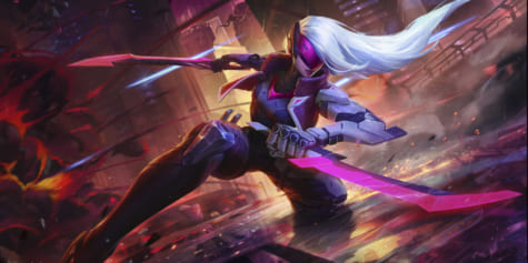
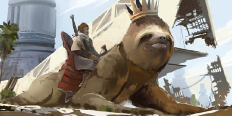
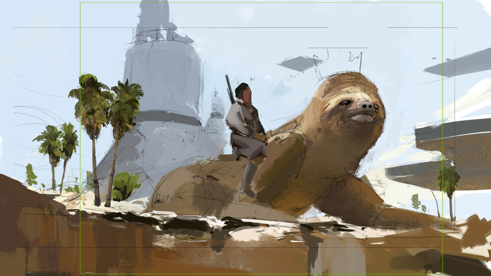
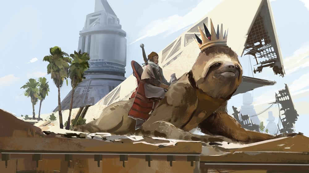
For this image, I had another image already made which featured the sloth and the rider. The structure in the background is a simple geometric shape, specifically chosen to work well with the composition. More on that later when we talk about abstract composition!
Sketching
Sketching is the second step in making a successful image. After we have made or taken a look at the designs, we can then start to combine them with the story. In TCG image creation we often work from a brief, also known as an Art Description. This simply tells us what the image should feature.
The brief for this image could, for example, look like this:
‘Please show us a Sloth mount with a rider in a desert / tropical rocky landscape. In the background, we should be able to see some signature structures as well as some remnants of long-gone machinery. The mood should reflect a sense of exploration and adventure’.
Now that we know the designs and the story, we can start sketching out our shot. Remember, sketching is about generating ideas and not making nice images! In this case, I wanted the rider to look out over the landscape, but we are not seeing it through their eyes. We look up to them and they leave us wondering what sights they behold! In the background, we can see some of the structures, and the rest will simply be there to help the composition. Let’s take a closer look at the composition.
Abstract composition
Composition is the framework that ties everything together. It determines how the viewer’s eye moves across the image from one important focal point to the next. In order to properly sell the story, we need to know the most important parts of the image. Sometimes this will be clear, sometimes it’s won’t. It is our job as illustrators to figure out what this is, and then illustrate and position it in such a way that people who have no knowledge of the story can still understand what is going on.
This part is called ‘Visual Storytelling’. While composition is part of the fundamentals of art, unfortunately, it’s not as straight forward as some of the other fundamentals such as perspective, which has strict rules. In this sense composition is very personal, it is about how you want and like to tell stories. There are, of course, right and wrong ways to do it but they have less to do with rules and more to do with how clear an image reads to the viewer.
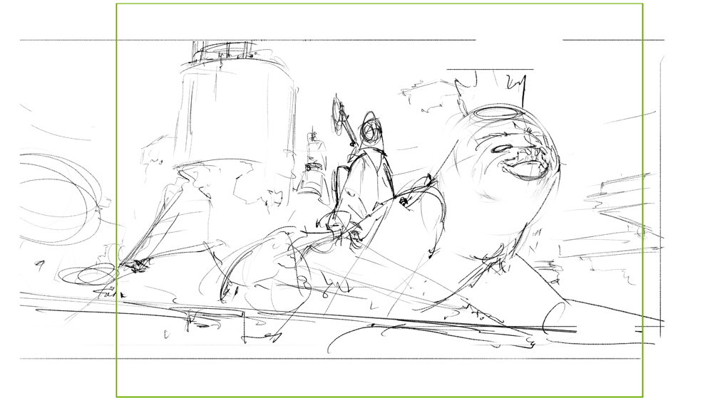
One of the methods I like to use in order to check my composition is to have a black and white image where the values are reduced to either being in light or in shadow. The term for this is ‘Shadow Shapes’. The ultimate skill is to convey an image simply with the shadow / light shapes in their simplest form!
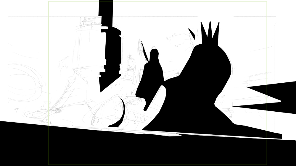
In the Black and White image, we can see 3 repeating verticals representing the 3 focal points of the image. You can have more than that but it’s best to stick to no more than 3 focal points, otherwise, people won’t know where to look! Another thing we can see is that each of the vertical shadows has plenty of room around them and that they stand alone. This is done intentionally to create contrast. We’ll talk more about that later when we talk about color. For now, it is important to remember that there are dozens of different types of composition, here are a few names for you to look up!
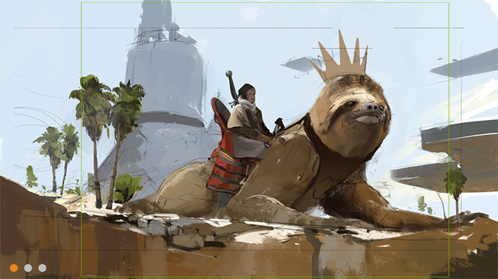
Circle composition, radial, L shaped, T shaped, S curve, and the Steelyard. Try spotting them in different paintings. As a bonus, you can take a look at the composition image I added.
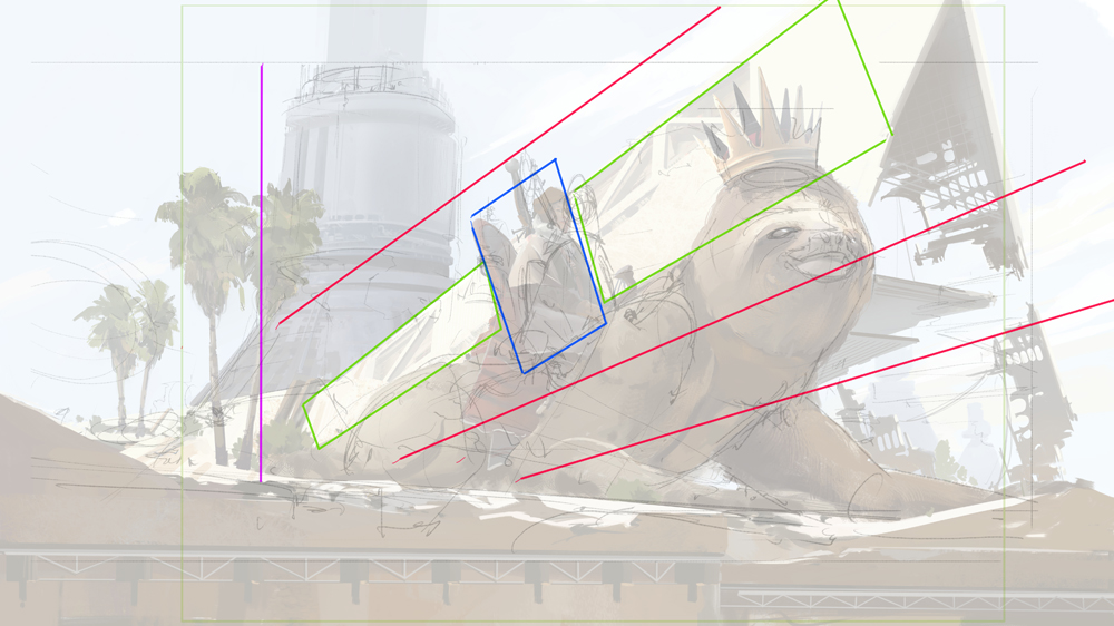
Reading left to right, the diagonal red lines (diagonals represent motion, they give your image a sense of movement) frame the character and the sloth. To highlight the character even more they break the lines up by being oriented vertically instead of more horizontal like the sloth and the structure right behind them. The purple line represents the boundary for the more 4:3 aspect ratio of TCG games. Since I don’t want the viewer’s eye to linger too long on that left side, I added the trees which mark the starting point of the red lines. Think of it as a roadblock; the road continues behind it, of course, but we’re not meant to go there!
Colors
One of the most frequently asked questions I get has to do with color.
How to pick the right color, how colors behave under different lights, and so forth. These are all good questions and they share a perhaps unlikely answer; black and white values! If we take an image and we take away all the colors, we are left with a grayscale image. Keeping your values noticeably clear and separated will help the image read, which is incredibly important when making work for TCG’s since the final product is often very small. It’s one thing to have an image work big, and a whole other thing to have it work as a thumbnail! This is why I always have a Hue / Saturation Correction Layer with the Saturation set to 0.
After that, I start blocking in my colors. There are various ways to do this and all of them are valid! You can look for a photo online or from your own reference library and take the colors from there, which I recommend to beginners. When you do this, make sure to check if the light is warm or cool! This will teach you a lot about how colors shift from a bright day, overcast, sunset, and even moonlight.
Another is to grab a base color; this requires some more studying and knowledge but it’s quite fun to try. After you have the base color, you will need two additional colors and values, the highlight and the shadow. A rule of thumb is that in exterior settings, light is warm and shadows are cool, and in interior settings, the light is cool and the shadows are warm. Our big blue sky in acts as a big reflector, pushing in a lot of blue onto our world. The sun brings in warm light and is much stronger, so the highlights fill with warm light, while the shadows trap the bouncing blue light. When studying colors, always make a note of the highlight, midtone, shadow, and bounce light.
Focus
Now that the image is well underway, we must make sure we stay on track. It is quite easy to stray from the original idea while making images and start adding details that really do not belong! I certainly have this problem and I often add things in just to take them out. You can see this happening in the steps all the time.
To prevent this, I check my focal points from time to time. These are the points of interest responsible for the most important parts of the story, and as such, they are entitled to the most attention from the viewer. One way we can do this is by using contrast. Contrast is a vague word on its own, and in the world of art, it can mean a lot of different things. For us, the most interesting properties are concepts such as Dark versus Light, Detailed versus Plain, High saturation color versus low saturation color, and so forth. These points of contrast push the viewer’s eye to your focal point.
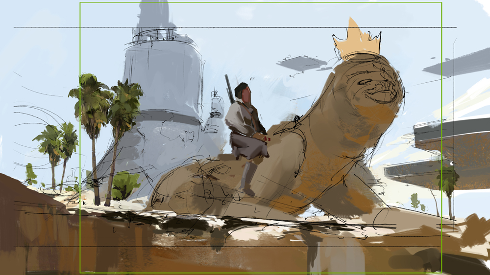
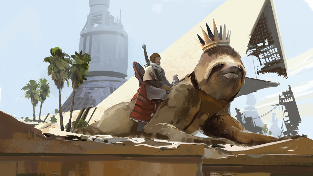
In this image, for instance, the rider is quite dark and their surroundings are very bright. As they are the only dark spot in a wash of light, they immediately catch your attention! Mission accomplished! The same is true for the sloth, and in a lesser way, for the tower in the background. The building there is not so important, so the contrast with its surroundings is lower as well. The higher the contrast, the more likely it will draw attention.
Make sure not to go overboard and add contrast everywhere, it only works if you are very selective.
Finish
Finishing an image is the last thing on the menu. If this was a nice meal out it would be dessert! Not the most important part of the meal (to most), but one that is quite enjoyable. In order to get the right feel, I have created some of my own brushes! These range from having heavy texture and noise to being quite clean. There is no right or wrong way to use them so I’d say experiment away!
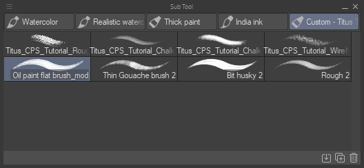
▲ My own brushes with CLIP STUDIO PAINT
Make sure to keep using the Selection Tool to keep things organized, for a while at least, and remember to name your layers when you can. This is something I am quite terrible at but I try. My opinion is that paintings should evolve naturally from their starting point as long as they keep true to the original idea and story. There is little left now but to sit down and carefully putting some marks down. Make sure to stay economical with your brushwork, and consider the impact each brushstroke would have as if you were oil painting.
The image is done when you are out of time or when you think it is done. Remember, a client pays you a certain amount to get a painting done, so make sure to set a daily rate for yourself and divide the price by the daily rate. That’s how many days you have! Don’t overwork yourself for a work client, that is a slippery slope!
Summary:
To summarize, making an image for a TCG client is all about clarity. Make sure your image reads very well by figuring out what the story of the image is. Next, select the story highlights and turn them into your focal points. Manage your focal points by clearly separating the values so they stand out. Use contrast where necessary to further highlight the important parts, and don’t add detail where none is required. Choose a composition that fits the story. Some shots are more dramatic than others, it’s up to you to pick the right one. If you’re stuck, take a look at movies you like on that topic and see if you can study them. Manage your brush strokes as carefully as you can by being precise, don’t add more than you need. It’s perfectly fine to add or take out elements all the time. Don’t be too precious about what you paint, and make sure that it works for the image and story!
About the Artist
My name is Titus Lunter, I have been an illustrator and concept artist since 2010. Since then I’ve worked on many AAA video game titles as well as TCG games such as Magic: The Gathering, as well as Dungeons & Dragons. In that time I have shipped more than 300 commissioned illustrations. I also teach art fundamentals and how to deal with mental pressure of being an artist.
https://www.artstation.com/titus
https://twitter.com/tituslunter
https://tituslunter.com/
Interested in concept art or what it takes to become a concept artist?
Check out the link below!