Step-by-Step to Creating Matte Paintings
Check out this new step-by-step matte painting tutorial by painter and concept artist Benjamin Nazon. He explains how to combine and edit photos to create a new piece of concept art.
Introduction
Hello! My name is Benjamin Nazon, I am a freelance painter/concept artist and I am teaching digital art in a school in Montpellier, France.
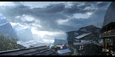
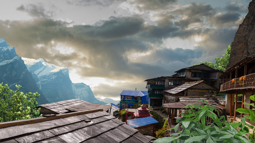
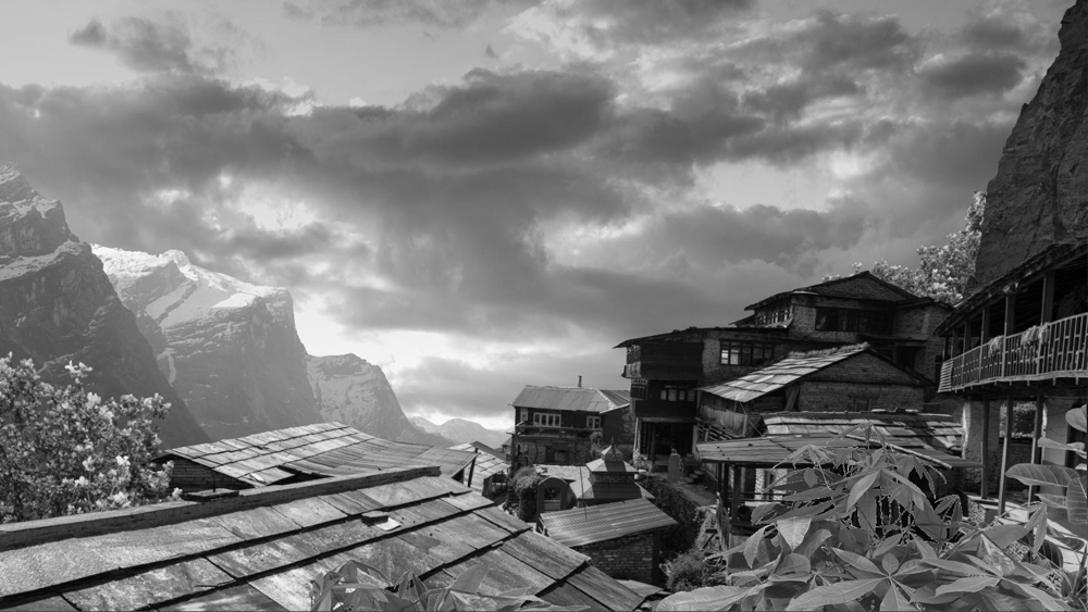
In this tutorial, I will make a matte painting using Clip Studio Paint. It will portray a village in the mountains in cloudy weather.
But before we begin, what exactly is “matte painting”? It is a process that allows you to create an extension of an existing landscape (set extension) or to create one from scratch. This practice is used in the movie industry as well as in the advertising and the video game industries.
See the article below to learn more about matte painting.
https://www.clipstudio.net/how-to-draw/archives/156700

Reference searching
After I’ve finished developing my ideas, I look up references that may be useful when creating my illustration.
It takes me at least half a day of research, depending on the subject and the complexity of the picture I am working on. When working professionally, I avoid digging through Google Images as I might get sued for copyright infringement (it can happen to anyone, even the show Stranger Things fell into this trap).
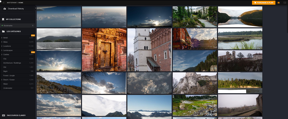
Most of the time, I find references on the website https://mattepaint.com/ which is filled with incredible images, aimed for matte painting and concept art. It is easy to navigate as pictures are sorted by categories (skies, mountains, panoramas, etc.) and can be downloaded in raw image format (.RAW) allowing precise modification.
Mood board
What is a “mood board”? A mood board is a reference sheet to help you convey the mood and atmosphere you want to create for your scenes. It is very useful when you are suffering from art block, and it can also help your future clients decide what kind of graphics they want.
To create your mood board, you can get inspired by looking at other artists’ work (beware of copyright infringements) or your own pictures. I recommend a board containing four or five images to guide you through the creation of the mood of your scene and your final choice regarding the composition. This is the starting palette of any matte painter.
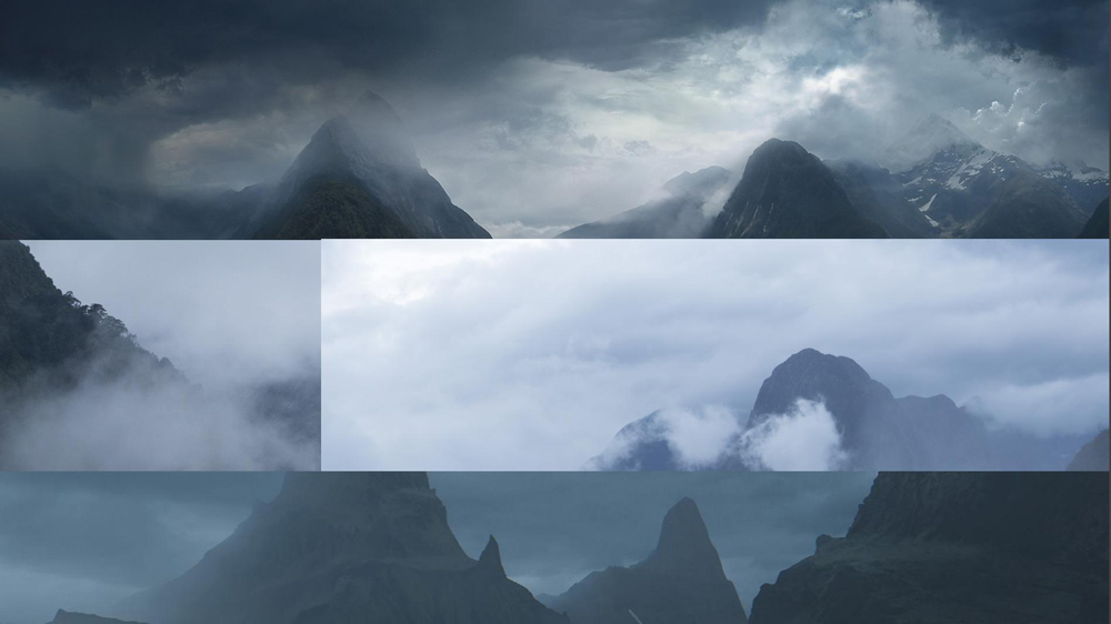
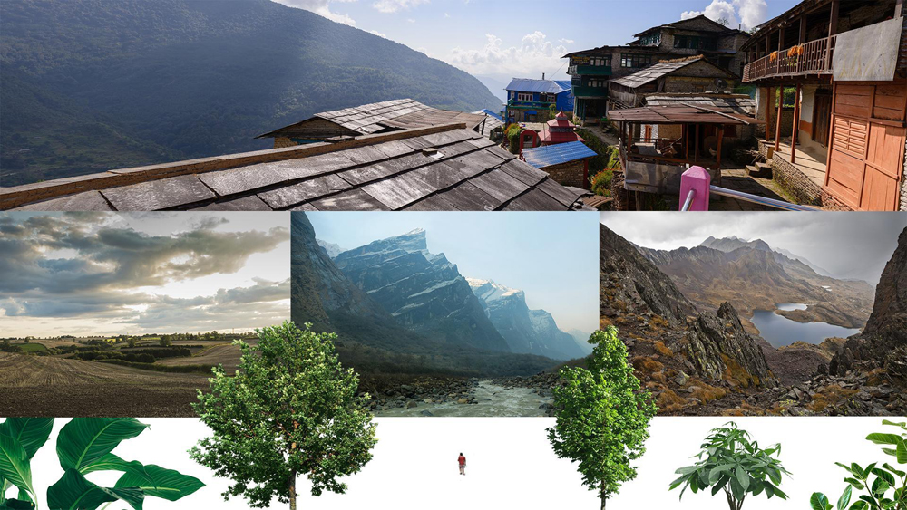
The pictures used in this tutorial
Here are the pictures that I used to create the matte painting for this example:
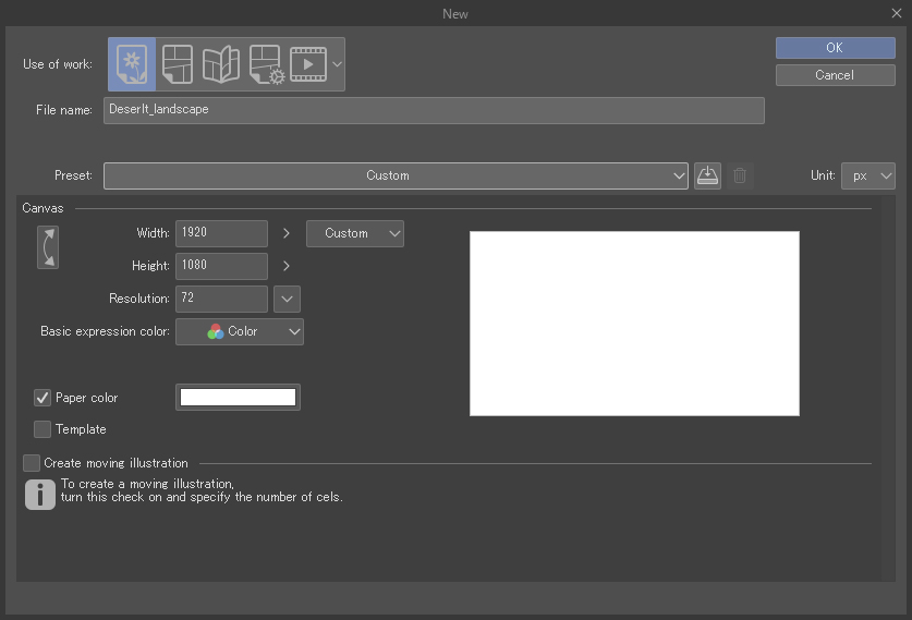
Creating a new document
I start by creating a new document through File > New (Ctrl + N keyboard shortcut).
In this tutorial, I use the full HD format (1920×1080) and I make sure that the resolution is 72 dpi (dots per inch).
Importing your pictures
To import your pictures, drag and drop them into the Layer palette.
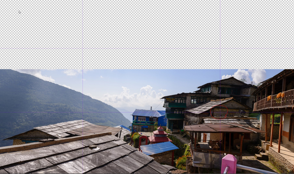
Picture composition
I use the shortcut Ctrl + R to show rulers that will help me create a grid, thus making it easier to position my main picture.
I try to respect the rule of thirds and place the village on the intersection of the right grid to make increase its impact on the scene.
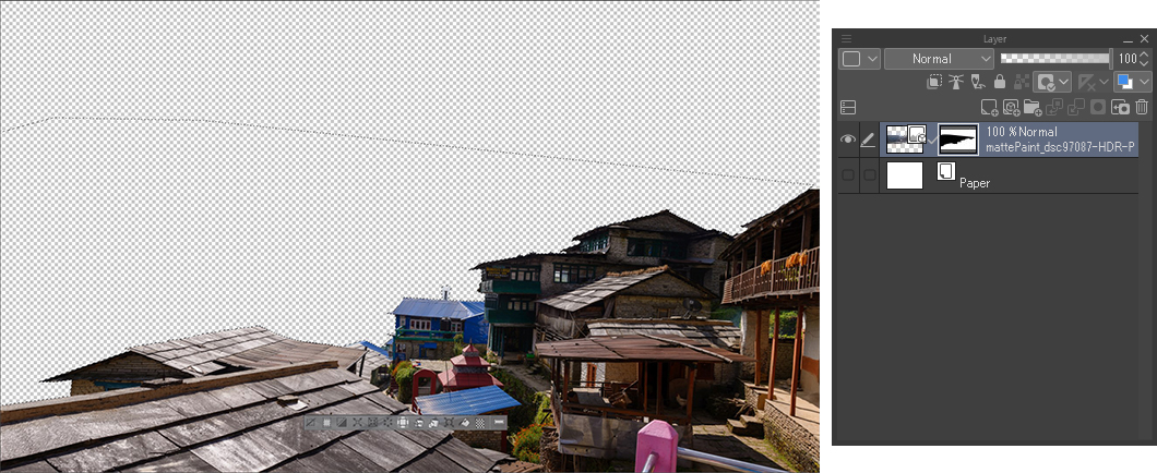
Cropping the background
I use the Polyline tool (shortcut: M) to crop the picture. I use this tool because the shapes of the buildings are straight and simple. If the picture had been more complex, I would have used the Selection Pen tool.
Once the selection is done, I apply a layer mask to my layer to hide my selection without deleting it permanently.
It is important to not destroy your basic image: always use layer masks, never delete pixels!
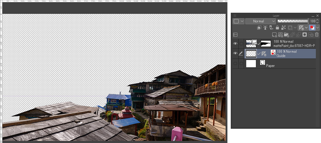
Adding a horizontal marker
Like in the previous stage, I use grids (Ctrl + R) to help me add a horizontal line. Thanks to that line, I can now position my pictures in perspective.
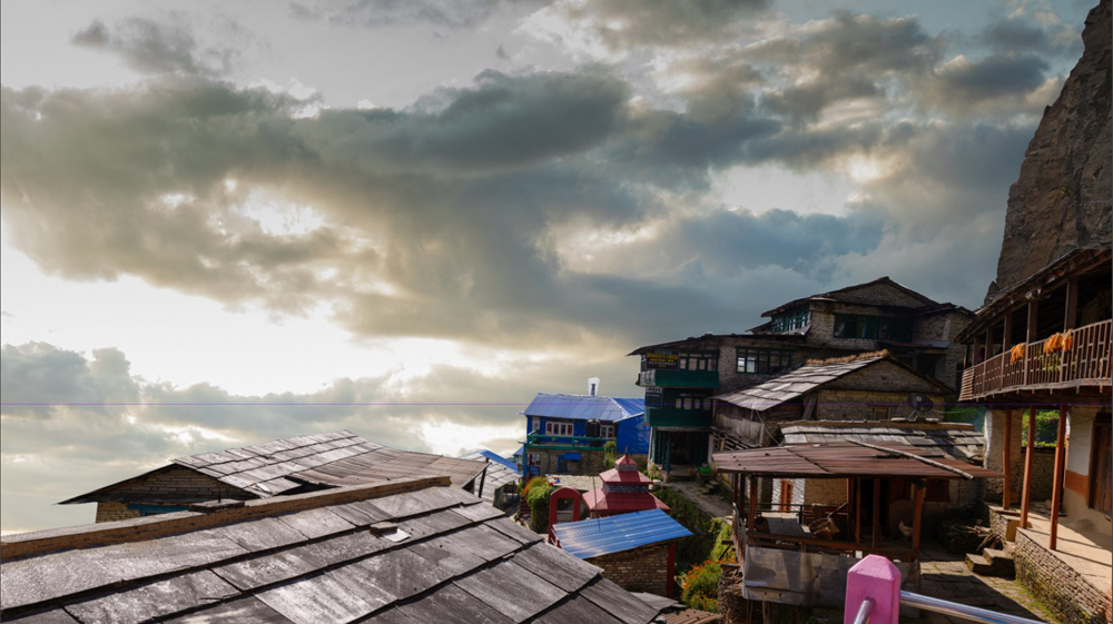
Positioning the sky
The sky is a key element to set the mood of the picture.
Be careful of the direction of the light in your picture! I use hints such as shadows to figure out where the light comes from. In this example, the sun is coming from the left.
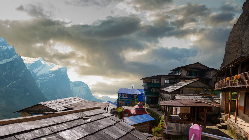
Adding mountains
Once the sky has been positioned, I import pictures of mountains. I select the ones that fit with the lighting and the rest of the scenery.
In this example, the mountains on the left guide the viewer’s eye towards the village while the mountain on the right surrounds the village, making the picture look more confined.
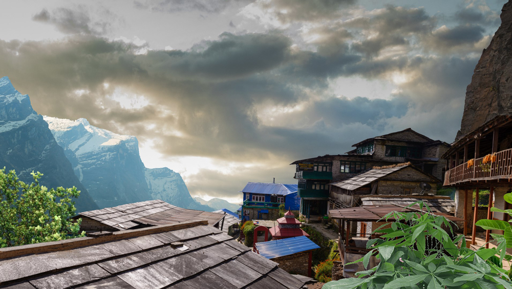
Adding greenery
Vegetation can help create a sense of depth; it also allows me to hide unwanted objects, such as the distracting pink structure in the bottom right .
For the time being, I’m roughly positioning the plants to build the landscape.
Cleaning up
The more details there are, the more difficult it is to see the whole picture!
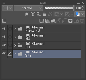
Take the time to organize your layers in groups and do not forget to name them to make it easier to find them later.
Adding depth
Adding a few trees in the background of the village helps to give more depth to the picture.
However, I try to be careful to not make them too big as to not “clog” the picture!
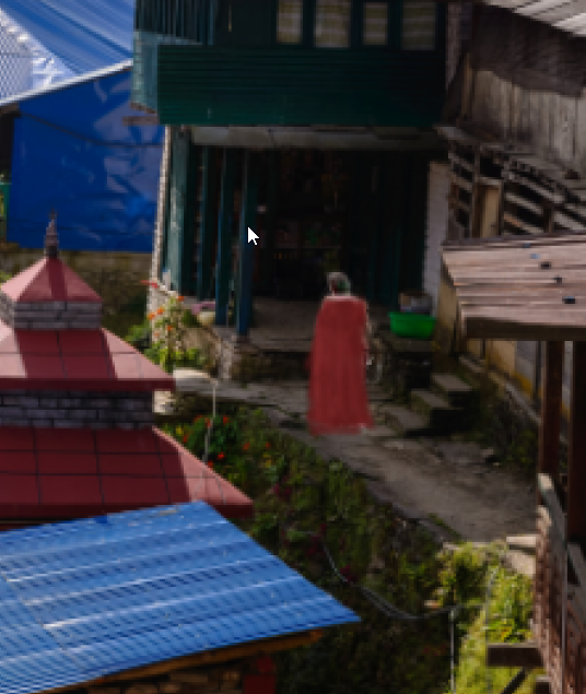
Adding a character
To make the picture look more alive, I import a character.
I crop the character and use a Brush tool to paint over him. I decided to give him a cape so he can easily blend with the fantastic landscape instead of looking like a tourist walking around in flip-flops…
Telling a story through your illustration is very important as it adds meaning and depth to your images!
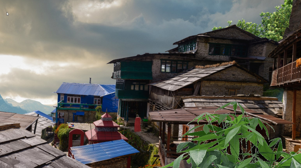
Cleaning the picture
The village looks too modern. I use the Copy stamp tool (a very powerful tool available in Clip Studio Paint), as well as the Brush tool to alter it. I also duplicate certain parts of the picture and paint over them.
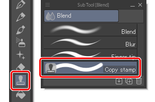
Copy stamp tool
Adjusting values and unify elements
Now that the composition of the picture is done, I adjust the values of the brightness to maintain consistency across the illustration.
The farther the objects are, the more light-colored they should be to blend with the rest of the landscape.
On the contrary, objects that appear closer should be darker. To do this, I create a new layer on top of the others and fill it with black. I then change the blending mode to Color or Saturation to obtain a black and white image.
Adjustment layers
To adjust the values of my image, I use correction layers. My document is well organized, so I just have to select the “Plants” group, then apply the Hue/Saturation/Luminosity function.
For now, I’m only adjusting the brightness!
Adjusting the sky
To be able to get closer to what I had in mind when I created my mood board, I correct the sky using a Hue/Saturation/Luminosity correction layer to slightly desaturate the image.
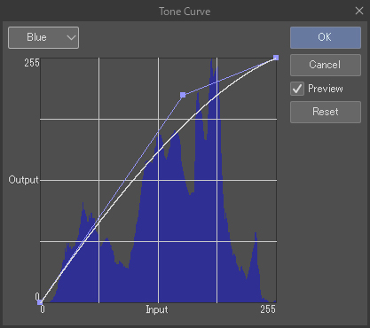
Next, I apply a Tone Curve in which I modify the RGB channels one after the other to increase the bluish hue of the picture.
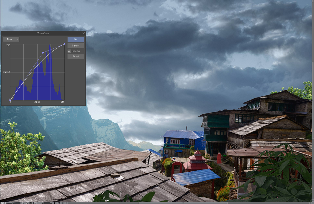
Overall mood
It is important to work on the sky first, as it establishes the color grading for the rest of the picture. That is why the sky should always be the first thing you work on when creating an illustration.
Now that the sky is ready, I’ll use correction layers again to adjust the rest of the picture.
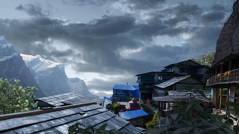
Aerial perspective
Once everything is adjusted, I add fog.
The farther an object is, the more it must be covered in mist. The fog adds depth, realism and embellishes the scene. To do this, I create a layer and paint over it. For example, I sample the color of the sky and then paint directly on the mountains in the background with low opacity.
I do the same for the rest of the image.
More details
Details such as clouds and sunbeams make the picture look more polished.
Once these details are added, I create a beam of light (a glow) to the left of the picture to imply that the sun is behind the mountains.
On a layer in Add (Glow) mode, I use a very large airbrush then draw a stroke of white on the top left.
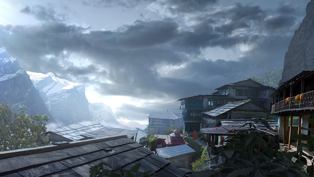
Almost done!
Lastly, I will share with you some of my little secrets…
I have a few habits: the first one is to increase the contrast of my picture. I duplicate all the layers, then I merge them. Once my image is flattened (be careful to keep a backup with all your layers), I duplicate it and change the blending mode to Soft light. I lower the layer’s opacity to around 40%.
Then, I add a slight vignette effect (darkening the angles of the picture), which I create manually with an airbrush and a dark color (I used dark blue in this example). On a new layer, which I switch to Soft light mode, I paint the edges of the image (except where the light source is placed).
To finish up, and connect all the elements, I apply a grain effect to my image. To do this effect, I create a new black layer which I switch directly to Soft Light mode. I then apply a noise effect from the Filter menu > Render > Perlin noise. But be careful to not overdo it!
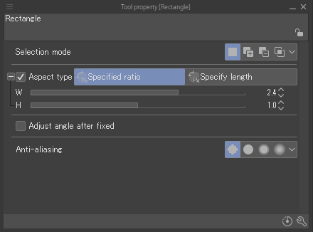
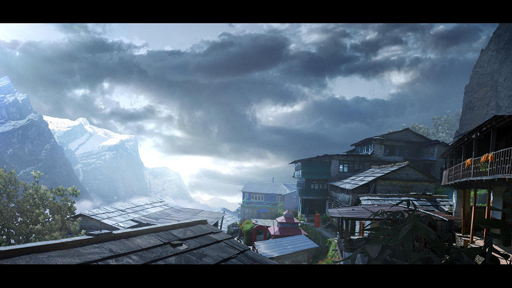
A cinematic look
If you want to give a cinematic look to your picture, there is a rather nice trick which consists of placing black bars at the top and at the bottom of the picture.
Just create a rectangle selection, then, in the options, check Aspect type and choose the Specify ratio method (the left icon). For the width, use 2.4, and leave the default height. You now have a rectangular-shaped selection in 2:35 ratio, just like in the movies! Create a new layer, reverse the selection (Ctrl + Shift + I), then fill it with black!
See you soon!
Benjamin N
About the Artist
Hi! My name is Benjamin Nazon. I am a concept artist and a matte painter. I work for companies such as Mathematic-TV, Eurosport, and Hexis.
I am presently studying lighting techniques in real-time on UE4 to gain new skills. I enjoy helping and sharing about art and welcome you to contact me on my ArtStation page or my website if you need help!
https://www.artstation.com/benjaminnazon
https://www.bnazon.com/
Interested in concept art or what it takes to become a concept artist?
Check out the link below!