Character Portrait Illustration Workflow (Video Tutorial)
Learn how to draw a dark academia-esque character portrait with artist Yana van Houtte, Cosmic Spectrum, who shows her workflow and process using Clip Studio Paint to create a moody illustration.
Contents
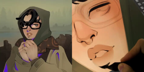
Hello everyone, I am Yana, also known as Cosmic Spectrum and I am very excited to show you all the process of how I draw a character portrait illustration in a dark academia aesthetic.
For this character portrait, I will only be using the default brushes (in the software) since this video is in collaboration with Clip Studio Paint.
Getting started
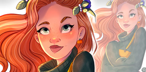
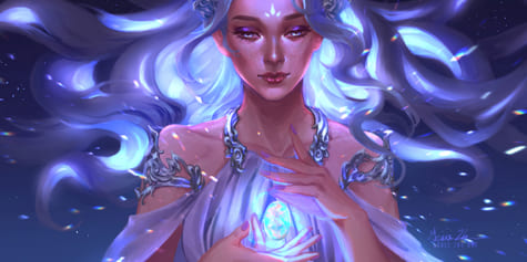
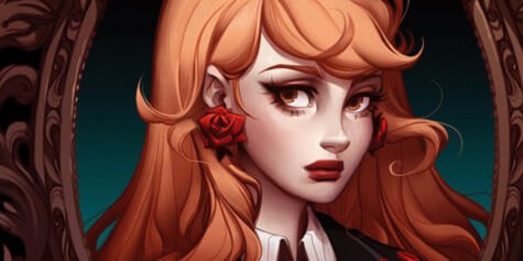
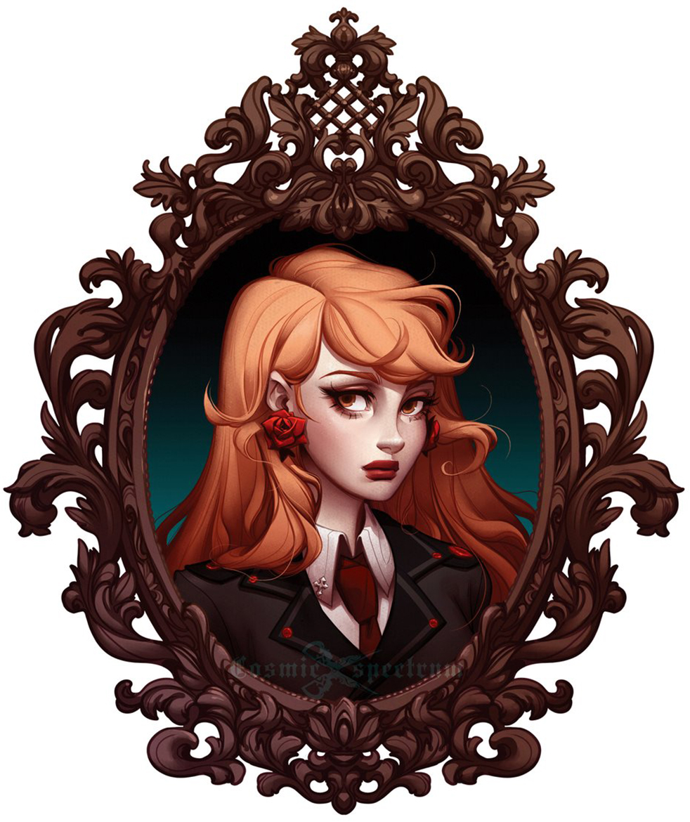
Today, I will be creating this moody portrait illustration of my original character, Noelle, depicted in an ornate antique frame. I will be using several Clip Studio Paint functions and brushes during my workflow to speed up and make the process easier to follow.
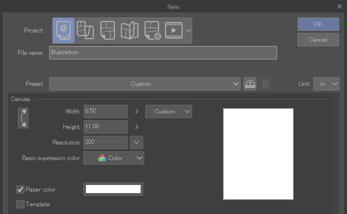
First, let’s open up a new document to begin the process of the portrait illustration.
For this character portrait I will be using a 8.5 x 11 inch canvas with 300 DPI.
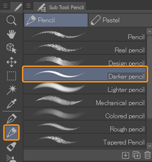
For the sketch I landed on a brush called “design pencil” which can be found under the pencil category.
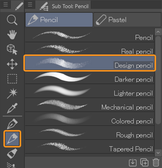
Can’t find the brush?
These brushes are part of the old default brushes – in newer versions of Clip Studio Paint you will have to download them yourself.
You can download the brush from the ASSETS store for free!
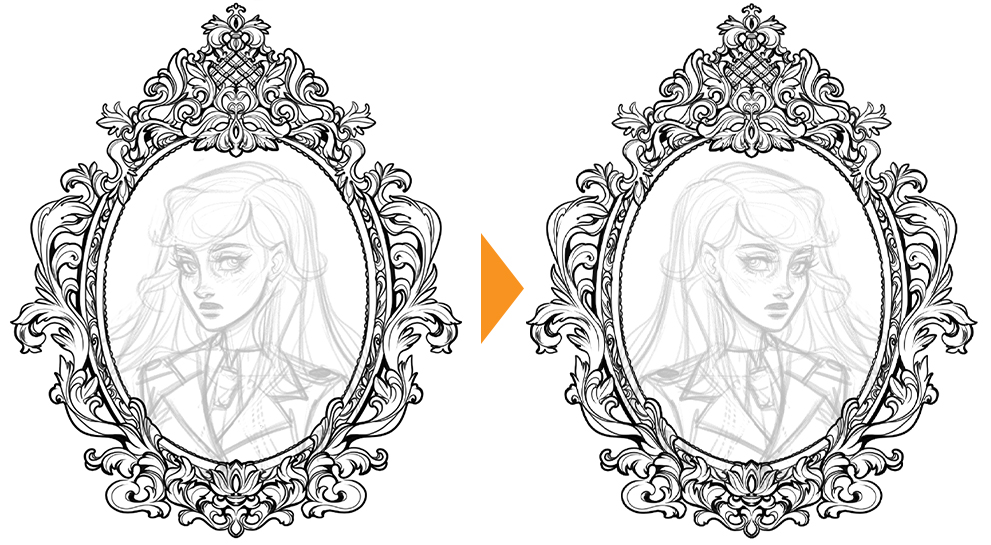
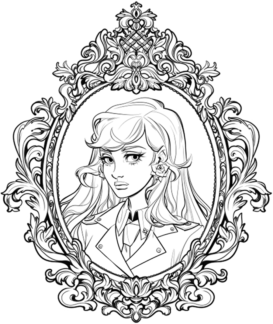
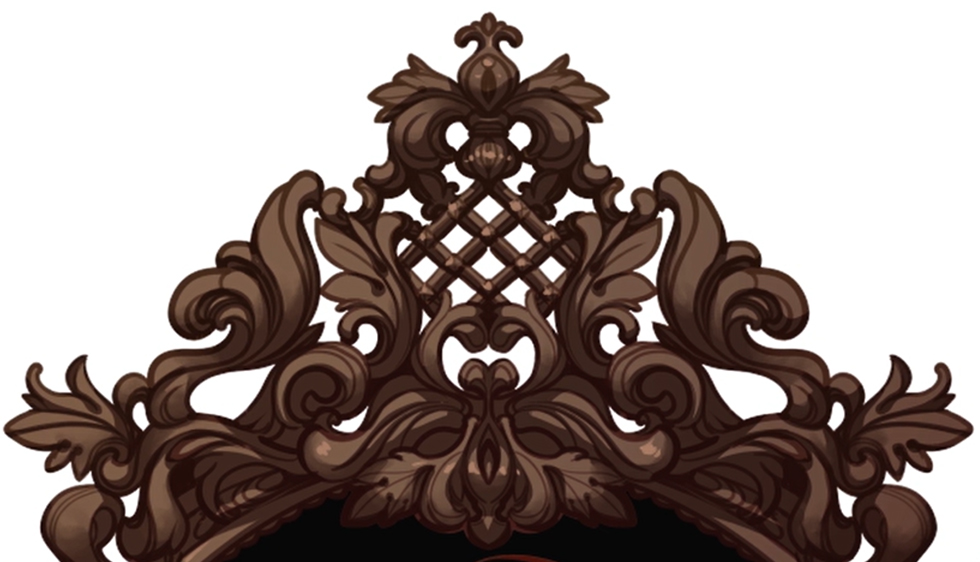
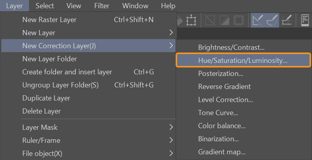
Drawing an Antique Frame
I started with the antique frame because I had a pretty clear idea of what I wanted it to look like, but I wasn’t sure what to do with the character or who I was going to draw as the focal point of this portrait illustration at this point.
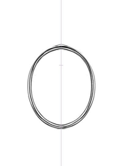
To create a visually appealing antique frame I began by placing the symmetry ruler on the sketch-layer and drew an oval as the base of the frame.
The symmetry ruler is an extremely useful tool because you can clip the ruler to the layer you are working on, and you can move it to other layers too.
This is something I haven’t seen in other programs, and it makes the whole process so much easier.
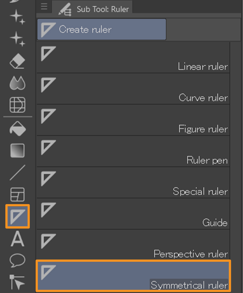
What is a Symmetrical Ruler used for?
If you want to draw symmetrical objects or geometric patterns, a symmetrical ruler can be of great help. It allows you to mirror what you are drawing on the other side of the ruler, thus creating a perfect symmetry. Depending on the type of drawing, you can decide how many symmetry lines you want to create.
Check out this article for more ideas on how to incorporate the symmetry ruler into your art.
After looking up a couple of references, I freehanded the design of the ornate antique frame.
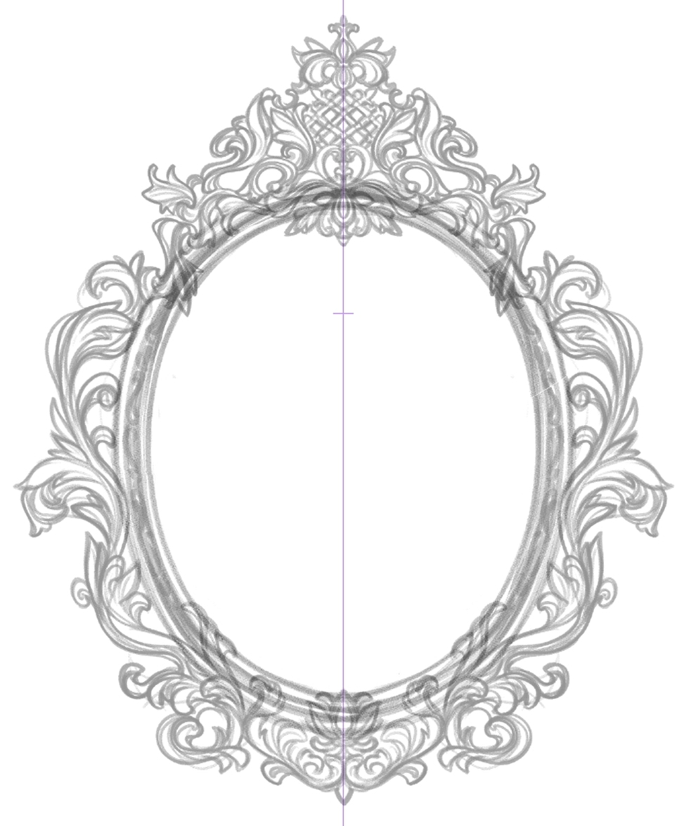
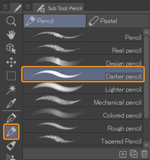
To ink the antique frame, after experimenting with some of the available brushes, I ended up choosing the pencil brush “darker pencil.”
I set the brush size to 12.0.
The inking process for the antique frame is pretty quick because it’s ornate and mostly decorative so I don’t have to think too hard when I make designs like this, as I can draw what I imagine without needing to confirm if it is correct or not.
I was amazed by how quickly I was able to draw the detailed looking antique frame by using the Symmetry tool and I highly recommend trying to play with it because it is so fun.
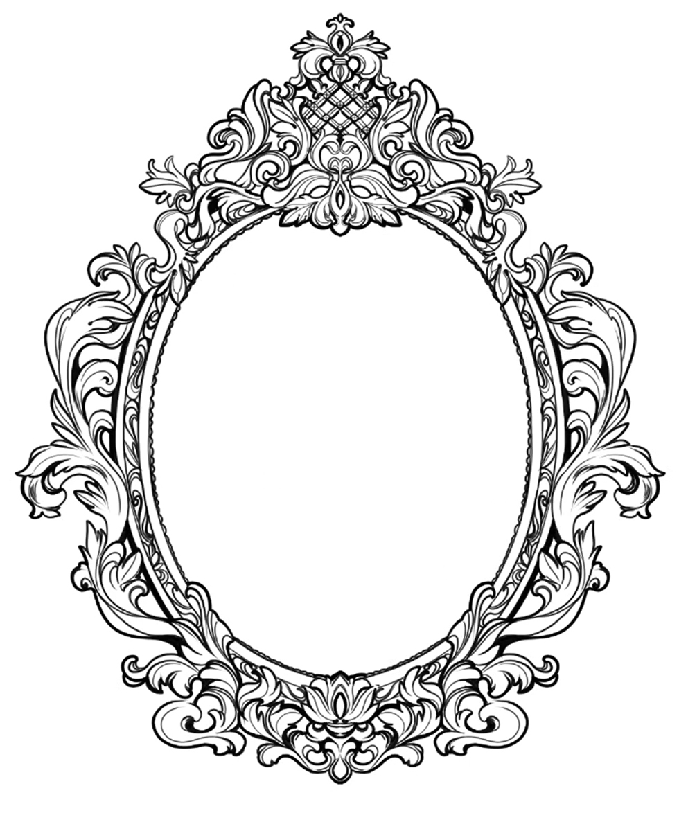
The inking of the antique frame is a quick process and as soon as I was done with it, I started sketching the character portrait.
Want to speed up the process?
With the help of ASSETS you can quickly add a glamorous vintage or antique frame to your drawing.
The Portrait
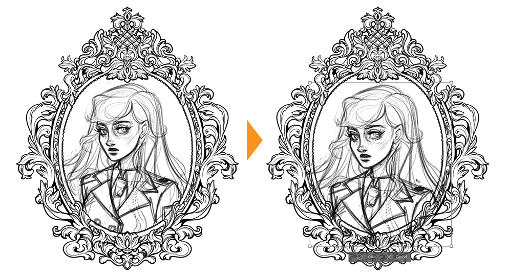
On a new layer, I am now moving on to the character portrait that is going to be inside of the antique frame.

I am not too worried about the placement at this point because I know that once I get the sketch to completion more or less I can move it around, so my primary goal here is to get the sketch looking as close as possible to my character.
How do I adjust the size and placement of a sketch or drawing?
To easily adjust the size or placement of the sketch choose Scale/Rotate from the command bar above the canvas while the layer you want to adjust is selected.

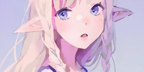
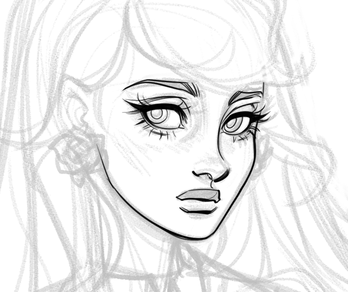
When I draw my character’s faces I want it to look close to what I imagine them to look like, so it takes a while because I keep erasing and fixing certain features.
This character’s name is Noelle and she’s one of the main characters in the comic I’m currently writing so I have a ton of background information about her and I feel super familiar with what type of vibe she has and her character design, which is why I was so adamant on getting it right before moving on.
About Noelle
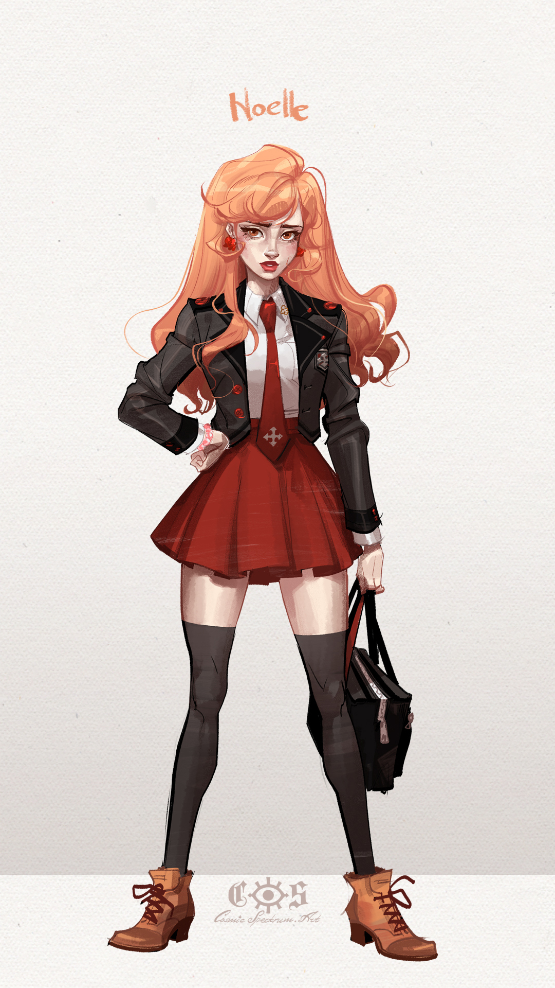
Noelle is a character in the comic Gloamingvale which is currently in production – for more information check out the official site:
Once I was more or less happy with the face, I moved on to the hair.
I want to mention that when I decided to move on to the face it wasn’t at the “100% happy” point.
I do this, because when the sketch is too perfect, I have so much trouble replicating it with the line work, since something inevitably gets lost.
Which is why, it’s sometimes easier for me to leave the sketch at 85% perfection, and then bring it up to 100% during the inking process.
That way, I feel like I’m perfecting the sketch instead of trying to replicate it by inking which can be pretty impossible for me, since I can never get it to look the same way.
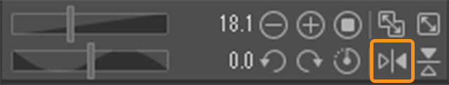
To start inking, I lower the opacity of the sketch layer and flip the canvas to start inking the face. I flip the canvas to make sure the proportions of the character are correct.
How to flip the canvas
You can flip the canvas by either clicking the flip icon underneath the preview window, or by selecting View > Rotate/Flip > Flip Horizontal.
The image will be flipped around the center point.
Note that Fill layers and tonal correction Layers can not be flipped.
Inking
For inking I’m using the same brush as I did for the antique frame, which is the “darker pencil” brush and setting the brush size to 8.0.
When I’m inking an illustration for a character I usually spend the most amount of time on the face, this is for the reason I mentioned earlier where I’m just trying my best to get the characters to look like what I imagined them to.
I ink the face first because it is the most energy consuming and the most important part of the drawing, and it kind of dictates the mood of how everything else is going to go.
This is an example of the things I take into consideration during the drawing process.
These micro decisions, like what to draw first, keep it fun for me, so I kind of dart back and forth between the different parts until I am done.
This is also why I decided to ink the clothing before the hair because I know that the hair is going to be draped over it but I am not 100% sure where yet.
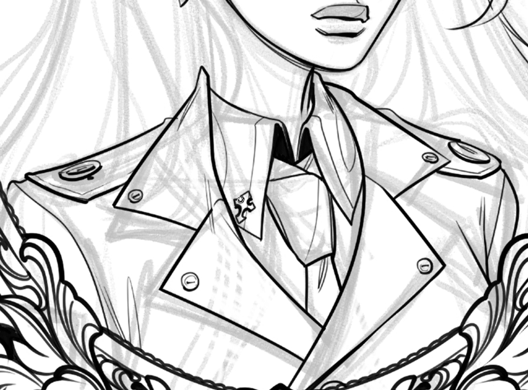
I decided to just ink the clothing and then erase whatever parts of it are going to be covered by the hair instead of doing the hair first and then figuring out where the clothes go underneath.
I do this quite a bit and I think it might seem like it’s extra work, but it actually ends up being faster to do things this way for me.
At the end I am defining some lines to help me see the silhouette with more clarity.
When it comes to a drawing like this, I aim to have certain areas that are busier than others and have some areas that are kind of like a rest for the eyes, creating a sort of rhythm.
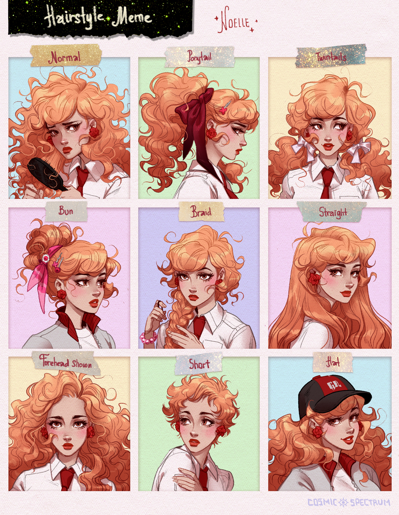
I tried to put a little more detail in the hair and other areas, to attract attention to smaller areas and take the viewer’s eyes around the entirety of the portrait illustration and of course to the focal point which is the face.
Once I finish inking I flip the canvas again to start the coloring process.
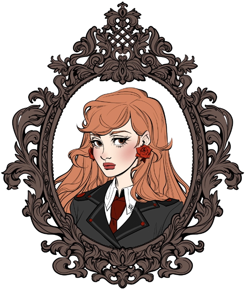
Coloring
Flat Colors
In this stage I am adding the base colors for the portrait illustration to the canvas using the selection tool.
For this character portrait, I already knew a lot about this character and since her hair and eye color, the color of the uniform, and the overall color scheme is pretty much decided, I didn’t have to think much about the colors.
Generally, I think that keeping it simple is a very good rule to go by when picking colors.
An important part for me is coloring the lines and picking the colors for the lines.
Picking the colors can be kind of tricky and sometimes I’ll go back and tweak the colors depending on what the rest of the image ends up looking like.
This is one of the fun parts of the process for me, because it instantly makes the character portrait very pleasant to look at.
I also added some darker and lighter colors to the flat color to create a gradient.
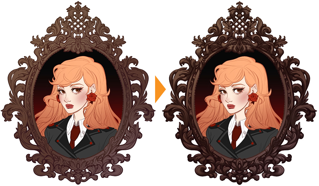
Shadows
After laying down the flat colors and a background, I decided to give the antique frame more volume. I could have gone into a lot more detail but because the focal point of this portrait illustration is the character, I went generic on the shading and I didn’t add any highlights at this stage.
After I added shading I went to soften some of the edges with the “wet bleed blender” which is also one of the default blending tools that can be found in Clip Studio Paint.
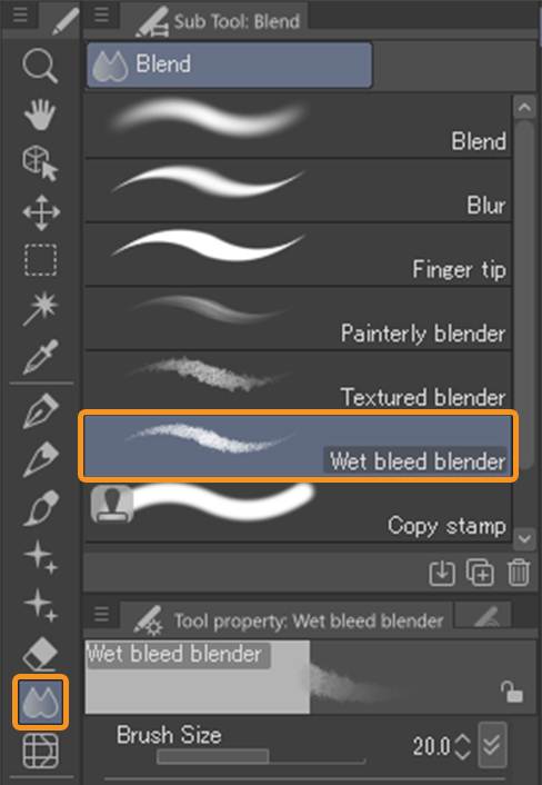
After I softened some of the edges and added a bit more detail, I decided that that was probably enough and moved on to the portrait.
My steps for adding shadows and lighting to a character portrait starts with putting down very crude shapes and jagged lines with a solid brush.
I do this on a separate layer, which is set to multiply and about 60 opacity.
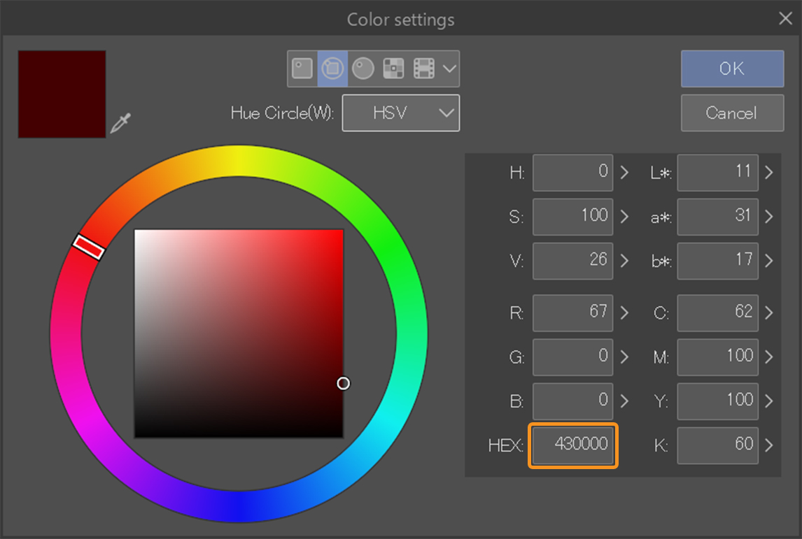
I always use a dark burgundy color like a dark red to do the shadows with, here I am using the color #430000.
After I do the abstract type of Shadow shapes, I usually work from imagination here. I put down the shapes where I think Shadows or lighting would be based on the vibe of the picture.
The initial placement is nothing complicated and I usually spend more time polishing the shading.
Here I am imagining that the light is coming from somewhere above and in front, a little bit to the left of the character.
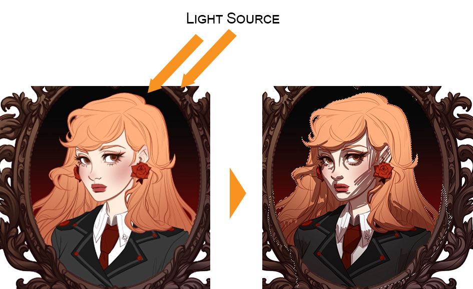
This step doesn’t actually take very long but I take my time with it.
I like to keep the layer count low which is why most of the time I actually just do one Shadow layer but in this portrait illustration I actually ended up using two.
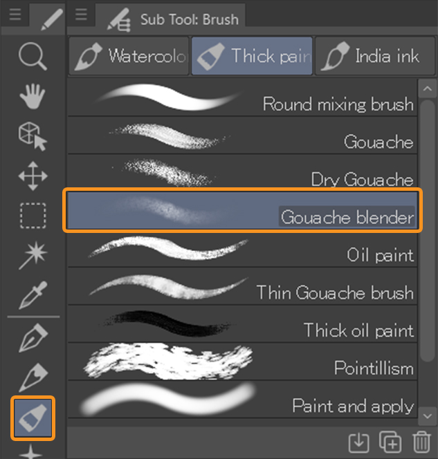
Adding Texture
Creating texture in a digital illustration, like what you would find in traditional art can be somewhat difficult, which is why the coolest thing about this particular process that I loved was the “gouache blender”.
It’s absolutely amazing.
It’s a really nice smooth blender but it also adds these tiny pixels to create a subtle texture.
I just really love this blending tool.
I think it looks good and I was super involved with it and I spent a long time polishing all the steps, like the extra Shadow layer, which is a little bit out of the ordinary and I was immensely enjoying using it.
Blending
On the first layer of the shadows I make multiple, careful passes over all the areas so I’ll do a soft Shadow and then I’ll go over it again with the blending tool.
I’ll blend out the color and that way it gets less saturated and then I go over it again to add more saturation and depth.
I usually go over one area two to three times to get it to the darkness that I wanted to be.
If i go over the same area one more time not changing any of the brush settings just using the same brush same color it’ll appear darker.
I go all around the canvas frequently zooming out just to see which parts I want to concentrate on and slowly make my way towards polishing the results.
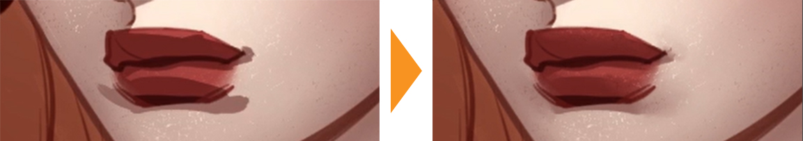
Lips
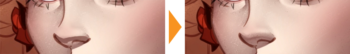
Nose
Accessory
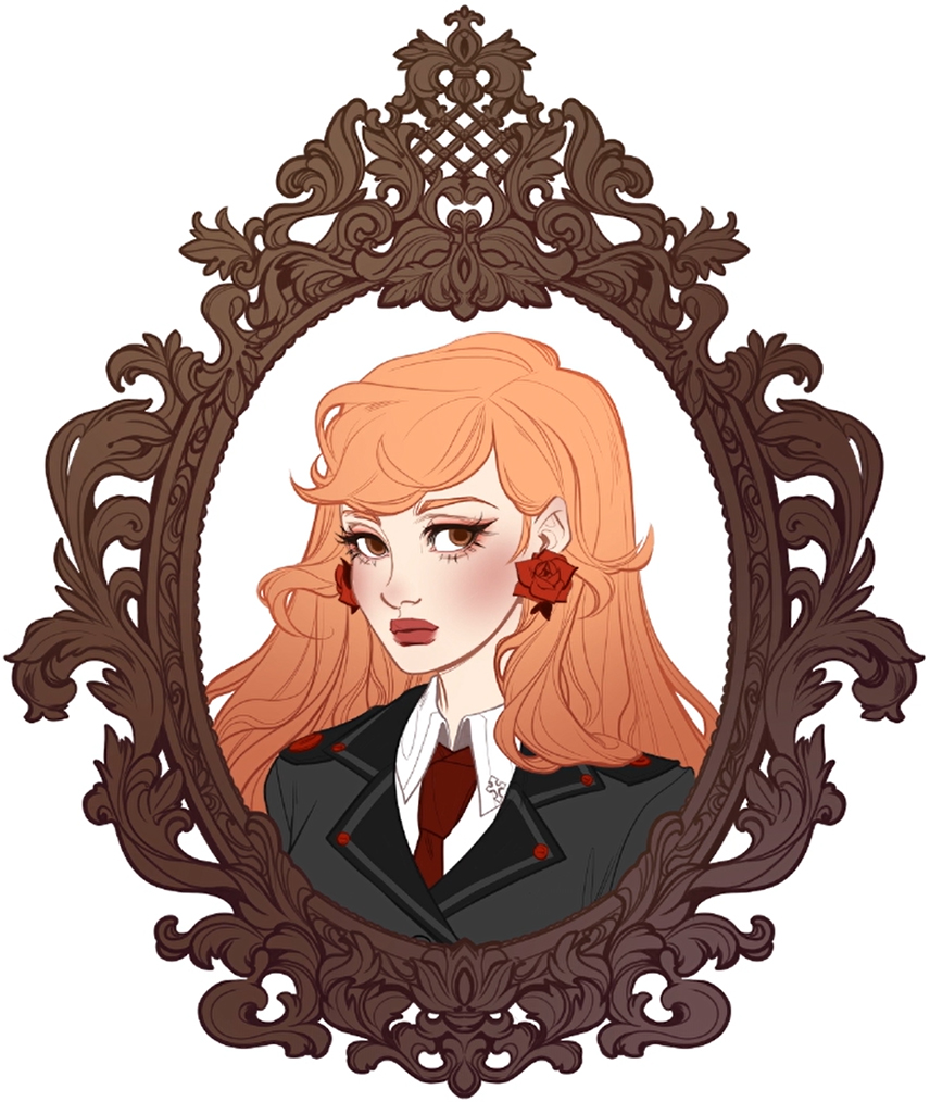
I wanted to be meticulous with the shading in this character portrait, so I made another Shadow layer on top of the one I already have for the darker areas.
I essentially did the exact same thing I just did on the new layer.
I set it to multiply and 55% transparency, and again using the same color (#430000) I went over certain areas and this time it’s obviously a lot more detailed work.
Eyes
Hair
Paint Overs
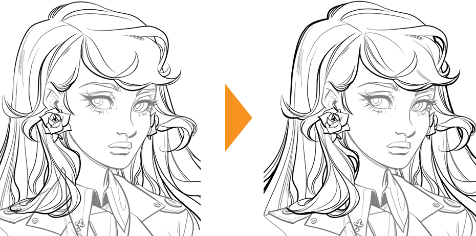
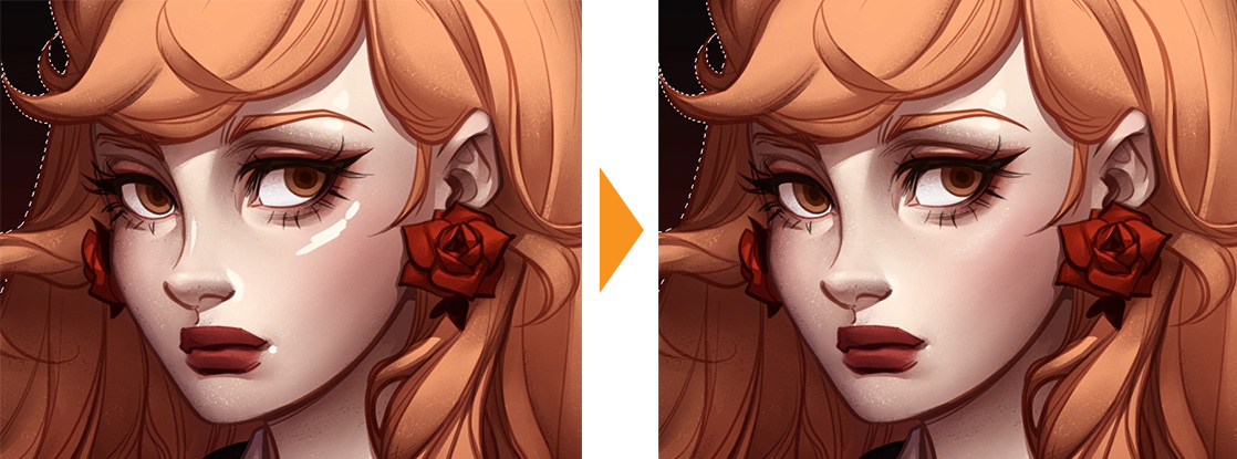
As soon as I decided to finish up the second shadow pass I moved on to the next standard part of my process which is doing small paint overs on a layer above everything else.
This step is one of the best steps because it really adds so much to the character portrait, I cover up some of the line work with paint overs.
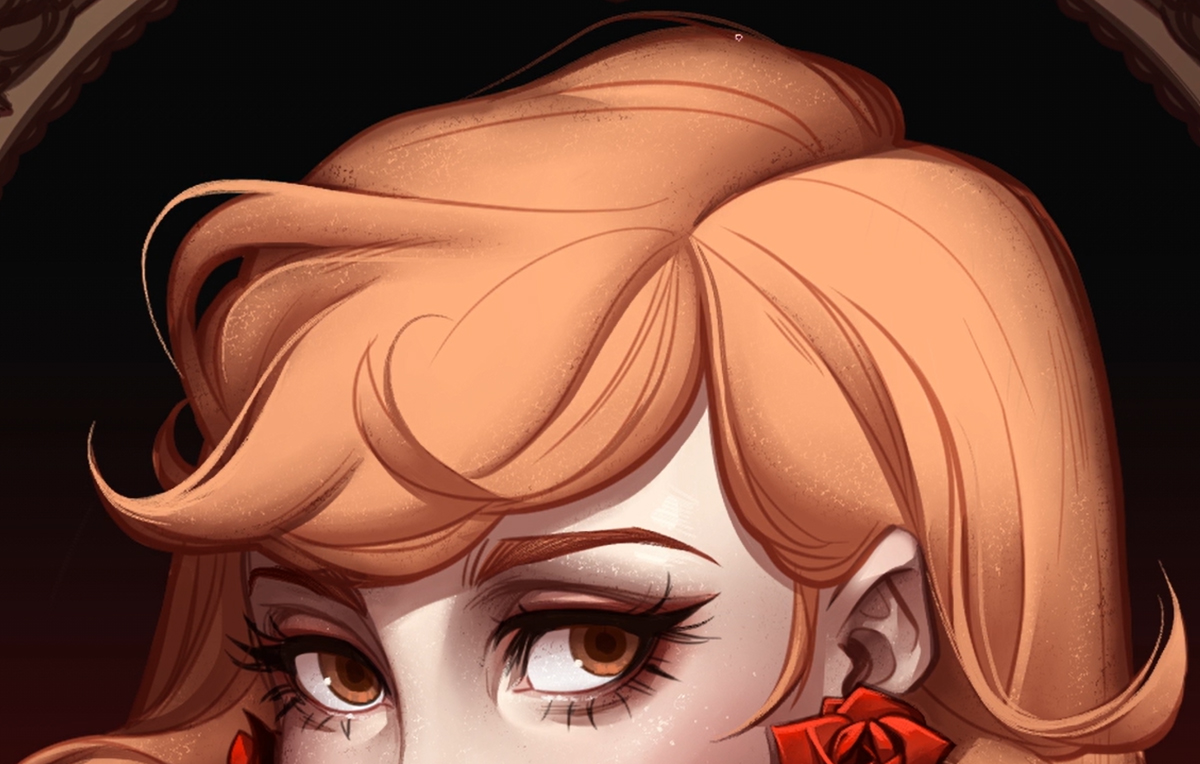
The main points that I cover and focus on in this step are the hair strands; to make the hair look more alive and give it more contrast, like to have some of the strands stand out from other strands that are behind it.
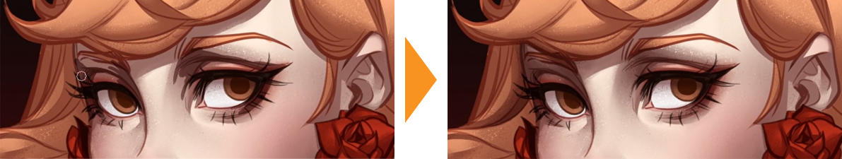
Highlights
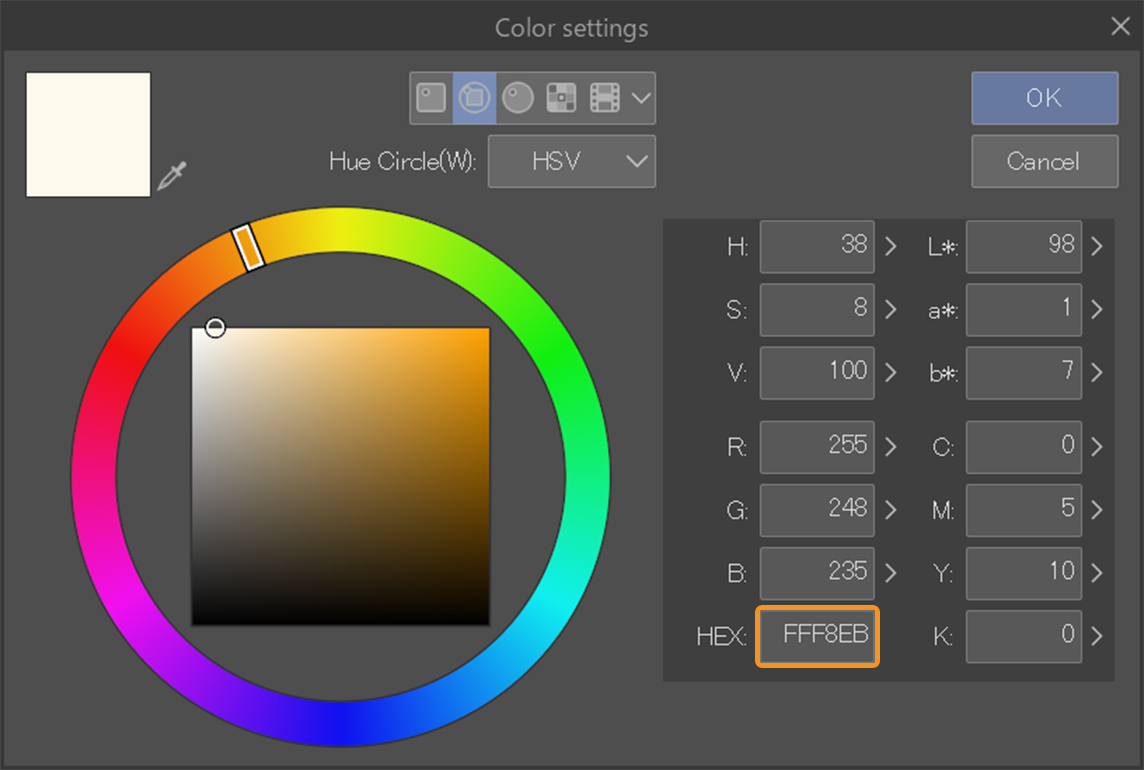
I also add tiny highlights on various parts of the portrait illustration like the eyes, the nose and whatever else has small details in it.
For the highlights in the face I am using the light cream color #FFF8EB.
Face
Eyes

Lips
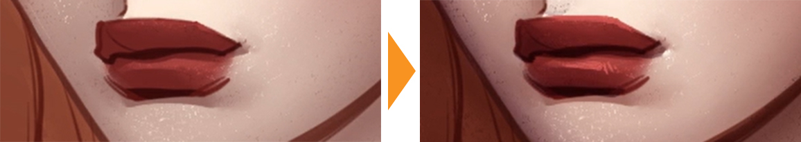
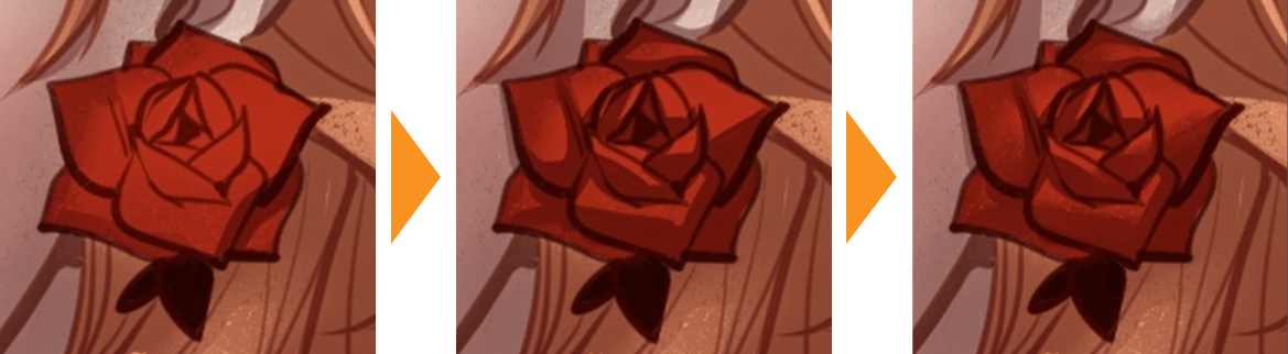
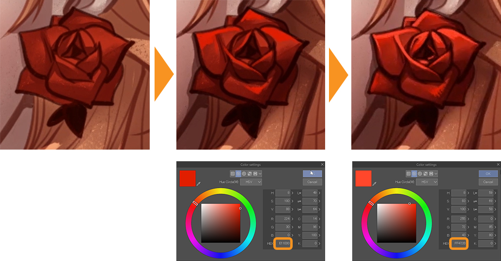
I also decided to go into more detail on the rose earring using two reds (#E11E00 and #FF472B) to create more depth.
Depth
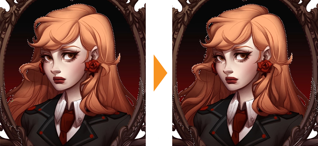
After I finished putting in the highlights, I decided to give the portrait illustration some extra polish with the paint over so I wanted to soften some of the line work and add a little bit more depth in certain parts of the hair.
By adding small strands of hair you can make the portrait illustration appear more lively and the hair more voluminous.
I think this is my first time having such a nice and smooth hair rendering result in an illustration which is why I’m so impressed and pleased with how it turned out.
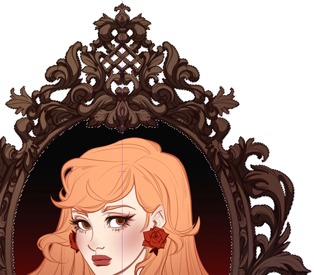
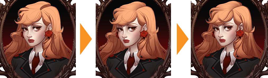
Finishing Touches
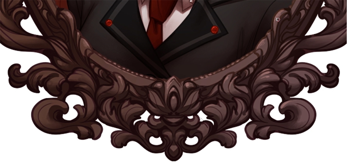
I added some tiny highlights to the antique frame because I figured the frame now looked kind of unfinished compared to the portrait illustration so I wanted to give it just a little more work.
Top
Bottom
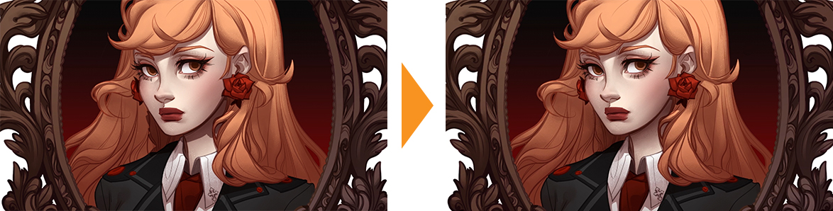
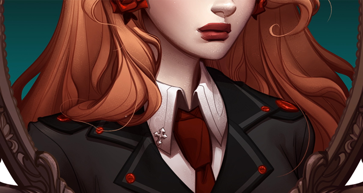
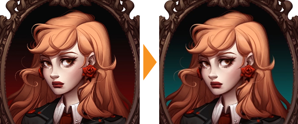
The last thing I did was change the background color because I thought it was kind of blending into the hair at this point and I really love the contrast of this teal color.
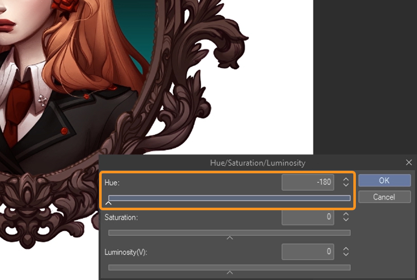
I think it added to the sort of moodiness that was missing before.
Sometimes it can be like an endless process, I keep wanting to go back and add some more polish here and there, so at some point it’s good to just call it quits.
Because I do see how this process can get out of control and become infinite, I could technically go back and keep polishing the hair into infinity but at this point I thought it looked decent enough to call it done.
That is the entirety of the process of this character portrait.
I’m super happy with the results of this portrait illustration, and I hope you enjoyed following this process.
Artist Profile
Yana Van Houtte, also known as Cosmic Spectrum is a Toronto based artist specializing in character art and comics. Yana is currently working on her own comic series “Gloaming vale.”
See her works here: https://cosmicspectrum.art/pages/about-the-artist
Intstagram: @cosmicspectrum
YouTube: @CosmicSpectrumArt
)