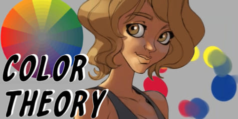
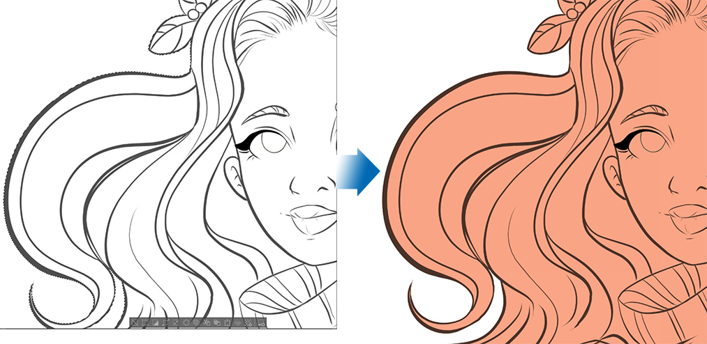
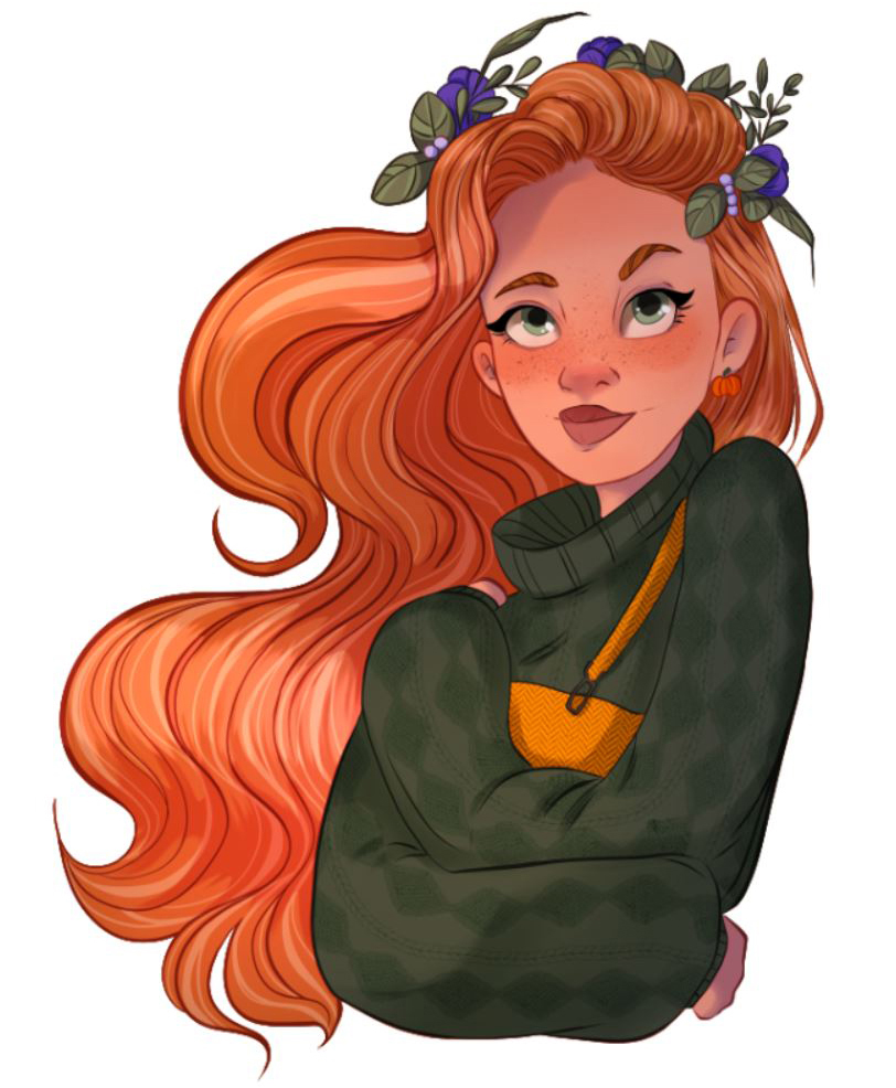
Painting digital illustrations for Instagram
Cristina Gómez explains how she paints her work in this Instagram digital art tutorial covering brush choice, shadow & highlight creation using blending modes & bonus watercolor techniques.
Index
-
-
- Transformation tools
-
- Brushes for coloring
- Creating a Color Palette
- How to Paint base colors
- Knowing how to work with layers
- Making lightning effects with blending modes
1. Presentation
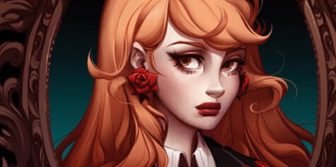
Hi everyone! I’m Cristina Gómez, a freelance illustrator and graphic designer specialized in digital portrait drawing. In this tutorial, I will show you how to create a full-color illustration for your Instagram, from basic canvas settings to a full rendered work. Shall we start?
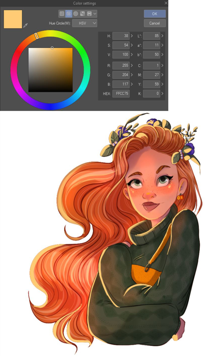
2. Setting canvas for Instagram
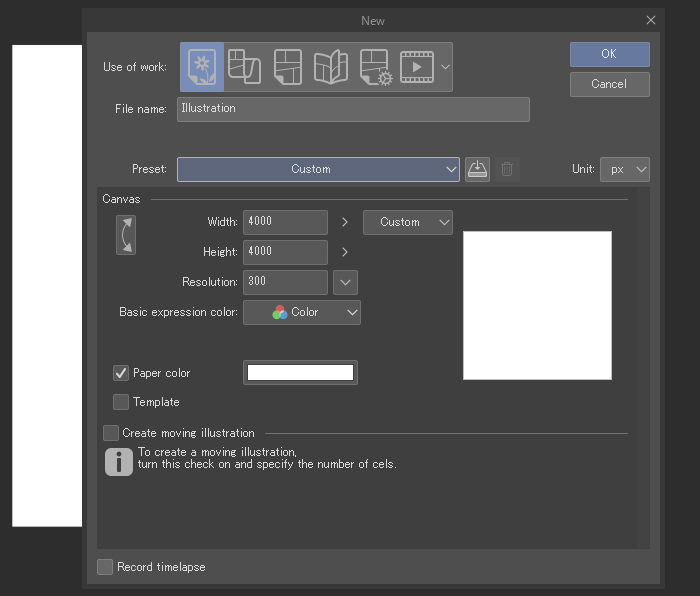
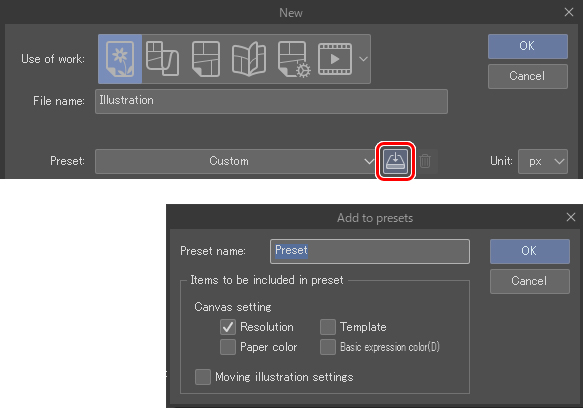
The first thing is to set the canvas, in my case, my canvas size for Instagram 4000×4000 300dpi but, because if I need to print it, I have it in the right resolution, but if we need a lower resolution file for the screen, we can set it up to 72dpi, and it will continue looking awesome.
Also, we can save the presets to have them ready for next time.
3. Time to sketch
Brushes
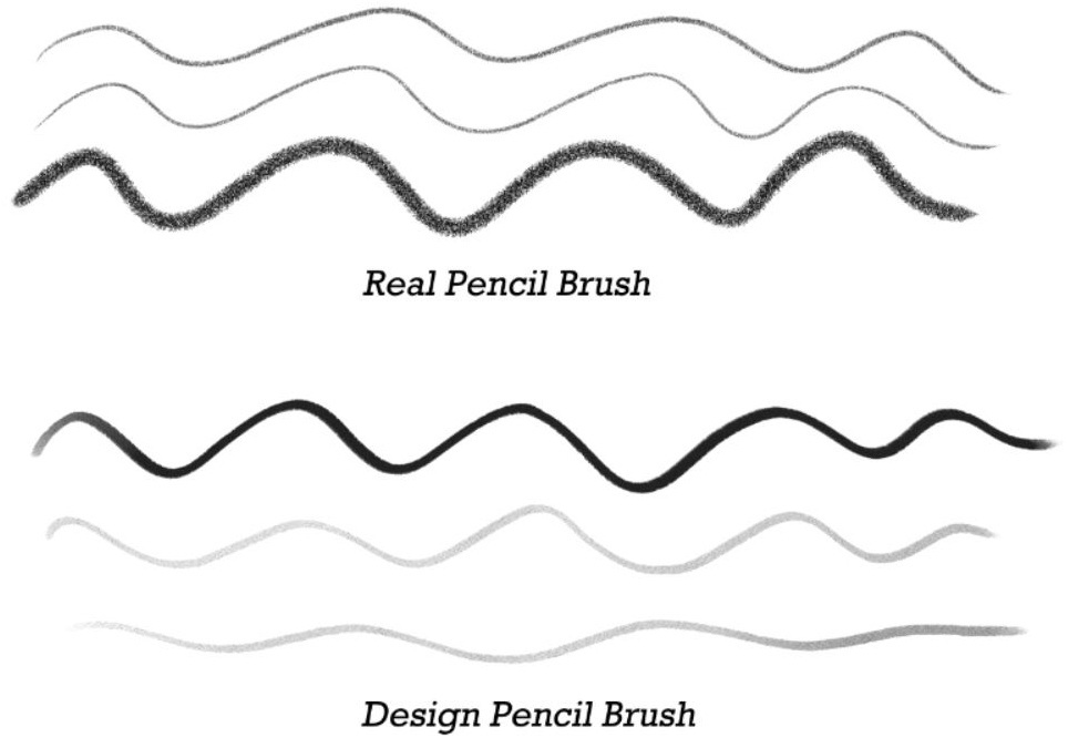
For sketching, I love to use textured brushes, like the real pencil or the design pencil. I love the realistic effect as if drawing on paper.
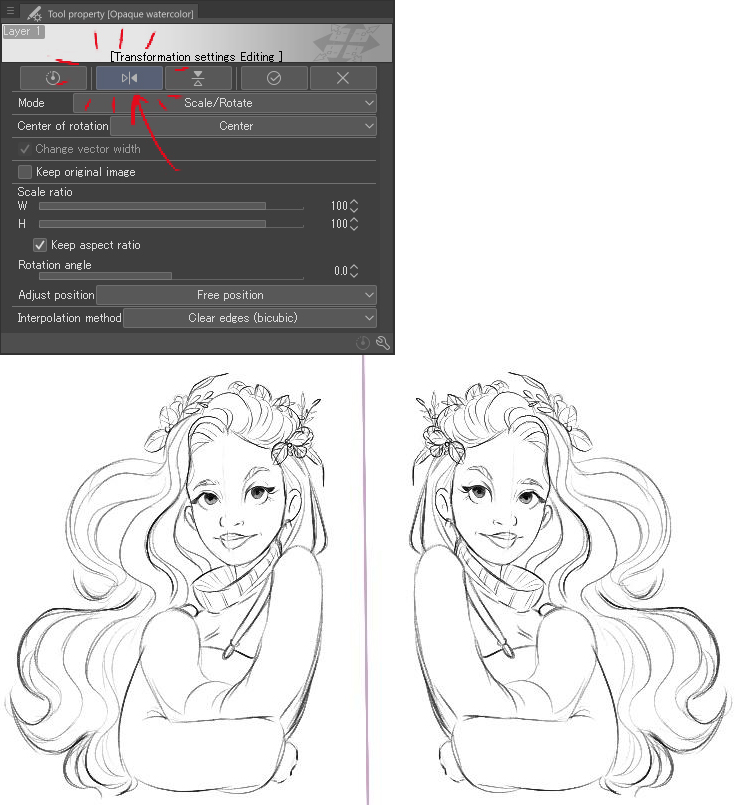
Transformation tools
When doing the sketch, I like to use some tools to adjust the drawing to my needs, like the flip canvas horizontally, the transform tool, and mesh transformation. They help me to get the correct proportions and view of my portraits. Mesh transformation can be found here (Edit menu > Transform > Mesh Transformation).
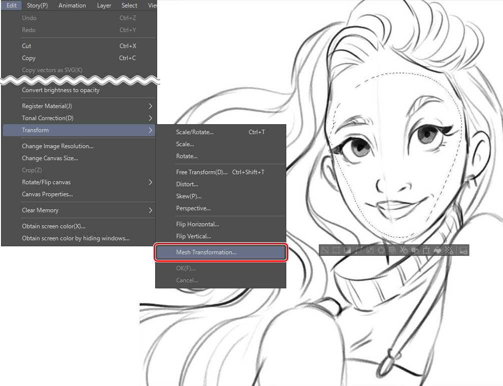
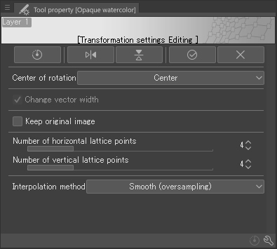
You can adjust the settings for this tool to make it more suitable for the area you need to transform by changing the number of lattice points.
Another tool that I use each time is the flip horizontal option. It helps to refresh the point of view.
4. Time to color!
Brushes
For coloring, I used the Clip Studio Paint present brushes, like the Mapping pen and the Oil Paint brush for color blocking, which fits perfectly with my needs. For basic shadows, I ended up using the Smooth Watercolor brush, which is perfect for this soft effect I am working for in this illustration.
For the textures, I downloaded other brushes and images from Clip Studio ASSETS:
Knit cables: https://assets.clip-studio.com/en-us/detail?id=1767268
Herringbone more Bosoboso: https://assets.clip-studio.com/en-us/detail?id=1751233
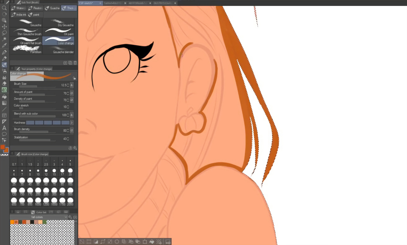
Inking
Inking is a very careful task; we must try to close all gaps to achieve a faster result on the filling part. I use vector layers and the vector eraser brush to ink.
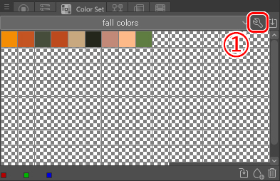
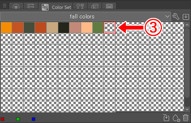
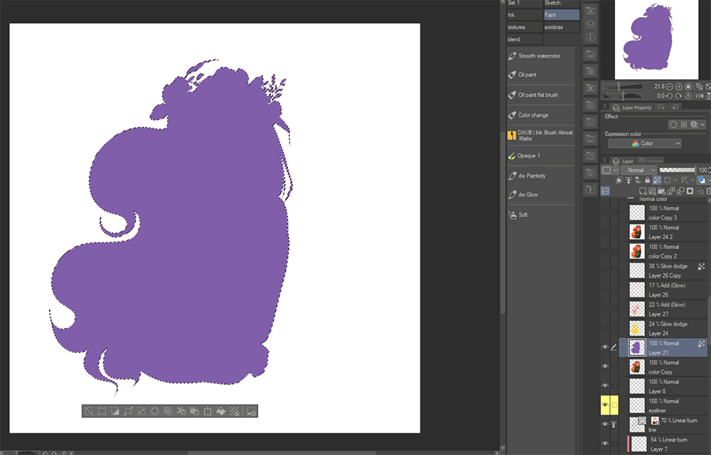
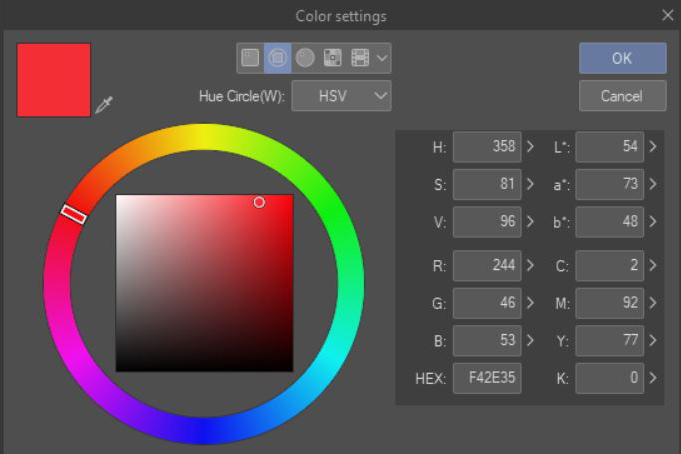
Creating a color palette
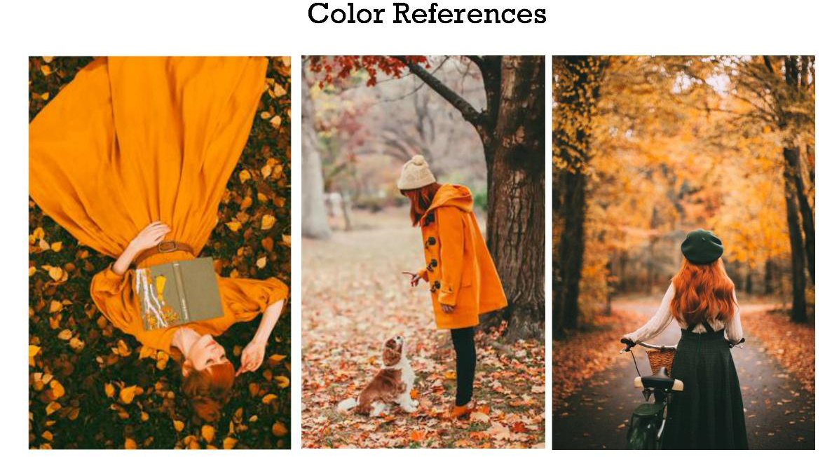
It is important to set up our color palette before painting to have a clear idea of the hues we are going to work with.
To set up the color palette:
Step 1:
Step 2:
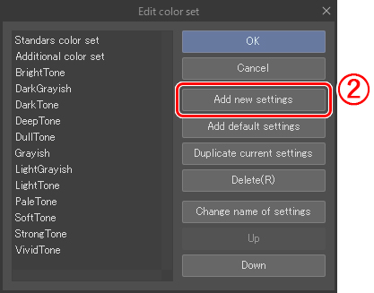
Step 3:
Step 4:
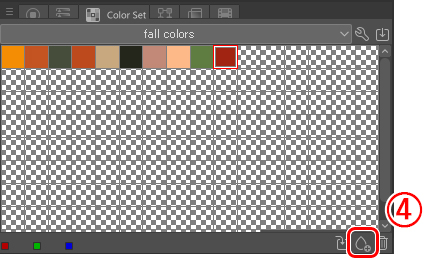
For completing our palette, we must repeat steps 3 and 4 until we have all the colors we need.
Base Colors
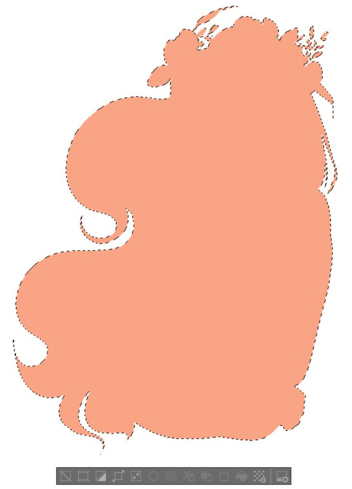
The first thing I do for the color is to paint all the shapes of the illustration. For doing that, I go to the clean sketch layer, use the auto-select, invert selection and, check that all the line art is inside of the selection, then fill.
Now is time to start filling in all the elements of the illustration, such as the hair, clothes, and so on. We can do it two different ways, using the fill tool or drawing (with the main shape selected) on a new layer and use the fill “refer other layer” tool.
Option 1:
Option 2:
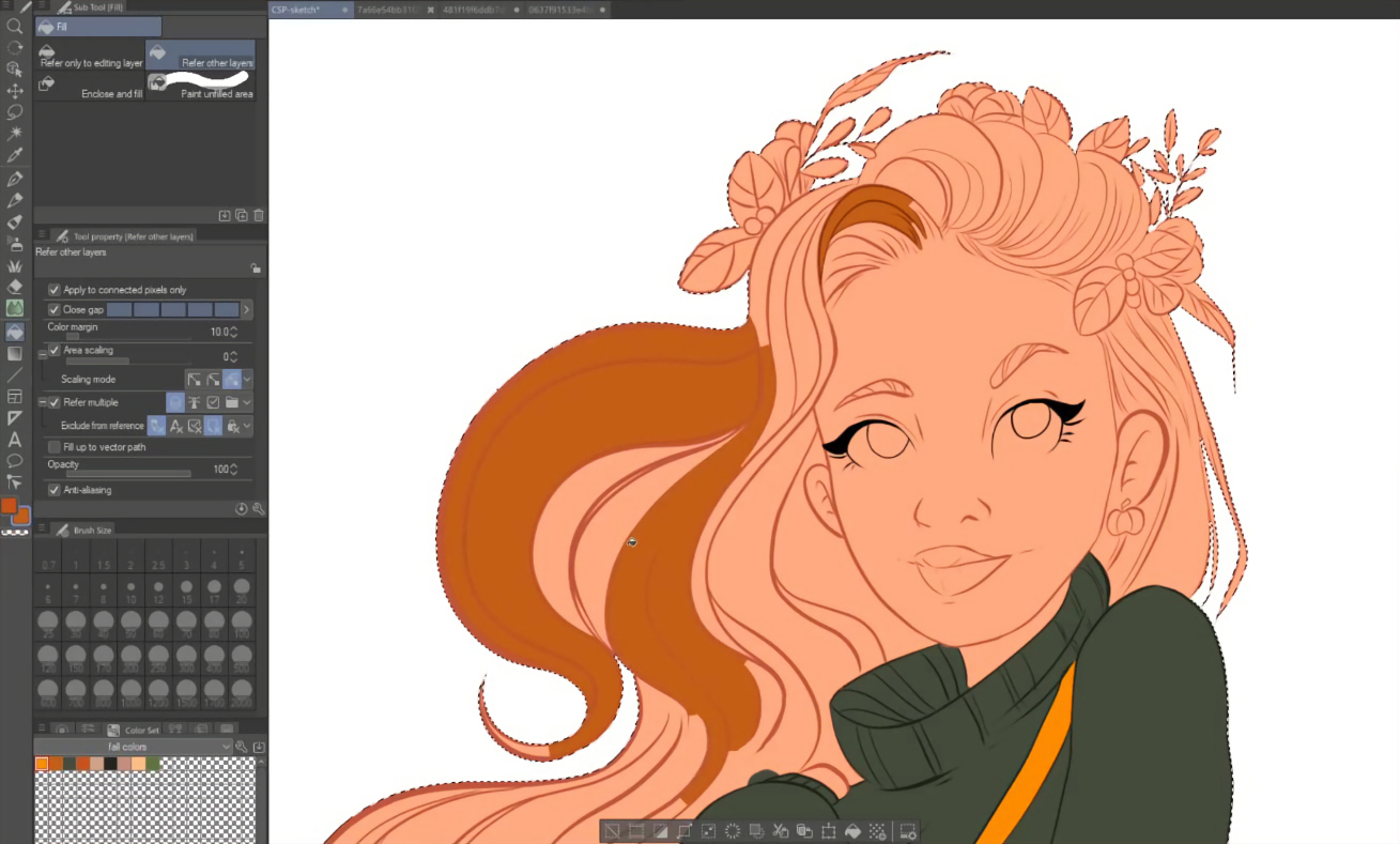
Either method is ok. We follow the process of all the elements (hair, eyes, clothes, lips, eyebrows, earring, and floral decorations), coloring them in a new individual layer.
Adding shadows and Textures
With a smooth brush (smooth watercolor) and in lilac color, draw all the areas that are going to be in shadows. At this point, you can adjust the brush to be more soft or hard; this is up to you. Also, you can play with the opacity to have different intensities. We do this on all the elements of the drawing.
If you need to add textures, now is a good time to. For example, draw some blush on the face or add details to the clothes, like in my case.
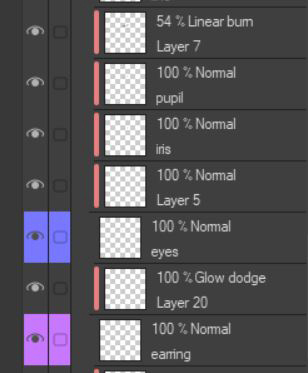
Working with layers
It is important to get used to working with layers instead of drawing all on one single layer. The basics to get these effects are to master “clip to layer below,” the selection tool, and layer blending modes.
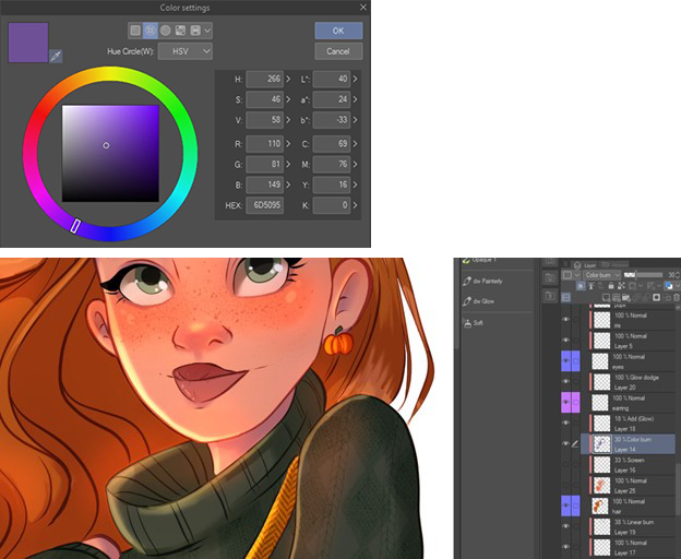
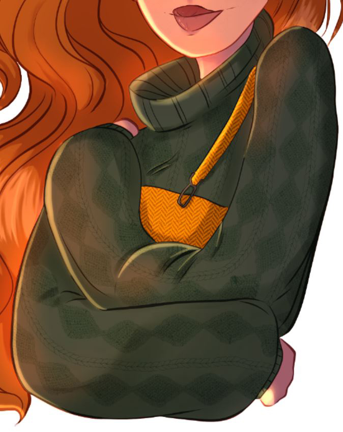
Adding Lights and Shadows
After adding the details (hair strands, textures, etc.), it is time to finish our illustration with some lightning effects. In this part, we are not going to use “Clip to layer below,” instead I use the selection tool (Right-click > Selection from layer > create a selection or Ctrl + left click on the layer thumbnail) because I don’t want these layers to be attached to the main shadow layer. If you clip them and the main layer has a lower opacity, the clipped layer will become that same value, and we don’t want that right now.
So, the first thing is to go to our base color layer, the one we did at the beginning of the color process, and create a selection from it.
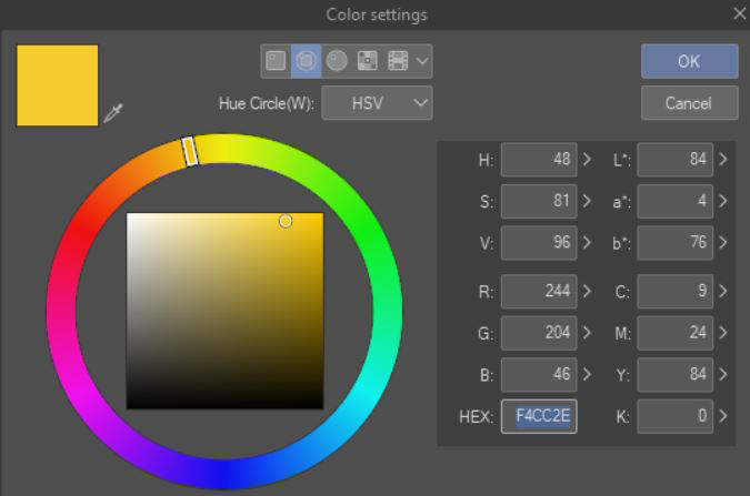
Now, we create a new layer on top and fill the selection in a lilac tone (#815EAA). It should look like something like this. This is our main shadow layer.
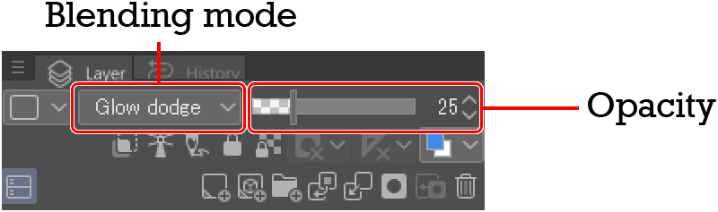
Without deselecting the shape, I go to the blending modes option and mess with them a bit until I found a mode that I like. In this case, I set it to Multiply at 28% opacity.
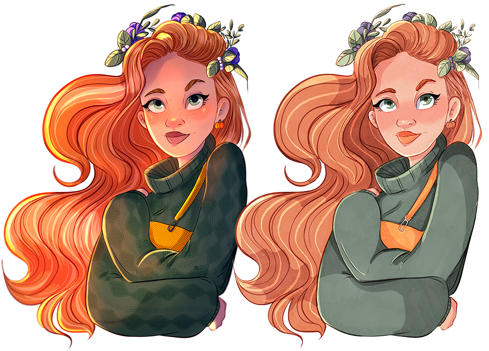
Once created, and without deselecting the main shape, it is time to add new layers and create all the lightning effects. For this part, I recommend using a soft airbrush. The idea is to create a gradient effect without using the gradient tool. This way, we have more control of the areas we want to be painted.
On the first lighting layer, over the shadow one, I paint all the areas where I want light in yellow. For this step, the first thing I do is establish my main light source. In my case, it comes from the left, so I kept this in mind when adding these lights.
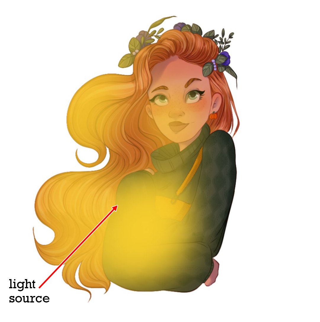
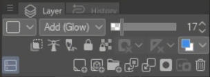
When we have all the areas painted, go to the blending mode and choose the one that best fits your illustration. In my case, I set it to Glow dodge mode with opacity at 25%.
We can see that all the area painted in yellow now looks lighter and more saturated, which gives the feeling of soft light from a light source outside the scene. It still doesn’t seem to be enough light. For this, I create a new layer (we continue with the selection) to start painting some soft highlights.
With a reddish color, I start painting areas where the light is stronger, like on the forehead, the nose, and all the areas that stick out.
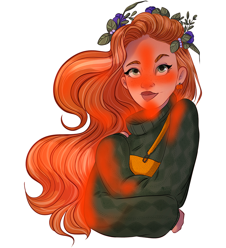
Again, we change the opacity and the blending bode to make these colors glow. I set it to Add (Glow) and an opacity of 25%. Of course, it is important to play with the settings first to see which one is going to create a more realistic effect. This can depend on your base colors. For example, reds might not work this well in a cooler-toned drawing.
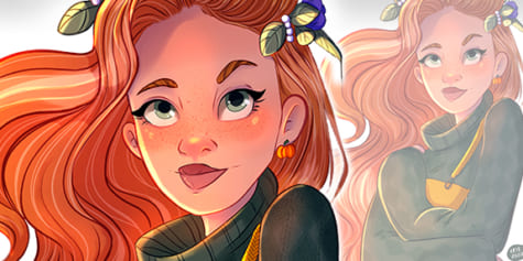
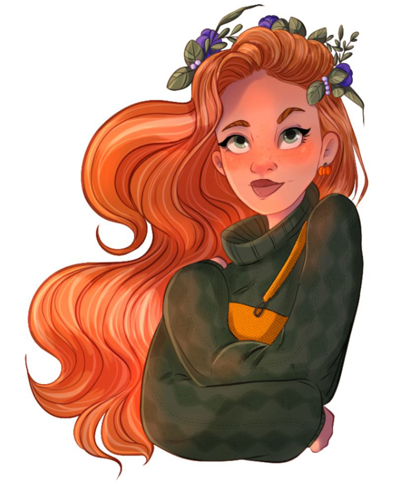
The result is areas more saturated with a red hue. This type of lighting is reminiscent of a sunset, where the sun is setting, and the colors are more orange. But at this point, we are not finished yet! Now we’ll add some hard highlights with some glow.
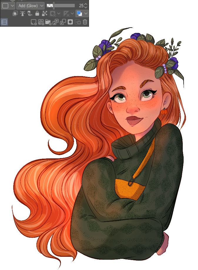
I create a new layer on top, and with a light yellow color, we make a small brushstroke on the tip of the nose, on the edges of the face, and all the areas that are closest to the light source.
You should arrive at something like this. I used the Oil Paint Brush to make these strokes with the amount and density of paint set to 100 and the opacity set to 100%. We want a very opaque brush stroke here. The point is to highlight very specific small areas of the drawing to make it more interesting visually and avoid looking so flat.
I continue with the Add (glow) mode and set the opacity to 25%. The result will be a very subtle highlight, do not worry, because I want this girl to glow, and for that, only one more step remains.
It’s so easy to do this glowing effect that appears when bodies and objects receive direct light, and it will make our illustration pop out. First, I duplicate my highlight layer and raise the opacity to at least 40% (we can adjust this later if we want more or less glow). Now, we have to create the blur effect.
Go to Filter, tap and click on the Blur option and select Gaussian Blur.
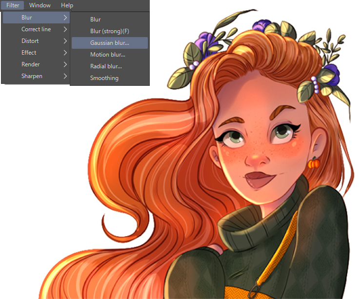
Adjust the amount of blur you want by sliding the little triangle. We don’t want a huge amount because we will lose color, so I set it between 6 to 10.
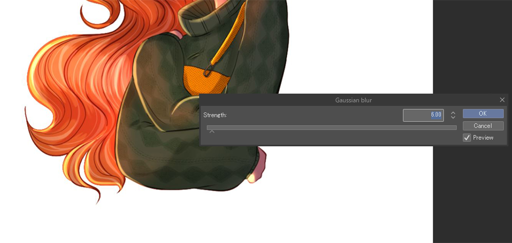
The result is a glowing highlight that greatly compliments the lightning we have created.
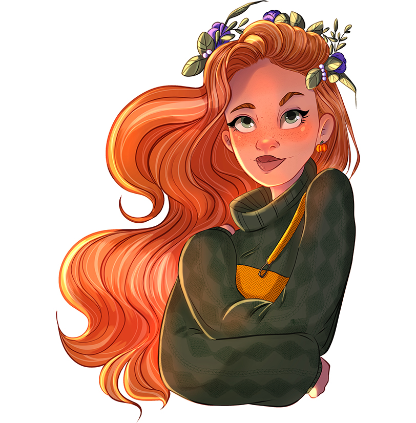
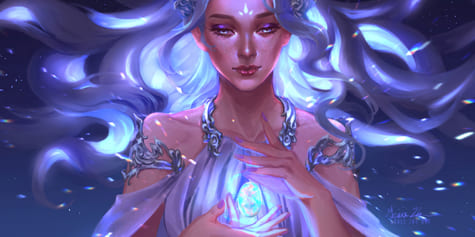
And this is how I work with Clip Studio Paint to make cool portraits for my Instagram feed that I can turn out into prints if I need to. Don’t forget to try new brushes and coloring techniques from time to time. This is something so refreshing to me, and I love to go deep into Clip Studio ASSETS and search for cool new brushes.
To give an alternative to this full-color illustration, I want to show how, in some quick steps, to work with the Realistic Watercolor brushes from Clip Studio. Shall we?
5. Tips to Realistic Watercolor Brushes
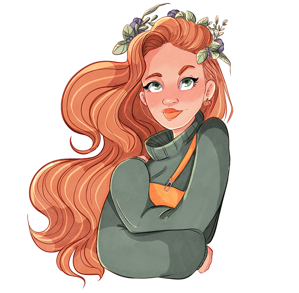
The Realistic watercolor brushes are amazing for drawing with more traditional vibes. I know at first I felt overwhelmed with this type of brush because I didn’t know how to work with them. Still, in the end, I followed the same steps as in the previous coloring style with only a few little changes to the process:
- I worked each element in separate layers, but this time I didn’t color all the shapes with a base color.
- Once I painted each element (hair, clothes, skin, etc.) I duplicated each layer and set the copy to multiply or another blending mode that makes colors more saturated.
- I created a base shadows layer for each element and painted the shadows in a dark purple tone, and searched for a blending mode that highlighted the texture of the realistic watercolor brush.
- At this time, I didn’t create very intense highlights because, in real watercolors, we can’t naturally achieve a vibrant highlight.
The brushes I used were:
- the Round Watercolor brush for color blocking
- the tapered watercolor for the shadows because it is very textured
- and the soft bleed for the blush
6. Closing
And this is all for this tutorial. I hope you find it useful for creating an amazing illustration for Instagram in both styles, rendered and watercolors! Thank you so much!
-Cristina Gómez
https://www.instagram.com/adesignerlife_
https://www.patreon.com/adesignerlife
-
Interested in character art & design or what it takes to become a character designer?
Check out the link below!