Color Theory for Digital Artists
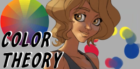
In this lesson, concept artist Magdalena Proszowska explains how to approach colors and some good tools to help you understand color theory.
THE COLOR WHEEL
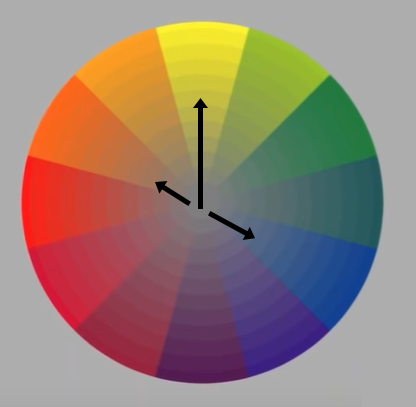
First, I want to explain the tool that should be every artist’s best friend: the color wheel. This color wheel is the traditional painter color wheel.
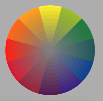
It’s built on three primary colors: yellow, red, and blue. By mixing primary colors together you get secondary colors between the primary colors. These are orange, violet, and green. The outside of the circle organizes the colors according to how they combine.
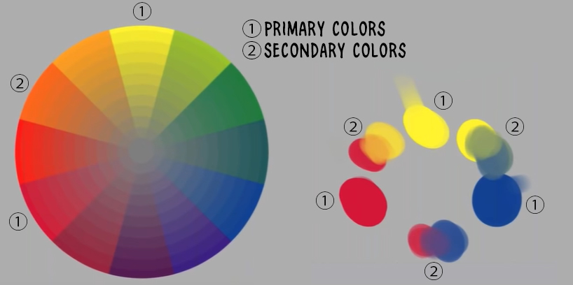
A key point we will focus on today is “complementary colors”. Complementary colors are on opposite sides of the color wheel. When you mix complementary colors together, for example, blue and orange, the result will be a gray color. That is true for every single of these color pairs. When you mix violet with yellow, you will get a muddy gray color.
Gray is in the middle of the color wheel. The color wheel is important because it will be a guideline to identify how colored light influences the original or base color, called the “local color”.
SHADING
Before I start using colors, I’ll explain the principles of shading. In a simplified world, everything would be grayscale because it would be easiest to draw and paint.
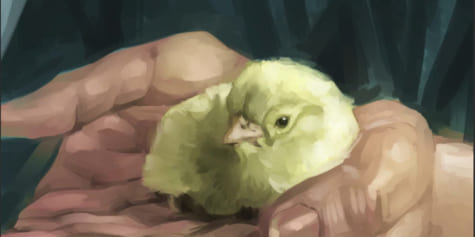
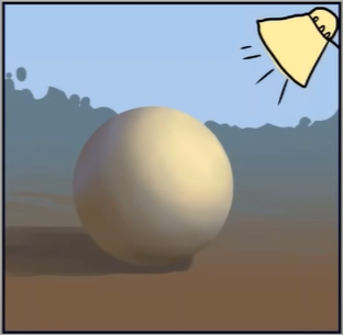
For this example, let’s imagine a neutral grey ball on a gray table with a source of light.
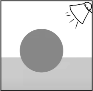
The light comes from the right top corner. When the light hits the surface, all planes of the geometry facing the light are lit and become brighter, while all planes not hit by the light are in shadow.
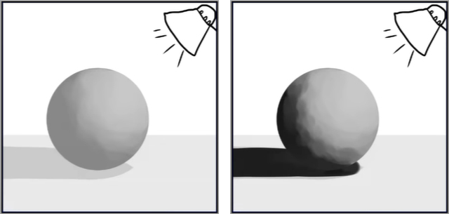
There’s also a third kind of light source that comes from the physics of the light itself. Light bounces around everywhere and so a little bit of reflected light appears in the shaded area. The reflected light is never as strong as the light itself.
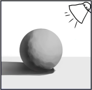
Those are the basics of shading. With these principles, you can create the illusion of dimension just by knowing the source and direction of the light.
COLOR AND LIGHT
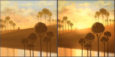
Even though this is a flat surface, when we look at this picture we can understand geometry and the depth expressed in the picture. When you add color, that’s where the hard stuff is happening. Not only do we have to think about the values, the light source, the shadow shape, and the reflected light, but also the color of the environment, the color of the light, and the color of the shadows. There are a lot of complicated elements.
Let’s use the same grey ball in a different environment. The environment is quite warm with earthy tones, and the light source has a color. If we imagine this as an outside environment, the source of light will be the Sun so it will be yellow.
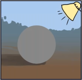
What happens when the light hits the surface of the grey ball? The light is yellow, so the highlight on the grey ball is yellow.
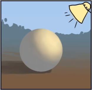
The environment is a warm brown. Shadows are influenced by the color of the environment, so the shadow is a warm color, not just black.
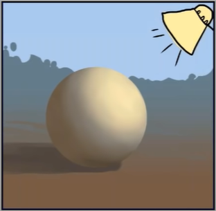
There’s also some reflected light from the blue sky that influences the shadow side. It’s very delicate in this example, but I think it makes the point.
USING THE COLOR WHEEL
So what does the color wheel have to do with this explanation of how the light works?
We started with just a grey ball because it’s easier to explain. Grey is in the middle of the color wheel. We have a yellow light source so we look for yellow on the color wheel and we know that we can push in this direction to predict the resulting color from the light. It’s very simple with gray because it always goes toward whichever color we want to apply to it.

For the highlight, we move from the middle of the color wheel toward the yellow. For the warm shadows, move from the local gray color to the warm tones. Finally for the blue reflected light, we move from the gray toward blue.
This is a simple example, but it’s really important to imagine it on as simple a situation as possible. When you use different local colors, you will have a much easier understanding of what is going on with the colors and why they change the way that they do.
COLOR THEORY IN ACTION
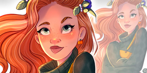
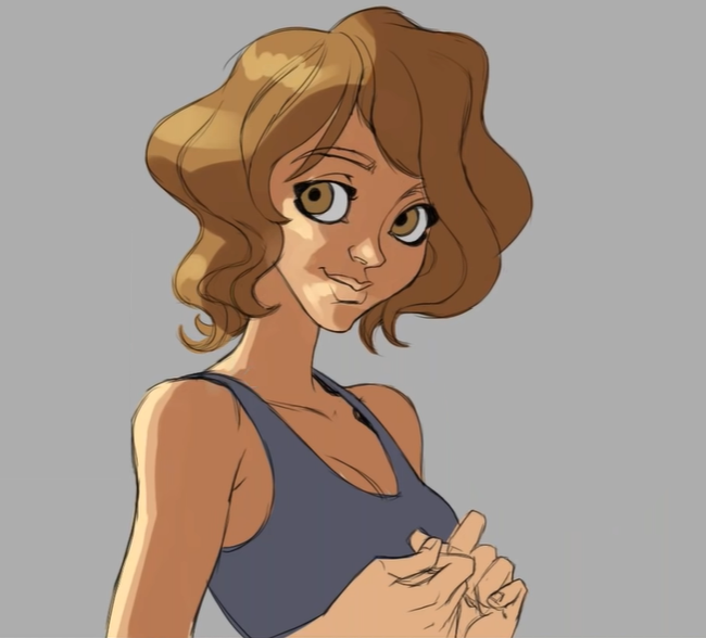
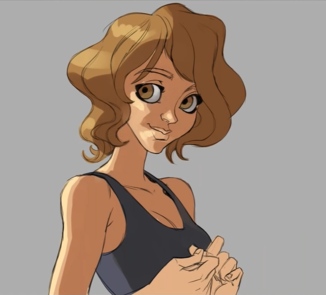
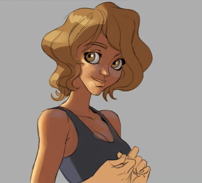
So far we’ve looked at the basic color theory. Now let’s see it in action by painting this character.

In this example, we’ll use the same lighting conditions as our gray ball, with warm light coming from the Sun, warm shadows from earthy tones, and some reflected light from the blue sky.
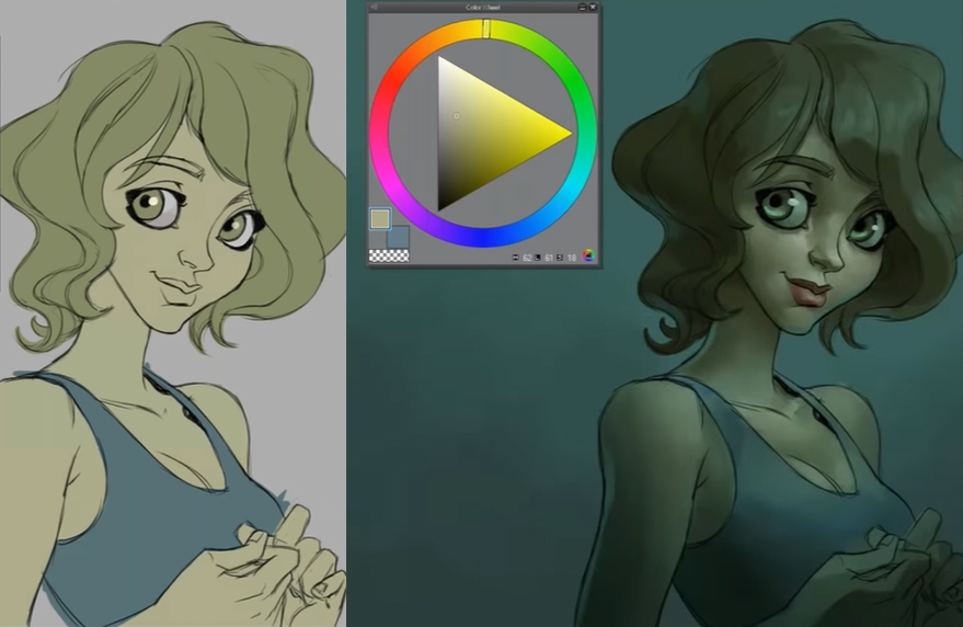
For the skin and the hair, I choose the shadow color by darkening the local color and moving it towards red to make it warmer. For the highlights, I make the local color brighter and more yellow.
Adding warm light to cool local colors
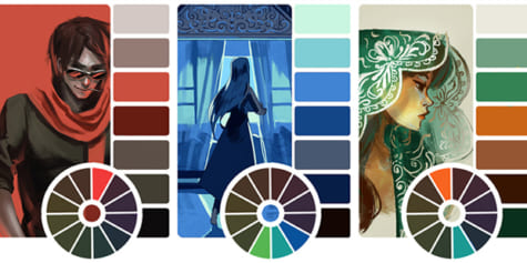
It’s simple when working with warm colors and making them warmer for shadows and highlights. The difficulty starts with more drastic colors like the bluish blouse.
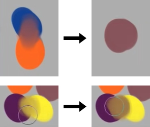
We start with blue on the color wheel. If we draw a straight line through from blue to orange, the line goes through grey. This means that for blue, we need to desaturate it to make it warmer.
When I did not understand colors at all, I would take the local color and slide it down and increase the saturation for this color.
But as you can see, the shadow is much bluer and cooler than the local color even though the other elements in the piece have warm shadows. It feels wrong because it has a different color shadow.
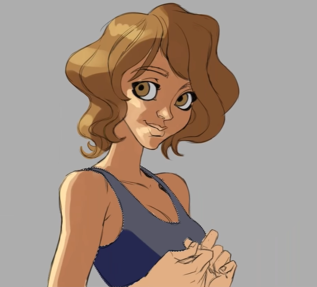
Here’s the appropriate shadow color for the shadow on the blue blouse. All the colors are unified by the same lighting conditions, with warm light and have warm shadows.
Skin is never just one color, so I add some red tones using the airbrush. I add red on the cheeks, as well as where the skin is thinner and has more blood vessels close to the surface.
Next is the reflected sky color that hits the shadow area. Orange and blue are on opposite sides of the color wheel, so they are complementary colors. When we mix two complementary colors, they turn gray, so when the blue light hits the color of the skin, we will see gray. I use a slightly pinkish violet color.
Then, I blend the colors together.
You can use the same approach to do something more drastic with the colors under different lighting circumstances.
You can take any type of color reference and apply it to your paintings. Just remember to always think about the color of the light, the influence of the environment on the shadows, and any secondary light sources that can influence the surface.
Colors can make a huge difference to your artwork in the emotions that come with the colors, so use them wisely!
Watch Magdalena’s webinar for the full live drawing and Q&A session!
ABOUT THE ARTIST
Magdalena was born in Poland, and is currently living and working in Germany as a Senior Concept Artist for game developer Ubisoft. Digital painting is her passion, spending any free time working on illustrations and character design. She’s an active speaker and guest teacher at top game development universities in North-Rhine-Westphalia area of Germany.
Interested in concept art or what it takes to become a concept artist?
Check out the link below!