Drawing memories: an artist’s iPad illustration experience
With the iPad and Apple Pencil, you can work on your art at home, on the road, anywhere you want. In this article, Norway based artist Fatemeh Haghnejad walks us through how she completed an illustration inspired by her travels using only her iPad.
About me (where I work)
Hi, my name is Fatemeh Haghnejad (BlueBirdy). I’m an illustrator and a character designer that lives and shares a studio with the love of my life, Even Mehl Amundsen, and our kitten, Pixie, in Oslo, Norway.
My typical day starts with me drinking water and practicing yoga. Yoga makes me feel healthy, flexible, and comfortable for the long hours of sitting that await me on a typical workday. Fortunately, I happen to live close to nature, and there’s also a lovely park nearby. I often go there for morning walks and to take pictures of different plants and trees to use as a reference.
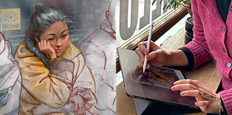
I travel a lot, and the iPad and digital drawing apps allow me to work for different clients wherever I go. For example, I started working on this illustration at home in Oslo and finished it in Aarhus, Denmark.
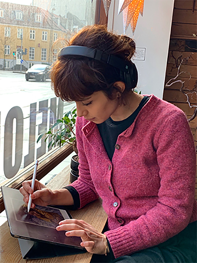
In this tutorial, I’ll show how I work on my iPad, talk about the benefits of digital drawing, and give a step by step walkthrough of the illustration I’ve made.
Note: For a comprehensive list of drawing apps for the iPad and other devices, see here!
30 Drawing & Painting Apps for iPad 2022 Free/Paid

Where inspiration and ideas come from
When I’m free to choose the subject for stories or illustrations, they usually come from personal life experiences. This can be from what I read, what animations I watch, and how much I’m in touch with my feelings at that time. Sometimes all I can go for is showing love in different ways, or being independent, being strong, being free or magical, being crazy, and other related emotions.
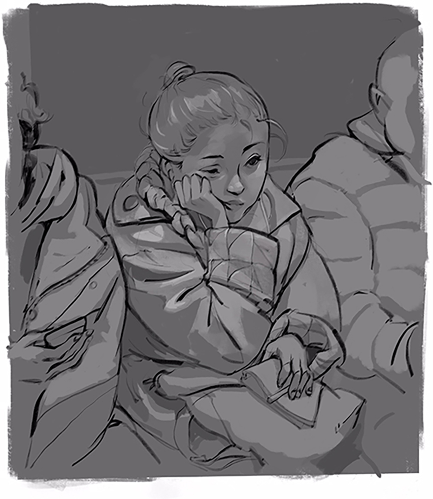
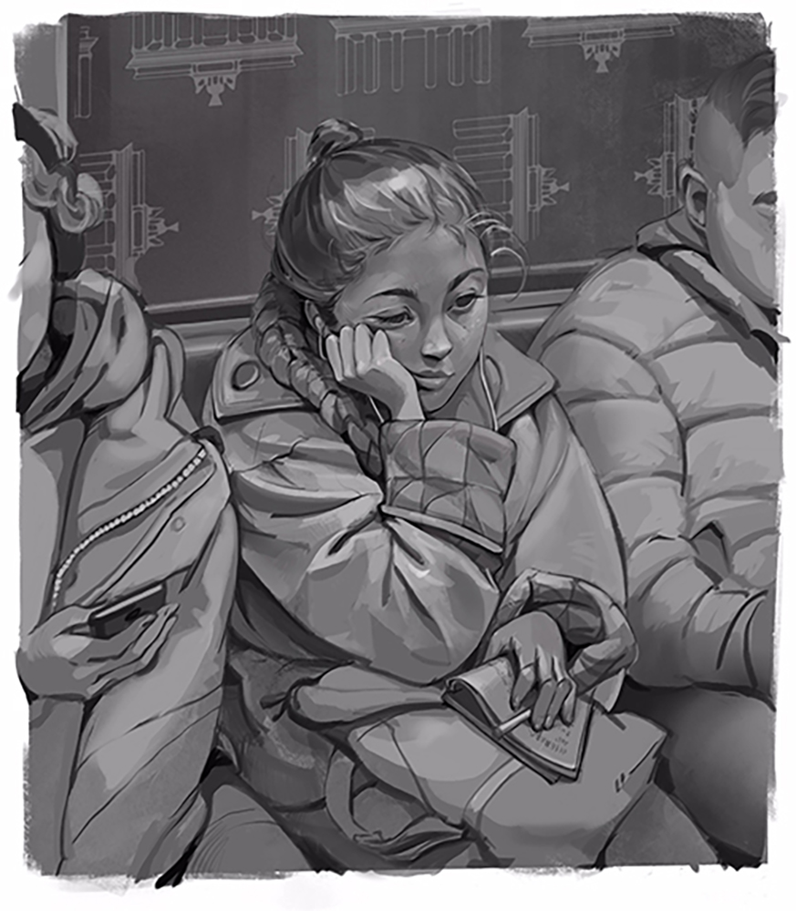
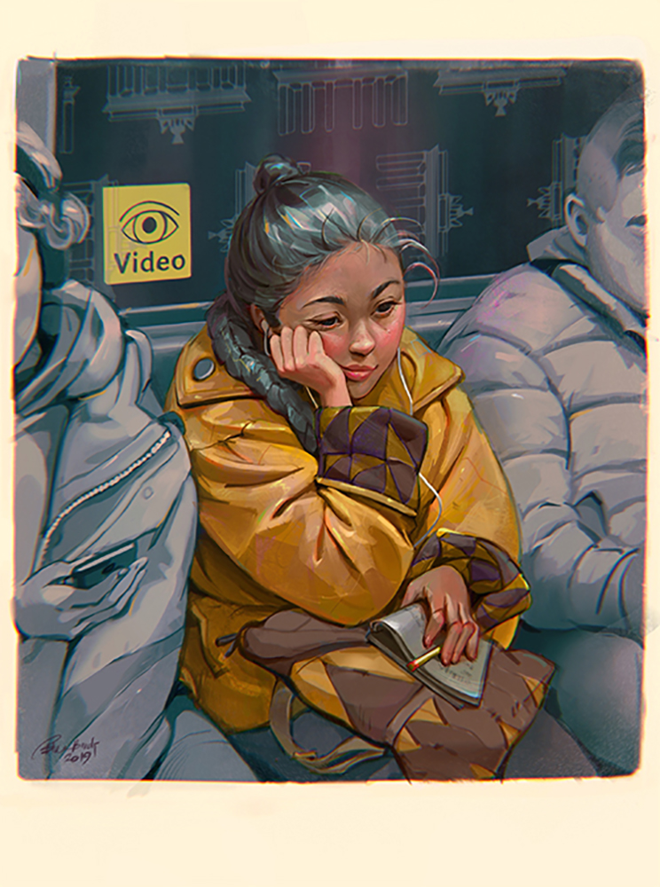
For this piece, I chose to draw a lady I saw in the metro while I was traveling to Germany for a workshop. My immediate perception based on her looks was that she was up to something great: she was tired but was smiling, and she looked very fashionable.
When I start working on an illustration, the first thing I do is make a checklist of what I want to see in the image. For this illustration, I jotted down the words: stylish, train, tired, new country, autumn, creative, and Asian.
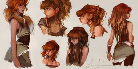
First sketches and thumbnails
To start, I pick a big brush to block out the basic shapes and design my character. I usually close my eyes and try to imagine my character while walking around her to choose the perspective, all the while drawing the first things that come to mind. To give myself options, I try to make at least three sketches to choose from.
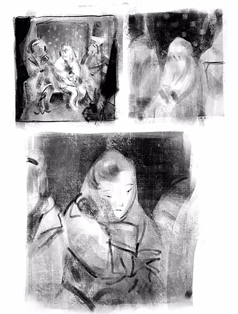
Inspiration
After making these thumbnails, I had a rough idea of what I was going for. However, I wanted to gather reference pictures and get more acquainted with the qualities of the subjects. This includes Asian characteristics and stylish fashion. So, I googled some images of German fashion, the inside of a German metro cabin, and Asian girls.
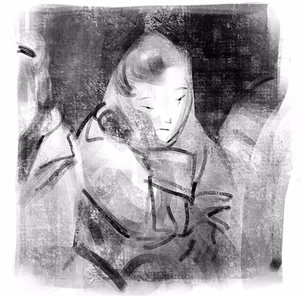
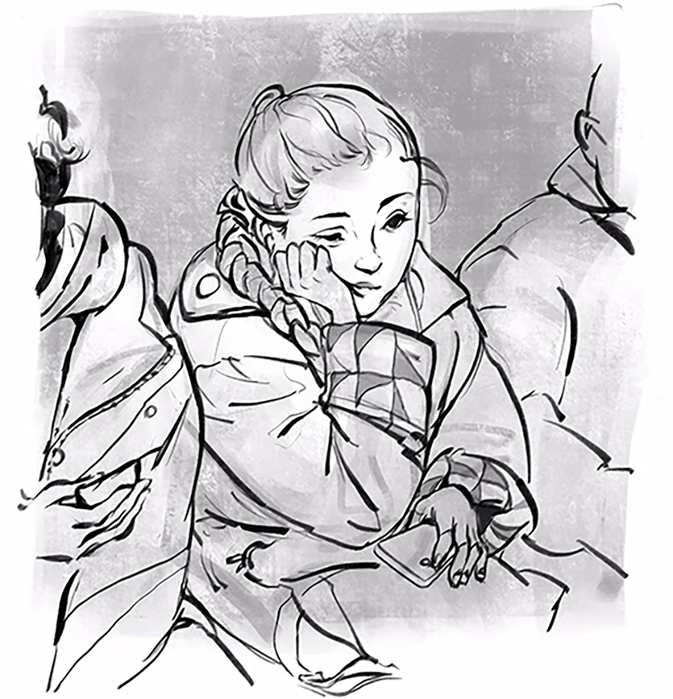
Lineart
Here is the step I really love about digital drawing. When starting line art, all I need to do is make my favorite thumbnail bigger and start drawing in a new layer above it. I like to draw line art in a different color than the thumbnail to highlight the new lines I’ve drawn.

I have two ways of approaching the final piece. Sometimes my client will ask me to keep the line art, or I’ll like the image better with it left in. In those cases, I color the line art to make it look like part of the painting. Other times, I’ll remove the line art layer by reducing the opacity or painting over it to make the piece look more painterly. In those cases, and for this illustration, I want to leave the line art, so I change the line art’s color to black and make a new layer with the blending mode set to “darken” on top of it. I made the canvas a dark grey to make it easier to see the values, but as you can see in the picture, the line art is still visible.
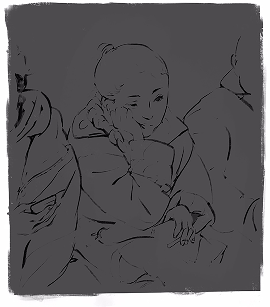
The light source
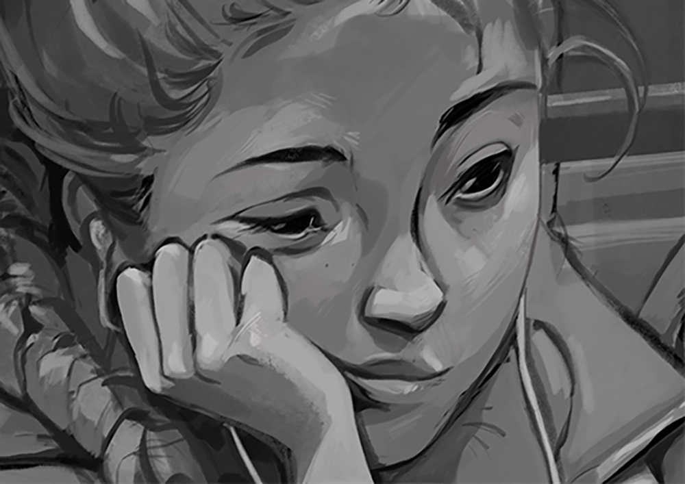
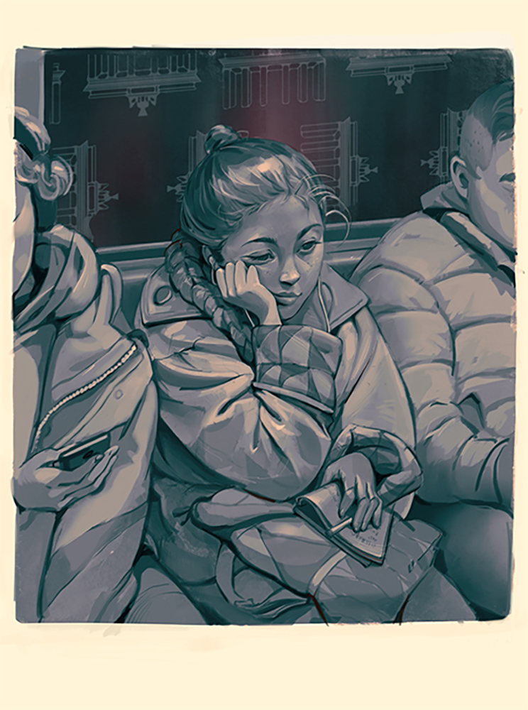
Now, I start thinking about the light source in the cabin and how I can begin shading. The whole ceiling could be made of LED light panels to create a fully illuminated ceiling, which means we have more than one light source. This will make very smooth shadows, making it easier to see every little detail. Working digitally, I can push around the lights and shadows to focus on how I want the image to look. I can evaluate every part of the image affected by the lights one section at a time. This time, I started with a light gray for the highlights, trying to sculpt my character out of the canvas.
Note:
I reduced the opacity of the “darken” layer to see the line art better. A bonus when doing this, and what I love about working this way, is that every time I color pick a shade of grey and paint with it, the shade becomes lighter than the grey I selected. This means that I don’t need to go to the color pallet to change the lightness of my current shade of gray.
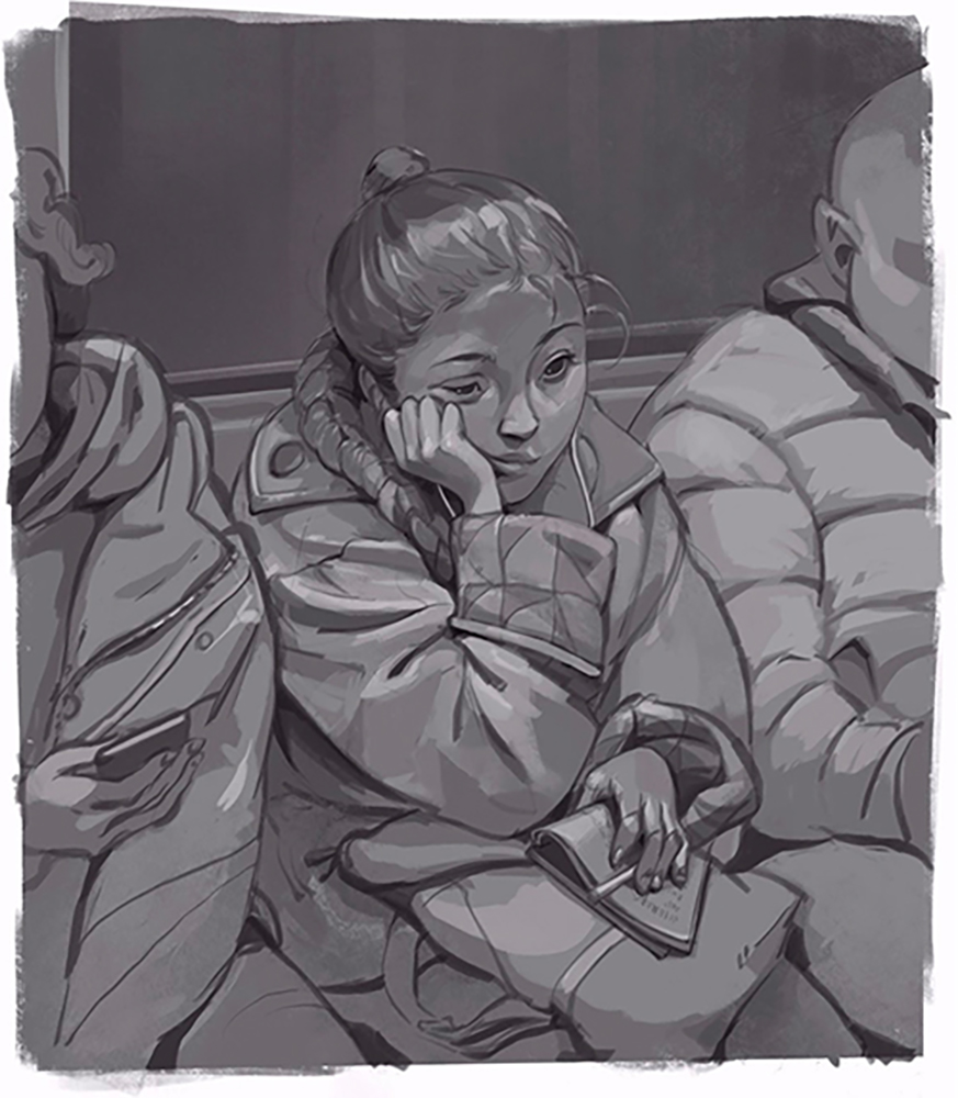
As I continue to work on this layer, I start to see mistakes. For example, I realized that I didn’t like how the eyes were. So, I made another layer and tried a different eye shape to see if it would work better. Knowing that I can go back to the last step of my work, anytime, is very comforting.
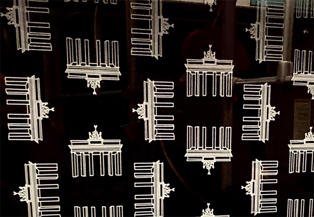
I wanted to show that she is in a metro in Germany, so I used the pattern from a picture I took when I was in Berlin. Using the transformation tool, I match it to the window and then adjust the blending mode and opacity. For the reflection, I made another layer under the pattern layer, selected the window area, and added some darker greys.
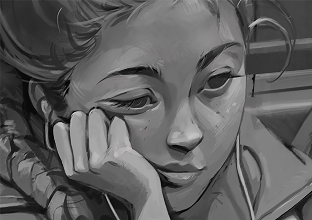
At this stage of the drawing, where the character is rendered all in grey, it is super easy to add color. It’s just a matter of applying a color tone that isn’t grey. I copied the layers and merged the copies so I could work on a merged layer, and with color balance tool, I changed the grey tone to cyan tone.
Colors
To start coloring the drawing, I open a layer and change the blending mode to color. It will have bright, happy colors, and with this blending mode, I won’t need to think about anything but the colors and how they help to develop the character’s personality.
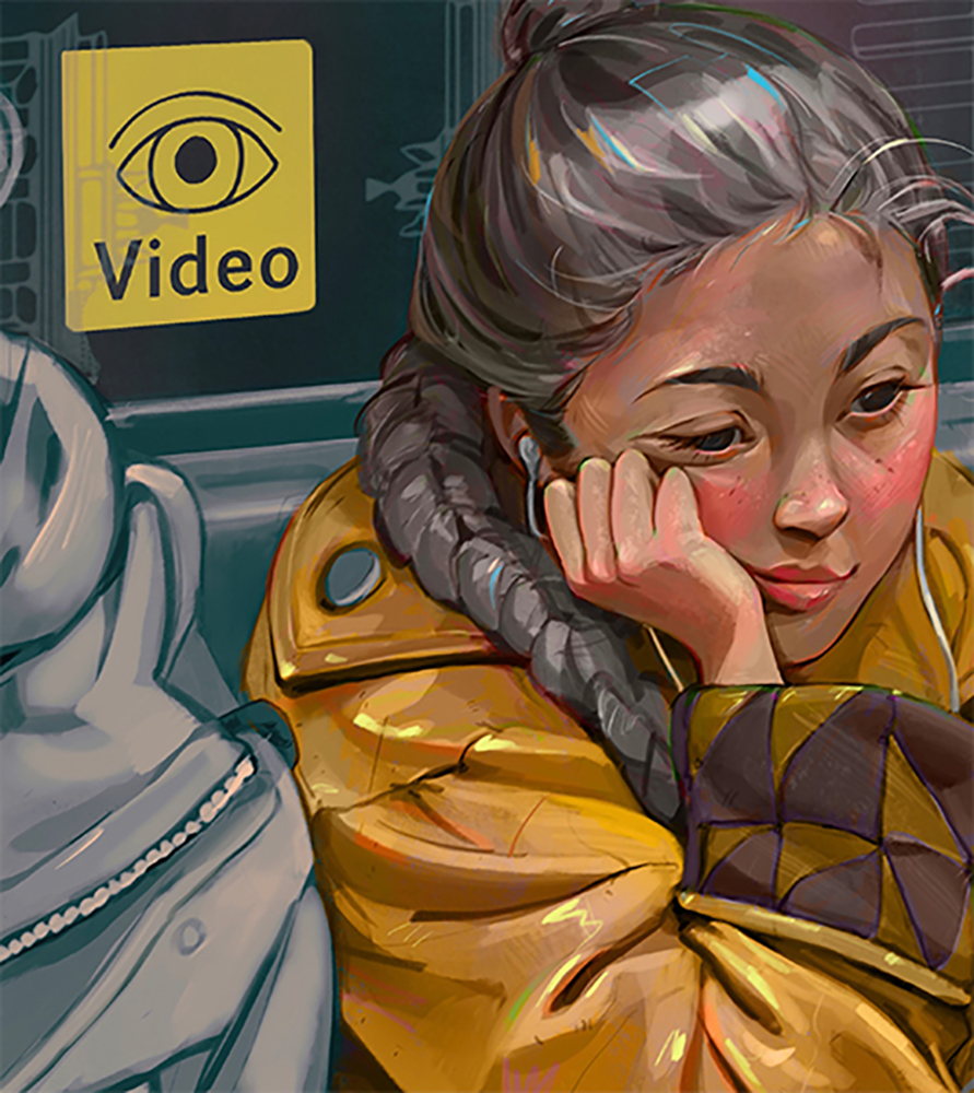
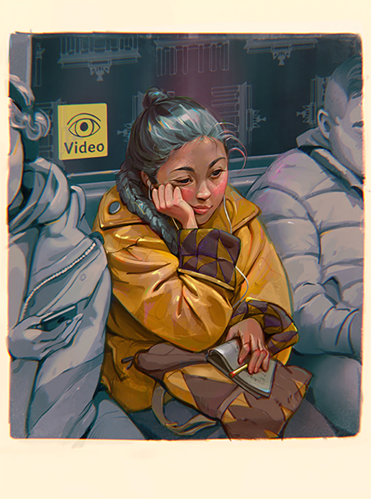
With that, the illustration is done!
I hope you enjoyed reading the tutorial and try out the techniques in your own work. If you do, please use #bluebirdy to share your work with me. I can’t wait to see your work!
Interested in character art & design or what it takes to become a character designer?
Check out the link below!