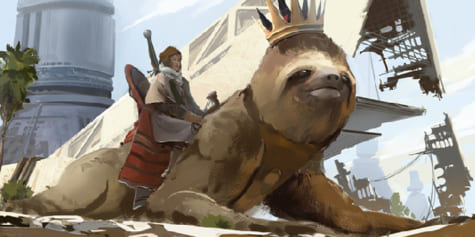
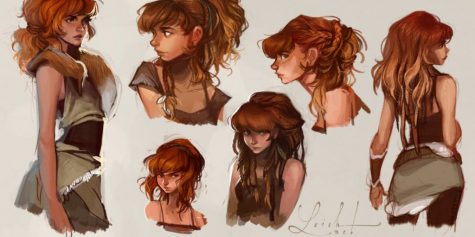
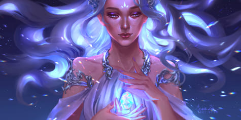
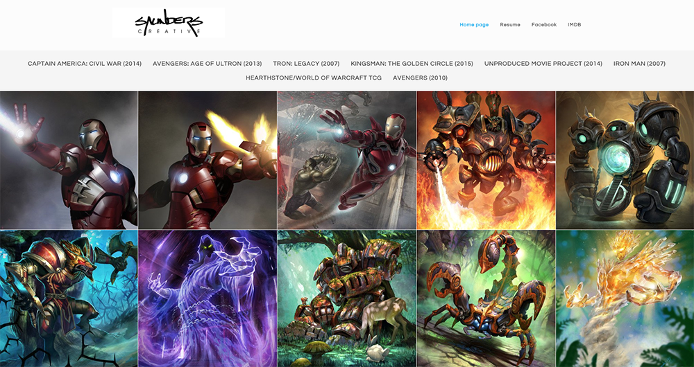
Featured Pro Portfolio: Phil Saunders
Phil Saunders is a concept artist best known for being THE Iron Man suit designer, from the first movie to Avengers: Endgame.
In this interview, he talks about his work on Infinity War and Star Wars Episode 9 and shares some valuable advice.
Tell us about your work in Avengers: Infinity War.
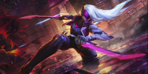
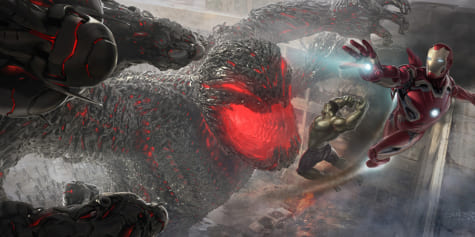
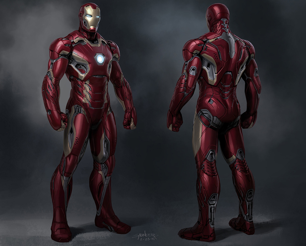
I was primarily responsible for designing the Iron Man Mk50 and War Machine Mk4 suits. The challenge this time around was that Tony Stark was going to have the “Bleeding Edge” armor, which is unlike any armor in that it is grown around him with nanotech rather than being built out of stamped, machined and assembled parts. A new manufacturing process and new materials require a completely different form language. If you’re essentially making something out of liquid metal, you’re not going to use it to make traditional nuts and bolts and separate panels. You don’t need traditional cut lines if you can vary the hardness and flexibility of your material at will. But the audience needs something to connect with that telegraphs an understandable functionality, so the Mk 50 was designed around accordion-like semi-rigid joints in the areas that would demand it, so that you didn’t feel like the whole thing was rubber or Terminator T-1000-like.

As well, the form language reflects the flow of liquid metal as it forms the suit. It was tough getting the right balance of organic to mechanical to keep the feel of an Iron Man suit. It’s bound to be his most controversial suit design, because it’s such a departure from what people are used to. Another challenge was developing weapons that also felt like they grew organically out of the suit. I took advantage of that to render them up in keyframes, something I don’t often get to illustrate on Marvel projects. I’m looking forward to showing that artwork when Marvel gives us the green light.
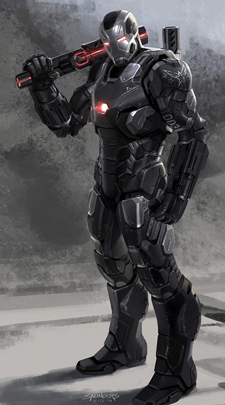
War Machine Mk4 was a much more classic design problem, but the challenge was advancing that design as well to keep up but in a completely different direction. I always try to contrast the two as much as possible in both form language and silhouette, so this time I went with a more faceted armor look that feels more futuristic to what Rhodey’s worn in the past. I also focussed on developing massive advanced weapons systems that fold up seamlessly into his back but totally change his silhouette when all deployed at once.
What experiences brought you to where you are today?
Well, I always knew since I saw Star Wars as a kid that I wanted to be a concept designer for movies, but along the way, I took a lot of detours, into automotive and product design, into theme park ride design and as the creative director of a computer game company. I think the diversity of design experience has helped make me a more well-rounded designer than if I had just jumped directly into concept art. Understanding how things work and how they are really manufactured I think lends a lot of believability to even fantasy design. If every line is placed with a thought to its theoretical function I think designs just feel “right” to the viewer. We absorb far more than we realize in our day-to-day experience, and even the layman knows instinctively when something is off, even if they don’t know why.

Tell us about one of your most challenging projects.
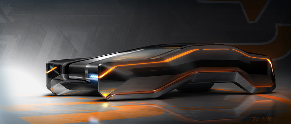
I just finished working on Star Wars Episode 9, and that was a truly humbling experience. The level of work produced by people like Ryan Church, Eric Tiemens and Doug Chiang is both inspiring and intimidating.
▼Ryan Churchhttps://www.artstation.com/ryanchurch
▼Doug Chiang
But this is the only way you grow as an artist, by working alongside artists who’s work you’re in awe of. You never learn anything by being the most talented guy in the room.
What is your advice for aspiring concept designers?
We live at a time when tools and techniques are readily available that let you bypass the fundamentals of both design and image creation. And with the volume, pace and realism expected by the state of the art in games and movies, these tools are essential in the work environment to keep up with demands. But I would caution young artists not to be tempted to bypass learning and applying the fundamentals of perspective, color theory, composition, material indication, lighting, anatomy, by jumping straight into 3D and photo bashing.
Software can do all of the aforementioned jobs for you, but unless you understand them and have mastered them from the inside out, without any tricks crutches, your images will be driven not by your singular vision, but by what you’ve been able to find on Google images, or the kinds of forms that are easiest to make in your 3D software of choice, or simply the path of least resistance to creating an image. Worst of all, it won’t be what you don’t know that limits you, but what you don’t know that you don’t know.
As an example, I am most commonly asked how I am able to render such realistic metallic surfaces freehand without 3D. All of that experience comes from, as an automotive designer, sculpting surfaces into clay, covering them with shiny material and observing how minute changes in the cross-section of a surface affected where the reflections fell, and how they traveled over that surface as I shifted my point of view. So with that experience, I am never satisfied with what comes out of Keyshot, for example, and I always have to paint it over in Photoshop to make it match what I see in my head. 3D may do a great job of imitating reality, but our job as artists is to give clarity, to simplify, to idealize.
We make choices of where a reflection should be simple, in order to communicate how a form is turning or to complete a graphic composition, or where it should be complex to give texture, granularity, and realism. But without a fundamental understanding of what’s under the hood and therefore what it should look like, you will just accept the miracle of what your renderer gives you and not even know the opportunity you are missing to elevate it to the next level.
Knowledge is control. I am constantly grateful that I came of age at a time when design was created in gouache and marker, pencil and paper, cardboard and clay, but I’m also constantly lamenting that even with that background I didn’t have more training in traditional painting and art. I know enough to recognize my own limitations, and they don’t come from lack of experience in any software, they come from my own headlong rush 30 years ago to become a concept designer without becoming a solid artist first.
So take my advice, and please don’t let your crutches become your handicaps.
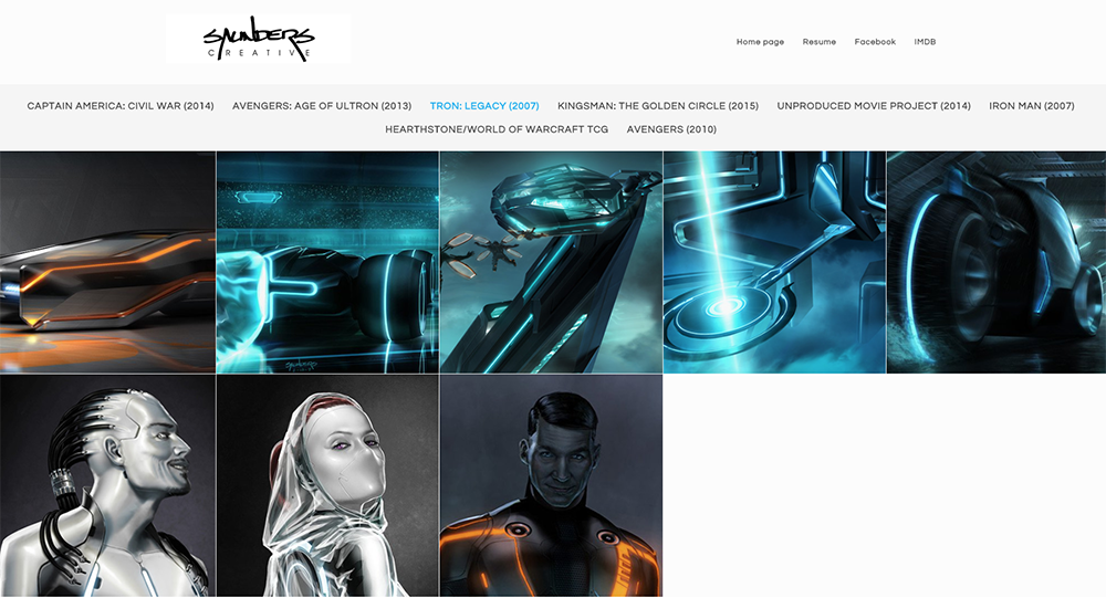
See more of Phil’s work on his portfolio website.https://philsaunders.artstation.com/
To find out more about ArtStation Pro portfolio websites, click here.
■ About the author: Sierra Mon
Sierra is the Editor of ArtStation Magazine.