Simple Lighting Techniques (Video Tutorial)
Bluebiscuits teaches you simple tricks to achieve stunning lighting in your illustrations. Read this tutorial to learn more about blending modes and tools to achieve a contrasting effect.
Contents
Hello, I’m Bloo, and today I’ll be showing you a really easy way to add dramatic lighting to your drawings.
I will be using Clip Studio Paint in this tutorial. It is my go-to art program that I’ve been using for two years now and I literally cannot go without it.
Lighting can really add to a piece’s feeling, from intense and menacing to soft and soothing, and it’s really easy to do.
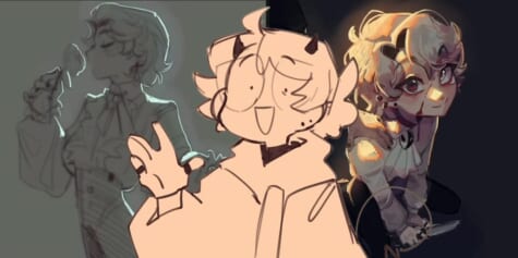
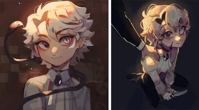
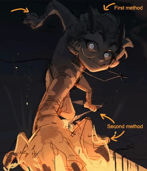
There are two types of lighting techniques I will be introducing.
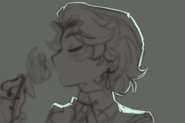
The first one is going to be really simple, and the second one is going to be more detailed, as you can see here:
Now, on to the tutorial.
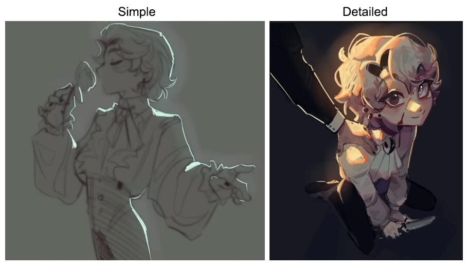
Simple Lighting Technique
Let’s start with the simple one.
The first thing you will need to do is make sure that the piece is on the darker side, so the lighting will stand out more.
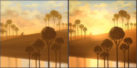
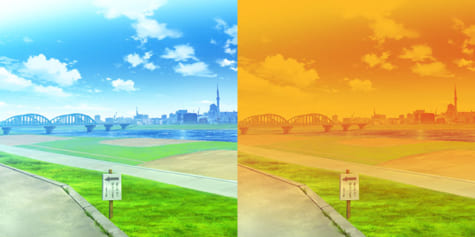
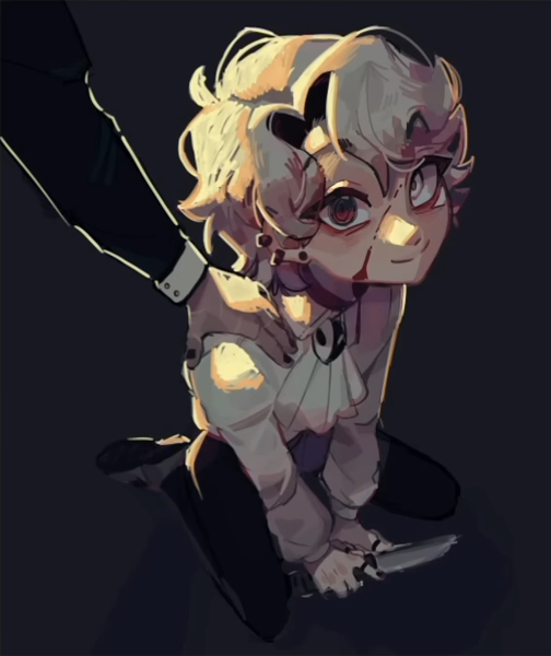
Look at the difference in intensity between these:
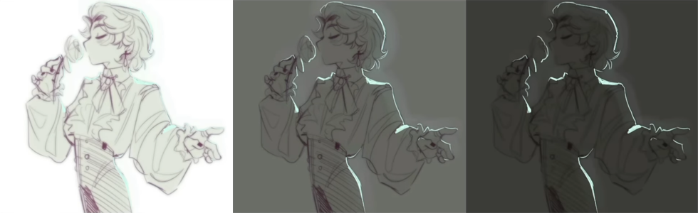
The darker the piece, the more intense the lighting will be.
This can really change the intensity that the piece is giving off.
Blending Modes
You can plan your lighting out beforehand, so just make sure that the colors you’re picking stay within the darker values. You can also use a layer blending mode if you decide, after choosing the colors, that you’d like to add lighting.
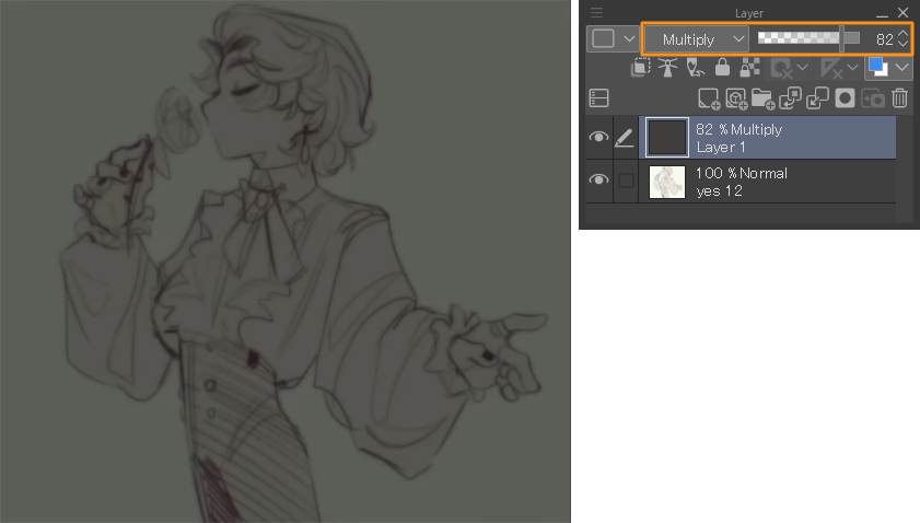
To do this, create a new layer above the art and fill the entire canvas with one color.
Make sure that the color you’re using will suit the piece.
So if the piece is more brown, make sure you’re using a more light brown color.
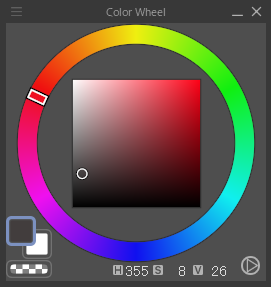
Then, on the layer palette, select one of the blending modes that will darken the colors, like Multiply or Darken. I prefer Multiply.
Then, change the opacity of the layer to your liking.
This depends on how intense you want the lighting to look.
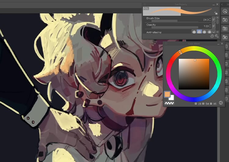
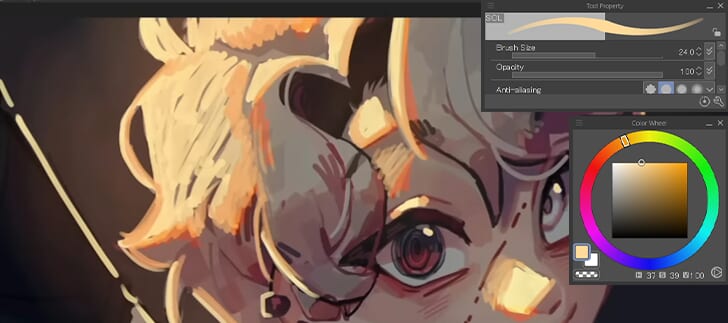
Recommended Brush
The brush I’ll be using is called SOL by noctilin.
You can download a bunch of brushes including this one on the Clip Studio Assets store.
https://assets.clip-studio.com/en-us/detail?id=1778145
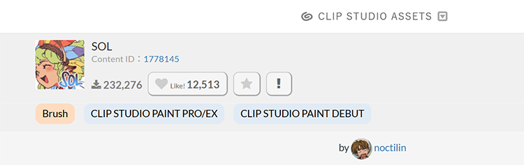
I really recommend this brush, it’s great for rendering and laying out colors.
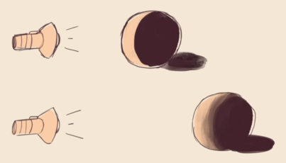
Adding a light source
Before you add the lighting, you should first pick the direction from where the light source is going to come from.
For this piece, the lighting comes from the top right corner.
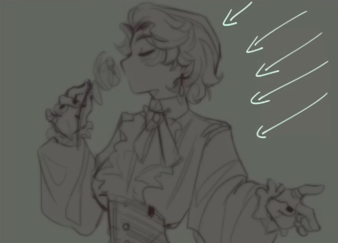
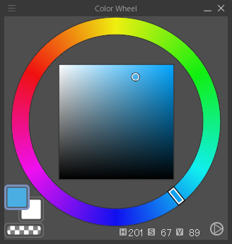
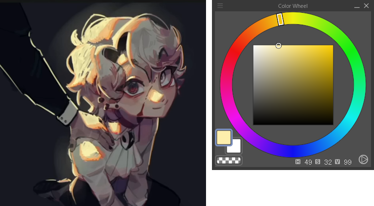
Next, pick a color that you’re going to use for the lighting and that will suit the mood of the painting.
I’ll use a teal color for this one, since I want the mood to be soft and calm.
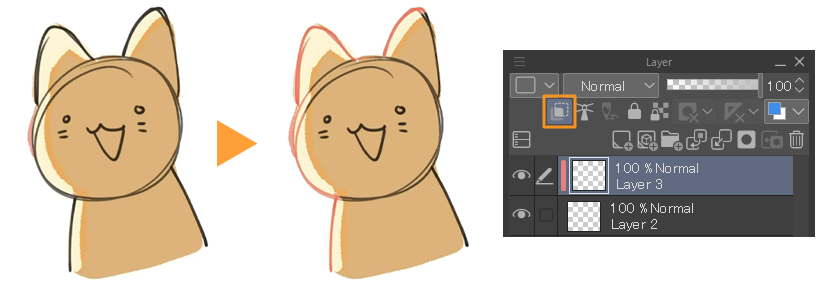
Make a new layer above everything, even the multiply layer if you use that method, and start outlining the areas the lighting is coming from.
You can make the lines thicker here and there to add volume.
You can also add softer edges on some spots like hair or clothing.
HINT
The closer the object is to the lighting source, the more intense and hard it’s going to be, and the further away it is, the softer and more blended out it will be.
So if you’re adding light further away, I recommend blending it out a little bit.
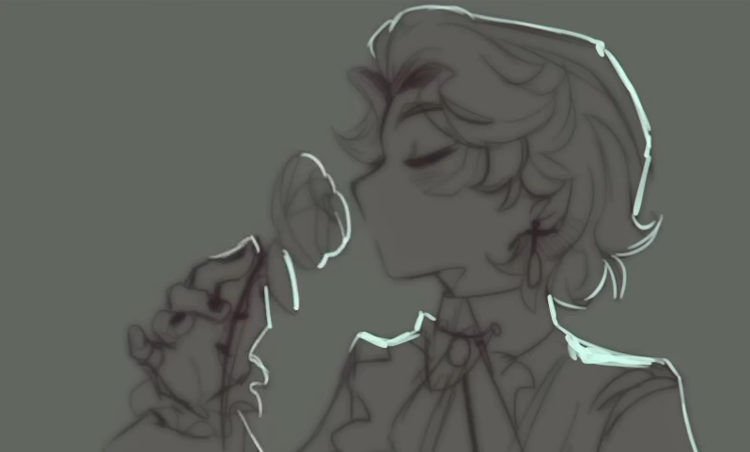
Add to it until it suits your art style.
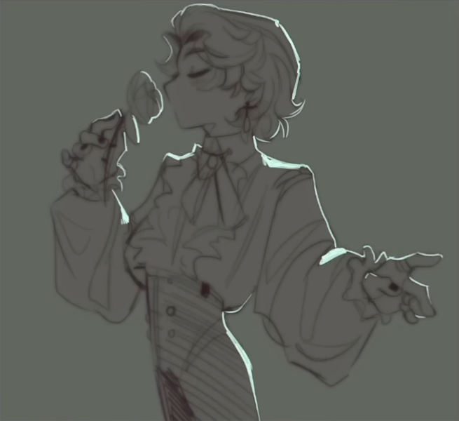
Final rendering
Once you’re done outlining the area, grab the Airbrush from the Tool palette.
Using the same color, use the Airbrush to go over the area that you just outlined.
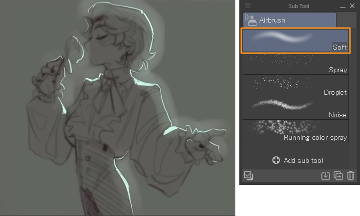
Make sure to use a larger brush size and turn down the layer opacity.
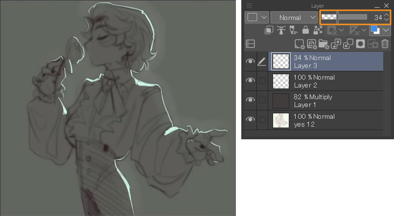
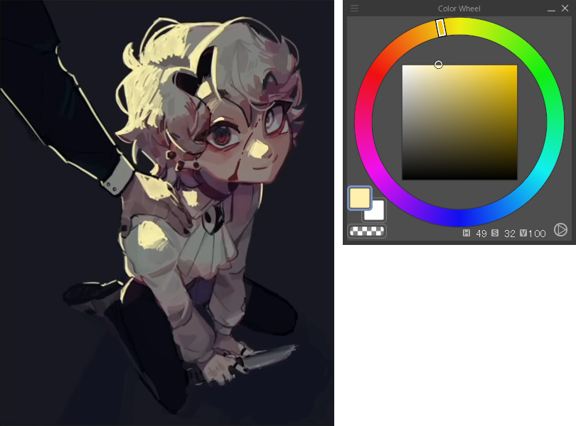
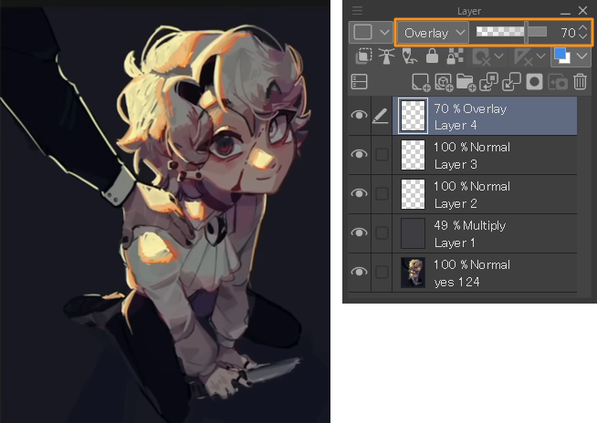
Create another layer, and pick an even more saturated color in the same hue range.
I’m going to go for this blue color, and then go over the lighting again for the second time.
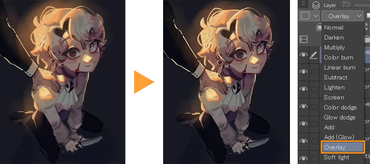
I then change the layer blending mode to Overlay and play with the opacity.
So that’s the first method! It’s really easy and simple.
Detailed Lighting Technique
Now, onto the second one. This one is a lot more detailed, and is what I do for bigger illustrations.
This lighting technique is all about layering the colors.
The three colors that I will use to layer for this example are yellow, orange, and red.
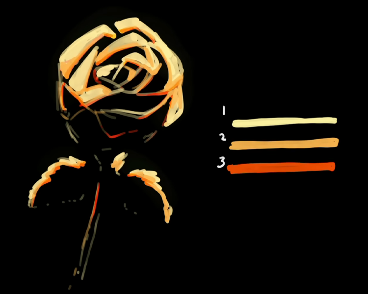
HINT
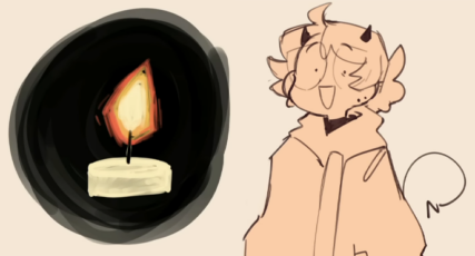
You can think of it as a candlelight, the center being the brightest place.
This is going to be the yellow that you put down, and the further the flame goes, the more orange and then red it becomes.
So when you’re layering it, think of it like that.
Just like the previous lighting technique, make sure that the drawing is on the darker side and pick a lighting source.
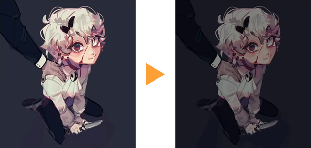
For this piece, I want the lighting to be a lot more intense on the figure.
So the light source is not just far back behind them, it’ll be more in front of them.
Essentially, it catches more of the character’s surface area.
Start off with layering the yellow first.
Some areas can have lighter yellow if they’re further away from the lighting source, and then some areas can be a lot more intense and hard. So, if you want to use a harder brush, you can.
Once you’re done outlining where the lighting is on the character, you can take an orange color and create a thickish outline with orange on the outer edges, the furthest areas from the yellow.
I’m outlining it on the outer sides of the yellow, and then sometimes I go into the front.
The final step is to add the red on the edges. This should be a lot thinner and lighter and very intense, bright, and saturated red.
I also take this red, and then I color around the edges.
Sometimes it just makes it look more alive.

An optional choice is to set the red layer to Overlay.
I think it blends the colors better, and gives you a lot more colors to paint with when you go in to render the lighting.
HINT
Create a new layer above your line art or sketch, Clip to layer below and then change that layer to a red or orange color. This makes it a lot easier to render.
Then, we will do the same thing we did for the simple lighting technique.
Using the airbrush, go over the drawing with yellow or very white paint and then turn down the layer opacity.
Create a new layer, use the airbrush with the orange color, and then set that layer to Overlay.
You can do another layer if you want with Add (Glow) or Add, the glare color blending modes, this is very optional.
I don’t always do this.
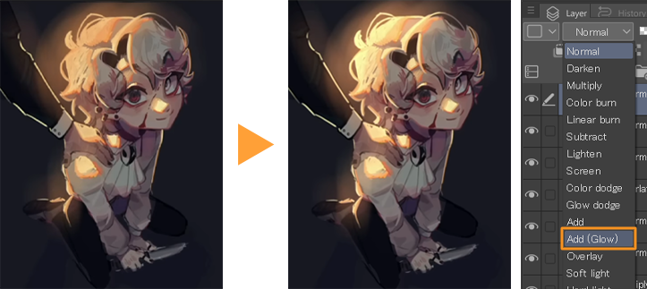
It depends on how intense you want the lighting to look.
These layer blending modes are great for that.
Recommended Article
Read this article to learn more about blending modes in Clip Studio Paint:
So that’s the second method, it’s pretty simple.
After doing this, I would go in and render it and make it look more natural.
The Importance of Color
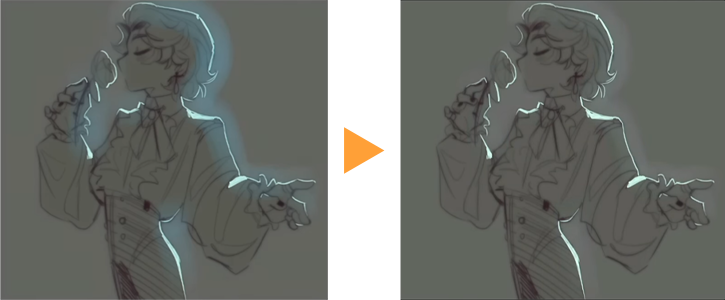
Now, the color of the lighting can really change the mood of a piece.
If the example below were more of a teal color, the piece would be a lot more calming.
It’s in a softer environment than these really bright red and orange colors.
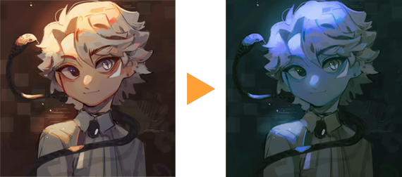
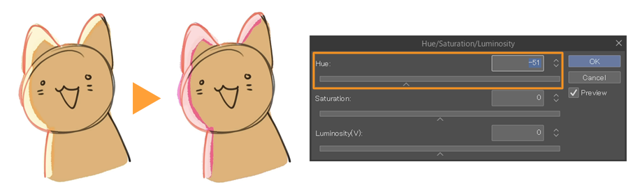
HINT
A quick way to change the hue and the colors is to select the layer the lighting is on, go to Edit > Tonal correction > Hue/Saturation/Luminosity, and move the bar to change the color to your liking.
This is a really fast method, and if you decide to change the color of your drawing halfway, you can just do this.
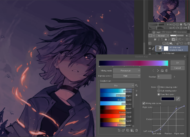
Using Gradient Maps
You can also use a Gradient map to change the color of the lighting and the overall piece.
You can do this by simply going to the Layer menu > New Correction Layer > Gradient map, to create a new layer above everything. Then find one you like from the available Gradient sets.
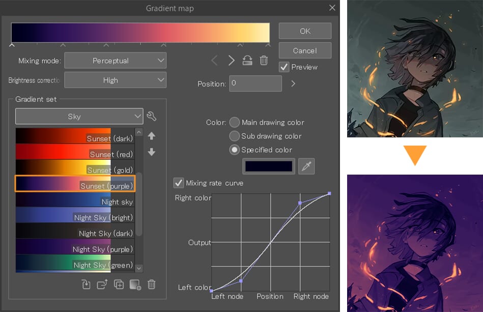
You can also change the color by selecting them on the bar at the top.
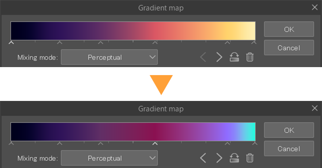
So, if you want the lightest colors to appear blue, you can change the lightest color to blue and play around with the layer opacity until you like the way it looks.
Recommended Article
You can learn more about gradient maps and how to use them in this tutorial:
Final Tips
When creating lighting, you can try adding multiple lighting sources or blending the two lighting techniques I shared.
This way, you can add more depth to your drawings and make your characters look like they have lighting coming from various angles in various colors.
Just have lots of fun with it!
Artist Profile – Bluebiscuits
Hello 😀 I’m Bloo, I also go by Bluebiscuits and I draw,,,,sometimes! I love sharing what I learn about art with other fellow artists. Thank you for taking the time to look at my silly tutorials!
YouTube: Bluebescuits
Instagram: bluebescuits
X: bluebescuits
Want to learn more? Check out these tutorials on lighting!
Luisa Preissler demonstrates shading and lighting techniques for portrait painting:
https://www.clipstudio.net/how-to-draw/archives/158015
Reuben Lara shares how to use blending modes in your paintings:
https://www.clipstudio.net/how-to-draw/archives/156055
Grace Zhu explains how to create a glowing effect on portraits to evoke a magical atmosphere:
)