Shading and Lighting Techniques for Portraits
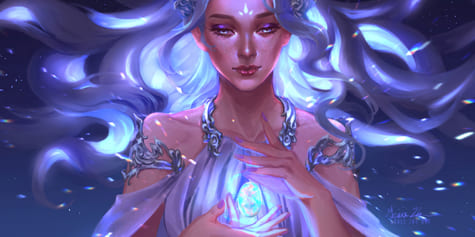
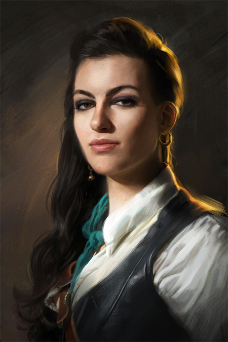
In this tutorial, German illustrator Luisa Preissler shows how she draws realistic portraits using digital drawing programs. Using a pirate lady as an example, Luisa sharing tips and techniques on how to add dramatic lighting and shading to your work!
1. Set up a layer structure
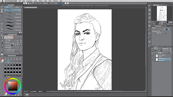
I always start my paintings with a clean line art sketch. In this case, I decided to paint a portrait of a cool pirate lady. Having precise lines helps me define each element and detail early on. It also makes the actual painting process a lot smoother, because I don’t have to figure out the composition while painting. I put the lines on a separate layer set to multiply, so I can begin painting under them.
I strive to set up a layer structure that makes working on the painting easy. To this end, I like to arrange my layers in a way so that I can paint each element of the picture separately without worrying about accidentally painting over the lines. My goal is to separate my image into the following parts: skin, hair, background, shirt, leather, and smaller details like earrings, the belt, and belt buckle. Then I go on to color them individually.
I start by manually selecting the areas with the lasso tool. You can use different methods like the Auto Select tool as well. I personally like to have 100% control over the selection and try to avoid any jagged edges.
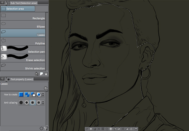
Once the selection for the face is done, I use the Fill tool to fill in the area with a skin tone in the middle value range. This means that the colors I chose here are neither too dark nor too bright so that I can still play with highlights and shadows afterward.

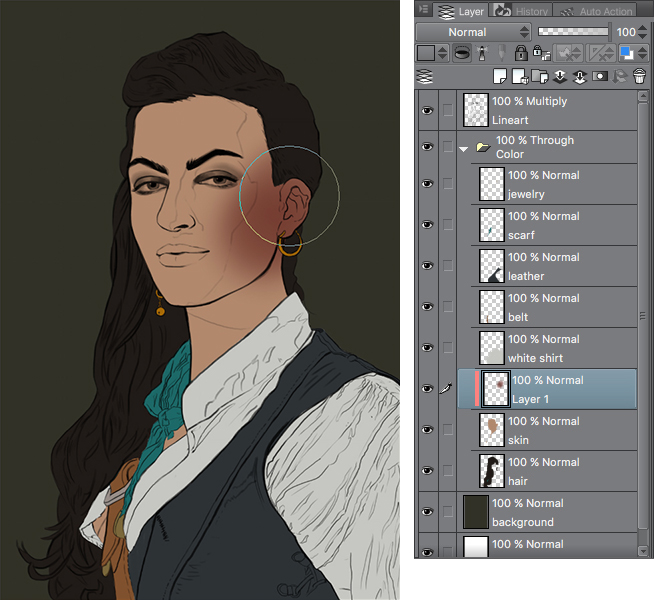
I repeat this with every major element in my painting. I sometimes go as far as to separate small things like jewelry as well.
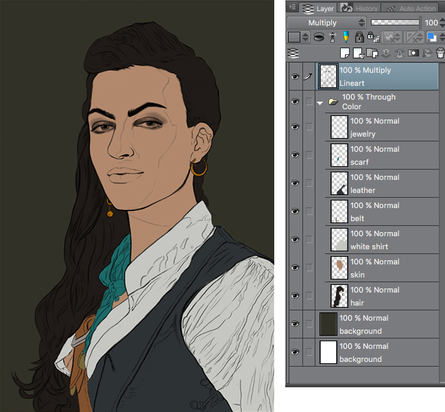
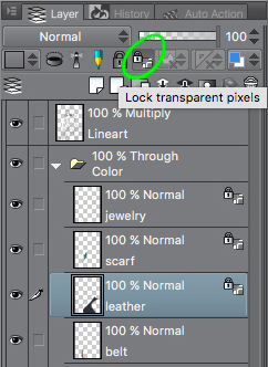
In the image above, you can see my layer structure before I delve into painting. With every element selected and filled with a base color, I can then either lock the transparency of each layer or use Clipping Masks to lay in brush strokes.
By locking the transparency, only the pre-existing pixels of a layer can be painted.
If one layer per picture element isn’t enough for your purpose, you can start adding clipping masks on top and build up layers of the picture element and painting this way.
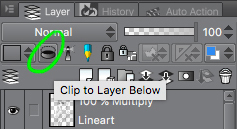
Clipping mask layers are layers that are “clipped” to the layer directly below. On clipping mask layers, you can only paint within the pixels that the layer below already contains. I use these if I want to try things out, as creating a clipping mask layer makes it easy to go back. In other situations, you may want to work with different blending modes like Multiply, Overlay, or Linear Burn. You can do that easily on a clipping mask layer, as they only affect a specific area.
Needless to say, this is just a technique that I frequently use, if you like to work directly on one layer that’s totally fine, too!
2. Lighting
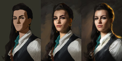
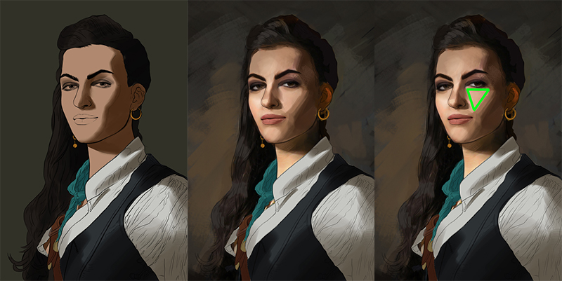
The first thing I always think about before painting anything is “Where does the light come from?” Always make sure that your lighting is consistent: don’t light one part of the picture from one side and accidentally light other parts from another side. I love lighting schemes with strong lights and darks that emphasize the forms. In this case, I decided to base my lighting on a classic portrait lighting scheme called Rembrandt lighting. It’s named after the famous Dutch old master painter Rembrandt and has a very distinct characteristic: a triangle of light on the cheek of the less illuminated side of the face. It’s very pleasing to the eye and makes the shadow and light shapes interesting.
Another important factor when it comes to lighting is to differentiate between form shadows and cast shadows. Form shadows are shadows that occur when the form of the object changes and one side goes into shadow. A cast shadow is when a shadow is literally cast from another object, for example, the nose. Cast shadows are often sharp, whereas form shadows are smooth as they wrap around the form.
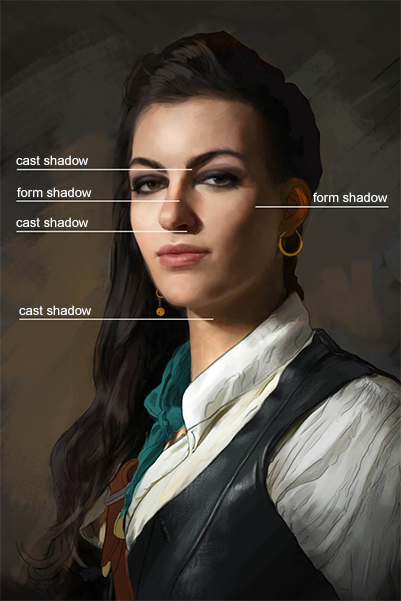
If you’re unsure of where to place a certain type of shadow, it’s very helpful to simulate the lighting on your own face and look in the mirror or take a picture. Usually, the facial features that protrude (eyebrows, nose, chin) can cast a shadow onto other planes like the cheek or neck.
Another thing I always do is start with the big shapes and not try to get lost in details early. I also avoid zooming in too much in the early stages of painting.
3. Hair Light
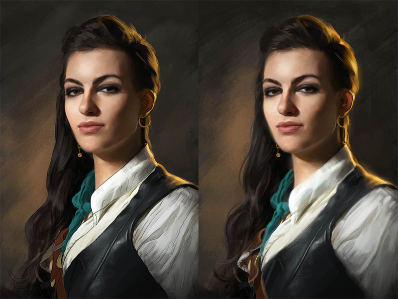
I take my time rendering the hair, leather, clothes, and skin. Refining the details takes the largest amount of time in my painting process. You can also see that I also erased some of my lines to make it look more painterly (after all, line art is just a base to work from.) While rendering, I thought my image looked a little flat and could use some punch, color, and vibrancy. After much thought, I decided to add a hair light to make the figure stand out more against the background. A “hair light” is a light behind the subject that illuminates the hair and the top of the shoulders in photography. It’s also called a “rim light” and is used to make the figure stand out more from the background. I chose a warm orange light to add interest and vibrancy to the painting. When using rim lights, make sure that you don’t just paint a thin line around your subject, but make it bleed into the form to bring out the three-dimensionality.
4. Final Touches
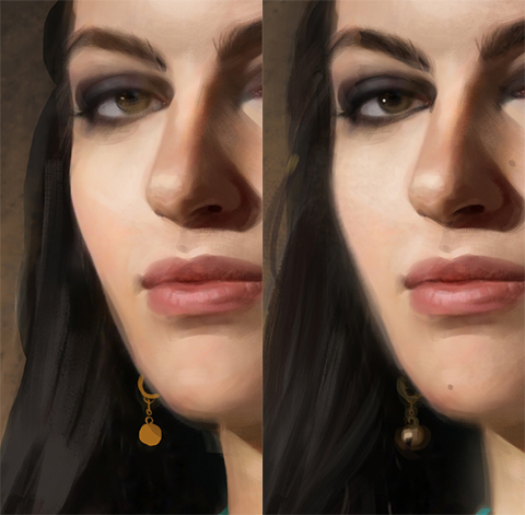
Now that the painting is almost done, let’s talk about the last steps that I always do in order to bring the painting together. Due to my selection at the beginning of my painting process, I end up with some very sharp edges. Sharp vs. soft is one of the major ways to create focal points in a painting, so I want to make sure that I don’t accidentally draw focus where I don’t want it. For example, the left cheek is razor-sharp and can be softened a bit. Where values are close together, I can soften the edges as well. For example, where her leather vest bleeds into the background and where her white shirt almost merges with her neck were softened. I also softened the edges close to the edges of the painting where I don’t want to draw focus.
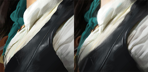
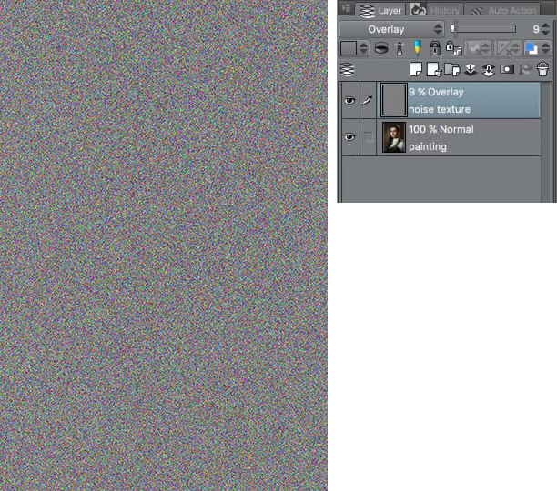
To avoid the clean, digital look, I like to put a noise layer on top of everything and put it on overlay at 9% transparency. This creates some visual noise that’s reminiscent of a photograph.
Then I let the painting rest for a day, add some small details and call it done.
Luisa Preissler
Interested in concept art or what it takes to become a concept artist?
Check out the link below!