How to paint the four elements
Artist Dani Puente explains how to paint digitally the four main natural elements: water, fire, air, and earth. Learn how to use features such as gradients and layer blending modes to draw detailed and realistic illustrations.
Index
Introduction
In our illustrations, we have to face new challenges, and sometimes things that seem easy end up getting complicated, even when their eventual solution is actually pretty simple.
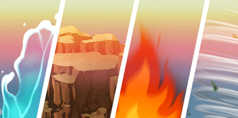
In this tutorial we will learn how to represent the four elements of nature: water, fire, air, and earth in a quick and easy way.
Get your tools ready and let’s get started!
New document
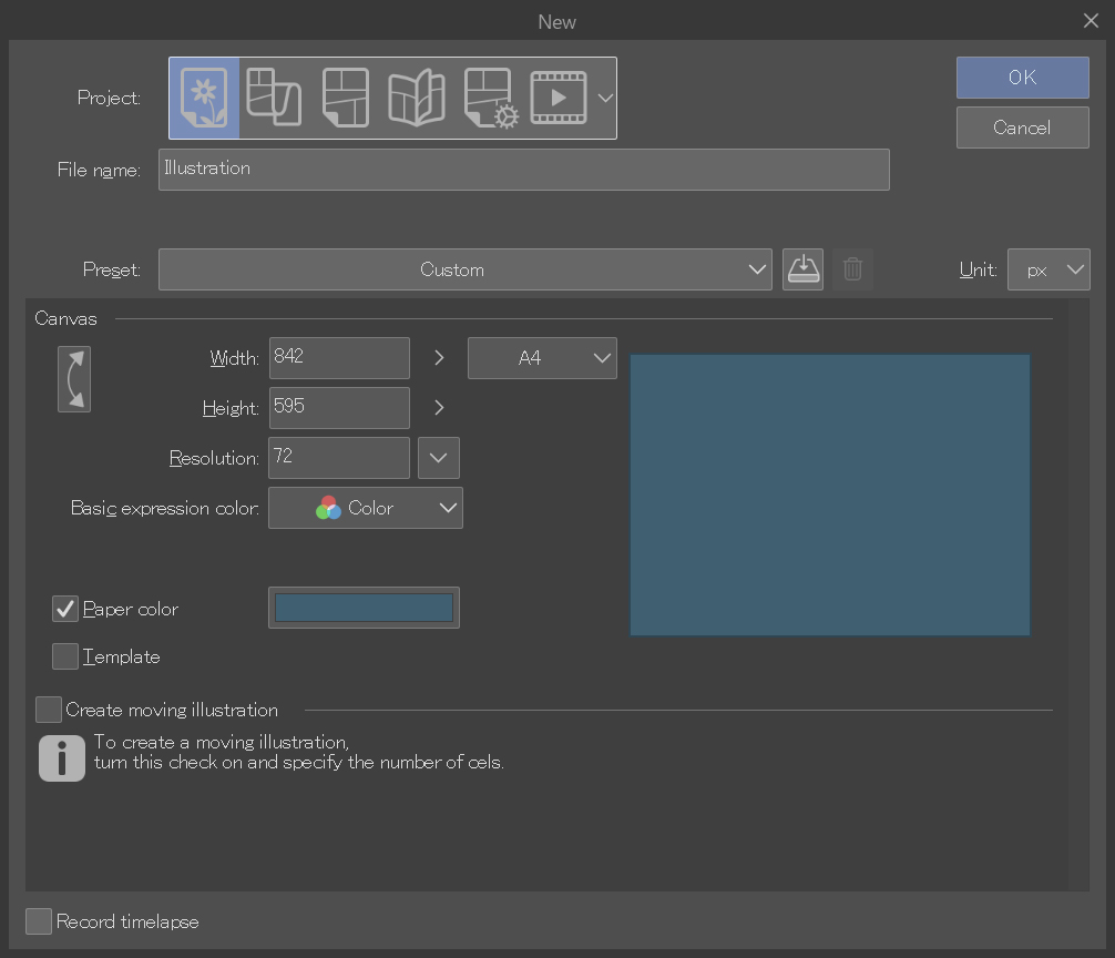
Before we start drawing the elements, the first step is to open a new Clip Studio Paint document. To do it, click: File > New
Then, under Project, select Illustration, choose a landscape A4 format, and set the dpi to 72. You can also set the background color if you want.
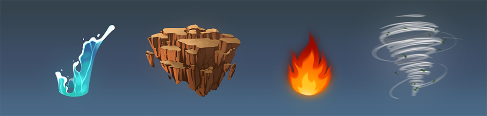
Now let’s start rendering the first element: water.
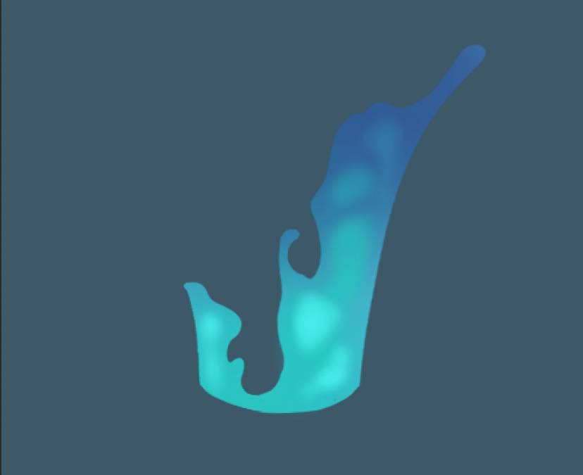
1. Element 1: Water
First, create a new layer to draw the shape that will form the basis of your object.
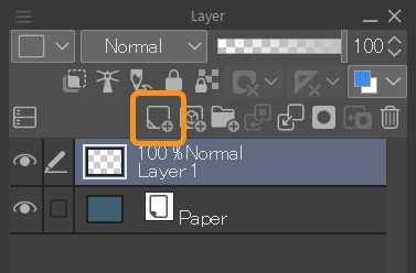
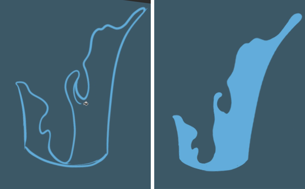
Then, with the G-pen tool set to a light blue color, paint the outline and fill it with the Fill tool.
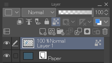
Then press the Lock transparent pixels button in the Layer palette. The function of this button is, as the name suggests, to lock the pixels that are not painted so that you can only work on the pixels that are already on the layer. In this case, the blue shape.
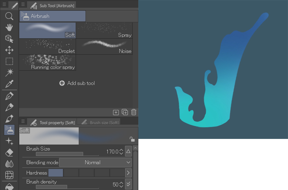
Next, select the Soft Airbrush tool and apply a dark blue color on the top, and a greenish-blue on the bottom. I recommend you set the brush size fairly large with a density of 50% for the airbrush.
Then, in a new layer, using the same tool but with a smaller brush size (around 17 px), add some subtle spots in a lighter shade of blue than the area below.
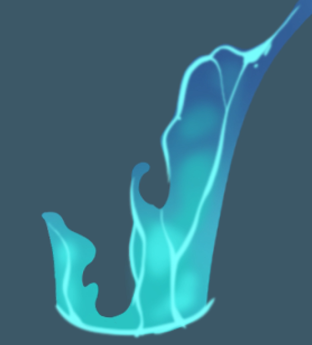
For this fourth step you’ll have to create another new layer and paint some blue lines with the G-pen tool similar to the ones below:
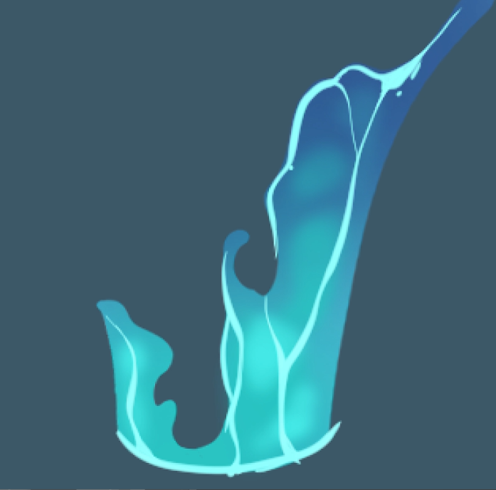
Set the Blending mode on this layer to Lighten. Don’t worry even if the paint goes outside the lines; we’ll fix that in the next step.
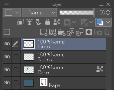
Since we are working with several layers, I recommend you give them each names so you know what’s in each layer. Just click on the name to rename it.
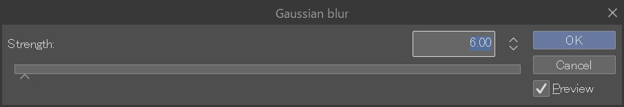
Adjust these new blue lines by applying a blur filter. To do this, go to Filter > Blur > Gaussian Blur. Adjust the blur to about 3-6 px.
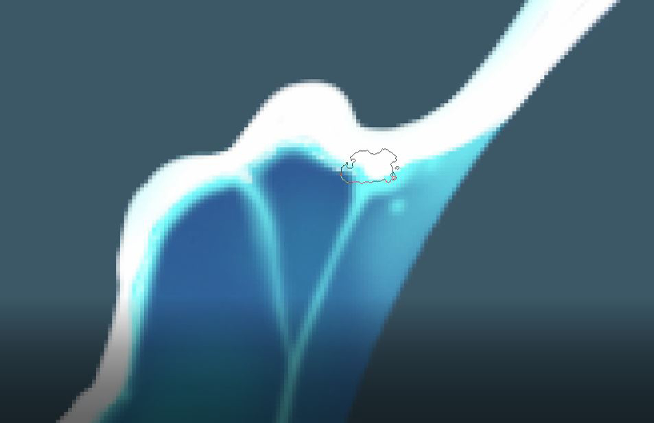
Now, to remove the unnecessary parts of the line art layer, go to the line art layer and click on the thumbnail of the base layer while holding the Ctrl key (Cmd on Mac) to create a selection.
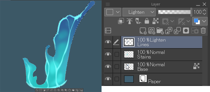
Once you have created the selection, invert it by pressing this button on the selection bar (or Ctrl + Shift + i) at the bottom:
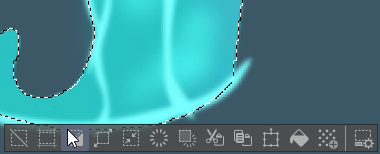
Now all we have to do is press the Del key.
Next, create a new layer called “Foam” to paint the white ends of the shape using the G-pen tool with a white color.
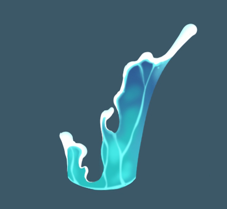
To improve the finish on this, let’s do two things. The first is to better blend the hard edge with the blue water using the India ink > Dry ink tool:
And the second is to paint a few splash drops to add a more realistic touch.

Finally, create your fifth and final layer and place it underneath to paint the background water. Just keep in mind that its colors will be darker than those of the foreground:
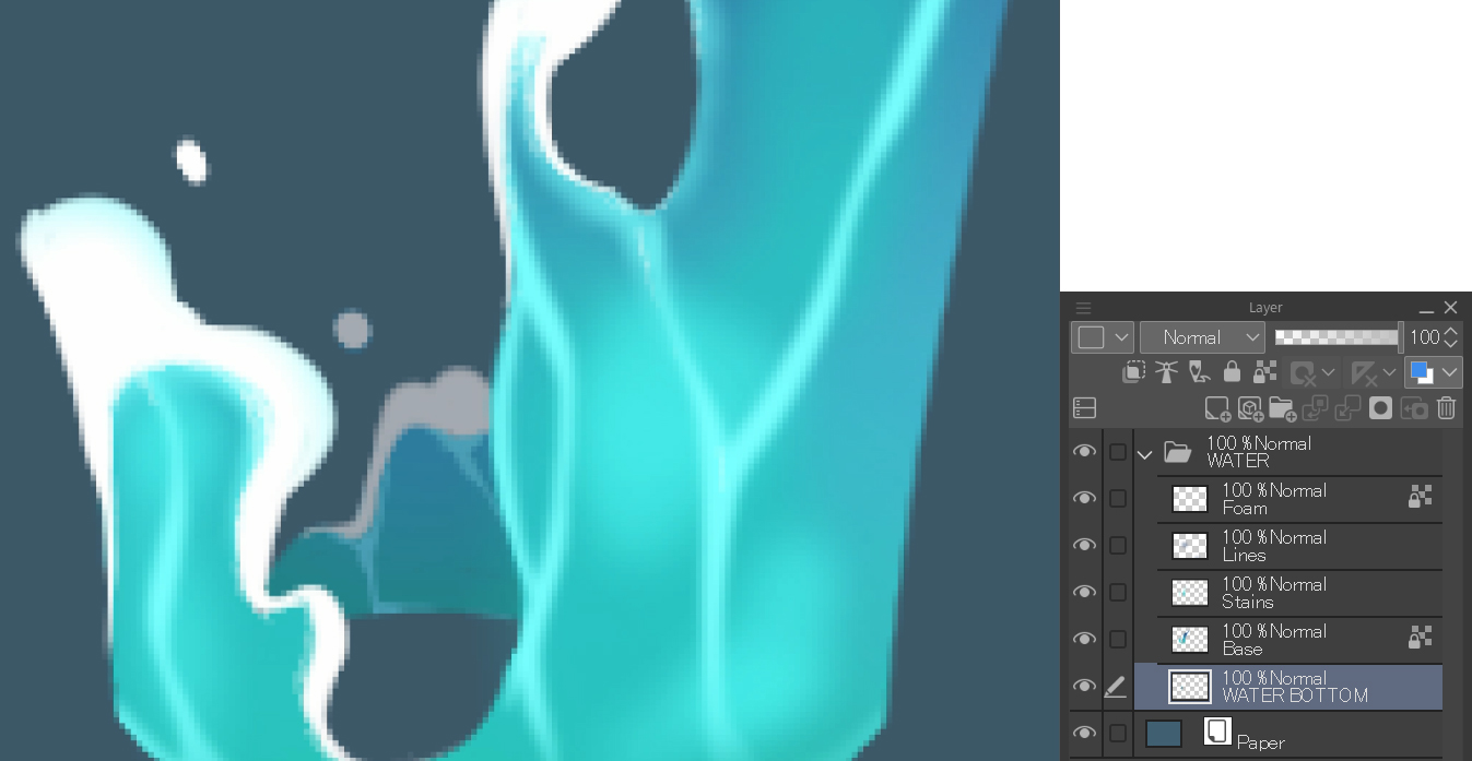
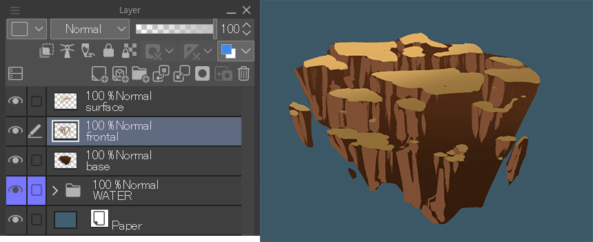
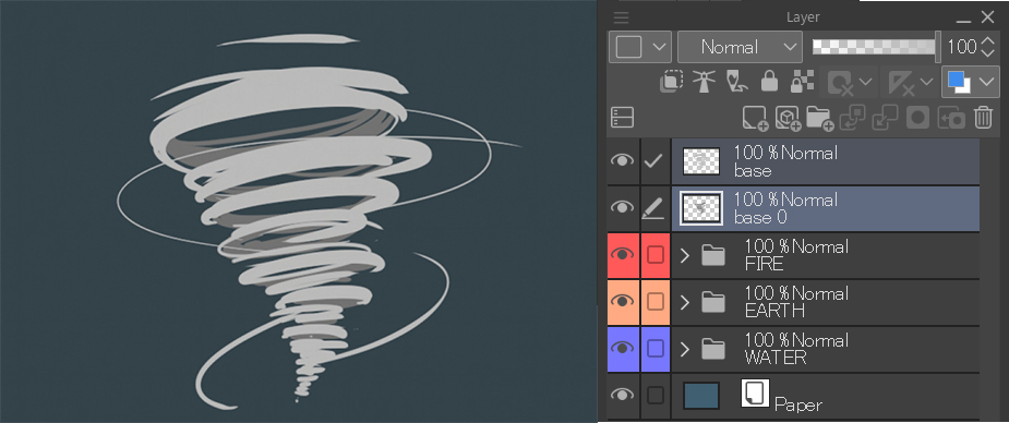
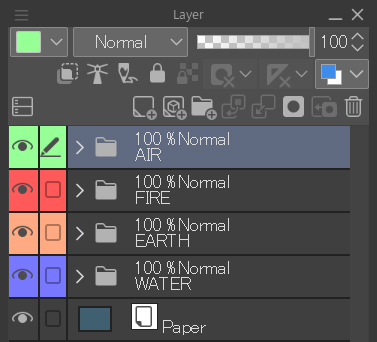
As you can see in the Layer palette, I created a “Water” folder to put the 5 layers we have been working with in. To do this, click the New Folder button to the right of the New Layer button and drag the layers into it. This is one of the best methods to organize your workspace.

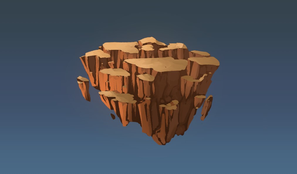
2. Element 2: Earth
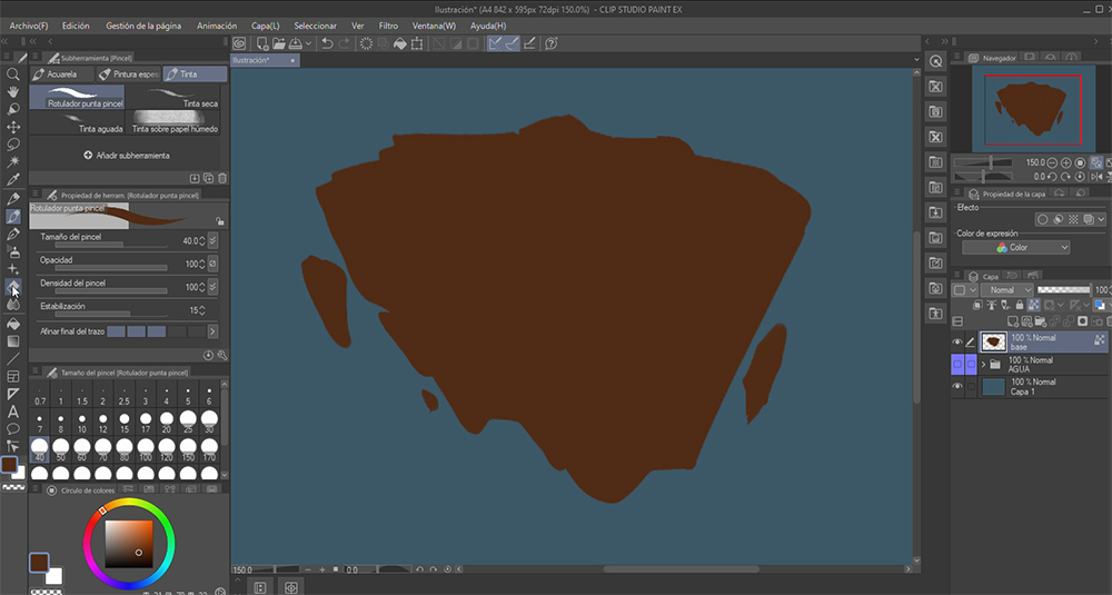
The steps for this second element are similar to the previous one. Start by creating a new layer and draw the basic shape with a brown color. This time we will use the India ink > Brush pen tool, as it has a more irregular shape and will be helpful for drawing our rocks.
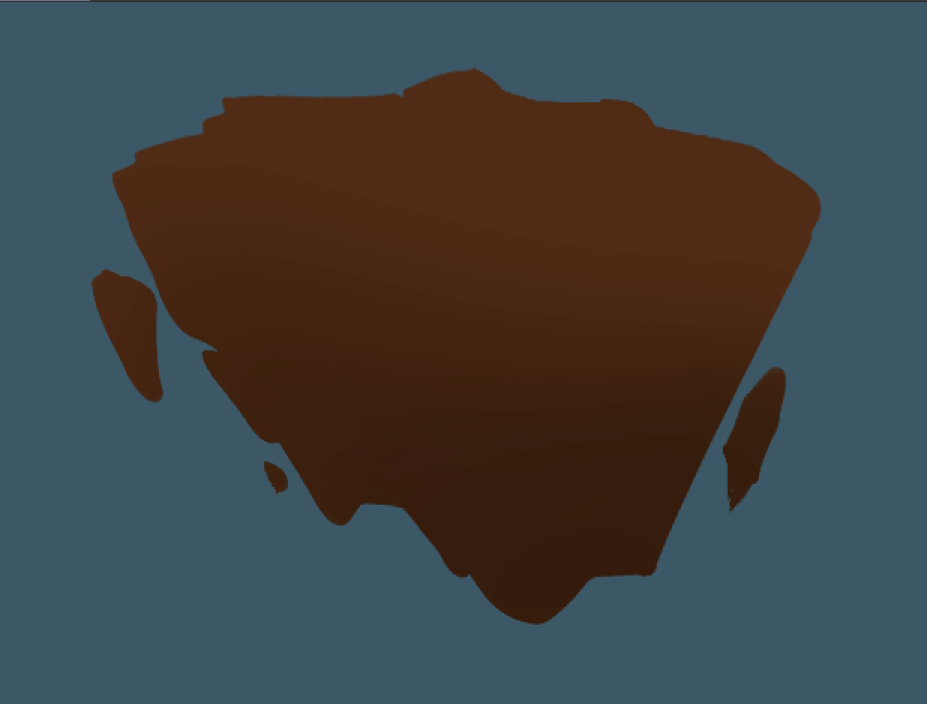
Next, lock the transparent pixels and, with a 170 px Soft Airbrush tool, paint the lower area in a dark brown.
Now create a new layer on top which we will call “Surface”. On this layer paint some lighter horizontal spots to represent a horizontal plane, similar to the ground.
Now repeat the second step that we did in the first layer. Lock the transparent pixels and with the airbrush add a different color, this time lighter, in the upper area.
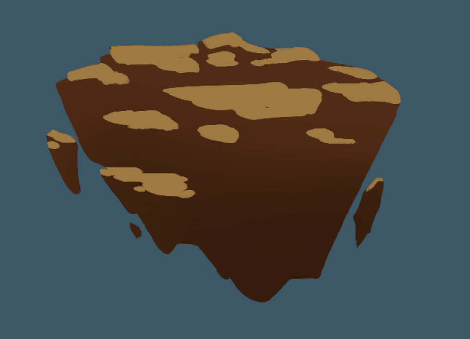
Create a new layer with the name “Front” and paint the vertical planes of the rocks. It is important to place this layer between the first two:
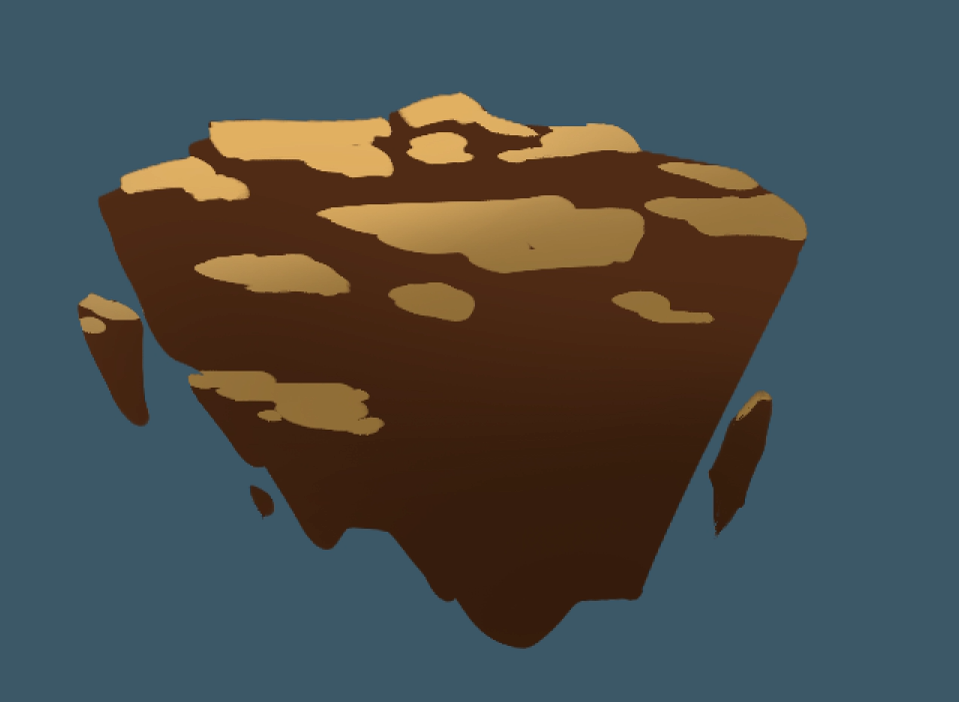
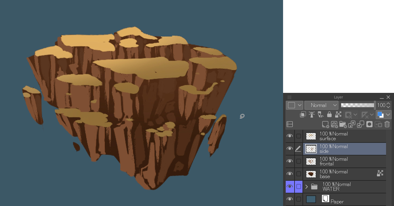
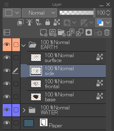
Next, repeat the steps to draw the right vertical plane. Create a new layer with the name “Side” and keep working on it with the India ink > Brush pen with a color lighter than the background but darker than the left plane. Take a look at the image below:
Select the “Front” layer and lock the transparent pixels to apply an orange tone to the layer to simulate natural light. For this, use the Soft Airbrush tool again.
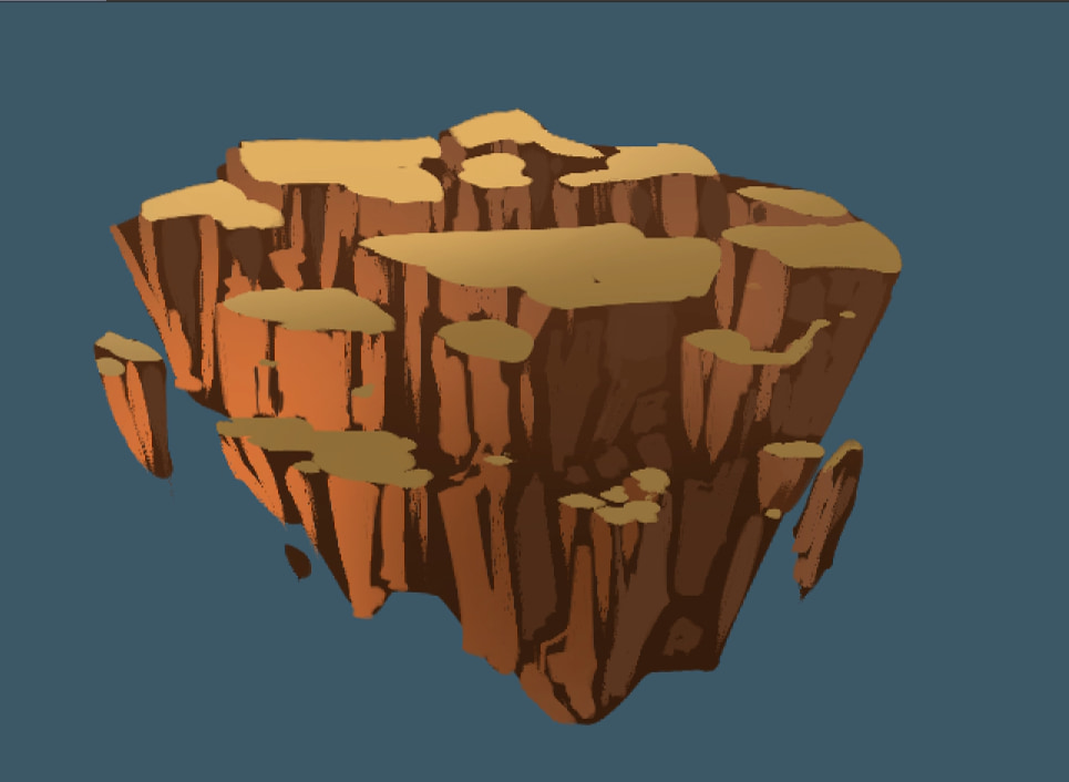
To organize the layers, create a folder and put in it the 4 layers you have created for the earth element. You can also use the layer colors in the upper left corner to visually organize the space. I chose orange for this element.
The next step is optional, but I recommend it to help improve the rocks shape and integrate them better. In the layers palette, right-click on the “Earth” folder and duplicate it. After duplicating it, right-click again and select Merge Selected Layers. This way you’ll have all the rocks in the same layer and will be able to work on them directly. With the Eraser tool adjust the profile of the object and with the G-pen tool add any small details that are missing. Don’t forget to put the final touches to the rocks on all the planes.
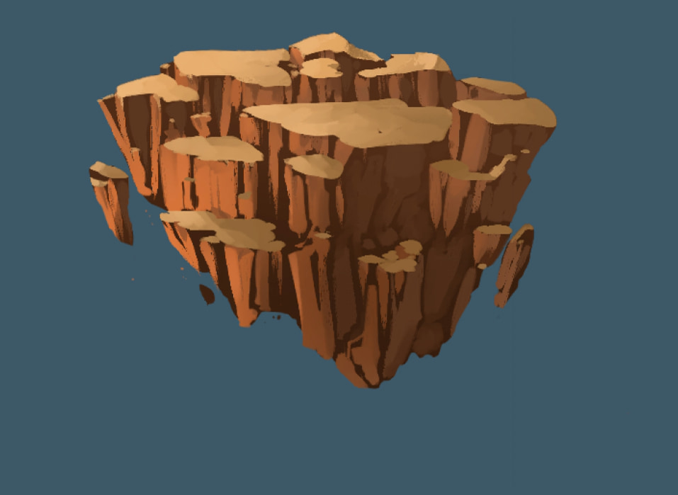
I also encourage you to try to adding some textures with the Decoration tools and add to the earth texture or even a couple of cracks.
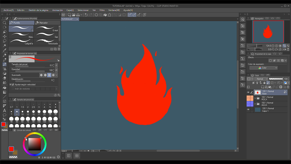
3. Element 3: Fire
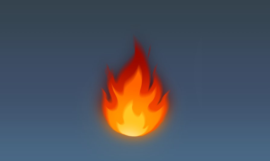
Start by creating a new layer and, using a strong orange-red color with the G-pen, draw the shape of a flame.
Then lock the transparent pixels and with the same technique as before add a dark gradient over the top.

We will apply this technique to the next two layers, which will be orange and yellow ones:
New Layer > New Shape > Lock pixels > Airbrush gradient.


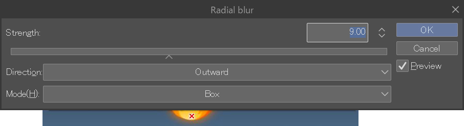
Now let’s add a motion effect to the fire.
How? Simple. On the first layer (“Base”), disable Lock transparent pixels and apply a radial blur.
Filter > Blur strength > Radial Blur
Set the following parameters:
Direction: Outward, Mode: Box and Distance: around 8-12.
When you are working on the settings for this blur, a red and white cross will appear on the canvas. It is very important to place the cross at the base of the fire so that the direction of the blur starts from there.
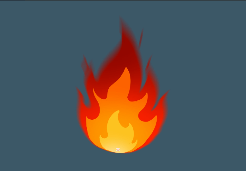
Apply the same blur on the other two layers, too.
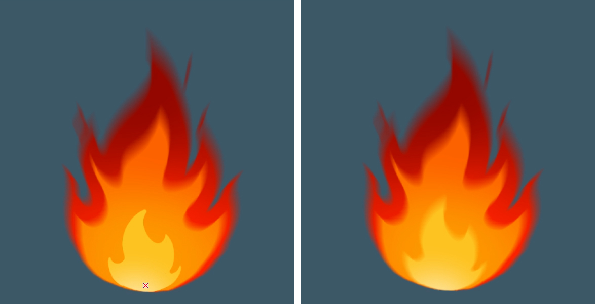
To finish this third element, right-click on the first layer (“Base”) and duplicate it. Change the layer name to “Lighting” and place it below the previous three layers. Next, enable Lock transparent pixels again, and add some dark maroon on top and light orange underneath with the Soft Airbrush tool.
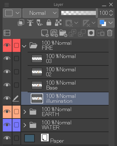

To complete the fire, apply a bit of Gaussian blur to the layer to give it a glowy feel.
Filter > Blur strength > Gaussian blur

4. Element 4: Air
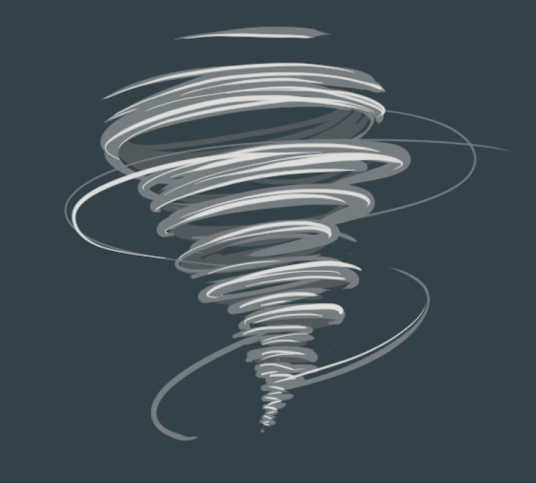
As with the other three elements, start by creating a new layer with the name “Base”. Draw on some curved lines with the G-pen tool in a very light gray color. Start by painting some thick and large lines at the top and decrease their size and thickness as you go down. Then, draw some thin messy lines around to add more sense of motion.
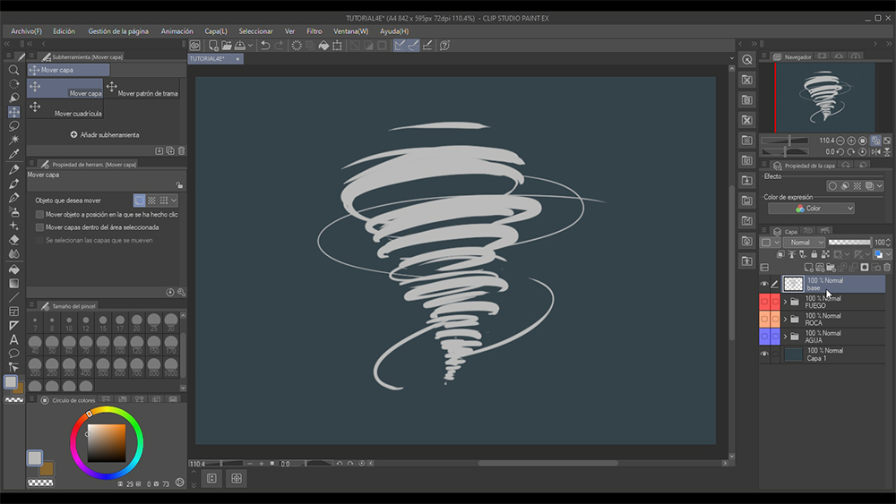
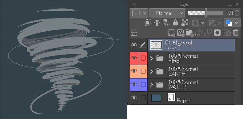
Create a new layer (“Base 0”) and place it below the “Base” layer. On this layer, paint the inner part a darker gray.
Select the two layers, right-click on them while holding down the Ctrl key (Cmd on Mac) and select Merge selected layers. Then reduce the opacity of the layer to 50%.
On a new layer, draw some white lines thinner than the initial ones to emphasize the front part of the gust.
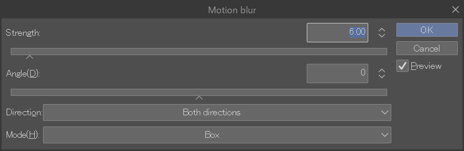
The next step is to apply motion blur to the two layers. This will make it look a lot more dynamic.
Filter > Blur strength > Motion blur
Set the following parameters:
Distance: 6-10, Angle: 0, Direction: Both directions and Mode: Box.
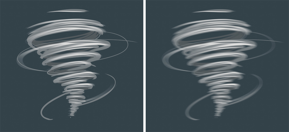
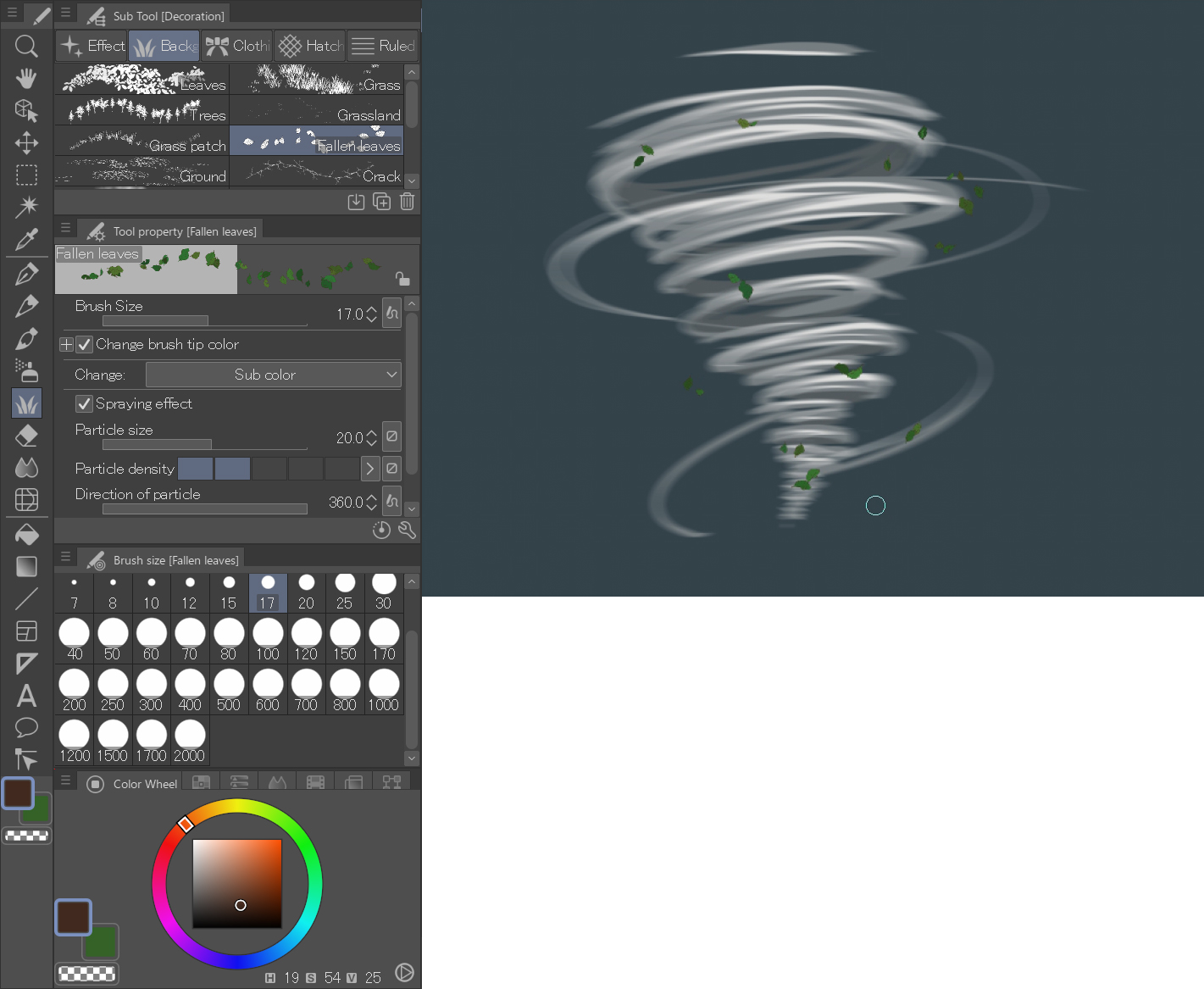
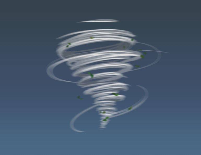
For the final touches that will boost the effect of movement, let’s add some blustery leaves in a new layer. Select the Decoration tool > Background > Fallen leaves and the colors of the image below and add both in a few areas of the element.
Pay attention to the tool properties so you can achieve a similar finish as the image. Both the brush and particle sizes are less than 20 px.
Try to work by always sorting your layers with folders and by color. This will speed up your work and improve your productivity.
Finally, apply the previous motion blur also on this last layer.
In this tutorial I have shown you a simple and straightforward methodology to paint the four elements, which can get complicated if you are not familiar with them. As you have seen, you just have to find a method that works for you and apply it in different situations. I’m glad I was able to show you my technique. As always, I encourage you to investigate and try new processes to enrich your illustrations. Until then, I hope you find my tips helpful!

Right, that’s all for today. I would appreciate it if you could show me the elements you created with this tutorial on social media.
If you have any questions, feel free to contact me by email: danielpuentemorales@gmail.com.
As always, it’s a pleasure to draw for all of you!
Dani Puente
Interested in concept art or what it takes to become a concept artist?
Check out the link below!