Metal Engravings Made Easy in Digital Painting
Learn how to add intricate, realistic engravings when drawing armor and weapons with illustrator Mirjam Löfgren!
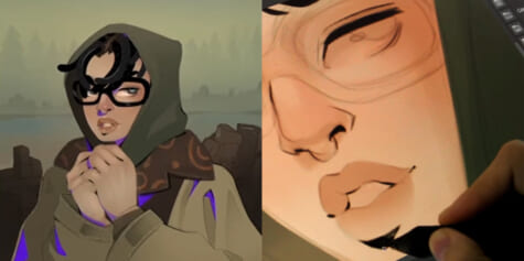
Hello, my name is Mirjam Löfgren. I’m also known as Foervraengd online, and I’m a digital illustrator. Today I’ll show you how to make objects such as armor look rich, detailed, and ornate by adding engravings using the digital art software Clip Studio Paint.
You can use any brush for this, but the ones I’ve used in this tutorial are the following:
Mirres Marker Brush Set: https://assets.clip-studio.com/en-us/detail?id=1749822
ornament ribbon brushes: https://assets.clip-studio.com/en-us/detail?id=1727628
Sharp Pencil: https://assets.clip-studio.com/en-us/detail?id=1758016
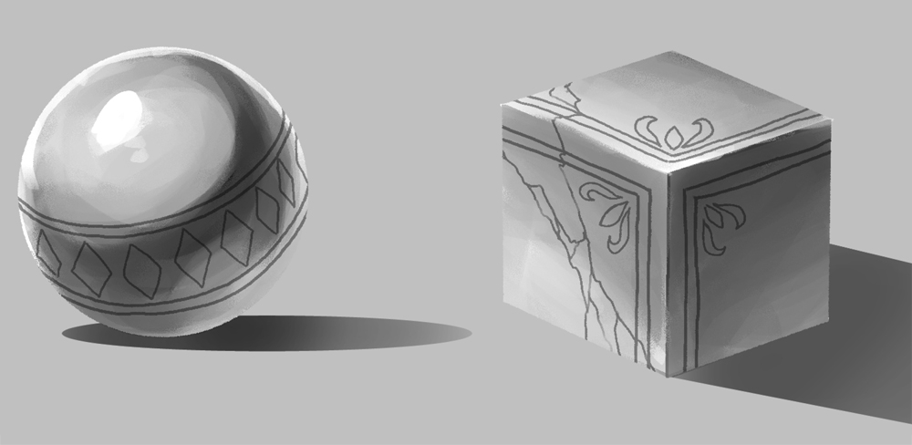
Engraving is a pattern, picture, or text carved onto a surface, which is usually metal. It’s mainly a method to decorate areas and make them look more appealing.
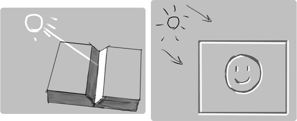
The opposite of engraving is embossing. These are patterns and text that are added onto the surface.

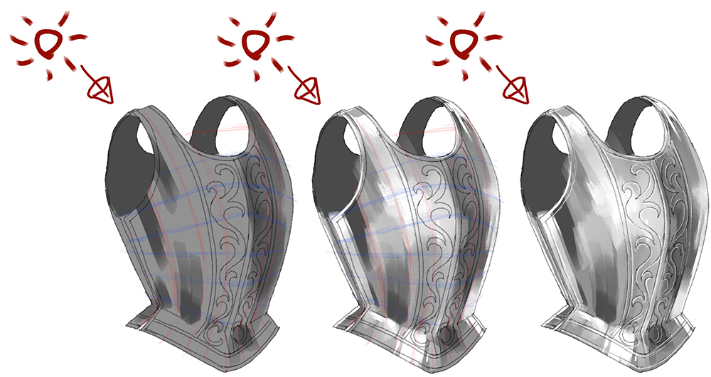
To achieve a convincing result, you need to pay attention to the light source. Just by changing the lighting as shown here, the surface can look either engraved or embossed.
There are different ways to add details to your artwork and they all are useful, but you might prefer some methods over others depending on your own art style. That’s why I’ll show you several methods I mainly use for a digital “painterly” style. Even if it’s not your usual style, I still encourage you to give these methods a try!
Using layer modes on different surfaces
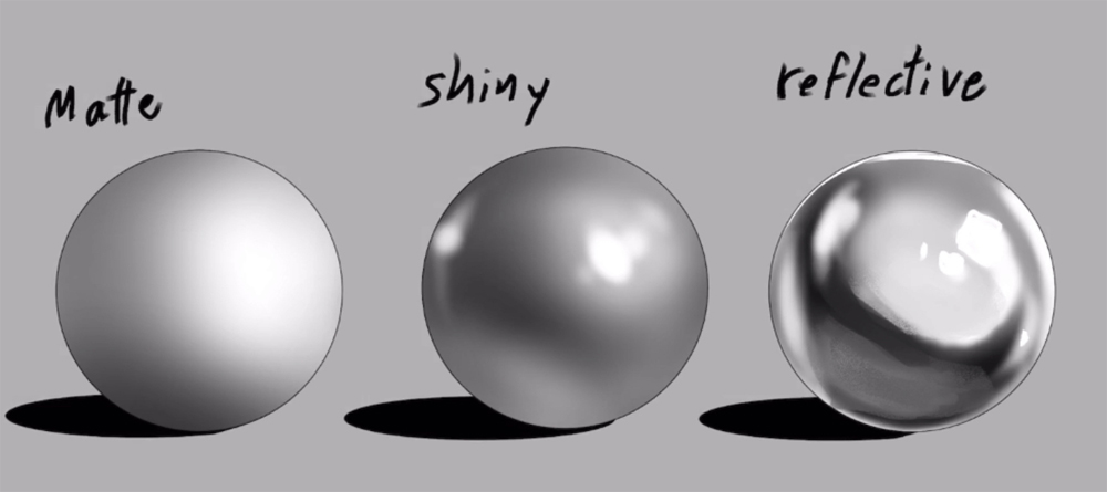
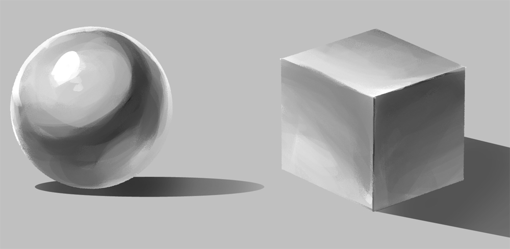
Engraving can be done on any type of surface, but it’s good to be aware of how it looks on matte, shiny, and reflective objects.
The main factor that separates shiny objects from matte objects is that the reflective light is more pronounced, as we can see with the bottom half of the middle sphere. The highlights and core shadows are also sharper and higher in contrast.
A reflective surface takes this further and starts to reflect its surroundings like a mirror. The more reflective the surface, the more you have to include the surrounding colors.
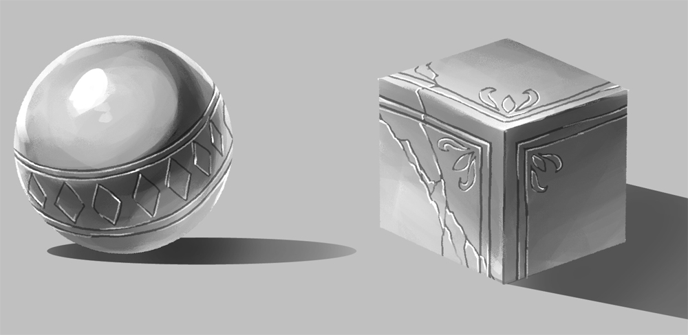
If we give each sphere a deep groove along the surface, we can see that they each look different.
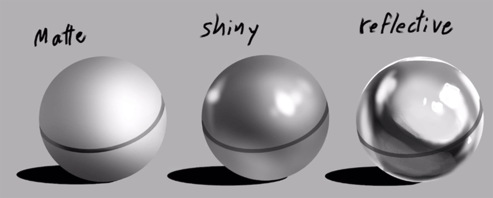
For the matte sphere, we can pretty much only use a multiply layer. But for the other two, we have to take the reflective light into account.
For the shiny sphere, I set the line-layer to “normal” and locked the transparent pixels. I then used a soft airbrush to add variety to the darker shades along the line.
As a rule of thumb, you should only darken areas that are lighter than the mid-tone. For example, the reflected light at the bottom of the sphere and areas close to the highlight are areas where I would make the line a bit darker.
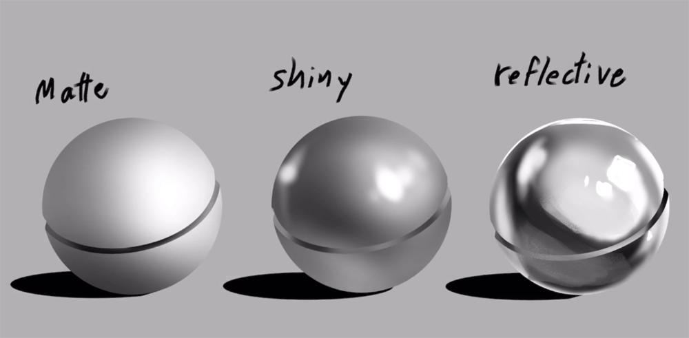
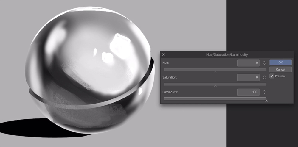
We’ll repeat this with the reflective sphere, but instead of a normal layer, let’s set the layer to “difference”.
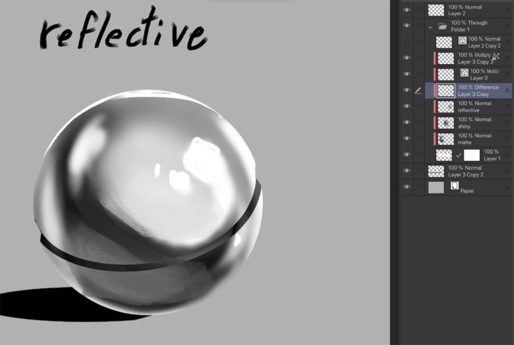
If it doesn’t look right off the bat, adjust the luminosity until it looks something similar to the image here. Usually white or very light gray should do the trick. Depending on what colors or values you work with, you can get similar results with the layer set to “Exclusion”.
Using layer mode “difference” works pretty good for patterned brushes with a lot of details and thin lines. There are a lot of beautiful pattern brushes to download on clip studio assets, so I really recommend it for finding inspiration and resources.
Manually by hand
Painting engravings by hand is useful when other methods don’t match your own style that well. It’s also good practice for beginners. Make sure to determine the light source first, which is where the highlight should follow.
The next stage is to add engravings. Create a multiply layer and use a medium gray color to draw the patterns. You can also have a normal layer and use black on low opacity for a similar result. Make sure the pattern follows the shape of the object. You can also use this method to create shallow cracks in rocks and marble sculptures.
Make a normal layer above the multiply layer and add highlights. Pay close attention to your light source, as both the main light source and reflected light come into play. You can see with the sphere in the example.
This is a simple way to add engraving manually without relying too much on layer modes.
Using Patterned brushes
You can, of course, use brushes with custom patterns to save some time.
Just remember that if you have too many details, it can take a lot of time to add all the highlights manually.
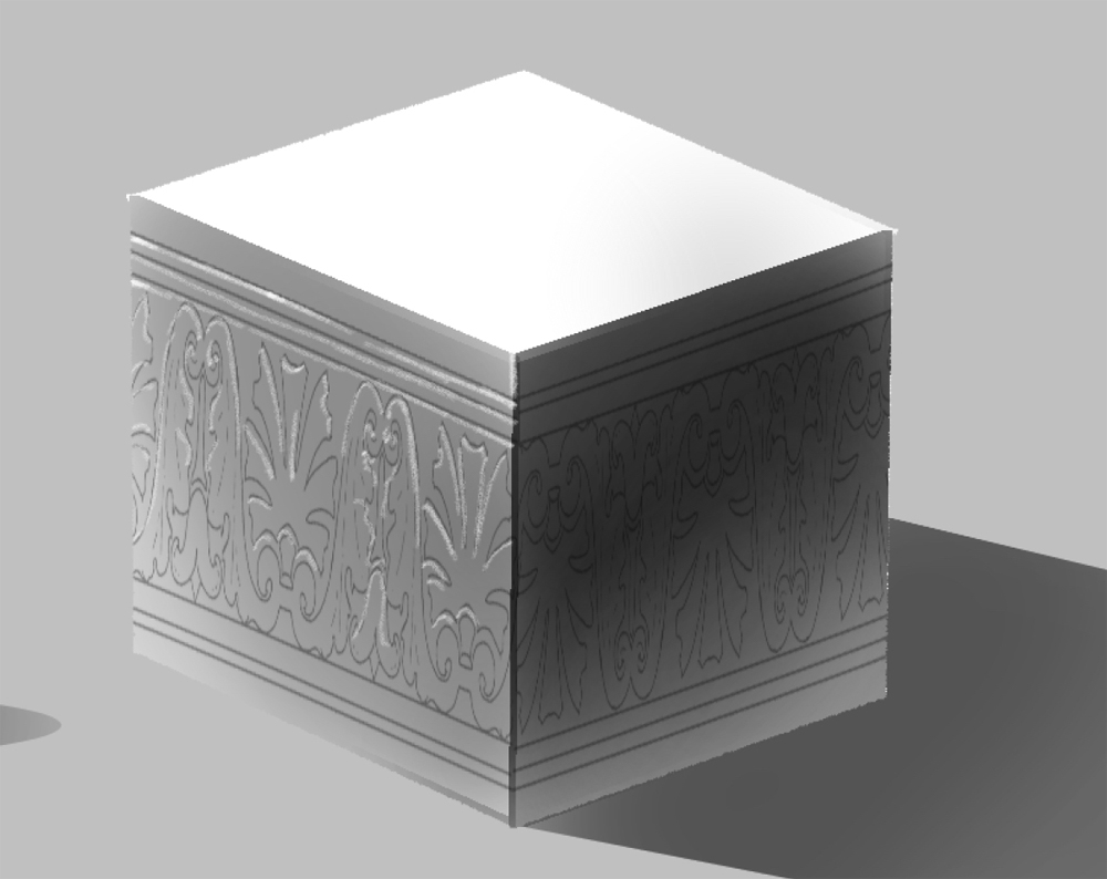
One trick is to make a copy of the pattern layer and color it white, then move it a tiny bit up or down depending on your light source.
Layer modes such as color dodge and glow dodge can also be useful here.

Complex shapes
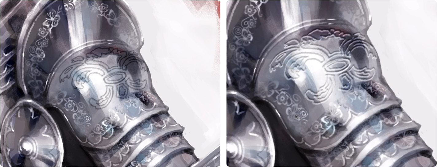
When you want to apply this to something more complicated, always make sure to have a reference photo available if needed.
On this piece of armor, I sketched out a grid in red and blue as a “shape” guide for when I add the engraving.
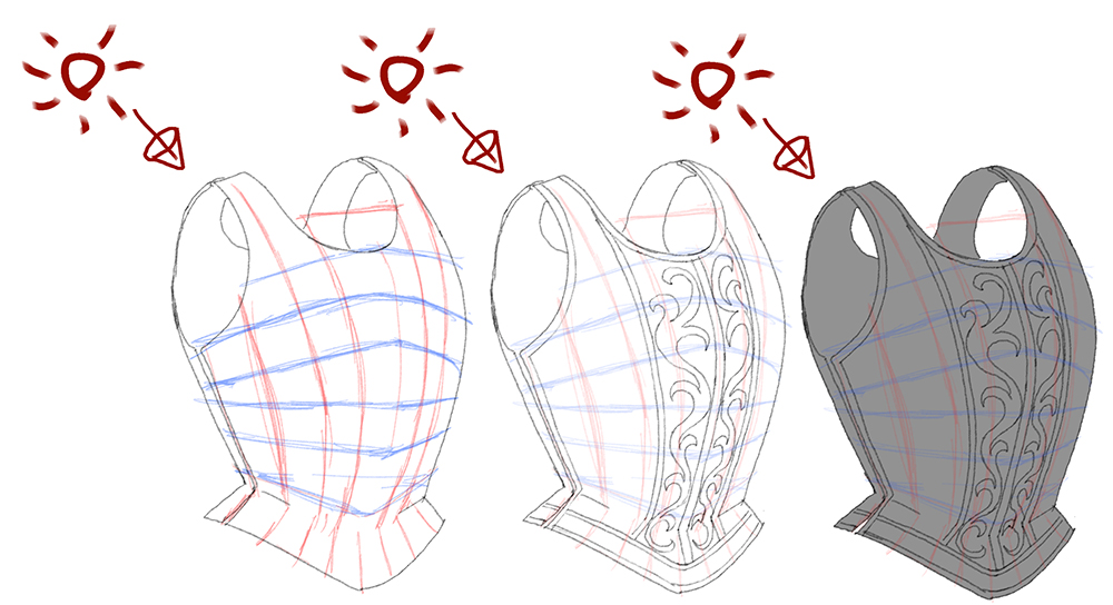
Notice how I follow the grid when applying shadows, reflections, and highlights.
The last step is to add light to the engraving. You want to make sure the pattern looks the way you want, so you won’t have to go back and readjust things.
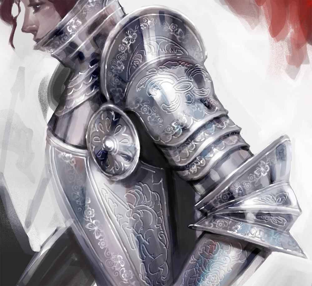
Now let’s apply these techniques to your artwork.
Engraving is something you often add at the end of the process. And as long as you keep it on a separate layer, you should have enough room for adjustments if needed.
I first start by painting most of the artwork. As for metal, I find it easiest to first use a soft round airbrush and then render it into sharper brushwork using a blending brush.
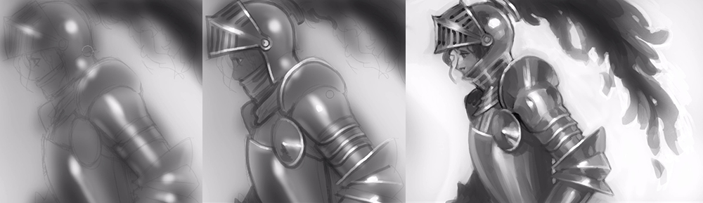
I use manual engraving along the edges of the armor since it will look deeper and match the overall brushwork. It will also serve as a template for when I add more intricate details later.
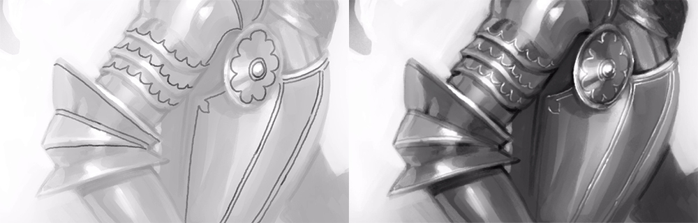
For intricate engravings, I used one of the default ribbon brushes that came with Clip Studio. But you can use any ribbon brush with thin lines for this. I also blurred this pattern a little bit so it doesn’t stand out too much. We want it to blend in with the rest of the art style here.
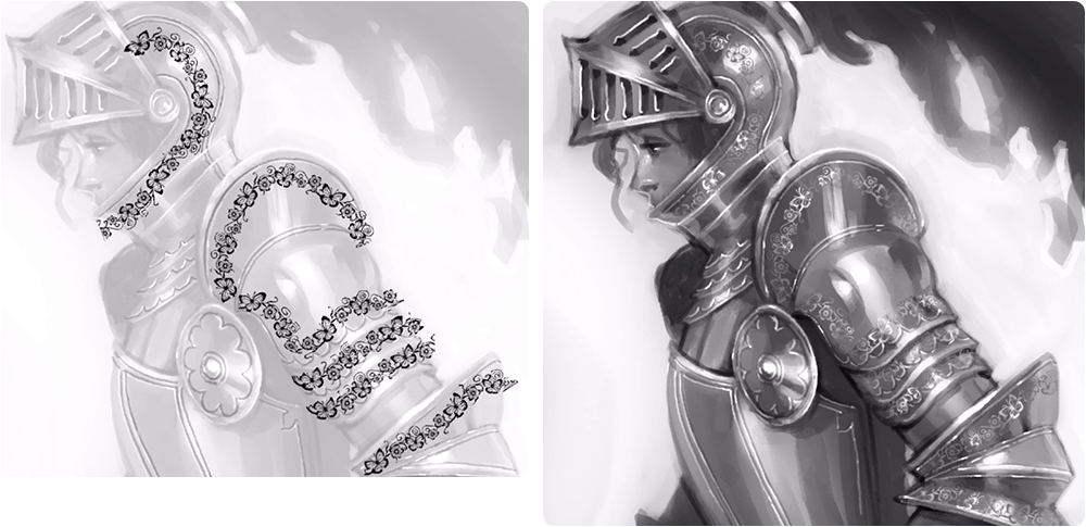
Lastly, I drew some bigger ornaments, but instead of a multiply layer, I set it to “Linear burn” and used a light blue-gray color. Then I duplicated it, set it to “Color dodge,” and moved the layer a little bit to the side.
The only issue with engraving in your art is that you don’t know when to stop because it is a really satisfying process!
I hope you’ve found this tutorial useful and I wish you all happy painting!
Interested in concept art or what it takes to become a concept artist?
Check out the link below!