Digital Painting Landscape Photo Studies

Marco Bucci shows how to make the most out of landscape photo studies & digital painting tools by covering useful color palette functions & watercolor painting techniques.
Hey everyone. This video is brought to you by Clip Studio Paint. A software I’ve been playing around a lot with lately. Today, I’ll put it through its paces doing some photo studies. I’ll share some tips as to how I get the most out of these sketches, and along the way, I’ll outline some features of Clip Studio Paint I think are really cool.
-
- Making My List
- Paint Small
- Adding Depth: the atmospheric perspective
- Advanced Color Picking
-
- Painting Digital Watercolor Effects
- Shadows & Reflections
-
- Selection Pen & Pixel Lock
- Fog Structure: Value Contrasts
Basic Clip Studio Paint Tools
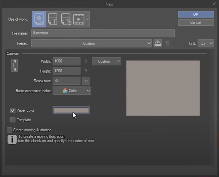
When you make a new canvas, you can set a default paper color. I’ve set this neutral warmish gray as my default.
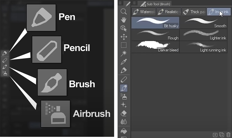
The main brushes I use to paint with are located under these four icons. When you click on one of them, you will have further brush selections in the Sub Tool menu.
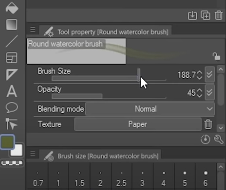
When you click one of those, you can fine-tune that specific brush in the Tool Property palette shown below. Options include brush size, opacity, the blending mode, as well as a bunch of textures you can emulate. And what’s nice is as I select a different brush, I get different customizable controls. When I work in Clip Studio, I tinker around in these areas a lot.
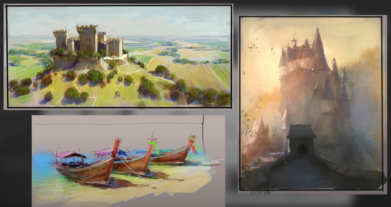
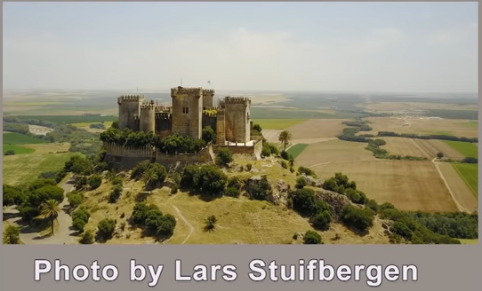
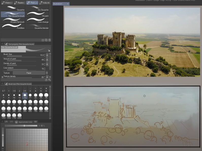
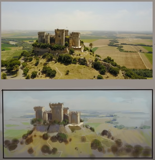
1. Aerial View Castle & Making My List
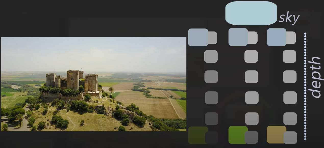
Here’s a photograph I’ll do a study from.
Before I jump in and start painting, I find it helpful to make a list of things I want to study.
I like the atmospheric perspective, specifically the challenge of tracking each color through depth. I think it will be a real exercise in grays as those colors get a lot closer together back of the photo. I’d also like to get a sense of the non-repetitive patterns that nature makes, which I find quite difficult to pull off. And I really like the sense of the graphic punch on that castle. That’s a clear focal point right there, and I want to make sure it comes off equally as clear in my painting.
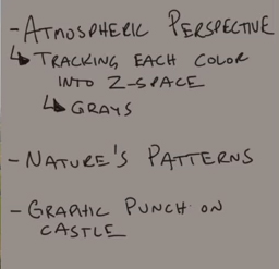
That simple list will keep me dialed in as I work, and when I finish that painting, I’ll consult that list again and ask myself, did I capture those things? So in a way, I’ve also created a little rubric in which I can grade or self-evaluate my study.
Straight Line Tool
In Clip Studio Paint, if you put down a dot and then hold shift, it will give this interactive Straight line tool, which I find extremely helpful for blocking in a drawing or a basic composition.
I’m using this tool to block in the castle and a lot of the surrounding landscape. The trees here I’ll just freehand and referencing my list, this is my first stab at nature’s pattern.
Ok, So I’m using brushes in the gouache collection to paint the sky. Remember that I want to capture the graphic punch of the castle. And in order to give myself an opportunity to do that, the sky should just be dead simple.
So, I’ve switched over now to the pen brushes, which tend to make very bold marks, which I think is a good choice to get this castle laid in. I’ve only been painting for a minute here, and I’m already trying to satisfy one of the items on my list, the graphic punch on the castle, which brings me to my next piece of advice when studying from photos.
Two simple words: Paint small
I’ve got two good reasons for this:
- Painting small in no way inhibits your ability to make a good picture. And because painting small reduces the physical labor parts of painting a little bit, you can get more studies done in less time. So more studies, less time, same pictorial impact, that’s reason number one.
- Reason number 2 surrounds some psychology I don’t quite understand but, painting small will help steer you away from the common tendency to just want to copy everything.
And this is a common question I get from students. How do you avoid simply copying a photograph and actually doing a conscious, focused study? Answering that question was really the driving force behind this video.
Adding Depth
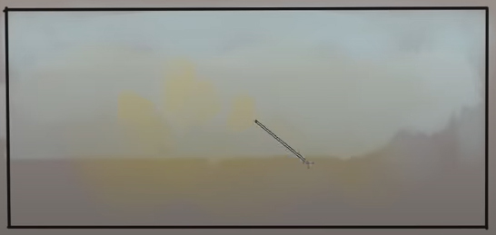
So at this point in the painting, I’m dealing with the whole depth problem. That is the atmospheric perspective tracking all those colors as they recede in space. I’ve been painting this stuff for many years now, and I’m aware of a pattern or two.
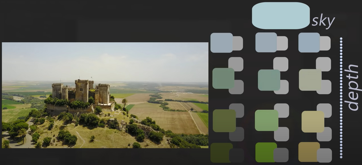
Let’s take three of the basic colors in this scene. The green of the trees, the green of the yard, and that yellowish-sienna color. Here are their corresponding values.
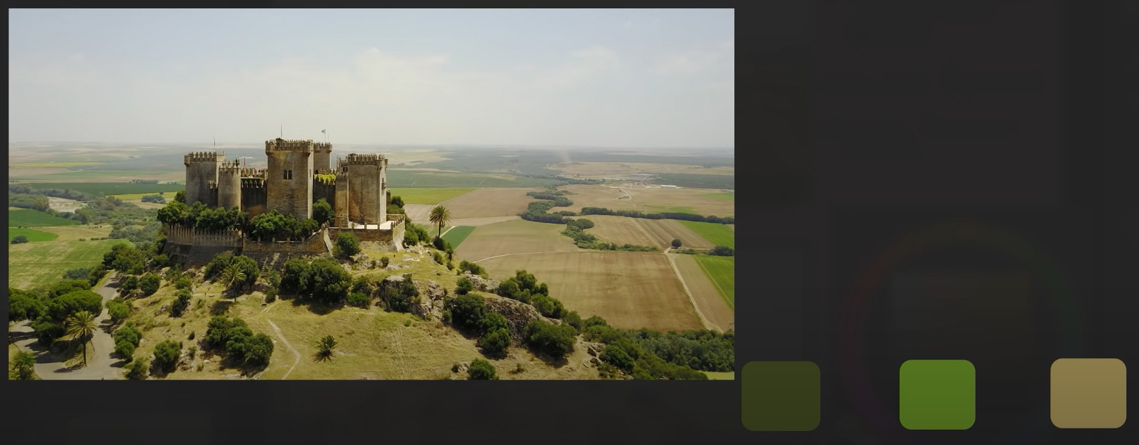
Now that represents those things close to the camera. We need to know how they change as they recede. First, these things are all darker than the sky, and they have to stay that way. The values will get lighter with distance while still maintaining that relationship.
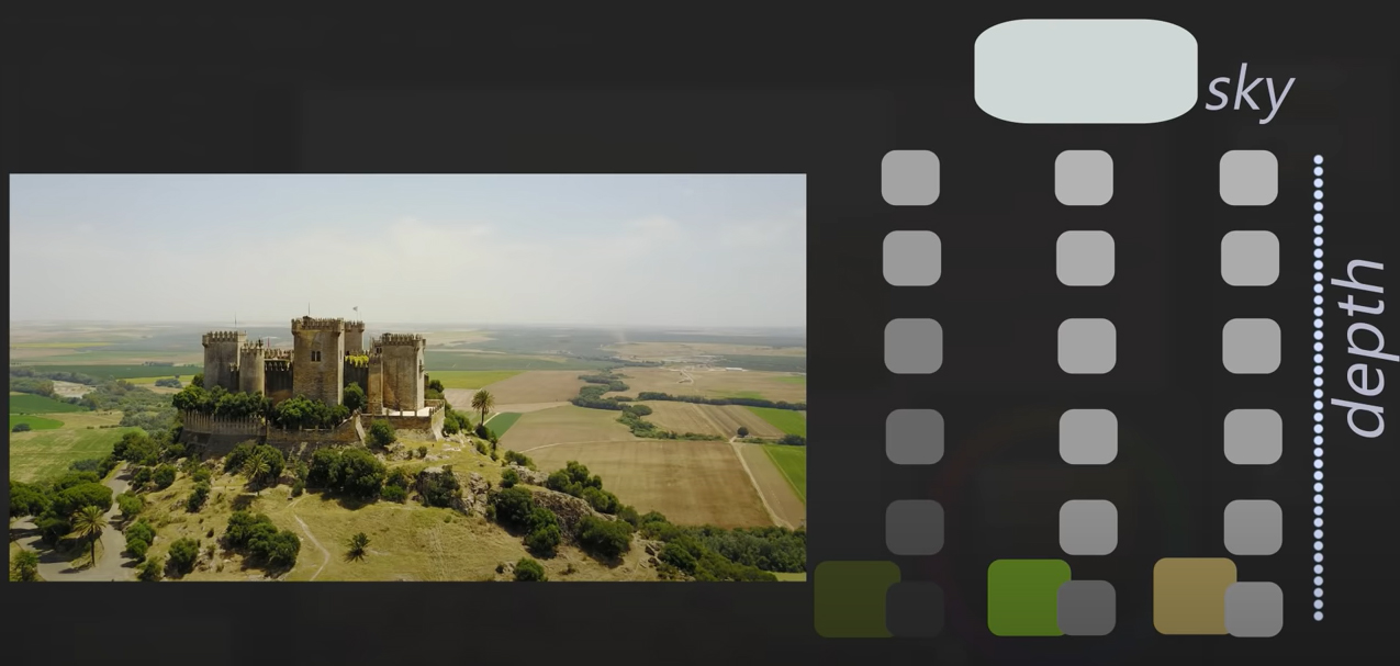
The things that are the darkest, the trees, in this case, experience the most change simply because they have more values to go through. If you can see right to the horizon like you can in this photograph, everything will eventually compress to the same value. The same is true with color. We’ll give the sky a faint blue as in the photograph. As the colors get further and further away, they’ll be influenced by that sky color. I think that’s simple enough to understand. Getting the colors there, that’s the tricky part.
Tips: Color Transitions
Below you can see a color wheel. We have two colors, the green and the orange, and we want to eventually get them blue.
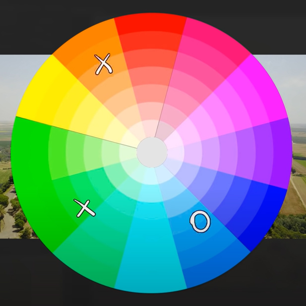
Let’s start with the orange; you might think it takes a path like this or maybe the other way like this.
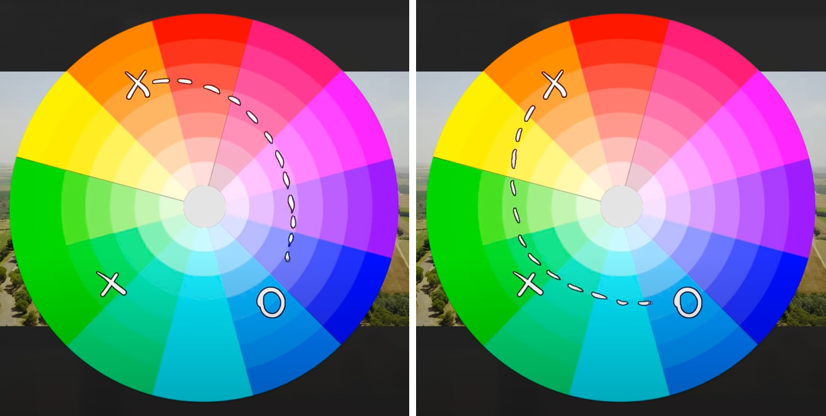
It actually won’t do either of those. Instead, it will go through gray, the area where all colors unite. The exact path it will take can vary, but it will look something like this. Similarly, the green is less likely to do this and more likely to chart this path.
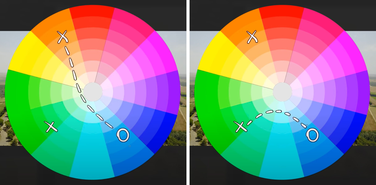
The colors don’t have to pass through perfect gray, but you can think of the gray as a kind of gravity well that, when it comes to depth, will pull colors toward it as they pass by.
Back to our color chart here, this is more or less what I’m going to be looking for.
If you look at what I have in the painting at this early stage, I’ve kind of bookended it. I have the close colors, and I have the far away colors, those being the two easiest parts, at least in my opinion, and then as the painting progresses, I will fill in the difficult middle.
At the moment, however, I have parked all that in order to work on other things. I’m laying in the light shadow on those trees, the cast shadows they make onto the ground, refining the focal point and working on the other items of my list there. Notice I’m not overly concerned about the exact shape of those trees. That’s because that’s not on my list. I’m interested in the pattern, not necessarily the trees themselves, so making those trees essentially dots of various sizes will still satisfy that item on my list.
Ok, but switching gears now back to the atmospheric perspective stuff, I’m sifting through those colors that are responsible for the translation from foreground to background. Basically, I have that color chart from a moment ago in my head and just kind of searching for colors within those boundaries.
I’m using Clip Studio Paint’s thin gouache brush and round watercolor brush for a lot of this. I find those two brushes really interact well with the colors already on the canvas. And that’s really important when it comes to painting atmospheric perspective because you’ll generally be doing a lot of little, little tweaks.
Advanced Color Picking
Speaking of little tweaks, I really love this color picker in Clip Studio; it’s kind of like a magnifying glass for color picking.
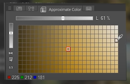
It’s showing you a very close neighborhood of different saturations and different values, so if I wanted to lighten this and desaturate it just a tiny hair, I could click on that one. And, of course, that color updates on the main color picker and the color wheel. You can also play with this luminosity slider, which sets how many values are displayed in this neighborhood. So if it’s set to a high value, I have access to a full range of values, and if it’s set to a lower value, I can be very scalpel-like with these colors.
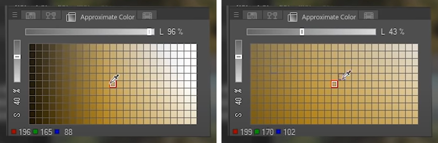
Another cool feature is, Let’s say I’m up here and I change the color on my color wheel, it defaults me back to the middle, so I always have a full range from left to right and up and down to pick from.

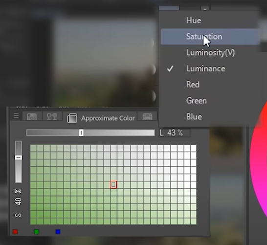
If you click on the icon at the end of the slider bar, you can change what information is being displayed in this table, but I like the default, which is Luminance.
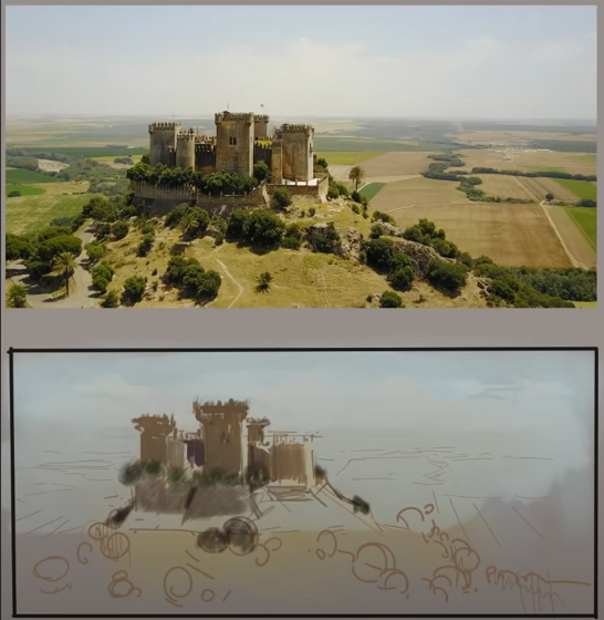
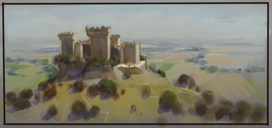
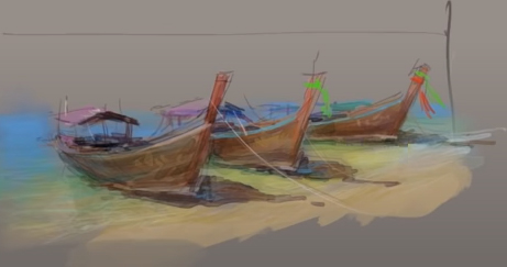
Here’s the finished photo study. It’s small; it didn’t take too long, so let’s do another one.
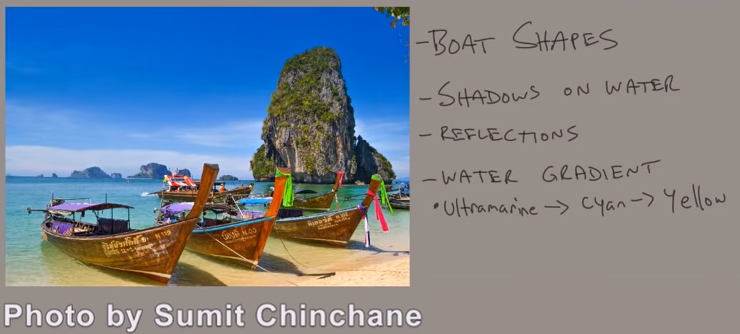
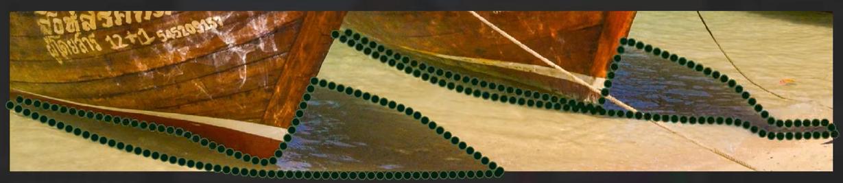
2. Boats on the Water
In this photograph, I’m drawn to the actions surrounding those boats, way more than the background. Not only the boats themselves but the shadows being cast onto that shallow water, which is partially reflective. I also just love the color gradient in that ocean water. Because everything in my list surrounds the boats, I don’t even really need to compose this within a frame; I can just isolate the general area of the boats and paint it up from there and see what happens.
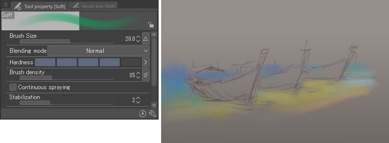
I’m using the soft airbrush tool here for the water, although I’ve set that airbrush to a pretty high degree of hardness, as you can see in the brush settings box.
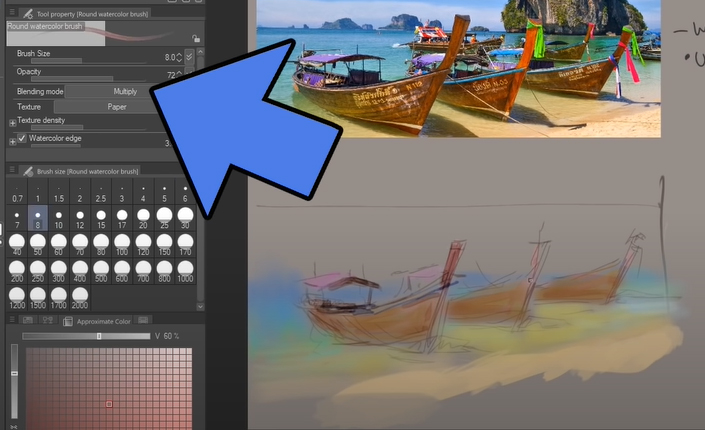
And I should mention that, while Clip Studio has all the layer functionality you would expect in a digital painting software, I like to just paint on one layer most of the time. One of the benefits of that is now I can switch over this round watercolor brush and set it to multiply mode, it’ll interact with the other colors on that layer, and I can treat this as a watercolor painting.
Painting Digital Watercolor Effects
So I’m taking all those really light colors that I started with and using this digital watercolor brush to go darker and darker. Very similar to what I would do with traditional watercolor. Setting the opacity low on this brush is similar to having a very wet wash, versus setting the opacity high will recreate the effects of having more pigment on the brush.

If you’ve seen my videos before, you probably know this, but I do a lot of traditional watercolors as well. So when a piece of software says it has a watercolor brush, I’m going to be pretty skeptical, but Clip Studio’s watercolor selection is pretty nice. You can make it look and feel like traditional watercolor, but also you can reap the benefits of it being digital.
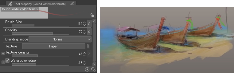
Switch your brush over to normal mode instead of multiply and make it behave more opaquely. This is how I draw the ribbons, some of the light, caustic patterns in the water, and some general highlights on the boats and the lapping waves, etc.
Shadows & Reflections
Anyway, on my list, I said I was studying shadows and reflections, well, something very interesting is happening with those. If there was no water there, the shadows would more or less look like this.
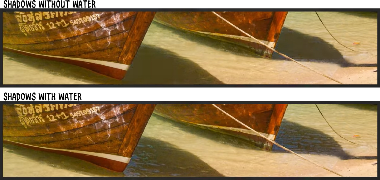
But, because water is reflective and it’s reflecting a light sky, the light reflections are battling with the dark shadow. So, in this case, we will get a few lighter colors mixing in with our dark shadows.

The thing to note, though, is the clarity of our shadow shapes is still there.
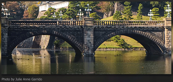
This doesn’t always happen, though. This bridge, for example, is casting a shadow on the water, but its shadows are being defeated by the reflection. You really got to take this stuff on a case-by-case basis.
Now, if this was a full-size, fully-detailed painting, I might want to go in there and capture every little shape of reflection, but that’s not what I’m studying; I’m studying the optical effect of these things, and to that end, painting small like this really helps me stay focused.
So, just putting a few finishing brush strokes on this. I think I’ve captured the things I set out to capture, and that means we’re done with this one.
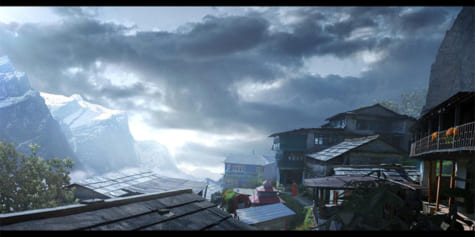
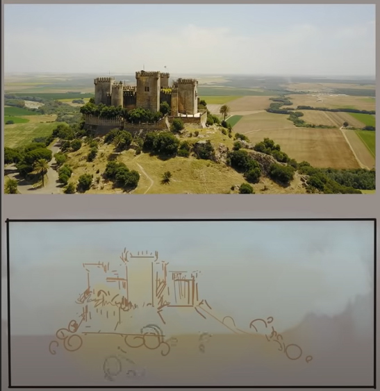
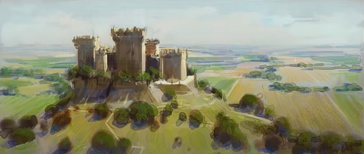
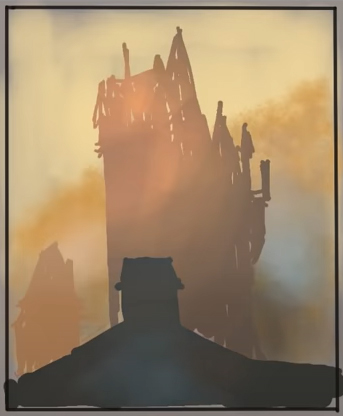
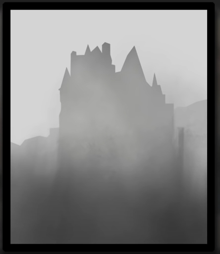
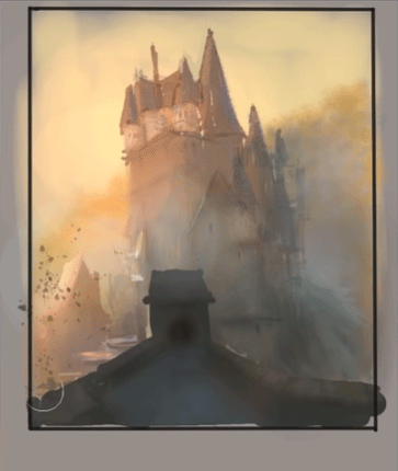
3. Castle in Fog
Alright, there’s a cool photo.
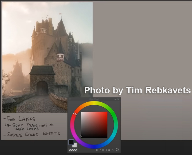
I obviously want to capture those layers of fog. The fog makes those hard castle forms feel very soft. I think it will be a nice challenge to go for that. And along with the fog, there are subtle transitions of color, kind of warmer on the left and color on the right.
Selection Pen & Pixel Lock
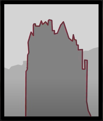
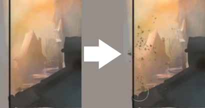
So I’m using Clip Studio’s Straight line tool to block all of this in. Now check out this feature here; it’s called the selection pen. It kind of looks like I’m painting green, but I’m not; the tool makes selections out of the areas that you paint.
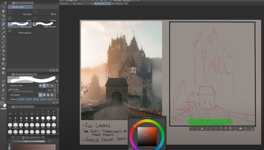
With that selection, I’ll make a new layer and then go grab the paint bucket tool and fill that in, just a flat color for now. I’ll repeat that same process now for the large castle, and I’m not too worried about those accidental negative spaces; I think it will just add to the charm when I’m done.
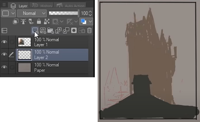
On the very first layer, I’m using this textured airbrush to block in the background trees—another layer for that little house on the left.
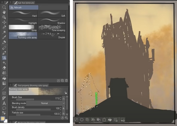
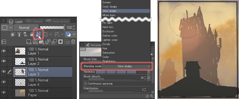
I’ll select the main castle layer, and I’ll push this button here that allows me to paint with this very large airbrush, which I’m setting to glow dodge mode; anyway, I can paint with a large brush, and it locks my painting to the pixels that are already on that later. The upshot is, my castle selection stays intact.
And that’s what I’ll do to continue blocking in this scene: switching layers, locking the pixels, and then painting with a soft airbrush into it.
This is already steering me in the direction of fog, but I don’t want everything to be so soft, for example, these rooftops I’m carving out with a round watercolor brush. I’ll keep switching around to find other rough brushes to help me offset the effect of the airbrush.
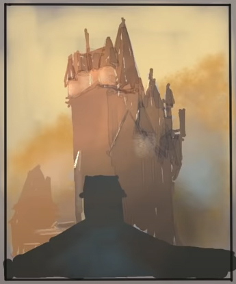
Now that the forms are being developed, it’s critical I capture that subtle color shift I mentioned in my list. Warm in the upper left and then cooler as we go down into the right. I’ll use various airbrushes to block that in.
Now that I have that, I can go after some subtle features, like the little windows, the ambient occlusion under the roofs, and further obscuring the forms with more fog.
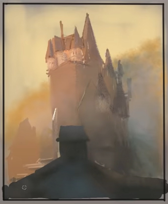
Fog Structure
I want to quickly discuss the general structure behind painting fog. You can start with a clear silhouette like this as a block-in but have a basic structure in mind as you obscure it with fog.
Commonly you’ll see this kind of structure, where the silhouette remains clear at the top but becomes less contrasty and therefore softer below.
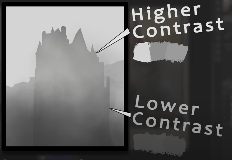
You could totally even lose these edges like this depending on how foggy you want your scene to look. Just make sure if you do that, you’re maintaining your basic structure.
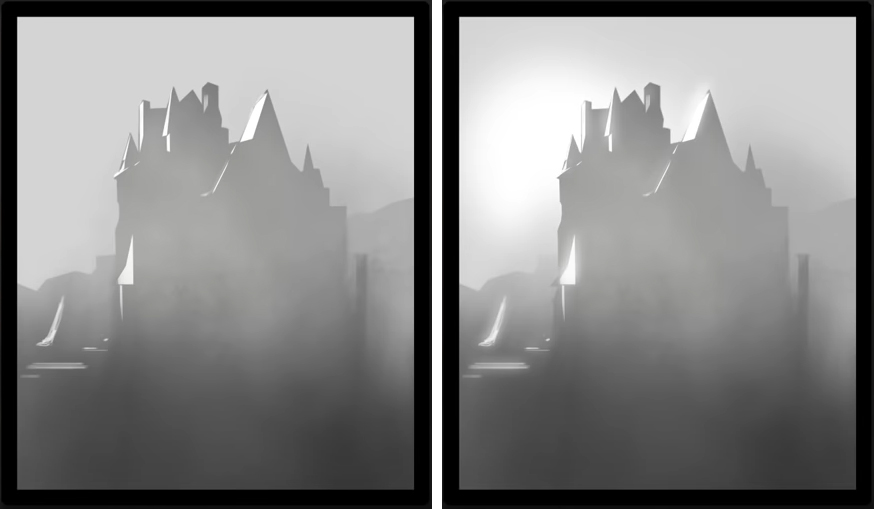
Now, if light is coming in at an oblique angle like it is here, the brightest lights can pierce right through the fog, making for very clear hard-edged shapes. And to sweeten it further, you can add a bit of glow around the lights and play around with some minor value variation.
So getting back to the study, you can see how I’ve built it on that simple structure, and then, of course, you can add whatever frills or details on top of that. Here, for example, I’m using a spattery airbrush to block in a bush on the left.
Now I have the pastel brush, and I’ve chosen a paper texture for it that kind of mimics the bricks on that castle, and I find that with a large enough brush size, I can get both an airbrush-like effect but with a hard edge texture. It’s an interesting combination that happens to work for bricks in fog.
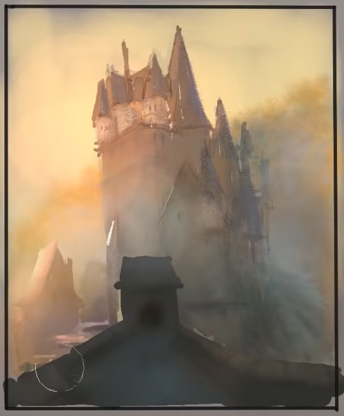
Anyway, I think I’ll leave it there.
I hope this tutorial can inspire you with your photo studies and go to clip studio.net and get yourself a free trial of the software, whether you’re a student or a professional, I think you’ll really like it.
About the Artist
Marco Bucci recognized two things at a young age. The first was that he wanted to become a professional artist. The second was that he couldn’t draw. This delayed him for quite some time. He filled that time pursuing other artistic interests such as music and writing, but the urge to draw never left him. At age 19 he began to study classical drawing, which led him to kindle a love for painting and illustration. He hasn’t looked back since.
Marco’s experience includes books, film, animation, and advertising. His clients include: Walt Disney Publishing Worldwide, LEGO, LucasArts, Mattel Toys, Fisher-Price, Hasbro, Nelvana, GURU Studio, C.O.R.E. Digital Pictures, Yowza! Animation Inc., Pipeline Studios, and more.
Marco is also a passionate teacher, and currently teaches “The Art Of Color & Light” at CGMA, a course specifically designed to build painting fundamentals from the ground up.
Marco is available for freelance work on projects big and small! Feel free to email – marco@marcobucci.com – or find him through his representation, Shannon Associates LLC.
Social Media
- Patreon: https://www.patreon.com/marcobucci
- Instagram: https://www.instagram.com/bucciblog
- Website: https://www.marcobucci.com
Interested in concept art or what it takes to become a concept artist?
Check out the link below!