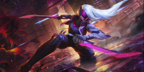
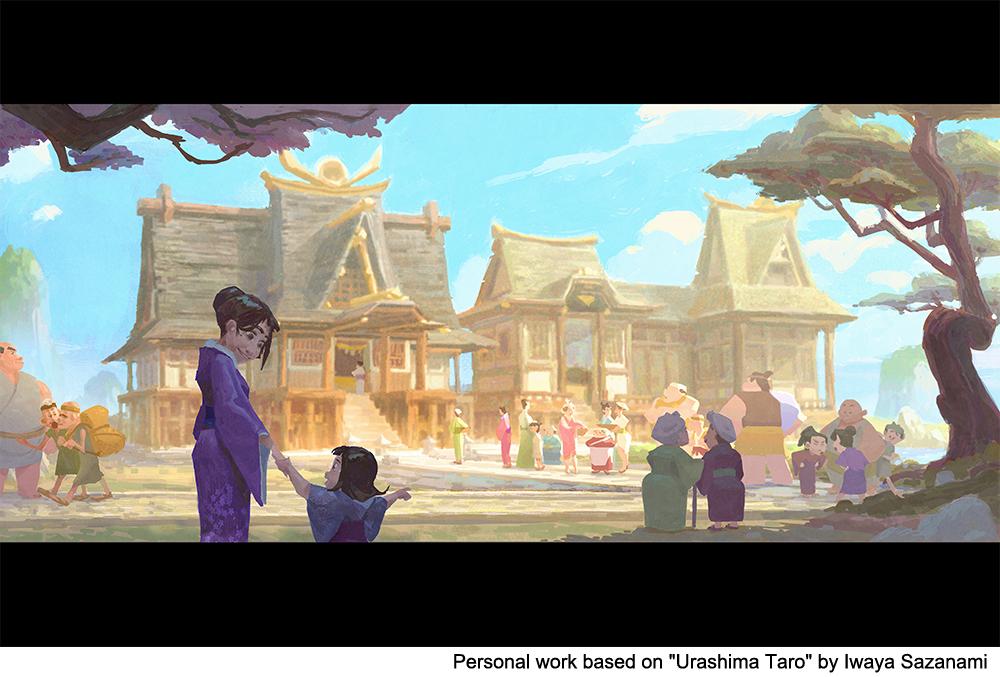
Creating Visual Narratives and Storytelling
How can you effectively tell a story through a single image? Visual development artist Simon Baek shares his insight on using color keys, lighting and composition to create artwork for pre-visualization, as well as other steps of visual development!
Introduction to the Job of a Visual Development Artist
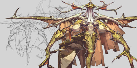
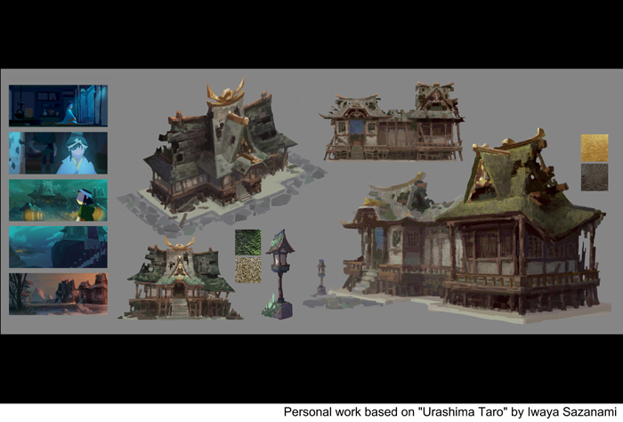
What is visual development? I believe any design or piece of art that helps visualize the storytelling process can be considered visual development. Visual development can include set design, prop design, shading, color keys, scenery painting, and more.
Many people might think a visual development artist’s role is just painting amazing scenes for their current film. However, that is not the only thing they do.
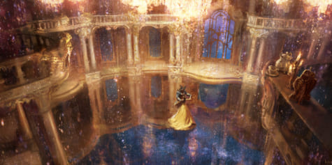
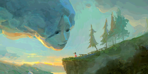
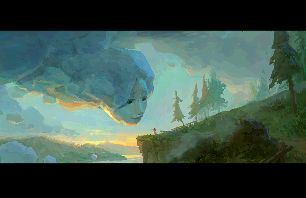
In this article, I’ll focus on my process of pre-visualization, specifically, painting scenery that has visual storytelling. I consider this one of the most enjoyable parts of visual development, and I hope these steps help you paint your own visual narratives. This article will cover values, composition, and colors that can improve your artwork.
Gather Your References
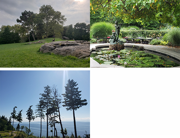
One of my hobbies is to take photos when I’m travelling. It is vital to collect references to design something compelling. Even if you are not interested in travelling or taking photos, you still need to search for real-life references to create better artwork. At the very least, try collecting references online. Once you have enough images, place them next to your work so you can apply them to your design.
Thumbnail Sketches
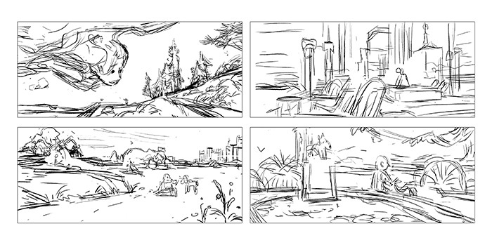
I always start my paintings by creating a few thumbnail sketches. Take the time to adjust the shapes and composition to guide the eye of the viewer. During this process, I decide where to place the main focal point. Usually, I set my focal points by following the rule of thirds.
Value Structure
I must say that this is the most crucial part of the process, as this can be likened to building the main framework of the entire work. Some things to take care with in your value structures are readable shapes, eye movements, grouping, and contrast at the focal point.
Use dark shapes to make a balanced scene. You want to draw the eyes toward the focal point and around on your painting; dark shapes on the scene can help control these movements. When you start painting later, always remember to stick to your original value structure. Group closer valued shapes with each other when you need to organize.
Remember that the area with the highest contrast becomes the focal point, what our eyes see first in the painting.
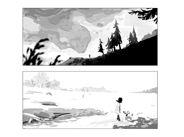
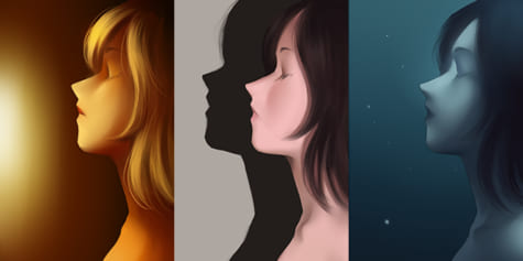
Color Key
Color keys are fundamental when planning out the lighting and mood of a painting, and almost 70% of your final look will be visualized at this step. You can also experiment with colors and lightings in this stage. The goal is not to render but try to capture the mood of a scene.
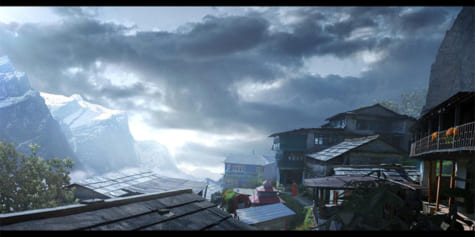
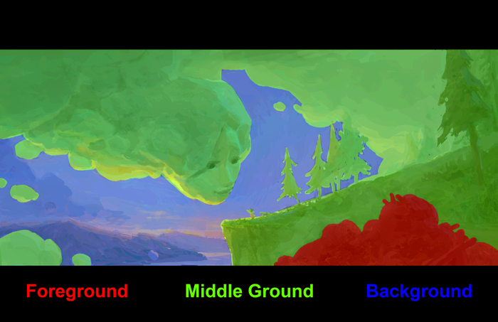
Separate the Foreground, Middle Ground, and Background
You can separate the foreground, middle ground, and background by using different shapes, values, colors, and more. These elements are a must when adding depth to your painting. A good tip is to overlap shapes to show depth.
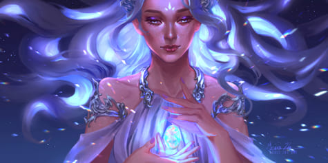
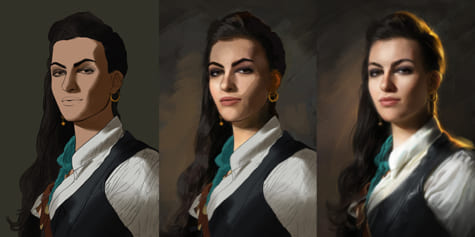
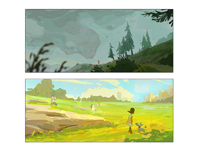
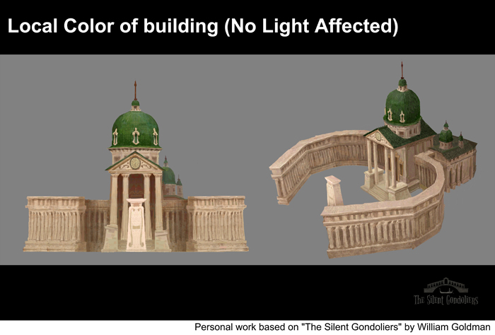
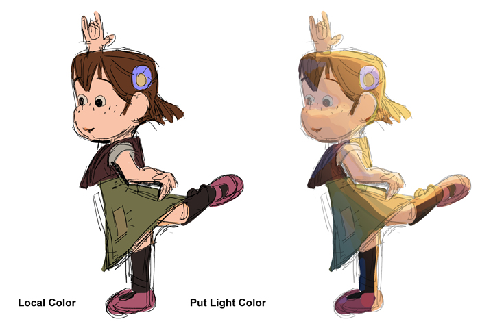
Local Color
When I start coloring, I make sure to create layers for different sections so I can adjust things and organize my file easier. To do this, I first organize the local colors of every object by creating layers.
After I start painting, I try to use colors that are adjacent to each other on the color wheel so they can mix in and harmonize better in the painting. In this process, check to see if each element is readable and only use local colors.
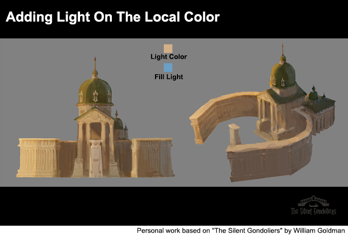
Lighting
I always add the lighting at the end because it helps me to refine my focal point and eye movements in the painting. Our eyes move around dark shapes and follow contrasts.
Lighting is the best way to create an obvious focal point and contrast. It is easier to figure out the lighting before adding finishing touches, which is why visual development artists work on color keys to visualize and plan eye movements before finishing.
Finalizing
This is the last step before wrapping up. First, I start from the background and refine things up to the foreground. I usually play with a subtle shift in colors and textures to create more entertaining visuals. It seems like a small part of the painting, but it could make a significant difference.
Since it is boring to look at huge empty spaces without any variation, I try to break up big shapes. However, make sure not to break the value structure, and try to add variations that fall within the value range while you do this.
Moreover, try not to render every single object in your painting. Always remember that our eyes move toward the highest contrast. Rendering your focal point will help guide eye movements naturally toward the focal point.
During this process, think of what your second focal point could be. It should not dominate the first one, but it needs to make the narrative stronger. Make sure the eye is led toward the second focal point as well. I would say you accomplished your job if the audience or viewers can understand the narrative and feel the mood of the painting without explanation.
Simon Baek
Interested in concept art or what it takes to become a concept artist?
Check out the link below!