Gothic Stylization using the Fundamentals of Illustration

With her signature gothic Victorian-inspired aesthetics as an example, Hugo Award winning illustrator Abigail Larson introduces the fundamentals of illustration that will help you leave a lasting impression regardless of style and genre!
1.INTRODUCTION
A successful illustration not only has a unique style, but incorporates good composition, shape, form, color, and value. Understanding the importance of these elements will help create a piece that leaves a lasting impression on the viewer, and successfully communicates the idea you want to illustrate.
In this lesson, I’ll cover these elements in my own artwork, and how I incorporate them in my style.
2. The Subject of the Illustration
What are you drawing? Consider your visual style choices
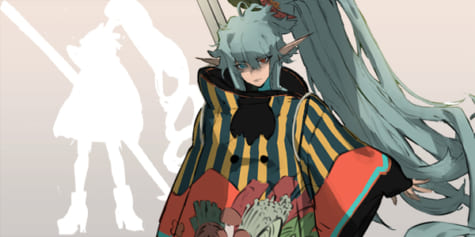
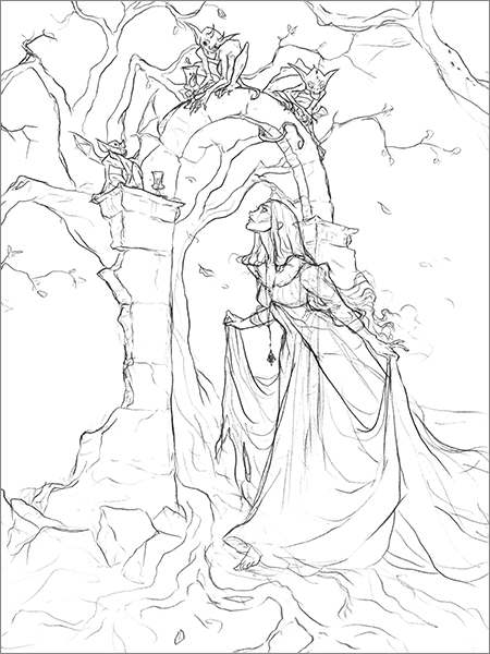
First, I have to decide what I want to draw, the subject, the details, and the background. Because I enjoy gothic Victorian aesthetics, For the piece I’m illustrating, I’ve chosen a dark ghostly woman passing under some ancient ruins. On top of the arch are little creatures who look down at her.
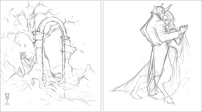
3. Brainstorming Concepts
Visualizing an idea in a unique way
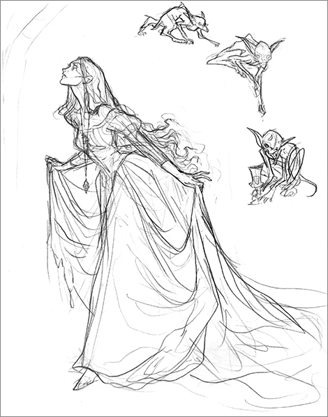
To prepare for my piece, I start with a few very rough sketches for my piece. Whether dealing with human subjects, monsters or even animals, it’s important to understand your subject’s anatomy, and how they move. This way, you’ll be able to confidently change their position while you’re brainstorming your piece if needed.
Movement in an illustration is important, because I have to consider how the viewer’s eye will move over the image so that they take in all the details and feel engaged with the piece. You want to make sure that even if the scene is fairly calm, your piece does not feel stagnant. I achieve this in a pretty simple way, for example, by showing a figure that is taking a step, and having falling leaves going diagonally across the page, instead of falling straight down.
4. Research
Inspiration for the illustration; gathering reference material
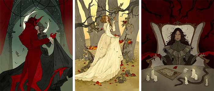
While I’m still brainstorming, I do some research for some of the details in the piece, such as the ruined archway, and the dramatic gown on the main subject. I also like to look for images that evoke a similar feeling that I want to achieve in my own piece. I love the dark, gothic, fantasy aesthetic, so lots of dramatic drapery and elegant poses are very important in my work. I’m heavily inspired by Golden Age illustrators, such as Arthur Rackham, Edmund Dulac, John Bauer, and Ida Rentoul Outhwaite. I love their sense of playfulness and elegance in their pieces, particularly when combined with darker subjects, like witches and monsters from fairytales.
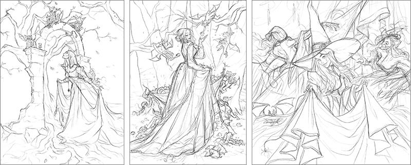
5. Studies
Figuring out the form of each item and detail in the illustration and understanding how they help tell the overall story of the piece
I tend to sketch the individual subjects for the piece separately, and often several variations until I achieve the form that I like.
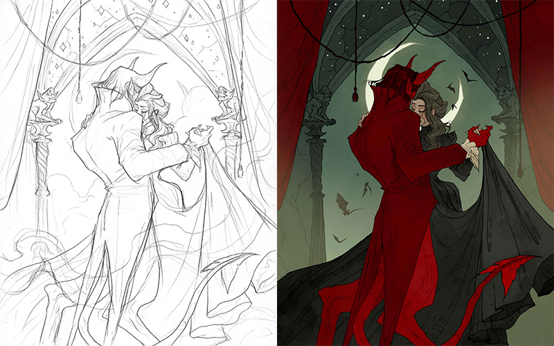
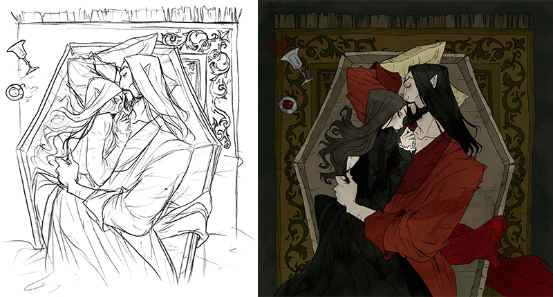
6. Sketch
The initial composition for the final piece
When I reach the stage of final sketch, I start by roughly laying out the characters in the composition, then slowly honing each of the details in the costume, face, and background. My style is very angular, which helps for the dark, gothic mood of the piece, and I like the drapery to have some grounding and weight to it.
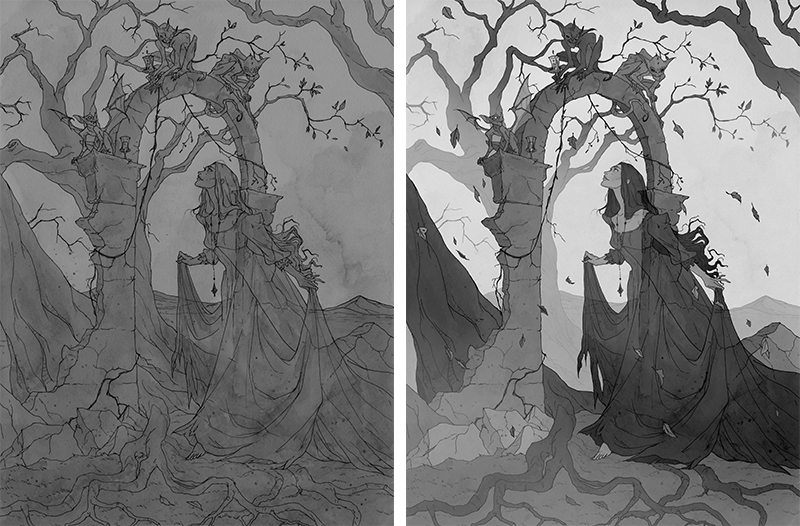
7. Texture and Tone
Final lines, watercolor, and adding value
I ink the final on a clean sheet of paper, and I apply a watercolor wash for texture and shading. I typically keep it grey with a watered down black watercolor paint. Once it’s dry, I scan it and digitally work on the tones and value to prepare the piece for color. Figuring out the values early on in greyscale is helpful to see the contrast in the piece.
8. Color
Finalizing the colors.
The final colors are applied using selection tools and hue and saturation, color balance, and levels. Each piece takes time to select and color. Some details are pushed back with less saturated colors, others are brought forward with darker, richer colors. I like to have some details highlighted with a spot color, like crimson, olive green, or rusty oranges, because I love the Autumnal “vintage” feel those colors evoke.
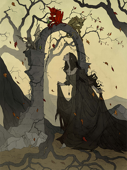
9. Final Piece
My final pieces are eventually flattened, and then I’ll use the hue and saturation and color balance tools to make subtle color adjustments, and I’ll use levels to adjust the tones. In the end, I like my work to have a good amount of contrast, with emphasis on the subjects of the piece – particularly their face, or body language.
10. Conclusion
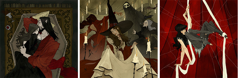
While my work does incorporate heavy influence from Golden Age era illustrators, and Victorian aesthetics, my work overall is in the whimsical fantasy genre, because I really enjoy exploring supernatural subjects! Monsters, ghosts, and all kinds of strange fantasy creatures appear in nearly all of my work, and I like to show either a humorous or romantic side to those characters, while still embodying a dark, gothic style.
Abigail Larson
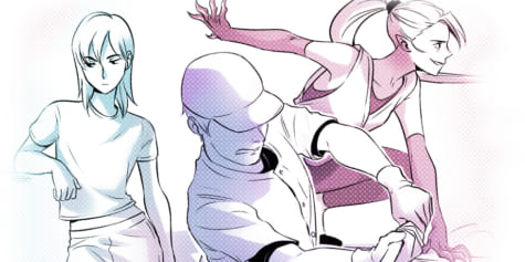
Interested in concept art or what it takes to become a concept artist?
Check out the link below!