How to Design Characters with Bold Fashion and Strong Silhouettes
The design of a character has a huge impact on how the viewer will perceive them. Check out this illustrated tutorial by character artist midorynn for tips on creating interesting designs!
There are many angles we can look into before we design a character. Drawing the design depends on what our goal is: Is it for an animation series? Maybe a game? How detailed can we go?
Maybe we want to focus on the silhouette to make our character memorable for a comic/story we are creating, or maybe we just want to show off our fashion sense. Maybe we want to do all of them at once!
For this tutorial however, we’ll focus on fashion and silhouette.
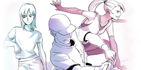
We can show a character’s attitude simply by their design. How we decide the pose also helps reinforce that. Let’s say our character is mostly one of these attitudes:
1. Calm and Cool
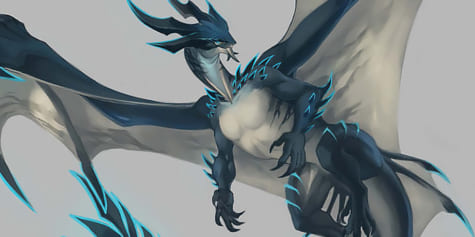
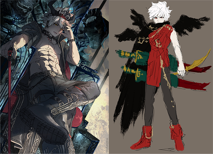
Unless the character is meant to be over-the-top unique, a “calm and cool” character tends not to wear neon rainbow-colored trousers with memes and unicorns printed on their shirts, with small fluffy wings growing out their backs. This kind of character exudes… eccentric, or even annoying, yet quirky happy vibes. Definitely not our goal! Instead, we might want them to wear a red jacket, a gritty thick black cape, silver light armor, wielding two blood-red long swords, and gold and silver accessories all over.
2. Shy and Girly
“Shy” is a bit hard to show design-wise without the help of posing, but if we really want to show that our character is shy without facial expressions or body language, then we can consider what shy people do—they “hide” a lot.
This gives us ideas of “covering up,” maybe they have really thick, layered clothes. A hat to hide their faces. A fan or an umbrella to hide even more of their faces. Or they live in a big pot with a small crack on it while their pet wendigo carries them around.
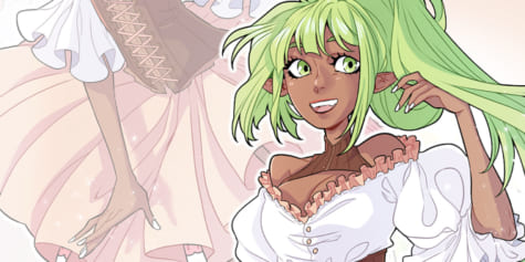
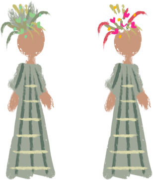
“Girly” on the other hand is easy to show, for example with pastel colors, pink, and flowers:
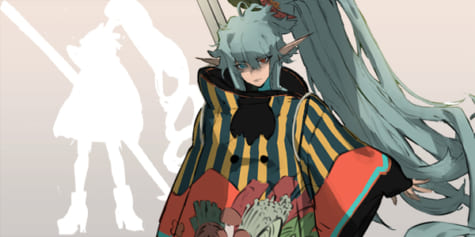
What about “Girly” but more emo?:
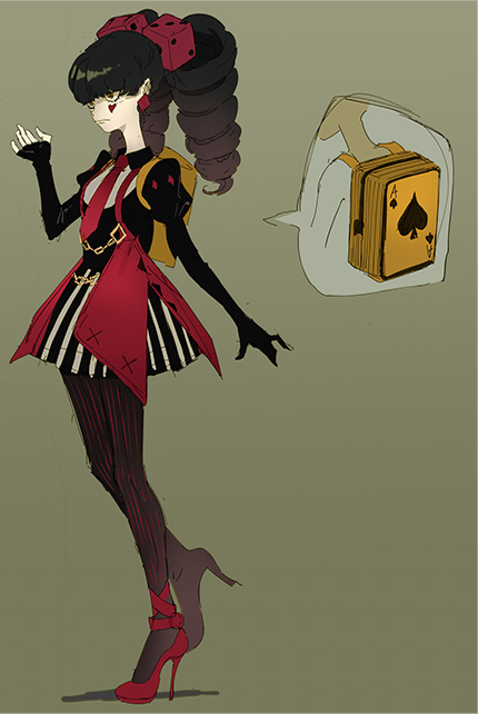
3. Angry and Brutal
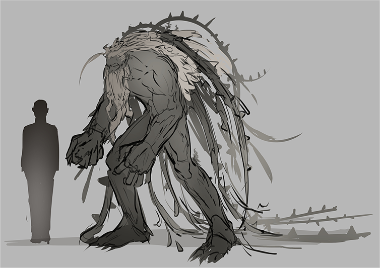
If someone asks us to show “angry and brutal” simply through a character design, we tend to think about a big character and how they execute this brutality. They crush skulls with their bare hands. They wield a hammer or a chainsaw. They have big jaws and sharp teeth.
To show that they are exclusively using their bare fists to fight, it’s a good idea to give them muscles, and make them big or tall. A well-trained body means the character is strong and has the realistic capacity to intimidate just standing in front of us — even without wielding weapons at all. Which is why big monsters or beasts are usually boss fights in video games.
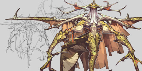
The sample below is a “gentle, but scary when angry, treant that likes taking care of nature and plants, but get in the way and it will stomp you”-type character:
Of course, this applies only when we want to show the personality through the design only.
Posing is an important factor in character art.
Anyway, it’s time to look for inspiration! If our character is a knight, obviously we look up warriors. Inspiration is everywhere. We can look at other people’s photos or art. Sometimes we get an awesome idea when we’re in bed about to sleep at 3 a.m. (Grab your phone and write that down before you forget by the way!)
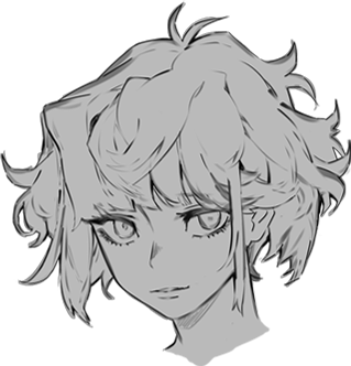
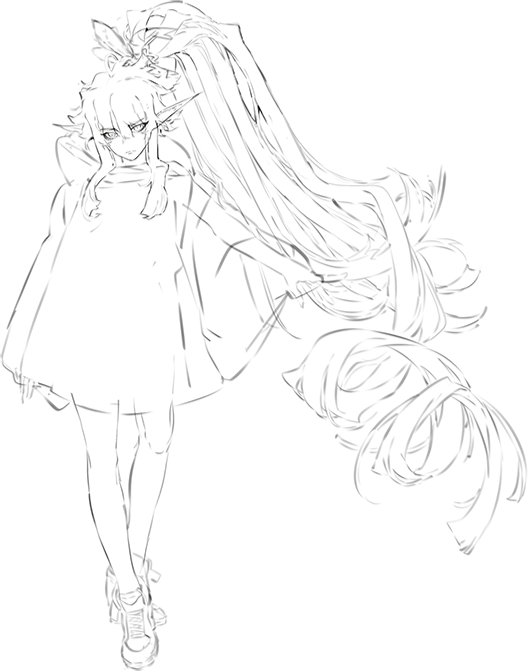
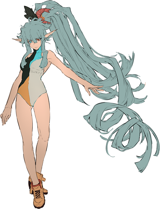
Character Design: Portrait
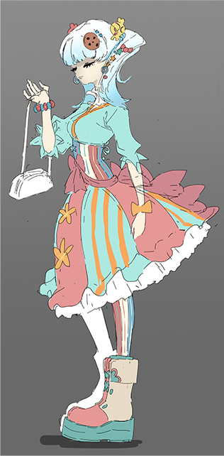
For this tutorial, we are using food as inspiration, because who doesn’t get inspired by food? Our inspiration for this character is matcha, whipped cream, waffles, and sweets.
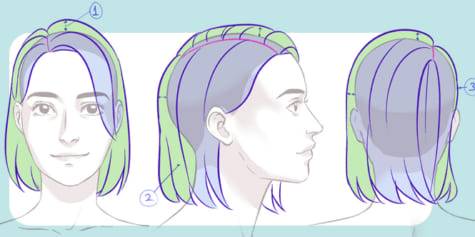
A portrait character design focuses on the face and hair features. Let’s start!
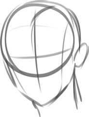
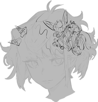
Basic head shape
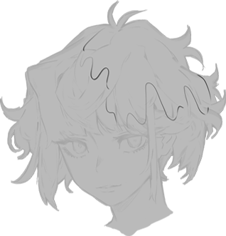
With the word ‘whipped cream’ in mind, I draw her hair fluffy and curly.
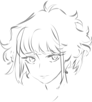
I add more details to the sketch to make her hair look even fluffier until I’m satisfied with the level of details.
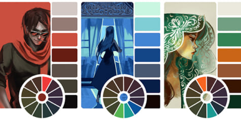
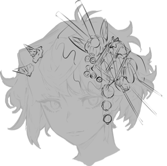
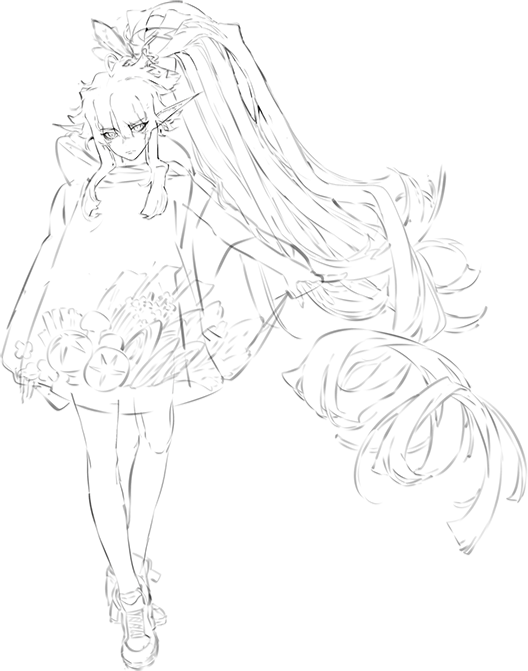
Since our inspiration is matcha and whipped cream, our colors will also end up as green and white. On another layer, I draw the division of these colors as a “splat” shape. This shape is inspired by chocolate drip on ice-cream toppings.
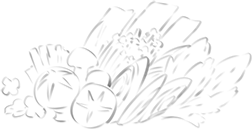
I draw the details on separate layers, taking inspiration for her hair clips from sweets. So the remaining themes are ice-cream and waffle.
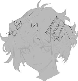
Then I add wafer biscuits, cherry on cream, strawberry, and chocolate drip (on top of the waffle)
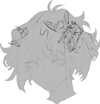
Next are fruit loops and three macarons.
And finally, some wafer and biscuit sticks, and three ice cream scoops. Phew, that’s a lot! We can have fun populating our design as much as we want, but make sure not to overdo it!
Once I’m happy with the hairclip designs, I can proceed to colors. Make a layer below the lines. I use matcha green and whipped cream white. I use brown to reflect the color of waffles for her skin.
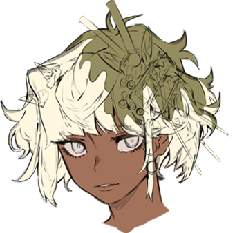
On separate layers, I color the hair clips. Notice that no strong colors like saturated reds, dark blues, bright purples or neon greens were used. That’s because I’d like to stick to a ‘sweet’ image, so I chose colors that will not attack the eyes. Basically, more muted or pastel colors.
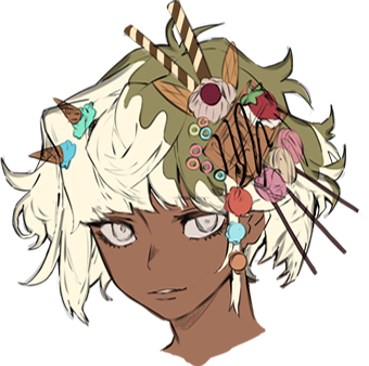
However, to bring attention to her face or eyes, using a strong color is an advantage. In the end, I am drawing a character, not a dessert. So even if our viewers’ eyes look at the yummy hair details, we still want them to go back and look at the character’s face.
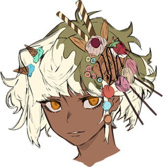
Add some light and shadow and I’m done!
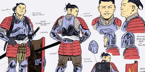
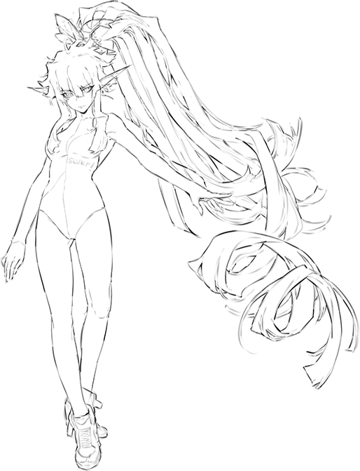
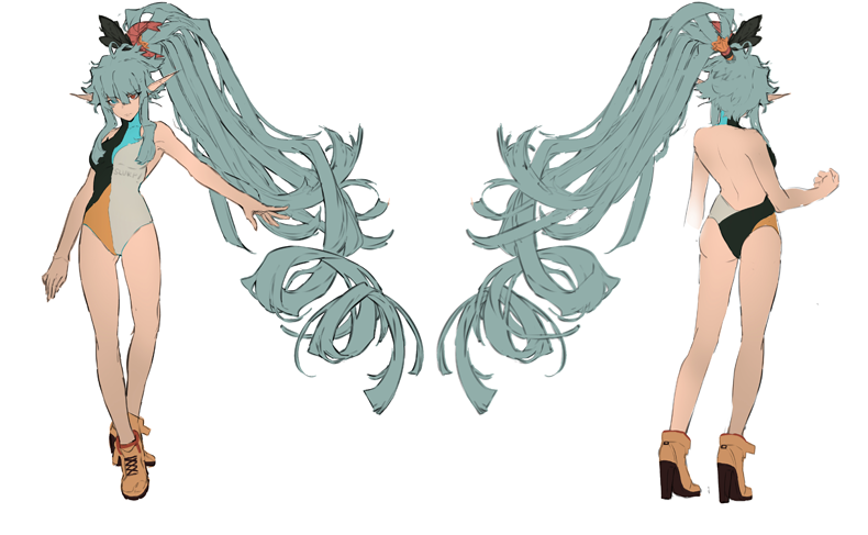
Character Design: FULL BODY
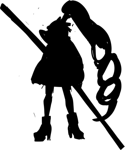
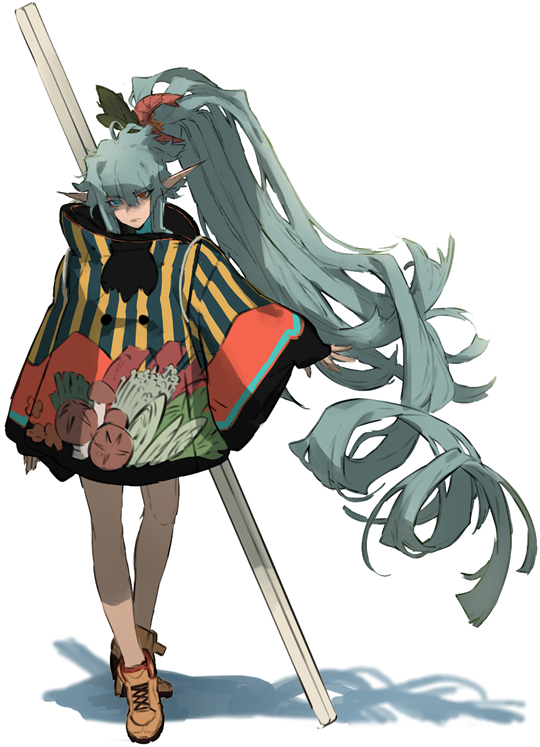
This full-body design will focus on the character’s outfit, so we will make a front and back view character sheet. Our inspiration this time is nabe, a Japanese hotpot!
We can go as crazy as we want when drawing the silhouette. As long as we can make it work, nothing is wrong in the art world.
While silhouette is really important when it comes to character design, I will have a preference on style and fashion over silhouette. (This may make the design weaker, but personally aesthetic is much more important to me!)
Inspirations for the major shapes:
- Rice noodles for her hair (the flat noodles)
- A chopstick for her weapon.
- A bowl for her jacket and collar
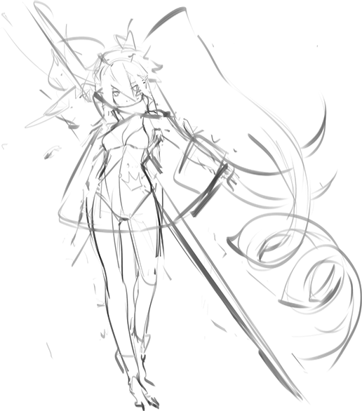
While sketching, think of a rough idea of the colors. Make it a part of the design process. Using my imagination, I assign colors on the clothes while I sketch.
If you feel that the colors are too monotonous, you can add accessories like a bag, a gadget, a weapon, a toy, etc. then plan for that item’s color as well.
Also, plan what sort of fabric it is to help us decide how to draw the clothing folds. Fewer folds generally indicate thicker or heavier fabrics.
You can also plan the texture or material (leather, cotton, etc.) if you want to render later on.
For this design, let’s include what the character’s clothes look like underneath her jacket, so viewers don’t conclude that she’s only wearing undergarments or a plain white shirt. Since her jacket is detailed and bulky, it is cool to have contrast and make her a simple skin-tight suit that shows off her shapes when she’s without her jacket.
Contrast is:
Detailed – Simple
Bulky – Fitted
Now that we’re done with that, let’s start designing the jacket. I draw a separate sketch for the jacket’s print. The print includes ingredients that usually found in Japanese hotpots: green onion, carrots, mushrooms, thin-cut beef, etc.
I’ve designed lettuce leaves and a simplified shrimp soft toy for her hair tie if you have noticed. Choosing green and red colored items is deliberate, because these colors make up a large portion of the nabe ingredients’ colors, thus are likely to work well.
‘Blending’ colors is one way of choosing our colors.
Another example:
If the jacket print features cacti which are largely pale green, her hair tie can be the flowers of blooming cacti, which are commonly white, fuchsia or yellow.
Or I can draw three giant cactus spikes, then color them white, fuchsia and yellow.
But why did I not choose green when cacti are largely green, you ask? That could work, but:
Largely pale green + Sudden burst of bright colors = Contrast.
This is another way of choosing colors.
Base colors. Having knowledge on color theory will help a lot upon deciding our colors. The choice of yellow and blue is also deliberate. Like red and green, these are hot and cold colors.
Front and Back:
The jacket’s colors: The rest of the jacket’s colors are inspired by cup ramen labels. The design is so that if the print was pasted on a cup ramen container or label, it would almost pass as one.
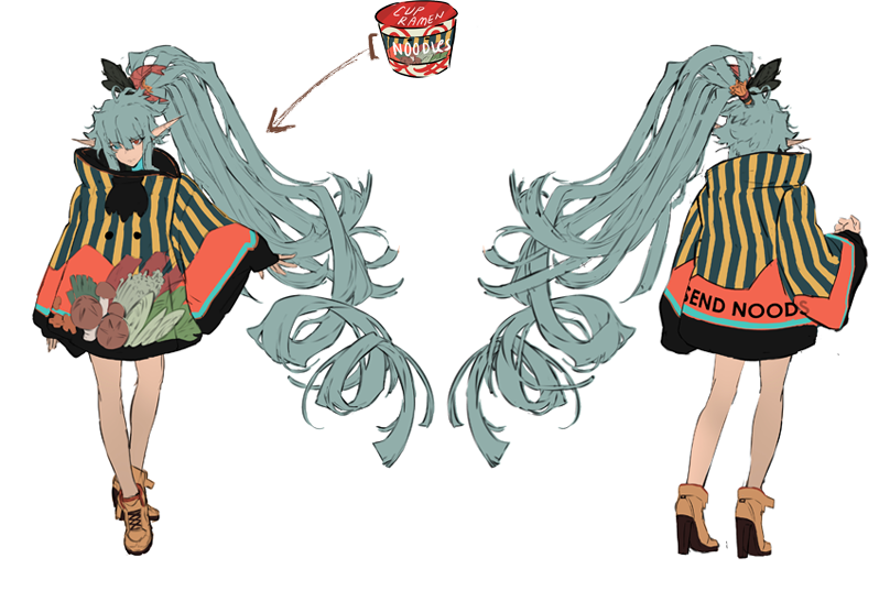
I add the chopstick weapon, some shadows and lights, and I’m done!
Author profile:
Rynn (also known as midorynn) is a self-taught artist who mainly uses digital tools and software such as Clip Studio Paint and Photoshop. Having worked five years on various freelance projects on animation, illustration, and design, she has learned a variety of techniques and know-how that she is enthusiastic to share with other self-taught artists.
Twitter: https://twitter.com/rynn_apple
Instagram: https://www.instagram.com/rynn_apple/
Interested in character art & design or what it takes to become a character designer?
Check out the link below!