Grayscale to Color: Digital Character Painting
In this tutorial, artist Marco Bucci shows you how to create a beautiful full-color painting from a grayscale base, describing tips and painting techniques along the way!
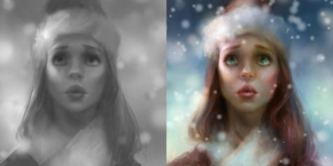
Hello and welcome to my tutorial on digital character painting! Clip Studio Paint is a great program, and as you’ll see, we only need a few of its many tools to do a good-looking painting. See fig. 1.
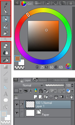
fig 1. The main tools and windows we’ll be using in this painting
Before we begin, let me outline what we’ll be doing. We’ll be painting a character with basically human proportions, in full color. We are going to do it in two overall stages. Stage 1 is a grayscale (or black-and-white) painting. We’ll deal with blocking in the character and its overall design. Stage 2 is when we’ll add in the color and bring the piece to a rendered finish, fit for a portfolio or commission!
Stage 1: The Grayscale Phase
First, let’s start a new canvas. Go to File > New. See fig. 2 for the settings I used, but feel free to use whatever settings you like. You’ll now be confronted by one of the scariest things in art: a blank white canvas, *gasp!*
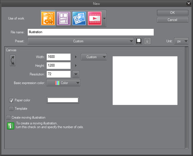
fig 2. My settings when creating the new canvas
But never fear! This is precisely why we’re using the grayscale-to-color technique: we only have to worry about values to begin with. Oh, by the way, ‘values’ and ‘grayscale’ refer to the same thing. See fig. 3.
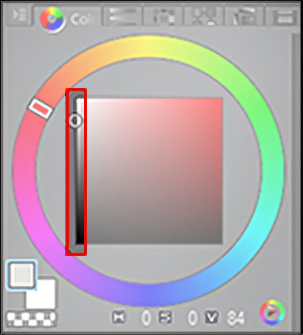
fig 3. The grayscale
This makes our decision-making so much less stressful at the outset. So, let’s kill that white-canvas monster with the ‘Fill’ tool. I selected a fairly light gray to begin with. I chose this value because I tend to want lots of room to go darker (to add shadows and other dark elements), and only need a little room to go lighter. See fig. 4.
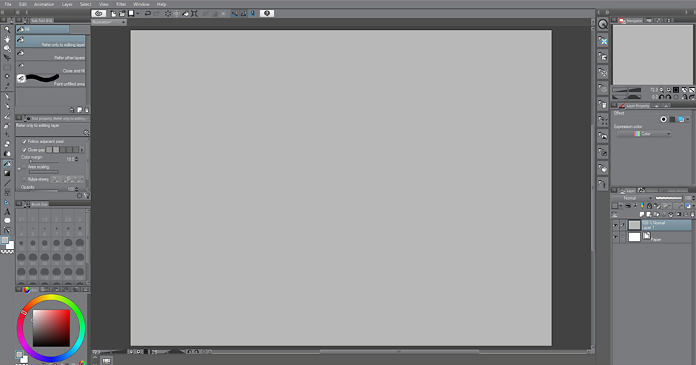
fig 4. Filling the canvas with a light gray
Okay, it’s time to start drawing. I grabbed the Pencil tool and chose the Rough pencil brush. The brush you select is not to be fixated upon; choose anything that you feel comfortable drawing with. Clip Studio Paint offers so many great choices for this, you almost can’t go wrong! See fig. 5 for my settings.
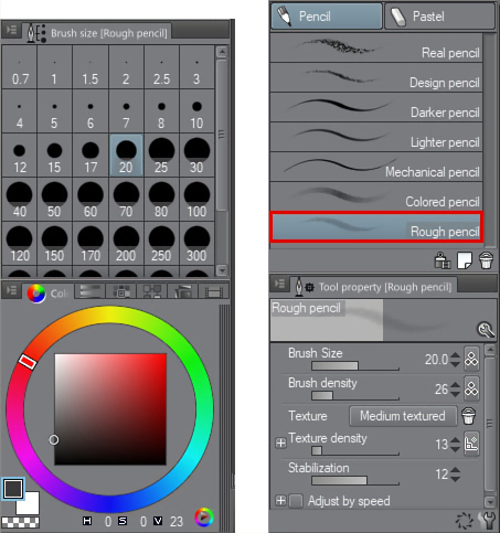
fig 5. My initial pencil settings
I block in a rough construction for my character. It will be a young girl with her head tilted up. She’ll be wearing a hat and coat, as if going for a crisp winter stroll.
Notice that my lines are not just outlining the silhouette; they are construction lines. I am building up the face with its major planes, thinking about the skull underneath and the general structure of the head.
The planes of the head are not the focus of this tutorial, but are an invaluable thing all artists should learn, as the knowledge will enable you to draw the head from any angle.
If you are following this tutorial and just feel like painting along with me, feel free to simply copy or trace my drawing! After all, we are focused on painting technique here, not the planes of the head. See fig. 6.
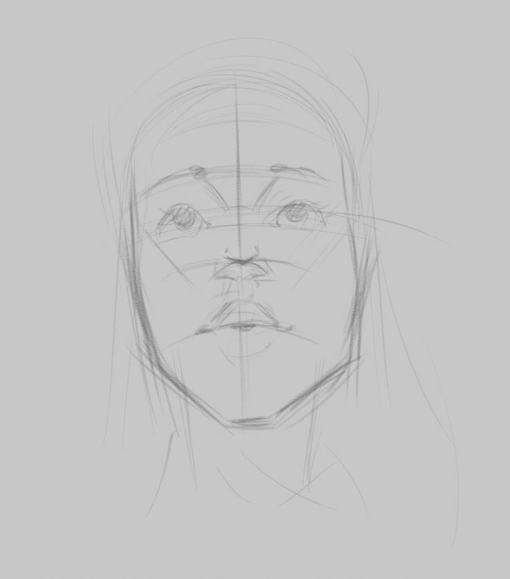
fig 6. Roughing in a sketch
Switching to the Airbrush tool, I now block in very basic value decisions: the character will be dark, and the background will remain light. See fig. 7 for my Airbrush settings.
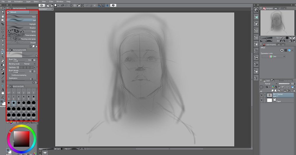
fig 7. Blocking the most basic value groups
I have two things to note. First, I am still working on just one layer! Also, about my brush choices: I am always changing brush settings.
In fig. 7, you can see I have the ‘Hardness’ set low. I will change that as I work, based on the stroke I want. For instance, if I want to do some finer work, say, on the eye – instead of switching my tool altogether, I’ll first simply try adding more hardness to the airbrush.
This keeps the workflow moving, which maximizes the time you’re interacting with your art, rather than fixating on the digital tools.
I also change my brush size a lot, based on the stroke I want. Fig. 8 shows how multiple brush sizes from the same tool produce strokes that appear to be made by different tools!
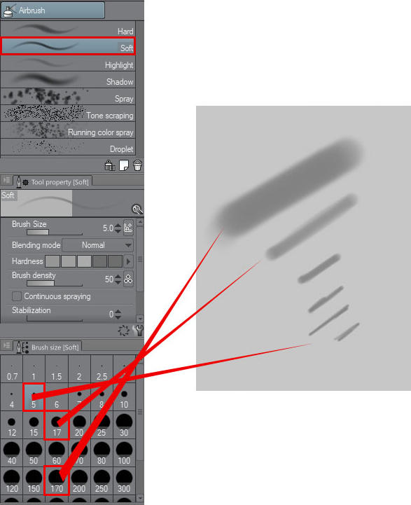
fig 8. Using the airbrush to achieve multiple looks
Still working with the airbrush, I’m building up some diffused lighting on the character’s face. I’m imagining the light to be softly coming down from above. This means that the planes that face upward will receive slightly lighter values in the grayscale, planes that face to the side will be a little darker, and planes that face down will be the darkest. See fig. 9.
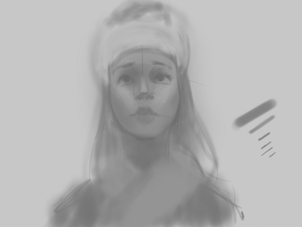
fig 9. Starting the modeling of soft light on the forms
I want the character to have a slight tilt to her, as to not be so rigid. I just made a selection and used the tool’s built-in widgets to rotate the head. See fig. 10. I’ll then simply fill in the gaps that are left behind with the brush I already have active.
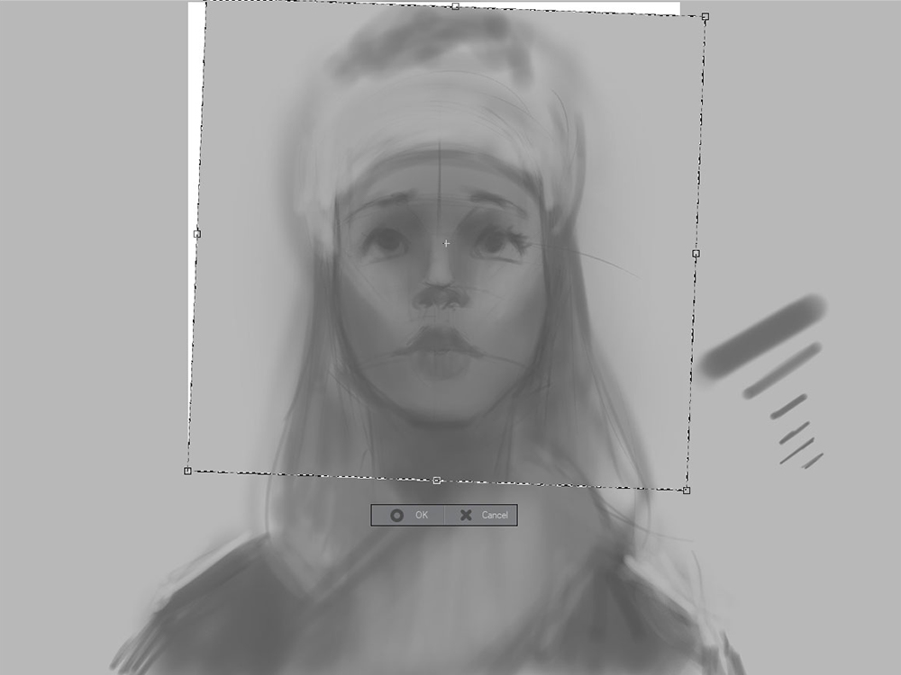
fig 10. Adding small touches of asymmetry
I flip my canvas often as I paint. This is a holdover from my oil painting days, where I would have a giant mirror behind me, which I could use to see my painting flipped around.
The reason artists do this is that it momentarily “tricks” your brain into thinking it’s seeing your image for the first time. As such, it becomes very obvious where the mistakes are. It also brings to light things you simply get used to as you create something, for better or for worse.
Because I am only working on a single layer, I can go to Edit > Transform > Flip Horizontal. See fig. 11.
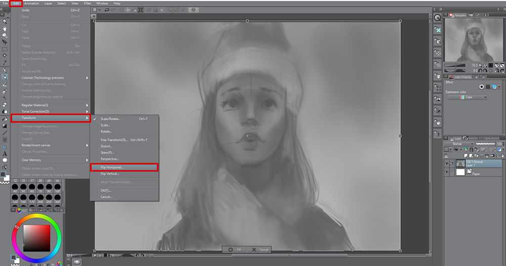
fig 11. Flipping (mirroring) the active layer
I want to darken some of the shadows. I’ll do this with a special layer designed for that purpose! Add a new layer with the button shown in fig.12, outlined in red. On the right side of fig. 12, I am choosing the Multiply mode.
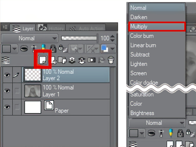
fig 12. Making a new layer (left), and setting it to Multiply mode (right)
This mode is specifically for darkening tones. So, even if you have a light value selected, it will darken your image.
Choose light values to darken slightly, and dark values to darken dramatically. Still using that same airbrush from earlier, I apply some general darkening to the planes that face downward, thereby increasing the contrast and sense of light on the planes that face upward! See fig. 13.
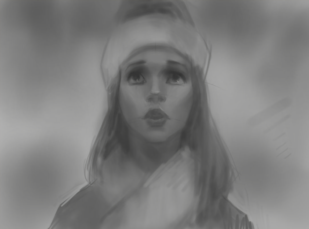
fig 13. Darkening areas to add modeling and design accents to the forms
When you’re done with this step, I recommend committing to it with this button (fig. 14). This will get you back to working with one layer.
Note: You do not have to combine layers. Sometimes it is helpful to keep your layers separate, so you can edit them later. The downside of that, however, is that it can start bogging you down with technical decisions that may distract you from the act of drawing and painting. This is why, more often than not, I will choose to combine layers and work on the fewest layers possible!
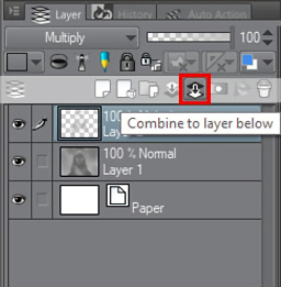
fig 14. Committing to the layer
Now I want to make a layer to handle some lightening of values. I’ll add a new layer, but this time I will set it to Glow Dodge mode (see fig. 15.)
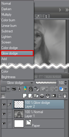
fig 15. New layer set to Glow dodge mode
This is like the opposite of Multiply mode: picking a dark value will only slightly lighten the values, and picking a light value will dramatically lighten them. Fig. 16 is the result of painting on the layer. I kept the brush soft, as to imitate very diffused light coming from the environment.
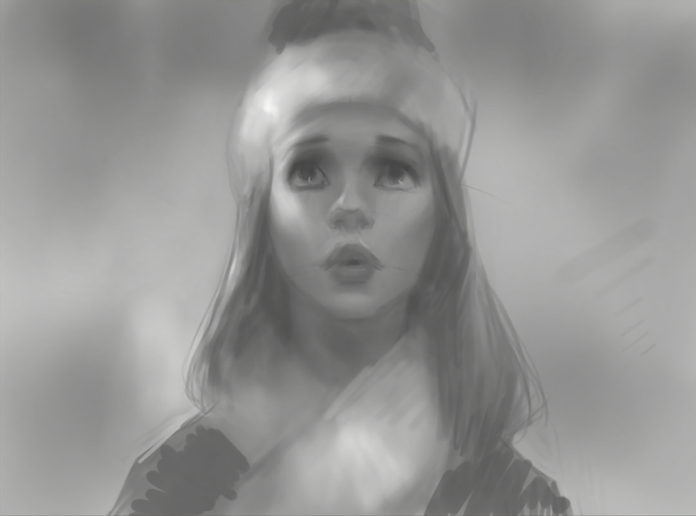
fig 16. Painting in some light
Now that the character is taking shape, I want to get some kind of background/environment in there. I will keep it relatively abstract, as to not distract from the character. I created this tutorial during an actual snowfall, so, inspired by real life, let’s suggest a winter wonderland! To make snowflakes, I will use the Airbrush tool, but now with the Spray brush selected (see fig. 17.)
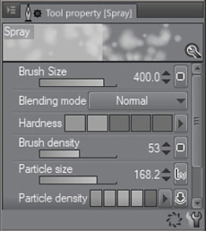
fig 17. Spray brush settings
I’ll make some snowflakes, trying to keep them looking random, and also strategically placed so they do not interfere with our character too much. As usual, I will play with the Spray brush’s many settings here, in order to create snowflakes of all sizes. Variety is the key to making something appear organic! See fig. 18 for the result of this step.
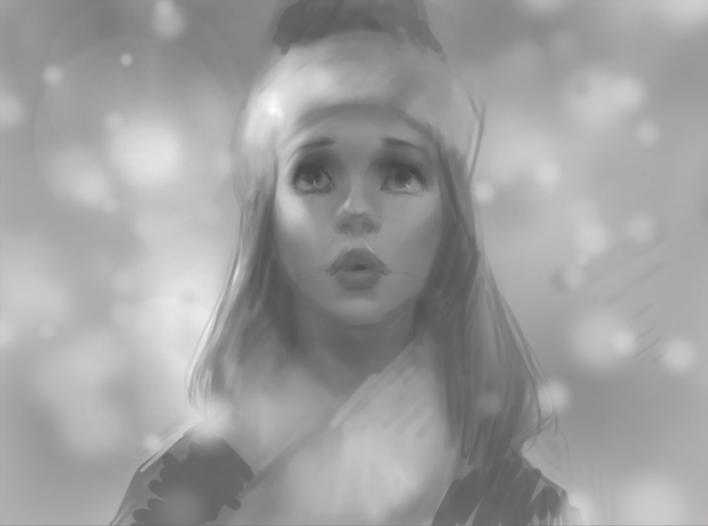
fig 18. Playing around with various snowflake sizes
Now I’ll select the Blend tool, which allows me to blend and smudge the paint around on the canvas, almost like a real oil or acrylic painting! I can achieve some of the furry texture for the woolly hat with this tool. Try using strokes that go in multiple, random directions.
fig 19. Using the Blend tool for some texture
And just like that, we are done with the grayscale/value stage! One thing to keep in mind is that we do not need to get to 100% completion at this step. Do not feel the need to slave over this stage until it’s perfect; save all those little details for the next step, when we’re working in color! I consider the grayscale stage completed when the lighting is believable, and we’re using the desired range of lights and darks. See fig. 20.
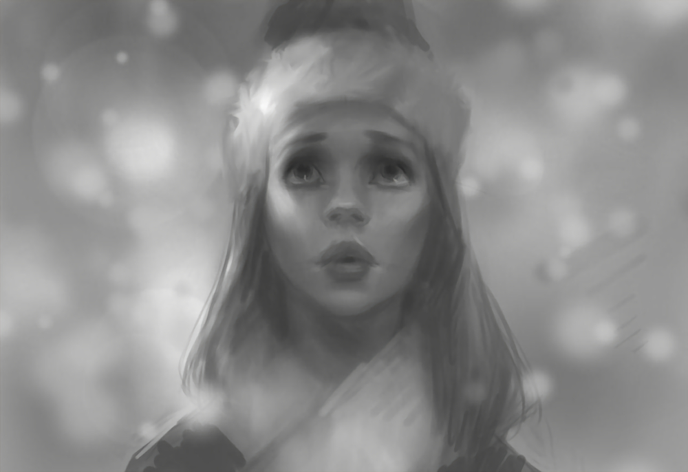
fig 20. Ready for color!
Stage 2: The Color Phase
Are you ready for some color? This is where this method really pays off, as our lighting, value, form, and design are already taken care of! We’ll start by making a new layer and setting it to Color mode. See fig. 21. This will preserve our value decisions, and simply glaze the color on top.
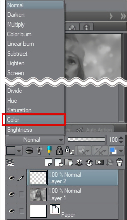
fig 21. Making a new layer and setting it to Color mode
The power of this approach will be immediately evident. I’ll begin by adding some red to the cheeks. See fig. 22. I am still using my soft airbrush for this step, though, as always, you may use whichever brush gives you the best results or feels right to you!
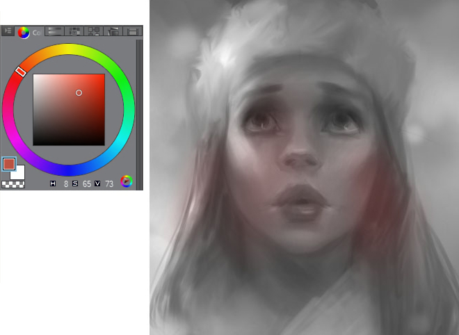
fig 22. The first color stroke of the piece
You may have the question: which colors are appropriate for flesh tones? Well, that’s a complicated subject. The real answer is: skin is not one color, nor even one range of color. In fact, any color can be used for skin, depending on your desired palette and lighting. But if you’re just starting out with skin tones, I recommend staying in fig. 23’s range of colors for this step.

fig 23. Getting all areas colorized, using this range (upper-right) of the color wheel
There will be a point where our current Color layer runs out of usefulness, and you’ll actually want your color choices to slightly affect the values underneath. To achieve this, make a new layer, and set it to Overlay mode. See fig. 24.
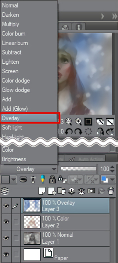
fig 24. Making a new layer, setting it to Overlay mode
Overlay will glaze color just like before, but also has the power to darken or lighten values. Experiment to get a feel for it! See fig. 25 for my progress.
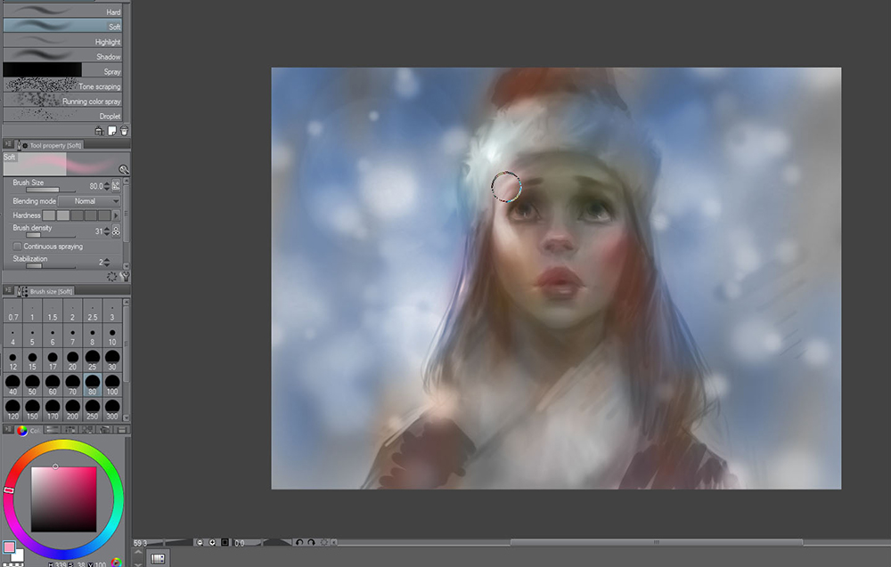
fig 25. The color still being blocked in, still using the Airbrush tool
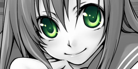
When you isolate just the color layers, the painting is laughable! It proves that the real heavy lifting is being done with our grayscale painting. (See fig. 26 – LOL!)
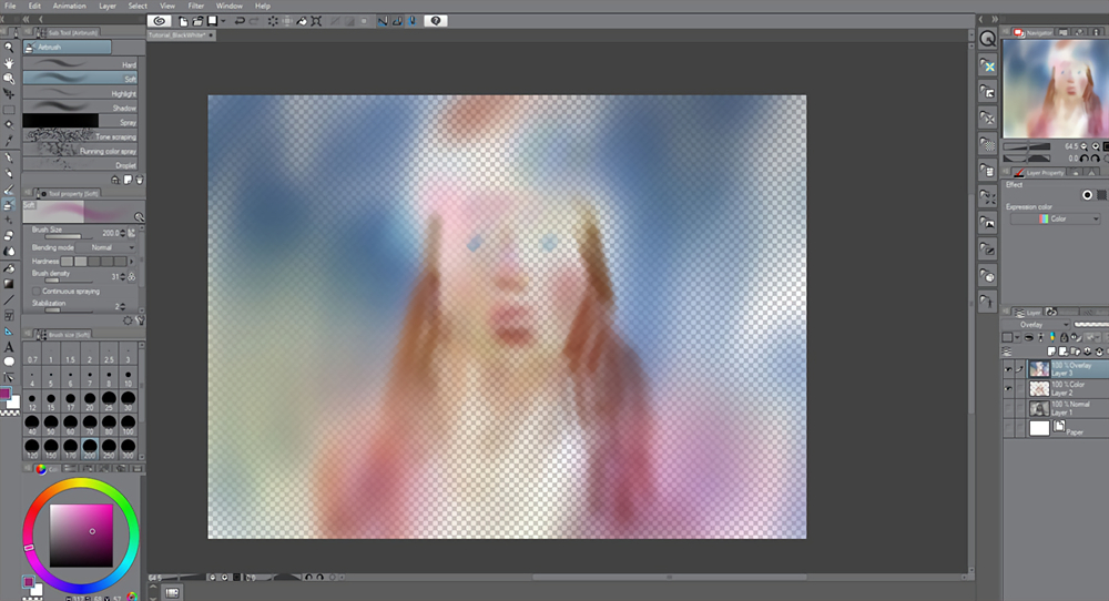
fig 26. The color layers without the grayscale painting (yuck!)
Working with my two color layers (Note: you can always go back to your original Color layer, and/or work both layers simultaneously) I will complete the color-glazing phase. See fig.27. Notice that, while there is color in our painting now, it looks … kind of bland, like a coloring book, rather than a beautiful painting. That’s okay! We will now move to the finishing phase.
fig 27. Finishing the color-glazing phase
To finish this painting, we will need to paint opaquely. That is, putting brushwork over top of everything. We will now work with both color and value together, for the first time in our process. Add a new layer and keep it at its default Normal mode. See fig. 28.
fig 28. Making a new layer, set to the default mode (Normal)
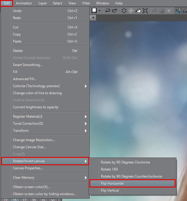
fig 29. When you have more than one layer, use this option to flip/mirror the canvas
Because I’ve placed this character in a blue environment, I want the blueness from it to filter its way into the light and color on the character. To do this, I will pick a fairly desaturated blue (that is, a blue that’s close to gray), and will press lightly with my tablet to affect the planes of the character that face up (remember fig. 6!) See fig. 30 for the areas I am choosing to add some blues to.
Keep in mind that, by pressing lightly with your tablet, you will be able to mix the color on the canvas itself. Sometimes I will even “overshoot” the blue in my color picker (that is, pick a color that’s too blue), but by pressing lightly, I arrive at the desired mixture.
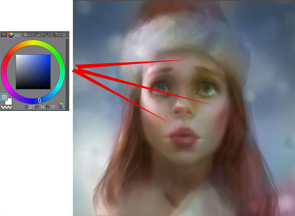
fig 30. Using blues with soft tablet pressure to cool off some of the flesh tones, mixing the color on the canvas
At this point, I will commit to my layers. I have combined them down to just one layer. Don’t be afraid of doing this! It may feel scary at first, but over time it is really helpful for building confidence. However, if you are shy to commit and lose your layers, I recommend saving the file before combining layers, then save a new file where you go ahead and combine everything. That way you can always go back.
fig 31. Flattening the layers (don’t be afraid!)
I thought freckles would fit this character. Using the Spray brush from the Airbrush tool (the same tool I used for the snowflakes), and on a new layer, I’ll spray in some freckles. Because I did that on its own layer, I can soften the effect with the layer’s opacity slider (see fig.32.) I can also use the Eraser tool to eliminate freckles I don’t want.
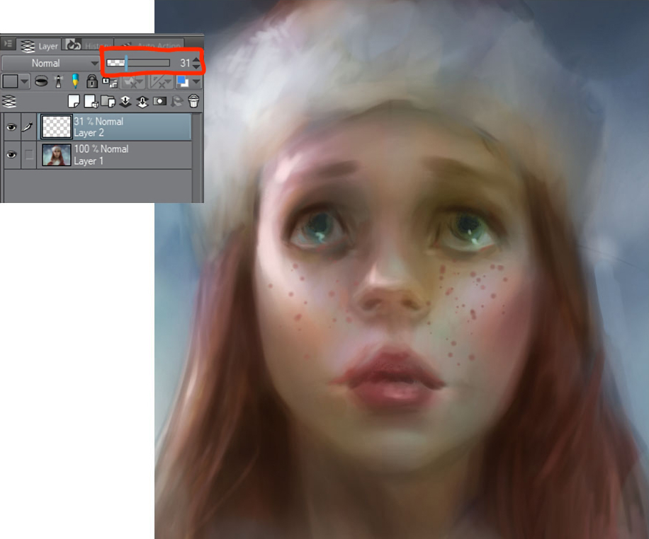
fig 32. Blocking in some freckles on a new layer
I’ll now switch to some different brushes to help the painting look organic and traditional (which I feel looks more lifelike and interesting.) I’ll select the Watercolor tool and use the Watercolor brush. See fig. 33 for my settings. This brush will both apply color, as well as rub or smudge colors that are already there. Look at the hair on fig. 33 to see this effect on the painting.
(Note: I am only able to achieve this smudging effect because I am working with everything on a single layer. If you were using this tool on a separate layer, it will not smudge the paint on the layers beneath it.)

fig 33. A nice painterly style brush, allowing for some subtle color mixing
Aside from creating interesting brushwork, I am really focused on expanding my palette at this stage. Hair, for example, is made of a myriad of colors. My character has reddish-brown hair, but notice the subtle hints of blue, and the variety of reds and browns (both saturated and muted) that exist, all weaving together! See fig. 34.
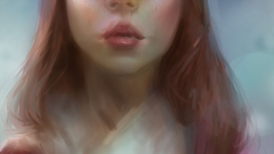
fig 34. The myriad of colors that exist in hair
Moving back to the eyes, I’ll use the Blend tool to smudge the paint in the form of eyelashes. See fig. 35.
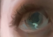
fig 35. The Blend tool used to paint eyelashes
I switched to the Pencil tool and chose the Colored pencil brush to create some harder brushstrokes that will help sharpen the painting. I am using thin brushstrokes that move in the direction of the form. See fig. 36. This technique is commonly referred to as “hatching.”
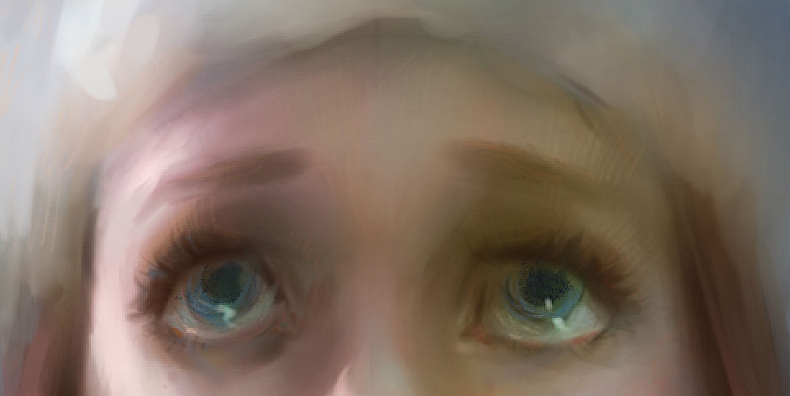
fig 36. Using hatching as a method of tightening up the painting
I want some more furry texture on her jacket and hat, particularly for the white-wool areas. So, I’ll add a new layer, and find an airbrush tool that allows me to spray on some texture. See fig. 37 for my settings and how I’ve applied the brushstrokes. Like I did with the freckles, I’ll adjust the layer’s opacity, as well as erase areas to get the texture to “sit in” the way I like it.
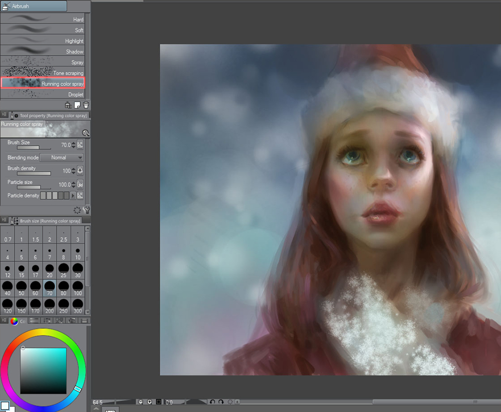
fig 37. A good brush for simulating a furry texture on the jacket
See fig. 38 for our progress. We’re getting there!
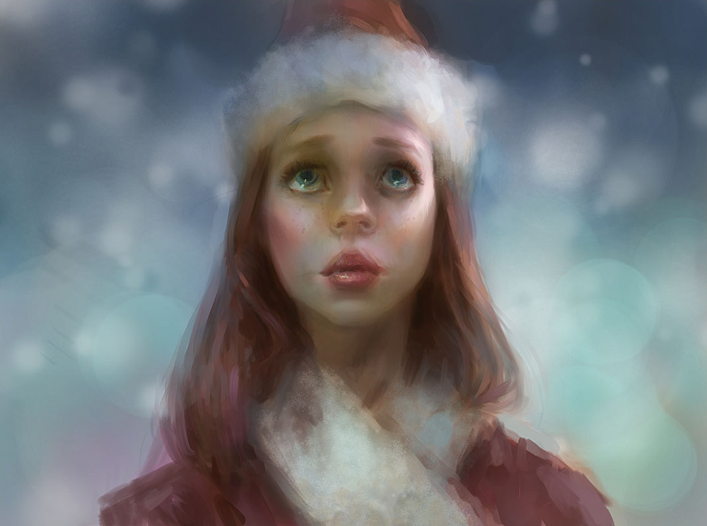
fig 38. Our progress
I’m always evaluating the rendering of the forms. I felt that her cheekbones could be a little more pronounced. I switched to a soft airbrush with a large brush size. I chose a deep, reddish color, and softly brush in some darkening under the cheekbone, to help the plane change feel more pronounced. See fig. 39.
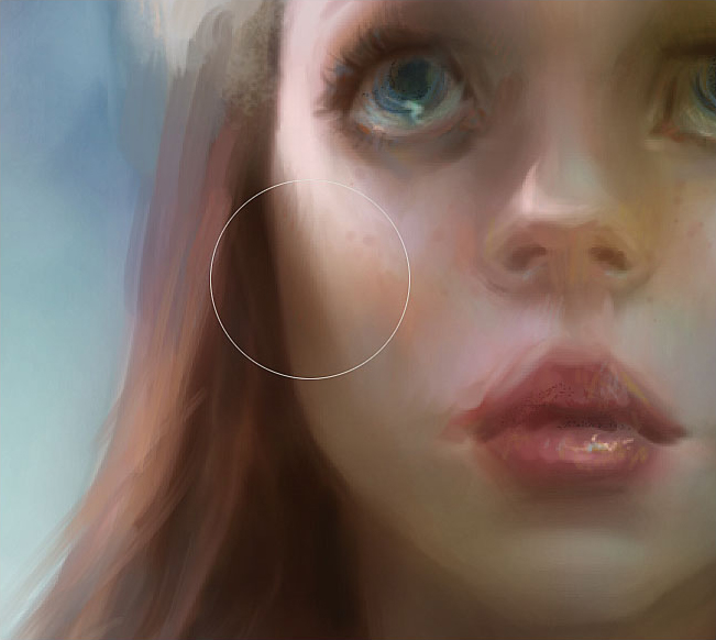
fig 39. Using a large airbrush to deepen the cheekbone area
As I moved toward the finishing strokes in the painting, I found myself using the Round watercolor brush quite often. See fig. 40 for my settings.
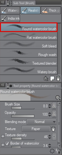
fig 40. Another brush setting I use often
As I worked on this color phase, the snowflakes slowly got painted away. I now want to add those back in! I’ll use exactly the same Spray brush settings as I did in the grayscale stage, only this time I will include color in my decisions. I want the snowflakes to be warmer than the blue background. Some of the snowflakes will be a very desaturated cyan-ish blue (which is still warmer than the saturated blue background!) while other snowflakes will have a yellow tint to them. I found it very helpful to include some very, very, large particles with the Spray brush, which helped simulate a depth-of-field effect! See fig. 41.
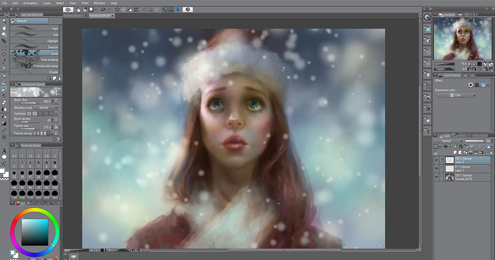
fig 41. Painting back in the snowflakes, using two separate layers
I’ll finally zoom in on the hair and paint in some individual strands. I’m using the Round watercolor brush (fig. 40) for this, with a very small brush size.
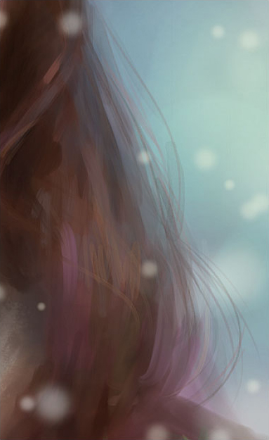
fig 42. Finally painting in some individual strands of hair
Fig. 43 shows the level of rendering I consider “finished” for this piece. Remember that you are your own artist, and will have your own opinions on how rendered you’d like things to be in the final. Your painting can be looser than this or tighter than this; the aesthetic of your work is entirely up to you, and your aesthetic taste is just as valid as mine!
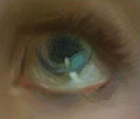
fig 43. A close up of the finished eye
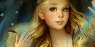
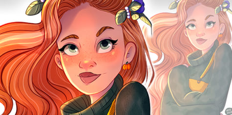
Well folks, we did it – the painting is finished! See fig. 44.
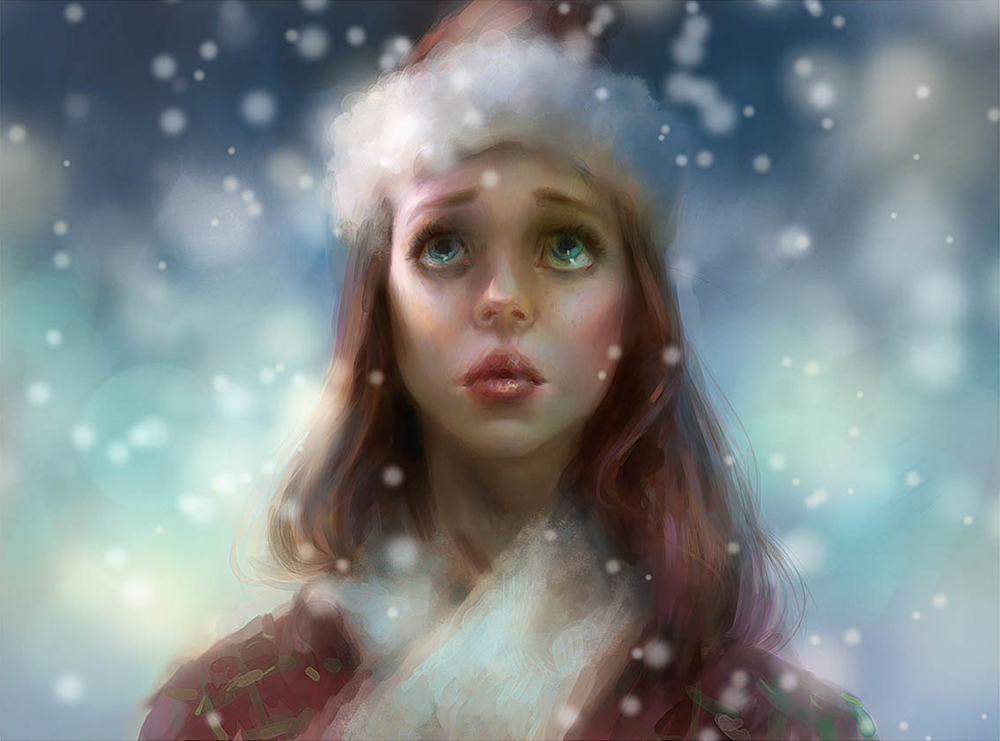
fig 44. The finished painting
This is a very versatile approach to digital painting. You can use it to paint all kinds of characters, in all kinds of lighting, with all kinds of palettes – all with just a few simple (yet powerful) tools in Clip Studio Paint. I hope you enjoyed following along with me, and I wish you all the best with your work! This is Marco Bucci, signing off!
About the Artist
Marco Bucci is a professional artist with 15 years’ experience in the film, TV, game, and print industries. His clients include Walt Disney Publishing Worldwide, LEGO, LucasArts, Mattel Toys, and more. Marco is also a passionate teacher, and currently teaches “The Art Of Color And Light” at CGMA, a course specifically designed to build painting fundamentals from the ground up.
Interested in character art & design or what it takes to become a character designer?
Check out the link below!