How to Draw Beautiful Fairy-tale Princess Hair
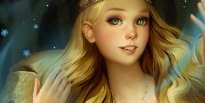
In this step-by-step tutorial, learn how illustrator Svetlana Tigai structured shaded and detailed the flowing, glowing hair of a princess based on Scandinavian folklore!
Finding an inspiration
This spring I bought “Among the Elves and Trolls,” a fairy tale book of Scandinavian folklore with illustrations by the famous Swedish artist Jon Bauer. Fairy tales are wonderful, and the illustrations were very atmospheric and authentic. When I was asked to draw something from European mythology, I immediately thought about this book.
In Scandinavian folklore, there is a traditional plot where a beautiful girl or young princess is searching for her lost brother (brothers) or her lover. She, as a rule, goes through a terrible forest, where many obstacles await her. On her way, magic is sure to occur, and the kind spirits of the forest usually help her. I like the contrast between the bright image associated with a character, and an unfriendly, frightening environment.
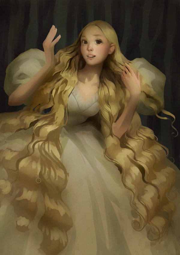
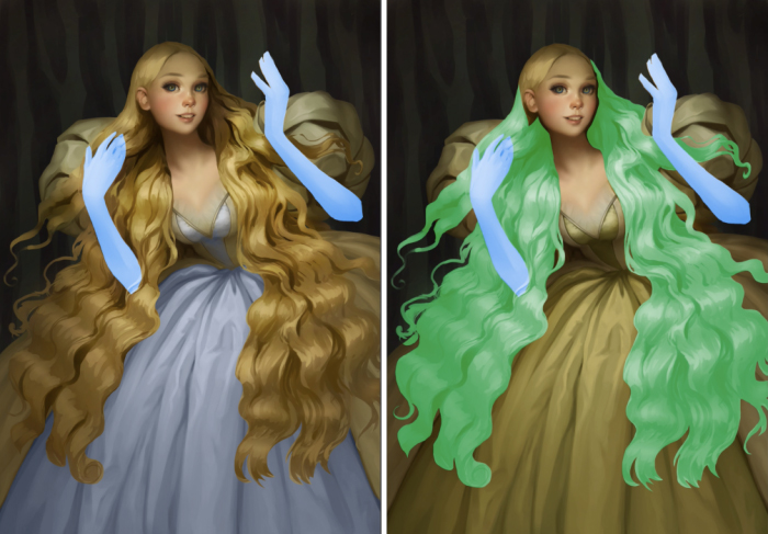
Inspired by Bauer’s paintings, I decided to draw my character young and golden-haired to emphasize her purity and innocence.
This tutorial will cover how to draw hair while introducing the overall flow of creating this illustration. I used Clip Studio Paint, but the same techniques can be used with other programs as well.

Illustration breakdown
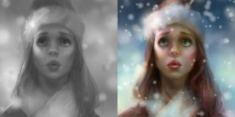
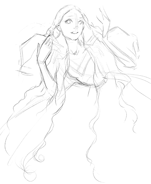
1. Rough sketch
I always start with a rough sketch on a new layer. I don’t try to make a perfect lineart and don’t work on small details. Clean lines do not make sense on this stage, because this layer will be deleted later on. It is a compositional layout – I try to fit my idea on the canvas.
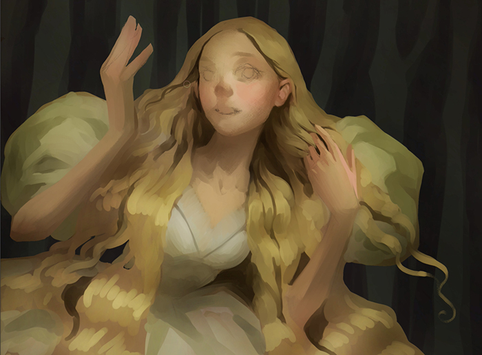
So, in my head, there is an image of a long-haired princess in a magnificent bouffant dress with huge lantern-shaped sleeves. This silhouette of the clothes, a softer faceline, rosy cheeks, round big eyes and loose hair will emphasize her youth. I want to focus on charm and loveliness, not sexuality.
2. Values
After drawing the main lines, I begin to set up the layers of the illustration. First, I create a new layer to draw the character on. The lower layer I leave for the background.
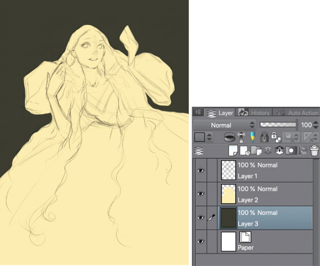
Very roughly and with simple large spots, I apply approximate colors. I prefer going from dark to light.
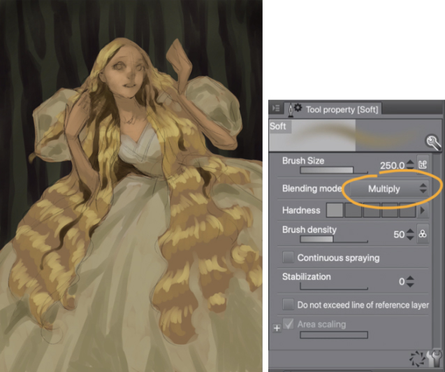
Using a large-diameter airbrush, I outline simple values. Sometimes I switch the brush mode from normal to multiply, soft light or overlay, depending on my needs.
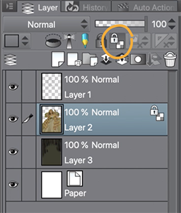
Since the character is on a separate layer, I lock the alpha channel(transparency), so I will not have to clean up the strokes that have been painted beyond the character’s shape.
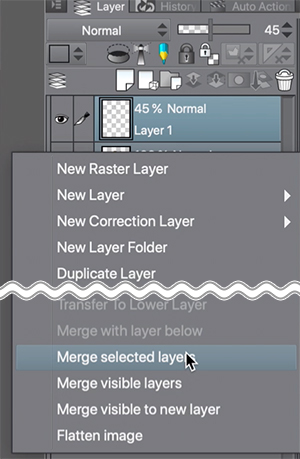
Having decided on the color palette and rough values, I moved on to a general silhouette and readable elements, starting with a more detailed drawing. To make sure the pencil lines do not bother me, I begin to gradually get rid of them by reducing the transparency of the layer to 45%. Then, using a soft eraser, I completely remove the lines I don’t need anymore. As a result, there are some strokes on the face and hands. I then select the layer with the sketch and the character layer and merge them into one.
I constantly flip the canvas horizontally while drawing. This helps me avoid compositional and proportional mistakes. To see the whole composition, we have to draw everything at the same time.
3.Adding light sources
For this composition, I chose an upper front light source. Combined with the dark background, the brightest area will be on the character’s face, and thus become the focal point. As this is a forced light source, it looks more like a light bulb hanging overhead. I call this effect theatrical light, and for this illustration I apply it intentionally, hoping to enhance the fairytale-like atmosphere.
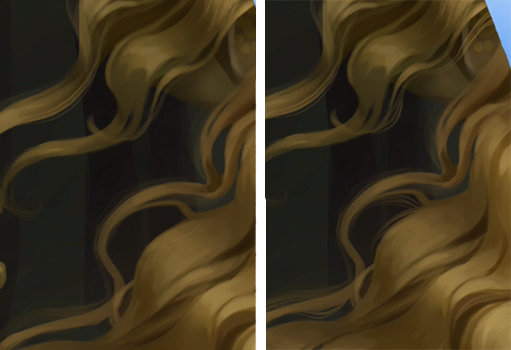
4. Drawing hair
The secret of drawing beautiful hair is not to use custom brushes that imitate individual hair strands at the beginning. Such brushes are needed only for detailing and the final polish. I recommend using hard brushes when creating values and light. Since hard brushes are simple, you will not get confused and will not be distracted by the details. I also do not recommend using very small diameter brushes at the very beginning.
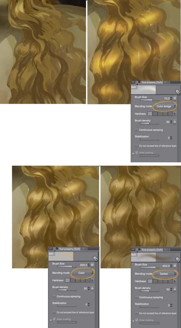
Soft, thick, long hair – it is very feminine and beautiful. I do not want to create the effect of made-up curls. I am going to make natural-looking waves. To make their shape a bit more voluminous, I take the airbrush and switch the brush mode to Color dodge, and paint highlights with horizontal lines. However, these will make a glow that is too saturated and vivid, so I change the brush mode to Color, and using an eyedropper, I select a muted tone. Some highlights seem too contrasting to me, so I soften the transition from dark to light changing the brush mode to Darken.
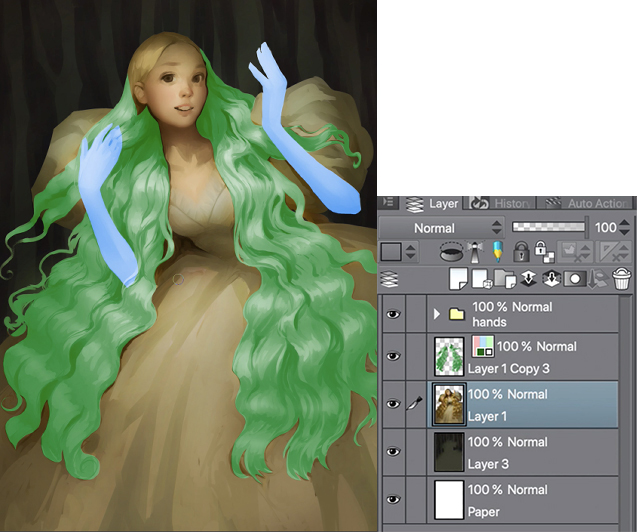
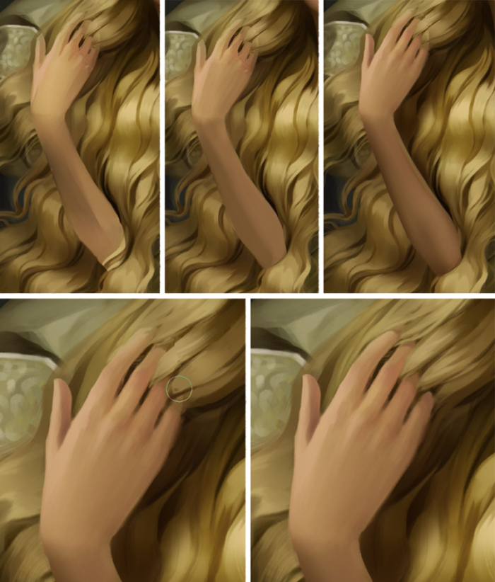
5.Separating arms and hair layers
When I have a rough sketch of a character with color, light, and main shadows, I divide it into 3-4 layers. Using the lasso tool, I select the hands and duplicate the selection on a separate layer with the copy button in the selection menu.
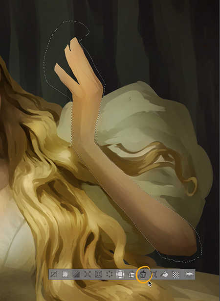
To see the outline of the hands better, I fill them with blue using the layer effects button. I also move these layers in a separate folder to make it easier to work with objects located behind the hands.
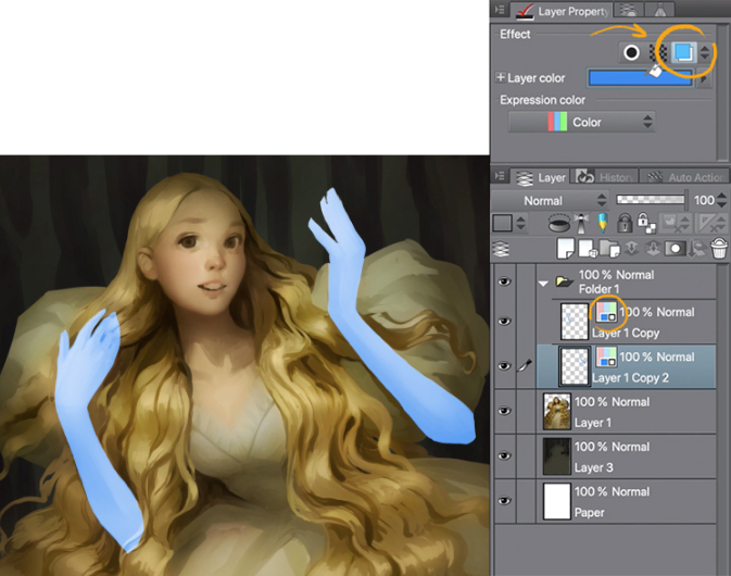
I repeat the same process with hair, and now I can begin working on the character’s dress and face.
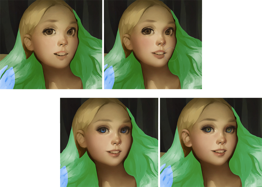
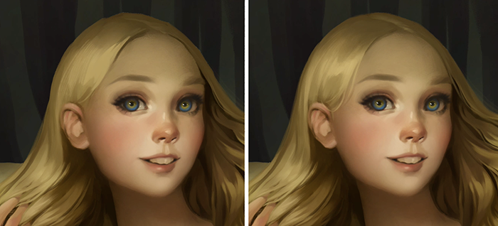
6.Drawing the face and neck
I formed the sleeves and start with the face. For the cheeks, forehead and neck, I often use an airbrush, sometimes switching it to Soft light mode to add blush.
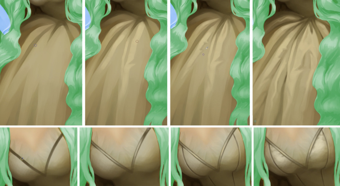
7. Drawing the dress
I really like drawing silk fabric. I take an eyedropper, select a dark area, and make a long, slightly curved stroke in the opposite direction to the light area. After that, I pick up a light shade with an eyedropper and drag the brush over the same dark area, creating sharpened stripes. Since silk fabrics have a smooth and shiny surface, don’t forget the reflections. Usually, the darkest places will be at the border between light and shadow.
Having finished with a skirt, I turn to the bodice and draw something like a silk border. I paint highlights while paying attention to where the surface is closest to the light source.
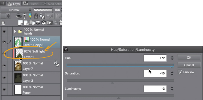
To make the dress more interesting, I decided to make it two-toned. I select the middle section of the dress with a lasso, create a new layer and fill the selected area with a random color. Then I switch the layer into Soft light mode, go to Edit and find Color settings, then play with slider. I eventually come to the conclusion that green fits best.
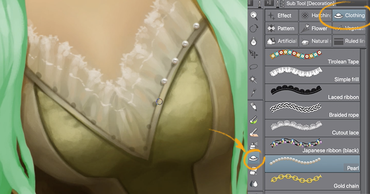
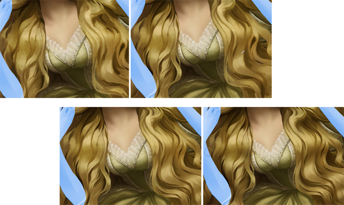
I add some decorations to the dress bodice. Custom brush in the form of pearls fits great for this purpose. First I draw a shadow from the pearls, and only then the pearls themselves.
I would like to make the dress more interesting, but I don’t want it to take too much attention. I like the idea of a hidden pattern, so I create a new layer and draw a simple dark green pattern. Then I lock the alpha channel(transparency) of the layer, and highlight areas where the light falls. I also draw a thin border on a patterned fabric.
8. Touching up the hair
My character is divided into three parts. I finished with the first part and go to the next one with hair. I love this stage. My movements are smooth as if I am combing hair and creating a hairstyle. It is like an art therapy – laying strokes in a harmonious rhythm, creating dynamics with lines. Also at this stage, I begin to add lighter shades to emphasize the light source and make the hair shine.
I use a simple method of dividing hair into strands. With an eyedropper I select a dark area on the hair and using a brush, whose transparency depends on pen pressure, I make a wavy stroke in the opposite direction to the light area. After that, in the same place, I pick up a light shade with an eyedropper and lead the brush back to the dark, creating pointed stripes. Thus, it turns out that first I draw a shadow from the strand and only then the strand itself.
I always clearly indicate for myself the darkest and the lightest parts. Most often this area is near the face. During the whole process, I try to keep these areas the darkest and the lightest. This is done in order to emphasize the focal point and not to destroy the volume and planning.
When I draw the main large locks, in my mind I simplify their shape to round wisps and flat ribbons. This way I create the shape of the hair mass. Perceiving hair as a geometric object, it is much easier to work with light and shadow and create the correct volume. I always know where each strand begins, where it connects or diverges with other curls. Thus, I avoid inaccuracy and, so to speak, logical errors.
Now I take a custom brush for hair and begin drawing thin strands that got out of the bulk of the hair. This brush is denser but quite soft. This is a brush for thin strands. Using it, I separate the strands from the total hair mass and I also use an eraser to separate the tips.
Now I slowly reduce the diameter of the brush for detailing. I continue working on thin strands, but I try not to get out much beyond the general hair mass. These strands are needed in order to remove the plasticity and give the hair a more realistic look. This does not always work for the first time. I do not recommend you to rush or draw spontaneous strands. Although they will look like spontaneous and random in the final illustration, in fact, you can better choose the ideal position for each strand.
Another important point is moderation. If there are too many thin strands, then the hairstyle will have a disheveled look.
The free ends should be laid in the direction of hair growth, and not vice versa. Otherwise, you may get the effect of hair torn in the middle.
It is also necessary to ensure that thin strands do not change the overall shape of the hairstyle. Their purpose is only to emphasize. By drawing individual hairs I follow the direction of the total mass of hair just slightly skewing from it in different directions.
Often I create a new layer BETWEEN the layer with hair strands and the layer with the main portrait. I set this new layer in multiply mode. Then I take an airbrush with a small diameter, using an eyedropper I pick up color from the light area and begin to draw contact and cast shadows from strands and curls. The closer the distance between the hair and the surface on which the shadow falls from them, the harder and darker these shadows should be. To gain the hardness, I use an eraser with hard edges and remove in some areas the soft airbrush edges. The shadow should repeat the trajectory of the surface and not the object that gives this shadow.
9.Drawing hands
Having finished with hair, I move to the last part. Hands.
They seemed to be slightly larger than they should be, so I adjust the size. Using an eraser, I aligned the linesand painted the details with a small diameter brush.
10. Touching up
On a new layer, I draw hair strands near the face and hands.
I finish the background without going into details. I make it a little bit darker, but also add sky and stars.
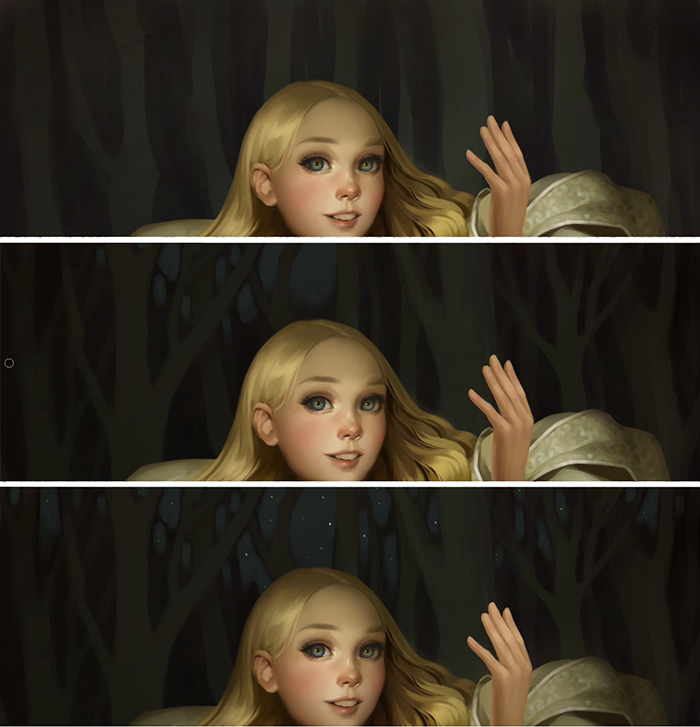
Now the character seems like it doesn’t fit in with the environment. This is due to the hard edges. Using the airbrush in Multiply mode, I work along the edge of the character’s figure. On a separate layer, I repeat the same process, but with a light tone – I draw some kind of glow that comes from the girl. And now I have a connection between the background and the character.
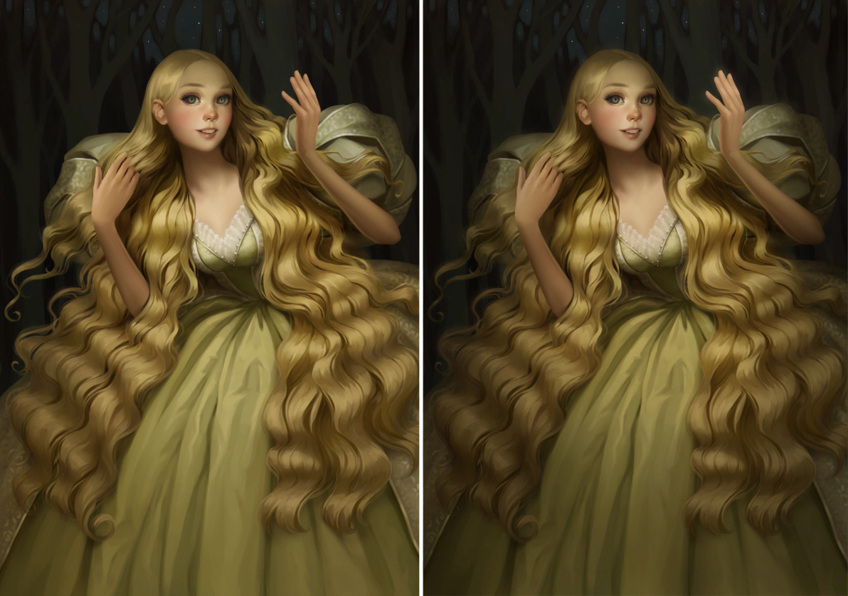
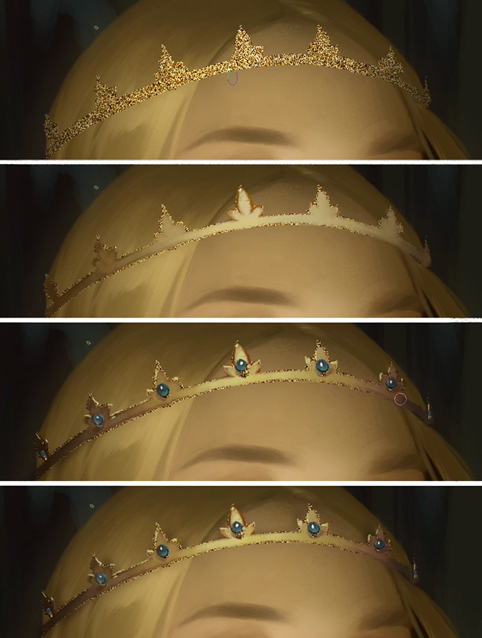
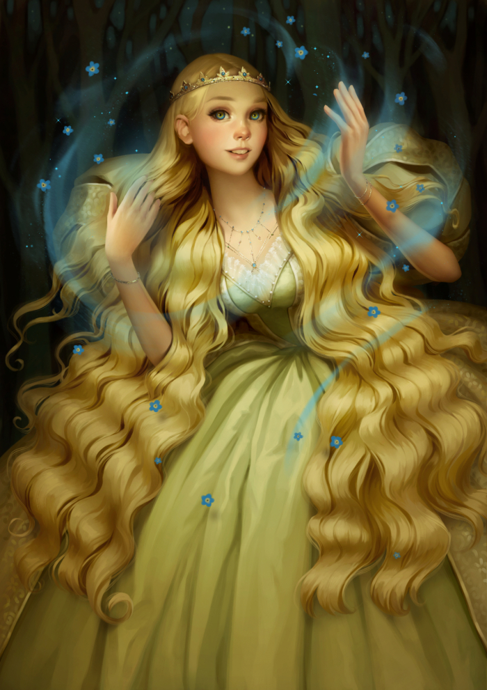
The light dress and the golden crown are the traditional bridal outfit in Sweden. In the story, the girl often distributes her jewelry to elves and trolls in exchange for help.
After drawing the jewelry, I added texture using an image of gold beads, and drew the details in.
11.Drawing magic effects
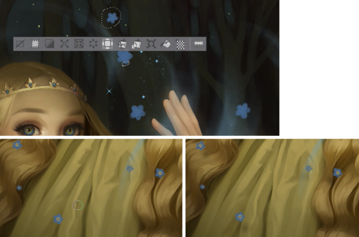
In Scandinavian mythology, there is a legend that forget-me-not flowers grew out of the tears of a bride who cried at parting with her fiance. In this illustration, the magic of love in the form of forget-me-nots brings the girl the news that her lover is alive and he still remembers her. The girl is inspired to follow the call of the heart and continue the search.
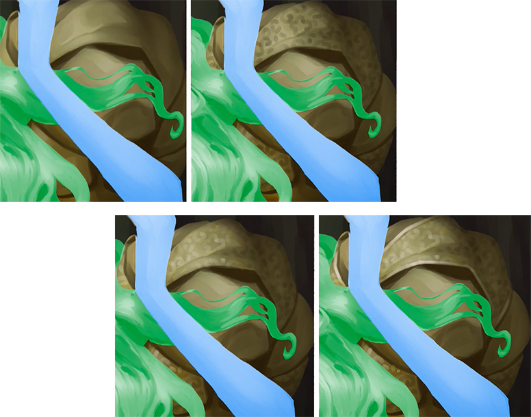
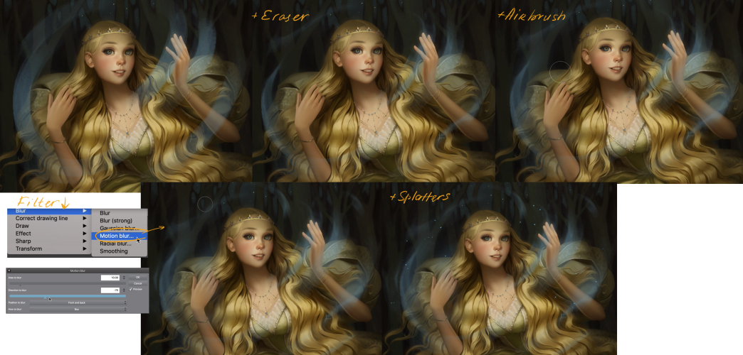
To draw the magic soaring around I take a round brush with a medium diameter. Its transparency must respond to pressure. I paint blue flashes near the hands, but they look rough and not very dynamic.
Therefore, an eraser with the same settings as the previous brush comes to my rescue. With gentle movements I remove the excess giving the strokes a more dynamic look. With an airbrush, I give a little glow to the soaring magic. Statics are still present, so I go to the Filters – Blur – Motion blur. There is a pop-up window with sliders where I can play with blur. At the very end, I use a custom brush imitating stardust.
I do not draw all the forget-me-nots, I prefer to copy them and paste. I change their size, rotation and location. When all the flowers are arranged in their places I can only draw the cast shadows from them on the dress. That’s all!
12. That’s all!
I hope you like my artwork and hope this lesson was useful. Thank you for reading!
Svetlana Tigai (as known as Tsvetka) is a freelance illustrator from Kyrgyzstan. For the past 11 years Svetlana has been working on many different projects but most of her career she’s been drawing fantasy illustrations for collectible card games.
More of Svetlana’s works you can find on her ArtStation page or follow her Instagram
Interested in character art & design or what it takes to become a character designer?
Check out the link below!