Using Overpainting to Create a Dramatic Scene
Learn how to use overpainting techniques, incorporating photos to add details to your illustrations and concept art! This article explains how to merge a photo with your rough sketch and how to paint atmosphere and details over the photo so it blends in with your painting seamlessly.
For this tutorial, we are going to create a scene of building and a couple of characters with some sort of interaction.
We will go through three stages: Establishing, Clean-up, and Overpainting.
Establishing Stage
Before drawing environments, think about the perspective of your illustration first. The composition can easily be determined once we have the perspective established.
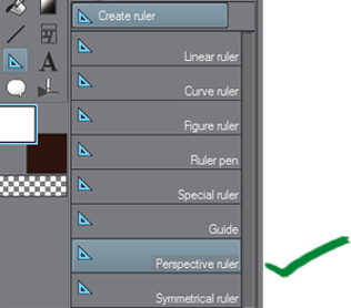
Use Clip Studio Paint’s extremely handy Perspective Ruler tool for ease of establishing accurate guides. You can play around with different perspective ideas thanks to this tool because it’s very easy to use!
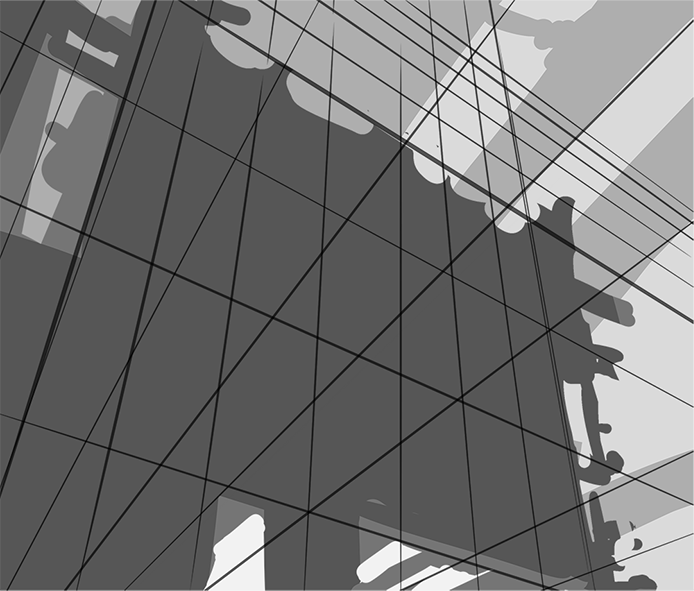
Draw the silhouette of the foreground (darkest), midground (mid-tone), and background (lightest). The shape doesn’t have to be accurate because we are going to use a photo anyway.
For now, we just want to illustrate our idea using simple shapes.
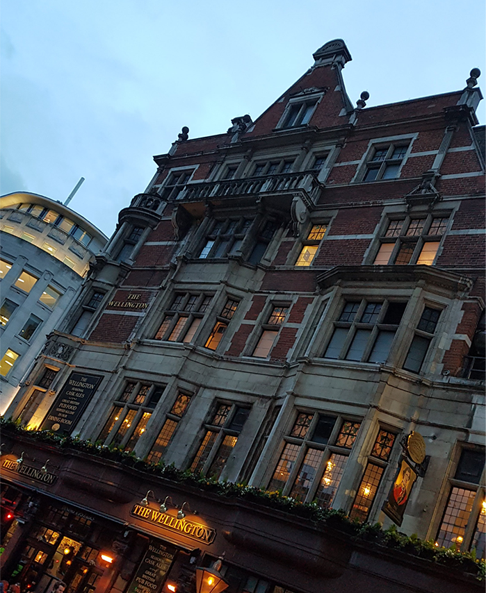
This is the photo that we will be using for this tutorial. Make sure you have the rights to/have permission to use the photo(s).
You can use as many photos as you want depending on your scene, but for now, we are going to use just this one for simplicity’s sake.
Erase the unneeded stuff (like the sky because we only want the building) using a combination of Eraser tools and Selection tools of your choice:
– Auto Select/Magic Wand
– Select > Select Color Gamut (Clip Studio Paint)
– Select > Color Range (Photoshop)
You need patience for this step depending on how much you need to remove.
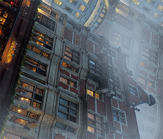
Copy and paste the same building into the background. Add a layer on top then brush over some “fog” to push it back to the background. Add another layer on top of the foreground building and dab a bit of fog as well.
Painting “atmosphere” over your photo immediately reduces that stock photo look.
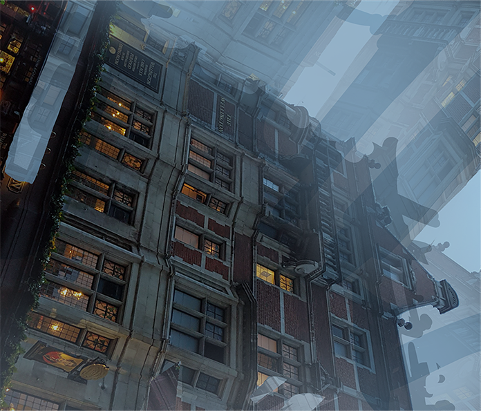
Change the grey block colors from earlier to blue to make the scene look cold, then set the blending mode to Multiply.
Form the pillars by cutting and pasting, erasing unwanted parts, scaling, and rotating the building to make it look like a thin structure.
It doesn’t have to be clean at this point. It’s more important to focus on the whole picture.
To focus on the whole picture:
1) Make sure to have the canvas zoomed out enough that you see the entire image
2) Have the Navigator window turned on so you can see the illustration at a thumbnail size
If the thumbnail looks good, there is a very high chance that the full version looks good too. Zoom in only when you are rendering and adding tiny details.
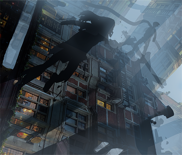
If there are characters in the scene that are close enough to the camera to take up a good amount of space, draw them early because they cast shadows and affect the composition of a scene. They can cause tangents against the background if they are not positioned properly.
Tangents are a no-no.
Avoid this.
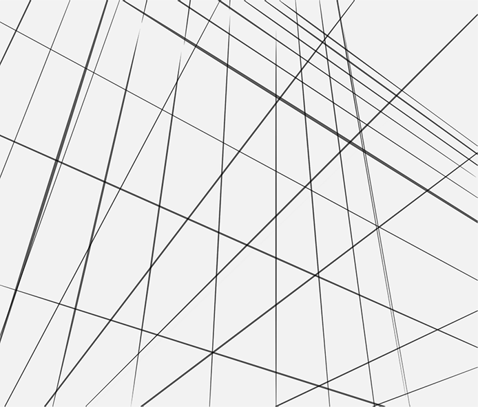
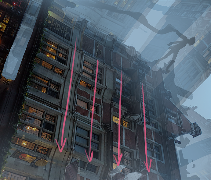
Lines of different objects that are overlapping or are parallel with each other are called “tangents” and must be avoided when drawing composition.
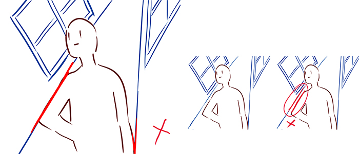
Instead of parallel lines, go for intersecting lines, and avoid lines that seem to merge with each other.
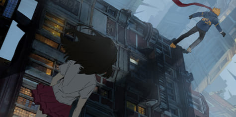
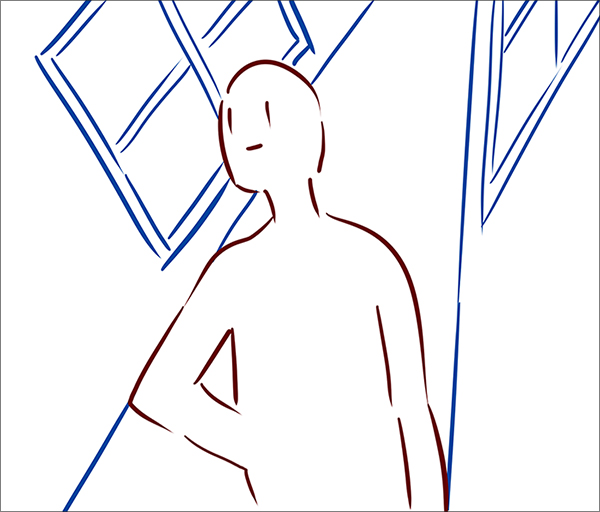
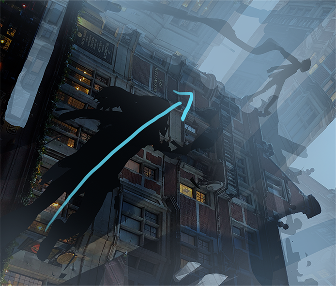
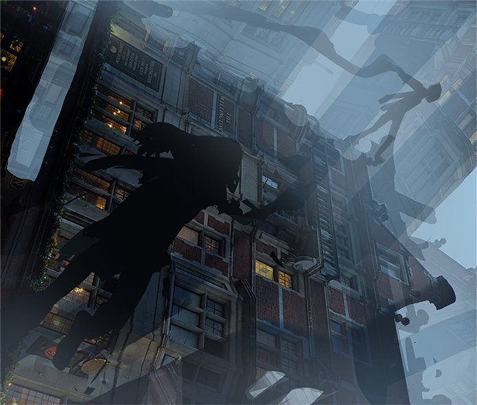
The Focal Point
The guy is our focal point and making him stand silhouetted against the lighter part of the background between two pillars helps our eyes focus on him.
But notice how our eyes just slide away from focusing at him and proceed to look at the building instead.

This is because the parallel lines of the building are ‘leading lines’ and human eyes unconsciously follow them. These leading lines guide our eyes to look towards the bottom half of the building.
Another reason is because the building has more details than the focal point, and people tend to look at detailed areas first.
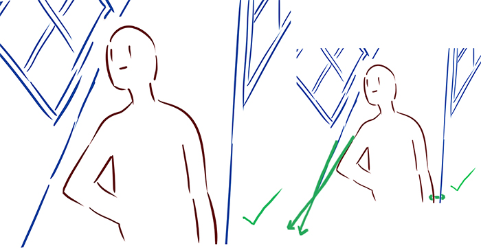
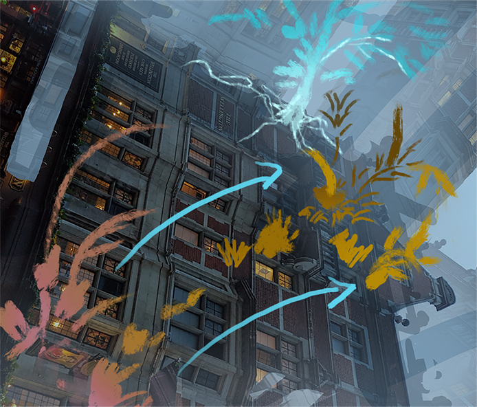
Strategically adding another character or object helps prevent this problem.

Make the object cut through the building’s leading lines to create a break.
This effectively stops the straight lines from leading our eyes away from the focal point.
We can also do this without characters. They could be moss, they could be birds flying in a different direction, or they could even be broken steel frames from the building itself.
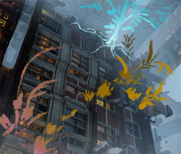
Simply drawing these “breaks” already helps a lot.
Deciding the character interaction
Now, think of a story. The story is what makes your picture stand out from everyone else who has already used this same kind of concept. There is already a ton of art out there with buildings. But how can you make this art your own? Give it your own twist. The story can be something simple, but the important part is that SOMETHING has to be happening in the image:
1) A guy and a girl are on an adventure. The guy is looking down in awe as the girl trails behind going.
“Wait for me!”
Or she is running towards him to stop him from jumping off depending on how you take it.
2) An action scene where the girl jumps up (so her head pops on top of the building) and the guy prepares to receive the attack.
3) The girl slowly walking to backstab the unsuspecting guy. He is busy saying, “Wow, look over there!”
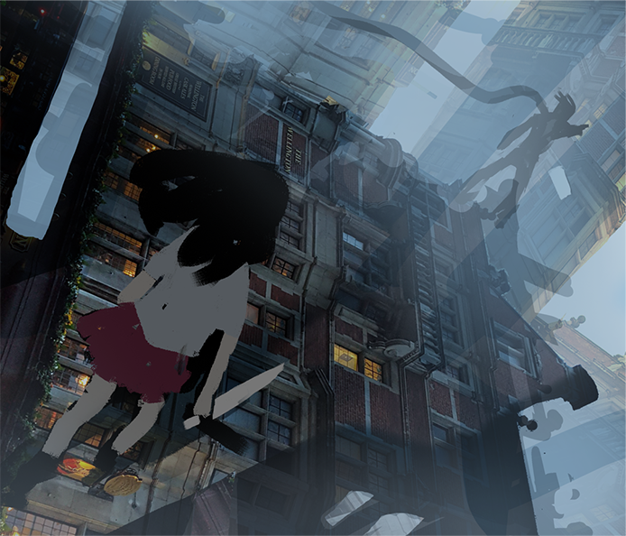
I leaned towards 2 and 3, however ultimately decided to go with 3 to match the sinister lighting/setting.
– Add some yellows to show that the time is dusk.
– Add cast shadows too to show that there are other buildings outside the frame.
Photos have their own lighting/shading. Intentionally drawing our own light and shadows helps get rid of the stock photo look.
I cannot emphasize this enough:
Get rid of that stock photo look! The key to that is dramatic lighting.
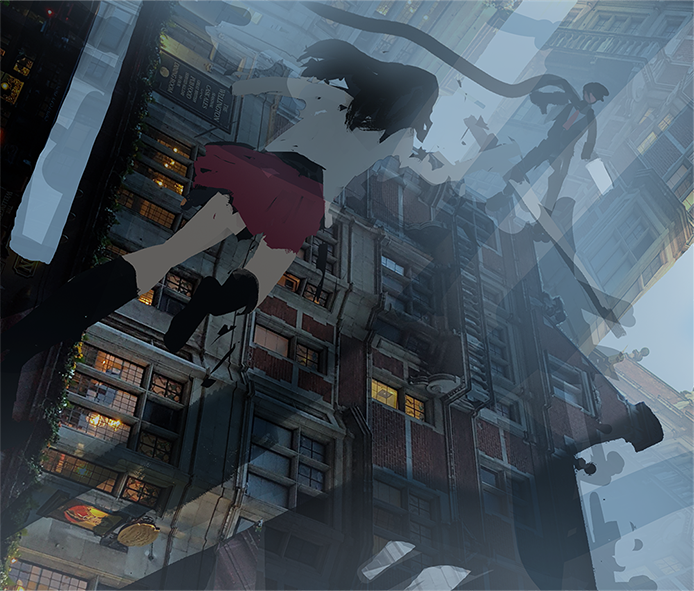
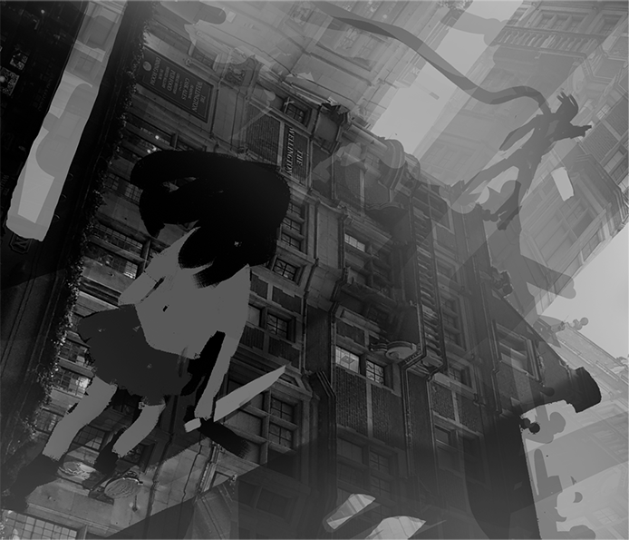
And with that, we are done with the Establishing Stage. Now let’s check our values by making a new layer on top and setting it to Hue, then filling it with either black or white.
If we think that the major individual objects (Characters, foreground, and midground) properly stand out against their respective backgrounds instead of blending in, we can proceed with the Clean-up Stage.
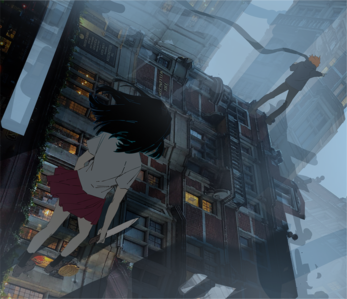
Clean-Up Stage
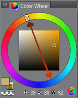
Drawing the characters to finish, I gave the guy character orange hair to give variety and contrast against the bluish mist. Remember your complementary colors from grade school?
Complementary colors are also known as “opposite colors.”
Fixing the shadows of the pillar buildings according to the light source. I also fixed the shape of the building a little bit. Then I added those small bridges to the left.
Corrected the girl’s cast shadow.

Overpaint Stage
The overpaint stage, a.k.a humanity’s test of patience.
Despite having a few photos alreadys, this stage can actually take the longest depending on how refined you want it to be.
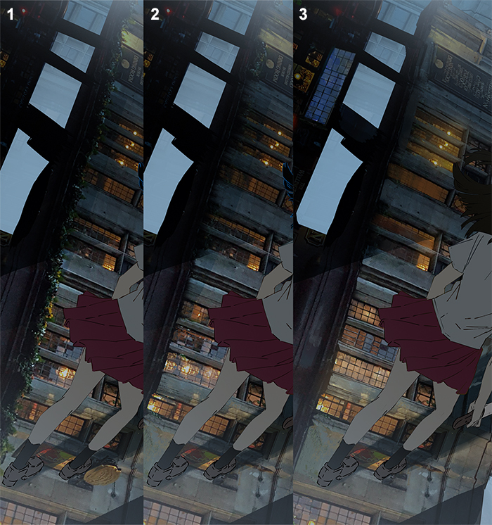
1) Original.
2) With the copy stamp tool and a small brush size, carefully erase the leaves on the edge of the building.
Clone from the correct area/color. I didn’t quite like the idea of life/growth, so went for a scene that’s just dry and dead.
3) Switch to a small hard brush to paint over areas to complete the shapes (the yellow squares for example).
Try not to lose the original textures from the photo when painting over. Do this by using the eyedropper tool and carefully choosing surrounding colors only. Only use a small brush size to paint. Painting with a big brush will cause colors to blend too much and smooth the textures out.
Yes, this part can be tedious and requires a lot of patience, so you can see some matte paintings that are essentially just photobashing with very minimal painting.
Sometimes artists do this to show ideas fast. Sometimes their clients want 100% photoreal images, so brush painting over a lot of areas is a bad idea. Then there are artists like Makoto Shinkai (Kimi no Na wa, Garden of Words, etc.) who choose to paint over every pixel of their photos.
Whatever the case, how refined you want to go with your paint-over depends entirely on you!
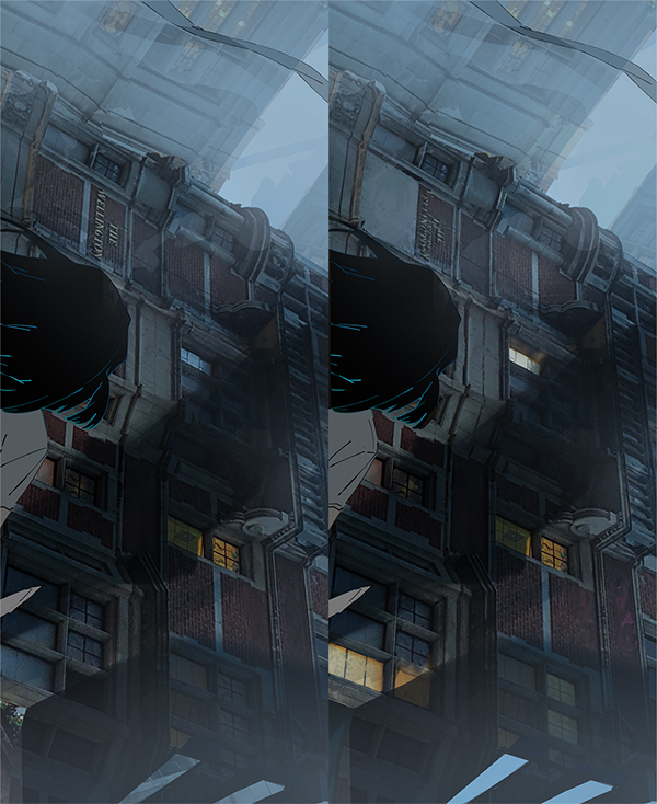
Before background overpaint:
With background overpaint:
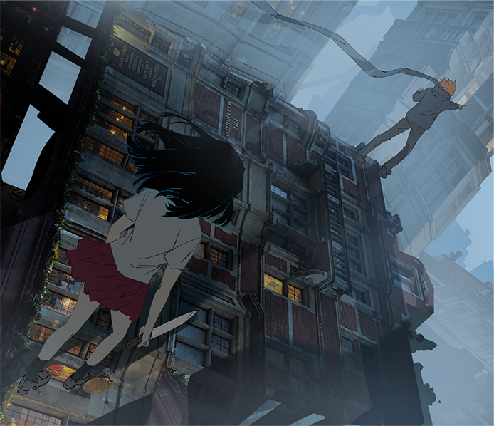
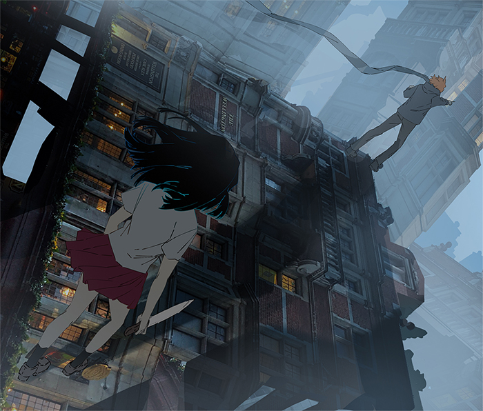
1) Made changes to the characters. I changed the guy’s pose to make him look more like a human even on a small thumbnail view. Added more details to the girl, but removed the blues on her hair because it looked quite unnatural.
2) Slightly widened the gap between the buildings on top. Added those spiky structures in the background. Theses are not so subtle leading lines that help reinforce where the focal point is. I also adjusted the girl’s cast shadow once more so it goes straight to the guy.
3) Added more yellow lights to the right of the image.
4) Overpainted mostly the left half of the building.
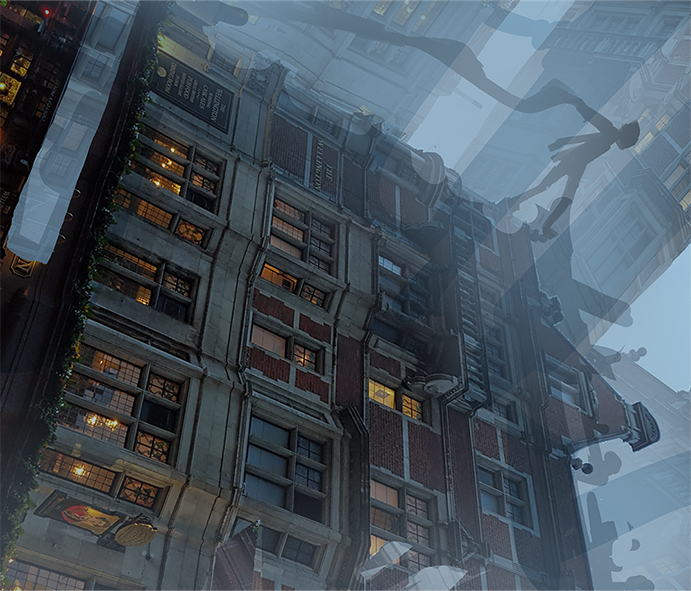
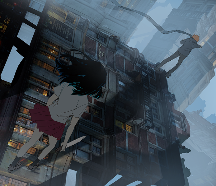
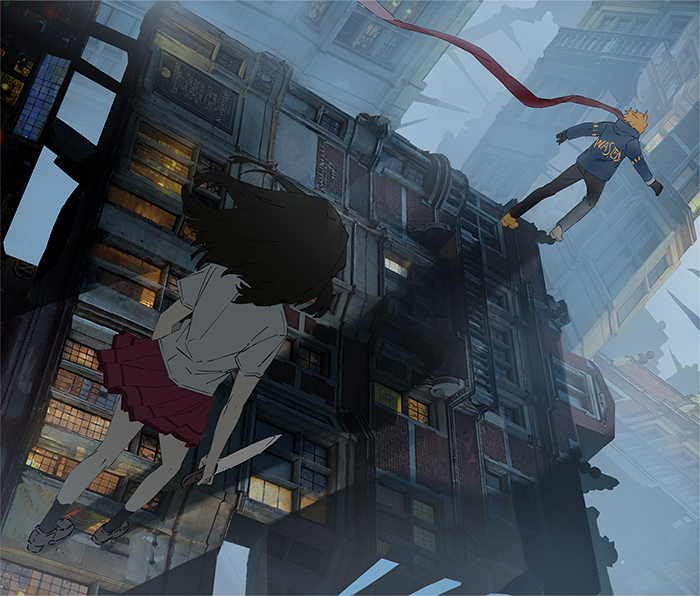
FINAL IMAGE:
1) Copy and pasted the buildings in the background, then scaled down to make the windows look smaller, thus making the building appear a bit further away.
2) Added a structure on the foreground (still serving as leading lines to the guy).
3) Added blur on the foreground for that out of focus effect.
4) Added yellow tint across the building the characters are standing on.
5) Added dark shadows behind the guy character.
And we’re done!
Author profile
Rynn (also known as midorynn) is a self-taught artist who mainly uses digital tools and software such as Clip Studio Paint and Photoshop. Having worked five years on various freelance projects on animation, illustration, and design, she has learned a variety of techniques and know-how that she is enthusiastic to share with other self-taught artists.
Twitter: https://twitter.com/rynn_apple
Instagram: https://www.instagram.com/rynn_apple/
Interested in concept art or what it takes to become a concept artist?
Check out the link below!