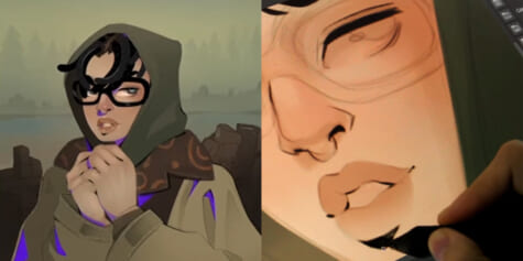
How to draw super detailed anime aesthetic art
Artist Carles Dalmau explains techniques to create charmingly intricate illustrations. Learn how to bring a drawing together and draw the eye to the focus of the image, even when you have a busy concept, by controlling the composition of the piece.
Index
- Introduction
- Simplifying Objects and Understanding them in Perspective
- Values (Foreground, Middle-Ground & Background)
- Conceptualizing the Scene (sketch)
- Lineart
- Coloring and Shading
- Finishing Touches
- Image Formats and Exporting
1. Introduction
When creating illustrations, we often make the mistake of wanting to put in so many details that in the end we overload the image, losing the meaning we originally wanted it to convey.
In this tutorial I will teach you how to include lots of elements in an illustration in a way that keeps it from looking too busy and keeps the main element you want highlighted clearly in the line of sight of the viewer.

To create the illustration for this tutorials I have used two different pieces of software:
- Clip Studio Paint (CSP) for sketching and digital inking.
CSP has a brush stabilizer that makes your lines very comfortable and fluid. This (in my opinion) makes this software ideal for both inking and sketching your illustrations.
- Photoshop (PSD). For coloring and final brush-up.
As PSD is specially designed for photo editing, it has lots of options in terms of coloring and post-production of images, making digital coloring very easy.
2. Simplifying Objects and Understanding them in Perspective
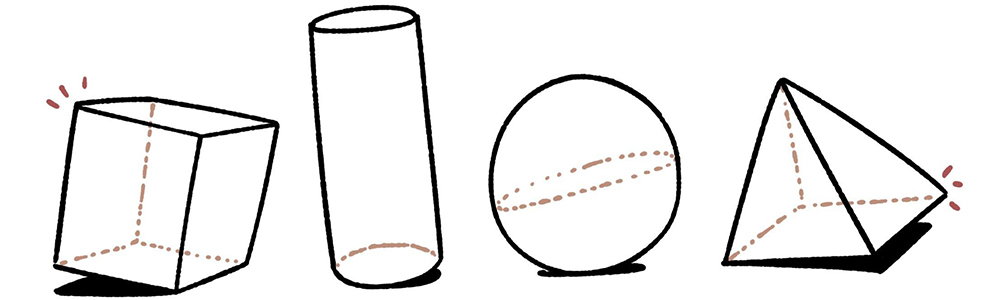
For any illustration (be it simple or more complex) you must understand that any element that appears in it, be it a character or an object in the environment, can be simplified into geometric shapes. This will save you a lot of time when locating any element within the perspective drawing.
The most common (and easy to make) shapes are cubes, cylinders, spheres, and pyramids.
It is very important to know the basics of perspective before we start to make any drawing of this type. But to streamline the process, I think it is also very important to understand perspective instinctively. i.e., to be able to locate any of the elements mentioned above at any point in space without using vanishing points. This will help you a lot when you want to insert many objects in a single image without having to make many different vanishing points.
The following is an exercise that helps to hone this instinct: take a photo of a space (a street or a room) and try to create different geometric shapes within the image without using vanishing points. Use only the perspective of the photograph as a reference for the placement of the figures.
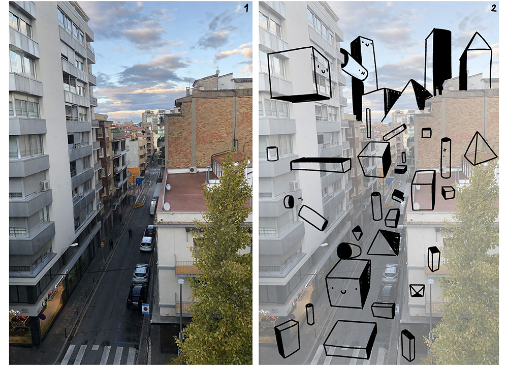
If you apply the concept of this exercise to the illustration that you want to make (I will use the tutorial illustration as an example) you will be able to create a base which you will be able to draw over very easily.
In the same way you just used the perspective of the photo as a reference to make the geometric figures, you can use the perspective of these reference figures to make even more detailed figures! Start simple and little by little you can increase the complexity.
I conclude this section by emphasizing how important it is to understand the object you are drawing, so using references is highly recommended.
3. Values (Foreground, Middle-Ground & Background)
The best way to make dynamic and in-depth compositions is by keeping the Foreground, Middle-Ground, and the Background in mind. As their names suggest, this is all about organizing the elements of your illustration by their distance from the viewpoint.
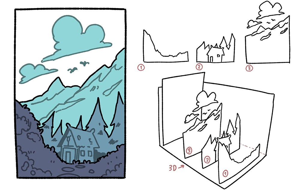
1 (foreground), 2 (middle-ground), and 3 (background)
Depending on the complexity of the image, you can have more than one Middle-Ground, as in the piece below:
Note: Separating the elements into different blocks will also help you when you get to coloring. The reason is that it helps you keep all the elements organized.
4. Conceptualizing the Scene (sketch)
Next, I will explain the way I sketch most of my drawings. Bear in mind that making an illustration is a very subjective thing and, in the end, we all have our own ways of working comfortably.
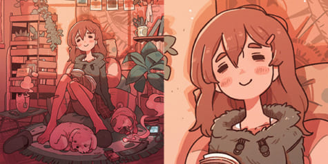
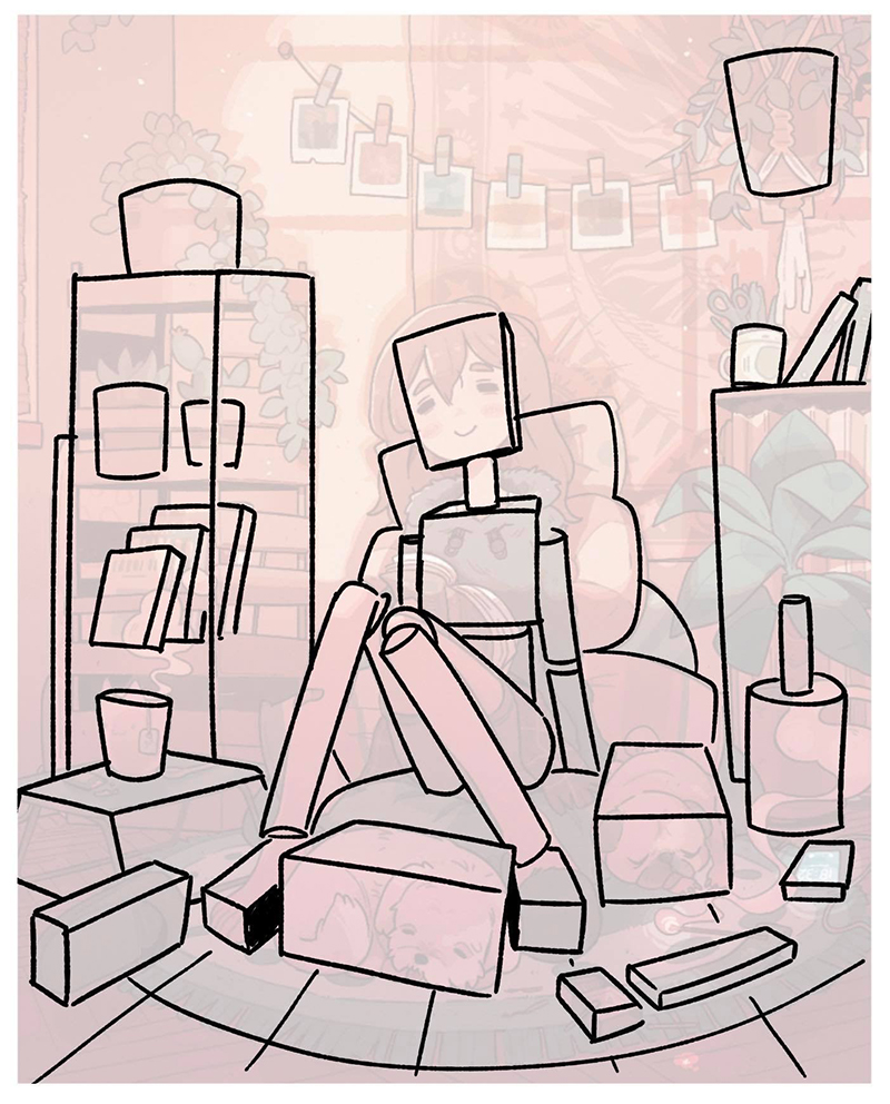
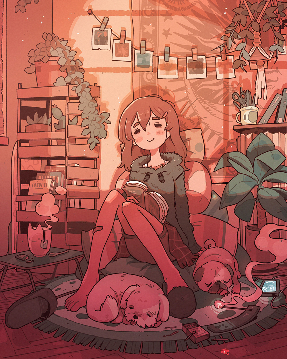
For this drawing, I knew that I wanted to show a girl resting with her animals in a very relaxed environment, so I started doodling until I found one that convinced me. At this point in the process, I don’t focus on the final image – I only think about the idea and how I want the objects to be distributed throughout the scene. I usually use an isometric perspective (especially for interiors) since it makes it a lot easier to locate elements within the image.
Once I finally have an idea that I like, I draw a rough sketch of what the result would look like in terms of composition. I think the trick here is to think about where you would position your camera if you wanted to take a photo of the scene. These rough sketches are only for you to figure out the composition of the piece, so don’t worry about making them clean and beautiful. Here, I try to apply what I explained in sections 2 and 3 in a more intuitive way.
When the rough sketch is done, I start to create the final sketch. Using the rough sketch I made earlier, and looking at references for objects I want to put in the scene, I draw the details and elements of the image so that everything I want to put in the illustration is clear. At this point, I also think about how the lighting will affect the final picture.
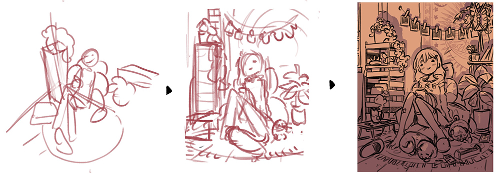
As I said before, the focal point of the image is the resting girl , so, to make her compositionally stand out, I need a lot of detail in all the elements that surround her, but also to leave a space between them so that her face can be quickly identified by the viewer. I have also taken advantage of the shadow in the image to “split” the drawing in two and help the viewer quickly focus on the girl’s face, since it is too easy for our eyes to fall to the lower area of the drawing. With this shadow, I am also able to create that relaxed atmosphere that I wanted for this image.
Finally, it is very important that, if there is something you’re not sure on how to draw, start with something very simple and gradually add complexity to it.
Note: For all my sketches in CSP I use a custom Turnip brush with pressure opacity, 36% pressure and 59% random.
5. Lineart
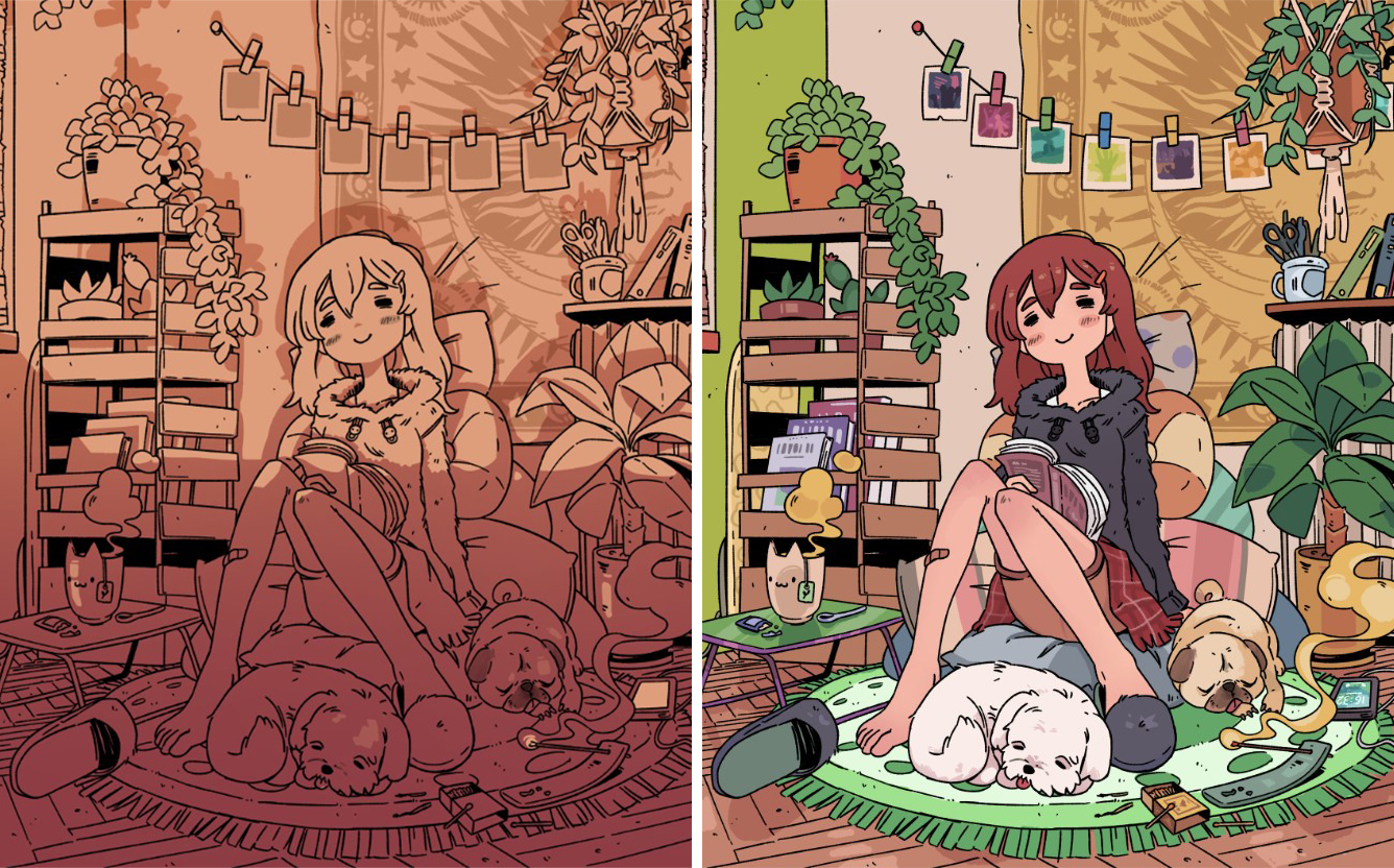
Once you have a defined sketch, doing the line art is very simple. It takes though a lot of patience (and references) to get it exactly how it is in your mind. This stage is very important to make your life easier in the coloring stage of the process. Personally, I do the lineart in blocks, separating each group of elements by where they are in image, as you can see below:
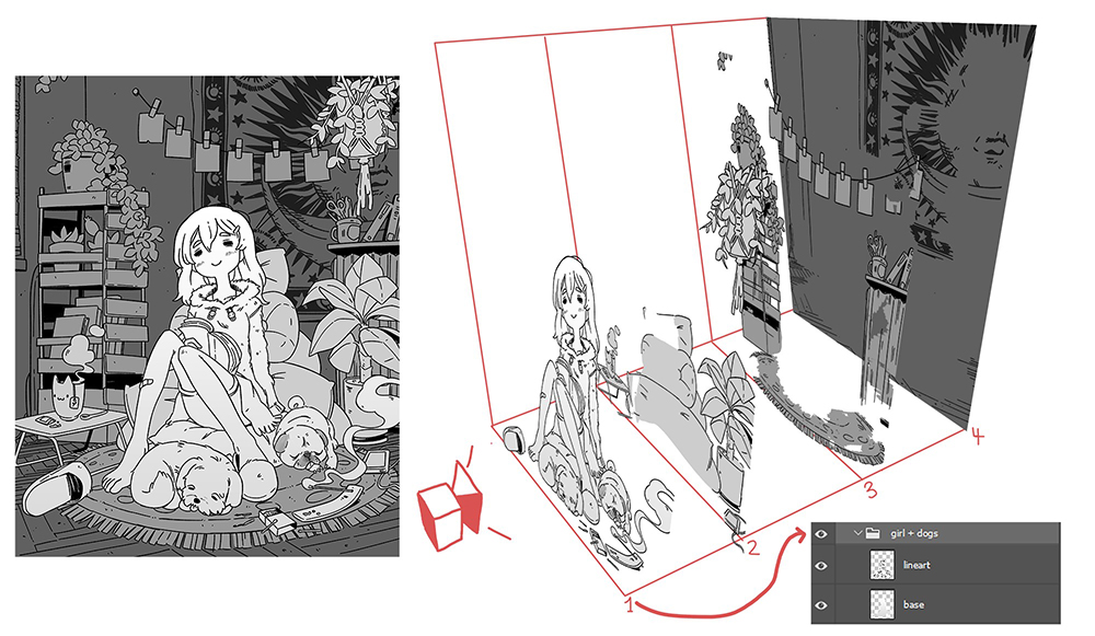
Each block has its own lineart and base color. In this case, they are divided into 4 different folders. Organizing the illustration in this way allows you to split the drawing into several sections, making the process of coloring and shading much easier.
Note: To make my lineart I use the same custom Saji brush that I used in the sketch, but this time I don’t use pressure opacity.
6. Coloring and Shading
Once I have finished my lineart, I export the document as a PSD file and start adding shadows. In this case, since there is only one light source, I created the shadows on a single layer with the Multiply blending mode.
Thanks to the fact that I split the lineart into sections in the previous section, the coloring goes much faster since I can focus on each section of the drawing separately. At this stage, I prefer to think about the specific colors of each individual element rather than about them as a group.
Shading (left) and colors (right)
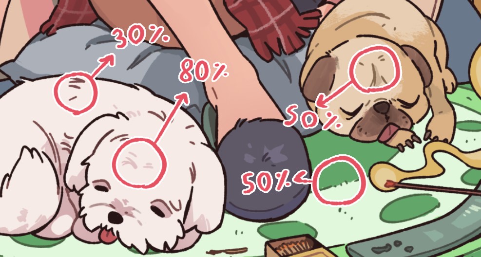
At this point, I like to paint the lineart inside the elements. This is a part of my personal style, but I think it helps me make the image less loaded, as these color lines are not too dark. This is the process that I follow:
- Lock the layer where the lineart is.
- Choose the main color within the line, or, if the color is too neutral, (as with this white dog), choose a similar but more saturated color (in this case, a very light red).
- Depending on the effect I want to achieve, I increase or decrease the brush’s opacity (in the screenshot below you can see the different opacities that I have used in each part).
When we bring the shading layer and base colors together, this is what the drawing looks like:
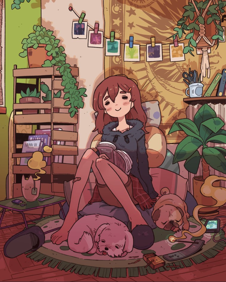
7. Finishing Touches
At this point, I just finish bringing everything I have so far together.
To get the sunset mood that I was looking for, I use PSD’s orange photo filter, along with a layer in the Overlay blending mode, where I highlight the warm tones of the image using a more yellow/orange hue for the light and a slightly lilac/reddish color for the shadows.
Note: In situations like this, using the Color Lookup adjustment layer can help a lot, as it includes several color presets that can greatly improve the final aspect of your artwork.
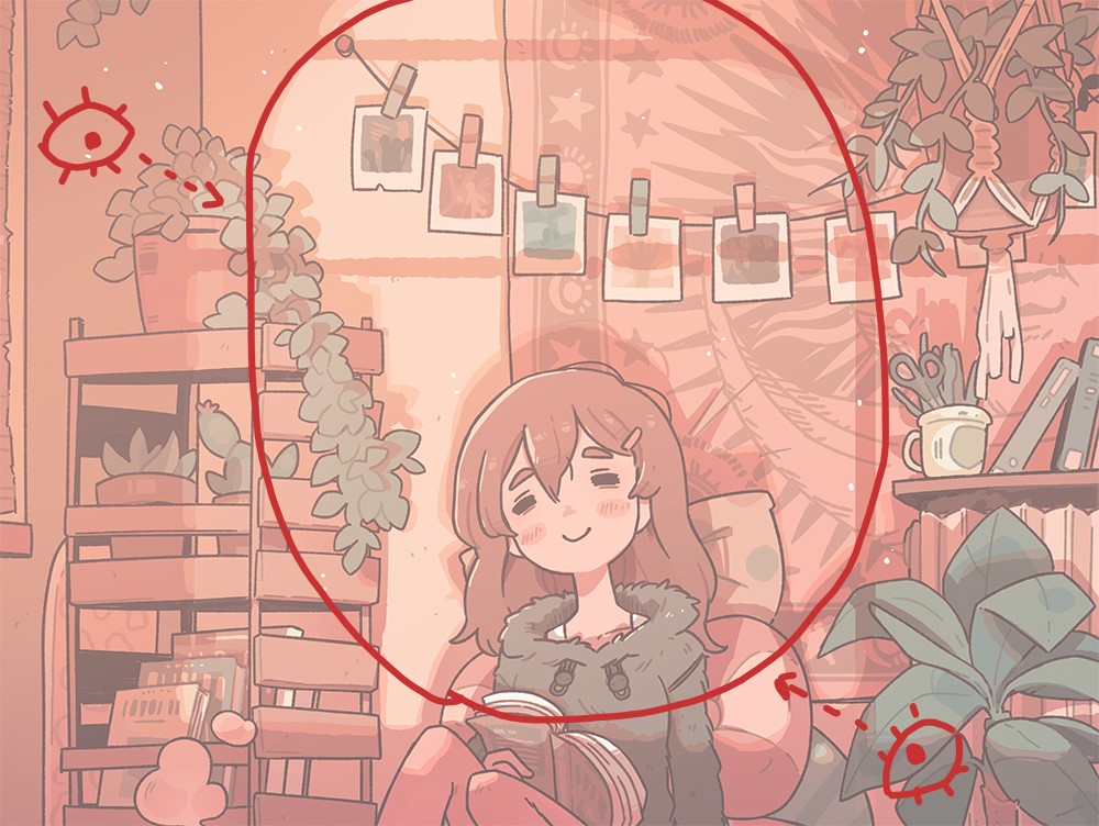
Once you have the colors and shading you were looking for, just add the final touches on the drawing. To further focus the image on the girl, I decided to make the shadow a bit wider (to make it look like part of a window). This way I can create a kind of circle around the girl, which directs the eyes to the center of the illustration.
Notes:
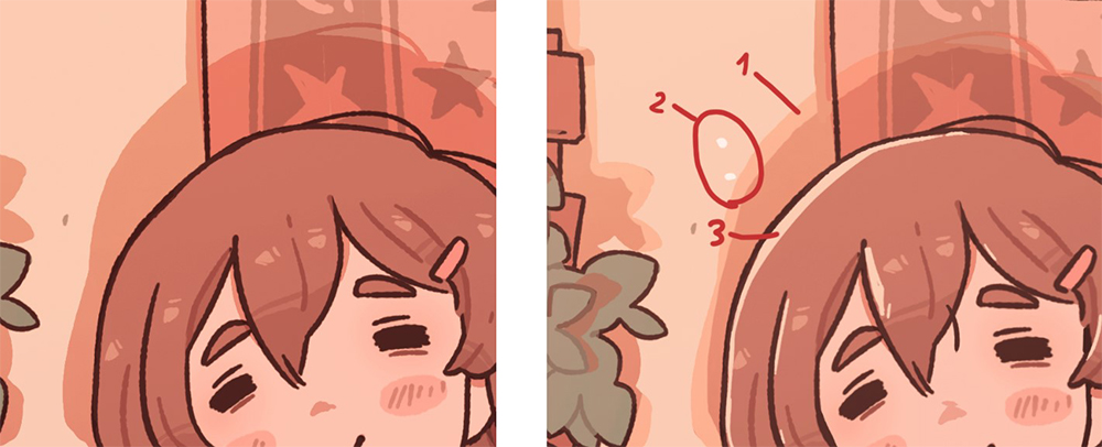
(1) I recommend going over the edges of the shadows with another Overlay layer where the light is stronger.
(2) When strong light enters a room, you can also see shiny specks of dust, like the ones I added all over the drawing.
(3) Adding flat colors of the main light color on specific surfaces (such as hair) makes them stand out more.
The drawing is complete!
8. Image Formats and Exporting
I usually work on my illustrations keeping the format of Instagram images in mind. Instagram allows the following three formats (and variations between them):
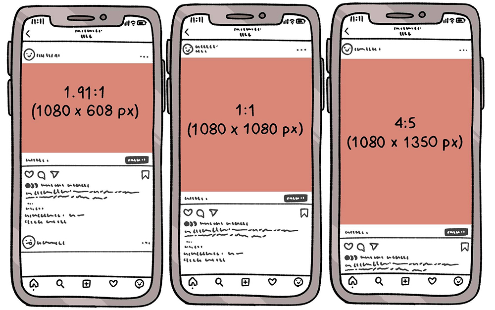
I choose one of these three formats and multiply it by 3. That is, if I want to go for a 1080 x 1080 px image, I’ll make my canvas 3240 x 3240 px, this way the resolution is much higher than a smaller illustration when I export it (as a PNG) to my phone to upload it to Instagram.
About the Author
Carles Dalmau is an illustrator, concept artist and comic artist born in Girona. He currently works freelance for various companies, indie games and individuals. He also posts his illustrations regularly to Instagram and has more than 310,000 followers.
Interested in concept art or what it takes to become a concept artist?
Check out the link below!