How to Create a Duotone Illustration with Print Shift Effect
Join illustrator Julio Robledo in this Duotone illustration tutorial using layer blending modes to digitally create a traditional print shifting effect.
In this tutorial, we will create an image using two colors called a duotone illustration. The two colors in a duotone illustration produce a third color when combined. We will learn how to digitally simulate a printed duotone work and explore its expressive possibilities.
Index
1. Draft
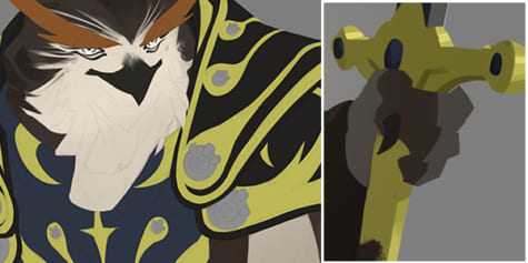
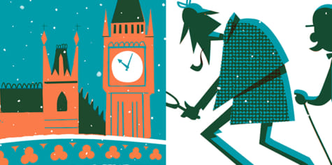
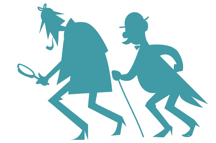
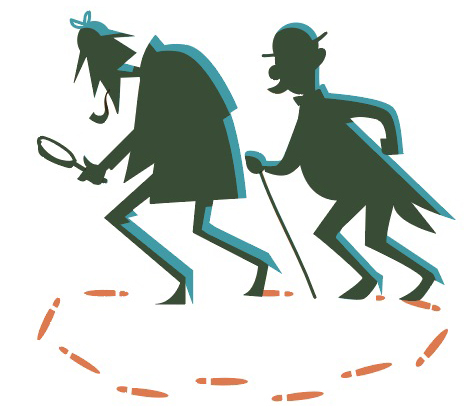
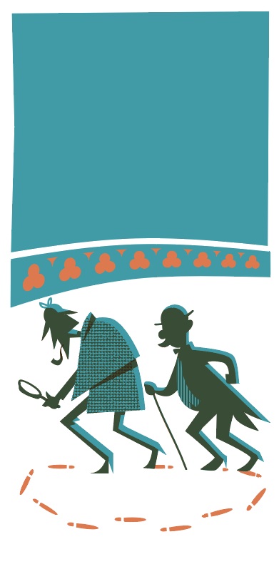
The illustration shows a well-known pair of detectives, looped along the trail of their own footsteps in the snow. Is there anything better than a gag? In the background, Big Ben and the Houses of Parliament set the scene in London. The idea of the snow came to me only after thinking that the characters would stand out better as silhouettes on a white background.
These were my initial sketches:
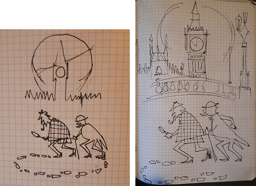
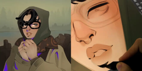
Then I made a sketch in the application that I used to create the illustration, Clip Studio Paint.
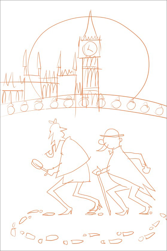
I chose a 20 x 40 cm canvas at 72 dpi resolution.
2. Choosing Colors
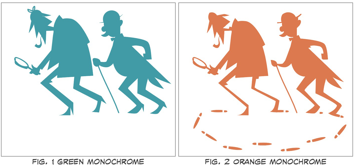
For traditionally printed duotone items such as posters or photographs, the printing process requires the creation of a printing plate for each ink color. These monochrome plates were traditionally used with the color black. For our digital duotone image, we will use solid black filled shapes to indicate where our chosen tone will be placed.
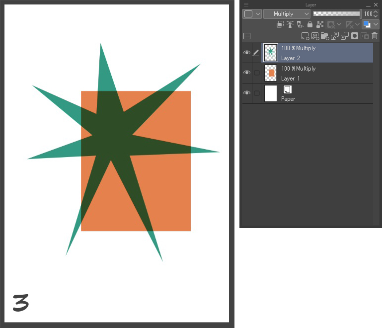
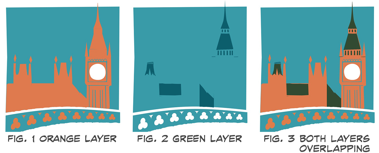
As an example, let’s imagine a simple print: A green star and an orange square. Fig. 1 is the monochrome plate of the star and Fig. 2, the monochrome plate of the square. If these were traditionally printed, the overlapping colors (inks) would generate a third color.
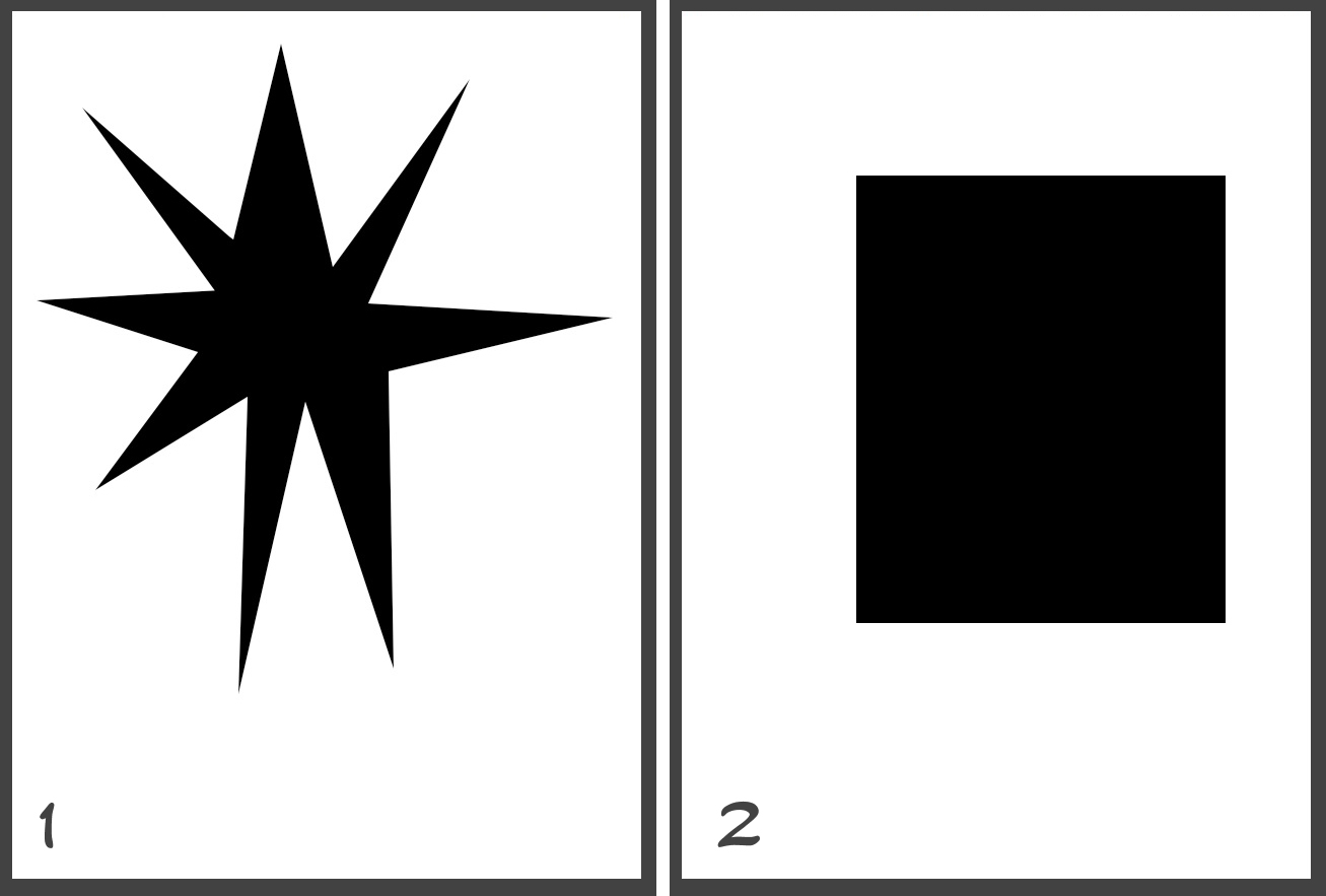
We can digitally mimic this printing process by keeping each color on a separate layer and then setting their Blending Mode to Multiply. (Fig. 3)
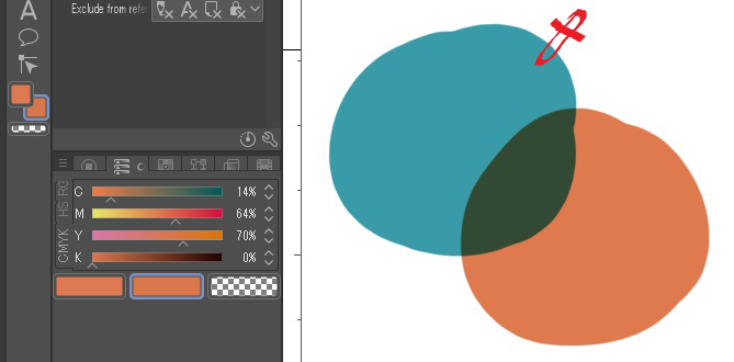
In software like Photoshop, the information for each color or ink would be put into a different channel. In this case, our duotone illustration will not necessarily be printed, so I will use two layers for each color set to Multiply. To choose the two colors, I tried a few different combinations seen in the image below. I then decided to go with the darker green and the orange-ish vermilion.
Red and green is a good choice, as their combination produces an almost black tone. If we think about the theory of complementary colors, according to the three colors, cyan, magenta, and yellow, magenta’s complementary color is cyan/blue. Other popular color combinations include cyan/blue and orange. Or red and blue, etc.
If we wanted to print the image, we could choose colors from a color library such as a Pantone color chart or define their CMYK or RGB values. The printing press would then work with two spot colors. Let me clarify that the CMYK or RGB values only serve as a guide since the printer produces the flat inks by mixing primary colors. To adjust the printed color to what we see on our screen, we need to perform printing tests. Furthermore, different paper types also change the ink’s color.
If you want to check the color of your document before printing, select CMYK or RGB from the View menu > Color Profile > Preview Settings and select a printing profile to see a preview of it.
Using the Eyedropper tool, you can see a CMYK or RGB value from Window > Color slider. Once our two colors are defined, we can easily choose them with the dropper, and paint with them.
Shortcut Settings: [ I ]
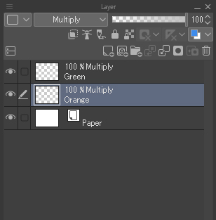
3. Create a Monotone Layer for Each Color
We will create a monochrome layer for each of the two colors. Using Layer > New raster layer, I create two new layers and set their blending mode to Multiply. In one layer, I paint with orange, and in the other, with green.
Creating the characters’ silhouette
To create the silhouette’s, we will use the curve ruler tool, one a separate vector layer. First, we’ll create the layer the Ruler > Curve ruler tool, select Cubic Bezier in the tool properties, and draw our shapes.
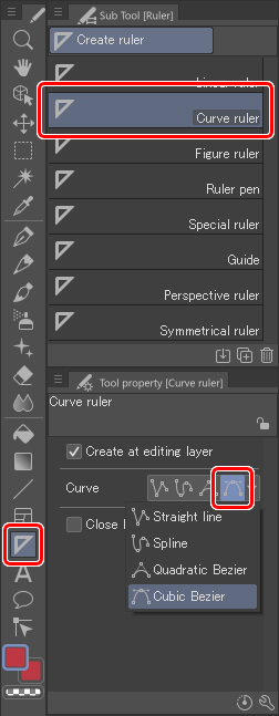
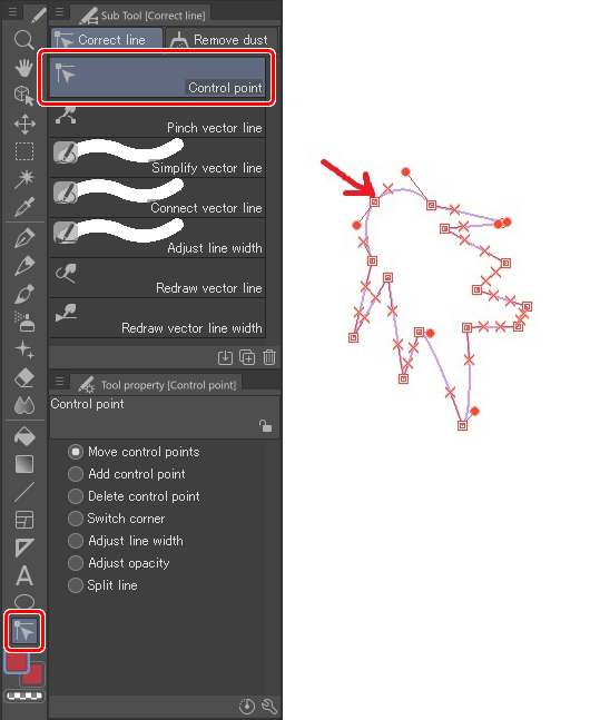
The Curve ruler lets us create closed vector shapes. To create a vector that joins two lines only requires the click of a mouse. To create a vector containing a curve, click and hold until the curve appears. Once we have our basic shape, we can further edit it using the Correct line > Control Point tool.
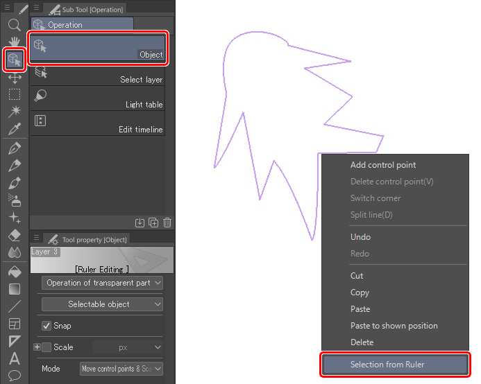
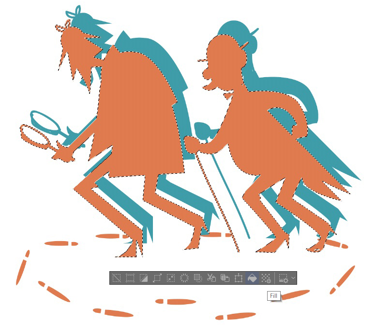
Using the Object tool, select the new shape, and create a selection area by right-clicking and choosing Selection from ruler. A dotted line will then surround the selection.
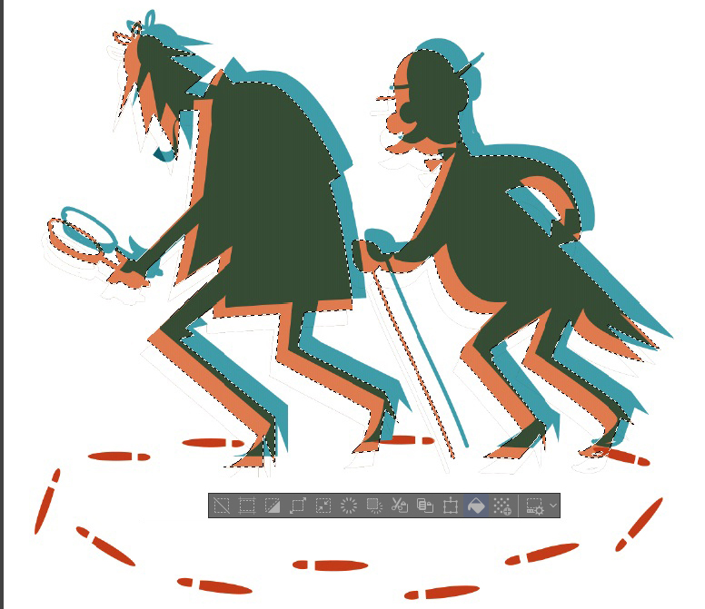
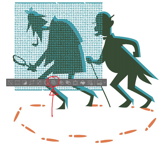
On a new raster layer, fill the selection using the Fill tool. This is how I painted the green layer.
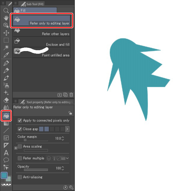
This is the finished silhouette of the characters on the green layer.
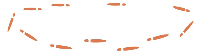
Then, I added the footprints. For these, I created one and duplicated and rotated them. These were all added to the orange layer.
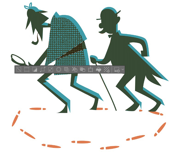
Now I will create a shadow for silhouettes which mimics the traditional print-shifting effect. The simplest way to do this is as follows. I duplicate the green layer (where the silhouettes are) and fill it with orange, as in the image below.
I then combine that layer with the orange one and set it to Multiply.
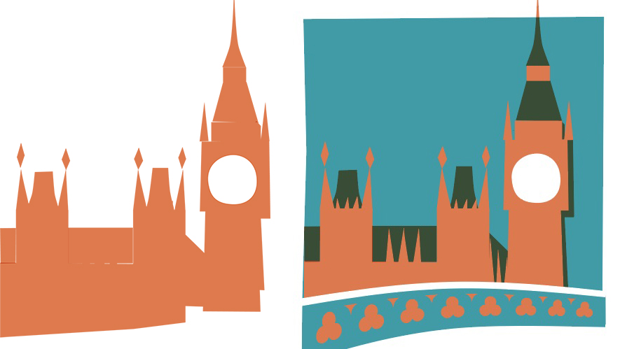
I then make some adjustments and delete what I do not need. The result is the blending of the visual overlapping of the two colors. Fig. 1 shows the green monochrome plate/layer, and Fig. 2 shows the orange monochrome plate/layer.
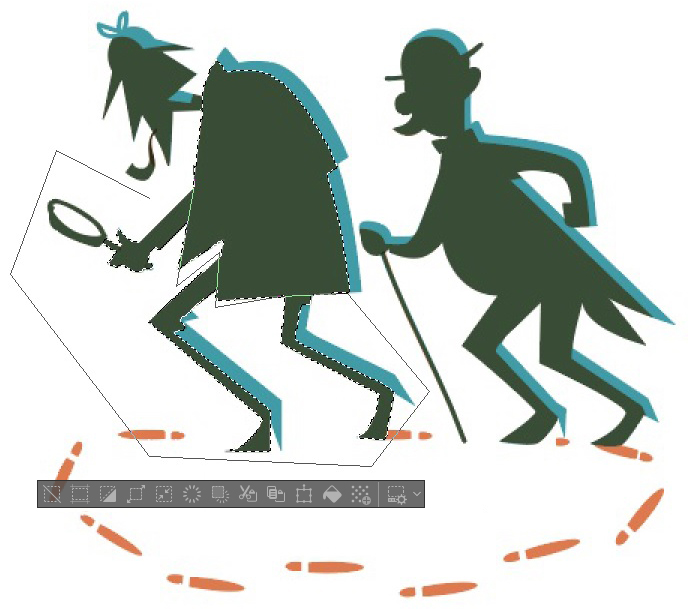
To add texture to the coat, select the area where the coat is using the Auto Select and Polyline tools.
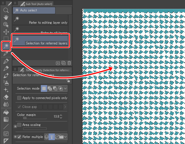
I have a folder for my favorite textures. I open one of them and erase the white color so that the texture is only green. To do that, I used Auto select with the Apply to connected pixels only option off. Doing this, if you click on any white point with the auto-select tool, you will select all the white in the image. Once selected, I just delete it.
Then, I select the whole image (Ctrl + A), copy it (Ctrl + C) and paste it (Ctrl + V). The software creates a new layer for it. Finally, I delete the external part of the previously selected area (the coat), pressing the icon shown below on the texture layer.
I will add a couple of shadows on the coat. In the orange layer, I select the area with the Polyline tool and fill it with orange using the Fill tool.
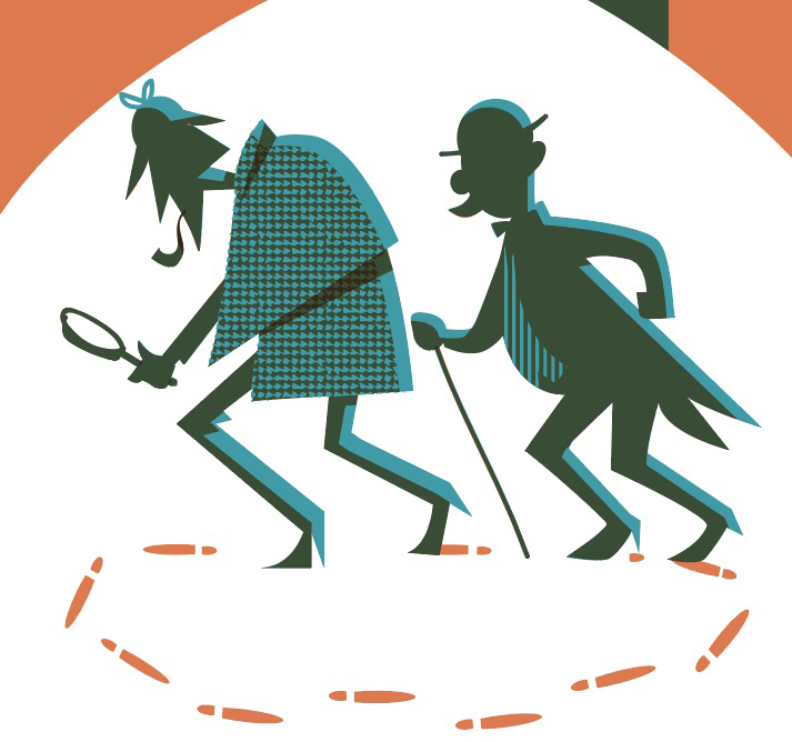
After following the same method with the assistant detective, the resulting image looks like this:
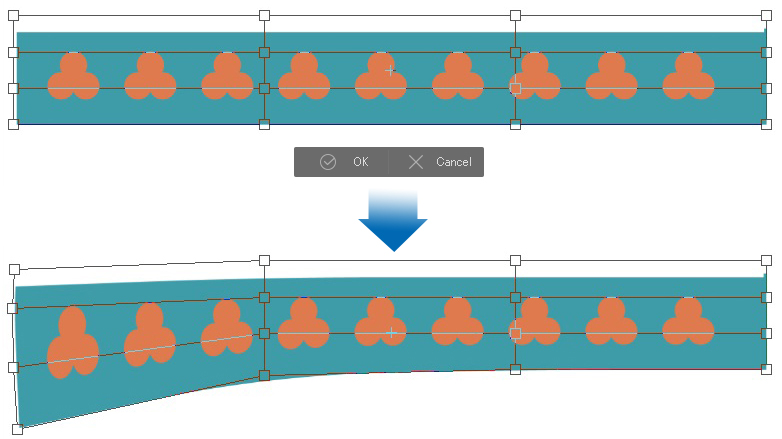
To build the bridge, I combine three circles and duplicate the shape. I then transform the final element to give it some perspective using Edit > Transform > Mesh Transformation.
I aimed for the following shape:
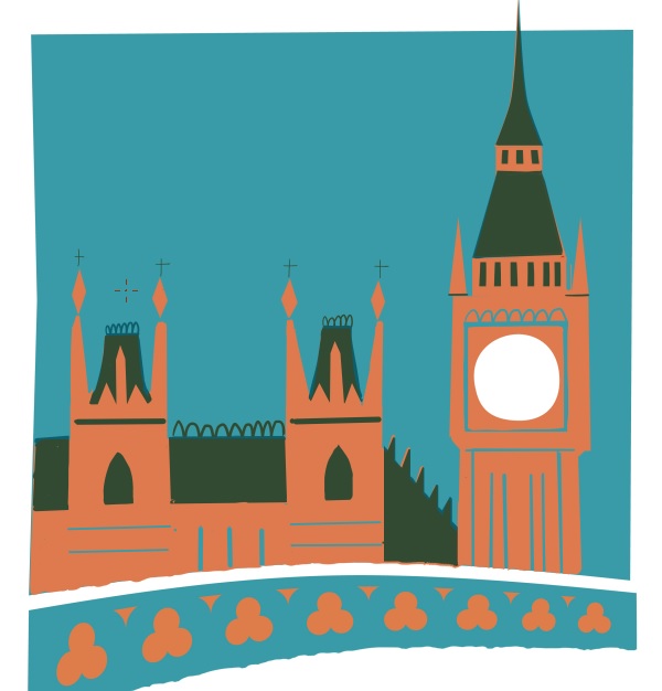
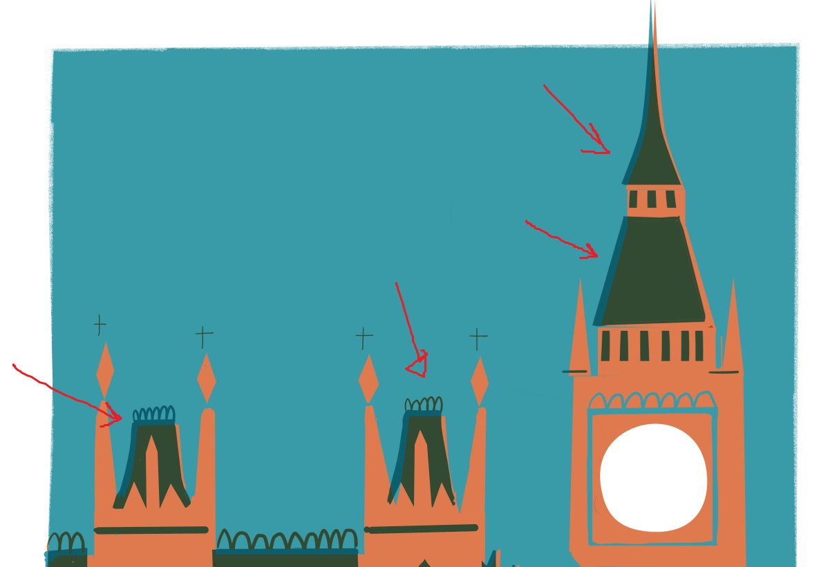
Then, I started working on the general shapes of the background. I quickly traced them with the Bezier ruler, remembering to paint each color on a separate layer. The dark areas are achieved by overlapping the colors. In the image on the left, you can see how the orange monochrome is being emphasized.
To paint in detail, I used G-Pen and Hard eraser, both at 100% opacity. The process is similar to creating a woodcut. You work separately on each color plate, and always think about the resulting combination of plates will look.
4. Effects
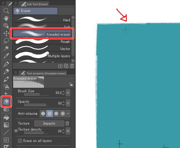
We can emulate a piece of paper by erasing the edges of the illustration with the Kneaded eraser.
We can simulate effects – or defects – typical of traditional printing, such as print shifting due to unaligned plates. This effect is easy to achieve; just push one of the layers over a bit using the Move tool.
I chose to leave the layers in place, as some of my colors were already applied out of place.
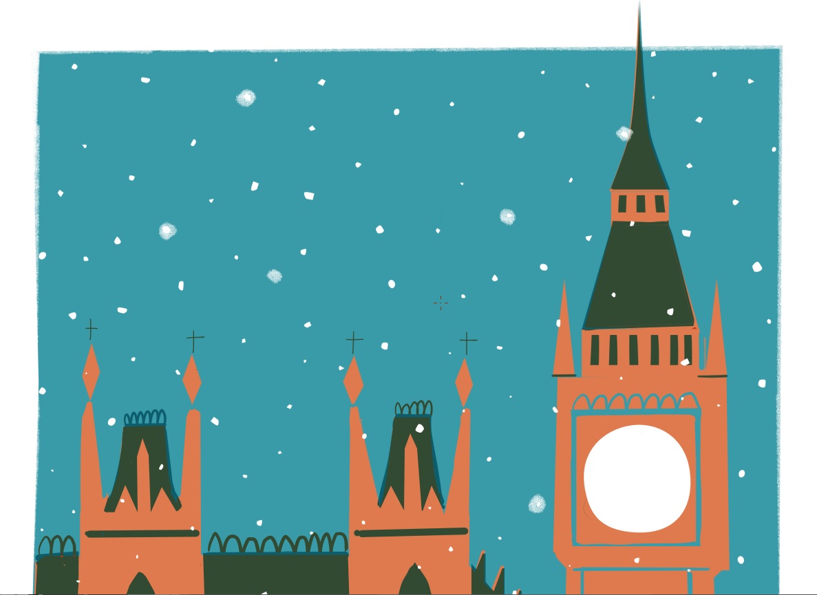
For the snow, I have created a new raster layer and painted the white snowflakes using the Pen and the Real Pencil tools. As the final artwork will be digital, I did not follow the only-two-layer rule. If we want to respect the rules of this printing game, we should create the flakes by erasing directly on the monochrome layers. If you want to try that, select all the flakes of the white layer (Layer palette > Ctrl+Click on the layer) and delete that selection from both monochrome color layers.
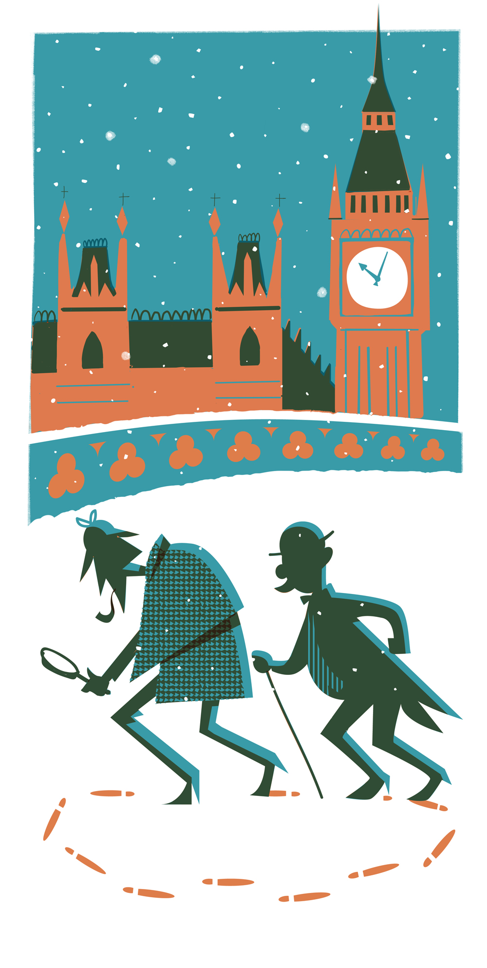
This is the result.
Thanks for your time.
Julio Robledo.
About the artist
Julio Robledo is a freelance illustrator and online art teacher.