Painting Texture: How to Render Metallic Surfaces for Illustrations & Game Art
By pushing artistic boundaries and focusing on creating texture, such as wood, metal, or skin, our art can become even more impressive and convincing. This article will explain in simple steps how to paint a useful texture that often appears in illustration and game art: metallic surfaces.
Fundamentals:
Advanced:
-
- Creating a non-shiny metal surface
- Adding rust
-
- What is a gradient map?
- Changing the color of the medallions
Fundamentals: Drawing the basic shapes
Let’s start by painting metal onto a simple shape. The examples in this tutorial are created with Clip Studio Paint and Photoshop. The steps and basic functions used can be repeated in most drawing software.
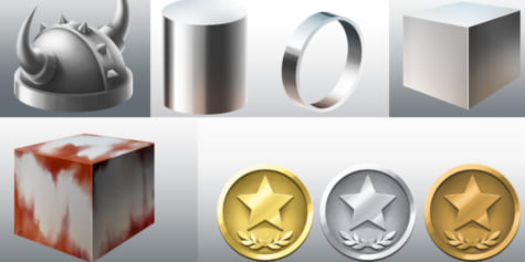
1. Cylinder: Curved Surface
Curved surfaces, like those found on a cylinder, are the most likely to show the characteristics of metal and the easiest shape to paint a metallic surface onto. Even simple painting methods such as cel-shading can be used to evoke metallic effects, so we’ll start by reviewing this relatively simple painting method first.
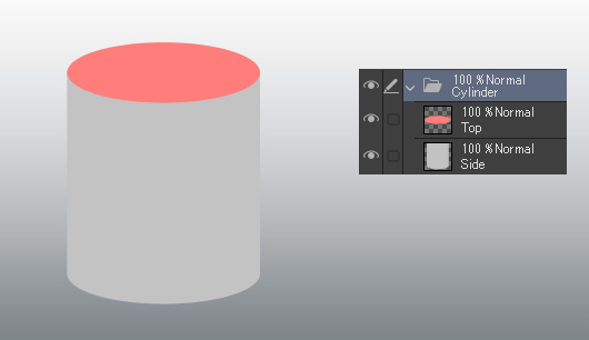
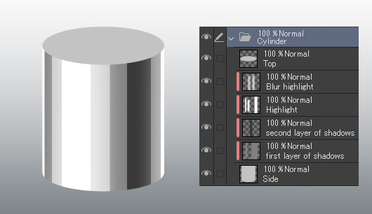
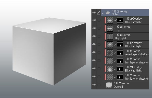
First, paint the curved surface with the base color of the metal. For this example, I imagined steel, so I used gray. Make separate layers for both the side and the top, so it’s easier to paint shadows and highlights later on.
In the image below, the color of the top has been changed to red to make viewing each of the sides easier.
Let’s paint the sides now.
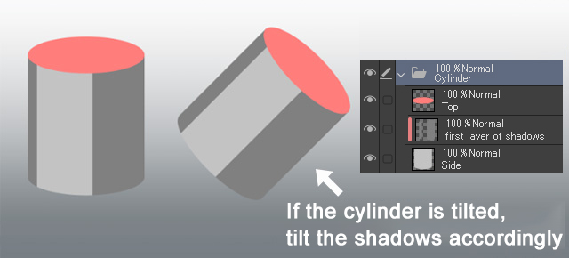
Create a new layer to use for the first layer of shadows and apply a somewhat darker color than the base color to the sides of the cylinder, as in the image below. Clip the layer to the base layer so that the painted shadows do not protrude past the painting on the base layer. Make sure your lines are parallel to the sides of the cylinder. If it is tilted, tilt the shadows accordingly. In this case, the light source is on the upper left side.
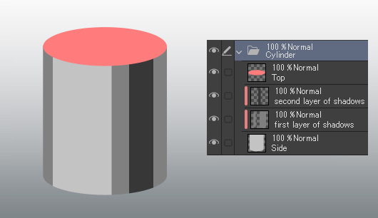
Next, create a second shadow layer and paint another shadow with a darker color, as in the image below.
Next, create a highlight layer and paint a highlight in white from the direction of the light source. Also, paint highlights on the edges of both sides in addition to the highlight from the direct light source. These represent ambient reflection from the surroundings.
As there is now a distinction between the top and the side surfaces of the cylinder, we changed the top from red to the same gray that was used for the base color of the metal.
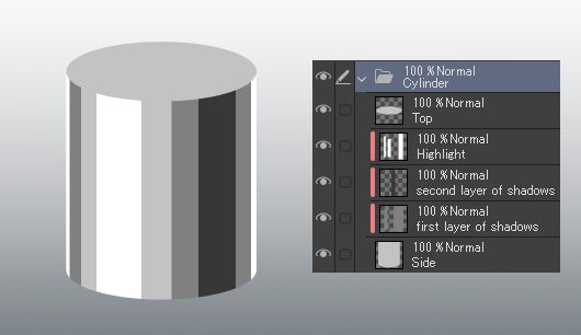
For the final step, add a blurred highlight to make it look more metallic.
With that, the cel-shading painting process of a curved surface is now complete. Next, we will review how to paint a flat surface for the top flat part of the cylinder.
The above painting method is simple but effective in creating a metallic appearance on a curved surface. Although processes for painting metal in anime sometimes differ due to the use of software such as AfterEffects, this is a similar finish to how metal armor and other items on anime characters look. That being said, this method is still a bit bare-bones, so let’s take a look at a slightly more elaborate metal painting method for the top part of the cylinder.
To achieve that game illustration feeling, we should blur the shadows and highlights. If we blur them farther away from the light source, rather than blurring them overall, it will make the surface appear even more metallic.
For an oil painting effect, use a tool similar to the watercolor brush that leaves thick brushstrokes behind in the artwork.
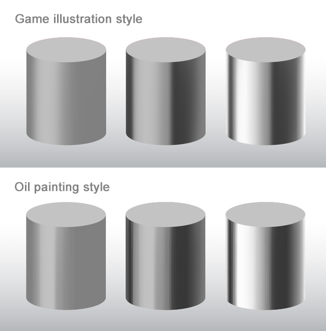
So, the main points when drawing a curved surface like a cylinder can be summarized as follows:
- Paint shadows and highlights parallel to the sides of the cylinder
- Add highlights to the edges to show the ambient light from the surroundings
- As you paint in shadows farther away from the main light source, blur them for maximum effect
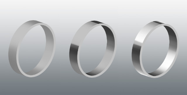
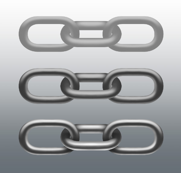
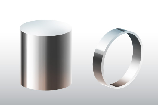
We can take this method and use it on objects other than cylinders such as rings, bracelets, chains, etc. Let’s apply what we have learned so far to other shapes such as rings and bracelets. After all, these are really just short cylindrical objects.
Paint the shadows and highlights on the inner and outer face of the ring parallel to its sides.
Like a cylinder, chains are also bent and curved. However, it is different than the round surface of the ring so light also hits it differently. Pay close attention to the direction of the shadows and highlights.
2. Cube (flat)
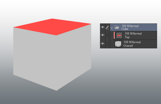
Next, let’s paint a cube. Previously, we looked at painting a curved surface; now, we will look at how to paint a metallic effect on a flat plane. First, just like with the curved surface, paint the base gray. Again, to make it easier to paint shadows and highlights on each side, the top side is on a separate layer. In the figure below, the color of the top has been changed to red for ease of understanding.
Create a shadow layer for each face of the cube and paint in the shadows like in the image below. Setting a layer mask for each face makes it easier to paint them. For cubes, painting them with an anime style is unexpectedly tricky, so we will paint them in a video game-like style instead. The light source is on the upper left, like with the cylinder.
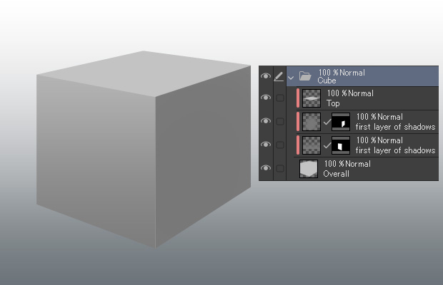
Next, paint in a darker shadow. Remember not to make the top and left sides too dark because the light source is on the top left. Then, create a second shadow layer for the right side of the cube and shade it in with an even darker color. Leave the bottom of the right side slightly brighter to represent the reflection coming up from the ground.
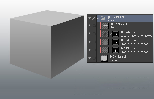
Add strong highlights to the edges and corners of the surface. This helps achieve a metallic look.
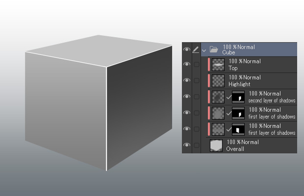
Finally, add some soft, blurred highlights, as in the image below. Again, draw highlights that are reflections from the surroundings. In this case, paint them up from the ground. This is a useful technique for expressing a metallic surface. Increasing contrast between adjacent surfaces also gives it a more metallic appearance.
Our cube is now complete. When using this method on a flat surface, it can often end up looking plastic instead of metallic or just altogether unconvincing. The same applies when painting cubes with an anime-style. So, let’s push the painting a little further to solidify the metallic finish on our cube.
Metal reflects its surroundings like a mirror. By drawing in reflections, you can express this quality of the metal. Reflections are challenging to draw. How sharply the surrounding objects are reflected depends on the processing of the metal. If you draw them in too sharp, it will look like the object is floating over the cube rather than being a reflection.
If what is being reflected isn’t an essential part of the illustration, it’s better to draw in simple reflections instead.
For planes, it’s best to add these kinds of reflections to the plane that has faint highlights and shadows along its surface. Here, only the highlights are added. Furthermore, reflecting surrounding objects also means reflecting the color of those objects. A useful technique is to lightly reflect those colors off of the surface closest to them.
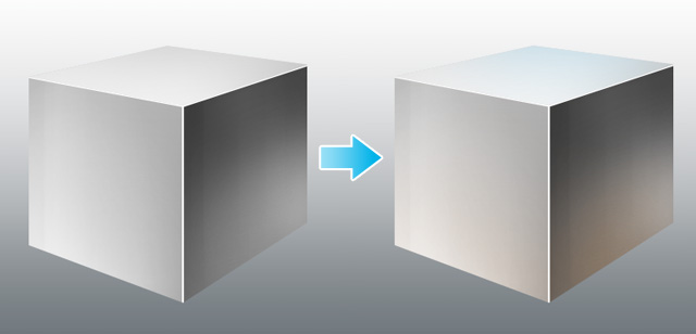
To sum up drawing planes:
- Strong highlights on the edges and corners of the surface
- Increasing contrast of light and dark between adjacent surfaces also gives it a stronger metallic appearance
- Create reflections of surrounding objects by lightly adding shadow on the surface
- Add color to express the reflection of color from surrounding objects
This is the completed result of applying this last part to a cylinder or ring.
3. Ball
Finally, let’s draw a sphere. It is quite challenging to properly express the reflections of a sphere, so for this tutorial, we will just paint a simple version instead. Moreover, the sphere doesn’t have multiple sides like a cylinder or a cube, which further simplifies the process.
First, paint the sphere normally. Then, add a subtle highlight on the bottom of the sphere to give it a more metallic appearance.
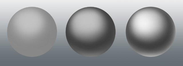
For a simple sphere, you can stop here. You can take it a step further by adding the reflection of the surrounding colors as we did with the cube.
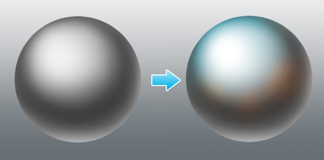
To further enhance the reflection of light, either hide your first layer of shadows or forgo it from the beginning, so there is an even sharper contrast between light and dark, making the sphere look even more metallic.
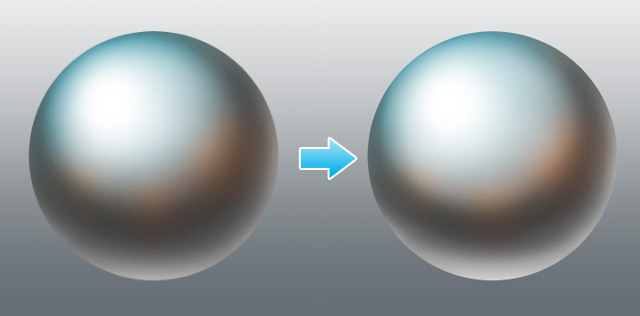
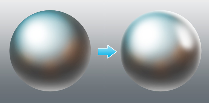
You can even go a step further and add a highlight from another light source.
So the points when drawing a sphere are as follows.
- Add a subtle highlight on the bottom of the sphere to give it a more metallic appearance
- Express its metallic appearance by reflecting the color of surrounding objects
- Sharpen the contrast between light and dark and add more light sources
Drawing dull, worn metal
So far, we’ve only looked at how to draw smooth, reflective metal surfaces, so now, let’s take a look at how to draw a dull metal surface.
Creating a non-shiny metal surface
Metal that is not shiny can be easily expressed by using a texture included in your drawing software.
1. Adding a texture image
First, let’s place a texture onto the canvas.
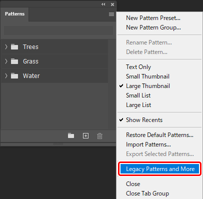
●For Photoshop
Select Window > Pattern to open the Pattern panel.
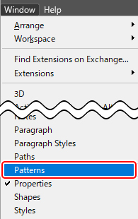
Click the menu of the Pattern panel and select Legacy Patterns and More to load additional pattern images.
Create a new layer and fill it with white. Select Layer Style > Pattern Overlay > Matte Texture to apply it to the layer. Then, open Layer Style > Pattern Overlay > Pattern and select the Texture group from Legacy Patterns and More group > Legacy Patterns group we just loaded.
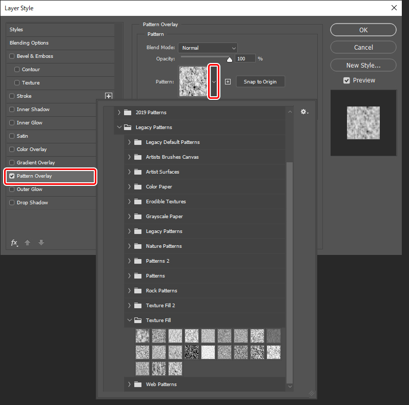
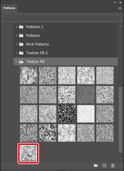
The Texture set is a set that contains texture patterns for rocks and trees. The pattern was created with the settings shown below.
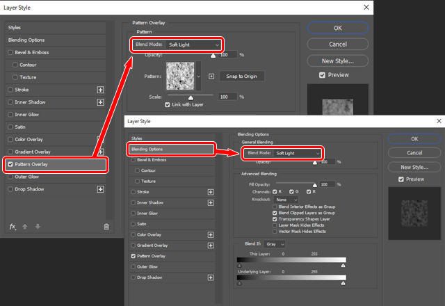
Set both the pattern overlay blending mode and the Layer effects blending mode (the layer panel blending mode) to Soft light.
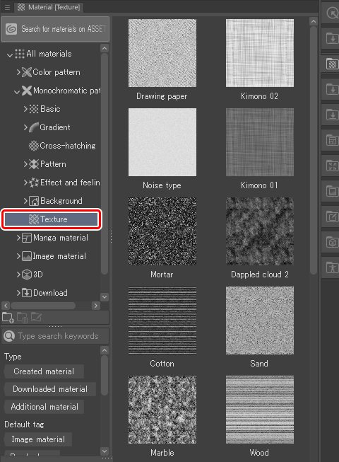
●For Clip Studio Paint
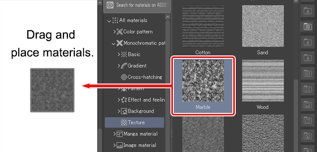
Click on Texture from Material palette > Monochromatic pattern.
Drag the desired texture image from the material palette onto the canvas and set its blending mode to Soft light. For the sake of this tutorial, I named the layer “Material texture.”
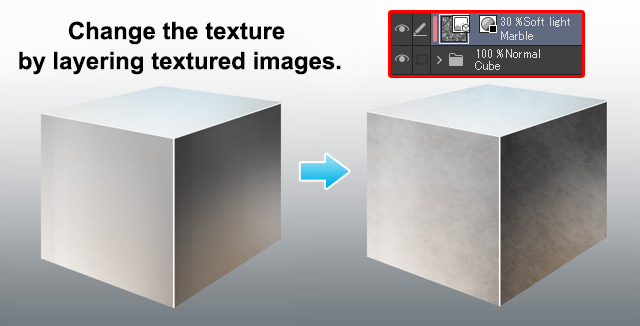
2. Clip the texture to the metal cube
From here, the process is the same for both software. Clip the “Material texture” layer to the layer showing the metallic cube. In the example, the texture image layer is clipped to a layer folder that contains all the layers of the metallic cube. Then, reduce the opacity of the material texture layer to about 10–30%, depending on how dull you want the metal to look.
3. Finishing touches
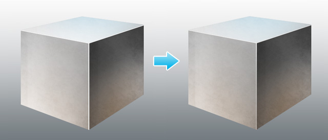
At this stage, the metal looks dull, but depending on the texture used, the pattern may look too noticeable or too flat. In that case, add a layer mask to the “Material texture” layer, and erase any unnecessary parts with a brush that has a blurred edge. Finally, slightly reduce the opacity of the metal highlights. This reduces its shine. That completes our simple method of rendering a metal surface with a dull finish.
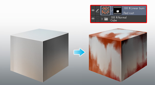
Adding rust
Metal rust is created by adding several different layers together. Let’s add rust to a cube as an example.
First, add a layer for drawing rust on top of the folder that contains the cube layers. We’ll call it Red rust. Next, you can clip to the cube folder, but we want to create a clipping layer on the Red rust layer itself, so instead, we will add a layer mask in the shape of the cube in the folder. Then, draw some rust on the Red rust layer and set the layer’s blending mode to Linear burn to match the shade of the shadows on the cube. Depending on the hue of the metal, you may find that another blending mode suits the image better.
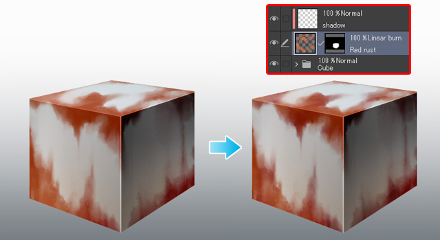
Next, create a layer and clip it to the “Red rust” layer below and add some darker areas to the rust.
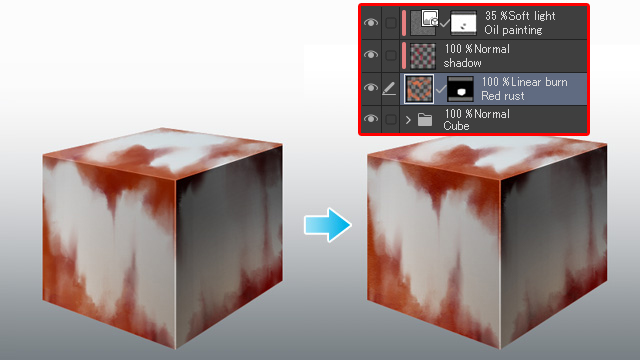
Finally, add a texture image to create the fine irregularities caused by erosion. I used the Oil paint texture from Clip Studio Paint. Change the blending mode of the texture to Soft light and lower the opacity. If the texture pattern is too noticeable, add a layer mask and adjust as needed. Our rusted metal cube is now complete!
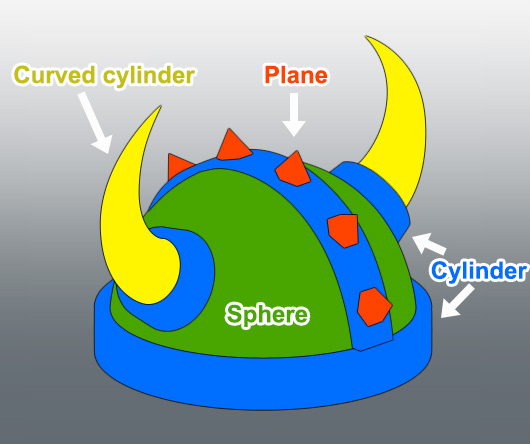
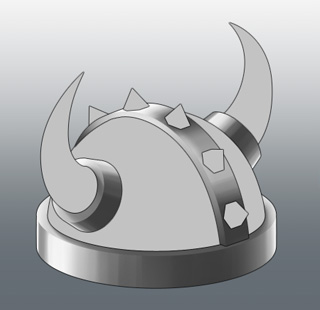
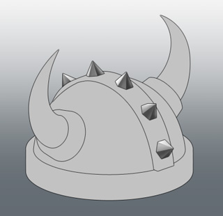
Let’s Practice: Fantasy Helmet
So, do you have the basics of painting metal down yet? Even with access to tutorials, it can be challenging to put these methods into practice. So let’s use these basic shapes to draw something complex.
I’ve drawn a medieval fantasy helmet that combines simple shapes. First, I split each part into separate base layers. We prepared the below image as a reference to show how we divided our base layers, but there is no problem if you do this step on your own.
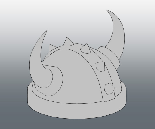
It may not look like it at first, but this complex shape is made up of a combination of simple shapes we discussed earlier in the tutorial.
First, let’s paint the part that covers the head, which occupies most of the helmet. You can apply the sphere shape here.
For this example, there are two light sources, one on the upper left towards the back and one on the right. Keeping a basic idea of the light sources in mind, we paint in the shadows.
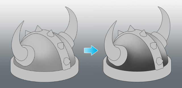
With those finished, we then add highlights and some sharper shadows created by light sources, and we can move onto the next part.
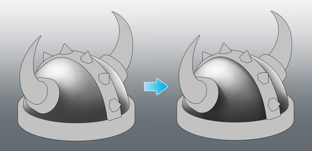
Next, let’s paint the places around the base of the horns and the rim of the helmet where the cylinder painting method can be applied. As before, keep in mind where the light sources are while painting. However, thinking about it too much can cause unbalanced light and shadow, which lowers the image’s three-dimensional appearance, so just loosely keep it in mind when thinking about how the shadows and highlights are cast.
Add highlights after finishing the shadows. For these parts, they will look better with a sharp, clear contrast between light and shadow.
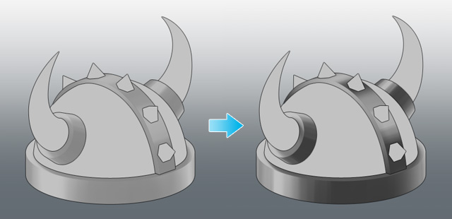
Let’s move onto the horns. Despite the curve, they can also be painted using the cylinder method.
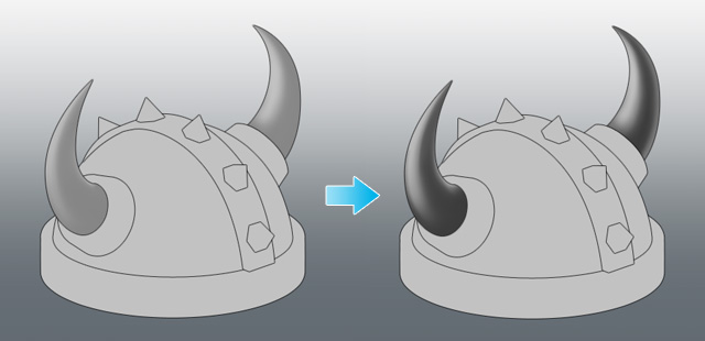
There are some challenging areas to create shadow as the shape is curved and tapered, but once they are finished, the highlights are then added, and the horns are now complete.
Finally, let’s paint the spikes using the flat plane painting method. Apply two separate planes of shadow that have a difference in contrast.
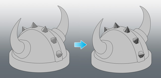
Then add highlights to complete each spike.
Now, look at the image as a whole and make any adjustments needed. I felt that the spikes needed some more brightness, so I added more highlights and shadows, as in the image below.
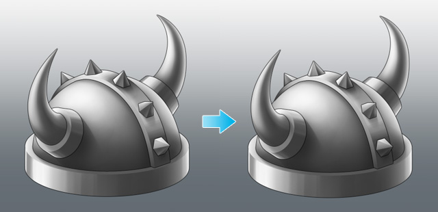
The helmet is now complete.
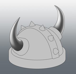
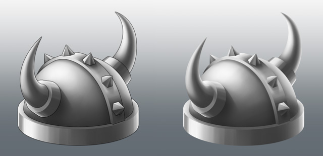
By the way, you can remove the line-work, and your image will look like the image below. I think that beginners will want to focus on the line drawing, but I recommend removing them because illustrations without lines help make the image feel even more three-dimensional.
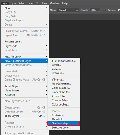
Bonus: Change your metal type with a gradient map!
Finally, as a little extra, I want to talk about a function called a gradient map that can be used in both Photoshop and Clip Studio Paint. This function allows you to easily create gold, silver, and bronze medallions from a black and white illustration.
What is a gradient map?
A gradient map is a special kind of layer that assigns a color according to brightness.
From here, I will explain the process of using a gradient map using Photoshop. Let’s start with a simple example. Create a new canvas in Photoshop and fill it with a black and white gradient.

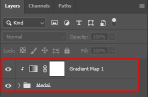
Next, we’ll create a gradient map. Select Layer menu> New Correction Layer > Gradient Map to create a gradient map layer.
The layer comes with an attached mask that hides half the layer, which shows us how the effect works.
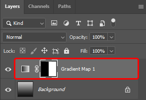
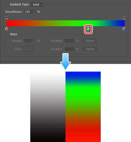
We will set up the gradation map from the Attributes panel. Select the gradient map layer and click the gradient displayed in the Attributes panel to show the Gradient editor.
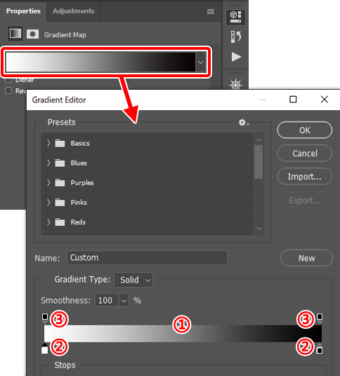
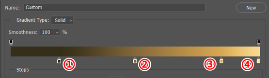
In the Gradient Editor is the color bar (1) containing the colors of the set gradient. (2) contains nodes that set the gradient color, and (3) includes nodes that set the opacity of the color. Click one of the nodes in (2) and click (4) [Color] to display the Color Picker, where you can select the color to set for the node.
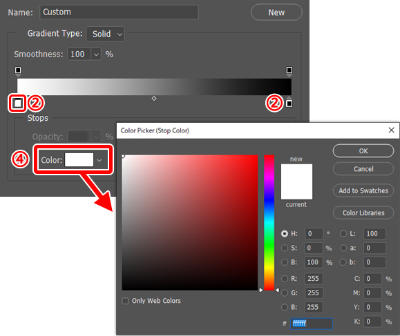
For now, let’s set the left node (2) to red and the right (2) node to blue. You can see in the image below that this changes each part of the gradient on the canvas to the corresponding colors.
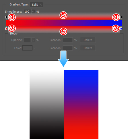
As you may have noticed with the gradient settings, the left-hand color (red) is replacing the dark colors, and the right-hand color (blue) is replacing the light colors. The (2) and (3) nodes can be added by clicking on the area of (5) and can be moved by dragging. You can also erase the node by dragging it outside the (5) area. For example, you can change the image by adding another node on (2) and setting its color to green.
By changing the color of the lighter part of the gradation to green, the light gray part of the black and white image has now also changed.
Changing the color of the medallions
Now, let’s change the black and white medallions to gold and silver bronze using a gradation map. First, prepare a medallion drawn in black and white.

From here, we will use the gradient map. Create a gradient map layer and clip it to the folder that contains all the layers of the medallions.
After that, set the gradient colors and create gold, silver, and copper colors. The gradient for each color was created with the settings shown below. Depending on the black and white of the medallions and the exact positions of the node, gradient results may vary but, the below image is still a good reference guide for the colors.
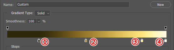
Gold gradient
(1) R:51 G:42 B:17 / position: 20%
(2) R:153 G:126 B:50 / position: 50%
(3) R:255 G:230 B:130 / position: 85%
(4) R:255 G:249 B:227 / position 100%
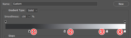
Silver gradient
(1) R:48 G:49 B:51 / position: 20%
(2) R:121 G:124 B:128 / position: 50%
(3) R:210 G:213 B:217 / position: 85%
(4) R:255 G:255 B255 / position: 100%
Copper gradient
(1) R:51 G:40 B:20 / position: 20%
(2) R:128 G:99 B:51 / position: 50%
(3) R:217 G:169 B:87 / position: 85%
(4) R:255 G:218 B:153 / position: 100%
The result of applying this gradation map setting to each of the three black and white medallions is as shown below. This allowed us to change the color of the medallions to gold, silver, and bronze medallions without repainting.

The color settings of the gradient map can also be used as normal gradients. Saving your favorite gradient settings may make the gradient map even more useful. Also, many gradient color palettes are published as free materials. However, their usage may differ, so be sure to check any information posted along with them.
I mainly create objects and items for smartphone games, such as buildings. I also create manga and games as a part of the fanzine group “orange girl.”
Twitter: twitter.com/yuzuki