Simply Well Drawn Part 3: Coloring Your Drawing

A guide on how to choose good color combinations and tips for digital coloring. Learn how different colors create different moods for your illustration!
Read part 1 here!
Read part 2 here!
In this third part of my tutorial series, we cover the topic of color choice and digital coloring.
Drawing digitally offers infinite possibilities when it comes to choosing color. That sounds great, doesn’t it? Instead of buying individual colors, you have (almost) all possible colors available at once! However, millions of colors can be an intimidating thing, since you might be overwhelmed with what color to choose for your particular image.
As mentioned in part 1, the cover illustration I am working on is commissioned work, which means that my client gets to choose from different options.
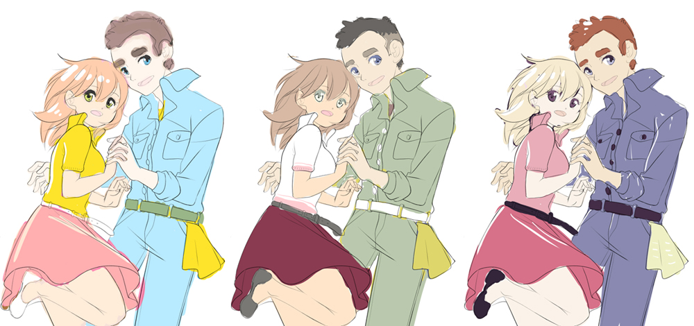
Version 1: When thinking about “manga”, many people assume it means bright colors, right? Here I pretty much pushed it to the extreme with the color saturation …
Version 2: This is quite the opposite of version 1. The colors are less saturated and the mood is, therefore “softer”.
Version 3: This option is a mix of strong and pastel colors. Personally, I like this one the best!
And then the waiting begins. Which version will the client choose? You never really know what to expect when you open your e-mail …
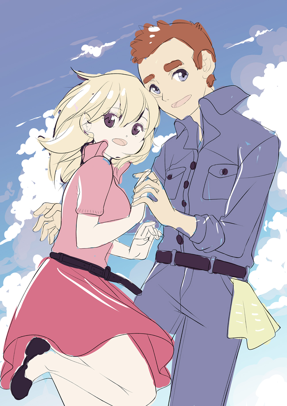
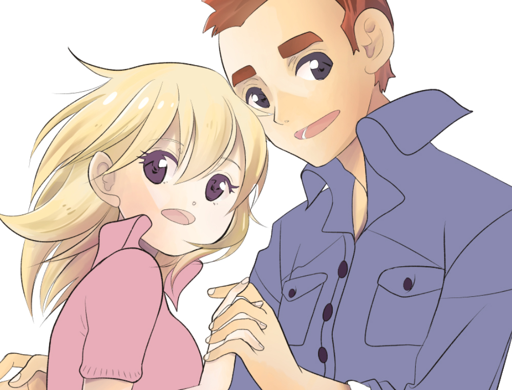
The client chose version 3 (here with a rough background)! Let’s briefly analyze why this was also my favorite:
1) I’m a big fan of complementary colors: Blue-Orange, Yellow-Violet, Pink-Blue.
2) The saturated eye colors seem especially bright and beautiful on the lighter faces (especially for the girl).
3) The high portion of red in this picture looks good and is easy to recognize from a distance (it is a signal color!)
Always remember the desired mood of your illustration. The color blue can convey freshness or lightness. Red, on the other hand, often stands for power or passion. The psychology involved when perceiving colors always plays an important part in the selection.

In this step, I pick my final colors with the digital eyedropper tool and create small color samples on the canvas, which are called “swatches”. If I were painting with oil paint, these would be little mounts of color on my mixing palette, haha.
By strictly deciding on the colors like this, I make sure that I never lose sight of my primary colors (because there are millions!). I think this type of color palette is very helpful and I would recommend it to anyone who has trouble with coloring.
Looking closely, you will see that the vertically aligned swatches don’t change too much. This helps to keep the picture harmonious. Furthermore, I define light and shadow variations of each individual color, because this is where I start working things out:
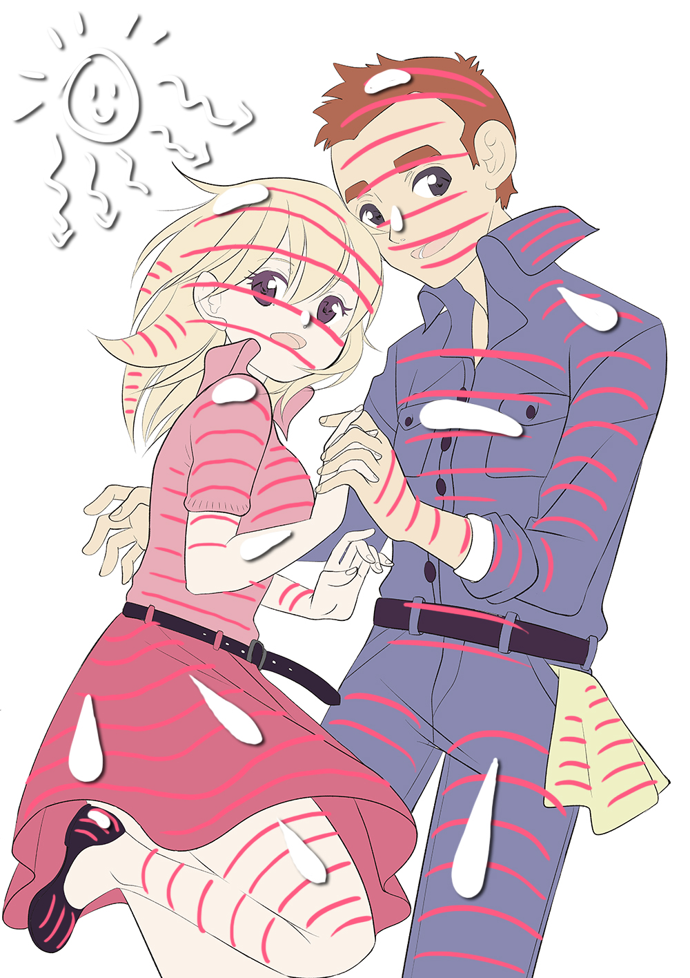
No, no, Inga did not go crazy. I’ll tell you what’s up with the snow-like blobs and the lines. Before you start to randomly draw shadows, make sure to remember the following:
- A) When you color humans, think of them as three-dimensional objects. Imagine wrapping pink yarn around our two lovers and paying attention to how it is placed around the body, depending on the shapes. The head is a sphere, legs are cylinders, etc. …
Make sure to base your placement of shadows on this.
- B) There should always be one main light source, like a “sun”. What seems like random white blobs here is meant to show you the areas where the light hits first. As you will see, I do not always strictly follow these rules, but if you are uncertain, where to place reflections and illuminated areas, this can be a good approach.
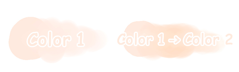
For coloring, I like to use the watercolor tools in my drawing programs. It is very close to how I work with traditional watercolor.
With these types of watercolor tools, it is easy to create both hard and soft transitions, depending on how hard you press with the pen.
This way you work through the piece bit by bit. Personally, I always start by drawing the skin tones. In this case, the places in which the sunlight hits show a higher saturation (for example on the cheek of the girl), while areas in the shadow are colored more greyish (like the neck of the girl.)
Some artists only use a single layer for the entire coloration, I, on the other hand, use separate layers for everything (sometimes more than 80 layers …). To better keep track of your layers, it is good practice to name them.
It is important to keep calm and don’t panic when considering the amount of work that needs to be done, and don’t despair when something doesn’t immediately turn out perfect.
Make sure to take breaks and ask others for advice if you’re stuck. Especially as a hobbyist, drawing should not make you suffer. There is no shame in asking for help.
After about two days of work, my picture looks like this:
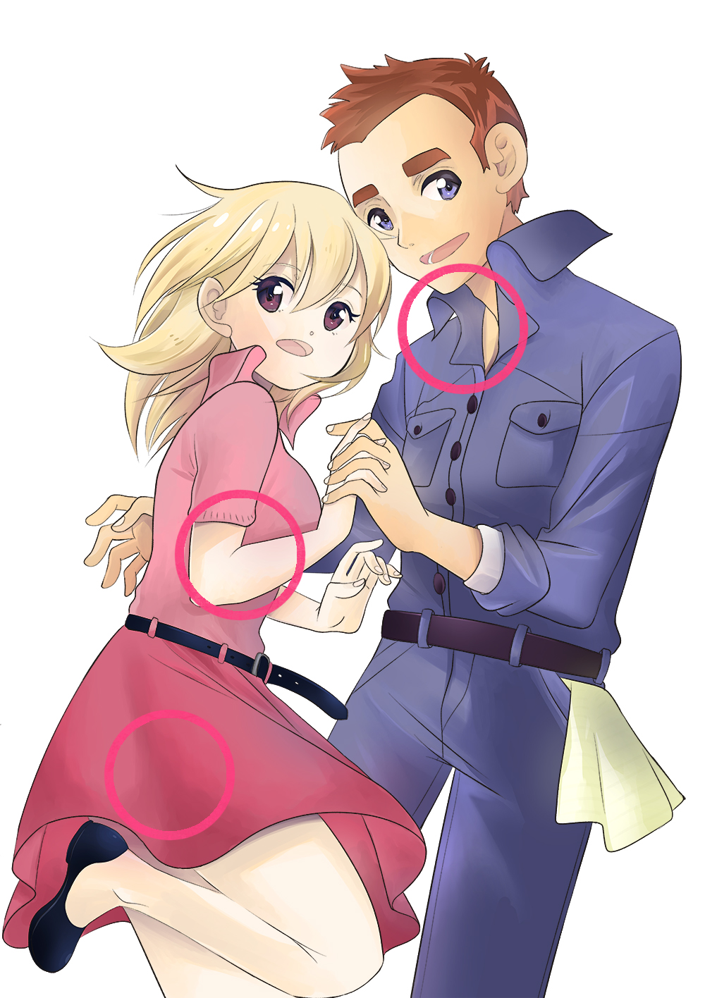
Let’s take a look at some of the details of the coloration:
1) Looking closely, you notice on the boy’s neck that I’ve used some of his skin color in the collar of his shirt as well. Bright areas usually scatter their colors onto the surrounding objects. At the girl’s ankles, you can see for example the pink reflection of her skirt.
2) I used both soft and hard shadows on the girl’s arm. On her legs, I tried to diversify the color of the shadows as well. The way you draw shadows can push the image quality a lot and also guide the eyes of the viewer. Personally, I would like to improve more in this area!
3) Especially on the skirt, you can see that not every fold needs to be outlined. Soft fabric often looks better with folds that are just painted.
Coloring is a wide and fascinating thing to do, especially when you start to deal with light and shadow. I hope you enjoyed this little guide! In the last part of my SWD tutorial series, we talk about the design of the background and its clouds. I will also share some cool tricks with you. See you!
Inga Steinmetz lives and works in Berlin. She was born in the former GDR and currently lives near the East Side Gallery. At the age of fifteen, she began writing stories and drawing comics.