Judges
Watch the video below for the judges’ overall comments on this year’s contest.

Javier Fernández
https://www.instagram.com/javifernandez_comic/
Shuichi Hiratsuka
Youhei Sadoshima
I also thought about what these artists would need to do if they wanted to become professionals and gain popularity. What's important when you're new, is knowing what emotions you want to convey. To do so, you also need to think about other emotions surrounding the main point. A lot of newcomers think about what kind of events they want in the story. But these events exist to draw out emotions in a protagonist. So I want you to decide what emotions you want to convey and how your characters will express them, either before you or as you are beginning to draw.
I think a good work is one in which the reader can see that you purposefully decided to draw a specific frame or expression. All of the works have very attractive designs and stories, but many were unclear in terms of what emotions they wanted to convey. I suggest that you practice drawing the emotions you want to convey and posting on fast-paced social media sites like Twitter and Instagram. You see if your work conveys the right emotions, by seeing how your followers react to it.
It was a great honor to read everyone’s artworks from all around the world. Thank you.
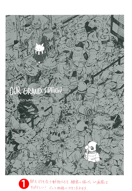
Grand Prize (1 Winner)
Cash prize: US$3,300, Wacom Cintiq 16, Clip Studio Paint EX
Our Grand Station
Artist: Caoqian (United States of America)
School: The School of the Art Institute of Chicago
Language: English
Shuichi Hiratsuka
Youhei Sadoshima
Shueisha
KADOKAWA
Solmare Publishing (NTT Solmare Corp.)
J-POP Manga
Comic Category (1 winner)
Cash prize: US$2,200, Wacom Cintiq 16, Clip Studio Paint EX
Eda & Roach
Artist: Madita Schwenke (Germany)
School: Hamburg University of Applied Sciences
Language: English
Javier Fernández
Youhei Sadoshima
Wacom
Amutus Corporation
Glénat Editions SA
Comic Category (5 winners)
Clip Studio Paint EX
Wacom
KADOKAWA
BookLive Co., Ltd.
J-POP Manga
Winner's Comment
My first thoughts after the contest were that I have a lot to improve on. This isn't surprising as I've only been drawing comics for a year, but still, I want to be able to draw more easy-to-read comics.
This was my first attempt at an American comic style, but even while I struggled with the format, I think I was able to finish something. I'd like to continue challenging myself and keep on improving.
Advice from Professionals
Detailed advice from the editorial team at Solmare (NTT Solmare, Inc.).
Read advice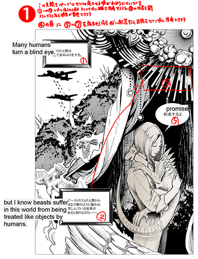
Shuichi Hiratsuka
Shueisha
Solmare Publishing (NTT Solmare Corp.)
J-POP Manga
Machiko Satonaka ,Manga artist, President of Manga Japan, Inc./President of the Japan Cartoonists Association
Youhei Sadoshima
Shueisha
BookLive Co., Ltd.
Ko-fi
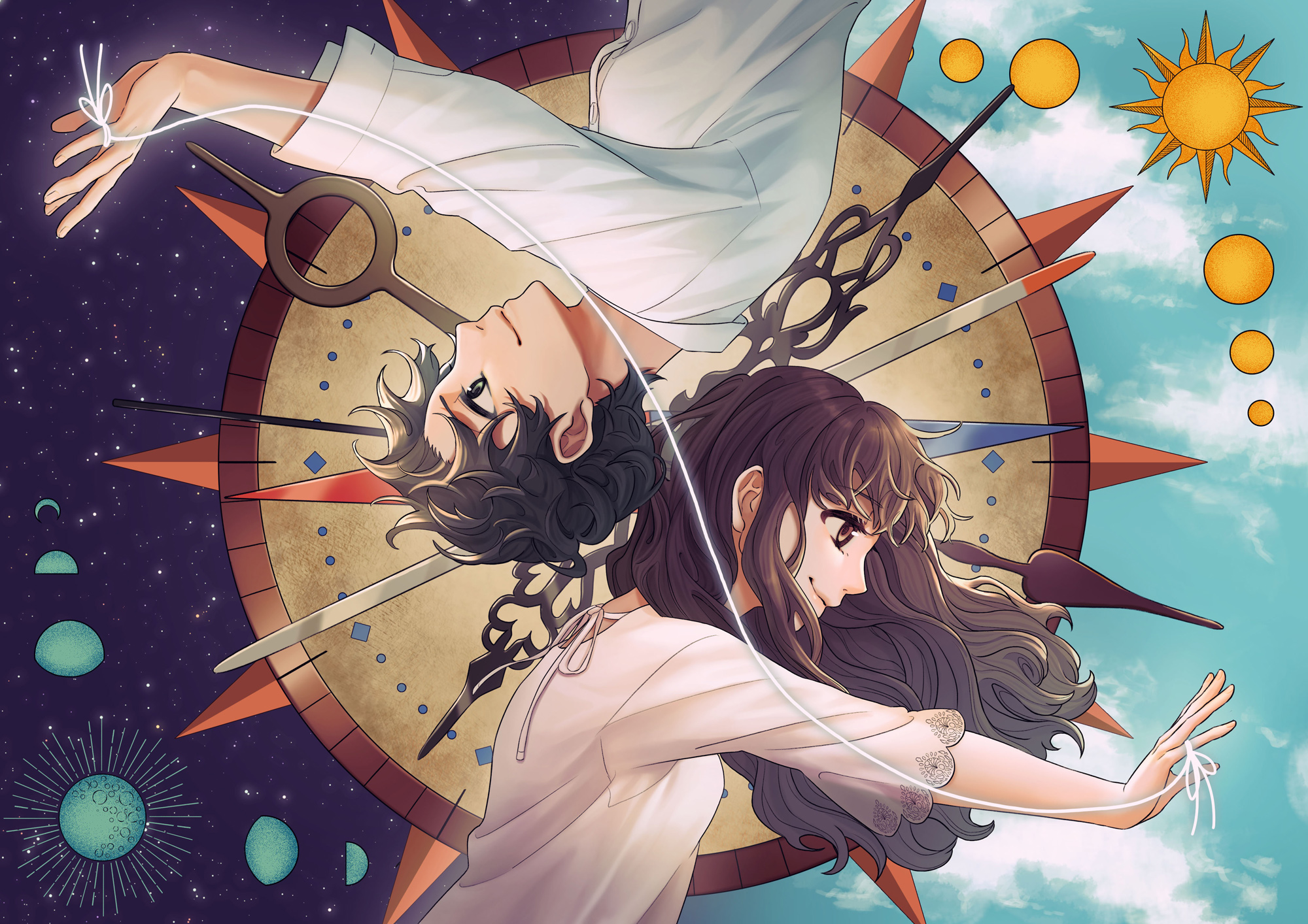
The Promise of Devi Danu
Artist: Rodan (Indonesia)
School: University of Indonesia
Language: English
KADOKAWA
Shueisha
Amutus Corporation
Ko-fi
Winner's Comment
I am very honored to receive this award. Getting recognized in the International Comic/Manga School Contest 2020 gives me the confidence and motivation to continue drawing comics in the future. I enjoyed doing what I love to do. The process of coming up with ideas and creating cartoons can be both hard and fun, and it's my lifelong goal in making comics to be able to tell my stories and expressions to more people.
Shuichi Hiratsuka
KADOKAWA
Solmare Publishing (NTT Solmare Corp.)
Machiko Satonaka
Manga Category (1 winner)
Cash prize: US$2,200, Wacom Cintiq 16 , Clip Studio Paint EX
Forgiveness
Artist: 小河少年 (Xiao-He Shao-Nian) (Taiwan)
School: Chaoyang University of Technology
Language: English
Winner's Comment
Thank you to Clip Studio Paint for organizing this international school contest. I was very honored and touched to receive the award among so many entries from so many different countries and schools.
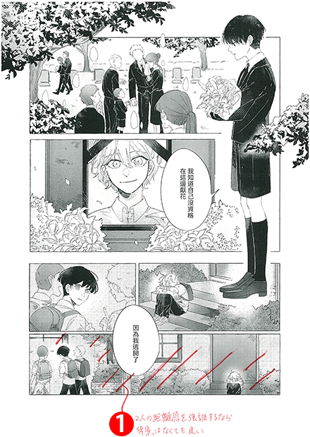
I created this work to express a heavy, sad and peaceful "promise". Reading the comments from the judges, there are certainly things that could be improved upon. The judges and KADOKAWA's detailed comments have helped me to understand the strengths and weaknesses of my own work better. The advice on panel layout, as well as the critique comments of the other winners were also very helpful. It was a very rare and valuable experience for me to participate in this contest!
Youhei Sadoshima
Shuichi Hiratsuka
KADOKAWA
Shueisha
Solmare Publishing (NTT Solmare Corp.)
Ko-fi
Machiko Satonaka
Manga Category (5 winners)
Clip Studio Paint EX
Flight to the moon
Artist: 博尔济吉特 (Boer Ji-ji-te) (China)
School: Xi'an Academy of Fine Arts
Language: English
Winner's Comment
For a long time now, I've been in a slump. Being selected has convinced me to pursue a career in comics. I'm grateful for the praise and pointers I've received from the judges, which are very important to me. I know that I struggle to make stories interesting and express my characters' emotions, and that's a result of my negligence in training my skills. From here I will face my shortcomings with humility, respect and confidence. Once again, thank you all so much for your acknowledgement.
Javier Fernández
KADOKAWA
Ko-fi
Solmare Publishing (NTT Solmare Corp.)
Youhei Sadoshima
KADOKAWA
J-POP Manga
Kana
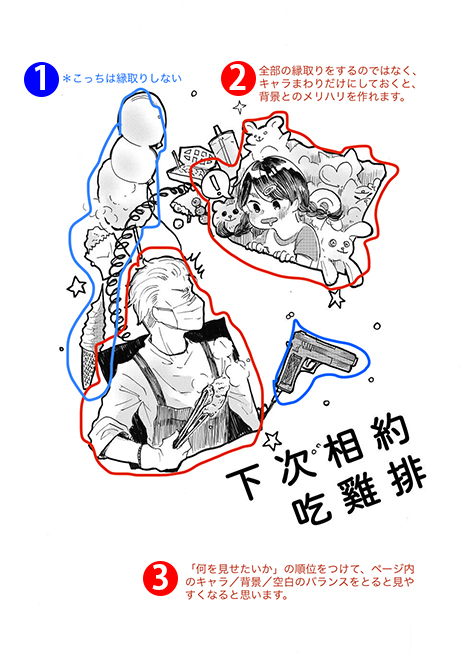
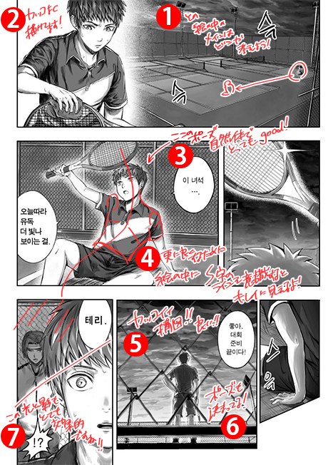
Let's meet to eat chicken
Artist: 小玫喵 (Xiaomei) (Taiwan)
School: National Taipei University of Education
Language: English
Winner's Comment
I never thought I'd win an award! When I first came up with the story about promises, I really struggled. I kept changing the story and adding to the plot. But I wanted to keep my original idea, and keep it a straightforward, funny and heart-warming story. The advice I received from the jury didn't just point out my shortcomings, they gave me a lot of confidence and courage. I'd like to work on improving my drawing technique and create more interesting stories in the future. Finally, thank you to all the judges and to my family and friends who have supported me! Thank you!
Shuichi Hiratsuka
Shueisha
KADOKAWA
Glénat Editions SA
Amutus Corporation
DVD mobile shop
Artist: opennewcanvas (South Korea)
School: Chungkang College of Cultural Industries
Language: English
Winner's Comment
I had fun preparing for the contest. I'm glad to have the opportunity to show my work to different people and get their advice, which is something I don't get to experience very often. I want to use this as an opportunity to create better work, and would like to take part in this contest again if I get the chance. I would like to thank Clip Studio and all the judges for providing me with such a good opportunity.
Javier Fernández
Amutus Corporation
Ko-fi
That vacation as we agreed to go together.
Artist: ARWAKE (Thailand)
School: Rangsit University
Language: English
Solmare Publishing (NTT Solmare Corp.)
Amutus Corporation
J-POP Manga
BookLive Co., Ltd.
Webtoon Category (1 winner)
Cash prize: US$2,200, Wacom Cintiq 16, Clip Studio Paint EX
Charlotte
Artist: cloud7 (United States of America)
School: Leland High School
Language: English
Javier Fernández
Shuichi Hiratsuka
Wacom
KADOKAWA
Shueisha
Glénat Editions SA
Webtoon Category (5 winners)
Clip Studio Paint EX
Youhei Sadoshima
Javier Fernández
Shueisha
Wacom
BookLive Co., Ltd.
Ko-fi
Amutus Corporation
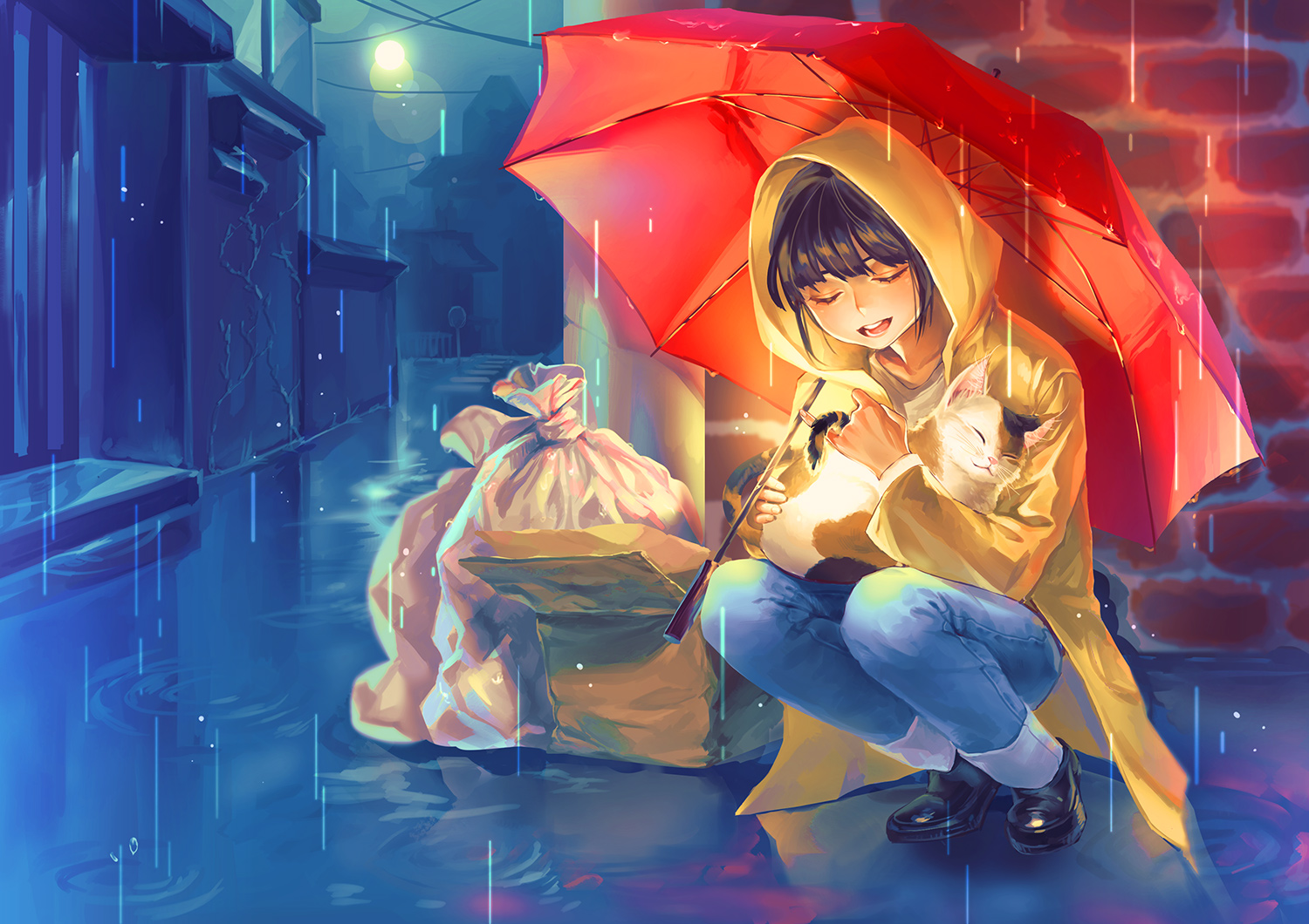
Welcome to the Underworld!
Artist: ditaamy (Indonesia)
School: Bandung Institute of Technology
Language: English
Winner's Comment
First, I would like to thank judges for picking my entry “Welcome to the Underworld” as one of the runners up for this comic contest. I was shocked and humbled that despite so many incredible submissions I was chosen for the runner up. This motivates me to improve my skills and learn more about making comics, so thank you so much!
Secondly, I would like to thank the International Comic/Manga School Contest committee for giving us, students, a chance to try creating works that would be reviewed internationally and professionally. As far as I am concerned there aren't many platforms for students to compete internationally through comics/manga and this contest is one of those rare spotlights for us. This contest highlights the ability of students to create a story, and how to tell it effectively through comic and artworks, it’s really eye-opening. Regardless of the outcome, I learned a lot by joining this contest, by seeing other students' amazing submissions from around the world, and of course by the constructive comments from the judges.
I hope Clip Studio Paint and the other sponsors will hold this comic contest again next year and for years ahead!
Shuichi Hiratsuka
Youhei Sadoshima
KADOKAWA
Shueisha
J-POP Manga
Winner's Comment
The feedback I received from the judges for this contest was very informative. As the feedback pointed out, I mainly intended to focus on the vertical scrolling format to express something that any other format could not when I came up with this story.
To emphasize this, the story itself wasn't prominent, tame overall, and left some unresolved issues. I'm going to take the advice given to me by my teachers for my work in the future and think properly about how I can create a great story with great delivery.
Youhei Sadoshima
Shueisha
KADOKAWA
Solmare Publishing (NTT Solmare Corp.)
BookLive Co., Ltd.
Winner's Comment
This is my first time creating a cartoon in webtoon format, so I'm very happy to have won an award. I would also like to thank my teacher for their advice.
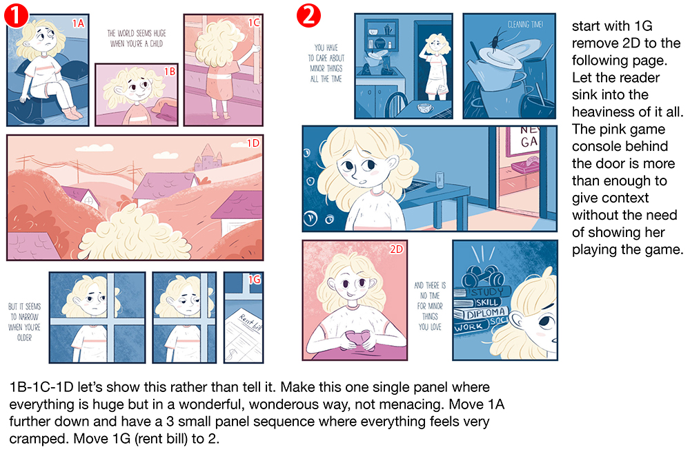
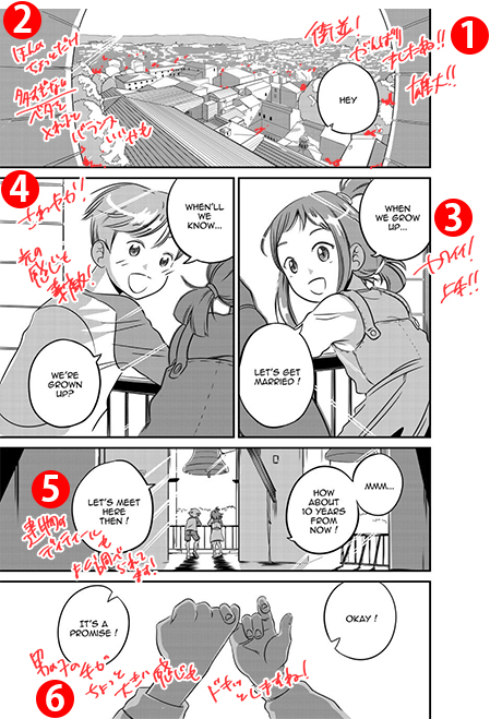
This year's theme was 'Promise', so I thought there were many different stories that could be developed. I was considering all kinds of stories like horror and mystery, but in the end I decided to depict the love of a family, a promise between an old man and his grandchild. This time I wanted to create a comic with a picture book-like feel to it, and I wanted the overall atmosphere to be cute and warm. I hope the comic will resonate with and move the reader, even slightly.
Shuichi Hiratsuka
Youhei Sadoshima
Wacom
Ko-fi
BookLive Co., Ltd.
Winner's Comment
I thank the organizers of the contest for the opportunity to participate in such a large project.
It's amazing how many stories this year were about the underwater world! As they say, geniuses have similar thoughts.
But I wanted to show the most non-trivial interpretation of the "promise" theme. No matter how much you promise, you will not fulfill it. I realized how important story is in my webtoon thanks to the jury comments.
I would also like to say thanks to all participants, you guys are really inspired me, keep up the good work! I thank the contest jury for choosing my work! And special thanks to Solmare Publishing (NTT Solmare Corp.) for your comment.
Youhei Sadoshima
KADOKAWA
Solmare Publishing (NTT Solmare Corp.)
Machiko Satonaka
Bande Dessinée Category (1 winner)
Cash prize: US$2,200, Wacom Cintiq 16, Clip Studio Paint EX
MIDSUMMER TRAVELER
Artist: Echo (China)
School: Wuhan Textile University
Language: English
Winner's Comment
For me, being awarded this award is the end of my college life. I am so honored to receive such good news before I graduate. I was in a slump in my life when I was working on this piece. I was very worried about school and my family. I was fortunate to be able to turn this pain into something creative, to create a manga that is loved by many people and to convey how I felt. The theme of "promise" is very easy for me to draw. Even if my head is filled with sad and tender thoughts, I think everything can be forgiven if you can depict all the cruelty in a story.
Thank you to the contest, the judges, and the people who love me for it. I was very touched that my work was recognized.
Advice from Professionals
Detailed advice from the editorial team at Solmare (NTT Solmare, Inc.).
Read advice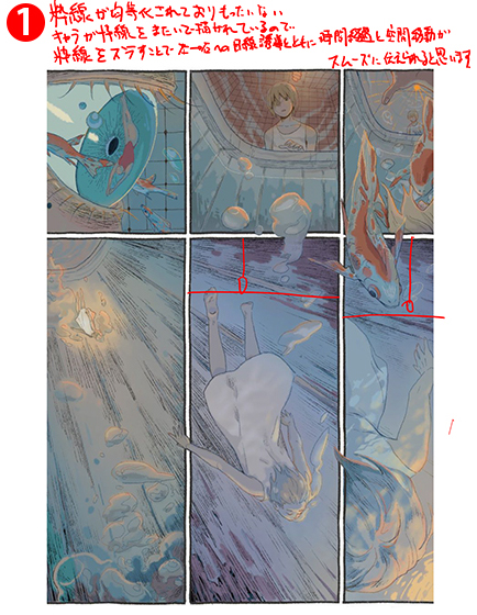
Youhei Sadoshima
Shuichi Hiratsuka
Wacom
Shueisha
J-POP Manga
Ko-fi
BookLive Co., Ltd.
Bande Dessinée Category (3 winners)
Clip Studio Paint EX
The Promise
Artist: Erica Eng (United States of America)
School: Academy of Art University
Language: English
Winner's Comment
I was inspired by poetry and song when writing the comic. As for the setting and characters, they came about because I was tired of drawing humans and real places. I was also interested in the feeling of smallness and so I drew mice. Then, I drew them wrapped in sweaters and blankets, afraid to go out of their cozy homes and afraid of death, two valid fears we all experience. I knew I wanted to use charcoal for the drawings. Charcoal makes soft edges that melt into light and dark. I love that.
I'm usually a storyteller who meanders around before finding an end, but I knew I wouldn't be able to do that with such a small page count. So, I read ancient stories which are so boiled down to their essence that they don't meander at all. I read the Old Testament and the Gospels before writing The Promise. The Book of Hebrews also discusses the major themes I touched on in the comic (an ancient promise, truth and rest). I found my faith in God at an early age, so stories that expressed the same hope that I had were deeply important to me as a kid. Most of my childhood was spent escaping into books, so I wanted to write a fairytale that younger me would have loved. The Promise is an expression of that.
Shuichi Hiratsuka
Javier Fernández
Youhei Sadoshima
KADOKAWA
Shueisha
Amutus Corporation
Machiko Satonaka
Winner's Comment
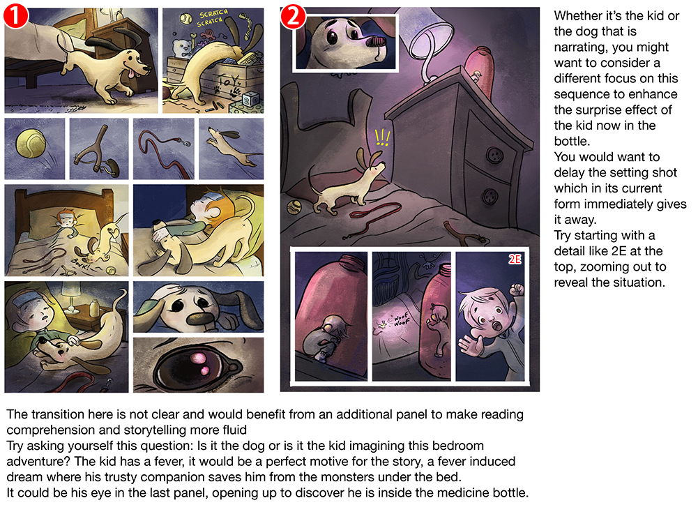
Participating in this contest was a way to get involved and compare myself with the works of people from all over the world. It stimulated me to do my best. The news of having been chosen among the winners of the contest filled me with joy. I was surprised and excited. Through my story “WooF” I wanted to communicate the link between a child and his little dog. Who help each other in times of difficulty. They don't need words to express their bond and their emotions. I tried to find the universality of the gestures. Thanks to the comments of the judges and sponsors, I had confirmation that I was able to convey the emotions of the characters through their gestures and color. The plot of the story is deliberately free to interpret. It can be seen from the point of view of the child, who in the grip of fever, visualizes the disease as a monster that kidnaps him. Or it could be what the dog perceives when he sees his owner being bedridden. Maybe it's a dream that both are living, or it could be a real adventure. I found interesting to play with the plot, the possible points of view of the characters and the use of everyday objects as a tool for an adventure. I wanted to thank the contest organizers who gave me the opportunity to compare my artwork on an international scene. I thank the judges, who commented on my art. Giving me useful advice and ideas for future work. I will follow their advice and work even harder. The sponsors for judging my work so positively. It is encouraging and gives me strength to continue imagining new stories. I am grateful to the Roman School of Comics and to my professors for giving me the opportunity to participate in the competition and for providing me with the knowledge to face this artistic path. I hope one day to realize my dream: create stories that will thrill readers.
I thank everyone again.
Javier Fernández
Shuichi Hiratsuka
KADOKAWA
Wacom
Ko-fi
J-POP Manga
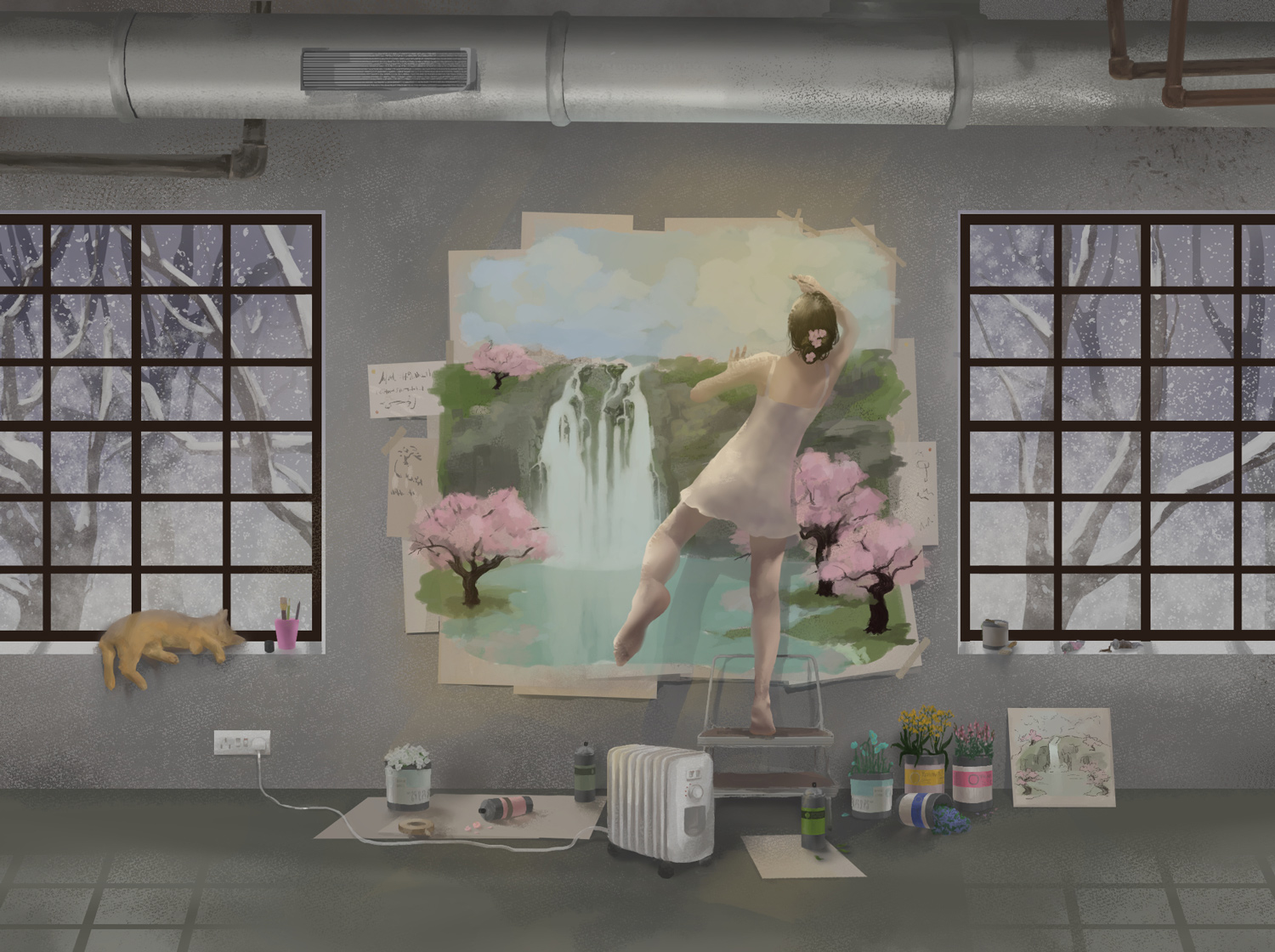
GROW UP (promise not to)
Artist: Alina Slyshik (Russian Federation)
School: Saint-Petersburg State University of Industrial Technologies and Design
Language: English
Winner's Comment
I am really glad I took the opportunity to take part in this competition! It was a really interesting experience that will definitely be helpful in the future. The feedback from the judges was so positive and constructive, I will take their advices into account. Also I would like to thank the wonderful sponsors of this competition for making it possible to compete - I've seen many amazing entries from over the world, it is so inspiring! It was an opportunity to prove myself and I'm going to develop my art skills further.
Thank you!
Javier Fernández
Wacom
BookLive Co., Ltd.
Kana
J-POP Manga
Ko-fi
Storyboard Category Grand Prize (1 winner)
Cash prize: US$2,200, Wacom Cintiq 16, Clip Studio Paint EX
Youth Promise
Artist: SHeyll (France)
School: Human Academy Europe
Language: English
Winner's Comment
It is such an honour to receive this award in the "Storyboard" category. I'm glad the jury had this keen interest in my work and I would like to thank my school, Human Academy Europe, which has strongly encouraged me to participate to this contest. It was a good opportunity to get both positive and negative critics, about my work and technic skills, coming from true professionals. I would have never thought I could win such a prestigious prize and I'm thrilled.
Youhei Sadoshima
Shuichi Hiratsuka
Shueisha
KADOKAWA
Solmare Publishing (NTT Solmare Corp.)
BookLive Co., Ltd.
Storyboard Category (2 winners)
Clip Studio Paint EX
International comic manga school contest
Artist: 김현준(Kim Hyeon Jun) (South Korea)
School: Dongcheon High School
Language: English
Winner's Comment
It was an honor to participate in a great competition at the end of my high school life and receive an award. I was very disappointed not to win first place, but the feedback from the judges was more important to me than anything else as up to now I had to learn on my own. I would like to thank the judges for choosing my work, and the contest staff for patiently answering my questions. I want to grow even more through this competition and become a manga artist who can draw the best manga ever. Thank you very much.
Javier Fernández
Shuichi Hiratsuka
Youhei Sadoshima
Amutus Corporation
Winner's Comment
I would like to thank the judges for choosing me as one of the runners up and for commenting my comic. This feedback is what I value most about having participated in this contest, and it's a reward I'm extremely proud of. I was also delighted to see the entries of the other winners and to learn from the feedback of their works. This has really encouraged me to participate again next year. It has been a very enriching experience.
Shuichi Hiratsuka
Youhei Sadoshima
KADOKAWA
Shueisha
BookLive Co., Ltd.
Illustration Category (1 work)
Cash prize: US$550, Wacom Cintiq 16, Clip Studio Paint PRO
Artist: あろえ (Aroe) (Japan)
School: Nihon Kogakuin College
Winner's Comment
Thank you very much for choosing my work for the grand prize. I would also like to thank my teachers at school and my acquaintances and family for supporting me.
This time, it was very difficult for me to decide what kind of illustration I would make from the theme, "Promise." However, as I was working on it, I realized the fundamental and important thing: what did I want to convey and how should I express it? I'm still lacking in certain areas, so I want to use this experience to grow even more.
Youhei Sadoshima
Shuichi Hiratsuka
Shueisha
Wacom
Amutus Corporation
Illustration Category (4 winners)
Clip Studio Paint PRO
Artist: Seungyeon (South Korea)
School: Kookmin University
Winner's Comment
While working on my illustration for this contest, I was able to revisit basic skills such as light, backgrounds, and color, and I was able to determine my style and direction for the future. Every step of the process, from coming up with ideas to finishing, was a good learning experience. Also, the experience of seeing works on the same theme helped broaden my horizons.
Shuichi Hiratsuka
Youhei Sadoshima
Amutus Corporation
Wacom
Artist: ariane (United Kingdom)
School: Charterhouse
Youhei Sadoshima
Ko-fi
CoAket

Artist: IZ (Japan)
School: Nippon Designer Gakuin
Winner's Comment
I am very happy to receive this award. It's a scene that just came to me, so it's not as highly original as the feedback I've received, but I think I was able to capture and express it through the colors and other elements. I'll keep the advice in mind as I continue to explore different genres and methods of expression.
Javier Fernández
Shueisha
CoAket

Artist: 긱(Gick) (South Korea)
School: Sahmyook University
Winner's Comment
First of all, I am very honored to have achieved this award for my first contest. I also hope to use this contest as a springboard to draw various artwork and pursue my dreams, and make the most of my short but long school life. I intend to continue working hard until I can draw pictures that make everyone happy. Thank you very much.
Youhei Sadoshima
Javier Fernández
KADOKAWA
Solmare Publishing (NTT Solmare Corp.)
Contest theme:
Promise
| Comic Category (color) | An original color comic for all ages (8-16 pages, including cover). This is the most appropriate category for American style comics. |
|---|---|
| Manga Category (B&W) | An original black-and-white comic/manga for all ages (8-16 pages, including cover). This is the most appropriate category for Japanese manga style comics. |
| Bande Dessinée Category (Color) | An original bande dessinée for all ages (8-16 pages, including cover). |
| Webtoon Category (Color) | An original webtoon for all ages (sized 690 x 16,000 pixels). |
| Storyboard Category |
An 8-page black-and-white comic or color webtoon (690 x 16,000 pixels) based on the supplied storyboard. You may rearrange the storyboard if you so choose.
Note: The storyboard can be downloaded from Learn more about How to apply. |
| Illustration Category | An original color illustration for all ages (There are no size requirements). |
Special Sponsors

Shueisha
Shueisha is a Japanese publisher that publishes manga, fashion magazines, and literary books. They have published comic magazines such as Weekly Shonen Jump, Weekly Young Jump, Ribon, Margaret, and Bessatsu Margaret. They have also published internationally renown comics such as One Piece.

KADOKAWA
KADOKAWA is a comprehensive entertainment company that is involved in a wide range of businesses, including book publishing, movies and animation. Comic Walker is a free comic site that offers many popular KADOKAWA manga in one place. From the latest media mixes to popular sci-fi comics, more than 2,400 works are posted here free of charge.

Wacom
Pioneer of creative pen tablets and displays which are being used to create some of the most exciting digital art, films, special effects, fashion and designs around the world.
Sponsors

Amutus Corporation
Japan's largest e-book site. Amutus, together with production partners, is responsible for planning and producing Mecha Comic and the original comic brand “Amcomi.” Amcomi works are distributed on e-book sites in Japan and overseas, including on Mecha Comic.

BookLive Co., Ltd.
BookLive! is a general e-book store selling manga, novels, magazines and more, stocking over 900,000 titles. BookLive! also offers over 10,000 titles to read for free, without even registering. Check out BookLive!’s easy-to-use interface with a free title!

Solmare Publishing
(NTT Solmare Corp.)
Operator of Japan's largest e-book store, Comic Seymour. The "Solmare Editorial Department" is responsible editing the e-comics that appear in the store. Solmare Publishing is also now creating original comics that appeal to global readers.

Mag Garden Corporation
Publisher of Monthly Comic Garden and operator of e-comic distribution platform MAGCOM. Mag Garden counts animation company Production I.G., WIT STUDIO and more among its group companies, working together with these partners in planning and producing anime series based on popular properties from their catalog.

Glénat Editions SA
Established in 1969 by Jacques Glénat, Glénat is a French publisher specializing in bande dessinée, manga, American comics and books on leisure topics (sea, mountains, gastronomy, cultural heritage, children and youth). A pioneer of Japanese manga publishing in France, Glénat remains the undisputed market leader in France today.

Ko-fi
Ko-fi is a small-sum funding and donation service that lets you support your favorite artists. Creators are free to make their own personalized Ko-fi page, where fans can support them for “the price of a cup of coffee.” Any creator can make a page and start taking donations with just a PayPal or a Stripe account. Creators can also take commissions through Ko-fi and even offer subscriptions and merchandise to fans.

Kana
Kana is a Belgian comic book publisher representing the French comic book market. Since 1996, Kana has been working to promote the diversity and richness of Japanese manga to French-speaking audiences, offering a wide range of popular shonen manga, including Saint Seiya, Detective Conan, Naruto, Death Note, and, more recently, shoujo and seinen manga in a wide range of categories.

J-POP Manga
J-POP Manga is one of Italy's leading manga publishers. Since its founding in 2006 by Edizioni BD, J-POP Manga has offered a diverse lineup of more than 3,000 titles ranging from popular shonen manga (Promised Neverland, Tokyo Ghoul) to masterpieces by masters such as Go Nagai, Osamu Tezuka, Moto Hagio and Kazuo Kamimura.
Collaborators

Gekkan G Fantasy
A monthly comic magazine released on the 18th of every month by Square Enix Co., Ltd., which will be celebrating its 27th anniversary in 2020. Known for titles like Black Butler, Horimiya, Toilet-Bound Hanako-kun, The Royal Tutor, and others. Gekkan G Fantasy additionally offers a number of serialized works that are ongoing now!
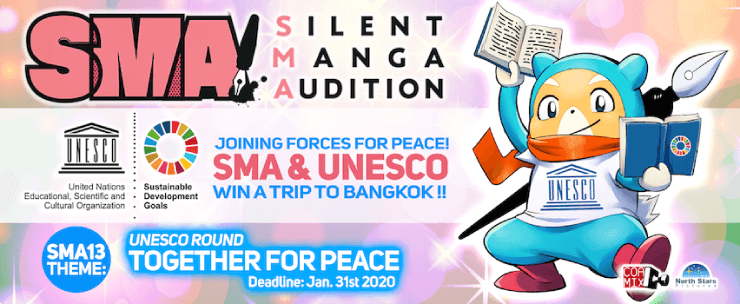
SILENT MANGA AUDITION
One of the largest and most successful manga contests in the world. Operated by publisher Coamix, Inc. which was established by renowned manga artists, it aims to discover, nurture, and publish the next generation of manga artists active internationally.

No9 Inc.
With the mission of enriching people's lives through manga, No9 Inc. is a digital comic agency that strives to maximize the manga market and sales in the digital age through four business pillars: manga agency services, manga app development, crowdfunding, and tax return services.

CoAket
Inspired by similar comics markets in Japan, CoAket is the first of its kind in Germany and is getting attention from local artists. Open twice a year in Hamburg, CoAket focuses on artist displays and publisher’s booths.

MAG
Super Crowd Entertainment GmbH is an event management company in Northern Germany. It holds the world's largest indie game developer booth, Indie Arena Booth, and a pop culture event, “MAG,” that covers games, comics, and all things Japan. MAG is held in central Germany. The company also supports many developers and artists.

TOKYOPOP
Since its establishment in 1997, TOKYOPOP has been a bridge between Asia's unique pop culture and the rest of the world, at the crossroads of tradition and innovation. By producing, publishing, and distributing comics from around the world, TOKYOPOPOP provides exciting content for fans of all ages.

Cork Co., Ltd.
Cork is a creative agency with a mission to "change the world, one person at a time, through the power of storytelling." The company is striving to redefine "editing" for a new era by working in collaboration with creators not only on an editorial level to design universal stories, but also on a community level to create enthusiasm while connecting directly with fans.
Tokyo name tank
Our goal is to support everyone in creating their own manga while having fun drawing it. We have produced many award-winning and debut artists. In addition to storyboard lessons that cover how to structure a complete a 32-page storyboard, we also hold individual consultations and storyboard exchange sessions to answer concerns about the creation of comics.
Supporters

Japan Cartoonists Association
The Japan Manga Association was established in December 1964 as the only nationwide organization of Japan's manga artist at that time. It’s engaged in a variety of projects, such as research on comics, efforts in popularizing comics and comics culture, and comics cultural exchange with other countries. The group became a Public Interest Incorporated Association in 2014.

Manga Japan
Manga Japan is an organization that aims to promote the development of manga culture and artists, contribute to society through the manga industry, promote international exchange and improve production environments for manga authors and others involved in the industry.
Contest Partners

Operational Support
Organizer
Participating Schools
Note: The following list only shows schools that provided logos.
As of 04/20/2020

四川农业大学
China

신목고등학교
Lao People’s Democratic Republic

Vancouver Film School
Canada


amps
Japan

角川国際動漫教育
Taiwan

日本工学院専門学校
Japan
Chatsworth International School
Singapore

Universidad de Guadalajara
Mexico

The Zero One
Thailand

거제장평중학교
Republic of Korea

臺中市立潭子國民中學
Taiwan

Academy of Information Technology
Australia

Institut Teknologi Bandung
Indonesia


IES Pere Boïl
Spain

Froggy Manga
United Kingdom of Great Britain and Northern Ireland

Rosa-Luxemburg-Gymnasium (RLO)
Germany

姫路情報システム専門学校
Japan

臺南市立永康國民中學
Taiwan
Belmont Community School
United Kingdom of Great Britain and Northern Ireland

Francis Holland School
United Kingdom of Great Britain and Northern Ireland


Fachhochschulde Dresden (FHD)
Germany
Gulf Coast High School
United States of America

Brújula Cómics
Mexico

청강문화산업대학교
Republic of Korea

Little Sun School
Indonesia

universiti malaya
Malaysia

Aix-Marseille Université
France

Johnsonburg Area High School
United States of America

Vechtstede College, Gooise Scholen Federatie
Netherlands

Salzmannschule Schnepfenthal
Germany

Mead High School
United States of America
CLAZROOM COLLEGE
Malaysia

Singapore American School
Singapore

Arts University Bournemouth
United Kingdom of Great Britain and Northern Ireland

Leroy Greene Academy
United States of America

Brooklyn Studio Secondary School
United States of America

中山大學南方學院
China

William Henry Harrison High School
United States of America

The King's University
Canada


Holy Trinity High School
United States of America

University for the Creative Arts
United Kingdom of Great Britain and Northern Ireland
예림디자인고등학교
Republic of Korea

Kunsthochschule Kassel
Germany
Les Maîtres du Monde
Switzerland

Capilano University
Canada

iACADEMY
Philippines


Академик Дечко Узунов
Bulgaria

Kunstschule Wien
Austria

University Centre, East Sussex College Hastings
United Kingdom of Great Britain and Northern Ireland

IES LOS CRISTIANOS
Spain
Savannah College of Art and Design
United States of America

AAA Paris
France

RMIT University
Australia

Florida Cyber Charter Academy
United States of America

Blanson CTE High School
United States of America

North Cobb High School
United States of America

Lycée Frédéric Chopin
France
Escola d'Art de Manresa
Spain

Staffordshire University
United Kingdom of Great Britain and Northern Ireland

École secondaire veilleux
Canada


Orestimba High School
United States of America

Lake Sumter State College
United States of America

学校法人角川ドワンゴ学園 N高等学校
Japan
Ecole d'Arts La Fontaine
France

BHAK/ BHAS Frauenkirchen
Austria


Nottingham College
United Kingdom of Great Britain and Northern Ireland

Bishop Challoner Catholic Federation of Schools
United Kingdom of Great Britain and Northern Ireland

Tampereen ammattikorkeakoulu
Finland

Ravensbourne University
United Kingdom of Great Britain and Northern Ireland

Wai'anae High School
United States of America

ZAMA Middle High School
Japan

東放学園映画専門学校
Japan

Universitas Surabaya
Indonesia


麗湖國小
Taiwan

California State University of Bakersfield
United States of America
Thelma Rosa Salinas STEM Early College High School
United States of America
名古屋デザイナー学院
Japan

EDUCA - SOŠ, s. r. o.
Czech Republic

Fordham High School for the Arts
United States of America


Montclair State University
United States of America
Perth Modern School
Australia

Futureworks
United Kingdom of Great Britain and Northern Ireland

KADOKAWA Animation and Design School
Thailand

Mỹ Thuật Việt Nam
Vietnam
School of Visual Arts
United States of America
Lycée Alfred Sauvy
France
BELLECOUR ECOLE
France
Westmount Charter School
Canada
IES Conde de Orgaz
Spain

East Stroudsburg University of Pennsylvania
United States of America

IES Río Miño
Spain


New College
United Kingdom of Great Britain and Northern Ireland
Catawba Valley Community College
United States of America
Freie Montessorischule Huckepack
Germany
Maine College of Art
United States of America

専門学校日本デザイナー学院
Japan

Universidad de Celaya
Mexico
Guldastronaut
Denmark
Priory School
United Kingdom of Great Britain and Northern Ireland

Harris Academy Purley
United Kingdom of Great Britain and Northern Ireland

Agua Fria High School
United States of America

Minneapolis College Art and Design
United States of America
Merbein P-10 College
Australia

Prescott High School
United States of America

V.W. Miller Intermediate School
United States of America

Institut Teknologi Telkom Purwokerto
Indonesia

Lignes et Formations
France
Natick High School
United States of America

Ysgol Dyffryn Ogwen
United Kingdom of Great Britain and Northern Ireland


IES CARRÚS
Spain
City College of San Francisco
United States of America

Martinez Junior High School
United States of America

Husson University
United States of America

加藤学園高等学校
Japan

Salesianos Pamplona
Spain
Gemeinschaftsschule am Brenzpark
Germany

The Art Institute of Dallas
United States of America

Universidad de Guanajuato
Mexico

Christmas Island District High School
Australia

창원과학고등학교
Republic of Korea

Western High School
United States of America

Verkmenntaskólinn á Akureyri
Iceland

มหาวิทยาลัยรังสิต
Thailand

Academia de Arte Taure
Spain


โรงเรียนเขมะสิริอนุสสรณ์
Thailand

Brunswick County Early College High School
United States of America

UOW Malaysia KDU University College
Malaysia

American School of Paris
France
Cégep Limoilou
Canada

Barack Obama Male Leadership Academy
United States of America


Heinrich Hertz Europakolleg
Germany

嘉義市輔仁中學
Taiwan

Stettbach
Switzerland

국민대학교
Republic of Korea

삼육대학교
Republic of Korea

홍익대학교
Republic of Korea

Kolej Asa
Malaysia

상명대학교 (2캠퍼스)
Republic of Korea

國立政治大學附屬高級中學
Taiwan

國立大湖農工職業學校
Taiwan

IAIN Tulungagung
Indonesia
Rhyl High School
United Kingdom of Great Britain and Northern Ireland
Humboldtschule Hannover
Germany

Brigham Young University
United States of America

Wrexham Glyndwr University
United Kingdom of Great Britain and Northern Ireland

Artside - Game art school
France

Argyle Elementary School
Canada

國立屏東女中
Taiwan

EDEC Universidad
Mexico

HTL Hallein
Austria

The Royal Harbour Academy
United Kingdom of Great Britain and Northern Ireland

世新大學
Taiwan
Gebrüder-Montgolfier-Gymnasium
Germany

Birmingham City University
United Kingdom of Great Britain and Northern Ireland

Universitas Sebelas Maret
Indonesia

敬和学園大学
Japan

한성대학교 한디원
Republic of Korea

Richmond Park Schools Bihać
Bosnia and Herzegovina

Private Realschule Dr. Jordan
Germany
La Salle College of Saint Benilde
Philippines
ΒΑΚΑΛΟ ART & DESIGN COLLEGE
Greece

華梵大學
Taiwan

實踐大學
Taiwan

SMK Kepong
Malaysia
Axe Sud - Ecole de Condé
France

ESCUELA DE DIBUJO GARBO
Mexico
Fayetteville-Manlius High School
United States of America

台南應用科技大學
Taiwan

โรงเรียนเตรียมอุดมศึกษา
Thailand

Saint-Petersburg State University
Russian Federation

School of the Museum of Fine Arts at Tufts University
United States of America

朝陽科技大學
Taiwan


Nimitz High School
United States of America

Tallinna Inglise Kolledž
Estonia

Arc School Ansley
United Kingdom of Great Britain and Northern Ireland

Sekolah Menengah Kebangsaan Kepong
Malaysia

Tecnologico de Monterrey
Mexico

Academy of Art University
United States of America
Lycée Raynouard
France

Oak Hills High School
United States of America

Universidade Positivo
Brazil

Sheridan College
Canada

Mindanao State University at Naawan
Philippines


Pratt Institute
United States of America

IES ISAAC PERAL
Spain

Heathcote School and Science College
United Kingdom of Great Britain and Northern Ireland

Dekalb School of the Arts
United States of America

Axe Sud - Ecole de Condé
France
スワスモア大学
United States of America

東海大學
Taiwan

SMAKr. Masa Depan Cerah
Indonesia

國立臺中科技大學
Taiwan

Universidad de Granada
Spain


Clarenceville High School
United States of America


Mažeikių Merkelio Račkausko gimnazija
Lithuania

ДСУЛУД Лазар Личеноски - Скопје
North Macedonia

Seoul Foreign School
Republic of Korea


南臺科技大學
Taiwan

Como Desenhar Quadrinhos
Brazil

XLI LO im.J. Lelewela
Poland


Crater VFX Training Center
Serbia

안동송현초등학교
Republic of Korea

Rocklin High School
United States of America

ArtStudium
Paraguay

University of Brighton
United Kingdom of Great Britain and Northern Ireland

Worth
United Kingdom of Great Britain and Northern Ireland

西安美术学院
China
IES Arabista Ribera
Spain

Quanta Academia de Artes
Brazil

GameDev-Profi.de
Germany

國立臺北商業大學
Taiwan

聖約翰科技大學
Taiwan

思特雅大学
Malaysia
ECV Bordeaux
France

CES VEGA MEDIA
Spain

IES PRÍNCIPE FELIPE
Spain
Graf-Friedrich-Schule Diepholz
Germany

Colegio Tacoronte
Spain

IES. Isaac Peral
Spain

University of Colorado Denver
United States of America

Northampton Community College
United States of America

IRSA CSES Alfred Peyrelongue
France

南京艺术学院
China

TEHNIČKA ŠKOLA ZENICA
Bosnia and Herzegovina

Государственное бюджетное общеобразовательное учреждение
Russian Federation

ENAAI
France
Campus Hannah Höch
Germany


Российско- Армянский университет
Armenia

Gesamtschule Gummersbach
Germany

Akademia Sztuk Pięknych
Poland
CIIT College of Arts and Technology
Philippines

Quanta Academia de Artes
Brazil
Santa Ana college
United States of America
EDAA
France

臺北市私立復興實驗高級中學
Taiwan

강원애니고등학교
Republic of Korea


James Madison University
United States of America
Liberty High School
United States of America

IES LES DUNES
Spain
Avicenna College
Netherlands

Western Springs College/ Ngā Puna o Waiorea
New Zealand

中央美术学院
China

Politeknik Elektronika Negeri Surabaya
Indonesia


Universitas Indonesia
Indonesia

國立華南高商
Taiwan
campus fonderie de l'image
France

國立臺北教育大學
Taiwan

Massachusetts Institute of Technology
United States of America


Maryborough State High School
Australia

Sekolah Kristen Kanaan
Indonesia

SEKOLAH MENENGAH ATAS NEGERI 81 JAKARTA
Indonesia

Shahid Buddhijibi Government College
Bangladesh


Singapore Polytechnic
Singapore
LANGEVIN WALLON
France

Universidad Martín Lutero
Nicaragua
Boston Latin Academy
United States of America


新北市立樟樹國際實創高級中等學校
Taiwan


海青工商
Taiwan

國立台灣藝術大學
Taiwan


Loreto Normanhurst
China

GENIMAGE
France


Viện Truyện tranh và Hoạt hình
Vietnam

育達科技大學
Taiwan

동천고
Republic of Korea


школа комиксов Палитра
Russian Federation

ECOLE PIVAUT
France
Cedar Valley College
United States of America

e-artsup Montpellier
France

Gözde
Turkey


Nimitz High school
United States of America

ESCUELALIMÓN
Spain

The Billings Career Center
United States of America

Carl Junction High School
United States of America

운암중학교
Republic of Korea

ASTERISK ACADEMY
Malaysia

SMK Tunas Bangsa Deces
Indonesia

復興商工
Taiwan

宝塚大学 東京メディア芸術学部
Japan

國立馬公高級中學
Taiwan
Lycée Corot
France

ARS STUDIO
Slovakia


SMK WIRA BUANA 1
Indonesia
SMA Muhammadiyah 10 GKB Gresik
Indonesia

香港動畫及視覺特效學院
China

Universiti Kuala Lumpur
Malaysia

Университет ИТМО
Russian Federation

世新大學
Taiwan
ESIPE filière IMAC
France
SMK SEKSYEN 7
Malaysia

BRG Wien 19
Austria

부산컴퓨터과학고등학교
Republic of Korea

Техноарт Београд
Serbia

UNIVERSIDAD DE GUADALAJARA
Mexico
Oasis Charter Middle School
United States of America


Pomona Catholic School
United States of America

Citipointe Christian College
Australia

Комп'ютерна Академія ШАГ
Ukraine
Seeway
Spain

臺北市立松山高級中學
Taiwan

태전고등학교
Republic of Korea
Lycée Edouard Branly
France
COLEGIO LOS PEÑASCALES
Spain


Wellington Secondary School
Canada

Instituto Uruguayo Argentino
Uruguay

한백중학교
Republic of Korea

桃園市立桃園高中
Taiwan

Universidad de Morelia
Mexico

Surval
Mexico

3IS
France

St. Clair County Community College
United States of America

Univerzitet u Tuzli, Filozofski fakultet
Bosnia and Herzegovina

SMKN 1 KLATEN
Indonesia


國立臺北科技大學
Taiwan
International Comic/Manga School Contest 2019
The previous contest, held from January 2019 on the theme of “Gift,” received over 1,400 entries from 639 schools in 67 countries around the globe!


© CELSYS, Inc.
![]() Celsys, Inc. / President: Narushima Kei / Corporate Number (Japan): 1011101062869
Celsys, Inc. / President: Narushima Kei / Corporate Number (Japan): 1011101062869
Pacific Marks Shinjuku Parkside 2F, 4-15-7 Nishi-Shinjuku, Shinjuku-ku, Tokyo 160-0023 Japan
+81-3-3372-3156 support@celsys.com