
The Art of Sequential Visual Narration
There are many small factors that can make your comic, manga, or webtoon more stylish and appealing to read. This article includes professional advice to avoid typical beginner pitfalls when creating comics, so you can start your project with confidence and express your story clearly.
You will learn techniques from digital comic apps like Clip Studio Paint to keep readers engaged in your work. This includes arranging your story into panels, using backgrounds to add to your story, and typography advice.
Panel Layouts and Storyboarding
Panel composition and pacing
In order to tell your story, you need to consider the panel composition and pacing. Whether you’re creating a paged comic or a vertical webtoon, your comic panels should flow well and each page or episode should entice readers to continue to the next part.
Consider the following when creating storyboards.
- What are the beginning and endpoints of the page or episode?
- What needs to happen between those two points to tell the episode or movement from beginning to end?
- What is the sequence of events and how many parts of this journey will you show?
- How is the reader expected to move from one panel to the next?
- How does the last panel lead to the next page or episode?
Designing effective panel layouts
To help readers understand the flow of your story, don’t just rely on drawing characters for your storytelling. Be creative with your background and composition.
Make sure that the panels lead the reader from left to right and down in a natural progression.
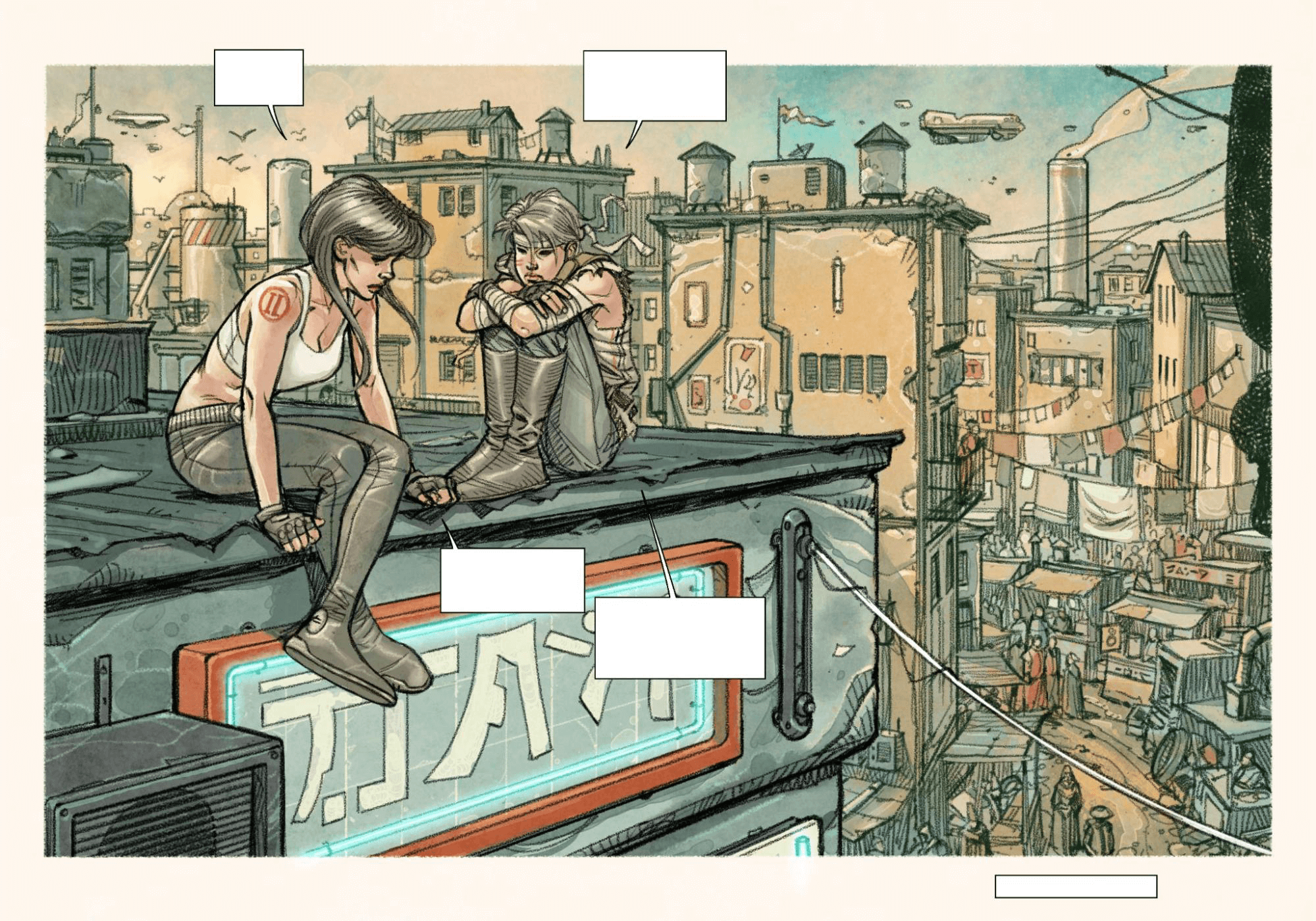
In this example, notice how the direction of the character in the final panel of the left page naturally leads the reader to the next page. Generally, left-to-right movement indicates progression, and so left-to-right movement by characters is perceived as more natural by Western audiences.
Here is the completed page.
Creating variety in panel layouts
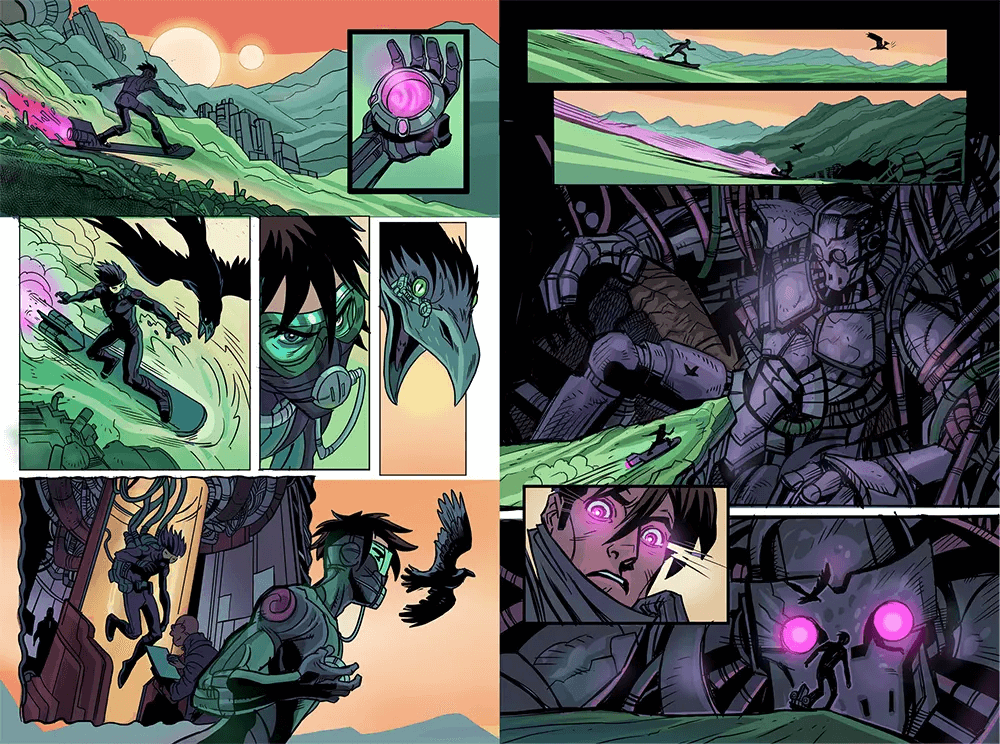
There are different panel types which are useful tools for storytelling. While they seem pretty standard, they can be used in different ways and combinations to create drama in your story. Adding multiple panels to an action can draw out time, show detail, or show the steps of the action, otherwise unseen. Using progressions like a close up can create excitement or tension when telling a story.
Wide shot
Use a panel showing the wider location to contextualize the scene.
Close-up of a character’s face
Show your character’s emotions at critical moments with a close-up panel.
Close-up of an object
Close ups of important objects can add more variety and context to your story, particularly during dialog sequences .
Overlapping panels
You can use overlapping panels or elements coming out of a panel to create an interesting transition. However, the technique of overlapping panels can be confusing if overused.
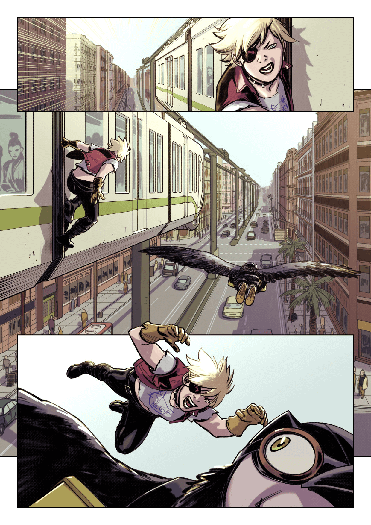
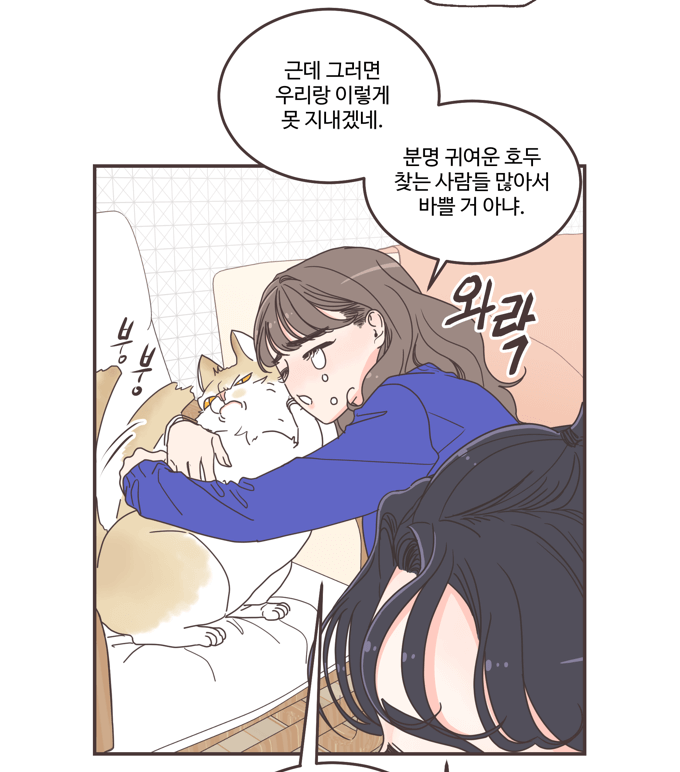
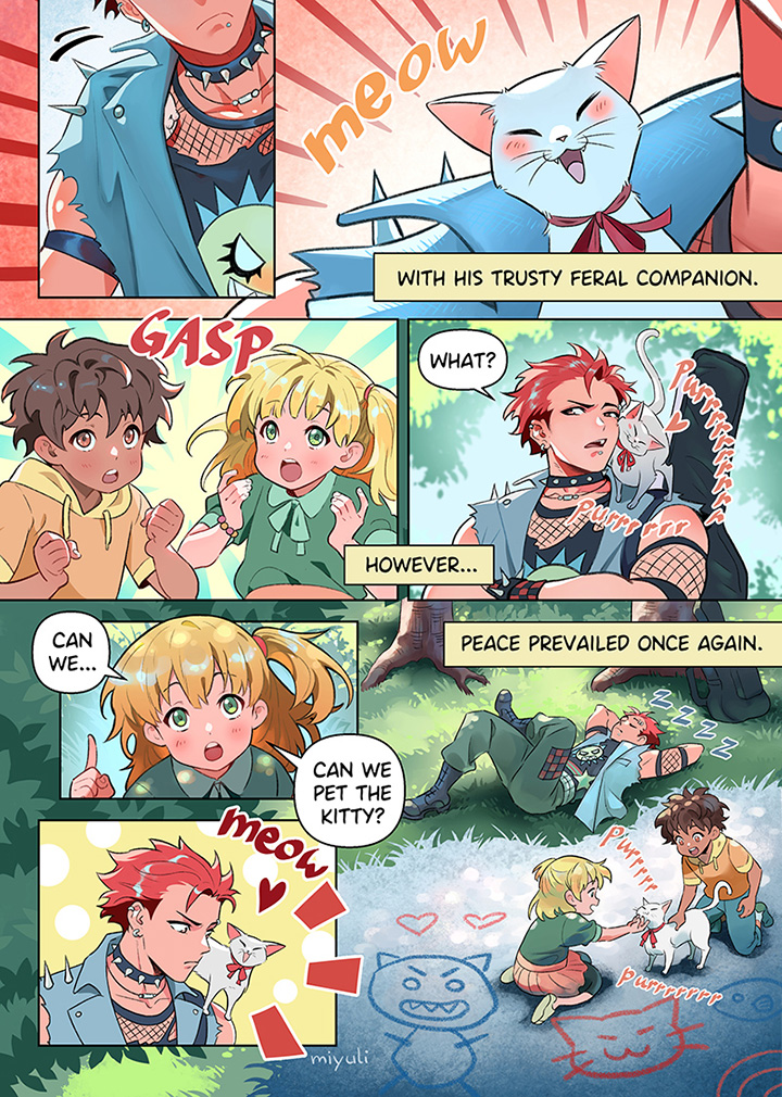
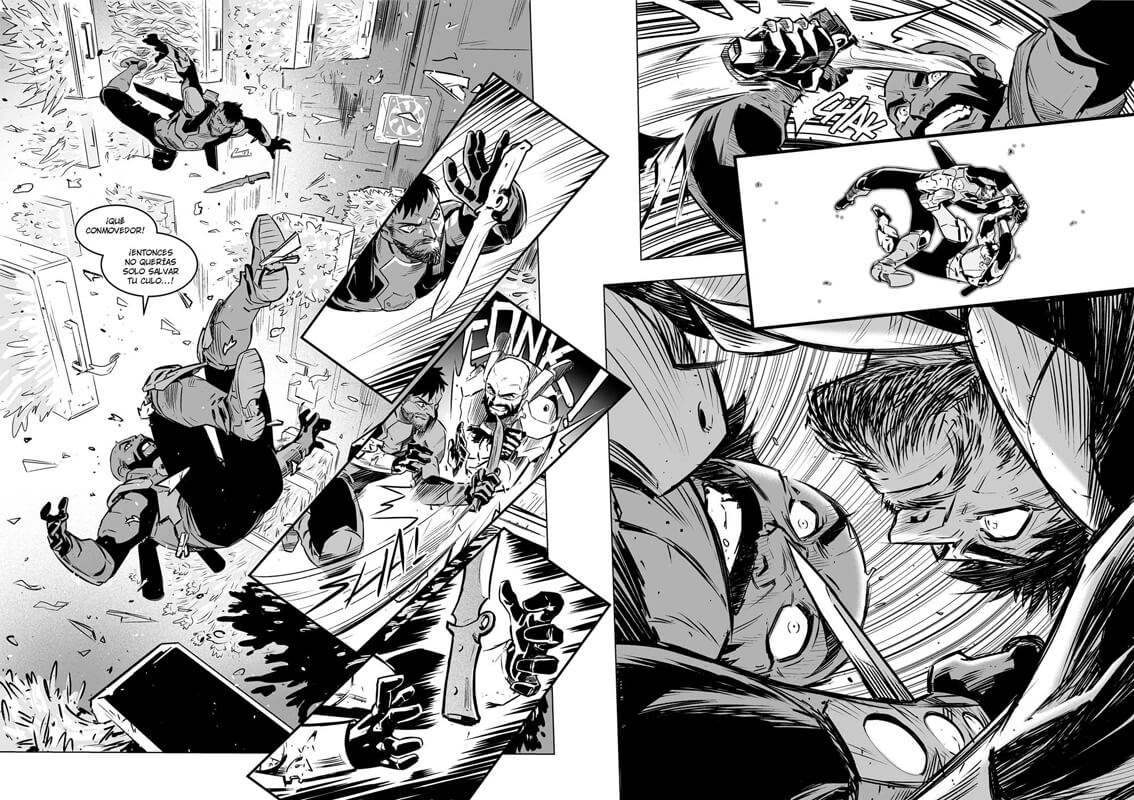
Capturing dynamic action and movement
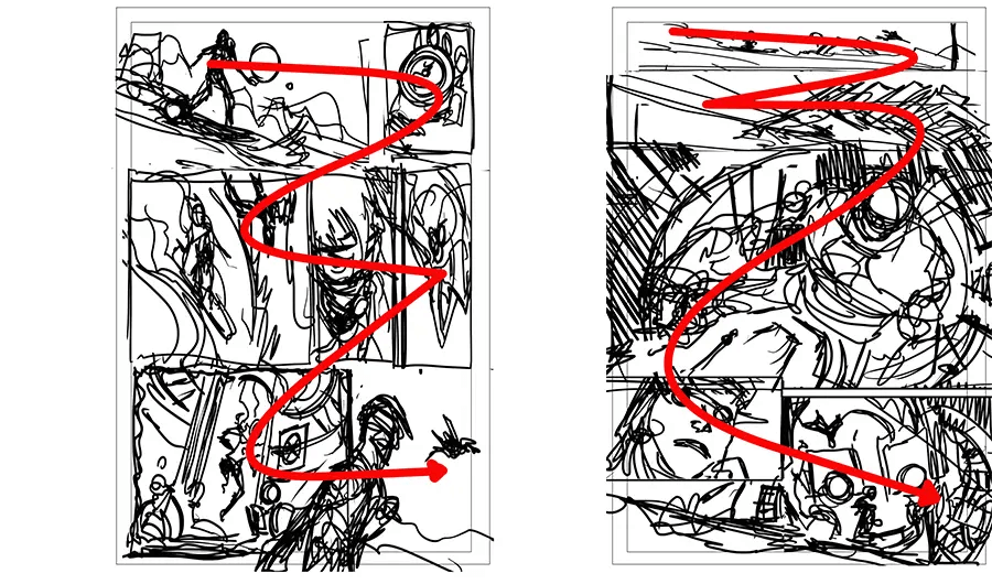
Comics, manga, and webtoons are static images, but they can be used to express action through cause and effect. You may try capturing a movement in a single panel as if using a fixed-point camera, like in the following example.
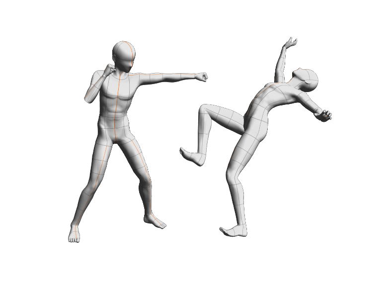
This shows the positions of the two people, but a single drawing is not enough to convey the progression of the action movement. To convey action effectively, you need three elements: anticipation, action, and reaction. You can also change the camera angle for each panel, keeping in mind the progression from left to right.

This technique of “anticipation, action, and reaction” can also be applied to all kinds of scenes, not only action scenes.
For example, to illustrate a character throwing a punch, show the motion of a punch by depicting the character pulling their arm back (anticipation), landing the punch (action), and the other character falling back (reaction).
To further express the changes in emotions of the characters within the scene, it can be effective to add close-up panels of the characters’ faces to show how they have been impacted.
Engaging Backgrounds
Backgrounds are important elements in comics, manga, and webtoons. They can indicate a change in scene or where a character is without the use of dialog.
Environment design and research
When drawing backgrounds in comics, manga, and webtoons, you should decide on the setting for each scene in advance.
For locations that come up frequently, like a main character’s home, you may even wish to create a room layout to reference. This will help you to keep the door and furniture layouts consistent throughout your story.
When deciding on the details of the setting, consider how it provides more information for your story and characters. For example, is your character tidy or messy? What decorations do they have? If you’re designing a city setting, how futuristic or traditional is it? Is it spacious or crowded? All of these details give more personality to your story.
Use 3D materials for backgrounds
3D models are often used for comics and webtoons as a reference for complex settings and to keep the layout consistent.
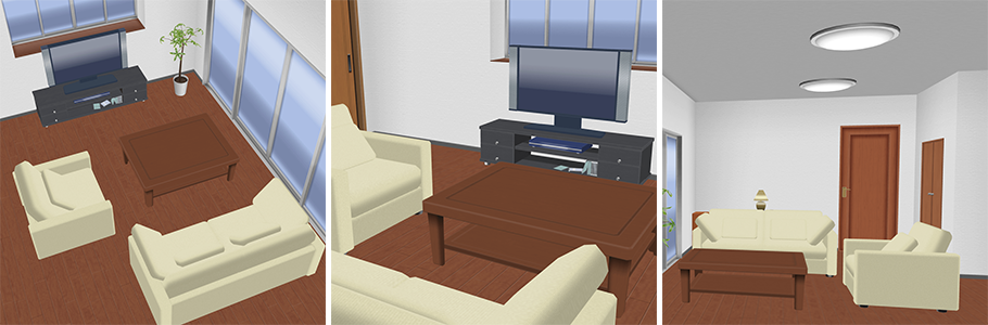
In Clip Studio Paint, you can import 3D models for settings such as rooms, city streets, and train stations, and change the angle and zoom as you wish. Once the storyboard is done, you can convert the 3D model directly to lines, or lower the opacity and use it as a general guide when drawing the panels.
Perspective and depth in backgrounds
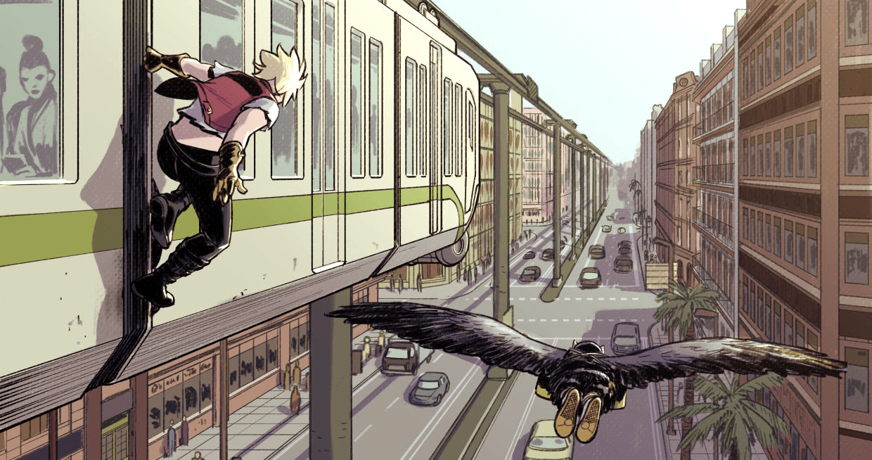
Using perspective in backgrounds can help create a sense of depth. Perspective is a technique that creates a sense of distance by depicting objects closer to the viewer as larger and objects further away as smaller.
The following figure is an example of a dynamic composition using perspective. The depth of the train and buildings is expressed through perspective. As the eye level matches the main character in the foreground, the road and cars are drawn smaller below, expressing the difference in height.
Balancing backgrounds with characters and dialogue
Although you should draw backgrounds with detail in wide panels where the setting is the main focus, you don’t need to draw detailed backgrounds for every single panel. In panels where the characters are the main focus, use techniques to modify the background to ensure that the character stands out.
With digital art software, you can draw the background and then adjust it so that the characters remain the focal point.
For example, you can make the lines of the background thinner than those of the characters and balloons, or fade the lines of the background. In some genres, you can add white space in the area around the characters to make them more visible.

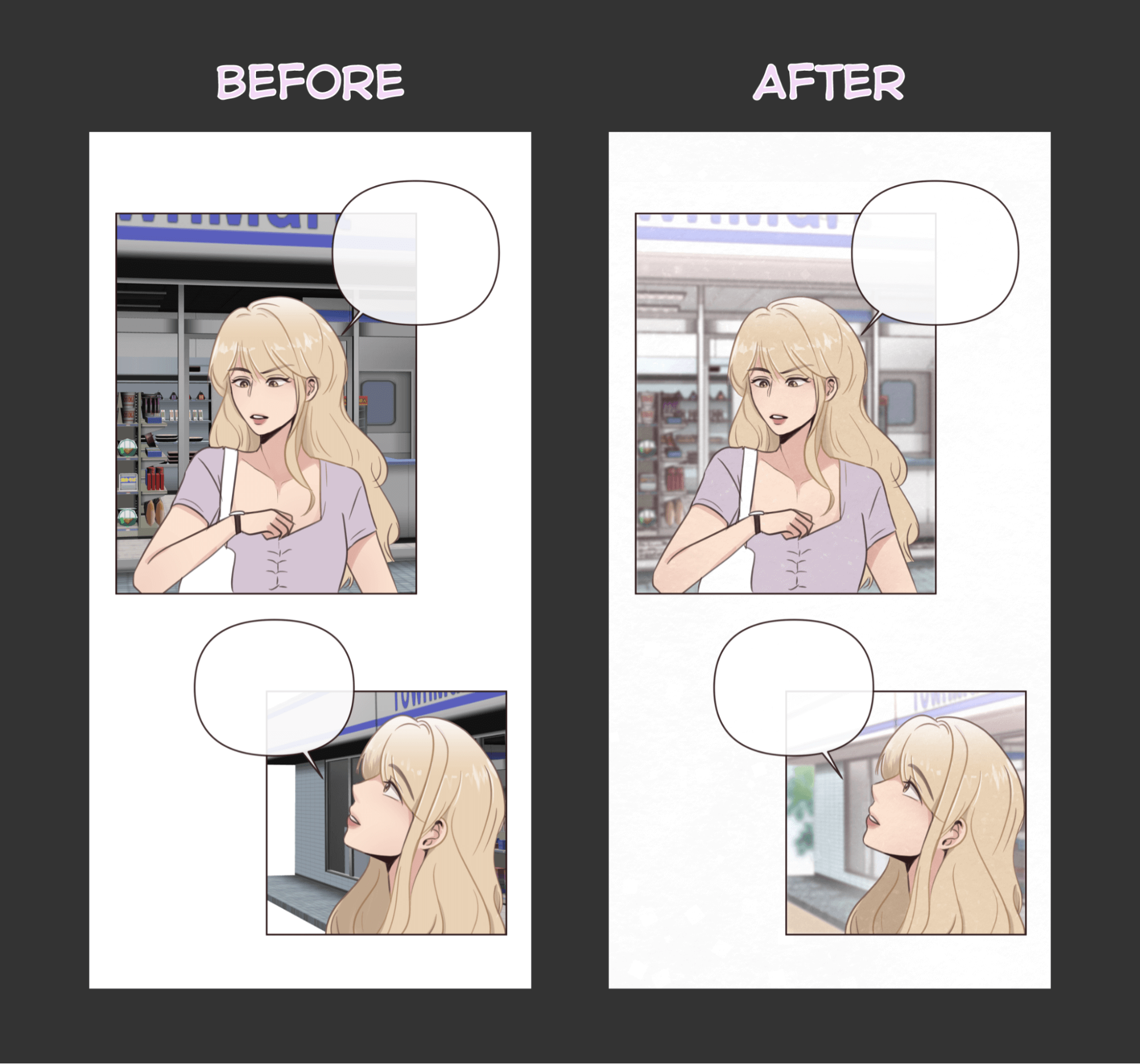
Simple backgrounds for webtoons
Webtoons are read on small smartphone screens, so the backgrounds are often drawn more plainly instead of in detail.
You can thin the background lines and lighten the background color to make the characters stand out.
In the following figure, a 3D background material was loaded to Clip Studio Paint, but the colors are too bold. A filter was added over the 3D material to make the colors blend better with the character.
Enhancing your typography
While often overlooked, typography is important to smoothly convey your story in comics, cartoons, and webtoons. This section explains ideal fonts, text placement, volume, and tips for sound effects.
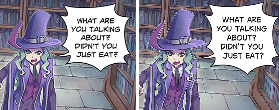
Choosing the right fonts
In Western-style comics, hand-drawn block capital fonts are preferred. A wide variety of fonts are used for sound effects, while orthodox, easy-to-read fonts are preferred for dialog. Some comic fonts need a license to use, but Clip Studio Paint includes a commercial-use comic font called Clip Studio Comic that you can use for your projects.
The fonts preferred vary from country to country. The figure below shows different fonts for the same work. On the left is Clip Studio Comic in English, and on the right is CCMarianChurchland in German.
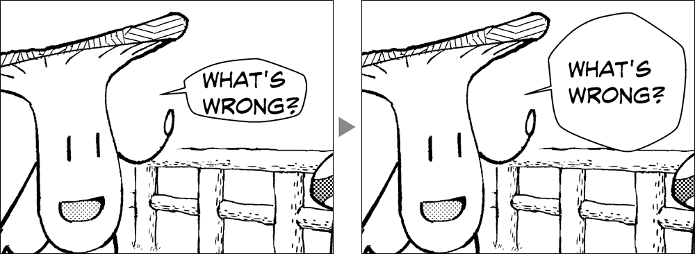
Lettering and speech bubbles
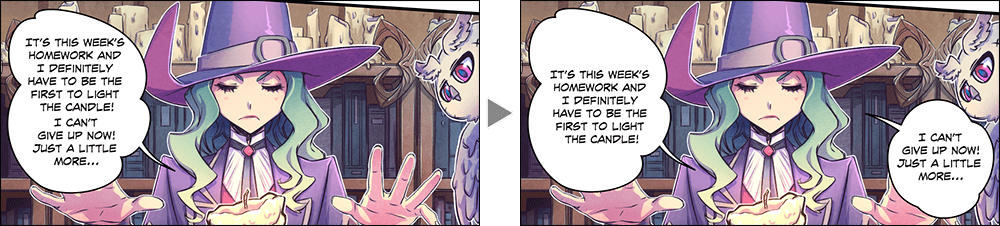
Keep in mind the balance between the text of the dialog and size of the balloons.
While it is important to make the text large, you should still keep a spacious margin in the balloons. This gives the text more room and makes it easier to read.
To avoid large dialog balloons covering important elements in your panels, you may wish to add rough balloons with the planned dialog at the storyboard stage.
While there are no rules on how much dialog you can include in your comic, a maximum of 35 words per balloon is a good guideline. If you have longer lines of dialog, try dividing it across multiple balloons to make it easier to read.
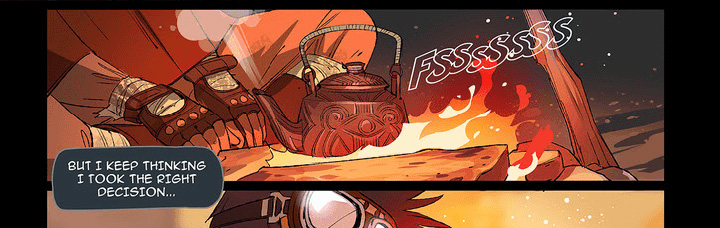
Incorporating sound effects to add impact
Sound effects, or onomatopoeia, add depth, impact, and immersion to your comic. Sound effects can be hand-drawn or written using a variety of fonts. In Clip Studio Paint, you can even download pre-drawn sound effects to use in your panels.
In the following example, the sound effects are placed in a scattered manner to match the position of the scattered hamburgers. By matching the sound effects to the positions of the objects, the sound effect becomes a natural addition that amplifies the effect of the drawing.
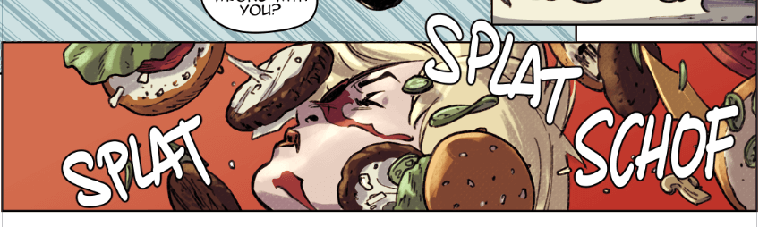
Often, the sound effects protrude significantly from the panel for more impact, almost like the sound is bursting from the page.
When drawing sound effect characters, think about how the texture, letter placement, and color of the words matches the meaning.
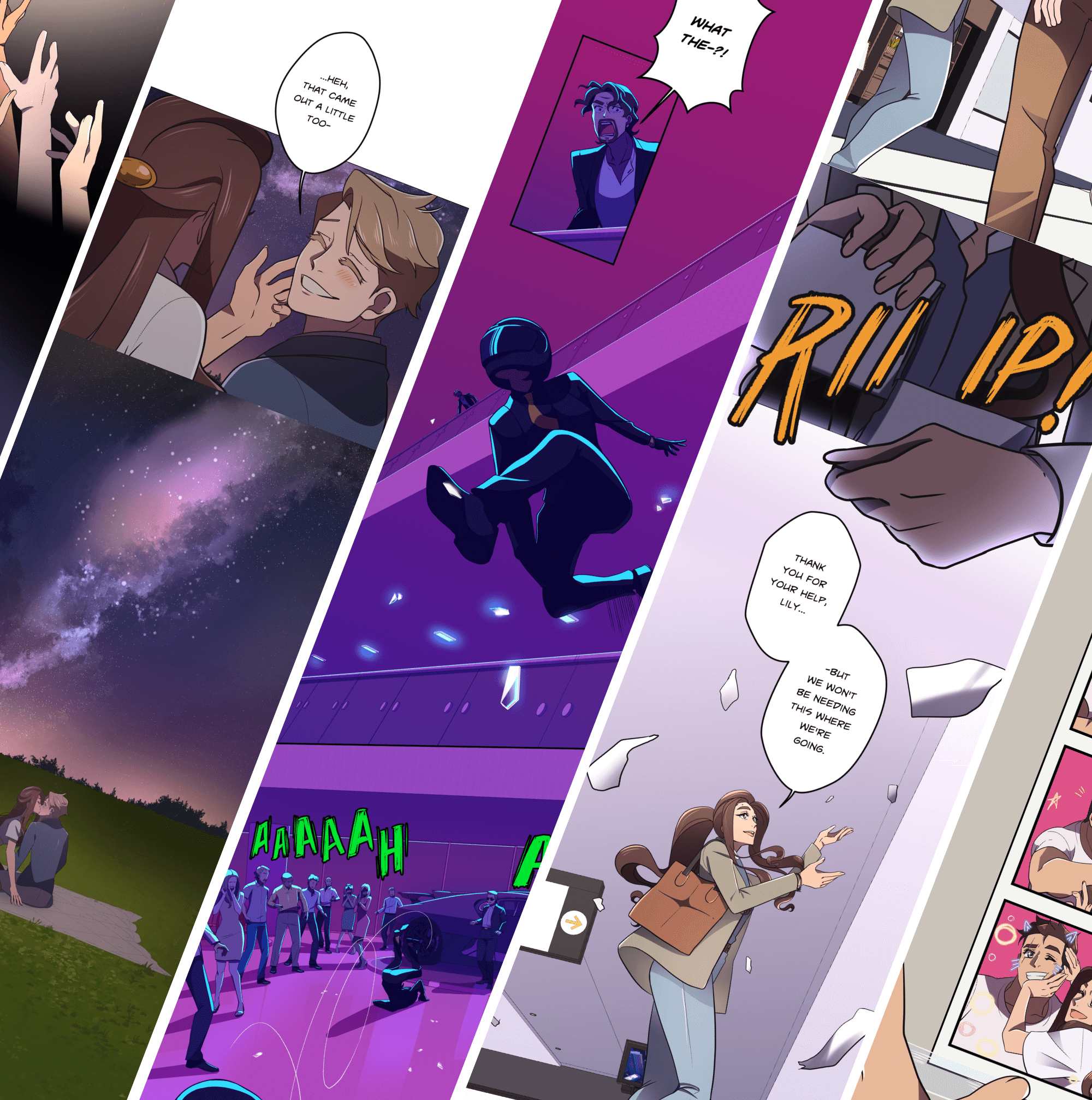
What Artists Are Saying About Clip Studio
-
 ArechanWebtoon ArtistUSA
 - ...there is no better software for making comics than Clip Studio Paint
-
-
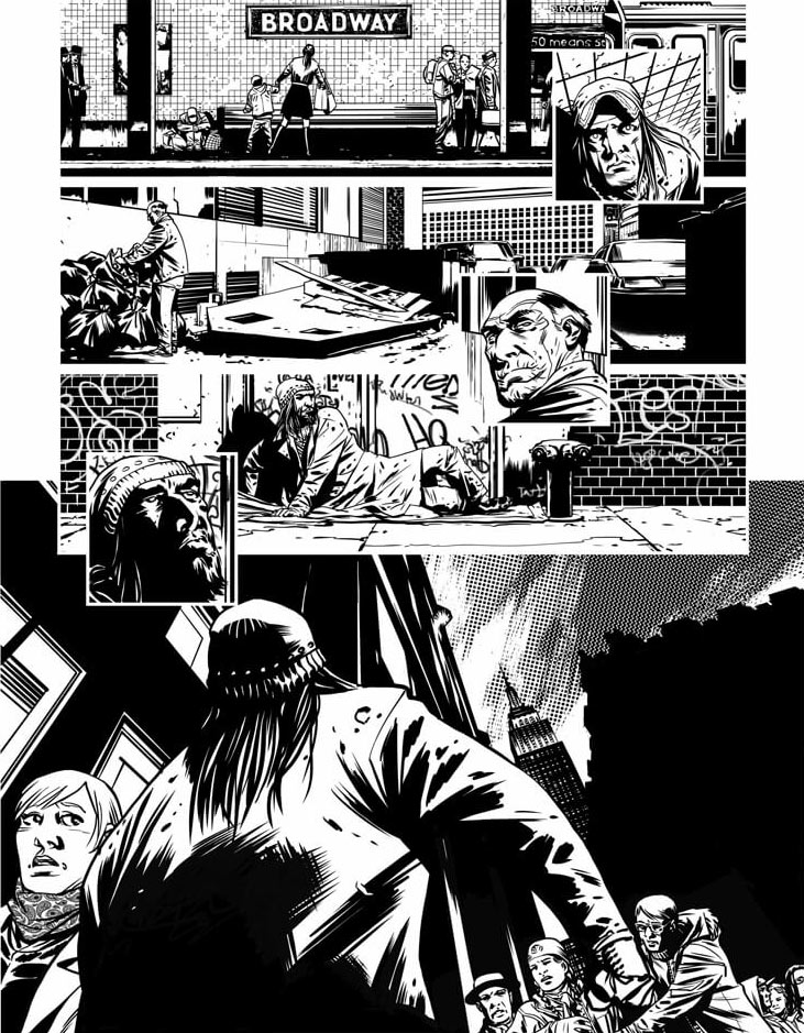
 Charlie AdlardComic ArtistUK
 - I can literally do everything I want to do on this single app
-
-
 Dylan TeagueComic ArtistUK
 - The brushes are just amazing… and feel extremely life‑like.
-
-
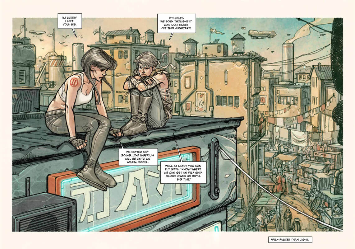
 Kenny RuizComic ArtistSpain
 - I can express myself freely in Clip Studio Paint without any restrictions.
-
-
 LaovaanComic Artist & IllustratorGermany
 - The app invites you to be more creative and try new things
-
CLIP STUDIO PAINT PRO
for character art, concept art, illustration
CLIP STUDIO PAINT EX
for comics, manga, webtoons & animations
Clip Studio Paint PRO/EX Comparison
| Feature | PRO For professional illustration |
EX All PRO features + animation and comic features |
|---|---|---|
Illustration (Character art, concept art, etc.) |
||
Import/Use 3D models |
||
Extract lines from images and 3D models |
||
Save layer comps |
||
Single-page comic tools |
||
Multi-page projects |
||
Webtoon tools |
* | |
PDF/Ebook export |
||
Simple animation/movie creation |
||
Full-length animation tools |