Introduction to Color Management for Printing (How to Switch from RGB to CMYK)

As many artists discover, the RGB colors displayed on the computer monitor can turn out differently from the CMYK color space used for printing. This tutorial explains the RGB and CMYK color modes, with essential tips on color management for artists!
When you’re viewing artwork and documents on a monitor, every color on your display is rendered in RGB — Red, Green, and Blue — because every pixel of your monitor is made up of those three colors. When you’re viewing artwork that has been printed by your desktop inkjet printer, an industrial inkjet printer or an offset press, the colors are rendered in CMYK — Cyan, Magenta, Yellow, and Black – which are the colors of the printer’s ink. These two color modes are available in Clip Studio Paint and it’s important for you to realize that they differ considerably in their approach towards color reproduction.

Human color perception is interwoven with our visual system. Our eyes have a retina – a layer of nerve cells lining the back of our eyes – which contains photoreceptors of two types: rods and cones. We see levels of light through the rods and color through the cones. We have three types of cones, of which some react to short, some to middle, and some to long wavelengths of light. We call short-wavelength light “blue,” middle-wavelength light “green,” and long-wavelength light “red.” In scientific terms, we are trichromatic beings.
Additive primaries — RGB
Trichromacy is responsible for us being able to experience additive primary colors. If you have three light sources of which each emits one-third of the wavelengths that make up the visible spectrum, you’ll perceive the color as white. As we are using light sources, we start with darkness (black) and add colored light — hence the term “additive.” To create white light, we add the three primaries in equal parts.
Depending on how much of each wavelength we’re adding, we will see different colors. As we are adding light, we associate the additive primaries with light-emitting devices, including computer monitors, TV screens, etc.
Subtractive primaries — CMY and K
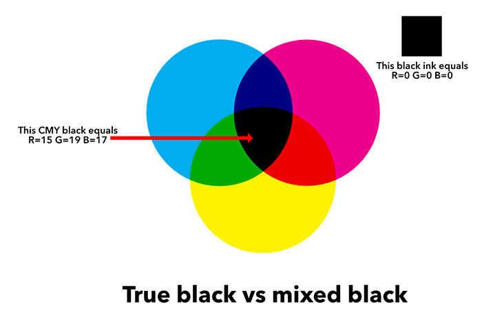
We can also see subtractive primaries with the eye’s cones. The colors that make up the subtractive primaries are cyan, magenta, and yellow. They refer to color that is reflected from a surface that absorbs white light. In printing, therefore, we start with a white surface (usually some type of paper) and add cyan, magenta, and yellow inks (or paint) to this white surface in order to end up with black.
You can also think of yellow as a short-wavelength subtractor, magenta as a middle-wavelength subtractor, and cyan as a long-wavelength subtractor.
Note: You’ll never end up with pure black from mixing cyan, magenta, and yellow only. The reason is that none of the pigments we make are pure enough, so the best you’ll get is a very dark brown. This is the reason why – when printing — we add black to the subtractive primaries. The letter “K” is used to rule out confusion with the “B” for blue. Black, however, is not a primary.
Color space
The three primary colors are useful not only to describe colors by themselves. They are also used to plot the relationship between colors by using the values of the primaries as Cartesian coordinates in a three-dimensional space, where each primary forms one of the three axes.
This space is what we call a “color space.” Well-known color spaces are Adobe RGB, sRGB (well-suited for the Web), eciCMYK (FOGRA53; print), GRACol, and SWOP.
For example, Adobe RGB was invented in 1998 by Adobe and is an RGB color space. It was designed to include most of the colors achievable on CMYK color printers by using RGB primary colors on a device such as a computer display.
FOGRA53 is a CMYK-based exchange space, which means it primarily serves color communication throughout print production. It complements reference printing conditions that reflect actual offset-based printing conditions. FOGRA53 allows for a consistent color reproduction throughout production, including copy preparation, job assembly, proofing, and process color printing.
It spans the expected range of color gamuts used for the production of printed material from digital data, regardless of the printing process and allows for proofing capability on established proof printers. (See: New CMYK-based color exchange space: FOGRA53 and eciCMYK released).

FOGRA53 color space
Measuring color
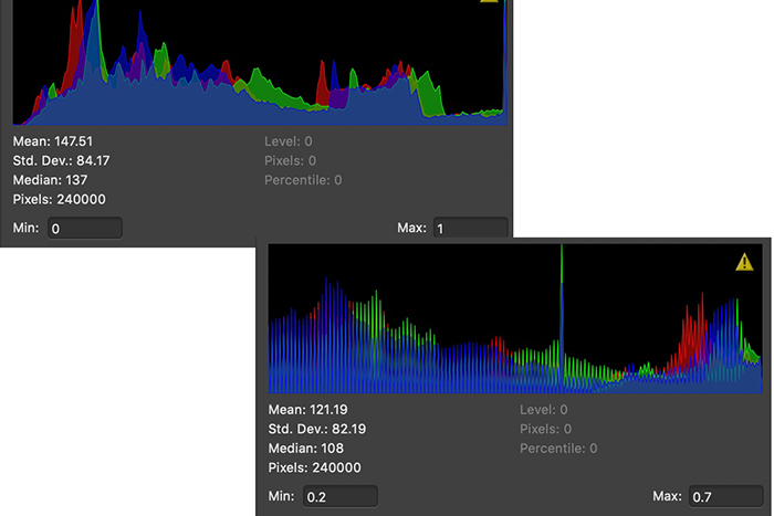
Humans are “trichromats,” but there are artificial trichromats too. We have developed photo scanners, cameras, and colorimeters to simulate human color vision. Of those, the colorimeter is the most accurate and important because it allows you to calibrate or profile a monitor. That, in turn, is essential if you want to ensure that the color you’re seeing on your screen matches the one to be printed as close as possible.

X-Rite colorimeter
Color management models
In addition to its trichromacy model, the retina has fundamental components that generate opposite signals depending on wavelength. This results in a model of the retina with the opponent pairs of Light-Dark, Red-Green, and Yellow-Blue. Both models are reconciled in a zone theory of color that describes how one layer of the retina contains the trichromatic cones with a second layer translating these signals into their opponents.
This is important for us because many models of color vision such as CIELAB — upon which most color management computations and conversions are based — incorporate aspects of both retina models.
RGB and CMYK expressed for digital devices
When we reproduce color on a physical device, whether it’s a monitor, a piece of transparency film, or a printed page, we do so by manipulating red, green, and blue light.
In the case of true RGB devices such as monitors, scanners, and digital cameras, we work with red, green, and blue light directly. With film and printing, we still manipulate red, green, and blue light, but we do so indirectly, using CMY pigments to subtract these wavelengths from a white background.
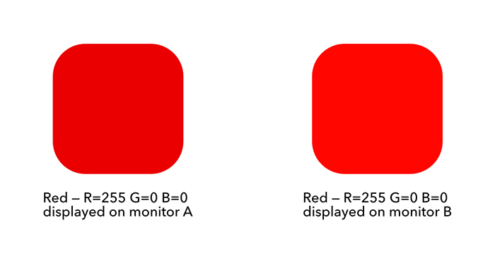
Most digital color is encoded to represent varying amounts of either R, G, and B or C, M, and Y, and K. However, these aren’t absolute values as an RGB or CMYK file only contains a recipe for color rendition that each device interprets differently. If you send the same RGB file as is to different monitors or the same CMYK file to different printing presses, you’ll get different images. Some of these will look very close to one another, while others will show clearly visible differences in one or more colors.
RGB and CMYK models are not even meant to render colors exactly the same across devices. To make a comparison with the real world, imagine you’re buying highly pigmented “Scarlet red” acrylic paint from two different manufacturers that both sell their medium to famous artists all over the world. You’re buying the same color, right? Well, they’re called the same but they don’t necessarily look the same. They will, however, both be reds, but “Scarlet” will most probably mean something entirely different to brand X than it does to brand Y.

— Three brands of acrylic paint, each called “Scarlet red” —
A bit of the same happens with RGB and CMYK models. Imagine you’re now sitting in front of your computer screen and you’re entering a red with the values R=255, G=0, and B=10. You might expect the same rendition across printers of the same brand and even across brands. But that is not going to be what you get. Even with these printers all having been calibrated and profiled, you’ll see slight differences and that is because the numeric RGB/CMYK values we use with digital color devices are nothing but control signals we send to make them produce colors as they have been programmed by the device manufacturer. So you should always think of RGB or CMYK numbers as tuned for a specific device.
The colorants or primaries
With paint, the colorants are the pigments used by the manufacturer and the chemical used as a binder. A well-known British company uses Arabic gum as a binder for its watercolor paint. That will result in a very slightly visible yellowish tint across all of its colors. A US-based competitor who is better known for its acrylic paints has launched a watercolor range that uses a 100% transparent binder, resulting in “truer” pigment rendition.
With digital color, we neither have pigments nor binder chemicals, but we do have other factors that interfere with a “pure” rendition of a color. The color that a device can reproduce depends – first and foremost – on the colorants it uses to do so. On a computer monitor, the primaries are the screen’s RGB LEDs. In a scanner or a digital camera, the primaries are the filters through which the sensors capture the image.
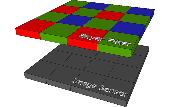
— Bayer Filter over camera or scanner image sensor —
In a printer, the colorants are closer to the real world in that they are the inks, toners, or dyes they put on the paper. When determining how a specific color should be laid on the medium (or for measurement purposes) — and because the subtractive color in CMYK printers is a bit more complicated than the additive color in RGB devices – we usually supplement values of the primary colorants with values of the secondaries. These are the overprints Magenta+Yellow, Cyan+Yellow, and Cyan+Magenta.

— Insides of a modern inkjet printing press —
The colorants also determine the range of colors the device can reproduce, which we call the color gamut of the device. Finally, with CMYK devices we also take into account how bright colors are. We call that the density of the primaries which is their ability to absorb light.
Brightness, Dynamic Range, Density, White Point, and Black Point
Besides the colorants, two other values define the gamut of a device. These need to be measured and monitored as well: the white point and black point.
The color of the white point is more important than its density because the tint of white serves as a reference for all other colors. When you view an image on the monitor or on white paper, your perception of all the other colors in the scene will adapt to this reference. It’s called a white point adaptation and it is an instantaneous eye reflex.
— Setting the black and white point for correct printing —
With the black point, density is more important than color because the black density determines the brightness range the device is capable of reproducing. As the rendition of detail is largely defined by dynamic range, it’s important to get the device’s black point correctly.
On a traditional LED monitor, you can get just enough brightness differences near the bottom end to have enough detail in an image’s shadows.
On a printer, you can improve color and black point density by adding black to the CMY colorants. This produces a neutral black point and a much darker black than by using only C, M, and Y.
White point and black point are at the extreme ends of color rendition, but a color management system also needs to know what happens to the tone reproduction characteristics of the device.
That’s why you’ll often encounter the term “tone reproduction curve” (TRC) which is a curve that defines the relationship between input values and resulting brightness values in a device. When using monitors, scanners, and digital cameras we call this a gamma curve. With printers, we call it a dot gain curve.
From one device to another
The dynamic range of a printer or printing press is limited by the brightness of the paper and the darkest black of the ink. Some devices (your DLSR, for example) have a huge dynamic range compared to others (e.g. your inkjet printer) which necessitates a compression from the rendition of colors from the larger range to the smaller. We call this tonal compression.
There’s also a problem when one device’s gamut doesn’t wholly contain the gamut of another device. An example is your computer monitor, which comes with a larger gamut than your printer, but which can’t reproduce some colors that CMYK ink on paper can render.
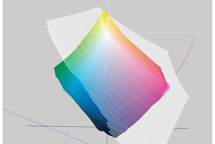
— The transparent white gamut is the display’s
The colorful one is a CMYK printer’s —
To solve both problems, color management systems use gamut-mapping, which is a range of methods — all with their own flaws — to reconcile the differing gamuts of our devices.
To reconcile a monitor and a printer, we know that some colors we want to reproduce lie outside the gamut of the computer screen and some are outside the printer’s gamut. To make these colors visible on a computer monitor or printable without distorting the color rendition of an image too much, we will run the image rendering through a modification process called “gamut mapping” using one of three rendering intents.
The first is Absolute Colorimetric. This rendering intent brings out-of-gamut colors back into gamut with the minimum possible change to them and leaves in-gamut colors alone. With this rendering intent, you risk changing some colors drastically while others may look totally washed out. That’s due to this intent showing the actual color of the paper white. Some saturated cyans and orange-yellows that are readily achieved in print can’t be displayed accurately on the monitor. Also, to show the color of paper white, the monitor has to display white as something less than RGB 255, 255, 255, so we lose some dynamic range as well.
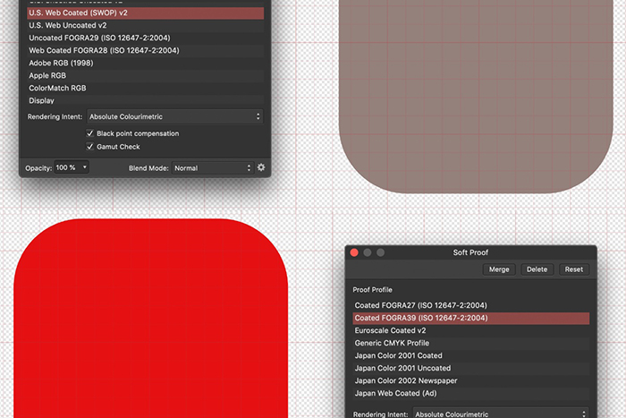
Absolute colorimetric
Color profiles
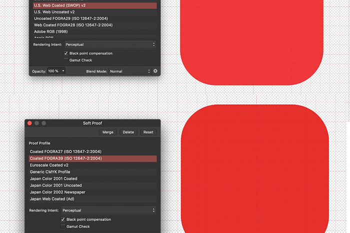
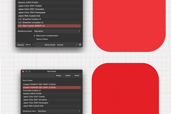
This is a good place to introduce color profiles. Color profiles actually are “descriptions” of the color space, gamut, and behavior of a calibrated device. In the professional printing world, color profiles such as “US Web Coated SWOP v2” are industry standards created by industry standards groups.
Printers will calibrate their printing presses to the standard such a profile represents, so that, when you use the appropriate one (ask your printer!) your colors will match those the printing press can reproduce.
Relative colorimetric is the second rendering intent. This brings out-of-gamut colors back into gamut by desaturating them but not changing their hues (if possible; not all colors can be brought in line without actually changing them). This is the way most applications render color to the display. Paper white gets translated to monitor white and all the other colors are shifted to match that white. This doesn’t show the effect of the paper white on the overall color, though.
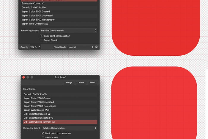
— Relative colorimetric —
Perceptual is the third rendering intent. It brings out-of-gamut colors back into gamut, keeping the relationships between different colors as closely as possible to the original. This desaturates everything but keeps the relationships between the colors intact. Color may become faded, but everything else stays the same.
Perceptual rendering intent
Saturation is the last rendering intent and it behaves like the Perceptual intent, but it moves out-of-gamut colors more than in-gamut colors. This keeps highly saturated colors as saturated as possible.
The Saturation rendering intent is mostly used for corporate logos and similar graphics, e.g. those colored with Pantone colors or other “spot colors.”
The most common intent for photographs is Perceptual.
Saturation rendering intent
When to use CMYK for output and when RGB
We use the term true RGB printers to refer to devices such as the LumeJet S200, a printer that has imaging heads based on LEDs. Through a fiber taper that acts as a lens, the printer reaches a resolution of 4000dpi, with the light from an individual optical fiber creating a red, green or blue spot the size of the silver halide particle of the photosensitive material the image has been printed on. It’s mainly if not only, used for printing photo books.
There have never been many true RGB printers and, at the time of writing, the LumeJet S200 was also no longer available. No other true RGB printers are currently known to me.
So, almost all printers are CMYK printers at heart, even our desktop inkjet printers. The common way to print to desktop inkjets is by using the manufacturer’s printer driver. When you print an image from an app, that driver converts the RGB information of the image into CMYK. Since the driver is developed by the manufacturer, it will render colors and put down the ink on the paper the way the manufacturer has intended it. This usually gives pleasing results.
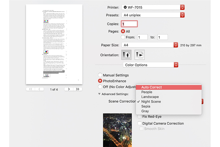
— The Epson RGB driver on a Mac —
However, if you want more control over how much ink for each color is laid down on the paper and you want to maximize the printer’s dynamic range, chances are a PostScript RIP is a better choice. A RIP — short for Raster Image Processor — bypasses the RGB-to-CMYK driver altogether and lets you handle the C, M, Y, and K nozzles and the complete printing system itself directly. The RIP essentially enables you to manipulate your printing process the way a professional printer would his proofing printer. With a RIP, you’ll be able to control color rendering, density, the amount of ink from each nozzle on the surface, etc.
However, with a PostScript RIP, you’ll first have to calibrate and linearize the printer, then build its basic profile and only create an output profile for each combination of ink and medium. All of that requires you to use a spectrophotometer such as the X-Rite i1Pro. It does provide you with total control over how colors will turn out to look on any specific paper, and it allows you to soft-proof your artwork accurately.
And that concludes our intro into RGB, CMYK, and color management.
About Erik Vlietinck
Erik Vlietinck became an independent writer and sub-editor 30 years ago, creating high-quality content in English and Dutch. He is familiar with industrial printing, video, and audio production on the Mac platform, as well as graphics design, digital publishing, color management, and more. As a journalist/reviewer, Erik contributes to a number of US- and UK-based publications, while serving Fortune 500 companies and SMEs worldwide as a technical copywriter. He is a keen amateur of pencil drawing and painting with acrylic media and has had some of his artwork exhibited in his native city Antwerp.
Interested in graphic design or what it takes to become a graphic designer?
Check out the link below!

)