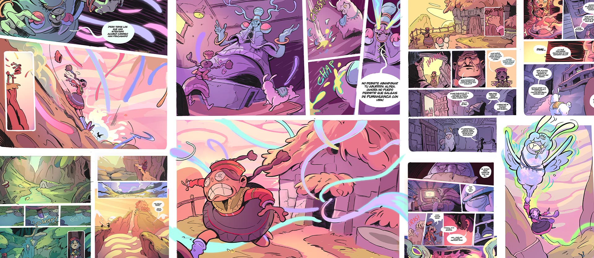
Thank you for all your outstanding entries!
We received over 1,600 illustration and comic entries from 1,317 participating schools in 90 countries and regions around the world.
Comic/Manga/Webtoon/
Bande Dessinée Category Winners
Bande Dessinée Category Winners
Storyboard Category Winner
Illustration Category Winner
Comments from Judging Panel & Winners
Watch the video for words from the judges on the contest, as well as specific critiques on the winners of the Grand Prize and individual category prizes.
Mariko IkedaSHUEISHA Manga Mee Deputy Editor-in-Chief
Manga mee: https://manga-mee.jp/
Manga Meets: https://manga-meets.jp/

Takashi HijikataComic editor for Second Integrated Comic department and member of editorial board for Vertical Comic department at KADOKAWA
https://group.kadokawa.co.jp/global/
This was my second time as a judge and I can say there were so many beautifully put-together pieces. With the Journey theme, I was taken on many trips: to our world, fantasy worlds, & worlds within. I don't deny that descriptive comics are good, but I would have liked to have seen more journeys that told exciting stories.
In the Storyboard Category, some of the contestants had unbelievable artistic ability. The skill used to tell the story surpassed the original text & superbly expressed it in comic form. When you have a manuscript, you can afford to make the best of the format and express the story in pictures, rather than lengthy dialogue. Like last year, I think that the essence of comics are their story layout. But to fully express the story, the power of rendering can't be ignored. I'm expecting even more from you as you all continue learning.
Once again, I felt passion for comics around the world through this experience reading your works.
Thank you so much!
Kazushi SuzukiEditor-in-Chief, Young Magazine, Fourth Business Bureau at Kodansha
I was impressed by how many entries came from all over the world, and how diverse the stories were. At the same time, I felt that no matter the genre, be it manga, webtoon, or bande dessinée, all of the entries were, at their core, stories that were woven together by pictures.
There were sadly many entries with remarkable stories that did not win awards, but all the winning stories had one thing in common: they made sure that they conveyed their stories through pictures in an easy-to-understand way.
I sincerely hope that you will all continue to create works that many people enjoy while referring to the critiques of the other entries to see how their stories are structured for ease of understanding, and how they get their points across with their artwork.

Takuya KashimaBookLive Editor-in-Chief, Content Div. 2nd Comic Editorial Dept.
https://booklive.jp/
https://www.manga-nino.com/
The judging process was thrilling this time, as we received even more entries than last time. Since the theme this time was "Journey", I was looking forward to seeing what kinds of journeys you would all take us on, but I was surprised to find that all of your ideas went beyond what I could even imagine.
Readers often judge a work only after a few pages, and quickly drop off if it doesn't appeal to them, so the challenge for you was how to grab your readers' attention from the get-go. But even with this one theme, you proved that there were many different stories to be told, so I believe that no matter whether you were a winner or not this time, you will surely get closer to becoming a pro as long as you keep your readers in mind and draw scenes that will grab them.
I hope you all continue to challenge yourselves and hone your skills even more.
Haruka IseEditor-in-Chief LINE MANGA 1st Editorial Department
I am delighted that manga, as a form of entertainment, born from a single person's creativity, has spread this far across the world, putting a lens on all sorts of ideas and cultures. I hope that this wonderful event will continue on into the future, so that works written in many different languages can inspire the next generation of creators.
That's the future we are excited about.
That's the future we are excited about.

Koji YanoWacom Creative Business Unit Vice President
Once again, I had a lot of fun reading great entries from so many places around the world. The overall theme of this contest was "Journey", and I was impressed by the diversity of cultures, views, and concepts displayed in so many unique entries. I know that many of the students who want to make this their future career entered, and this contest is a unique opportunity to get advice from professionals like artists and publishers who are already in the industry. We hope that you take advantage of this opportunity to keep creating even better artwork into the future. Wacom will provide you with the tools that will allow you to hone your craft and we look forward to supporting all your successes far into the future.
Haruna Ikedapixiv Editor-in-Chief, pixiv Comic Dept.
We are so pleased to have seen so many entries for this year's International Comic/Manga School Contest. The entries this year were packed full of enthusiasm and it felt like your characters, who we had never met before, came to life right before our eyes.
It has been over 800 years since Choju-giga emerged, which is said to be the origin of Japanese manga. And now, some 30 years after the explosion of the internet, it is possible to read, create and send manga to and from anywhere in the world. I think it's great that even though we may be from different cultures and speak different languages, we can all share the same emotions through images and text. I really hope you can sit back, relax, read your favorite manga, and continue drawing what you love.
It has been over 800 years since Choju-giga emerged, which is said to be the origin of Japanese manga. And now, some 30 years after the explosion of the internet, it is possible to read, create and send manga to and from anywhere in the world. I think it's great that even though we may be from different cultures and speak different languages, we can all share the same emotions through images and text. I really hope you can sit back, relax, read your favorite manga, and continue drawing what you love.

Kim BedenneKi-oon Tokyo Office Representative
Official website: http://www.ki-oon.com/
Twitter: https://twitter.com/kim_ki_oon
Hello everyone and thank you for taking part. I was impressed by the fact that students from so many countries competed again this year. I was especially interested in the manga projects since Ki-oon is specialized in manga, but it was fun to read all the entries no matter what the genre.
I found that despite corona and everything that happened in the last two years, there was a real desire to move forward, knowing that manga and comics have been very sought after during this challenging period. This art form is more needed than ever before. I also felt there were lots of introspective entries with works where the story was driven by monologue, or narration. Which is not a bad thing in itself, but as far as manga is concerned, dialogue is what helps readers connect with the main character.
Think of striking quotes - those are the real game-changers in this medium!
Anyway, congratulations to all of you! I hope to see you all again next year!

Lee Hyon SukRED SEVEN CEO
I was so happy to have this opportunity to see so many ambitious pieces of work.
There was Comic Category entry that showed sparks of young talent in its artwork and the story's message, but there were others that already felt of a professional quality. I am very honored to be able to meet such promising up-and-coming artists through their short stories. The greatest right and privilege that students have before starting their careers is "Freedom". Pro artists are already known to the public, and have somewhat of a responsibility to respond to their audience's expectations for their work. So sometimes they can be hesitant to express what they truly want to. Students, on the other hand, are free from these restraints.
I would like you students to express yourselves in new, bold ways and push the boundaries of the manga form. Rather than focusing on perfection in your entries, it would have been nice to see more works that had the courage to boldly show their handiwork. I wholeheartedly look forward to encountering more brave challengers like yourselves, to work together and create epic pieces of work to inspire the world.
Thank you very much!

Javi FernándezComic artist
Instagram: https://www.instagram.com/javifernandez_comic/
Twitter: https://twitter.com/javierfdezart
Catalan based in Granada. Working primarily for the U.S. market, he started his career with titles such as Captain America: First Vengeance, Nightwatchman, Magneto and Nightwing. In the European market, he is known for Nuevas Hazañas Bélicas and his biography of Amy Winehouse. He is now attached to DC Comics' Teen Titans, Green Arrow, Justice League and Batman franchises and is currently providing the artwork for King Spawn, the latest Spawn spinoff by Todd McFarlane.
Comic / Manga / Bande Dessinée / Webtoon Categories

Overall Grand Prize
1 winner
US$3,300 cash prize / Wacom Cintiq Pro 16 (DTH167) / Three years of Clip Studio Paint EX for a single device


Hi! I am so honored to have been chosen as this year's grand winner for the International Comic/Manga School Competition hosted by the lovely people at Clip Studio Paint.
My comic, PAGPAG, is all about how we find meaning in our everyday lives. Since this year's theme was 'Journey,' I wanted to write a story about the journey of life, in hopes that it would really resonate with people, and maybe even touch their hearts.
To be completely honest, I don't think that I would have been able to make it here and submit my comic if it weren’t for the people that helped and supported me throughout this time, which are my friends and family. You know who you are! To you guys, I just want to say a big, big thank you for supporting me and really seeing something in the story that I was able to create.
Once again, thank you to CSP and the judges for hosting this competition and choosing me as the grand winner!
This was packed with lots of expertly constructed elements that made for a really fun comic read! It was able to present all of the necessary parts of a story - encounters, challenges, arguments - all while drawing in the reader with folklore elements that give a sense of Filipino culture. Right from the outset we knew this one was going to be good! The rest of the story was also easy to read and well-structured throughout. The character’s expressions were full of charm and the girl was especially cute!
Kodansha
This entry tackles the meaning of life with the cultural backdrop of the Philippines. We give our award in recognition of the creativity and composition of this piece that allows the reader to empathize with the characters, a man who is alive but believes that life is meaningless because it inevitably ends in death, and a girl, who is dead but seeks meaning in order to keep going on, through their daily interactions.
BookLive
The theme of the grand “Journey” that is life was well put across. The way the author used colors and panels was unique and kept us reading right to the end.
Wacom
It's a smooth read, and the dialogue and framework are compelling. The theme and the setting are original, and despite its philosophical content, the story remains easy to understand. The drawing is pleasing to the eye and the color contrasts are used appropriately. The double twist at the end is funny and touching. The small touches of humor keep the story light despite its deep themes. The duo might have been even more interesting if the protagnoist showed his human side earlier in the story or, if we learned a little more about the girl before her death. It would have allowed us to feel more attached to the characters.
Ki-oon
There was a strong start and an equally strong end, making for a good read. The way the scenes were impressively presented was a sight to be seen, and stuck with us long after. The emotions of the characters were drawn well and helped us feel attached to them all. It could have been made even better if the introduction (pages 1-2) had been adjusted to be a little more engaging.
FUNGUILD
This was a wonderful entry, full of deep sadness and compassion. The storytelling technique of looking back from the past to the present was wonderfully executed and draws in the reader. It would have been good to have a full-body view of the male character popping out of the frame on the first page to make him more recognizable as the protagonist of the story - that would have added to the immersion of the piece. At first, we thought the girl was the main character! If you just changed how you presented the characters, the piece would have been even better!
Mangatari
The strengths of this entry lie in the engaging setting and the characters' charm. The main character has an exchange with the ghost girl where he seems to accept her, before the scene where he tells her that “Life has no meaning” - this felt strange to us, as if he had suddenly shunned her. If the man had strongly rejected the idea of there being a meaning to life from the beginning, with the reason revealed for his beliefs as the death of his wife during the story, it may have been a more effective way to present his change of mind moving towards the climax of the story. (This might be just my sense as a Japanese person, but) if characters are drawn in grey or purple, they look like ghosts or something non-human, so unless you are intentionally trying to mislead the reader it would have been better to color the characters with a more lifelike palette. If you intentionally want to mislead the reader, though, you need to put a bit more effort into the staging to pull it off more convincingly.
Amutus Corporation
Really beautiful. The use of colors is extremely well done. The bright and warm girl being dead, the grey and deathly-looking man being alive was a unique surprise. The story was a rollercoaster with small twists and turns that suited the overarching message. Well done!
Tapas Media


Comic Category Award
1 winner
US$1,700 cash prize / Wacom One / Three-year, single-device code for Clip Studio Paint EX
Artist: JAY HuH / 제이 허 (South Korea)
Title: FREESTYLE LIFE (Korean)


Hello, I am JAY HuH.
First of all, I would like to sincerely thank all of the judges for selecting my entry as the winner of the Comic Category. It was my first time entering a comic contest, but I really put my all into it. FREESTYLE LIFE was a comic I first came up with in high school, which I reworked as the 22-year-old university student that I am now, and submitted to the contest. The fact that it won the prize means the world to me.
I struggled as I worked on the piece on how to present each scene so that it would draw readers into the story. In reading my comic, I'm sure there are some who wonder if I really went to LA and learned how to dance as an exchange student, but the truth is that I've never gone to the US once. The comic is really about my wish to travel to the US, so I will be sure to put the prize money from the contest towards my US travel plans.
I am so grateful I could take the first step towards my dream and spread my wings on the world stage. Now, I want to get on and create bigger and better comics moving forward.
You get an overwhelming feeling of joy encountering this new world that comes from the color and movement in this comic. The development of the climax in the latter half was a little weak, and I would have liked to see more beyond it. To showcase the entire story better the structure could be improved more.
SHUEISHA
The crisp, vivid colors paired with the dynamic images were breathtaking! The look of the comic went well with the dance subject and was a blast to read. We liked the youthfulness of the dancers, but it was a bit unfortunate that I could see where the story would go before I got there. It would have been better if you were more conscious of the themes of “betrayal” and “catharsis” at the end, so that it wouldn’t “just” be a good story!
Kodansha
We were shocked at the heat emanating from this piece, and how well it was drawn! The characters were so full of life, which made it a really fun read.
LINE MANGA
This is a story with a dream. It was fun just looking at it with its use of vivid colors and energy.
Wacom
This comic was a very positive piece with some amazing dance scenes in it! The expressions of the characters were electric, which I loved. The last part fell a little flat, though. It would have felt even more immersive as a piece if you had a strong scene where the characters were given the chance to dance bombastically back at the bullies.
I personally really liked the last scene, but thought it could have been even more spectacular if there were some kind of answer to the problem of the bullies that were the original trigger for the story (for instance, a reminiscense of the problem, or a feeling that it doesn't matter much anymore) to make the story easier to understand.
Mangatari
This author clearly has great drawing skills and originality with scene composition. The story felt like a bit of a missed opportunity as it ended without you drawing the scene where the character meets his friends on the dance team, and uses his dance abilities to push back at the bullies, which should have been the climax. There were many elements of the character that could be explored in more depth, such as the growth of the character, how dancing changed them, and their setbacks. I have the sense that there were so many of these kinds of things that it was impossible to do them all justice. Please keep in mind that it is important to think about episodes of the story by taking time to organize where you place the characters and the climax of the story.
Amutus Corporation

Comic Category Runners Up
4 winners
Three-year, single-device code for Clip Studio Paint EX

What you created here was not just any “journey”, but a multi-layered and intriguing “journey”. I was simply floored by the way you managed to construct this despite the simplicity of the plot. The story of finding the nonna in her youth was a wonderfully romantic touch. The fact that it was difficult to distinguish the line between dream and reality was an interesting touch, but we thought that it would have been even better if it there were some hints to the reader to help make that distinction more recognizable.
SHUEISHA
The artwork is finished to a high level. There is a feeling of nostalgia, but I don’t think there is a strong enough throughline with his grandmother’s memories of the secret room. This could have been improved if more scenes from the past were inserted at the beginning. I was overcome with the desire to draw the view of the sea from the room at the end - a very fitting ending.
KADOKAWA
There was real artistic design sense that went into these colors. The structure of the story was very clear and easy to read.
LINE MANGA
The artwork is masterful and the facial expressions of the characters are well done. I liked the character design of the supporting characters; they are all recognizable and we quickly get attached to them. Yet, set side by side, the main character pales in comparison. His characterization could have been made a bit more distinct. The environments are detailed and immediately immerse the reader in the world. They would have been even better if highlighted in larger frames, or even double-page spreads. The diversity of points of view and the work on the angles is also exquisite. However, the work on the colors confused me a little. Sometimes it looks realistic with a range of several colors, bur other times there are only shades of the same color. It's hard to understand which color palette is used for the sequences of the past and those of the present. Clearer color coding is needed to make this a more enjoyable read. It comes across as disorganized which prevents the reader from focusing on the story - it's a shame because the piece is full of emotion.
Ki-oon
The color palette was very well chosen and the story was an interesting read.
Planeta Cómic
Clean, expressive. Beautiful choice of color. Great use of flashbacks. Very touching story and journey!
Tapas Media

This one made me cry...There was a part in the middle where I lost track of the timeline and order of events, but it wasn’t a problem because I got the main ideas. The sadness was heightened by the fact that there were so many happy scenes interspersed throughout the piece. The contrast of the colors between the wasteland and the happy beforetimes were also effectively deployed. It would have felt more real if there was some dialogue from the people the character loved in the past.
SHUEISHA
It is not possible for just anyone to describe without words and with just expressions alone, how the despair depicted at the beginning of the comic leads to hope.
This entry, through its use of the retro-futuristic aesthetic, and the telling of the story of the the growth of the man born into this situation of devastation caused by gluttony, brings up lots of different emotions in the reader; from relief to excitement.
BookLive
We liked this entry because the content is understandable from the pictures alone. It was also pleasant to read because the visuals were large. However, the punchline at the end of the story is not easy to follow, and we were left feeling that more structure was needed in the story to make the most of its expressiveness.
RED SEVEN
We appreciated the composition and the expressions of the character to convey the story, through visuals, without any dialogue.
The author also used colors very effectively.
FUNGUILD
This entry had a good sense of how to use space. The panels in the flashback scenes were very dramatic, and read like the scene from a movie.
The story is told well, but we thought that it might have been good to include some monologue or dialogue amongst the artwork, as there were many parts about the character’s psychology and motivation that were vague and left up to the reader’s imagination to fill in, like what the search for flowers meant to the character, or how his encounter with the baby gave him hope.
Amutus Corporation
Purposeful use of color, expressive, great technique. Loved the hatching!
Tapas Media

This comic has all the necessary elements for a short story. The intro is speedy, and the fact that there is a full emotional arc in such few pages is definitely commendable. We were particularly surprised by how dramatic such a limited color palette could be.
LINE MANGA
On the topic of dreams for the future, we could totally sympathize with the boy's revulsion against the fact that his future is set in stone. Also the affection the mother shows that seemingly envelops the young boy is very tenderly expressed. A little more attention could have been paid to trying to portray parts of the boy dreaming of his future, like him realizing his own immaturity and how certain things are out of his reach.
Solmare Publishing (NTT Solmare Corp.)
The style is unique and simple, yet very distinctive. The line work is brimming with personality.
Planeta Cómic
This entry was wonderful. Especially the young protagonist’s desire to confront challenges. The gratitude for things you have once you leave them behind. This was a piece which allows you to feel all of these wonderful emotions. If you wanted to make it even better, since the characters talk about what they want to be in the future at the beginning of the story, I wonder what the main character’s answer was to that question, and how did it change as he grew up. How did he end up? It would have been even better if the thrust of the story was all focused around this theme of dreams for the future. The ending was amazing.
Mangatari

Critiques from the pros
This entry received detailed critique from EVER GLORY PUBLISHING CO.,LTD..
See critique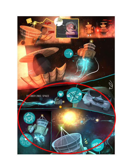
The artwork style feels very solidified. This piece felt more like it was intended as a picture book than a comic. If you were to have split it into panels, it would have suffered as it would have swung between the human perspective and the personified probe in the middle of the piece. From the human perspective, the probe is nothing but a machine. The probes feelings are just that of a probe, which is a one-way street. For that reason, I wish it would have been easier for each of them to see things from the other’s perspective. If you had done that, even though their standpoints were different, it would have gotten across the emotions and feelings of loneliness better. Conversely, though, I thought you did very well to express the feelings of the probe that does not seem to experience emotion. I would have liked it if it had completed its mission solemnly, without fanfare, though.
KADOKAWA
We loved the originality of Cassini’s amazing story and how that was conveyed using pop imagery. The layout of the panels was bold and impressive! That being said, it just feels like a series of facts about Cassini. It would have been a more engaging read if you had included some drama from his life which the readers could latch onto and get more emotionally invested in!
Kodansha
This entry makes good use of its strengths. Great care obviously went into creating it. The thought behind this, taking inspiration from the theme, was also well done.
RED SEVEN
This story centers around the probes being launched at Saturn, and you can really feel the excitement to get to space now, and the hope that brings for humanity. The story is based on the history of Cassini, an Italian thinker, but it might have been more interesting to the reader, if the author had included some fictionalized dramatic events. For example, a change of viewpoint when the craft gets an acceleration boost from a swing-by, instead of just a list of facts. It would have been interesting if the narrative jumped from the end of the mission to the future, where the probe is being repaired on Saturn, having still continued collecting data, long after the mission had ended.
Solmare Publishing (NTT Solmare Corp.)
The use of textures and colors is absolutely beautiful and whimsical. Love the expressions on the spacecrafts and the wholesome interactions between man and machine.
Tapas Media

Manga Category Award
1 winner
US$1,700 cash prize / Wacom One / Three-year, single-device code for Clip Studio Paint EX
Artist: theYOUNG (Taiwan)
Title: Kinabalu - Land of the Honorable Dead / 京那巴魯 - 尊貴的死者之地 (Trad. Chinese)


Before entering the contest, I had thought about giving up trying to be a mangaka, but thanks to the support of the people around me and some words of advice from my father, I decided to keep going. My teacher originally told me about the contest and was the reason I decided to enter.
This contest has been the most memorable experience of my life so far.
The contest was full of firsts for me: my first international contest, and the first contest I finished a piece of work for, not to mention the first I won a prize in.
At first, I had no illusions about winning a prize, and of course, neither did my friends. As it's an international contest, there must be so many other contestants who are better than me. I used everything I studied over my four years at university to create this piece.
What stayed with me the most when I created this was the spread where the climber got to the mountain top. It's the shot of the character's ascent to the top of Mt. Kinabalu, and symbolizes that if you work hard, you will be rewarded.
This contest has given me the strength to stay on the path of becoming an artist. I now feel that there is a future for me as a mangaka and illustrator. Right now, I'm putting together a creative team and if everything goes to plan, I would like to set up a small publishing house. With the goal of becoming a pro mangaka, I will continue to walk down this creative path.
The majestic mountains and the depiction of magic pulls you into this story. The climax really surprised me, which tells me that the manga was well executed. Add some more background to the main character and the other characters and this will turn into a truly unforgettable dramatic story.
SHUEISHA
I would first like to take my hat off to how this manga dealt with such a big theme without being preachy. The drawings were very real and the construction of the story went above my expectations as a reader. The end of the story has an appropriate rise in action and I was impressed by how the artist based this on a true story that ends in salvation.
Kodansha
Mt. Kinabalu is a sacred place that serves as a catalyst for you to realize you only live once and how precious that is. Over the course of this short story you see the emotional state of the main male character drawn out to express this. Life is really like climbing a mountain. Meaning that the higher you climb, the more hazardous the terrain becomes, but you also come to see brightness in the sense of loss that is not life, but death. This was shown beautifully through the composition of the story.
BookLive
The drawings in this work were top level among all entries. The juxtaposition of the main character's hard climb up against his life really made you feel the weight of each step. The ending where he tragically died made a complete ending to this story.
LINE MANGA
It was a story with a lot of depth. The way it was made had me gripping to every word written.
Wacom
The drawings have personality, power, and impact the reader. The scene when the earthquake happens and the character falls from the mountain had a lot of presence and was good. I thought that the character might have had too many lines where he was explaining the scene where instead there could have been a bit more showing or it could have been explained in a monologue.
FUNGUILD
This story takes place in 2015, when an earthquake hit Mt. Kinabalu in Malaysia while people were hiking it. The focus of the story is on the people who would have been there, and the emotions of the aspiring mountain climbers are well drawn. The illustrations were good but there were some expressions that felt a bit stiff, and there could have been more of a contrast between him and other characters. If the aim was to depict the afterlife there could have been some more drawing of crossing over through a material or scene change.
Solmare Publishing (NTT Solmare Corp.)
The drawings were great and the story compelling. I especially loved how the author was able to pull off a story exploring the character's life up until now, his motivation, his personality, and how he felt about the mountain all within so few pages. The message at the end was also good. I thought that they discovered him a bit too quickly after his death, and that there could have been a bit more of a pause. If you did that this story could draw you in even more!
Mangatari
The best part of this story is how it was made so you experience the main character's life alongside him. I thought that the story gained energy through the different scenes as it reached the climax well and worked very well as a one-off story.
Amutus Corporation
Compelling and heartbreaking. You get to know the main character, Bryan, in such a short amount of time and can't help but root for him! Loved how the story unveiled.
Tapas Media

Manga Category: Runners Up
3 winners
Three-year, single-device code for Clip Studio Paint EX
Artist: Kono / この (Japan)
Title: Welcome to the Galactic Railroad Trip / 銀河鉄道の旅へようこそ (Japanese)

We were drawn in by the contrast of expression from the uneasiness and longing in the beginning to the smile at the end. The scene with the crowd of people headed towards the train was drawn beautifully and drew you into the world. There could have been some more about the pair's bond in the past to bring out more drama to the story.
SHUEISHA
Although I am somewhat familiar with the source material, apart from the characters it felt a little lacking (the way the full-body shots of the characters was drawn could have used a little work too). This, and the fact that the characters crowded the panels so much, made it difficult to immerse myself in the world fully. Next time, give some thought to how to present a cleaner view to your readers - give your panels some space and make the important lines stand out and you’ll do wonders for your piece. A more considered approach to drawing will also help. If you keep going like this, you may end up as someone who can only draw faces well.
KADOKAWA
This piece was well thought out and an easy-to-read manga! The drawings were very well rendered and the author knew where they wanted to show off the characters and drama. However, we wish there was a bit more of a twist in the story composition. Try creating more of a set up before an important scene and cutting into some of the backstory to create more drama to make it harder for the reader to look away.
Kodansha
Twin brothers who were pulled apart by cruel fate and ride the Galaxy Railroad to fulfill a promise. This story was not flashy, but we were moved by how this young boy holds onto a sliver of hope. We felt there was a lot of potential in the way that the author fit such skillful expression and movement into this amount of pages. We also saw the level of understanding that went into manga composition and how well that was translated into this work.
BookLive
The drawings were very good. It was a feat to create a one-off story that is easy to read in this page length. The ending felt like the start of a new journey and made us emotional.
Wacom
The drawing and construction of this story are the closest to a classic manga style that we saw this time. There is a great emphasis on the atmosphere and the feelings of the characters. The story has an interesting twist. However, it would have been nice to allow a bit more breathing room in the panels to make it more of an enjoyable read. The panels tend to darken the work as a whole so a stronger contrast would have been easier on the eye. A double-page spread for an important moment (i.e the departure of the train?) would have also reinforced the drama of the story. But all in all, I enjoyed this tribute to Ginga Tetsudo.
Ki-oon
This story is based on the novel “Night on the Galactic Railroad” by Kenji Miyazawa and was drawn with great detail. Going on a railroad journey that serves as an important journey through life is a well-known trope, but the way the character was faced with life, death, and conflict, and how their expressions were drawn was well done. The smile at the end was especially good.
Solmare Publishing (NTT Solmare Corp.)
The detailed drawings were very nice. There were a lot of close-ups of faces and a bit of perspective and anatomy that seemed off, but overall the drawings were very good. This author can grow more by concentrating on improving their layouts.There was a sense of surprise when the character finds out that this is a journey of death and that his older brother was dead but it was too bad that there wasn't more about their bond or the brother's personality. This could have been improved by showing their promise as a separate scene that leads into the ending line. Or make a scene about what they talked about the time that the main character takes his brother outside to play. By being more aware of what scenes you should add you will be on your way to making a more interesting and easy to read manga.
Amutus Corporation
The mystery and emotions in the story unfolds with beautiful pacing and strong, attractive visuals. Thoroughly enjoyed each moment of this bittersweet story.
Tapas Media

We felt like we were watching an animation with how life-like the emotions between the girl and the guardian bird (person) were. I think that it would have packed more punch if we had gotten a better look at the bird (person)'s face.
SHUEISHA
You can’t use the character who first appears at the beginning of the recollection as the main character unless you treat them as such when they first appear in the story. It’s also difficult to understand what is happening because we’re dropped into the middle of the story. The story ends up with the reader unable to catch up with what is going on as no conversations to explain to the reader why we are here, the appearance of the crow-man or -woman, or who it is afterwards. The fact that it was so difficult to take in was disappointing. It could have been a much more interesting story otherwise.
KADOKAWA
The drawings were fantastic! The main character's cuteness and coolness, the detailed illustration, the easy to read panels, it was all really thought out well. The world we were shown through the drawings was also charming. However, we did feel it was a bit lacking in story. It would have been nice if you had shown us not only what transpired but what will happen in the future to get the reader excited for more!
Kodansha
The delicate drawing style matched the fantasy of this story well. We want to know what will happen to the girl next.
Wacom
The character design is good for both the crow-man and the little girl. It would have been nice to have given them names, so we feel closer to them. The flow of the story is interesting, but the flashbacks could have been longer and a bit more polished. It is not clear what the girl's problem is, and why she prefers to get lost in the forest rather than go home. There can be a mystery around characters, but if their background is not fleshed out then it is hard for the viewer to feel attached to them. The end is pretty with a nice cut for the last two pages.
Ki-oon
The artist has a fairly good understanding of character design and panel composition. The fact that they were able to create a warmer atmosphere by adjusting the amount of light in the panel with screentone was great. As a new artist, I feel like it will be a challenge to see how you will develop the form of your characters from here on out.
RED SEVEN
The drawings were delicate, soft, and showed subtle details which made it easy to settle into the world of this story.
It was short but wrapped up into a good story. There were many scenes that were zoomed, out so it would have been good to include some larger panels with close-ups of character expressions to create more dynamic scenes.
FUNGUILD
Memory and promise that lives on in the depths of the heart. The girl remembers something that was in her unconscious memory after chasing a bird. This memory is a very sad one but the act of remembering it brings happiness that you see by the kind expression in the girl. The bond between the girl and her protector was well depicted.
Solmare Publishing (NTT Solmare Corp.)
The narrative flows naturally through the pages and the story is very well explained given the small number of pages.
Planeta Cómic
Short and sweet with lovely character designs, and great movement and detail!
Tapas Media
Artist: Gudang / 구당 (South Korea)
Title: Let's go to earth / 지구로 가자 (Korean)

This was an interesting take on the “Journey” theme. However, it felt a bit like self-therapy. I perhaps would have liked to have seen a digest around the loop part. Also, the part with the 19-year-old girl flew by and her death felt so sudden that I feel we could have spent a bit more time with her. That would have made it easier for readers, using a digest or a cut, to picture the 18 lives that came after hers.
KADOKAWA
The black and white brought a lot of good contrast, and we were drawn into another world. We gave a lot of points to this work because it was on the daunting subject of why we live a life of suffering and it was done well.
LINE MANGA
This piece was completed to a very high level, and there was depth to the story, which I enjoyed. I have high expectations for this contestant's future - they understand how to place the subject and arrange the composition within a panel. Taking part in these kinds of contests and even judging them is a challenging task, but it is rewarding to encounter talent like this that is close to perfection. There is no doubt in my mind that this is the best entry for me among all the categories.
RED SEVEN
The author crafted the characters and world very well, which draws you in. The character was not emoting easily but the panels and layout was very appropriate. We have to applaud how easy it was to understand the story the author wanted to tell.
FUNGUILD
The drawing style was gentle, and the setting was interesting. It was especially interesting and mysterious exploring how you would spend your time on Earth if you had lived many different lives. It might have been even more interesting to go deeper into the various lives to keep the reader in the world with all different points of view.
Mangatari
The main character was simple but charmingly lovable. Overall, there was a lot of information presented in dialogue. For example, instead of experiencing the life of the girl and having her dialogue just be retellings of her life, there could have been conversations with her family, or a scene from her school life to make the character even more well defined.
Amutus Corporation
Whimsical and such an interesting concept! The characters are so unique and charming.
Tapas Media

Webtoon Category Award
1 winner
US$1,700 cash prize / Wacom One / Three-year, single-device code for Clip Studio Paint EX
Artist: Lin Yuwen_Gwen / 林煜雯_Gwen (Taiwan)
Title: Sun and Rain / 太陽和雨 (Trad. Chinese)


Firstly, I would like to thank the judges for their comments. I am so grateful to have been chosen from among so many excellent submissions.
I took inspiration from my own life experiences when deciding how to tackle the Journey theme. Adding in elements of Taiwanese culture, this comic contains a lot of personal emotions for me. I also got a lot of valuable advice from the judges, which helped me to realize that there is still a lot of room for improvement. I want to continue improving my abilities, with the aim of becoming a pro creative. I truly appreciate all the judges' critiques.
The award was not the goal, but I hope in the future, I can create comics that soothe peoples' hearts. I will do my best to reach this goal, thank you again.
The light and weather effects were incredible and gave the characters life. I think that this piece could be further improved with more exaggerated expressions and if the scenes were more tailored to talking to the reader.
SHUEISHA
There are some parts where I think more effort could have been put while being conscious of the vertical nature of the medium. While some of the visuals are cute, the quality was unfortunately not very consistent overall. The part where the rain hit the window was a nice, big point, but you could have really played with the sense of time with the vertical scroll and milked the drama more.
KADOKAWA
This was very nice and easy to read! The pacing of the panels and the scene composition was well done. The use of the webtoon format was very good. This story was straight to the point but a good read. The drawings were skillful and I liked both characters. The level was very high overall.
Kodansha
The composition of showing the changing emotions and scenery using the webtoon format was very appealing. If the story was set up with the character missing her grandma as the goal in the beginning then it would act as a catharsis for the girl to reflect on what she wanted to do with her grandmother. This is without a doubt a story that makes you think back on the memories you have with people you love who have passed.
BookLive
The mix of comical and emotional touches was great. I understood the feelings of the heroine who wanted to meet her grandmother again but couldn't. However, the story felt too predictable so I think it could help to throw a twist in there to spice it up more!
LINE MANGA
It was a sad but heartwarming story. The use of space was skillful and it resulted in a piece that was easy to read.
Wacom
The dialogue between the little girl and her grandmother is well-written with moments that ring true based on small touching details (the little girl swinging her feet, the smile of the grandmother...). The facial expressions are well portrayed and it feels like we are in the train, together with the endearing pair. The use of the lighting also adds a nice touch to the atmosphere. Thanks to the work put into establishing the scenes that come before it, the conclusion is very moving. There is room for improvement with the drawings, especially in terms of proportions and color palette, but this is a good start.
Ki-oon
This was a balanced work with easy-to-read, well-colored frames. But I would have liked to have seen you make more dynamic use of the panels and push yourself a bit more with the story's presentation.
RED SEVEN
The dialogue was very smooth and I read through it quickly. The drawings and story worked together to convey the message well. It would have been interesting to have a little twist to surprise the reader.
FUNGUILD
This was a journey through memories of a girl and her grandmother. Meeting, parting, growth, warm memories. The weather outside the window marks the flow of time well. You can also feel the kindness through the expressions and colors. The ending line also made this story very relatable.
Solmare Publishing (NTT Solmare Corp.)
The art was amazing! I think that it would have been even better if the illustrations were a lot bigger and with bolder layouts to showcase the art more. The story was also good so it might be good to study other people's layouts to increase your expression. You can play with the camerawork more with the webtoon layout style to create more of a reading experience.
Mangatari
The scenes and the way you presented them them was very good. The views from the train and scenes of the trip in the past gave vividness to her memories with her grandmother. There was relatively little drawn detail in the scenes so it would help if you showed where they were in relation to the panel or show how other people were in the scenes to improve expression.
Amutus Corporation
A short and sweet story with a soft style! I would've liked to see Xinxin's face when Granny had said the line “The most beautiful view to me is you.” I wondered if she was too young to appreciate her words until she was older, or if her perspective and attitude had changed in that moment.
Tapas Media

Webtoon Category: Runners Up
3 winners
Three-year, single-device code for Clip Studio Paint EX
Artist: bactewia (Philippines)
Title: First Step (English)

The scene where the main character dives into the ocean but is simultaneously diving into her feelings in the form of a vertical scrolling panel was very interesting. The art style was also very charming and is something that a lot of people would respond to. It was a bit hard to understand what the character was trying to accomplish so it would have been nice to get a bit more background on that.
SHUEISHA
I can tell from the introduction of the story you had structured this with a vertical flow in mind, but the middle part feels more explanatory and so doesn’t really fit a vertical flow. In recognition of the work you put into the structure, I think you could have created a scene facing the sea from the mountain, or one looking at the protagonist face-on or from above and created a feeling of speed from the vertical composition. The story, along with the recollections, could be made sense of with some work, but it wasn’t the easiest of compositions to read.
KADOKAWA
The girl was very cute! Even her subtle emotional changes were drawn in an appealing way. The solid drawings helped to make the story very readable as well. The way that you showed the scenes was also very impressive! It was a bit hard to understand why traveling the ocean was so important to her. If we understood why she felt so strongly it would have been easier to relate to the situation.
Kodansha
The panels where the story wanted you to take notice were dynamic and the webtoon format was used very well. Coming of age is a theme that is everywhere and everyone has an experience with it so it was very relatable. However the main character was moving through the story a bit too much on her own internally. This made it feel like I was not invested in the story as much. This story could improve with this fixed.
BookLive
The opening was very beautiful and made me want to scroll for more! I could relate to Estelle's very real concerns about what she would do in her future. The use of colors and the range of expressions made it perfect to be a webtoon. I think there could have been more provided to have us relate to Estelle's desire to travel the ocean.
LINE MANGA
There were a lot of scenes where you got to see the changes in the character's emotional state that also used the vertical format very well. It was a relatable story.
Wacom
The finish of this work is fantastic and was drawn with great care to detail. The foundations are there, so your next challenge is to find your style and what makes you unique as an artist.
RED SEVEN
The color, art, quality, and polished look was very impressive. The ocean was particularly beautiful and blue and very striking. I look forward to this author's future works.
FUNGUILD
I thought that the ocean, the internal turmoil of the heroine and the people around her, and her eventual growth was expressed well. The ocean was a very beautiful blue. The color use for the heroine's internal emotions was very fitting. The expressions were also drawn very well.
Solmare Publishing (NTT Solmare Corp.)
The artwork is gorgeous and says a lot with hardly any text.
Planeta Cómic
First off, it is impressive just how much this author drew. It's an accomplishment to do this amount and the ocean was beautiful. Conversely, I thought there were some parts that could be condensed. In the flashbacks there could have been less internal thoughts written and more showing. Try imagining the feelings and thoughts and showing them with less dialogue and monologues.
Mangatari
I felt that there were a lot of scenes drawn out of the desire to show the reader them. But because of that I didn't know which one to focus on which felt like a bit of a pity. The heroine's face was not drawn at the end purposefully, but if we had gotten to see her face it might have been better because it could have shown the reader a peak at what kind of adventure is awaiting her.
Amutus Corporation
Beautiful colors, emotions, expressive characters, use of full canvas. The story felt very complete and was paced very well.
Tapas Media
Artist: Nakayama / ナカヤマ (Japan)
Title: Bard / 吟遊詩人 (Japanese)

The whimsical colors and gentle pen strokes matched well with the theme of lossing someone important. It might have been better to play with the scrolling layout to show just how gigantic the wolf was. If there had been a scene outlining how the main character thought of the wolf then the tragedy of their separation would be even more apparent.
SHUEISHA
This is really good! I didn’t really get the title, but there was variation in the details and the quality of the visuals. As for the story, I was left wondering if the lack of explanation at the end, or the way the story was concluded, was intentional. If you don’t tie the knot somewhat, the reader will be left feeling frustrated after putting your story down. I know you want the reader to understand the story, but you should have guided them to that point a bit more. There is the vertical scrolling way of presenting a story, but I think in this case it might have been better off with a more traditional color comic structure.
KADOKAWA
The atmosphere was incredible and the drawings very delicate. It was a charming, gentle piece. The girl and the animals were very cute! This story might be helped with a bit more care. Right now it ends abruptly after an action so there is no swell of emotion and the reader feels just left there. Put in some dramatic to create a rise in action and create a story that will grip the reader.
Kodansha
The ending left an immense feeling of loss which was good. The sense of loss and regret from the girl growing up stood out.It was a bit of a pity that the webtoon format was not used more for expression but there was enough done very well that it outweighed those negatives. This author has potential and I felt that it should be rewarded.
BookLive
The illustrations were good as well as the webtoon paneling decisions. However, I think that there is still a ways to go until this author is able to make a story within the world they have created.
LINE MANGA
The artwork is stunning, the character design of the beast is strong, and the girl is painted adorably. The setting is intriguing and the various panelling decisions that are made give life to the work. However, the story is difficult to understand because the relationships between the characters are not made clear enough. It feels like some pages are missing. It's a pity as this could have been a charming human drama if it had been explained more. On a more technical side, you also have to think about changing the color of the text according to the background color to make it easy to read.
Ki-oon
The power of this image and the ability to create an atmosphere that this artist has are both top-notch. That being said, the post-processing is a bit rough around the edges, and it seems like it was submitted as if it was homework. My honest opinion is that it is difficult to judge the talent that went into this work.
RED SEVEN
The drawings were gentle and enhanced by the use of color. I thought this unique world was drawn well. Seeing as it is a color comic, you could have brought some color to some text to make it a bit easier to read.
FUNGUILD
The world was well expressed with light and shadow. The use of the blacks really showed the emotional state well. The relation to the animals and nature was easily understood.
Solmare Publishing (NTT Solmare Corp.)
The theme of man and beast was very matched to this soft art style. Sweet stories are really nice. It would be even better if we got more of an idea about the background or more information for the reader. The reader always needs to know the personality, background, and the main driver for the character in order to relate to the story.
Mangatari
Lovely style! I love how the tone changes with the colors (light and simple to reflect innocence and happiness in the beginning, but becomes darker and more detailed as the story progresses). I do wish the story was expanded further.
Tapas Media

There is not that much dialogue however the character expression and backgrounds tell you enough. Cheering you on to pursue your dreams like this character does!
Wacom
The story is not outstanding, but it is cute though. The pop artwork makes for a fun read, and the color palette easily conveys the heroine's feelings to the reader. It would have been nice to add a little more detail to the girl in terms of character design to compensate for the simplicity of the lineart.
Ki-oon
The art style is simple but that also lends to how heartwarming it is.
Planeta Cómic
There were not many lines or monologues but each scene was easily understood. Try to draw more differently aged characters and different visuals. I think that you could have drawn the family relationships better if you focused on character personalities through dialogue instead of trying to avoid dialogue and depending on symbols and exaggerated reactions.
Amutus Corporation
A charming slice-of-life style and wonderful message. I liked the silent-comic style the comic took most of the time, and wished the artist would lean more into this without the use of any written words or dialogue. The few spoken dialogues there were, however, were impactful ones.
Tapas Media

Bande Dessinée Category Award
1 winner
US$1,700 cash prize / Wacom One / Three-year, single-device code for Clip Studio Paint EX


It's a great honor to be awarded this Category award.
Before entering the contest, I was mainly an illustrator. My goal in entering the contest was to give myself an opportunity for learning and to try my hand at creating a comic.
When I heard that I was getting an award, I was floored.
Thinking about the "Journey" theme, I felt that the challenges of life and growing up would be rich topics to deal with. As a high school student, I feel like my relationship with my family is changing, so I modeled the main character after our cat. I hope that through the cat's journey, both I and the character in the picture can gradually grow up. Setting the story, using words, and laying out frames were new challenges for me in the creative process. So, I appreciate the support and advice I got from my family and friends.
I am thrilled to have had this experience. I hope moving forward, I will be able to grow wherever my creativity takes me.
The visuals are cute and feel complete in a manner of speaking. I almost was able to get the story. It didn’t feel like a particularly new story, but it was full of heart.
KADOKAWA
What a cute entry! I enjoyed looking at the bright and warm illustrations, like those in children's anime. Overall it had strong pacing and flow. However, a few places were difficult to read because there were too many comic panels. I also felt somewhat sad that the ending was so brief it undercut my sense of satisfaction.
Kodansha
The characters, the color scheme, the artistic touches, everything is adorable! The strange cat's slightly sad but happy journey warmed my heart.
Wacom
Although the story doesn't contain anything strikingly new, the warmth that emanates from the drawings tells me it is a work that could warm anyone's heart, regardless of age or gender. The main character going at their own pace and the somewhat mysterious storyline work well together, making it a perfect story that no one can dislike. We chose this work because we did not doubt its good taste.
BookLive
The warmth of the drawings made me feel like I was reading the famous Belgian comic “Tintin.” There is something therapeutic about the cat's first journey, but storyline development with more content would be needed for continuation.
LINE MANGA
With such perfected work its hard to believe that the creator is a student. I also really liked the color scheme, which was full of warmth.
RED SEVEN
The story seems standard, but the kitten is just so cute and full of life. The coloring is warm and inviting, and the kitten's relationship with the others seems to spread that warmth. The drawings also convey a sense of tenderness.
Solmare Publishing (NTT Solmare Corp.)
The drawings were wonderful, and on top of that, the story was also a great read. I liked the scene where he lifts up his grandmother's rice balls on the train. If the story included more episodes from the past with the grandmother, the relationship between the grandmother and the main character's kitten could be established from the beginning and further enhance a sense of empathy with the readers. It was fantastic.
Mangatari

Bande Dessinée Category:
Runners Up
4 winners
Three-year, single-device code for Clip Studio Paint EX

This has drama and excitement like watching a movie. I was intrigued by how the charming introduction naturally led to a development that made me curious about what would come next. The well-drawn backgrounds further enhanced my want to travel. The relationship drama between the older sister and younger brother could have been more in-depth. I think more background drama and circumstances would have increased an emotional attachment to the younger brother.
SHUEISHA
The drawings are outstanding...! The way the artist draws detailed gestures is not only well done, but also one that I can never get tired of. As for the content, it is a little disappointing that the middle is so predictable, but the awareness of plot development is commendable. There were parts where the reading order was confusing, so be careful how you place speech bubbles in the future, so your readers don't get lost.
Kodansha
Very well drawn. I also liked the punchline of two people meeting on a train and arriving at the same destination. This work made me look forward to this artist’s future stories.
LINE MANGA
The character design is a bit old-fashioned and the proportions of the characters sometimes seem a little ill-defined, but the structure, environment, and colors overshadow those weak points and make for a fun read. We have here an authentic story with well-written characters, clear objectives, and well-defined personalities. There is a solid introduction, turning points, suspense, and a bittersweet ending. In just a few pages, we enter another universe and become friends with the heroes. This was my favorite story of the contest.
Ki-oon
I appreciate that the men were very nicely drawn. The story was nice and cohesive. I think a webtoon format would also bring out the best in terms of this style and artwork.
FUNGUILD
The artist has excellent skills in rendering characters, clothing, and accessories. The scene where the characters reach the grave depicts the solemn atmosphere of dusk, made possible by the use of color.
However, the perspective- incorrect drawings and exaggerated faces feel awkward. I hope the artist can consider how to better balance comedic presentation and drawing practice in the future.
Amutus Corporation
Beautiful details in the characters and setting moving from day to night. Despite only just meeting by chance, the two characters have an easy chemistry with their fun and charming dialogue.
Tapas Media
Artist: Nagoyakanagomi / なごやかなごみ (Japan)
Title: Travelogue of a warm-blooded creature / 変温動物的紀行 (Japanese)

Even though you put in a lot of effort into creating an atmosphere, I don’t think you necessarily need to put each small line of dialogue into a speech bubble. I suspect it’s because you wanted to show that big vista towards the end, but I think it would have been better if you had just gone with pictures (showing the character’s expressions).
KADOKAWA
Wonderful visuals! The coloring and personal touch are consistent and worth reading. The composition and reading direction cleverly guided the eye through the work and directly related to its readability. The structure of the work, which gradually reveals the characters' circumstances, is also brilliant. However, some elements put the reader off, such as the unlikability of the main character's personality right from the beginning, making it difficult to get invested in the story.
Kodansha
The work itself is well crafted, and the drawing style is evidence of a very high level. The characters with deep backgrounds also have their appeal. On the other hand, the characters are not well introduced, and it is disappointing that the extent of their passion is not fully conveyed to the reader. It would be more appealing if more deliberate attention was paid to how the story is conveyed to the reader.
BookLive
The drawings are original and beautiful, though a bit dark and lack contrast between colors, which detracts from readability. Maki's character is intriguing; she would make a great heroine for a series. I would have liked to learn more about her and see her overcome some challenges in the story since overcoming difficulties seems to be the theme of her own life. On the other hand, the protagonist is so underdeveloped that I found it hard to care about him. It would have been interesting to vary his expressions to make his inner struggle more clear to the reader.
Ki-oon
I liked the beautiful use of visuals and colors. In particular, the expression on the woman's face in the fourth panel of the first page was lovely and drew me in at once.
FUNGUILD
The drawings are really beautiful and the techniques used give the comic a sublimely nostalgic and bucolic feeling.
Planeta Cómic
Artist: Sugoha (France)
Title: Rendez-vous under the oldest stars (English)

It is finished nicely, but the subject matter and design of this entry feels very classic. In terms of artistic ability, it would have been good to convey a more modern, or new, perspective using these kinds of classic visuals. Or, go the other way and put across a strong message or satire in a more contemporary drama. I feel like it would have been interesting to perhaps have drawn a journey to historical sites, or a journey around the world.
KADOKAWA
I like the fact they tried to tackle such an unusual subject matter and the rich use of color.
RED SEVEN
The story is about a journey through space that has a somewhat nostalgic touch. The illustrations are very nicely colored. The story develops smoothly, and you feel very comfortable reading it. If it had been a bit more dangerous or fast-paced, there might have been a bit more excitement.
Solmare Publishing (NTT Solmare Corp.)
The story is dynamic, and the original color palette gives the comic a unique feel.
Planeta Cómic
The theme of encounters in space is quite grandiose, and for such a difficult subject to realize, it was well put together. We liked the story's structure, which evolves into a conversational drama with the main character's counterpart. However, we felt that the joy of the encounter could be shown even better if the time span to the final encounter was a bit longer. It couldn't hurt to be aware of the passage of time in the comic while drawing.
Mangatari

Critiques from the pros
This entry received detailed critique from SILENT MANGA AUDITION®.
See critique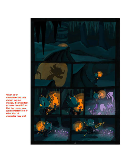
The main character is well done, full of joy, anger, sadness, and humor. You can really sympathize with her as she tries to go from a demon to an angel. However, the story was not very exciting, lacking surprises. The quality of the work would improve if, when drawing, you were aware of how to move the reader emotionally through climaxes to better involve them in the story.
BookLive
The characters of the angel and the devil are both interesting, and you root for them. The fast-paced tempo of the comic leaves a lasting impression.
Wacom
This is a very cute story with adorable characters. The lack of words does not hinder the reader's understanding of the flow of the story, which is quite rare. The expressions are refined and fitting; we feel the author is a confident lineart artist. The contrasting and soft colors are also well-chosen. It would have been perhaps interesting to flesh out the two main characters even more by showing the daily life of the little demon, or a scene so we can understand their love at first sight better.
Ki-oon
This piece is stylized in such a way it looks like it could be from an anime!
RED SEVEN
It is easy to understand how the main character wanted to act and how he did it for a specific purpose, even though there is very little text. However, there is a lack of originality in the depiction of heaven and demons as well as the story itself. It couldn't hurt to put more thought into the content, worldview, and character design.
Amutus Corporation
Storyboard Category

Storyboard Category: Grand Prize
1 winner
US$2,200 cash prize / Wacom One / Three-year, single-device code for Clip Studio Paint EX


First of all, I would like to thank the contest judges. It is truly an honor to have been chosen out of so many entries.
I found out about this contest from the Clip Studio Paint email newsletter. Because I want to become a mangaka in the future, I entered the contest as a way of training myself. This contest was the first one I entered, so to have won an award was so unexpected. It is also such a rare opportunity to have your work receive professional critiques from judges.
I appreciate all the work that went into organizing the contest, too.
Drawing the manga, the part I struggled with most was how to lay out the panels. My goal was to present a beautiful and well-structured page, while taking care to tell the story well. I'm still a work in progress, and there are many things I need to get better at, but on my creative journey from here on out, I hope to outdo myself and keep getting better.
This work was very easy to read with a refined manga-like design and composition. Try paying more attention to creating characters and settings with a bit more originality in the future.
SHUEISHA
Am I right in thinking that the age and gender of the magician weren’t specified in the original text? In any case, the story was an easily digestible read and was told well as a manga.
KADOKAWA
A very carefully drawn work! The readability is top-notch. The composition is reader-oriented and achieves good tension. However, the lines are a bit thin and blend with the background in places. It would be better to make them thicker and focus on the grid patterns to make everything even more readable. The level could be further improved if more originality could be shown in the design and composition of the images.
Kodansha
Thanks to the charming visual, you feel the character's warmth as if you existed in the same time and world. The effect on the reader of the powerful drawings in each panel is impressive, and the direction is well thought out. The artist has a sense for depicting human drama, and we are pleased to present this award to them in the hope that they will create an original work that will make the most of this sense.
BookLive
The crisp direction of the panels was good, and the dialogue had a nice pace and length to it. The ending was also well done, and overall, this makes it a well-structured work.
LINE MANGA
The drawings, panel layout, and structure of the manga were so well done that it was a smooth read. The characters' personalities were well drawn, and made you want to read the rest!
Wacom
The staging of the introductory sequence, with its large panels, allow all the past fear and pain to be seen in the protagonist's expressions, which was a good way to get the message across. Being a magician is not an easy task, after all. The use of the double-page spreads is clever, as is showing the master demonstrating his magic to his mesmerized disciple in a large panel. The lineart has a little way to go, but we can feel effort was put into the characters' facial expressions. The panels are often a little too small, so you should consider a three rows of panels per page as a maximum, so that the pages have room to breathe.
Ki-oon
The base drawings are good, and were just enough for me to be able to take in the performance of the characters. The line art was nice and smooth.
RED SEVEN
The characters' complex emotions were well expressed through their facial expressions and are praiseworthy. The way the panels were presented was also effective and drew you into the world.
FUNGUILD
The way the boy's facial expressions are rendered is good. The changes in his facial expressions show the deepening and growth of the relationship between the characters. Almost no panels of close-ups of the characters' mouths and eyes were present, but adding them could have given the story better pacing.
Solmare Publishing (NTT Solmare Corp.)
The visuals are stunning, and you perfectly get across what you want to the reader.
Planeta Cómic
Very appealing visuals. We liked them a lot, including facial expressions, backgrounds, buildings, accessories, and composition. However, it might be good if more close-ups of faces and larger panels were used to make them come alive. There are currently too many detailed panels, so it would be good to use some larger panels to engage readers and create a better tempo. We'd like to see an emotional explosion in the larger panels.
Mangatari
By showing the wizard's integrity and memories throughout, the revelation that the boy's words moved the wizard's heart was successfully shown. However, when all the images in an action scene are in the panels, they feel cramped. In this case, it couldn't hurt to paint over the edge in some panels. Even though the text of the monologue doesn't always match the scenario, many parts can be understood with visuals, so outlining the dialogue would make it easier to read on-screen.
Amutus Corporation
Strong visuals, great use of space and motion. Opening and ending were especially impactful, and every flashback to the mage’s past were done in a captivating and artful way.
Tapas Media


Storyboard Category: Runners Up
3 winners
Three-year, single-device code for Clip Studio Paint EX

We were fascinated by the world picture with its profound coloring and friendly character design. The expression of the characters is also impressive. It might have been better to make the panels a bit more varied.
SHUEISHA
The visuals weren’t the best, but I can tell that the artist tried their best drawing them. That being said, I appreciated the fact that they were able to put your imagination to use and really go beyond the original text, like with the conversation at the beginning.
KADOKAWA
The point of view used and the imagery of imaginary objects, such as the melted knife, are brilliantly done to transport the reader into this fantasy world. The story enters the reader's mind without difficulty. More vivid colors might make it even easier to read, and if you can remove the haziness of the highlights in the eyes, the humanity of the characters becomes clearer.
Kodansha
The way small items and gadgets are drawn here makes this one of the best among the contenders. The characters were drawn with a touch of individuality, but we feel there is room for growth. The work could be even better with panel rearrangement, a change of scenery, and the portrayal of emotions, especially the emotional transitions of the boy. These could be presented with a certain emphasis, such as panel size.
BookLive
The style of the work fits the fantasy world very well. The memory scenes, in particular, brought the journey into the past to life and stimulated the imagination.
Wacom
The choice of colors is very nice on the double-page where we see the characters go on a journey. The character design of the monsters and children is pretty good; I could easily see this style being adapted for a book series for younger children. However, I would suggest lightening the panels which are often too small and saturated. The eye has difficulty adapting to so many details in such a small space. I would also recommend working on the proportions of the characters, especially the adults.
Ki-oon
While there are some issues with how the piece is drawn, the effort put into coloring it in stood out to me.
RED SEVEN
The color scheme is very nice. The work could have been even better if the characters' emotions were a bit more expressive.
FUNGUILD
One gets the feeling that the boy's expression at the beginning of the work is not serious enough. It would be better to give him a more tense expression, such as one that conveys a sense of impending doom and determination, so that the subsequent relaxation would be better expressed. It would also be better to use darker colors in the darker parts of the image to convey a sense of fear.
Solmare Publishing (NTT Solmare Corp.)
The layout of the panels was very good. It was a clean, detailed, and time-conscious panel layout that made the reader want to take their time. Also, the facial expressions and distance between the two characters in the scene where they talk about it being a blessing and not a prize were wonderful. While it was nice that the story ended with a picture of the jewel, it would have left a more profound impression if the story had ended with the reader being shown the characters. For example, close-ups of their smiling faces could have been used to show that their relationship is a blessing.
Mangatari
The scenes where the wizard ponders the price of his actions make the world and characters understandable to the reader. However, there are problems with the drawings, as there are areas where the balance of faces and proportions are not quite right. The panel layout also looks monotonous. It's best to think about a scene and then how to make it more impressive, for example, whether to show a wide-angle or use a close-up to show facial expressions.
Amutus Corporation
The ambush by the mage was done so well! The adventures were done whimsically and brought out a great feeling of magic and wonder.
Tapas Media

Critiques from the pros
This entry received detailed critique from Solmare Publishing (NTT Solmare Corp.).
See critique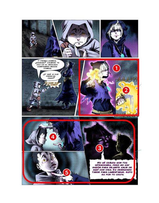
The worldview of the drawings is unique and leaves a vivid impression that is not easily forgotten. The effect would be even greater if the characters' expressions were as strong as this worldview.
SHUEISHA
The originality in the use of colors and artistic touch was very impressive. These aspects create an enchanting atmosphere, and the use of easily recognizable colors is well done. The expression of the light is also beautiful. However, the facial expressions and postures of the characters seemed a bit awkward. In addition, the arrangement of the images and the amount of dialogue means it gets hard to read.
Kodansha
The originality and drawing skill of this entry stood out. It's almost unfortunate that it was entered in the storyboard category. The story of the drama between the witch and the boy was told a little too quickly. As a result, the emotions meant to be conveyed to the readers were not fully portrayed, which was a shame.
BookLive
The unique American comic style was impressive. However, the amount of dialogue per panel was too much, so a better distribution of dialogue is needed.
LINE MANGA
The characters were clearly in focus, and as a short story, it was well constructed.
Wacom
The colors and the way the scenes were drawn were both impressive and beautiful. There are a lot of scenes zoomed out, so a more varied composition with different camera angles could have created even more impact to the most important scenes.
FUNGUILD
Although it's not quite finished, it is cleanly drawn and perfectly understandable.
Planeta Cómic

A manga that reads smoothly and at a good pace. However, the relationship between the boy and the girl was unclear and could have been structured better.
LINE MANGA
I can see an effort was made in the facial expressions of the characters and the way you gave impact to the powerful emotions. You made use of the panels very wisely: there is just the right amount of contrast to aid readability. On the other hand, it feels as though you were quite reserved with your artwork, which made the characters look stiff. The dynamism of the poses should be worked on and the paneling should be varied as it got a little repetitive. The final page is good, and has a nice, retro atmosphere.
Ki-oon
Emotional scenes are done very nicely, and the ending panel is strong! It could become even greater with a bit more variety in panel types and size, as well as different angles on the characters.
Tapas Media
Illustration Category

Illustration Category: Grand Prize
1 winner
US$550 cash prize / Wacom One / Three-year, single-device code for Clip Studio Paint PRO

Artist: KIKA (Japan)

Thank you so much for awarding me with the Illustration Category Grand Prize in the International Comic/Manga School Contest.
In this piece, I really tried to challenge myself to do something new. When I saw that the theme was "Journey," I initially struggled with how I should tackle it. Nowadays, it's scary to travel within Japan, let alone go abroad, but I wanted to put the idea into my piece that if you close your eyes and send your mind far away to somewhere you've never been before, your imagination can take you on wonderful journeys without even leaving your room.
I could not be happier to have received such overwhelmingly positive feedback from the sponsors I want to continue doing my best to create artwork that resonates with everyone.
Thank you once again for this honor.
There is a realism in the character’s expression as she lays down, imagining the world with the model plane in her hand. You can just barely make out the things she has prepared to take with her on her journey, but they’re drawn a little too darkly to notice immediately, which was a slight shame. Keeping the mood of the inside of the room, the piece could have been improved with a bit more of an expressive color palette.
SHUEISHA
The contrast between the star-shaped lanterns shining brightly at the top of the piece, and the darker palette employed in the rest of the piece were very intriguing. The ambiguity of whether the character is dreaming, or thinking about all the places she’ll go with the model airplane in her hand is an ingenious way to bring the viewer in and flesh out the story. However, all in all, the darkness of the piece makes it difficult to see the details - there was room for improvement, like making the piece a bit brighter, and focusing more on the small objects in the room.
KADOKAWA(Sneaker Bunko Editorial Dept.)
・The drawing is probably very skillfully crafted. The character is especially cute. However, because of how the illustration is constructed, your eye is lead to the star lanterns, which distracts the viewer, and makes it difficult to convey the emotion of the piece.
・I was really drawn in by the dynamic composition of the piece, despite how muted the color palette was.
・The interplay between the bright lights and the girl was well executed. The girl is cute.
・The mixture of the light coming from outside and the warm light of the lanterns overhead is really beautiful.
・The composition of this piece, where you can see the whole story in one glimpse, is great.
BookLive
The expression on the girl’s face as she sleeps contentedly in the warm light of the star lanterns was wonderful. The way it was drawn made me curious about the story that was packed into that small room - is she dreaming of going to a tropical island? Or perhaps she just got back from a trip.
LINE MANGA
This is one of the few illustrations that portray a character in a close-up shot with lots of little details. The young girl is very endearing thanks to the hints at her character we are given from the decorations and the accessories in her room. The light from the star-shaped lanterns is soft and dreamy, inviting the viewer to dream with her. The only problem is that the brightness is turned down a little too low and it takes a bit of an effort to fully appreciate the details. It would have been nice to have stronger lighting to highlight certain elements, so we can better understand the story behind the image (i.e the girl's face, the plane she has in her hand...).
Ki-oon
This artist does a brilliant job of using light to lead us to the key parts of this piece. It does this subtly but that should not be confused for underwhelming. It is actually quite effective without having to be ostentatious. The composition and lighting lead the viewer's eye to the beautiful lights at the top of the piece, then to the strip of light from the window, and slowly we arrive to the main figure, a young girl who seems to be napping or relaxing. The facial expression and lighting create such a soft atmosphere and the composition makes it feel like we're very close to this figure. It makes you feel like you are a part of such a tender moment. The artist seems to have a good grasp on perspective which is reflected by the depth in this piece.
Tapas Media


Illustration Category: Runners Up
4 winners
Three-year, single-device code for Clip Studio Paint PRO
Artist: 0328epip (South Korea)

Here the work is striking for its directness. It is impossible not to stop for a while observing the simplicity and beauty of the illustration. Special attention to the contrast between the weaving of the lines with the simplicity of the color.
Javi Fernández
People waiting at the bus stop in the rain. All the figures, except for the children, are tinted blue which suggested to us that their lives all have two sides. The detailed line art and color scheme are so simple, yet because of this they have a big impact and catch the eye immediately.
SHUEISHA
In spite of the adults with their somewhat deflated expressions, the children seem to be smiling and having fun, the combination of this with the platform made us wonder what the story was here. The way that all of their expressions are synchronized here is interesting and made us feel like we were being to enjoy the rain more too.
LINE MANGA
Love the characters, the feeling of the summer
DUPUIS
The way that only a few colors were used in this piece made for a very striking and distinctive image. The rainy scenario with the matching faces of the characters, and the way that the piece was drawn to make you feel slightly uneasy really shows off the artist’s individuality. It might have been a bold choice, but the choice to make the water uniform across the whole piece made the fact that it was raining a little hard to understand.
Amutus Corporation
The sense of story in this piece is phenomenal. At first glance it just looks like a crowd of people waiting for their train, but the more you look, the more you realize there's something deeper here. The adults all have their faces cast in blue and appear worried, anxious, or solemn. The children are the only two with any warmth on their faces, with expressions to compliment this: they're excited for their trip. The rain isn't bothering them and they don't have adult concerns weighing on their shoulders. The composition is well-executed with its limited palette and character placement. Something that could be improved: the characters do blend a little too much into the background, namely the characters wearing black. I would recommend on areas like that, using a hatching method that differs more from the trees behind them so they can stand out even with the similar color-usage, or making their clothing solid-black with hatching only used to emphasize the clothing wrinkles, similarly to how the treatment was done on the white clothing.
Tapas Media
Artist: lafπ (Mexico)

・The use of little objects (like the fish) and characters was well done. I imagined how fun it would be to turn this into a little movie.
・What beautiful colors! I would have liked to see the expression on the mermaid’s face, though.
・The way you used colors really conveyed the feeling of excitement in this piece. I also got that feeling of elation the girl has in the moment she meets the mermaid from her facial expression, and it made me feel the same way.
・I really like how the artist chose to color this piece. It was striking, and felt very fitting of the oceanic setting, how the subtle movement of was expressed in those bubbles.
・Coloring: ✔! I got the impression that the artist understood the character’s expressions well and put effort into drawing them carefully.
・This piece really stayed with me.
BookLive
We love your idea of going under the sea as a type of “Journey”! The wonderful encounters that await you as you swim deep underwater are almost too exciting to bear! The colors and textures match the style of the work well and the way that you drew the surface of the water, the surrounding sea and the depths in the distance were very well done.
Wacom
The perspective of the illustration is perfect and all the details help you feel as if you were under the water along with the main character (the details are very well worked out). There is room for improvement with the lighting, but the final result is great.
Planeta Cómic
For this contest, since we are a comic company, we judged the pieces on the way they were able to convey a story from a single image, and how their characters came across. We rated this entry because we were excited to see what would happen with the two of them next and what stories they have had so far. The relationship between not only the girl and the mermaid, but also with the fish surrounding them, was so amazing - we really felt ourselves immersed in the story!
Mangatari
We were impressed by this illustration, where you just get excited by looking at it. The composition was also well thought out, drawing you to both of the characters’ eyes. Even in a fantasy setting like this, it’s important to observe real-life objects and “cartoonize” them accordingly, so that they fit in with the rest of the piece and don’t look fake.
Amutus Corporation
Artist: Asfódelo (Chile)

There were many other entries that depicted “other worlds”, but that feeling of otherworldliness was especially strong the moment I saw this piece. It is drawn very well and feels like the artist has really been to this world and seen it with their own eyes. The composition isn’t anything special or unusual, but it has something about it that slowly sucks you into its world.
KADOKAWA (MF Books Editorial Department)
This illustration brings to mind memories of reading works like “The Lord of the Rings”. The classic dark fantasy genre is brought to life very well, and the color contrasts between the setting and the characters make it easy to understand the stakes of this scene. The mage and his henchmen are almost more frightening than the troll standing in the back who looks lost. We even empathize with him. It's an interesting turn of events. The only downside is that we cannot see the unconscious (or possibly dead?) characters lying on the ground. They blend too much with the background, despite them being an important point to set the atmosphere of this world.
Ki-oon
This work reminds me of a painting and really nails the fantastical atmosphere with the giant and wizard all lead by the unit of soldiers. The overall color palette is quite muted, but the magic handcuffs conjured by the wizard match the light from the torches well, and the careful detail painted into the background draws the viewer effectively into the world of the piece. Although the soldiers’ faces are not visible, we think that it would have helped flesh out the world that little bit more and maybe give you a glimpse into what lead up to them escorting this giant and the meaning of the journey they seem to be on.
Solmare Publishing (NTT Solmare Corp.)
For this contest, since we are a comic company, we judged the pieces on the way they were able to convey a story from a single image, and how their characters came across. It was very exciting to see what kind of story was being told in this picture with all these mythical races! But even in the midst of this, we got the feeling that they were all on good terms with each other and for that reason, we felt invested in finding out what their future holds for them! We hope you keep taking your audience on otherworldly journeys like you have here!
Mangatari
Artist: Bealouis (United Kingdom)

The coloring and the way the background was processed was very stylistic. The line art feels like it was drawn by hand, and the background, combined with the analogue telescope gave the piece a very nostalgic, yet futuristic feel. The woman’s movements and expression are also very lively-looking.
SHUEISHA
・The character and the composition of the piece. From this drawing you immediately get that this female character who is interested in astronomy is looking through a telescope. The way in which this act of looking through a telescope was highlighted in the piece was very eye-catching. We appreciated not only the simplicity of the piece, but the way it was presented to the viewer. It would have been a little better if the character was a little closer in the foreground so that the viewer could see her expression better.
・Even though the drawing is somewhat rough around the edges, the fact that the artist ignored perspective and focused on the illustration itself was a strength of the piece.
・The character has charm. I would have liked to have seen it from a more dynamic angle, though.
・Even though the drawing is somewhat rough around the edges, the fact that the artist ignored perspective and focused on the illustration itself was a strength of the piece.
・The character has charm. I would have liked to have seen it from a more dynamic angle, though.
BookLive
This piece has a beautiful composition that keeps the eye encapsulated in an endless swirl as it travels around the piece on a journey not unlike the one the woman in this image is embarking on herself. You really get a sense of this being a journey of the mind with the surreal nature of the swirl behind her and dreamy clouds wafting across the page. The colors are also usual, but strong, and don't distract from what you're meant to be looking at. A couple things that could be improved are a couple tangents of the telescope with the shooting stars, and the perspective of the stool doesn't look quite correct and should probably be placed a bit lower. The blue and red semi-transparent part of her coat isn't following her line of gravity, either. Regardless, it is an undoubtedly gorgeous piece.
Tapas Media
International Comic/Manga School Contest 2022
This is a manga, comic and illustration contest open to students worldwide. Winners are eligible for cash prizes, digital creation software, pen tablets, and chances to be featured in media publications!
Contest theme (all categories):
Journey
| Comic Category (Color) | An original color comic for all ages (8-32 pages, including cover). |
|---|---|
| Manga Category (B&W/Color) | An original black-and-white or color manga for all ages (8-32 pages, including cover). |
| Bande Dessinée Category (Color) | An original bande dessinée for all ages (8-32 pages, including cover). |
| Webtoon Category (Color) | An original webtoon for all ages (sized 800 x 40,000-144,000 pixels or a height ratio of 50 to 180 for an image 800 pixels or less when the width is set to 1). |
| Storyboard Category |
A 4-16 page manga, comic or webtoon drawn according to the supplied manuscript.
Script 1 (courtesy of pixiv)
In a world where you can become a mage by paying a heavy price, a mage who regrets this exchange one day encounters a young boy. (Source: "The Jewel and the Mage," winner of the Magic Master Award in the Novel Division of the pixiv SUKI1 October project "Magic Contracts and Their Compensation"/Tohro Hokoma) Script 2 (Courtesy of BookLive) Two childhood friends who don't want to be separated decide to carry out an escape plan... |
| Illustration Category | Original color illustration for all ages. There are no size requirements. |
Gold sponsors
SHUEISHA
SHUEISHA is a Japanese publisher that publishes manga, fashion magazines, and literary books. They have published comic magazines such as Weekly Shonen Jump, Weekly Young Jump, Ribon, Margaret, and Bessatsu Margaret. They have also published internationally renowned comics such as One Piece.
We also provide manga apps like Shonen Jump+, Manga Mee, Young Jump! and ZEBRACK.
KADOKAWA
An all-around entertainment company, KADOKAWA, runs a wide range of businesses in publishing, videos, games, web services, education, merchandising, intangible services, and inbound sales. The company’s free comic site, Comic Walker, features popular KADOKAWA manga. It boasts more than 3,500 titles ranging from mixed-media works to popular isekai comics.
Kodansha
Comics, novels, culture, journalism, fashion, picture books, anime, games - Kodansha has developed an all-around publishing business that creates and makes “stories” from all genres public, together with talent from across the world. As well as publishing a range of comic magazines for all ages, from Weekly Shonen Magazine, Young Magazine, and Nakayoshi, the company also runs the Magapoke and Comic DAYS manga apps.
BookLive
Since its establishment in 2011, BookLive has been one of the largest comprehensive e-book stores in Japan, with a selection of around one million books, including manga, novels, novellas, and magazines. BookLive focuses its efforts on the user experience with unique promotions like a coupon gacha to the highly acclaimed bookshelf function and multiple payment options. There are over 10,000 titles available to read for free without even needing to register for an account! Check out BookLive!’s easy-to-use interface with a free title. The company also produces original e-books, aiming to create titles that capture the hearts and minds of the smartphone manga generation.
LINE MANGA
LINE MANGA is an e-comic service where users can enjoy a number of manga titles on their smartphones and tablets. Since its launch in 2013, it now offers more than 1,120,000 titles, including over 1,100 original, exclusive, or preview titles that can only be read on the service. LINE MANGA is now putting its efforts on vertically scrolling, color digital comics, known as webtoons, that are especially suited to be read on smartphones.
Wacom
Pioneer of pen and display tablets made for creatives, used to create the world’s most exciting digital art, films, special effects, fashion, and design.
Click here to learn more about educational use.
pixiv
A social network for creators that makes getting creative even more fun! With over 71 million users worldwide, more than 100 million illustrations, comics, and novels have been posted. New, fun projects for illustrators, manga artists, and writers pop up every day.
Ki-oon
Ki-oon is a French publishing house founded in 2003 by two people who love Japan. They are currently the third largest publisher in France, publishing "My Hero Academia," "Jujutsu Kaisen," "A Bride's Story," "Prophecy," "BEASTARS," and many more. In addition to purchasing licenses, they also produce and publish original works in a variety of genres.
These works are initially published in France and then licensed for worldwide distribution. For instance, "Tsugumi Project" and "Lost Children" are published in Japan through licensing to Kodansha and Akitashoten.
DUPUIS
Dupuis is a Belgian publisher with over 100 years of history, and the main creator of many great Franco-Belgian comic heroes, such as Spirou, the Marsupilami and Gaston Lagaffe, to name a few. It is also known as the publishing house with the most diverse library in Europe, with titles in teen & young adult comics, manga, webtoons, graphic novels, news and many other genres.
RED SEVEN
RED SEVEN is a company founded with the combined powers of REDICE STUDIO, creators of "Solo Leveling," and L SEVEN, creators of "Omniscient Reader."
We aim to provide a superior media experience for our readers and set the full potential of both companies into motion.
Silver sponsors
FUNGUILD
A comic book publisher with a mission to "bring FUN to life through the power of stories,” FUNGUILD plans and edits original comics that resonate with their readership of girls, women, and young men, making them available via various Japanese and worldwide online comic sites.
Solmare Publishing (NTT Solmare Corp.)
NTT Solmare Corp. runs "Comic c'moa," one of the largest e-book websites in Japan, through its e-manga editorial department "Solmare Publishing." As well as adapting a vast number of properties, they provide full support to new artists to help them create smash hit works.
Planeta Cómic
Planeta Cómic, part of Grupo Planeta, was created in 1982. It offers a wide range of shonen manga such as Dragon Ball, My Hero Academia, Naruto, One Piece and Haikyu, as well as kodomo, seinen, shojo, yuri and BL manga works. It also has its own successful magazine: Planeta Manga.
The Star Wars books and other independent works form part of its North American offering, deserving of special mention. Also noteworthy is its collection of graphic novels, including titles such as “Nada,” “Voces que cuentan” and “From Hell.”
Mangatari
We are a Manga Artist Entertainment Production company with a vision to create the stage where the next generation of manga artists can be active and accelerate the evolution of Japanese manga. Working closely with manga artists' careers, we push the envelope on manga as an artform. For companies, we provide services such as the Original Story Advertising Manga "Orist" service, which produces manga for commercials. We also deliver manga to publishers through our Team-based Serialization and Comic Production "Manpro" business.
Amutus Corporation
Mecha Comic, one of Japan's largest e-book sites, plans and produces with its production partners the original brand "Mecha Comic Original," which is distributed on e-book sites in Japan and abroad.
Note: Books are sold under the Amucomi brand in bookstores other than Mecha-Comic.
Tapas Media
The leading digital publisher of webcomics and novels, Tapas is a pioneer mobile storytelling platform with more than 8.7 billion views to date from more than 9M registered users reading 99,000 series by 64,000 creators.
Collaborators
SHOGAKUKAN
SHOGAKUKAN is a general publishing company that publishes magazines such as comic magazines, children's magazines, information magazines, women's magazines, books and picture books. The comic magazine genre covers a wide range of readers from boys and girls to adults, such as CoroCoro Comic, Weekly Shonen Sunday, Sho-Comi, and Big Comic. The company also runs the comic app, Manga One, which has been downloaded over 20 million times.
POCKET COMICS
Pocket Comics is a manga/novel app that features a vast collection of vertically scrolling, full-color manga. In addition to the Korean, Thai, and Vietnamese versions, the English version of the app is available in France, Taiwan, the United States, and other English-speaking countries, having been downloaded more than 35 million times worldwide.
EVER GLORY PUBLISHING CO.,LTD.
Founded in June, 1991, Ever Glory Publishing Co., Ltd. has mainly had educational- and entertainment-oriented children’s books published and distributed. It once gained authorizations from SHOGAKUKAN, Kodansha, SHUEISHA, and Akita Shoten to issue comic in Chinese versions in Taiwan. Moreover, local cartoonists cultivated by the company are widely recognized nowadays and bring the eyes of the world to the international comics market.
SILENT MANGA AUDITION®
One of the biggest international manga competitions, exclusively without dialogue. It is organized by COAMIX Inc., a manga publisher founded by iconic creators such as Tetsuo Hara and Tsukasa Hojo. The competition aims to discover, nurture, and publish the next generation of international manga creators through exclusive opportunities, such as the MasterClass and Kumamoto-based Artists Village projects.
Tokyo Name Tank
Our goal is to support everyone in creating their own manga while having fun drawing it. We have produced many award-winning and debut artists. In addition to storyboard lessons that cover how to structure a complete 32-page storyboard, we also hold individual consultations and storyboard exchange sessions to answer concerns about the creation of comics.
Cork, Inc.
A creator agency whose mission is to change each and everyone’s world through the power of storytelling. The agency aims to create a world where comics can shine brightly, where excitement is generated from creators and fans connecting directly and building a model for entertainment in the Internet age that goes beyond traditional publishing and distribution.
FANFAN INC.
Fanfan Inc., located in Hangzhou, China, is an all-around IP business that deals in importing international cartoons, fostering domestic Chinese cartooning talent, and selling character merchandise. Since its founding over a decade ago, Fanfan Inc. has grown to a mid-sized company in the Chinese animation industry.
Shonengahosha
Founded in 1945, Shonengahosha is a publisher with a long history that specializes in manga.
The publisher covers a wide range of genres, from magazines aimed at young people such as "Young King," "Ours," and "Young Comic," to convenience store comic titles such as "Neko Punch," and "Omoide Shokudo." In particular, Shonengahosha publishes works with a strong point of view that manga connoisseurs favor. In recent years, they have also garnered a larger audience with the Manga DX+ app.
Supporters
Japan Cartoonists Association
The Japan Cartoonists Association was established in December 1964 as the only nationwide organization of Japan's manga artist at that time and became an Incorporated Association in 1985 before becoming a Public Interest Incorporated Association in 2014. It is engaged in a variety of projects, such as research on comics, efforts in popularizing comics and comics culture, and comics cultural exchange with other countries.
Manga Japan
Manga Japan is an organization that aims to promote the development of manga culture and artists, contribute to society through the manga industry, promote international exchange, and improve production environments for manga authors and others involved in the industry.
Digital Manga Association
The Digital Manga Association is an organization of volunteers established to explore creative technologies for the creation of digital manga and comics and research copyright issues caused by digitization.
Contest Partners
Participating Schools
Note: The following list only shows schools that provided logos.
As of 08/04/2022

송현고등학교
Republic of Korea
백석문화대학교
Republic of Korea
동서대학교
Republic of Korea
Carmel College
United Kingdom of Great Britain and Northern Ireland
Sacred Heart Academy
United States of America
ГБОУ Гимназия № 293
Russian Federation
Man 2 kota BOGOR
Indonesia
Sanger High School
United States of America
OHAYO Drawing School Batam
Indonesia
MJM Graphic design
France
The Costello School
United Kingdom of Great Britain and Northern Ireland
Lead-Forte Gate College
Nigeria
Bohunt School
United Kingdom of Great Britain and Northern Ireland
Highland High School
United States of America
Pearson Online Academy
United States of America
トライ式高等学院 姫路キャンパス
Japan
名城大学
Japan
八洲学園大学国際高等学校
Japan
豊島岡女子学園
Japan
Georgia Cyber Academy
United States of America
Özel Amerikan Robert Lisesi
Turkey
American School of Paris
France
Jay M. Robinson High School
United States of America
國立苗栗高級中學
Taiwan
屏東縣立大同高級中學
Taiwan
義峰高中
Taiwan
國防大學政治作戰學院
Taiwan
康寧大學
Taiwan
成都大学
China
大明高中
Taiwan
國立花蓮高農
Taiwan

Universidad ETAC Campus Coacalco
Mexico
U-tad
Spain

Centro Educativo Lapicitos de Colores
Colombia

SEKOLAH MENENGAH KEBANGSAAN TUNKU ISMAIL
Malaysia

MFR79 marais poitevin
France
İzmir Amerikan Koleji
Turkey
Madrona Independent School
Canada
율목초등학교
Republic of Korea
성암국제무역고등학교
Republic of Korea
원광정보예술고등학교
Republic of Korea
청강문화산업대학교
Republic of Korea
충남디자인예술고등학교
Republic of Korea
U-ERRE
Mexico
鹿港高中
Taiwan
南臺科技大學
Taiwan
高雄市林園高級中學
Taiwan
再興中學
Taiwan
南京晓庄学院
China
桃園天主教振聲高中
Taiwan
St. Julie's Catholic High School
United Kingdom of Great Britain and Northern Ireland
SMA Negeri 3 Depok
Indonesia
Bill R. Johnson CTE Center
United States of America
Clark Magnet High School
United States of America
Cincinnati Christian Schools
United States of America
Matthew Gage Middle School
United States of America
Southwest High School
United States of America
SMA KRISTEN MASA DEPAN CERAH
Indonesia
SMA Katolik Santu Petrus
Indonesia
Northern Vermont University
United States of America
Makati Science High School
Philippines
Instituto San Antonio de Padua
Argentina
Colegio Semper Altius
Chile
兵庫県立香寺高等学校
Japan
茨城県立並木中等教育学校
Japan

โรงเรียนนครไทย
Thailand
Osun State polytechnic
Nigeria
Natick High School
United States of America
University of Plymouth
United Kingdom of Great Britain and Northern Ireland
Norwich University of the Arts
United Kingdom of Great Britain and Northern Ireland
ASTERISK ACADEMY
Malaysia
ФГБОУ ВО "Московский государственный психолого-педагогический университет"
Russian Federation
ЧПГДН СофтУни Светлина
Bulgaria
岡山県立大学
Japan
沖縄県立美来工科高等学校
Japan
松本国際高等学校
Japan
杉並区立宮前中学校
Japan
アートスクール大阪
Japan
バンタンゲームアカデミー
Japan
和光大学
Japan
国際アート&デザイン大学校
Japan
Gymnasium Essen-Überruhr
Germany
Gymnasium „Geschwister Scholl“
Germany
St. Marien Realschule Regensburg
Germany
서림초등학교
Republic of Korea
풍생고등학교
Republic of Korea
석우중학교
Republic of Korea
서원대학교
Republic of Korea
(주)현대CAD디자인직업전문학교
Republic of Korea
산곡남중학교
Republic of Korea
선덕여자고등학교
Republic of Korea
순천대학교
Republic of Korea
보영여자고등학교
Republic of Korea

Gertrud-Bäumer Realschule Dortmund
Germany
LICONOGRAF
France
Fiorello H. Laguardia
United States of America
Valley Jr/Sr High School
United States of America
Winthrop College Prep Academy
United States of America
Sparkman High School
United States of America
École des Sentiers
Canada
國立台北護理健康大學
Taiwan
新北市東海高級中學
Taiwan
風采中學(教育評議會主辦)
China
杭州市萧山区第五高级中学
China
广州美术学院
China

華英中學
China
台北市景文高級中學
Taiwan
南投縣私立五育高級中學
Taiwan
藝術與科技教育中心 (政府官立中學)
China
臺北藝術大學
Taiwan
國立新化高中
Taiwan
臺北市文山區力行國民小學
Taiwan

Glanford Middle School
Canada
Lycée Fulgence Bienvenüe
France
iACADEMY
Philippines
Հետք Մեդիա Գործարան
Armenia
Collège du Léman
Switzerland
patrick henry high school
United States of America
Colegio
Spain
CEM
Mexico

Proactive Solutions Latam
El Salvador

CBTa 147
Mexico
Universidad Don Bosco Virtual
El Salvador
CEIP L'Hereu
Spain

Academia de Cultura Asiática Ninshi
Mexico
Royal College of Medicine Perak
Malaysia
Stormont House School
United Kingdom of Great Britain and Northern Ireland
Hornsby Girls High School
Australia
Washington Yu Ying PCS
United States of America
HOLY FAMILY SCHOOL OF QUEZON CITY, INC.
Philippines
Gazi Anadolu Lisesi
Turkey
HSLU Design & Kunst, Luzern
Switzerland
La Verdad Christian School, Inc.
Philippines
東京女子大学
Japan
北海道芸術デザイン専門学校
Japan
福岡県立筑豊高等学校
Japan
メロス言語学院
Japan
BG/BRG Bad Ischl
Austria
COLEGIO LETORT
Ecuador
AUTOGRAF
France
Madrasah Tsanawiyah Negeri 14 Jakarta
Indonesia
Campbeltown Grammar School
United Kingdom of Great Britain and Northern Ireland
Center City PCS
United States of America
North Allegheny Intermediate High School
United States of America
ГККП Дворец школьников
Kazakhstan
명지전문대학교
Republic of Korea
석정여자고등학교
Republic of Korea
경인교육대학교부설초등학교
Republic of Korea
성일중학교
Republic of Korea

시흥중학교
Republic of Korea
南投縣立旭光高中
Taiwan
河北科技学院
China
淡江大學
Taiwan
新化高中
Taiwan
郑州电子信息职业技术学院
China
國立潮州高級中學
Taiwan
广州市纺织服装职业学校
China
Summer Creek High School
Republic of Korea
Michigan Virtual Charter Academy
United States of America
Nichols School
United States of America
East Stroudsburg University of Pennsylvania
United States of America
ELLoquent
Serbia

부산 상당중학교
Republic of Korea
埴生中学校
Japan
Pioneer High School, Whittier Union High School District
United States of America
SEGi College Subang Jaya
Malaysia
Bloomridge Integrated School
Philippines
University of California San Diego
United States of America
Odyssey Charter School
United States of America
IGS Osnabrück
Germany

Colegio San Vicente de Paul Acarigua
Venezuela (Bolivarian Republic of)
세인트폴서울
Republic of Korea
東京都立八王子桑志高等学校
Japan
CLARENCE HIGH SCHOOL
India
五邑大学
China
Woodland High School
United States of America
University of North Texas
United States of America
國立曾文家商
Taiwan
興國高級中學
Taiwan
國立臺南藝術大學
Taiwan
嶺東中學
Taiwan
ARTENEO
Spain
COLEGIO ALCASTE
Spain
Instituto.
Spain
Escola Joso Sabadell
Spain
I.E.S Bahía de Almería
Spain
RPS INTERNATIONAL SCHOOL
India
Гуманитарный лицей
Russian Federation
Realms of Inquiry
United States of America
Duncanrig Secondary School
United Kingdom of Great Britain and Northern Ireland
FOSBOS Augsburgs
Germany
Universidad de Monterrey
Mexico
CIFOG
Spain
한국기술교육대학교
Republic of Korea
University of Washington Bothell
United States of America
Pontificia Universidad Javeriana
Colombia
Universitas Multimedia Nusantara
Indonesia
University of Middlesex
United Kingdom of Great Britain and Northern Ireland
Burlington County Institute of Technology, Westampton
United States of America
日本大学鶴ヶ丘高等学校
Japan
多摩美術大学
Japan
神奈川県立相模原弥栄高等学校
Japan
つくばビジネスカレッジ専門学校
Japan
Banasthali Vidhyapith
India
وزارت علوم، تحقیقات و فناوری دانشگاه بجنورد
Iran (Islamic Republic of)
Bangkok Prep
Thailand
Queen Elizabeth's Girls School
United Kingdom of Great Britain and Northern Ireland
Telkom University
Indonesia
高知工科大学
Japan
埼玉県立秩父高等学校
Japan
Erich-Brost-Berufskolleg
Germany
Anderson Serangoon Junior College
Singapore
Leeds School of Arts at Leeds Beckett University
United Kingdom of Great Britain and Northern Ireland
Lycée Notre-Dame
France
Alianza Educativa
Colombia
Inmaculada Concepción
Spain
Estudios Sancho
Argentina
新北市立鶯歌工商
Taiwan
창원대산고등학교
Republic of Korea
조선대학교
Republic of Korea
秋田公立美術大学
Japan
광저우한국학교
Republic of Korea
高英工商
Taiwan
協恩中學
China
North South University
Bangladesh
Denzel Washington School of the Arts
United States of America
St. Joseph's Academy
Philippines
Lewis and Clark Community College
United States of America
Simonds High School
Canada
Guildford Park Secondary
Canada
八度工作室
Canada
NPS International School (Singapore)
Singapore
ภูเก็ตวิทยาลัย
Thailand
千葉県立松戸六実高等学校
Japan
愛知芸術高等専修学校
Japan
IES FLORIDABLANCA
Spain
Escola d'Art
Spain
嘉義縣私立協志高級工商職業學校
Taiwan
臺中市立漢口國民中學
Taiwan
實踐大學(高雄校區)
Taiwan
上海师范大学
China
國立臺灣師範大學附屬高級中學
Taiwan
國立嘉義大學
Taiwan
El Carmelo Teresiano
Spain
Universidad Latina de Panamá
Panama
Mesa Community College
United States of America
St. Saviour's College
Australia
Lycée Saint Aubin La Salle
France
ABD
France
AAA Ecole de Manga
France
National University
United States of America
Universidad Abierta Interamericana
Argentina
Universidad de Celaya
Mexico
มหาวิทยาลัยรังสิต
Thailand
神奈川県立市ケ尾高等学校
Japan
京都精華大学
Japan
國立鳳新高級中學
Taiwan
臺南市立南寧高級中學
Taiwan
Sir John Talbot's school
United Kingdom of Great Britain and Northern Ireland
ANGELES UNIVERSITY FOUNDATION
Philippines
宇都宮アート&スポーツ専門学校
Japan
神奈川県立神奈川工業高等学校
Japan
Teesside University, MIMA School of Art and Design
United Kingdom of Great Britain and Northern Ireland
Delhi Charter School
United States of America
Killarney School
Canada
ПЪРВА АНГЛИЙСКА ЕЗИКОВА ГИМНАЗИЯ
Bulgaria
國立中興大學附屬高級中學
Taiwan
羅東高商
Taiwan
世新大學
Taiwan
國立彰化高級商業職業學校
Taiwan
中華基督教會馮梁結紀念中學
China

Harrison Prep
United States of America
Theresien-Gymnasium Ansbach
Germany
Hartselle High School
United States of America
อุทัยวิทยาคม
Thailand
SMAS Springfield
Indonesia
ROC van Amsterdam (ROCvA)
Netherlands
Düzce Bilim ve Sanat Merkezi
Turkey
E-artsup
France
Otto-Kühne-Schule Bad Godesberg
Germany
West College Scotland
United Kingdom of Great Britain and Northern Ireland
Virginia Commonwealth University
United States of America
Columbus High School
United States of America
CathWest Innovation College
Australia
SMK KHIR JOHARI BERANANG
Malaysia
South Effingham High School
United States of America
Tara Anglican School
Australia
國立東華大學
Taiwan
稻江高級職業學校
Taiwan
西安博恩文化艺术学校
China
IES
Spain
FAUCE
Ecuador
岡山県美作高等学校
Japan
神戸芸術工科大学
Japan
岩手大学
Japan
McMaster University
Canada
勇志国際高等学校
Japan
国際テクニカルデザイン・自動車専門学校
Japan
Unidad Educativa Las Américas
Ecuador
Escuela Secundaria Técnica
Argentina
SBS아카데미게임학원 신촌
Republic of Korea
IES ROSARIO DE ACUÑA
Spain
St Marys Senior High School
Australia
Walton High
United Kingdom of Great Britain and Northern Ireland
Universidad Rafael Belloso Chacin (URBE)
Venezuela (Bolivarian Republic of)
Julio Verne School
Spain
UNAM
Mexico
Technikum Kreatywne
Poland

Battery Creek High School
United States of America
第一学院高等学校 高萩校
Japan
静岡デザイン専門学校
Japan

東京芸術塾
Japan
千葉商科大学付属高等学校
Japan
東京大学教育学部附属中等教育学校
Japan

Highcliffe school
United Kingdom of Great Britain and Northern Ireland
ОУ СОШ "Первая Школа"
Russian Federation
Del Norte High School
United States of America
Bridgeland High School
United States of America

Lincoln-Sudbury Regional High School
United States of America
SDN Gunungbatu 2
Indonesia
University Of Lincoln
United Kingdom of Great Britain and Northern Ireland
SINGAPORE POLYTECHNIC
Singapore
Visoko učilište Algebra
Croatia

Ladybird International Arts Academy
South Africa
東南科技大學
Taiwan
新北市光仁中學
Taiwan
西安美术学院
China

St. Paul College of Bocaue
Philippines
อัสสัมชัญธนบุรี
Thailand
California State University, Fresno
United States of America
Killarney Secondary
Canada
Apex High School
South Africa
Davenant Foundation School
United Kingdom of Great Britain and Northern Ireland
Grupo EFP
Spain

Colegio Aquileo Parra IED
Colombia

Maria Aurèlia Capmany
Spain
UNITEC
Colombia
Figtree High School
Australia
正修科技大學
Taiwan
Singapore American School
Singapore
Teesside University
United Kingdom of Great Britain and Northern Ireland

Green Forest High School
United States of America

Colgan High School
United States of America
Abilene Christian University
United States of America

Dekalb School of the Arts
United States of America
Southernside Montessori School
Philippines
UOW Malaysia KDU University College
Malaysia

SMA Negeri 1 Makassar
Indonesia
Lucca Manga School
Italy
University of South Australia
Australia
Nagle College
Australia
同済大学
China
専門学校デジタルアーツ東京
Japan
東洋女子高等学校
Japan
あいち造形デザイン専門学校
Japan
武蔵野美術大学
Japan
Universidad VERITAS
Costa Rica
Universidad Privada de Santa Cruz de la Sierra
Bolivia (Plurinational State of)
Facultad de Artes y Diseño
Mexico
Estudio de Arte
Spain
中國科技大學
Taiwan
開南大學
Taiwan
Collège Bart
Canada
RUBIKA Montréal
Canada
Elkton Charter School
United States of America
Central Magnet
United States of America
Leeds Arts University
United Kingdom of Great Britain and Northern Ireland
TheSIGN Academy
Italy
名古屋造形大学
Japan
文教大学
Japan
北豊島高等学校
Japan
日本電子専門学校
Japan
京都芸術高等学校
Japan
SMPN 13 MATARAM
Indonesia
Centennial College
Canada
新潟コンピュータ専門学校
Japan
Medienschule Babelsberg
Germany
Granite State Arts Academy
United States of America
Mansfield State High School
Australia
CIIT College of Arts and Technology
Philippines
Académie Brassart Delcourt
France
開志専門職大学アニメ・マンガ学部
Japan
龍華科技大學
Taiwan
國立屏東大學
Taiwan
苏州工艺美术职业技术学院
China
市立台中工業高級中等學校
Taiwan
角川国際動漫教育
Taiwan
上海理工大学
China
台南應用科技大學
Taiwan
Winchester Thurston School
United States of America
Hope Christian School
Canada
Visayas State University
Philippines
Decatur High School
United States of America
UNAM ENES MORELIA
Mexico
Amerike
Mexico
École secondaire Mont-Bleu
Canada
Schiller-Gymnasium Hof
Côte D'Ivoire
大阪芸術大学短期大学部 デザイン美術学科
Japan

Parkville High School
United States of America

1 ΕΠΑΛ ΕΛΕΥΣΙΝΑΣ
Greece
МБУ ДО "Детская художественная школа г. Пскова"
Russian Federation
Range High School
United Kingdom of Great Britain and Northern Ireland
Ashdale Secondary College
Australia
University of Dundee
United Kingdom of Great Britain and Northern Ireland
International University of Sarajevo
Bosnia and Herzegovina
Lewisham College
United Kingdom of Great Britain and Northern Ireland

Sunnyslope High School
United States of America
Mount Tahoma High School
United States of America
RMIT University
Australia

ဘလောက်တုံးများနှင့်အတွေးများ
Myanmar
Лицей №126
Russian Federation
세명컴퓨터고등학교
Republic of Korea
湖北文理学院
China
銘傳大學
Taiwan
樹德科技大學
Taiwan
壽山國中
Taiwan
ENSA de Lyon
France
COSMO STUDIO
Paraguay
Schulen der Brede
Germany
Matthias-Claudius-Gymnasium
Germany
Universidade Católica Portuguesa
Portugal
California State University Fullerton
United States of America
学校法人江副学園 新宿日本語学校
Japan
中国デザイン専門学校
Japan
桜美林大学
Japan

ConceptX International School - CIS
Myanmar
Westfield State University
United States of America
SAE INSTITUTE MEXICO
Mexico
Universidad de Guadalajara
Mexico
UNIAT
Mexico

김포제일고등학교
Republic of Korea
新民高中
Taiwan
高雄市立新莊高中
Taiwan

Wise Kids School of Muntinlupa Inc.
Philippines
Scoil Mhuire Corofin
Ireland
INTI Center of Art and Design
Malaysia
Kearnan College
Australia
東京コミュニケーションアート専門学校
Japan
Golden West College
United States of America

Camden Haven High School
Australia
Campus Fonderie de l'Image
France
Британская школа в Ташкенте
Uzbekistan
Maine College of Art & Design
United States of America

Brújula Cómics
Mexico
한국교통대학교
Republic of Korea
臺中市私立弘文高級中學
Taiwan
Joilet Junior College
United States of America
Xceed Preperatory
United States of America
EFAN
Peru
Bairnsdale Secondary College
Australia
聖母玫瑰書院
China
Impact Academy
United States of America
New York School of Arts
United States of America
ART School for Digital Artists
United States of America
수원 동성중학교
Republic of Korea
고성여자중학교
Democratic People's Republic of Korea
Little Sun School
Indonesia
모전초등학교
Republic of Korea
Leeds Beckett University
United Kingdom of Great Britain and Northern Ireland
西交利物浦大学
China
吉祥女子中学・高等学校
Japan
SMP Kristen Petra 1
Indonesia
Universitas Telkom
Indonesia
동화중학교
Republic of Korea
The New School
United States of America
Lothar-von-Faber-Schule Nürnberg
Germany
태장중학교
Republic of Korea

득량중학교
Republic of Korea
新北市私立徐匯高級中學
Taiwan
Escuela Ola
Argentina
健行科技大學
Taiwan
Radical Manga School
Peru
HF/VUC Roskilde
Denmark
SMA N 3 Yogyakarta
Indonesia
광신방송예술고등학교
Republic of Korea
백석대학교 영상애니메이션전공
Republic of Korea
한림디자인고등학교
Republic of Korea
인덕대학교
Republic of Korea
University for the Creative Arts
United Kingdom of Great Britain and Northern Ireland
Wrexham Glyndwr University
United Kingdom of Great Britain and Northern Ireland
Booker T. Washington High School
United States of America
Budapesti Gazdasági Egyetem
Hungary

Nueva Ecija University of Science and Technology
Philippines
Wilhelm-von-Siemens-Gymnasium
Germany
Emile Cohl
France
天主教輔仁大學
Taiwan
UNACAR
Mexico
Froggy Manga
United Kingdom of Great Britain and Northern Ireland
의정부여자고등학교
Republic of Korea
가정여자중학교
Republic of Korea
도농중학교
Republic of Korea

대천리중학교
Republic of Korea
Yes Prep North Forest
United States of America
KURVA Digital Drawing Course
Indonesia
専門学校東京デザイナー学院
Japan
東放学園映画専門学校
Japan
沖縄県立那覇工業高等学校
Japan
アップルバレー高校
United States of America
Morrison Academy Taichung
Taiwan
Heartlands High School
United Kingdom of Great Britain and Northern Ireland
杭州职业技术学院
China

镇江高等职业技术学院
China
桃園市立同德國民中學
Taiwan
송악중학교
Republic of Korea
IES BENAGUASIL
Spain
FES Acatlán UNAM
Mexico
香港都會大學
China
Trường Đại học Kiến trúc TPHCM
Vietnam
Politeknik Negeri Media Kreatif
Indonesia
Brooks Composite High School
Canada
The Lakes Christian College
Australia
青翔開智中学校・高等学校
Japan
잠실중학교
Republic of Korea
Käte-Lassen-Schule Flensburg
Germany
국민대학교
Republic of Korea
홍익대학교
Republic of Korea
숙명여자대학교
Republic of Korea
宮城教育大学
Japan
白梅学園高等学校
Japan
吹田市立豊津中学校
Japan
千葉県柏市立松葉中学校
Japan
SMAK Penabur Gading Serpong
Indonesia
Nanyang Academy of Fine Arts
Singapore
GEMS Dubai American Academy
United Arab Emirates
Pennsylvania College of Art & Design
United States of America
HSE ART AND DESIGN SCHOOL
Russian Federation

Durham College
Canada
University of the Cordilleras
Philippines
私立衛理女子高級中學
Taiwan
臺中市立四箴國民中學
Taiwan
新北市立中正國民中學
Taiwan
Universitas Kristen Petra
Indonesia
Branksome Hall Asia
Republic of Korea
IES Margarita Salas
Spain

Inés Olmedo Territorio
Uruguay
BUAP CRS
Taiwan
써니힐크리스찬아카데미
Republic of Korea
Santa Fe College
United States of America
Academics Plus Maumelle Charter High School
United States of America
Rochester Institute of Technology
United States of America
Меѓународен Балкански Унииверзитет
North Macedonia
수원초등학교
Republic of Korea
青梅総合高等学校
Japan
School of Visual Arts
United States of America
Colegio Terranova
Ecuador
Morris County School of Technology
United States of America
Semper Fachschulen gGmbH
Germany
Gymnasium Johanneum
Germany
Gates High School
United States of America
โรงเรียนเบญจมราชูทิศ จังหวัดจันทบุรี
Thailand
Broughton High School
United Kingdom of Great Britain and Northern Ireland
Azur Montessori les colibris
France
中国美术学院
China
京都府立莵道高等学校
Japan
穴吹学園高等学校
Japan
大阪芸術大学キャラクター造形学科
Japan
田野畑村立田野畑中学校
Japan
Новосибирское государственное художественное училище (колледж)
Russian Federation
극동대학교
Republic of Korea
Elisabethenschule Hofheim / Ts.
Germany
阿佐ヶ谷美術専門学校
Japan
國立高雄科技大學
Taiwan
福井情報ITクリエイター専門学校
Japan
ドロー・ウィズ・ココ
Denmark
AID Berlin
Germany
Savannah College of Art and Design
United States of America
Fort Stockton High School
United States of America
Arts University Bournemouth
United Kingdom of Great Britain and Northern Ireland
Galileo Academy
United States of America
Lincoln Middle School
United States of America
Dr knippenbergcollege
Netherlands
Green Valley Middle School
United States of America

A.R. MACNEILL SECONDARY SCHOOL
Canada
The Zero One
Thailand
Dapto High School
Australia
O GARAXE HERMÉTICO
Spain
國立雲林科技大學
Taiwan
日本アニメ・マンガ専門学校
Japan
駿河台大学
Japan
大阪アミューズメントメディア専門学校
Japan
Earl Warren High School
United States of America
OFICINA - ESCOLA PROFISSIONAL
Portugal
대구예술대학교
Democratic People's Republic of Korea
Escola JOSO
Spain
Escuela del Cómic
Ecuador

Escola d'Art i Superior de Disseny Illes Balears
Spain
ANIMART
Mexico
Escuela One-Shot
Argentina
GSR
Netherlands
Thornlea Secondary School
Canada

CEBU TECHNOLOGICAL UNIVERSITY- Main Campus
Philippines
朝陽科技大學
Taiwan
花蓮縣海星高級中學
Taiwan
國立南投高商
Taiwan

台中市立文華高級中學
Taiwan
中央大學附屬中壢高級中學
Taiwan
國立台灣科技大學
Taiwan
永豐高中
Taiwan
Academy of Higher Education Limited
Trinidad and Tobago
Williston Northampton School
United States of America
University of Texas Rio Grande Valley
United States of America
Renaissance High School
United States of America
専門学校名古屋デザイナー学院
Japan
ヒューマンアカデミーヨーロッパ
France
College of St. Benilde, Manila
Philippines
Staffordshire University
United Kingdom of Great Britain and Northern Ireland
Coventry Universtiy
United Kingdom of Great Britain and Northern Ireland
Palm Beach State College
United States of America
pole 3D
France

군포중앙고등학교
Republic of Korea
Raffles College of Higher Education
Singapore
Colégio Caetano
Brazil
Creative Room Indonesia
Indonesia
文星芸術大学
Japan
吉備国際大学
Japan
Elutec Academy
United Kingdom of Great Britain and Northern Ireland
iQ Academy Minnesota
United States of America
赫綵設計學院
Taiwan
高雄市立三民家商
Taiwan
FURSTUDIO
France
Cushing High School
United States of America
Demontfort University, Leicester
United Kingdom of Great Britain and Northern Ireland
Haileybury Almaty
Kazakhstan
UTEZ
Mexico
Rhode Island School of Design
United States of America
RFGS Freiburg
Germany
神戸市立原田中学校
Japan
代々木アニメーション学院
Japan
Lycée Valin
France
Dasmariñas Intergrated High School
Philippines
University of Florida
United States of America
永平高中
Taiwan
吉林师范大学博达学院
China
amps
Japan
The King's University
Canada

LUCBAN NATIONAL HIGH SCHOOL
Philippines
المدرسة الوطنية للمهندسين بسوسة
Tunisia
성신여자중학교
Republic of Korea
Intitut Teknologi Bandung
Indonesia
Science is Fun and Awesome Learning Academy Charter School
United States of America
Don Bosco Technical Institute of Makati
Philippines
College of Eastern Idaho
United States of America
東日本デザイン&コンピュータ専門学校
Japan
Fiorello H. LaGuardia High school for Music, Art and the Performing Arts
United States of America
Anoka Hennepin Technical High School
United States of America
Universitas Jenderal Soedirman
Indonesia
Longsands Sixth Form
United Kingdom of Great Britain and Northern Ireland
Joliette High School
Canada
Manhattan High School
United States of America
The Wren School
United Kingdom of Great Britain and Northern Ireland
香港真光中學
China
新北市私立復興高級商工職業學校
Taiwan

Victory Christian International School
Philippines
SMK Raden Umar Said Kudus
Indonesia
日本工学院専門学校
Japan
学校法人角川ドワンゴ学園 N高等学校
Japan
Ecole La Fontaine
France
LPO Victor ANICET
France

The previous contest, held from January 2021 on the theme of Admiration received over 1,554 entries from 1,245 schools in 85 countries around the globe.
The winning entries received detailed critiques from sponsors. Please feel free to reference them when creating your entry.


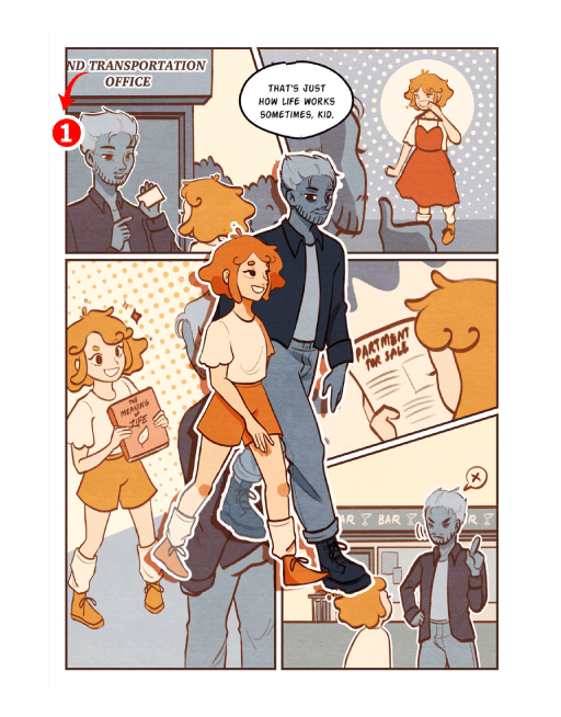

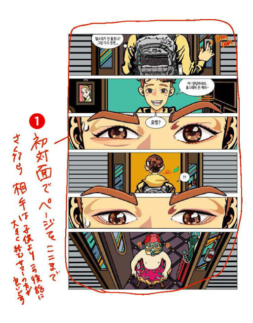

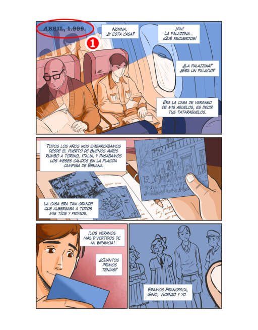

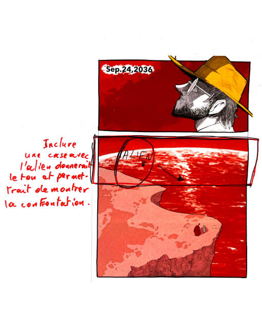


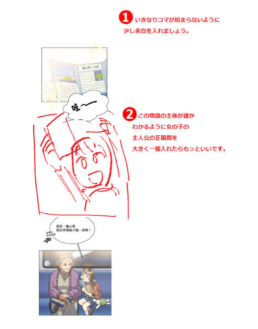

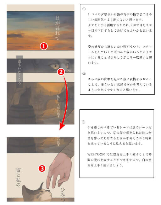

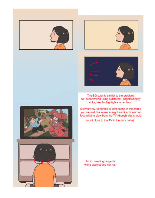


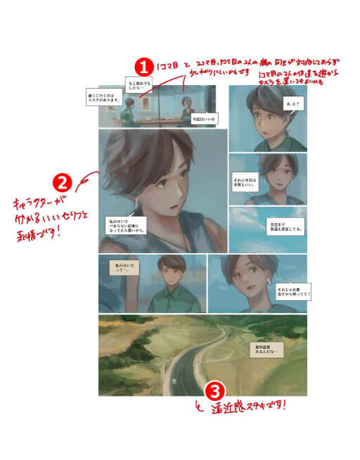



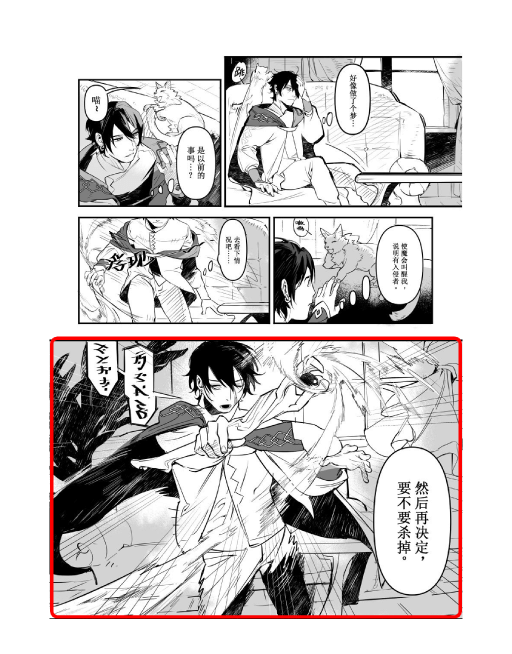


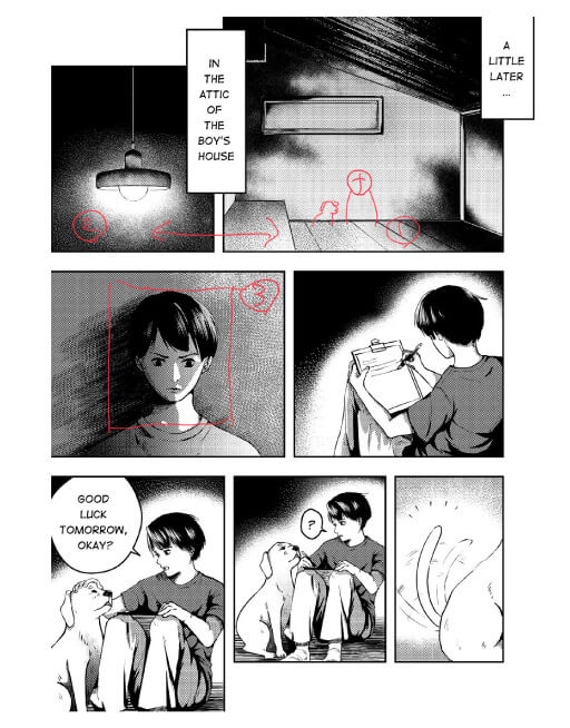
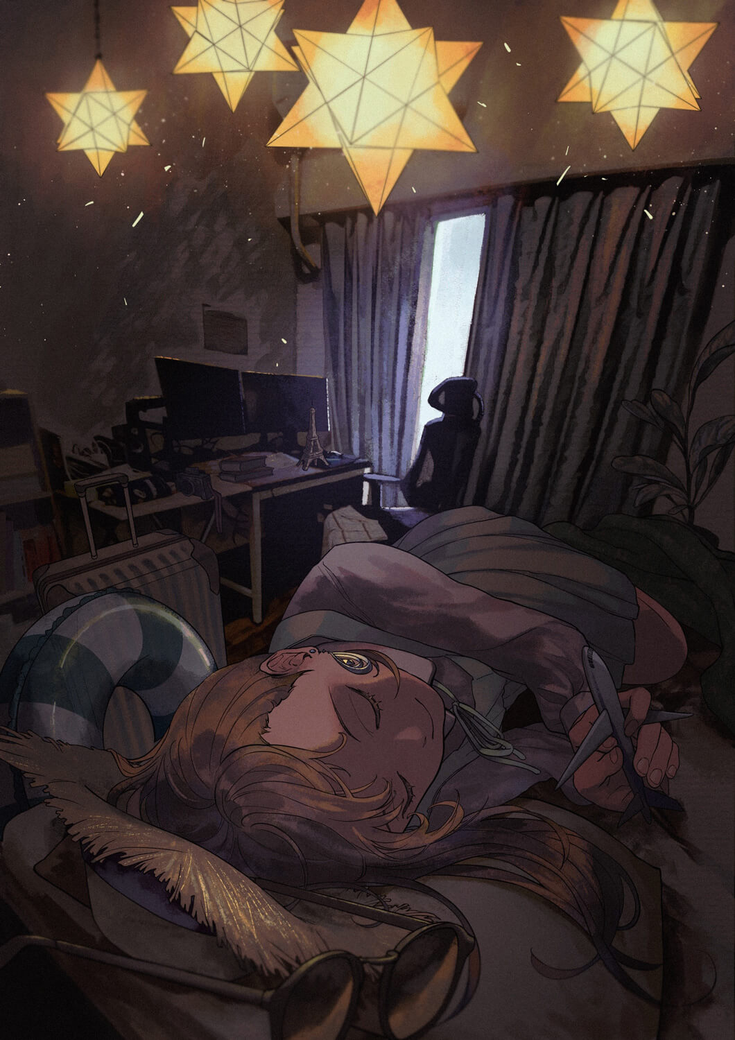

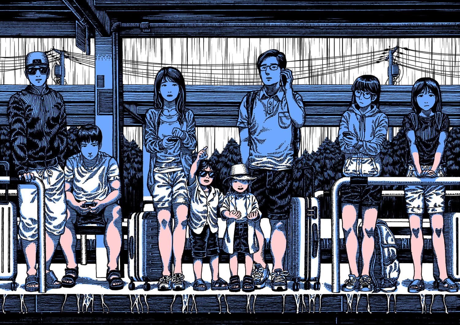

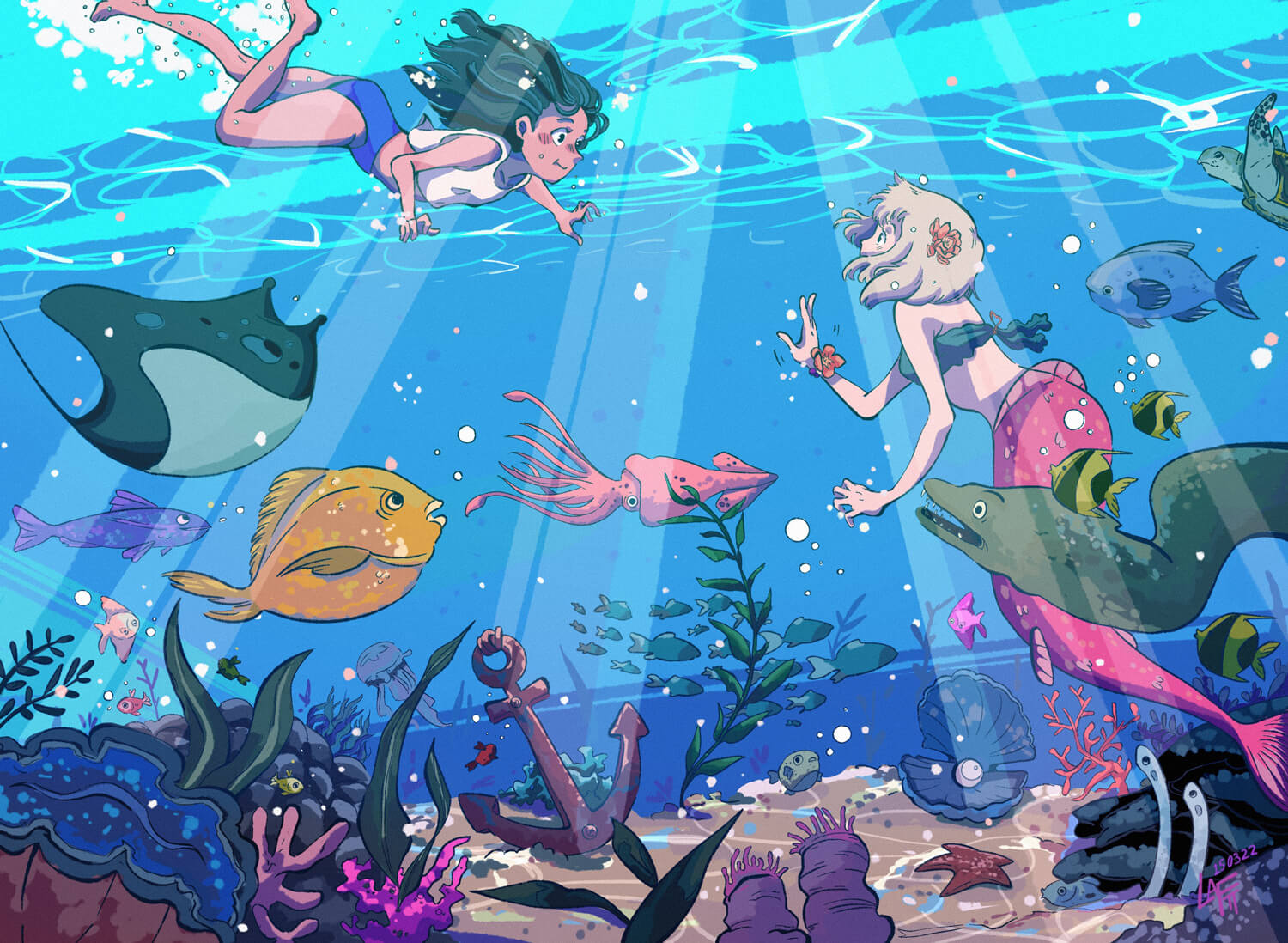

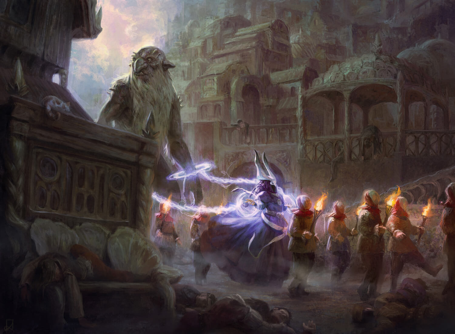

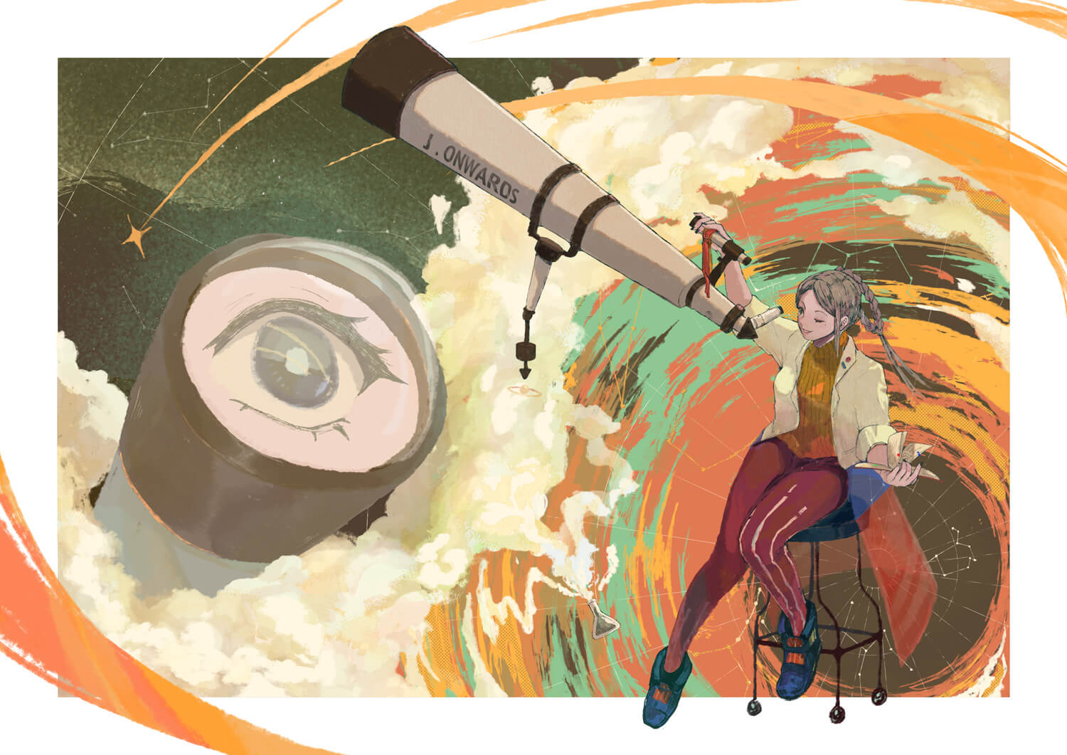





































































































































































I hope to see more work from you all in the future as well!