Bande Dessinée Category Winners
Comments from Judging Panel & Winners
Watch the video for words from the judges on the contest, as well as specific critiques on the winners of the Grand Prize and individual category prizes.

Charlie Adlard
Instagram: https://www.instagram.com/charlie_adlard/
Twitter: https://twitter.com/CharlieAdlard
Thank you Celsys for entrusting me to judge these entries... You’re a very, very brave bunch of people! My first reaction was literally “why me?”, because Manga really is my blind spot as an artist. I grew up very much on western comic art... Marvel comics and Bande Dessinée being my two main influences as a youth. But I saw it as a challenge and, really, comic books whether US Superhero, French cartoons, or Sci-Fi Manga etc. are all fundamentally the same:it’s all about storytelling.
The first thing that struck me was the sheer volume of talent out there. These were school kids, I had to keep kicking myself to remind me! So it made it particularly hard to single out the “best” out of an already brilliant, amazing bunch. I know it’s a cliché but everyone’s indeed a winner here. I had to keep asking my ignorant self... “is this good Manga?” I dunno, I could be judging it by my skewed western standards, but then, hey, perhaps that’s why I was asked, to shed a different perspective on it all.
But what was also very apparent was how international it was. Manga has indeed brought a worldwide community together. And that should certainly be applauded.
So congratulations everybody that made it to the initial list and to the “winners”.
I can see a bright future ahead of you all.

Simone Ferriero
Instagram: https://www.instagram.com/simz.art/
Twitch: https://www.twitch.tv/simzart/
Every artist's journey starts in a different way and while looking at all the entries of this contest I had a glimpse at the endless paths that every individual artist has in front of them. Paths that can lead in any direction and could change someone's life, both artists and viewers, forever. All thanks to something simple, in a manner of speaking, like a drawing, a short story or just an idea.
It’s amazing to see a bit of your personality behind every line and shape of your works. I had the chance to see different worlds, moods, concepts and many of those have been so inspiring even,
or maybe I should say especially, when they were so different from what I would have done myself.
In conclusion I wish all of you to succeed in any career you’ll end up choosing
and never forget to always stay true to yourself!

Masafumi Okamoto
https://www.shueisha.co.jp/english/
Takuya Kashima
https://booklive.jp/
https://www.manga-nino.com/
Showing your creations to the world is your first step as a professional author. On top of that, I was interested in the number of authors who put thought into why a reader would buy their comic. Readers have an insatiable desire to consume entertainment, which doesn’t always match up with authors’ desire to express themselves. Among the shortlisted entries, I felt that there were a few that, due to a lack of experience, didn’t really hit the mark from an expression point of view. So, there was a lot of room for growth there. To hone your craft and entertain your readers, think about how you can weave in specific details into your stories and characters, tickle your readers’ intellectual curiosity, and get them to spend more of their time in your world. In Japan, there are editors who work with authors and raise them to a level where their work can be sold, but you’ve stumbled on the shortcut to becoming a professional author by getting advice from professional editors, so make sure you make use of it and submit lots of work.

Kim Bedenne
Official website:http://www.ki-oon.com/
Twitter: https://twitter.com/kim_ki_oon
This is the first time that I have served as a judge in this international contest, and I was impressed by the variety of participating countries. It was also interesting to see the various formats chosen. Bande dessinée, manga and comics were classified separately, but the mix of influences was striking. This mix is one of the strengths of today's writers.
At Ki-oon, we try to give the chance to those who want it and who have the capacity to leave the traditional manga format behind, with for example titles in full color, like "Les Temps retrouvés" or "Roji"!
The shortlist had a lot of stories with interesting angles, but could have become remarkable with a simple structural trick: a hook from the start. It is better to use roughly the first 2 or 3 frames to grab the reader with an exciting scene, even in a double-page spread. It can be an intriguing situation, a magnificent image, a classy character ... Anything, as long as it allows you to stand out!
I was really happy to read all of your entries, I hope you continue down the path of drawing!
Congratulations to you all!

Ichihara Takenori
The contestants who were able to express what they wanted to draw and what they liked well stood out from the rest. The entries that put an emphasis on being easily read and understood were especially impressive. And the illustration and comic entries where the artist had put a lot of care and passion into the details were also very charming.
As I said before, I think the key to improving your work is to really think about how to communicate your piece to the reader.
I look forward to seeing more from not only the winners, but all of you, in the future.

Takashi Hijikata
https://comic-walker.com/
https://www.kadokawa.co.jp/category/comic/
It was very interesting to judge such a wide variety of entries. There were lots of entries, especially the color ones, regardless of their genre, that I felt had a lot of future potential because of the unique touches each artist put into them, including how they colored their pieces. As there was a theme and a page limit, the stories themselves were fairly simple to understand and digest.
However, we as editors would have liked to see you break free and show your emotions more. Stories are the essence of manga, but the way you present the visual to convey your story is also an essential skill. When putting your thoughts and feelings into your artwork, the more intense you can make them, the more heightened their effect on your readers.
I hope you continue to cram all your thoughts and feelings into your next storyboards! Thank you for exposing us judges to so much talent from around the world!

Koji Yano
Creative Business Unit Vice President
It was very difficult to decide which entries to choose from the many strong entries I had to judge. As this is an international contest for students, I was impressed by the diversity and number of entries and the wide age range of the contestants. I was also surprised that so many junior high school students entered.
Many contestants tried their hand at formats that are maybe not the dominant format in their own countries, like manga, webtoons, and bandes dessinées. This gave me the impression that there probably are quite a few hoping to break out beyond their home country in the future.
Through this contest, I hope you could learn from the other entries you saw and push yourself more based on the judges' critiques.
I hope that the competition has given you the digital tools essential to fleshing out the worlds in your pieces and express yourself freely in a variety of ways.
I look forward to your next works!
Overall Grand Prize(1 Winner)
Cash prize: US$3,300 / Wacom Cintiq 16 / Clip Studio Paint EX (3 years, single device)
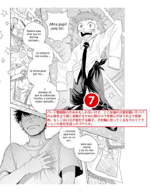
Artist: Konata (Spain)
Title: ¡ÁNIMO PAPÁ! (Spanish)
![]() Comment from the Winner:
Comment from the Winner:
When I received the news of the award I was very excited because it is a comic that, due to personal circumstances, I was very insecure about; I was working and studying at the same time I didn't have much time to be able to really plan the process, and I was very scared of not being good enough. But thank you very much, really, for the feedback and for everything.
The hardest part when creating this work was planning the story itself, since there are many ways to admire someone and honestly, from my point of view, I think that the most beautiful one is the admiration towards people who sacrifice their time and their vocation out of unconditional love, like parents to children. And I wanted that feeling to be the one that would reach the readers. So thank you for giving me the opportunity for it to reach the whole world.
Thank you
Critiques from the pros
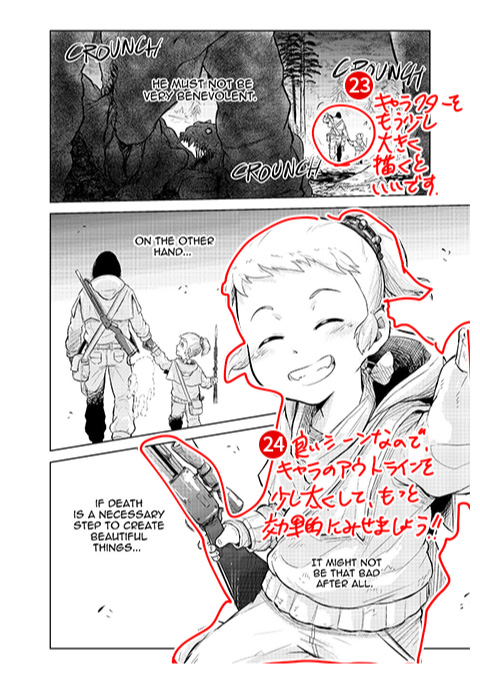
This entry received detailed critique from KADOKAWA.
BookLive
KADOKAWA
UOMO
Wacom
Amutus
FUNGUILD
Charlie Adlard
J-POP Manga
Comic Category Prize(1 winner)
Cash prize: US$1,700 / Wacom One / Clip Studio Paint EX (3 years, single device)
Artist: Álvaro (Spain)
Title: Diablo Andino (Spanish)
![]() Comment from the Winner:
Comment from the Winner:
First of all I would like to thank the jury for selecting my work as the winner. Having followed previous years' contests I am well aware that the level is very high. Therefore I am so grateful to have won. Honestly, I signed up for the contest with no expectations whatsoever of winning, but wanted to put into practice everything I've learned over the years. As for my comic, I wanted to create a simple story, but at the same time a dynamic and expressive one, which made the most of my cartoon style. I also made the color an important element here. I wanted to bring the whole story to life with a rich color palette and to show different environments... mainly to reinforce the magical aura of the story a little. During the process I have learned a lot, and having been selected as the winner gives me extra motivation to keep working hard and continuing to enter the world of comics.
Thank you very much.
BookLive
FUNGUILD
Solmare Publishing
Shueisha
Charlie Adlard
Simone Ferrierro
Tapas Media
Glenat
Comic Category Runners-up(3 winners)
Clip Studio Paint EX (3 years, single device)
Critiques from the pros
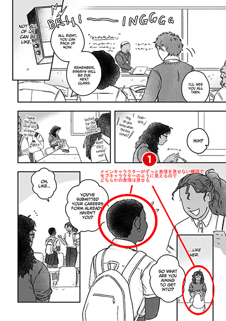
This entry received detailed critique from Hakusensha.
Shogakukan
KADOKAWA
Amutus
Charlie Adlard
Simone Ferrierro
Amutus
Ki-oon
J-POP Manga
Critiques from the pros
This entry received detailed critique from Glenat.
UOMO
Wacom
Charlie Adlard
Manga Category Prize(1 winner)
Cash prize: US$1,700 / Wacom One / Clip Studio Paint EX (3 years, single device)
Artist: 帰田 (Japan)
Title: 初夏 (Japanese)
![]() Comment from the Winner:
Comment from the Winner:
Thank you for choosing me as this year’s Manga Category Award Winner. I entered the contest was because I wanted my friend in Austria to read the manga I drew. It is difficult for me to go abroad and translate my work into English, so I entered thinking that it would be great if I could get some kind of award for my work. The manga I entered was originally something I was already working on, to which I added an endingthrough a bit of trial and error. In the manga, Wakamatsu Konatsu’s name came from a mishearing, but I liked the rhythm and how it sounded, so I put it in. Also, it was easy to understand the way that the main character, Minase, thinks and based on that, put her into motion in the story. In the future, I’m looking forward to writing a lot of different character types and pick some good scenes for them. I will do my best to push myself further as an artist!
Critiques from the pros
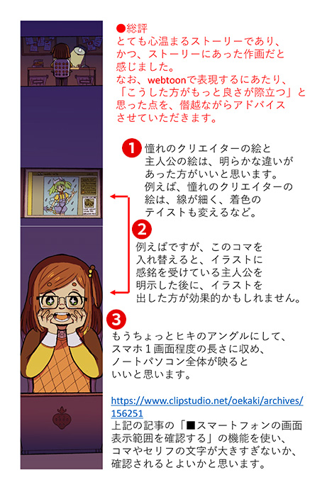
This entry received detailed critique from Shogakukan.
BookLive
Shogakukan
Solmare Publishing
UOMO
Wacom
Amutus
Ki-oon
Manga Category Runners-up(3 winners)
Clip Studio Paint EX (3 years, single device)
Critiques from the pros
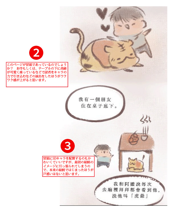
This entry received detailed critique from Solmare Publishing.
Shogakukan
Solmare Publishing
Shueisha
Simone Ferrierro
Critiques from the pros
This entry received detailed critique from Tokyo Name Tank.
BookLive
KADOKAWA
Charlie Adlard
J-POP Manga
Critiques from the pros
This entry received detailed critique from Amutus Corporation.
Amutus
FUNGUILD
Tapas Media
Simone Ferrierro
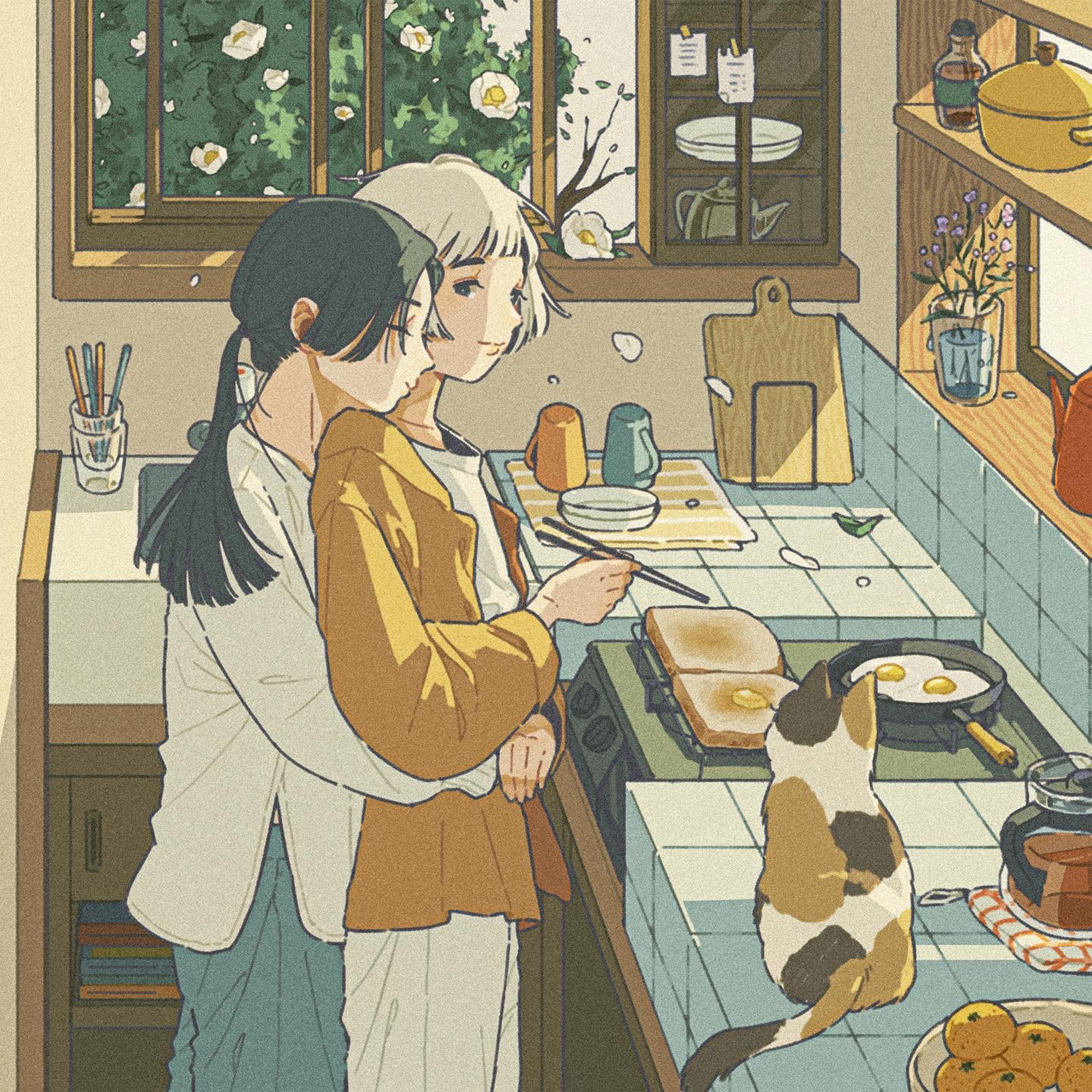
Webtoon Category Prize(1 winner)
Cash prize: US$1,700 / Wacom One / Clip Studio Paint EX (3 years, single device)
Artist: Mado (United States of America)
Title: I Admire You A Whole Lot! (English)
![]() Comment from the Winner:
Comment from the Winner:
Thank you for choosing me as the Grand Prize Winner of the Webtoon Category. I’m super honored to receive this award! Last year, I entered this competition with a comic called “Cross My Heart”. From that project, I gained a lot of experience in visual storytelling, and decided to re-enter the competition this year. Then, I used what I learned to make “I Admire You So Much!” - a very personal work. I admire many artists and storytellers. Their efforts and success motivates me to improve my own craft. However, over time, I learned to appreciate the encouragement of my friends and family even more. Their constant support for me and my work is why I continue to create to this day. In the future, I hope that I’ll be able to make stories that can impact a lot of people emotionally. I’m happiest when I see my work inspire others to create.
Critiques from the pros
This entry received detailed critique from NHN comico Corp. Editorial Team #2 H.N.
BookLive
FUNGUILD
Shogakukan
Shueisha
Wacom
Charlie Adlard
Simone Ferrierro
Tapas Media
Ki-oon
Webtoon Category Runners-up(3 winners)
Clip Studio Paint EX (3 years, single device)
BookLive
FUNGUILD
KADOKAWA
Shueisha
Wacom
Charlie Adlard
Tapas Media
Ki-oon
FUNGUILD
KADOKAWA
UOMO
Shueisha
Charlie Adlard
Simone Ferrierro
J-POP Manga
Artist: 詠無湮 (Taiwan)
Title: 選擇 (Chinese)
Critiques from the pros
This entry received detailed critique from KADOKAWA.
Shogakukan
KADOKAWA
Wacom
Charlie Adlard
Simone Ferrierro
Tapas Media
J-POP Manga
Glenat
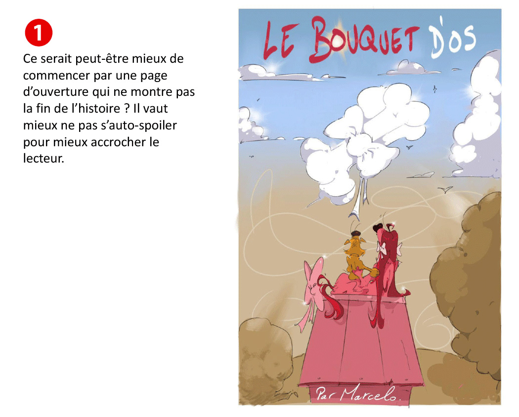
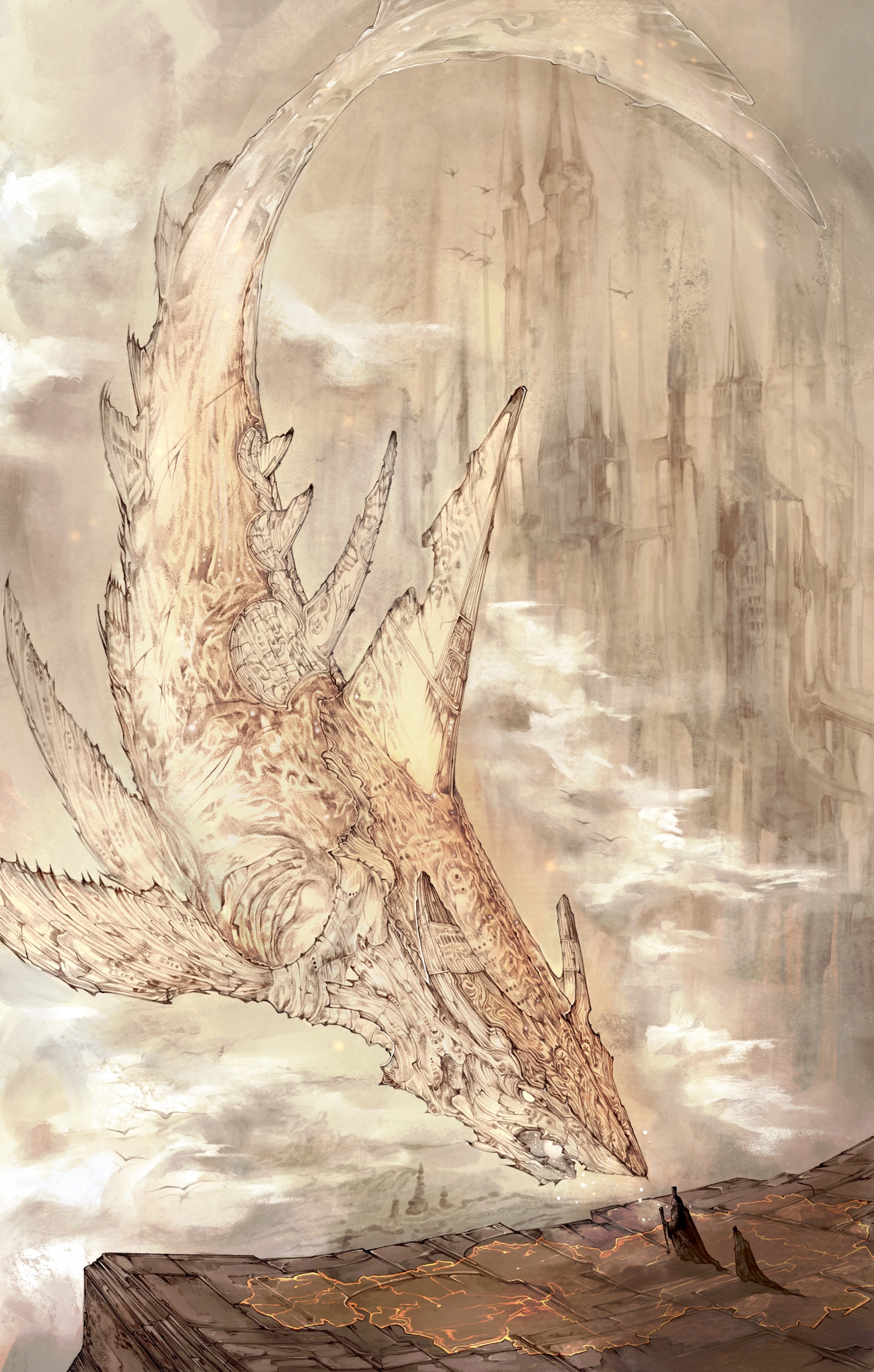
Bande Dessinée Category Prize(1 winner)
Cash prize: US$1,700 / Wacom One / Clip Studio Paint EX (3 years, single device)
Artist: 勝見ふうたろー (Japan)
Title: 青焦がれ 〜Blue longing〜 (Japanese)
![]() Comment from the Winner:
Comment from the Winner:
Hello, my name is Katsumi.
Thank you very much for this invaluable award.
I got obsessed with the world of Bande dessinée comics when I started university. I had wanted to try my hand at expressing the unique atmosphere and appeal of BDs myself, and, I had been thinking a lot about the theme of “aspiration” for a while, so I entered the competition, thinking it was a good opportunity to put both of those things to use. I drew a drama about a character who is saved from the darkness and the dangerous emotion of “aspiration”. I drew all the artwork traditionally, using a brush pen.I really enjoyed drawing the expressions of the main character, the penguin. The colors were all added digitally, and I tried to make the piece as colorful as possible, but also deliberately left some parts in black and white to communicate the characters’ feelings better. When I was told I had won the award, I was honestly over the moon. I was really surprised that it was me of all people.
Thank you once again for this precious award.
BookLive
FUNGUILD
Shogakukan
Solmare Publishing
UOMO
Wacom
Charlie Adlard
Simone Ferrierro
Tapas Media
Ki-oon
Bande Dessinée Category Runners-up(3 winners)
Clip Studio Paint EX (3 years, single device)
BookLive
FUNGUILD
KADOKAWA
Solmare Publishing
UOMO
Shueisha
Wacom
Charlie Adlard
Simone Ferrierro
Tapas Media
Ki-oon
Coamix
Artist: kimkim (South Korea)
Title: MY FUCKING STAR! (Korean)
FUNGUILD
KADOKAWA
UOMO
Shueisha
Charlie Adlard
Tapas Media
J-POP Manga

Critiques from the pros
This entry received detailed critique from Ki-oon.
KADOKAWA
Solmare Publishing
Shueisha
Wacom
BookLive
Charlie Adlard
Storyboard Category Grand Prize(1 winner)
Cash prize: US$2,200 / Wacom One / Clip Studio Paint EX (3 years, single device)
Artist: Mie. (Taiwan)
Title: 穿上裙子的他 (Chinese)
![]() Comment from the Winner:
Comment from the Winner:
I am very honored to receive this award. Thank you to the organizers and all the judges. My teacher had recommended I enter this contest. I entered the contest in the spirit of challenging myself, but during the contest, when I was creating my entry, I often felt the limitations of my experience as an artist. I chose the “Admiration” manuscript about a student who stops lying to himself and wears a girls’ uniform. I thought long and hard about how to portray the main character’s personality. I also put a lot of effort into making it so that the reader would empathize with the main character’s feelings, so that the conversation between the two characters would feel natural. I want to put my all into making more stories in the future. Finally, I would like to thank the International Comic/Manga Schools Contest for this opportunity.
Critiques from the pros
This entry received detailed critique from BookLive.
BookLive
FUNGUILD
Shogakukan
KADOKAWA
Solmare Publishing
UOMO
Shueisha
Wacom
Charlie Adlard
Simone Ferrierro
Ki-oon
Storyboard Category Runners-up(3 winners)
Clip Studio Paint EX (3 years, single device)
BookLive
Shogakukan
KADOKAWA
Solmare Publishing
UOMO
Shueisha
Charlie Adlard
Tapas Media
Ki-oon
Critiques from the pros
This entry received detailed critique from Tapas Media.
FUNGUILD
UOMO
Charlie Adlard
Simone Ferrierro
Tapas Media
J-POP Manga
BookLive
FUNGUILD
Shogakukan
Solmare Publishing
Shueisha
Wacom
Charlie Adlard
Tapas Media
Ki-oon
Illustration Category Grand Prize(1 winner)
Cash prize: US$550 / Wacom One / Clip Studio Paint PRO (3 years, single device)

Artist: chicami (Japan)
![]() Comment from the Winner:
Comment from the Winner:
Thank you for choosing me as the Grand Prize winner. I am extremely surprised to have won in such a big contest.
I made this illustration with the intention that it wouldn't reflect the positive, sparkly image people might associate with the theme of "Admiration", but more of a pessimistic picture that might stand out by not being too similar to other entries. I built the composition from photos I took with my phone and used the same photos as textures in the piece. I'm proud that I could combine both illustration and photo bashing in a way that worked well.
I want to continue working hard to become a creator who grows by absorbing new techniques and tools that keep coming up without being bound by conventions or stereotypes.
Shogakukan
Wacom
BookLive
KADOKAWA
UOMO
Amutus
Shueisha
J-POP Manga
Ki-oon
Charlie Adlard
Glenat
Illustration Category Runners-up(3 winners)
Clip Studio Paint PRO (3 years, single device)
Artist: るおーるおみ (Taiwan)
Shogakukan
FUNGUILD
BookLive
Solmare Publishing
Artist: Koss (Hong Kong)
Solmare Publishing
UOMO
Amutus
Shueisha
Ki-oon
Artist: アキオカ (Japan)
FUNGUILD
BookLive
Solmare Publishing
Contest theme (all categories):
Admiration
| Comic Category (Color) | An original color comic for all ages (8-16 pages, including cover). |
|---|---|
| Manga Category (B&W/Color) | An original black-and-white or color comic/manga for all ages (8-16 pages, including cover). |
| Bande Dessinée Category (Color) | An original bande dessinée for all ages (8-16 pages, including cover). |
| Webtoon Category (Color) |
An original webtoon for all ages (sized 800 x 40,000-72,000 pixels or a height ratio of 50 to 90 for an image 800 pixels or less when the width is set to 1). A template will be available for download. Webtoon Category Template |
| Storyboard Category |
A 4-8 page manga, comic or webtoon drawn according to the supplied storyboard text. Manuscript 1 (courtesy of BookLive): A girl with crutches always gets on the bus. In her hand, she always holds a photo album. Draw a short interaction of her with the bus driver. Manuscript 2 (courtesy of Shueisha): One day my childhood friend suddenly came to school in a girls' uniform... (Excerpt from “A blue we don’t know (Bokura no shiranai aoi)” (Japanese) from TanZak, a Shueisha short story app) |
| Illustration Category | Original color illustration for all ages. There are no size requirements. |
Special Sponsors

Shueisha
Shueisha is a Japanese publisher that publishes manga, fashion magazines, and literary books. They have published comic magazines such as Weekly Shonen Jump, Weekly Young Jump, Ribon, Margaret, and Bessatsu Margaret. They have also published internationally renowned manga such as One Piece.
KADOKAWA
KADOKAWA is a comprehensive entertainment company that is involved in wide range of businesses including publishing, movies, games, web services, education, merchandizing and business around intangible goods and foreign tourists. "Comic Walker" is a free comic site featuring popular KADOKAWA manga. The site features more than 3,000 titles, ranging from the latest mixed media works to popular isekai comics.

Shogakukan
Shogakukan is a general publishing company that publishes magazines such as comic magazines, children's magazines, information magazines, women's magazines, books and picture books. Comic magazine covers a wide range of readers from boys and girls to adults, such as "CoroCoro Comic", "Weekly Shonen Sunday", "Sho-Comi", and "Big Comic". Shogakukan also runs the comic app "Manga One," which has been downloaded over 20 million times.

BookLive
Since its establishment in 2011, BookLive! has been one of the largest comprehensive e-book stores in Japan, with a selection of around one million books, including manga, novels, novellas and magazines. From coupon gacha and other unique campaigns to the highly-rated bookshelf function and a number of payment options, we strive to provide readers with an easy-to-use platform. There are over 10,000 titles available to read for free without even needing to register for an account! Give it a go with your favorite manga and see how easy it is to use. We also produce original e-books, aiming to create manga that will tickle the hearts of the "smartphone manga generation".

Wacom
Pioneer of creative pen tablets and displays which are being used to create some of the most exciting digital art, films, special effects, fashion and designs around the world.

Ki-oon
Ki-oon is a French publishing house founded in 2003 by two people who love Japan. They are currently the fourth largest publisher in France publishing "My Hero Academia," "Jujutsu Kaisen," "A Bride's Story," "Prophecy," "BEASTARS," and many more. In addition to purchasing licenses, they also produce and publish original works in a variety of genres.
These works are initially published in France and then licensed for worldwide distribution (including Japan).
Sponsors

FUNGUILD
FUNGUILD is a comic book publisher with a mission to "bring FUN to life through the power of stories.” FUNGUILD plans and edits original comics, to meet the needs of their readership of girls, women, and young men, and distribute them to various online comic sites in Japan and abroad.

Amutus Corporation
Mecha Comic, one of Japan's largest e-book sites, plans and produces with its production partners the original brand "Mecha Comic Original," which is distributed on e-book sites in Japan and abroad. Note: With the exception of Mecha-Comic, books are sold in bookstores under the Amucomi brand.

Solmare Publishing
(NTT Solmare Corp.)
NTT Solmare is the company that runs “Comics C’moa," one of the largest e-book websites in Japan. NTT Solmare’s electronic manga editorial department "Solmare Publishing" runs the store. As well as producing a high number of multimedia works, they offer full support to the creation of hit works and emerging artists.

Tapas Media
Tapas Media is a next generation media company offering bite-sized content through its online mobile platform, Tapas. Tapas Media properties, which consist of the Tapas mobile app and Tapas.io, boasts over 6 billion content views to date, from over 3 million readers, primarily in North America. Tapas Media provides a best-in-class reading experience for story fans on mobile devices and the web.

UOMO
A men's fashion magazine published by Shueisha that targets men in their 40's with a keen interest in everything from fashion to culture.

J-POP Manga
J-POP, Edizioni BD’s manga imprint, is one of Italy's leading manga publishers. Since its launch in 2006, J-POP Manga has offered a diverse lineup of more than 3,000 titles ranging from popular shonen manga such as Promised Neverland and Tokyo Ghoul to masterpiece collections by authors such as Go Nagai, Osamu Tezuka, Riyoko Ikeda, Moto Hagio, Taiyo Matsumoto, Junji Ito, and Kazuo Kamimura.

Glénat Editions SA
Established in 1969 by Jacques Glénat, Glénat is a French publisher specializing in bande dessinée, manga, American comics, and books on leisure topics (sea, mountains, gastronomy, cultural heritage, children and youth). A pioneer of Japanese manga publishing in France, Glénat remains the undisputed market leader in France today.
Collaborators

Hakusensha
Hakusensha is the publisher of "Young Animal," "Young Animal ZERO," “Le Paradis.” They also publish Shojo magazines such as "Hana to Yume," "LaLa," "MELODY," "The Hana to Yume," and "LaLaDX." They also produce online magazines for women's manga, "Love Silky," "Love Jossie," "Hana Yume Ai," young men’s manga, "Harem," and the and the "Manga Park" app.
SILENT MANGA AUDITION
One of the biggest and most successful manga competitions in the world. Organized by Coamix, Inc., founded by some of Japan's most iconic manga creators, the competition aims to find, nurture and publish the next generation of international manga creators.

comico
“comico" is a manga app that features a large collection of original vertical scrolling, full-color manga. In addition to the overseas versions in Taiwan, South Korea, Thailand, and Vietnam, comico has recently begun offering its service in English-speaking countries such as the United States, Canada, and the United Kingdom. The app has been downloaded more than 35 million times worldwide.

CoAket
Inspired by similar comics markets in Japan, CoAket is the first of its kind in Germany and is getting attention from local artists. Open twice a year in Hamburg, CoAket focuses on artist displays and publisher’s booths.
Tokyo Name Tank
Our goal is to support everyone in creating their own manga while having fun drawing it. We have produced many award-winning and debut artists. In addition to storyboard lessons that cover how to structure a complete 32-page storyboard, we also hold individual consultations and storyboard exchange sessions to answer concerns about the creation of comics.

Cork Co., Ltd.
A creative agency with a mission to "change the world, one person at a time, through the power of storytelling". Cork dares to challenge the entertainment industry with a new model for the Internet age that goes beyond conventional publishing and distribution by putting new works out into world, generating excitement and conntecting fans directly to creators.

Weekly Shonen Sunday
Unbeatable fun! Mr. Shonen Manga Magazine here!
Shogakukan's signature comic magazine full of laughs, moving scenes, and love, featuring super popular serials such as Detective Conan, Komi Can't Communicate, & Frieren: Beyond Journey's End.

Gessan (Monthly Shonen Sunday)
A monthly shonen manga magazine that speaks straight to the heart!
Unique and interesting - that's the Gessan guarantee! Popular titles include "Teasing Master Takagi-san," Mitsuru Adachi's "Mix", about the aftermath of Meisei Gakuen, "Dai Dark," the latest work by Ball Hayashida of "Dorohedoro", "Nobunaga Concerto", and "Kaiou Dante" fame.A monthly shonen manga magazine that speaks straight to the heart!

Monthly Sunday GX
Tough heroine supremacy! A new generation of youth manga!
With a massive volume of over 800 pages in paper and digital formats, this next-generation youth manga mangazine features strong heroines, including the 20th-anniversary gun of the action masterpiece "BLACK LAGOON" and the hit imperial palace mystery "The Apothecary Diaries"!

Sho-Comi
Lessons in Love by Sho-Comi: Romance Comics Filled with Love.
This is the romance bible for girls in love, filled with all kinds of stories about both idealistic and realistic love. It is at the heart of shoujo manga, popular mainly among junior high school girls, but also among high school girls and older!

Betsucomi
Everyone is a hero of love - pure and authentic girls' manga!
Betsucomi is a comic magazine packed full of pure and sweet love stories, for all teens and high school students! Don't miss the latest works by popular authors such as Kaneyoshi Izumi, Maki Usami, Risa Konno, Kanoko Sakurakoji, Nao Hinachi, Shizuki Fujisawa, Kyosuke Saotomi, and more! Released on the 13th, every month!
Big Comic Spirits Weekly
An entertainment pursuit comic magazine full of passion, powerful scenes, and the brightest smiles of the moment...that's Spirits! Aoashi," "Asadora!," "Mogura no Uta," "Nigatsu no Shousha," "Kujou no Daizai," "Chi.," and "Detective Fuuto"... Don't miss the career-high points of these highly talented popular artists!

Big Comic Superior
More freedom in manga! A new generation of youth magazine without taboos!
We believe manga is the most flexible media in the world! With our motto, "More freedom in manga!", we meet the demands of the times with our collection of manga. Regardless of genre, from gourmet, to horror, IT, ramen, loving wife, murder, and Gundam, we aim to be a completely new type of manga magazine for young people that has never been seen before!
Supporters

Japan Cartoonists Association
The Japan Manga Association was established in December 1964 as the only nationwide organization of Japan's manga artist at that time. It’s engaged in a variety of projects, such as research on comics, efforts in popularizing comics and comics culture, and comics cultural exchange with other countries. The group became a Public Interest Incorporated Association in 2014.

Manga Japan
Manga Japan is an organization that aims to promote the development of manga culture and artists, contribute to society through the manga industry, promote international exchange and improve production environments for manga authors and others involved in the industry.

Digital Manga Association
The Digital Manga Association is an organization of volunteers established to pursue creative digital techniques of digital manga and comics and research copyright issues that arise from digital technology.
Contest Partners

Operational Support
Organizer
Participating Schools
Note: The following list only shows schools that provided logos.

Green Forest High School
United States of America

FH Bielefeld
Germany

GREENDALE SECONDARY SCHOOL
Singapore
CI IDIOMAS E ARTE
Brazil


CEI TARTESSOS
Spain
Unidad educativa Letort
Ecuador

INSTITUCION EDUCATIVA CEINAR
Colombia

Trinity Academy
United Kingdom of Great Britain and Northern Ireland

Pioneer High School
United States of America

Université de Mons
Belgium

Piedmont Lakes Middle School
United States of America

IES Cura Valera
Spain
Parkview Jr/Sr High School
United States of America

Navigate Nides
Canada

Interhigh
United Kingdom of Great Britain and Northern Ireland

Marysville Charter Academy for the Arts
United States of America
桃園市立南崁高級中等學校
Taiwan


The BRIT School
United Kingdom of Great Britain and Northern Ireland

国際アート&デザイン大学校
Japan

アカデミア宮城
Spain

桃園市信義國小
Taiwan

ESCENA
Mexico

台中市私立僑泰高級中學
United Kingdom of Great Britain and Northern Ireland

InterHigh Online School
Canada

McMaster University
United States of America

Shasta Charter Academy
Spain

CENTRO DE EDUCACION ESPECIAL
Germany

Europa-Gymnasium Wörth
Malaysia


IES ANGEL CORELLA
United States of America

High School in the Community
Vietnam


Universidade Fumec
United States of America

Garfield High School
Canada

John F. Ross C.V.I.
United States of America

天津外国语大学
China

Escuela de Game Design LA
Argentina

臺中市大里區永隆國民小學
Taiwan


Penicuik High School
United Kingdom of Great Britain and Northern Ireland

School of the Museum of Fine Arts at Tufts University
United States of America
St. Stephen's Episcopal School
United States of America

SMK TAMAN CONNAUGHT
Malaysia

Lesley University
United States of America

Dokuz Eylül Üniversitesi
Turkey


Gymnasium am Kaiserdom
Germany

マンガ教室daichi
Japan
El Paso Community College
United States of America

南華大學
Taiwan

北海道芸術高等学校 福岡サテライトキャンパス
Japan

Humboldt State University
United States of America

福岡デザイン専門学校
Japan

デジタルハリウッド大学
Japan


IES María Moliner
Spain

臺北市學學實驗教育機構
Taiwan

Servicio Nacional de Aprendizaje
Colombia
パルミー
Japan

Red Balloon Learner Centre
United Kingdom of Great Britain and Northern Ireland
Institution Scolaire Cusset
France

國立彰化高級商業職業學校
Taiwan


長榮大學
Taiwan

Florida Gateway College
United States of America

Gutenbergschule
Germany
名古屋デザイナー学院
Japan

SANTA MARÍA
Spain


PAU GARGALLO
Spain

Montana State University
United States of America


University of the Arts
United States of America
Extra-Escolar Cómic Francis Díaz
Spain


寶桑
Taiwan
北海道芸術デザイン専門学校
Japan

Kerschensteinerschule
Germany

Method Schools
United States of America

Colegio de Educacion Multiple ITDEM
El Salvador

Brown Deer Middle/High School
United States of America

Applecross Senior High School
Australia

다사고등학교
Republic of Korea

國立清華大學
Taiwan


Jay M. Robinson High School
United States of America

Universitat Jaume I
Spain

Kincoppal - Rose Bay
Australia

東海学園大学
Japan

同志社女子中学校・高等学校
Japan

Queen Marys College
United Kingdom of Great Britain and Northern Ireland

國立新竹高級商業職業學校
Taiwan

中央美术学院
China
SMK N 2 WONOSOBO
Indonesia

台北市私立東山高級中學國中部
Taiwan


lycee Leonard de Vinci
France


Minnesota Connections Academy
United States of America

Städt. Lindengymnasium
Germany


Gower College Swansea
United Kingdom of Great Britain and Northern Ireland
Toppåsen skole
Romania
EASD Antonio Faílde
Spain

國立屏東大學
Taiwan
Génimage
France

Columbia College Chicago
United States of America


GameDev-Profi.de
Germany
Sacré coeur Amiens
France

Agustí Serra y Fontanet
Spain

Inselrealschule Pforzheim
Germany

Institución Educativa
Colombia
Groupe Scolaire la Résidence
Morocco

上海率田文化艺术学院
China

Don Alejandro Roces Sr. Science-Technology High School
Philippines

Walker High School
United States of America
神戸野田高等学校
Japan

東京大学教育学部附属中等教育学校
Japan

台北市立復興高級中學
Taiwan

大阪府立今宮工科
Japan

神奈川県立相模原高等学校
Japan

아시아퍼시픽국제외국인학교
Republic of Korea

Universiti Teknologi Mara(UiTM)
Malaysia

Sekolah Menengah Kebangsaan Oya
Malaysia

雅加達臺灣學校
Indonesia

Cité scolaire de Brocéliande
France

universidad nacional experimental de yarcuy
Venezuela (Bolivarian Republic of)
Colegio Tomás Carrasquilla IED
Colombia

Aspaen Corales
Colombia

國立華南高商
Taiwan

Scotch College
Australia
下関商業高等学校
Japan

國立潮州高中
Taiwan

หมาวิทยาลัยศรีปทุม
Thailand

국민대학교
Republic of Korea

삼육대학교
Republic of Korea
https://artstudium.edu.py/
Paraguay

Angelo State University
United States of America
清真学園高等学校中学校
Japan


Columbus State Community College
United States of America

Angelo State University
United States of America
Clermiston Primary School
United Kingdom of Great Britain and Northern Ireland
IPVCE Vladimir Ilich Lenin
Cuba

IES Río Júcar
Spain

東京造形大学
Japan

樹德科技大學
Taiwan

東南科技大學
Taiwan

Zona D
Argentina

Helen E Taylor School
Canada


南臺科技大學
Taiwan
伊利沙伯中學舊生會中學
China

Green Valley Middle School
United States of America


白梅学園高等学校
Japan

Biznessdeti
Russian Federation
Tara Anglican School for Girls
Australia

臺北市立復興高級中學
Taiwan

University Of Plymouth
United Kingdom of Great Britain and Northern Ireland

Universidad de Alicante
Spain

Technological University Dublin
Ireland

Ogilvie Public Schools
United States of America

BCU
United Kingdom of Great Britain and Northern Ireland

The Royal Harbour Academy
United Kingdom of Great Britain and Northern Ireland

Montachusett Regional Vocational Technical School
United States of America


屋久島おおぞら高等学校
Japan

상명대학교
Republic of Korea

OCA大阪デザイン&IT専門学校
Japan

SMK Raden Umar Said Kudus
Indonesia

บดินทรเดชา (สิงห์ สิงหเสนี)
Thailand

V-ART
Spain

Yorktown High School
United States of America

Escola Secundária Tomás Cabeira
Portugal

Lynwood High School
United States of America

ASPAEN corales
Colombia

國立臺北教育大學
Taiwan

Brunswick County Early College High School
United States of America

장기고등학교
Republic of Korea

서울호서직업전문학교
Republic of Korea

Universitas Multimedia Nusantara
Indonesia

桜美林大学
Japan

総合学園ヒューマンアカデミー那覇校
Japan

Universidad de las Artes
Ecuador

Universidad Martín Lutero Ocotal
Nicaragua

군산여자상업고등학교
Republic of Korea

基督教香港信義會心誠中學
China

Stormont House School
United Kingdom of Great Britain and Northern Ireland
AGR École de l'image
France

Nimitz High School
United States of America

The Complete Works Independent School
United Kingdom of Great Britain and Northern Ireland

龍華科技大學
Taiwan


千曲市立埴生中学校
Japan

華南高級商業職業學校
Taiwan

臺北市西湖國小
Taiwan

GLOBAL ARTS STUDIOS
Greece

Омский государственный технический университет
Russian Federation

ГБПОУ СКИК им.О.Н.Носцовой
Russian Federation
창원대산고등학교
Republic of Korea

Universal schools 2nd
Jordan
UNDQT
Peru

福岡デザイン&テクノロジー専門学校
Japan

IRSA CSES Alfred Peyrelongue
France
Ohayo Drawing School
Indonesia

IES Monte Castelo
Spain

London College of Communication, UAL
United Kingdom of Great Britain and Northern Ireland


宜寧高級中學
Taiwan

CEV
Spain

EJ Moss Intermediate
United States of America

Centro Artístico Policromo
Mexico


University of South Australia
Australia

Юргинский Технологический колледж
Russian Federation
Westview High School
United States of America

불암중학교
Republic of Korea
SMP Little Sun School
Indonesia
バンタンゲームアカデミー
Japan

INSTITUT THOS I CODINA
Spain

Saint Paul Preparatory Seoul
Republic of Korea
EADT
Spain


Oklahoma Christian University
United States of America

Universidad Simón Bolívar
Venezuela (Bolivarian Republic of)
OCAD U
Canada
Boston Latin Academy
United States of America
中華基督教會全完中學
China
臺中市立福科國中
Taiwan

Детский технопарк «Кванториум» г. Владивосток
Russian Federation

國立員林崇實高工
Taiwan

健行科技大學
Taiwan
朋優学院高等学校
Japan


University of Huddersfield
United Kingdom of Great Britain and Northern Ireland

عرفات للموهوبين الثانوية للبنات
State of Palestine

Colegiul Național Mihai Viteazul
Romania


Colegio Las Rosas
Spain

Städtisches Gymnasium Gevelsberg
Germany


고양 중산고등학교
Republic of Korea

Te Kuiti High School
New Zealand

臺北市立南湖高中
Taiwan

동평여자중학교
Republic of Korea

남해제일고등학교
Republic of Korea

Werner-von-Siemens-Gymnasium
Germany


苗栗縣立大同高中
Taiwan

上海戏剧学院
China

University of Dundee
United Kingdom of Great Britain and Northern Ireland

Kenilworth School and Sixth Form
United Kingdom of Great Britain and Northern Ireland


Vilniaus Gabijos progimnazija
Lithuania


HSE University
Russian Federation

Educativo
Chile

collège Salette
Canada

Saint John's Catholic School
Indonesia

新北市立三重高級中學
Taiwan

臺北市立中崙高級中學
Taiwan

IES ROSA NAVARRO
Spain

Institut Seni Indonesia Surakarta
Indonesia

Российско-Армянский университет
Armenia

HomeLink Yakima
United States of America

Hacettepe Üniversitesi
Turkey

Bristol Cathedral Choir School
United Kingdom of Great Britain and Northern Ireland

Sentinel Secondary School
Canada

CEI
Mexico

Nanyang Technological University
Singapore

培僑書院
China

駿台甲府高等学校
Japan

沖縄県立芸術大学
Japan
갈매중학교
Republic of Korea

醒吾科技大學
Taiwan

國立臺北科技大學
Taiwan

東京都立青梅総合高等学校
Japan

女子聖学院高等学校
Japan

奈良県立青翔高等学校
Japan

검단고등학교
Republic of Korea

臺中市立臺中第一高級中等學校
Taiwan

MAOU "Centr Obrazovaniya №12"
Russian Federation

Ecole Suger bilingue
France

Winston Churchill High School
United States of America

Lycée Paul Lapie
France

Sharon High School
United States of America

Westlake Boy's High School
New Zealand

青森県立田子高等学校
Japan

Universitas Tarumanagara
Indonesia

École Virtuelle Assistée
Canada

國立金門高級農工職業學校
Taiwan

효문고등학교
Republic of Korea

長沙灣天主教英文中學 (香港)
China

高師大附中
Taiwan

Rhein-Sieg-Akademie (RSAK)
Germany

天主教輔仁大學
Taiwan
Desmond College
Ireland

숙명여자대학교
Republic of Korea


Gracefield School
New Zealand

원주삼육고등학교
Republic of Korea

高雄市立三民高級家事商業職業學校
Taiwan

SALT International School
Republic of Korea


長野市立東北中学校
Japan

Муниципальное бюджетное учреждение дополнительного образования
Russian Federation

臺北市立麗山高中
Taiwan

神戸芸術工科大学
Japan

國立曾文高級農工職業學校
Taiwan
LIGNES ET FORMATION
France

八洲学園大学国際高等学校
Japan

ISEM
France
Collège Bart
Canada

Детская студия архитектуры и дизайна "Архимодус"
Russian Federation


Teesside University
United Kingdom of Great Britain and Northern Ireland

Unidad Educativa Amerinst
Bolivia (Plurinational State of)
GIBRAN METHOD
Malaysia

SMAN 1 SUNGAI RUMBAI
Indonesia


東京朝鮮中高級学校
Japan

大阪市立工芸高等学校
Japan

Казанский государственный институт культуры
Russian Federation

St. Marien-Realschule
Germany

Gazi Anadolu Lisesi
Turkey
Centro Escolar 5 de Noviembre
El Salvador

부산 컴퓨터 과학 고등학교
Republic of Korea

成都大学
China

THPT Việt Bắc
Vietnam

Meridian Secondary School
Singapore


須磨学園高等学校中学校
Japan

SUGS "Orce Nikolov"
North Macedonia

Jiráskovo gymnázium, Náchod, Řezníčkova 451
Czech Republic


HAL大阪
Japan

University of Brighton
United Kingdom of Great Britain and Northern Ireland

HAL名古屋
Japan

Krasnoyarsk College of Services and Entrepreneurship
Russian Federation

Universidad
Chile

捜真女学校
Japan

Universidade dos Açores
Portugal

La Verdad Christian College, Inc.
Philippines


新竹市立香山高中
Taiwan

白頭学院建国高等学校
Japan

秋田公立美術大学
Japan

Escuela de dibujo de Claudo Kappel
Argentina

旭岡中学校
Japan

Radical Manga School
Peru

臺北市立大直高級中學
Taiwan

한성대학교 디자인아트교육원
Republic of Korea

東京デザイン専門学校
Japan
IDRISSI International School
Malaysia

兵庫県立明石高等学校
Japan

Virginia Commonwealth University
United States of America

ARS STUDIO
Slovakia

Colegio Santa Clara
Colombia


日本アニメ・マンガ専門学校
Japan


Grund- und Mittelschule Diedorf
Germany

あいち造形デザイン専門学校
Japan

Don Bosco Technical Institute-Makati
Philippines


МАУ ДО "ВГ ДДТ" Детский технопарк Кванториум г. Владивостока
Russian Federation

원종고등학교
Republic of Korea

東放学園映画専門学校
Japan

藝術與科技教育中心 (香港)
China

창원대산고등학교
Republic of Korea


Colegio Agropecuario San Carlos
Costa Rica

Cosmo Studio
Paraguay

Max-Planck-Gymnasium
Germany

Roosevelt Senior High School
United States of America

St.-Franziskus-Berufskolleg Hamm
Germany

Hogeschool van Amsterdam
Netherlands
Fast Forward Charter High School
United States of America

Sekolah Kristen Kalam Kudus Malang
Indonesia

Emporia High School
United States of America
札幌市立屯田中央中学校
Japan

Oak Hills High School
United States of America

The King's University
Canada

文星芸術大学
Japan

屏榮高級中學
Taiwan

北海艺术设计学院
China

University for the Creative Arts
United Kingdom of Great Britain and Northern Ireland

BELLECOUR ECOLE
France
ECV Animation Bordeaux
France

Universidad Intercontinental
Mexico

Harry Ainlay Highschool
Canada

保良局甲子何玉清中學
China

國立交通大學
Taiwan


Show Low High School
United States of America

Ada National College for Digital Skills
United Kingdom of Great Britain and Northern Ireland
Manhattan High School
United States of America

Arlington Catholic High School
United States of America

College du Saint Esprit, Quatre-Bornes
Mauritius

Madison West High School
United States of America

Academy of Arts, Careers and Technology
United States of America
Lucca Manga School
Italy

UOW Malaysia KDU University College
Malaysia

Universiti Teknikal Malaysia Melaka
Malaysia

Urban School
United States of America

California High School
United States of America

San Ramon Valley High School
United States of America

Univdep plantel Valle
Mexico

ΑΝΩΤΑΤΗ ΣΧΟΛΗ ΚΑΛΩΝ ΤΕΧΝΩΝ
Greece


예림디자인고등학교
Republic of Korea

New York City College of Technology
United States of America

Odessa High School
United States of America

university of bolton
United Kingdom of Great Britain and Northern Ireland

致理科技大學
Taiwan

School of Visual Arts
United States of America
Proactive Solutions Latam
El Salvador

Atlanta I.S.D.
United States of America

มหาวิทยาลัยรังสิต
Thailand

新北市立鶯歌高級工商職業學校
Taiwan

Sekolah Menengah Kebangsaan Rahmat
Malaysia


MJM GRAPHIC DESIGN
France

臺北城市科技大學
Taiwan

SATEC @ WA Porter CI
Canada
ΚΟΛΛΕΓΙΟ ΒΑΚΑΛΟ ART & DESIGN
Greece

國立政治大學
Taiwan

屏東縣立東港高級中學
Taiwan

Harmony Science Academy- Euless
United States of America
Colegio Santo Domingo de Guzmán
Venezuela (Bolivarian Republic of)

Ward Traditional Academy
United States of America

KURVA Digital Drawing Course
Indonesia

Учебный центр Гильдия Манги
Russian Federation

アニメマンガパイオニアスクールamps
Japan

Universidad Rafael Belloso Chacin (URBE)
Venezuela (Bolivarian Republic of)

Lycée Notre Dame
France
Wildern school
United Kingdom of Great Britain and Northern Ireland

Pobalscoil Neasáin
Ireland


L'ICONOGRAF
France

IES OCHO DE MARZO
Spain

Sint-Jozefscollege Woluwe
Belgium
Pinetree Secondary School
Canada

片山学園高等学校
Japan


星槎道都大学
Japan

Guru Nanak Sikh Academy
United Kingdom of Great Britain and Northern Ireland

EURASIAM
France

ESCUELA DE ARTE
Spain

East London College of Music and Arts
United Kingdom of Great Britain and Northern Ireland

American University of Paris
France

San Marcos High School
United States of America
BTP CFA Florentin Mouret
France


INTI INTERNATIONAL COLLEGE SUBANG
Malaysia

Methodist - 2
Indonesia

George Washington High School
United States of America

Mt. Carmel High School
United States of America

嶺東科技大學
Taiwan


St Richard's Catholic College
United Kingdom of Great Britain and Northern Ireland

Hispanoamericano School
Chile

University of Wisconsin Stout
United States of America

Arroyo Grande High School
United States of America
台中市立東山高中
Taiwan

Norwich University of the Arts
United Kingdom of Great Britain and Northern Ireland

愛知県立東郷高等学校
Japan

NC Virtual
United States of America

Fort Lewis College
United States of America

New York School of Arts
United States of America

California Connections Academy
United States of America

KADOKAWA Animation & Design School
Thailand

UPSA (Universidad Privada de Santa Cruz de la Sierra)
Bolivia (Plurinational State of)

Laguna College of Art+Design
United States of America

SMK RAHMAT
Malaysia
IES Pablo Sarasate
Spain

Southlake Carroll Senior High
United States of America

Tecnologico de Monterrey
Mexico

Sekolah Kristen Mawar Sharon
Indonesia

Human Academy Europe
France

東京アニメ・声優&eスポーツ専門学校
Japan

UDC
Spain

Kurt-Schwitters-Schule
Germany

Froggy Manga
United Kingdom of Great Britain and Northern Ireland

Lycée d'Arsonval
France

香港專業教育學院沙田分校
China
Universitas Ciputra
Indonesia

Aranmore Catholic College
Australia

Escuela Primaria
Mexico


University of Nebraska at Omaha
United States of America

대구광역시 청소년지원센터 꿈드림
Republic of Korea

British Higher School of Art and Design
Russian Federation

Lady Eleanor Holles School
United Kingdom of Great Britain and Northern Ireland
Académie Brassart Delcourt
France
Belmont Community School
United Kingdom of Great Britain and Northern Ireland

UAS
Mexico

学校法人角川ドワンゴ学園 N高等学校
Japan

SBS아카데미게임학원
Republic of Korea

청강문화산업대학교
Republic of Korea
St. Olave's Grammar School
United Kingdom of Great Britain and Northern Ireland

Universidade Anhembi Morumbi
Brazil

Studio M (Lyon)
France

新北市立丹鳳高級中學
Taiwan
Gymnasium Meiendorf
Germany

正修學校財團法人正修科技大學
Taiwan

수원여자대학교
Republic of Korea

國立臺北商業大學
Taiwan

James Gillespie's High School
United Kingdom of Great Britain and Northern Ireland
NEW CABALAN NATIONAL HIGH SCHOOL
Philippines

Lycée Frédéric Chopin
France

New Dimensions High School
United States of America

樹德科技大學
Taiwan
lycée Margueritte de Navarre
France

Cannon School
United States of America

大阪芸術大学 キャラクター造形学科
Japan

長榮大學
Taiwan

Gesamtschule Nord
Germany
Plympton International College
Australia

Muskegon High School (MCEC)
United States of America
INTI Center of Art & Design (ICAD)
Malaysia

新潟情報専門学校
Japan

Studium
Sweden

Boston Grammar School (UK)
United Kingdom of Great Britain and Northern Ireland

TheSIGN Academy
Italy

Liberte-jeunesse
Canada

Pioneer High School
United States of America

American Heritage Academy
United States of America

International University of Sarajevo
Bosnia and Herzegovina


白梅学園清修中高一貫部
Japan

UNISPORT
Poland

Anglo American School of Moscow
Russian Federation

RUBIKA Montréal
Canada

CENTRE CULTUREL D'ACHERES
France

Lycée Notre Dame La Riche
France

Jonesboro Math & Science Magnet
United States of America

JULIO VERNE SCHOOL
Spain

Darbi College
Bulgaria
St Mary's College
Australia

ZAMA Middle High School
Japan
Pôle IIID
France

Universidad de Celaya
Mexico

Fusion Education Support (FES)
United Kingdom of Great Britain and Northern Ireland
9 ФЕГ "Алфонс дьо Ламартин"
Bulgaria
The Zero One
Thailand

Akdeniz Üniversitesi
Turkey

El Dorado Springs R-II Schools
United States of America

新民高中
Taiwan


BEST-Sabel Designschule
Germany

SKY TOON LAND
Mexico
Escuela Nacional de Caricatura
Colombia

UNIVERSIDAD DE COSTA RICA
Costa Rica

宇都宮メディアアーツ専門学校
Japan

大原情報デザインアート専門学校金沢校
Japan

e-artsup
France

인천 보건 고등학교
Republic of Korea
O GARAXE HERMÉTICO
Spain

Doctors Charter School
United States of America

Ecole AAA
France
Centennial College
Canada

queue
Republic of Korea


SMK Telkom Banjarbaru
Indonesia

國立政治大學附屬高級中學
Taiwan

SMA NEGERI 3 YOGYAKARTA
Indonesia

Cégep de Jonquière
Canada

Montclair State University
United States of America


埼玉コンピュータ&医療事務専門学校
Japan


Francis Holland School
United Kingdom of Great Britain and Northern Ireland

Banasthali Vidyapith
India

InterHigh
United Kingdom of Great Britain and Northern Ireland

觀塘官立中學
China

銘傳大學
Taiwan


Blak Art Studio
Mexico

동주여자고등학교
Republic of Korea

CIIT College of Arts and Technology
Philippines

國立屏東大學
Taiwan

新北市立二重國民中學
Taiwan

東華三院郭一葦中學
China

Animation Mentor
United States of America

SMA Springfield
Indonesia

МБОУ СОШ №1 г. Южно-Сахалинска
Russian Federation

Bishop Challoner Catholic Federation of Schools
United Kingdom of Great Britain and Northern Ireland
Field Middle School
United States of America

Homelink of Yakima
United States of America

女子美術大学
Japan

COLEGIO PRIVADO
Mexico

臺北市立復興高級中學
Taiwan

UO
Mexico

Académie de Meuron
Switzerland

Dokuz Eylül Üniversitesi
Turkey

Hochschule der Künste Luzern
Switzerland

مدرسة الوردية
United Arab Emirates
Ecole de Condé Nancy
France
OCAD University
Canada


Deerfield Unified School District 216
United States of America

Singapore American School
Singapore

Holt's homeschool academy
Canada

Metzger M.S. Judson ISD
United States of America

Colegio Monterrey
Costa Rica

Schoolism
Canada

日本工学院専門学校
Japan

台南應用科技大學
Taiwan

藤沢市立村岡中学校
Japan

Wycliffe College
United Kingdom of Great Britain and Northern Ireland

國立羅東高中
Taiwan

BRASSART Bordeaux
France
Salesian School
United Kingdom of Great Britain and Northern Ireland

Fossil Ridge High School
United States of America


Oliver Wendell Holmes High School
United States of America

Georgia State University
United States of America

East Stroudsburg University of Pennsylvania
United States of America

関西国際大学
Japan

มหาวิทยาลัยเชียงใหม่
Thailand

名古屋文理大学
Japan

Wayne Hills High School
United States of America

Goethe Rosario
Argentina

William Henry Harrison High School
United States of America

Los Altos High School
United States of America

S4G School for Games
Germany

Ysgol Gyfun Aberaeron
United Kingdom of Great Britain and Northern Ireland
Middlesex County Vocational & Technical Schools East Brunswick Campus
United States of America
宮古島市立西辺中学校
Japan

創形美術学校
Japan

Beaconhouse National University
Pakistan

朝陽科技大學
Taiwan

名古屋造形大学
Japan

Langley Fine Arts School
Canada

Coventry University
United Kingdom of Great Britain and Northern Ireland


大阪アミューズメントメディア専門学校
Japan

Colegio Palmarés
Chile

Dekalb School of the Arts
United States of America


SMK Telekomunikasi Tunas Harapan
Indonesia

St Marks Academy
United Kingdom of Great Britain and Northern Ireland

London South East Colleges
United Kingdom of Great Britain and Northern Ireland


代々木アニメーション学院
Japan

Colegio Patria
Mexico

Lycée Pro Jean Lurçat
France

Medienschule Babelsberg
Germany

市立札幌旭丘高等学校
Japan

Sunnydale
Bangladesh

Weston Favell Academy
United Kingdom of Great Britain and Northern Ireland

Escola Joso Sabadell
Spain
Escola Joso
Spain

日本工学院八王子専門学校
Japan

多摩市立聖ヶ丘中学校
Japan


SMK BANDAR UTAMA DAMANSARA 3
Malaysia
International Comic / Manga School Contest 2020
The previous contest, held from January 2020 on the theme of “Promise,” received over 750 entries from 825 schools in 69 countries around the globe!
The winning entries received detailed advice from sponsors. Please feel free to reference them in your work.


© CELSYS, Inc.
![]() Celsys, Inc. / President: Narushima Kei / Corporate Number (Japan): 1011101062869
Celsys, Inc. / President: Narushima Kei / Corporate Number (Japan): 1011101062869
Pacific Marks Shinjuku Parkside 2F, 4-15-7 Nishi-Shinjuku, Shinjuku-ku, Tokyo 160-0023 Japan
+81-3-3372-3156 support@celsys.com