Creating narrative illustrations with a limited color palette
Artist Julio Robledo shares his knowledge on color harmony and color schemes. Limiting colors in your art gives you control over the impression you leave on your viewers.
Imagine for a second that we are all master artists and focus on what is really important in a drawing: to tell a story, convey a message, create an illustration that requires no explanation, define a situation or a character, and get across a mood through colors.
Today, we will learn how to cleverly limit the colors we use in our illustrations. This will help us to add consistency to the drawing. After all, as they say, less is more.
contents
1. What is a color palette?
Essentially, a color scheme is all of the colors that are used in the illustration.
The name “color palette” refers to the painter’s tool – the palette – where the painter keeps and mixes their colors to use on the canvas. It therefore also refers to mixtures of the base colors that the painter puts on their palette. Of course, the painter could only paint with colors directly out of the tube, if they wanted to, which would be its own color scheme.
So that you don’t have to rely on an automatic color scheme generator, let’s look a little more at color theory and color palettes.
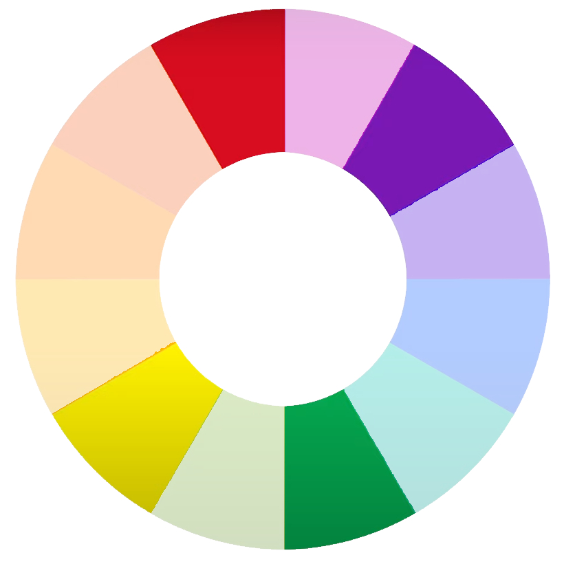
2. The color wheel
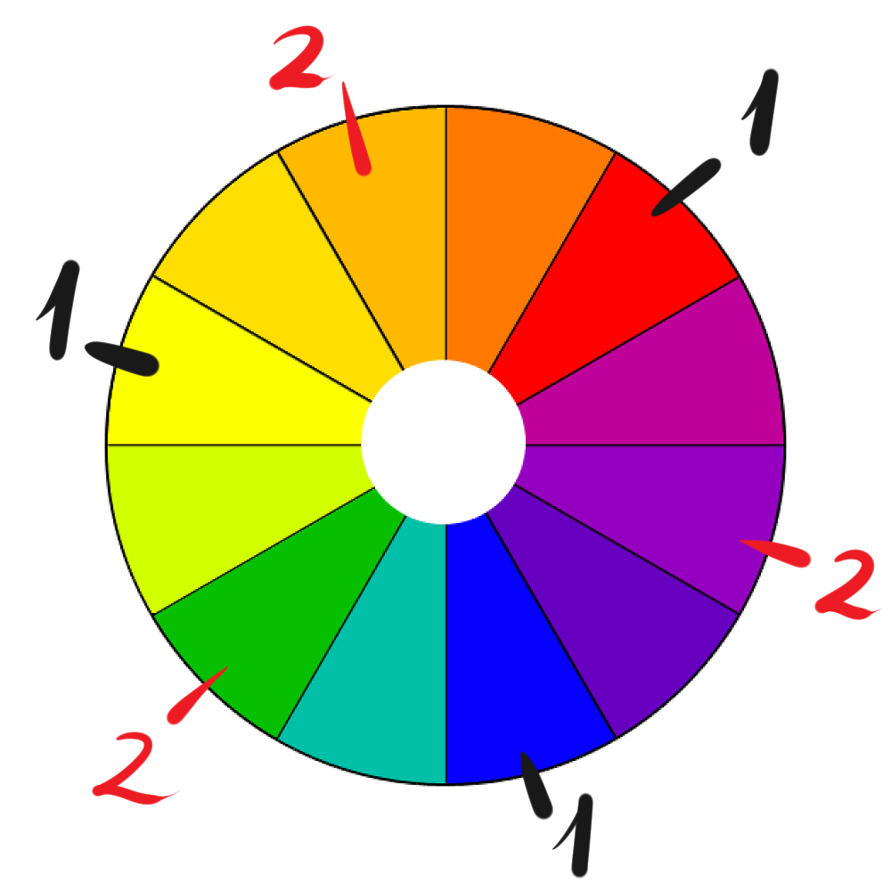
The color wheel, also known as the chromatic circle, serves as a guide for creating color schemes.
You can find the primary colors (red, blue, and yellow) placed equidistant from each other on it. By mixing these colors we get the secondary colors (orange, green, and violet).
It is important to understand that complementary colors are directly opposite each other, at the other end of the circle.
Red is complementary to green.
Blue is complementary to orange.
And yellow is complementary to violet.
As we will see later, you can create some good color schemes by making use of complementary colors.
Note: Above is an example of a traditional color wheel. Digital art apps may have color wheels based on CMYK (cyan, magenta, and yellow) and/or RGB (red, green, and blue) colors as primary colors, which, although useful in certain situations, cannot replace a traditional color wheel as the best guide for constructing color schemes.
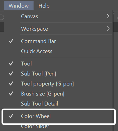
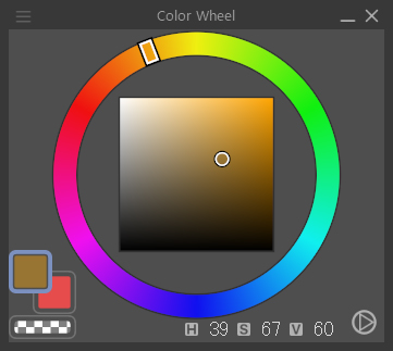
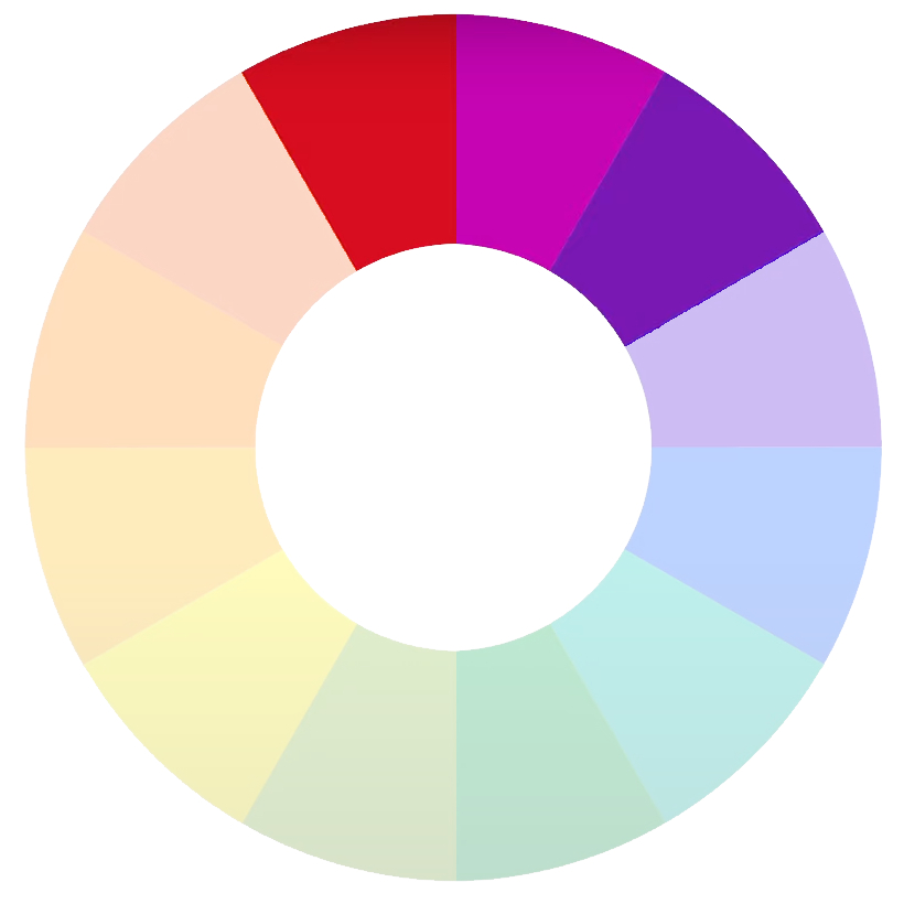
In Clip Studio Paint, you can find the color wheel under Window > Color Wheel.
3. Color palette types
We can separate palettes by the number of colors in them: two-color palettes, three-color palettes, four-color palettes…
Black and white is an example of a two-color palette. I recommend you include white as one of your palette colors, even if it is likely the color of your paper layer. Blue and red is another two-color palette.
Depending on how you choose your palette, using the color wheel as a guide, here are some examples of color schemes you could use:
3.1. Complementary color scheme
This is created by combining colors from opposite sides of the wheel (yellow/violet; green/red; orange/blue) or colors that are close to opposites.
The most basic ones consist of just two colors.
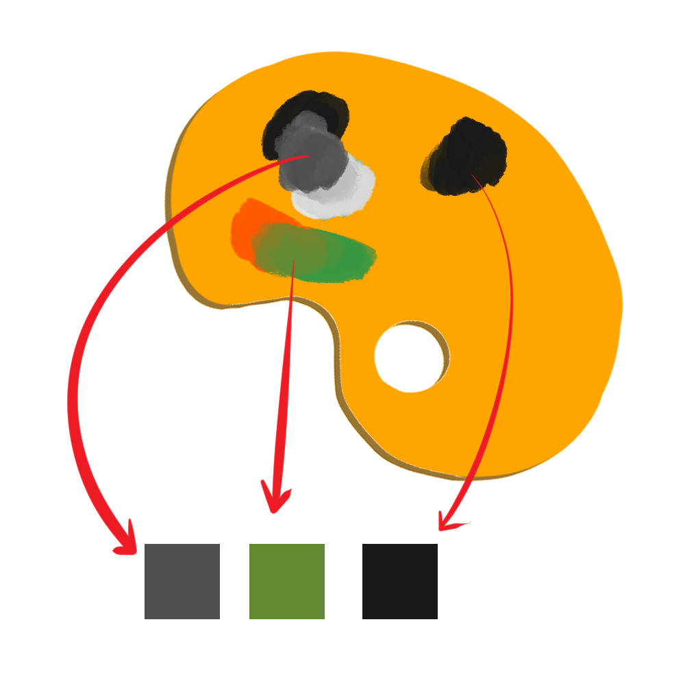
In this example, the palette uses turquoise and vermilion (complimentary), plus black. To get the black color, I overlapped the two complementary colors. For an explanation, check out this tutorial.
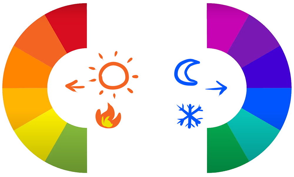
3.2. Cool color/warm color scheme
One of the alternatives to complementary colors is to contrast cool colors with warm colors. The color wheel can be divided into two parts: warm and cool.
3.3. Triadic or tetradic color scheme
To create a triadic color scheme, choose three equidistant colors on the color wheel.
In a tetradic color palette, you’ll want to choose four colors, so two pairs of complementary colors.
3.4. Analogous color scheme
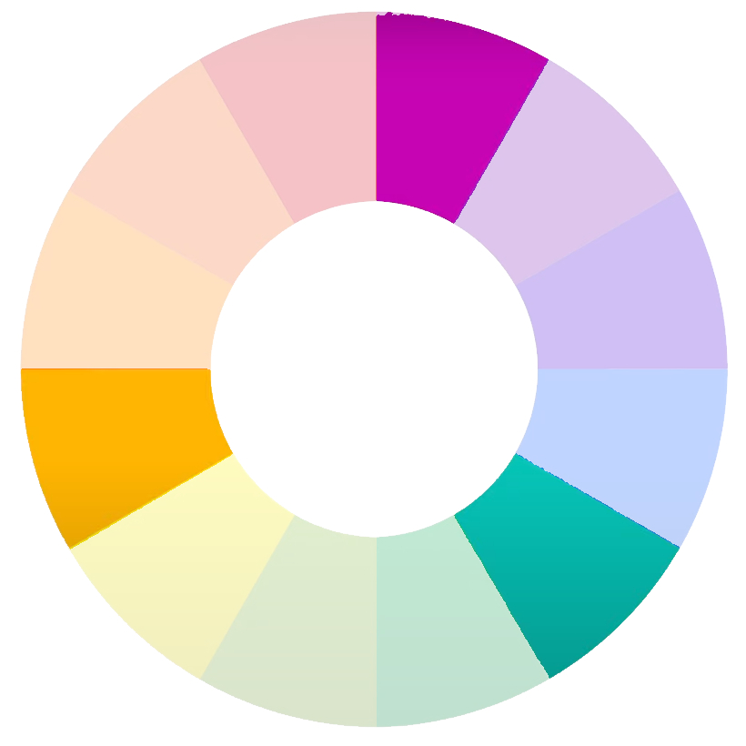
Choose adjacent colors in the 12-color palette.
3.5. Monochromatic scheme
Choose a color and change the hue (by mixing it with gray) or tone (by adding white or black).
A grayscale is a monochromatic palette.
You can also add an extra color to the monochromatic scheme to create another type of palette.

4. How to pick your color scheme
At this point, you already know about lots of different color schemes. Now, let’s take a look at some tips on how to choose the perfect color scheme for your illustration.
- Choose a dominant color
Choose the dominant color of the illustration first. It’s a good idea to choose one of the primary colors where possible: blue, yellow, and red.
Many watercolorists start by laying a primary base color on their watercolor paper before they start painting. The base color helps to add an even tone to the different colors, similar to digital color grading used in films or AV productions. The choice of color determines the mood of the piece.
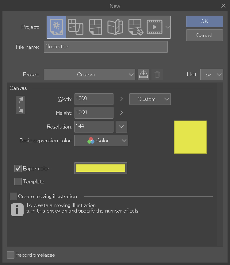
Set the dominant color as the paper color from File > New > Paper color. This way it will be like painting directly on colored paper.
- Choose your secondary color
Which color will contrast with the dominant color? Which color will complement it? The choice you make here will determine what color scheme you’ll get. But there is something else to keep in mind…
- Balancing your colors
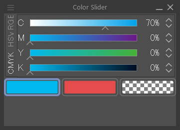
Think about the different luminosity of the colors to balance them. The brightest color will play the role of white, and the darkest will play the role of black. If you have several colors, think in grayscale.
You have a useful tool to help you balance the brightness of two colors in: Window > Color Slider.
- Less is more
Work with as few colors as possible. Or at least start with fewer colors. Don’t get carried away! You can always add more later if you need to. Removing them after the fact will be more difficult.
- Trust your gut
Another way to describe instinct is “learned knowledge that has already been assimilated”. You don’t necessarily need to know the color theory that we just studied. If you have honed your instincts by appreciating paintings, comics, illustrations, and animations, you will know how to recognize colors and schemes that have left an impression on you.
- Copy a palette you like
You can copy the color scheme from an illustration you like or from any of the illustrations in this tutorial. Open the image and use the Eyedropper tool to pick the colors. Then use them to paint your own illustration.
5. Studies of illustrations using different color palettes
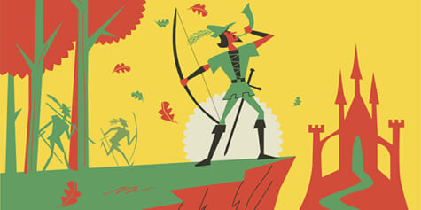
In this first example, we have yellow, green, and red (plus black and white).
This scheme mainly uses complementary colors (red and green), but also yellow in the background. It is close to being a triadic scheme, but is not strictly so. I have explained some of the existing color schemes, but feel free to combine the colors of the traditional color wheel as you like.
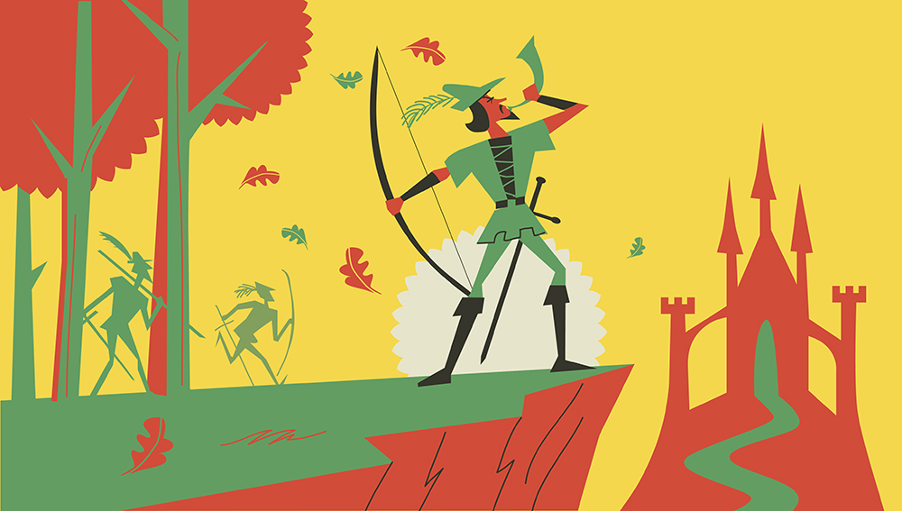
This illustration shows the moment when Robin Hood calls out with a horn to his men. In the middle ground, we can see them coming in response to his call. The trees indicate that we are in their territory: Sherwood Forest. Finally, in the background, there is Nottingham Castle, home of the evil King John, who dispossessed Robin of his noble title and his betrothed.
The dawn announces the final battle.
Start by choosing yellow as the paper color, which is our dominant color. Then outline with two colors the background (the forest and the castle), as well as the characters. The green is equivalent to a light gray and red takes the place of a dark gray. Finally, add black only for the central character (Robin Hood), who is in the center of the composition. The eye always goes to the black and the more contrasted areas, so I added the white of the sun to make the main character stand out even more.
The second illustration is of Jack and the Beanstalk. Jack is a poor boy who plants some magic beans that take him to a kingdom in the sky, where giants live. There he steals the goose that lays golden eggs.
In this composition, I show Jack making his escape on the back of the golden goose. The golden egg in the center is vital in telling the story in this image. The clouds suggest to the viewer that we are in a land up in the sky. By limiting the view, we can see the land of the giants as Jack sees it, at ground level. That way, the partially hidden giant looks more mysterious and threatening.
This illustration is an example of how finding a palette that works is a process of trial and error. This was my first approach.
Using a limited color scheme means repeating certain colors and restricting those not in the palette, such as the brown of the character clothes riding the goose.

I prefer the character in this second illustration, as it re-uses the green of the clouds.

Colors help the viewer read each of the elements of the piece easier. In this illustration there are two problems: the color of the goose and the giant’s sleeve do not stand out against the background, and the yellow of the egg is a bit garish. This is the result after changing the colors:

Here the dominant color is green, and the complementary color is red. The yellow of the egg contrasts with the grayish violet of the ground.
The whole palette has unsaturated colors, not clean-looking at all. The dark violet plays the role of black and the white is a bit blotchy. Some color combinations work well together, and I would say that this palette is one of the most used in these kinds of illustrations.

In this third illustration, taken from the well-known tale of Hansel and Gretel, we’ll learn how to choose a main color (blue) and define the whole drawing monochromatically (with the shades of a single color).
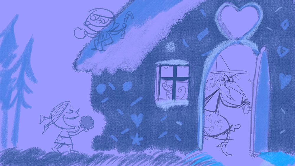
We can see the moment when the siblings find the candy house in the forest. The witch is stalking them from inside the house. The children have fallen into her trap and, like a spider, she runs after her prey.
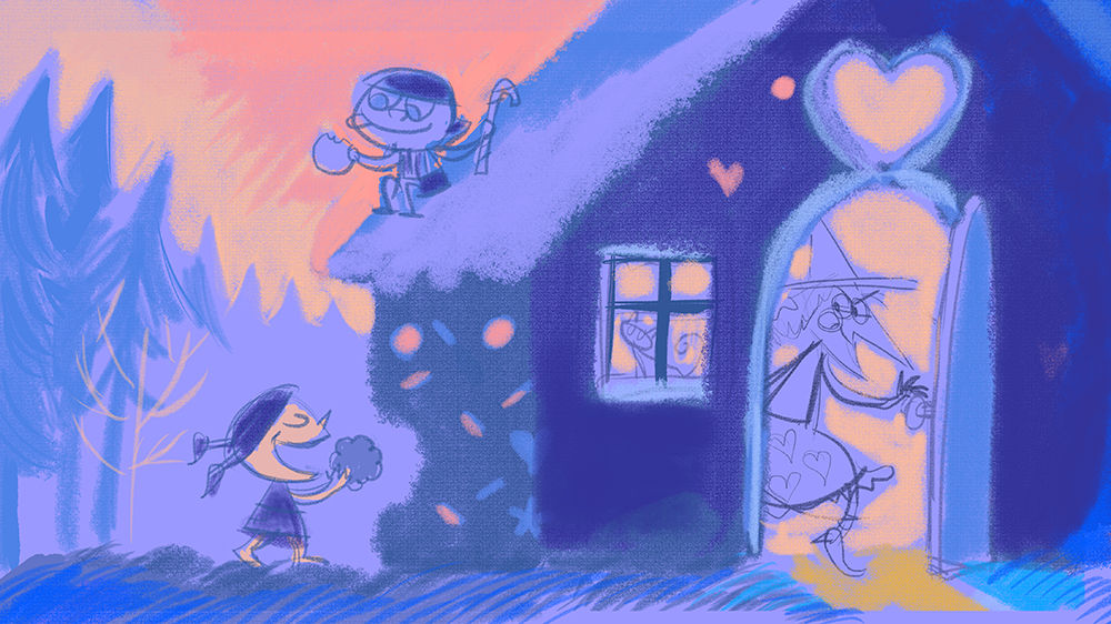
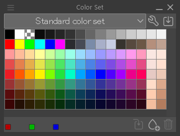
Adding a second color, pale vermilion, improves the contrast a lot. I took these colors directly from the standard color set.
We have the main blue and the secondary blue, which contrast perfectly, as one is cool, and the other is warm. This allows us to outline the characters. We managed to make each character the opposite color to the background.
The colors add to the atmosphere of the piece. It’s twilight. Night is falling, so we anticipate that the children are about to experience a perilous situation. I accentuated the contrast between the inside of the house and the witch so that the viewer’s eyes are drawn to that area. I also added other tertiary colors for the candy on the outside of the house, but we actually completed the illustration with just two tones.

In this case, the art director who commissioned this illustration asked me to add more color to the house. After all, it is a house made of marzipan, sponge cake, and many other sweets, and it is a children’s illustration. Despite my initial protest, adding more color was the right decision.
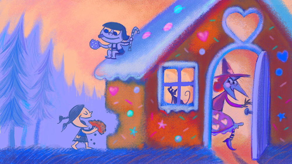
Although chromatically this palette is not that limited, having started with just a few colors determined the contrasts between figures and scenery, and helped us avoid a chaotic clash of colors.
6. Wrap-up
Now you know about color harmony theory, based on the traditional color wheel. It is sure to be your best guide when it comes to creating color schemes.
The fundamental principle is the contrast between colors, as in the scheme of complementary or triadic colors, which, complemented by analogous colors, harmonize by being close to each other on the wheel.
Contrast and balance.
Changing one color implies a change in other colors.
Remember the effectiveness of choosing just a few colors, and choosing a dominant color.
Colors in art are like chords in music: the best songs are made with only a few chords.
Interested in graphic design or what it takes to become a graphic designer?
Check out the link below!