
Created by Roig
Watch the video for words from the judges on the contest, as well as specific critiques on the winners of the Grand Prize and individual category prizes.
ArtStation / Instagram / linkedin
Shueisha 3rd Editorial Department Dash X Bunko/Webtoon Editorial Department
Kadokawa 4th Comic Editorial Department Manager & Webtoon Department Content Producer
Editor-in-Chief, BookLive Content Div. 2nd Comic Editorial Dept.
https://booklive.jp/
https://www.manga-nino.com/

pixiv Manga Editorial Department

Ki-oon Tokyo Office Representative
Official website:http://www.ki-oon.com/
Twitter: https://twitter.com/kim_ki_oon

VP Creative Business Japan and Marketing JPAP Wacom Co. Ltd.

Comment from the Winner:
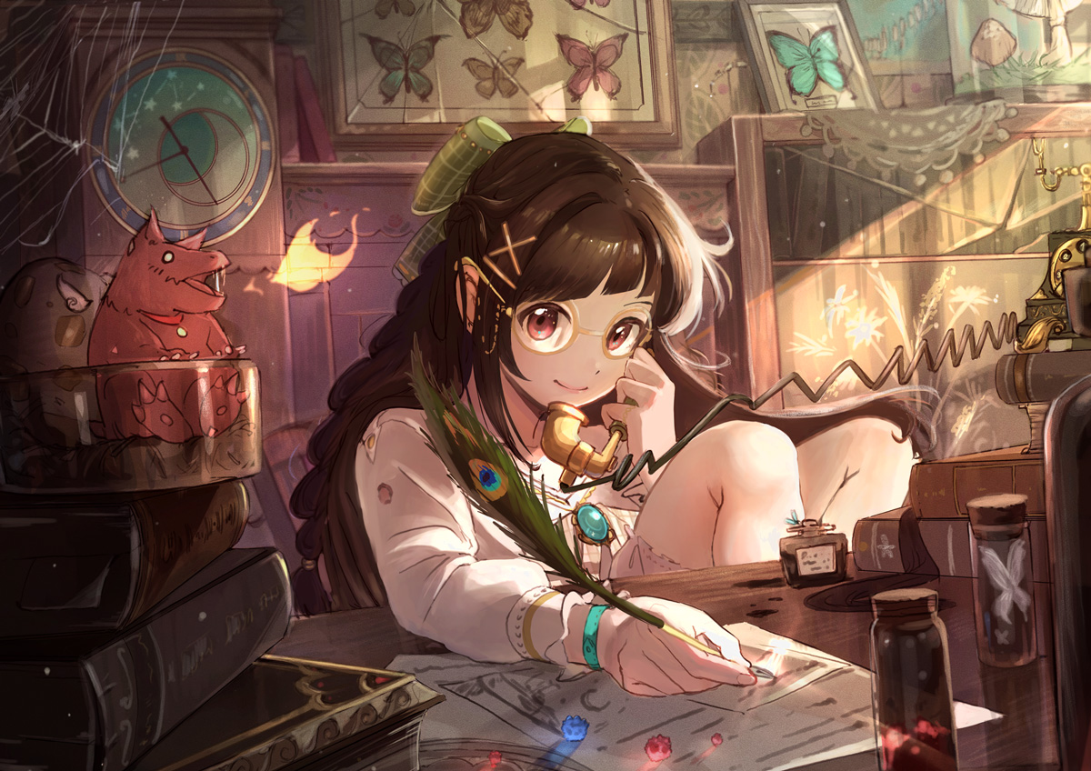
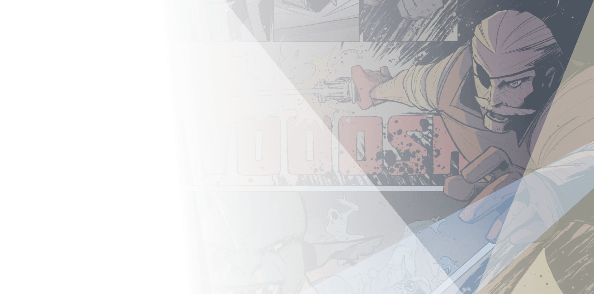
Hi! First of all, I’m so happy and honored to be chosen as the Grand winner of this year’s competition! When I saw the theme of Light and Darkness, the first thing that came to my mind was that light and shadow exist because of each other, and so do evil and goodness. Because of this, I created a brave hero and a kind dragon to break the stereotype in my story. Just like there are two sides to every coin, a creature that sounds evil can also be kind in some way. Also, to depict the theme of light and darkness in the story, the time of the comic was set at dusk, and the story was told using colors and changes in light and dark. I am very happy that the judges appreciated my work. There are still areas where I can improve, and I will continue my efforts to do so! Overall, I want to thank my teachers, family, and friends who supported me during the contest and thank you to the judges and to Clip Studio Paint. Thank you so much!
Justine Cunha
SHUEISHA
KADOKAWA
Ki-oon
Wacom
Planeta Cómic
RED SEVEN
SORAJIMA Inc.
Mangatari
Comment from the Winner:
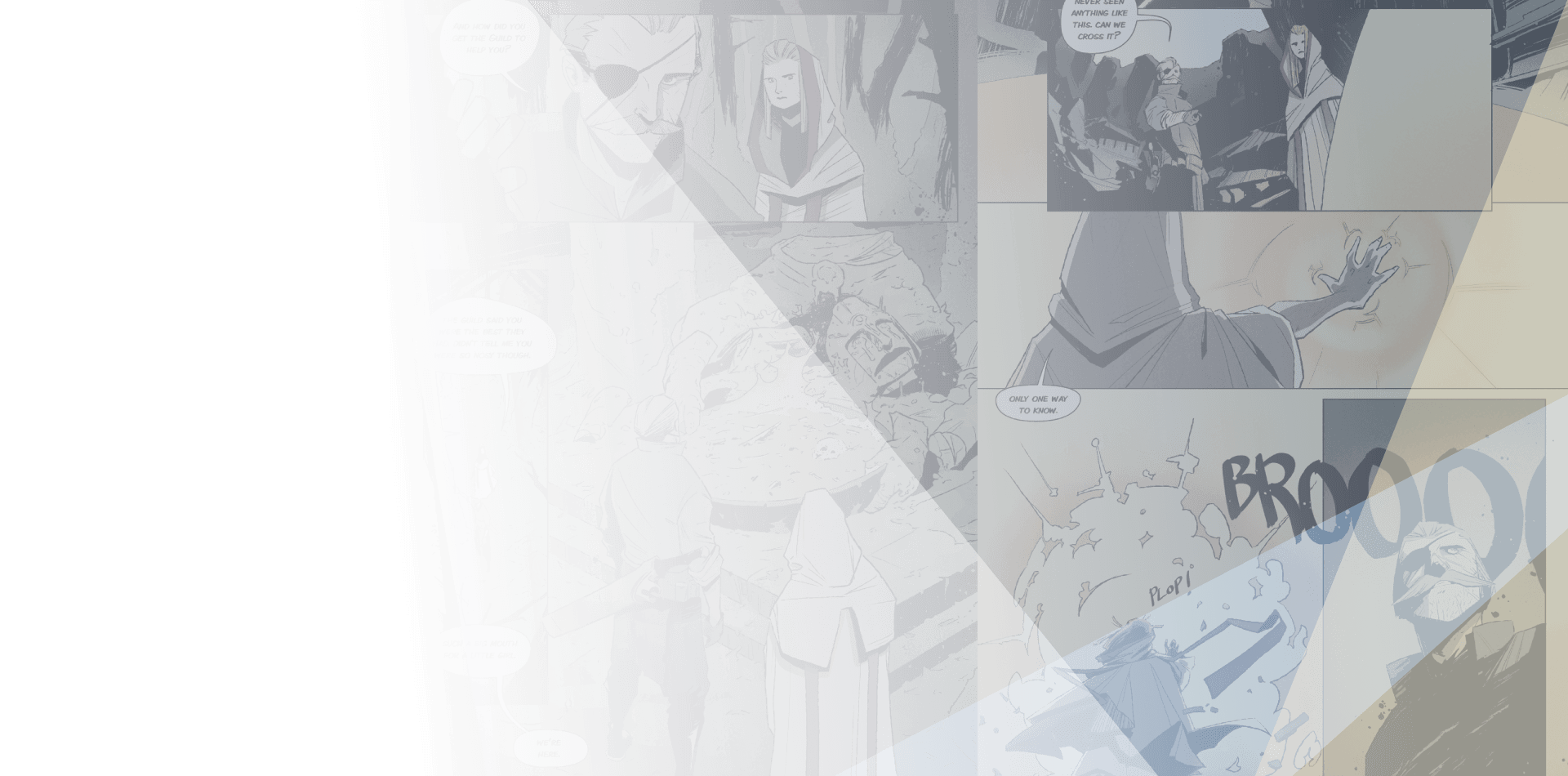
I am sincerely grateful to the judges for choosing my comic as the Comic Category award winner. I’ve been super passionate about comics since I was little, so I am very happy. But I had never published a comic of my own before, so I was also very nervous. For this year’s topic, I wanted to explore the relationship between light and darkness. I wanted to write about how not only they are opposites, but also how they coexist. In my comic, I tried to do this by representing light and darkness through life and death. I had no prior story writing experience, so I had to put a lot of effort into this comic. I struggled a lot and I made a lot of mistakes. But in the end, I think it was a very fulfilling experience. I can’t say I’ve achieved perfection, and I know I still have a lot to learn. But this contest has given me an immense amount of confidence and courage. This was my first comic but it won’t be my last. I will keep trying hard to improve my skills so that one day, I too can achieve my dream of finding my own place in the art world.
SHUEISHA
KADOKAWA
BookLive
Wacom
RED SEVEN
SORAJIMA Inc.
Mangatari
KADOKAWA
BookLive
Planeta Cómic
Mangatari
Ki-oon
BookLive
RED SEVEN
SORAJIMA Inc.
Critiques from the pros
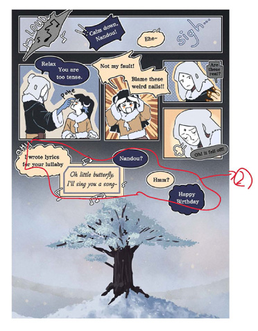
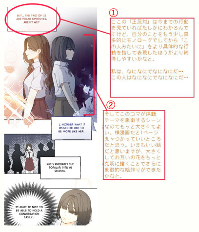
This entry received detailed critique from EVER GLORY PUBLISHING CO.,LTD.
See critique
BookLive
Wacom
MangaPlaza / Solmare Publishing (NTT Solmare Corp.)
DUPUIS
Comment from the Winner:
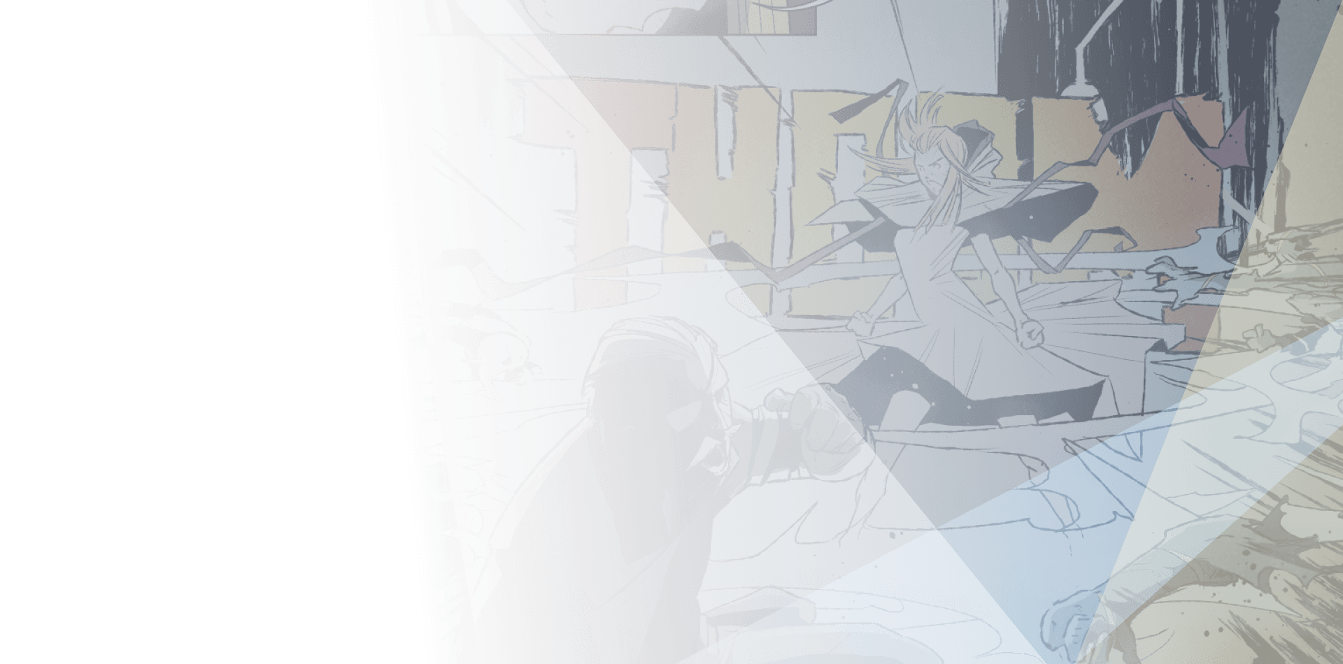
First, I would like to thank the judges for choosing my work out of so many excellent entries. I am truly honored and very happy. I had been doing illustration-related work for a long time before learning about manga creation. After starting to study manga out of curiosity, I was unexpectedly fascinated and realized that drawing manga was really interesting. I like to draw things related to everyday life, so I drew along the theme of little happenings between lovers. The inexperience of a man and woman starting a relationship and testing each other is like exploring a vast dark cave. The word "Lucia" in the title is derived from the traditional Swedish festival, St. Lucia's Day. It is held on the longest and darkest night of the year, and I believe it's meant to welcome light after experiencing darkness.
Justine Cunha
SHUEISHA
KADOKAWA
BookLive
MangaPlaza / Solmare Publishing (NTT Solmare Corp.)
Planeta Cómic
Mangatari
Justine Cunha
KADOKAWA
BookLive
Wacom
MangaPlaza / Solmare Publishing (NTT Solmare Corp.)
Planeta Cómic
SORAJIMA Inc.
KADOKAWA
BookLive
MangaPlaza / Solmare Publishing (NTT Solmare Corp.)
SORAJIMA Inc.
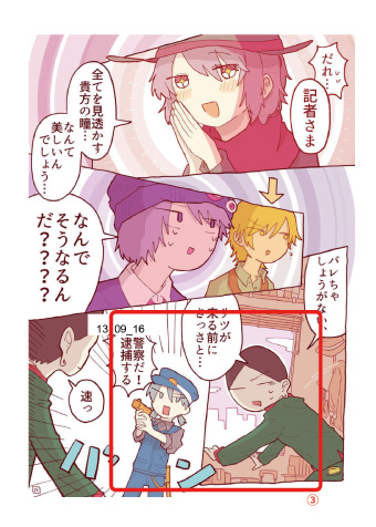
Critiques from the pros
This entry received detailed critique from SILENT MANGA AUDITION®.
See critique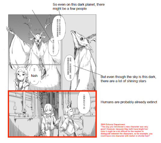
SHUEISHA
Ki-oon
Wacom
Comment from the Winner:
Since I was 12 years old, it has been my dream to make a webtoon or manga of my own. I would often share the story of it to my friends and even draw the characters, but I never pushed through it or published it online because I was very shy about it. So when I saw this contest, I thought it was a great opportunity to finally make my own webtoon and follow my dreams. I think Sorajima’s comment on my story was the most encouraging. My story was really analyzed in every detail through their comments. Reading it made me feel very motivated in creating and improving my skills in both art and storytelling. I think it was very fun and I have learned a lot in creating comics and managing my time because I had to manage my time between schoolworks and other contests in schools and this contest, too. In the end, I had fun joining this contest.
Justine Cunha
SHUEISHA
KADOKAWA
BookLive
Ki-oon
Wacom
FUNGUILD
Planeta Cómic
DUPUIS
RED SEVEN
SORAJIMA Inc.
Mangatari
Justine Cunha
KADOKAWA
MangaPlaza / Solmare Publishing (NTT Solmare Corp.)
Planeta Cómic
DUPUIS
RED SEVEN
SORAJIMA Inc.
SHUEISHA
KADOKAWA
BookLive
Ki-oon
Wacom
MangaPlaza / Solmare Publishing (NTT Solmare Corp.)
FUNGUILD
RED SEVEN
Mangatari
SHUEISHA
KADOKAWA
Wacom
MangaPlaza / Solmare Publishing (NTT Solmare Corp.)
Planeta Cómic
DUPUIS
KADOKAWA
BookLive
FUNGUILD
SORAJIMA Inc.
Mangatari
Comment from the Winner:
I don't have the words to express the honor I feel of having won this award nor the words to express my gratitude for those who awarded it to me. I participated in the competition in order to have a first experience in the world of competition, to get into the swing of things as you say. When teachers presented the shadow and light theme to us, I immediately wanted to tackle this one as a symbolism, that is to say, how I could present this shadow and light dynamic in a human relationship. This is what I wanted to do with My two characters Aro and Aina. Aina meaning "life" in Malagasy (my native language), and ARO meaning “protection”. So it's a shadow that protects at all costs its light which gives it life. I wanted to focus on the structure for a smooth reading of the story, but also on lights and shadows to accompany the theme. In the future, I would like to become an artist who is not afraid to get out of her comfort zone. And I think this work helped me get closer to this goal because it was the first time I told a story with action, a little epic and somewhat fantasy. I also want to tell stories that touch me and which can touch others. I thank my teachers for their precious feedback on this project, but also my family and my classmates for their support. I would once again like to thank Clip Studio, jury members and sponsors, both for their inspiring, benevolent and constructive feedback and also for this wonderful prize. Thank you.
Justine Cunha
SHUEISHA
KADOKAWA
BookLive
Ki-oon
Wacom
MangaPlaza / Solmare Publishing (NTT Solmare Corp.)
DUPUIS
RED SEVEN
Mangatari
Justine Cunha
SHUEISHA
KADOKAWA
BookLive
Ki-oon
MangaPlaza / Solmare Publishing (NTT Solmare Corp.)
Planeta Cómic
DUPUIS
Mangatari
KADOKAWA
Ki-oon
Wacom
MangaPlaza / Solmare Publishing (NTT Solmare Corp.)
Planeta Cómic
RED SEVEN
Mangatari
Justine Cunha
SHUEISHA
BookLive
Wacom
Planeta Cómic
DUPUIS
RED SEVEN
Comment from the Winner:
First of all, I want to thank the jury for choosing this work as the winner. I did this webcomic in collaboration with my friend, and we did it without thinking it would get the first prize. It's not the first time we have participated in this contest, so this time, we tried to put into practice what we learned from our past participation. We decided to use Tachibana's work because her story depicts hope in a discouraging environment. We modified the story's structure a little bit to tell it differently. We also worked with the colors to show the moments when the protagonist felt the light and the darkness in his life, and we also wanted to depict the main theme of this contest by showing the contrast between the personalities of the two main characters. It is very encouraging that our work was selected. It is a boost to continue in this world of comics and improve for future projects. Thank you very much.
Justine Cunha
SHUEISHA
KADOKAWA
Ki-oon
Wacom
MangaPlaza / Solmare Publishing (NTT Solmare Corp.)
Planeta Cómic
RED SEVEN
Mangatari
Justine Cunha
SHUEISHA
KADOKAWA
BookLive
Ki-oon
Wacom
MangaPlaza / Solmare Publishing (NTT Solmare Corp.)
RED SEVEN
SHUEISHA
BookLive
Ki-oon
Wacom
Planeta Cómic
DUPUIS
RED SEVEN
Mangatari
BookLive
Planeta Cómic
DUPUIS
Mangatari

Comment from the Winner:
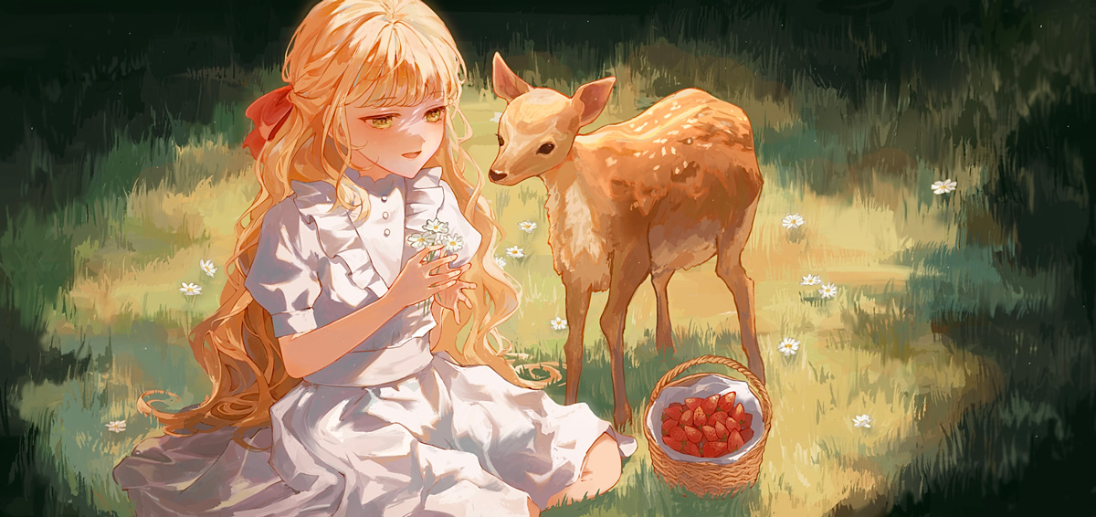
Hi, I’m really honored and grateful to be awarded the grand prize in the illustration category in this year’s international comic/manga school competition, when I first got notice I was beyond elated, and till this day it still feels kind of surreal just like I wanted my illustration “Gaia” to feel like. I approached this year’s theme “light and darkness” trying to portray a story that could be interpreted differently depending on the details that attracted the viewers the most, mainly to showcase that everyone sees the light and darkness in their lives differently When I entered this competition, my intent was to deliver an illustration that I was totally happy with and hopefully to grow as an artist as well, and now thanks to the amazing people from Clip Studio Paint, my pals and family that encouraged me in every step I took, I feel really excited about the bright future. Once again thanks a lot to the judges, and people from Clip Studio Paint, for hosting this competition and choosing me as the grand illustration winner.
BookLive
FUNGUILD
DUPUIS
SORAJIMA Inc.
Planeta Cómic
Justine Cunha
KADOKAWA
Planeta Cómic
Ki-oon
KADOKAWA
MangaPlaza / Solmare Publishing (NTT Solmare Corp.)
FUNGUILD
RED SEVEN
Wacom
RED SEVEN
Mangatari
FUNGUILD
DUPUIS
KADOKAWA
Mangatari
SHUEISHA
DUPUIS
YEONIESouth Korea
Web: https://yeonsanst.tumblr.com/
Twitter: https://twitter.com/YS0ST
They have serialized their fairy tale-style fantasy webtoon "The 0th Wizard" overseas under the pen name YEONIEST. It can be found on Kakao and Tapas in Korea, and on Piccoma in Japan and France.
- 2019 Comic Category Honorable Mention「바치나이다」
Chungkang College of Cultural Industries
CaoqianUnited States of America
Web: https://www.cchianart.com/
Instagram: https://www.instagram.com/cchian_art/
Received an honorable mention for A GOLDFISH'S DREAM in Taiwan's Creative Comics Collection's 2020 Original Comic and Screenplay Award Contest and published in the anthology, LISTEN. TAIWAN IS SINGING! (2021, published by Gaea Books, Taiwan)
Currently self-publishing their own short stories and plans to publish a science fiction series in 2023
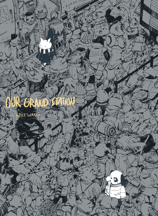
- 2020 Overall Grand Prize“Our Grand Station”
School of the Art Institute of Chicago
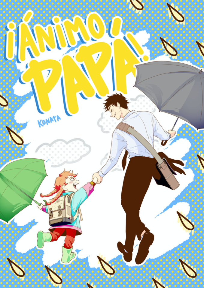
KonataSpain
Instagram: https://www.instagram.com/konata_art1/?hl=es/
Produced two open series in Planeta Manga, published by Editorial Planeta, Spain. They work as an illustrator.
They have planned to release a compilation of their first comic work, "Kohva," for which they wrote the script and drew the artwork.
- 2021 Overall Grand Prize “¡ÁNIMO PAPÁ!”
Escola Joso
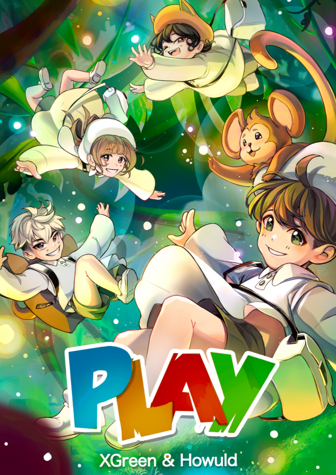
XGreenSpain
Instagram: https://www.instagram.com/xgreenkyun/?igshid=YmMyMTA2M2Y%3D
They are currently serializing "Krymsoul," an action/romance manga set in an Asian dark fantasy world, with Planeta Manga.
- 2022 Manga Manga Category Participant“PLAY”
Escola JOSO
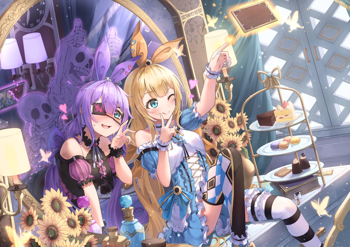
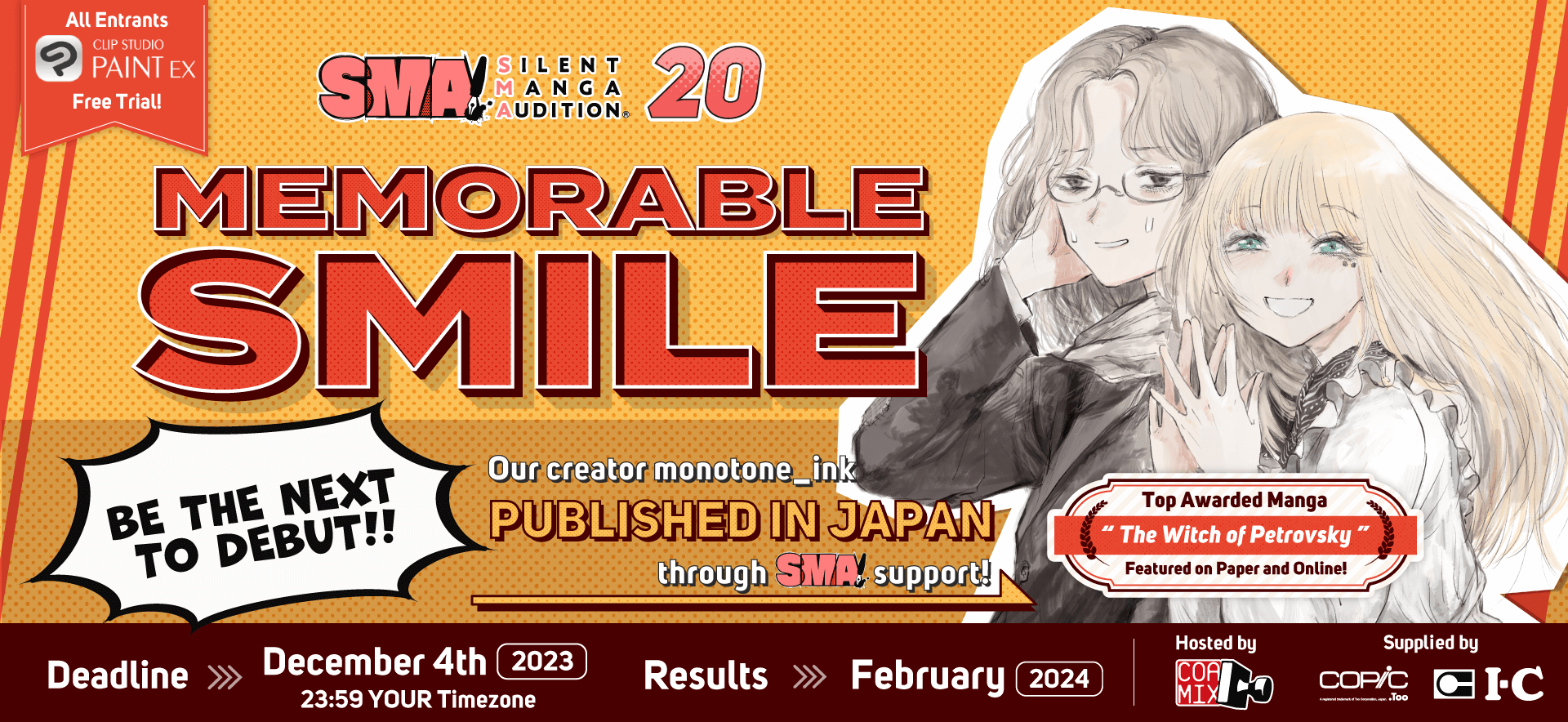
Light and Darkness
| Comic Category (Color) | An original color comic for all ages (8-32 pages, including cover). |
|---|---|
| Manga Category (B&W/Color) | An original black-and-white or color manga for all ages (8-32 pages, including cover). |
| Bande Dessinée Category (Color) | An original bande dessinée for all ages (8-32 pages, including cover). |
| Webtoon Category (Color recommended) | An original webtoon for all ages (sized 800 x 20,000-300,000 pixels or a height ratio of 25 to 375 for an image 800 pixels or less when the width is set to 1). |
| Storyboard Category |
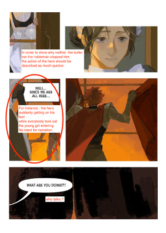
A 4-16 page manga, comic, or webtoon drawn according to the supplied manuscript.
Manuscript text (provided by pixiv)
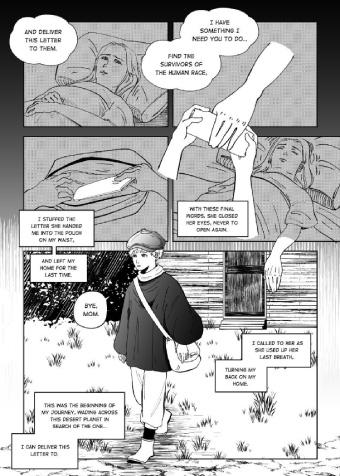
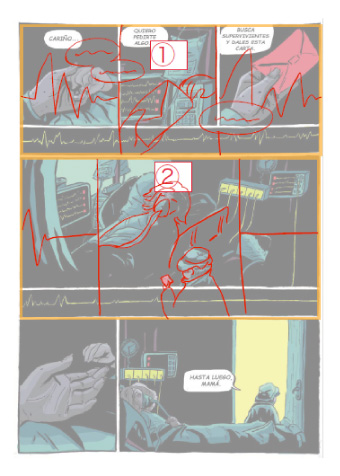
Our hero searches for any other surviving humans in a post-apocalyptic world and ends up happening upon a male android...
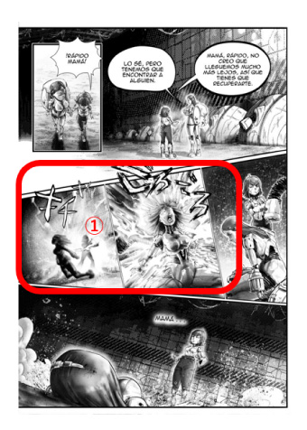
(Source: "Dear Living one" by Rikka, from the official pixiv project "Writing Support Project - Happy Endings") Manuscript text 2 (Courtesy of BookLive) Two rival wizards who used to be close childhood friends, have now crossed paths... |
| Illustration Category | Original color illustration for all ages. There are no size requirements. |
Contest submissions will be judged by an artist panel and sponsor companies. Contest winners are due to be announced in Early July 2023.
Graphic novelist, character designer, and artistic director
ArtStation / Instagram / linkedin
Hello, my name is Justine Cunha, I am a graphic novelist at Dupuis and I also work in animation as a character designer and artistic director ! After graduating at supinfocom, i worked in many animation studios such as Go-n, on entertainment, passion productions, dreamworks tv etc.. I especially love drawing badass female characters and working on fantasy stories !
3rd Editorial Department Dash X Bunko/Vertical Scrolling Manga Department
Joined Shueisha Inc. in 2014. After working as an editor for Weekly Shonen Jump, he was transferred to the digital business department. He works in the digital distribution of comics such as "Weekly Young Jump" and spreading availability through e-bookstores. He is currently a member of the Vertical Scrolling Manga Department as one of its initial members from its start in spring of 2022. He currently creates comics and conducts webtoon market research.
KADOKAWA 4th Comic Editorial Department Manager & Vertical Scrolling Comic Department Content Producer
https://group.kadokawa.co.jp/global/
As a comic/light novel editor/designer, he was involved in the launch of "Comic α," "Monthly Comic Flapper," "MF Bunko J," and "Monthly Comic Alive," and then launched "Monthly Comic Gene" and "COMIC BRIDGE" as editor-in-chief.
pixiv Manga Editorial Department
Haruna Ikeda works as part of the pixiv Manga Editorial Department, which promotes original manga posted to pixiv. The pixiv Manga Editorial Dept sifts through all the manga posted to the platform and picks up a few special posts to recommend to users. Haruna also is on the judging panel for the pixiv Monthly Comic Awards.
Ki-oon Tokyo Office Representative
Official website: http://www.ki-oon.com/
Twitter: https://twitter.com/kim_ki_oon
Ki-oon Tokyo Office Representative. After working at Kodansha’s International Business Bureau for four and a half years, she once returned to France where she worked for three and a half years as editor-in-chief for PIKA, a major French manga publisher, before coming back to Japan in October 2015 as the head of Ki-oon’s Japan office.
Wacom Creative Business Unit Vice President
Koji Yano was born in 1974 and started his career at Wacom Co., Ltd. in 2001. After developing the FAVO Comic Pack, he became the recipient of the Good Design Award for the promotional website he made in 2012. With a mission to raise the profile of the Wacom brand in the creative industry, he took on his current position overseeing marketing for the Asia Pacific region in 2018.

SHUEISHA is a Japanese publisher that specializes in manga, fashion magazines, and literary books. They publish a variety of comic magazines from Weekly Shonen Jump and Weekly Young Jump to Ribbon in Japan. As well as being the publisher of the worldwide smash hit, One Piece, SHUEISHA also provides manga fans with the Shonen Jump+, Manga Mee, and YoungJump! apps.

An all-around entertainment company, KADOKAWA, runs a wide range of businesses in publishing, videos, games, web services, education, merchandising, intangible services, and inbound sales. The company’s free comic site, Comic Walker, features popular KADOKAWA manga. It boasts more than 4,000 titles ranging from mixed-media works to popular isekai comics.

Amassing a stock of over 1 million books since its establishment in 2011, BookLive has become one of the Japan's largest comprehensive e-book stores.
Striving for maximum usability for readers, BookLive offers over 10,000 titles available to read for free!
The company also produces original e-books, aiming to create titles that capture the hearts and minds of the smartphone manga generation.

Ki-oon is a French publishing house founded in 2003 by two manga fans. It is currently the third largest publisher in France, publishing "My Hero Academia," "Jujutsu Kaisen," "Frieren", "BEASTARS," and many more. In addition to purchasing licenses, they also produce and publish original works in a variety of genres, such as "Tsugumi Project," "Léviathan," "Beyond the Clouds," "Outlaw Players," "Lost Children," "Outsiders," and "L'Éden des sorcières." These works are initially published in France and then licensed for Japanese and worldwide distribution.

A social network for creators that makes getting creative even more fun! With over 71 million users worldwide, more than 100 million illustrations, comics, and novels have been posted. New, fun projects for illustrators, manga artists, and writers pop up every day.
We are also running an event to support your first contributions to pixiv! Join us!
https://www.pixiv.net/contest/firstpostpixiv

Pioneer of pen and display tablets made for creatives, used to create the world’s most exciting digital art, films, special effects, fashion, and design.
Click here to learn more about educational use.

MangaPlaza is one of the largest providers of digital manga in the U.S. Boasting over 76,000 titles from 40+ publishers, users can discover exciting works, including platform exclusives. We also offer a monthly plan that grants users access to 21,000 chapters for a great deal. Begin your journey on MangaPlaza and find your next favorite series!

A comic book publisher with a mission to "bring FUN to life through the power of stories,” FUNGUILD plans and edits original comics and webtoons that resonate with their readership of girls, women, and young men, making them available via various Japanese and worldwide online comic sites.

Planeta Cómic (Grupo Planeta) was founded in 1982. We offer a wide range of the world's best shonen manga: Dragon Ball, My Hero Academia, Naruto, One Piece and Kaiju No. 8, as well as kodomo, seinen, shojo, yuri, and BL manga. We also have our own successful magazine: Planeta Manga. As for North American comics, our Star Wars books and independent works deserve special mention. Both our collection of national graphic novels (Los pacientes del doctor García, Voces que cuentan, Cuatro poetas en guerra) and international graphic novels (From Hell, The Hunting Accident, The Eternaut) are all highly acclaimed.

Dupuis is a Belgian publisher with over 100 years of history, and the main creator of many great Franco-Belgian comic heroes, such as Spirou, the Marsupilami and Gaston Lagaffe, to name a few. It is also known as the publishing house with the most diverse library in Europe, with titles in teen & young adult comics, manga, webtoons, graphic novels, news and many other genres.
RED SEVEN is a company founded with the combined powers of REDICE STUDIO, creators of "Solo Leveling," and L SEVEN, creators of "Omniscient Reader." They aim to provide a superior media experience for our readers and set the full potential of both companies into motion. With works such as "King of Excavation," "The Great Mage Returns After 4000 Years," and "Lady Devil," RED SEVEN aims to realize the potential of both and provide readers with an elevated reading experience. They are looking for all sorts of manga works beyond the webtoon genre they're known for and look forward to your entries.

SORAJIMA Inc. is a manga studio with the largest share of Webtoons produced in Japan. What’s more, while developing its global and multimedia offerings, the studio is also taking on becoming a platform provider and putting effort into its new manga app, SORACOMI, all built in-house.

We are a Manga Artist Entertainment Production company with a vision to create the stage where the next generation of manga artists can be active and accelerate the evolution of Japanese manga. Working closely with manga artists' careers, we push the envelope on manga as an art form. For companies, we provide services such as the Original Story Advertising Manga "Orist" service, which produces manga for commercials. We also deliver manga to publishers through our Team-based Serialization and Comic Production "Manpro" business.

SHOGAKUKAN is a general publishing company that publishes magazines such as comic magazines, children's magazines, information magazines, women's magazines, books and picture books. The comic magazine genre covers a wide range of readers from boys and girls to adults, such as CoroCoro Comic, Weekly Shonen Sunday, Sho-Comi, and Big Comic. The company also runs the comic app, Manga One, which has been downloaded over 20 million times.

BOOK☆WALKER Global is one of the world's most popular eBook stores and apps for reading over 29,000 digital Manga & Light Novels. Experience and enjoy the latest manga and light novels, mainly from Japan on your iOS and Android devices and/or the web viewer.

Founded in June 1991, Ever Glory Publishing Co., Ltd. has mainly had educational- and entertainment-oriented children’s books published and distributed. It once gained authorizations from SHOGAKUKAN, Kodansha, SHUEISHA, and Akita Shoten to issue Chinese versions of comics in Taiwan. As part of its recent focus on training manga artists and holding original manga contests regularly, the company also welcomes aspiring authors to submit their comics and novels whenever possible.

Pocket Comics is a manga app with a large selection of full color webtoons, known as comico in Japanese, Korean and Thai. In English, French, German and Traditional Chinese it is known as Pocket Comics and has been downloaded over 41 million times worldwide.
One of the biggest international manga competitions held in the world, exclusively without dialogue. It is created and organized by COAMIX Inc., a manga publisher founded by iconic creators such as Tetsuo Hara and Tsukasa Hojo. The competition aims to discover, nurture, and publish the next generation of international manga creators.

Minto Studio is a webtoon specialist, which built up a unique production system through its vast global creator network and 10 years of content production knowledge. It produces works in collaboration with a number of platforms including Kakao Pikkoma, with whom it has a business alliance with.
Our goal is to support everyone in creating their own manga while having fun drawing it. We have produced many award-winning and debut artists. In addition to storyboard lessons that cover how to structure a complete 32-page storyboard, we also hold individual consultations and storyboard exchange sessions to answer concerns about the creation of comics.
A creator agency whose mission is to change each and everyone’s world through the power of storytelling. The agency aims to create a world where comics can shine brightly, where excitement is generated from creators and fans connecting directly and building a model for entertainment in the Internet age that goes beyond traditional publishing and distribution.

LINE WEBTOON is a new global digital comics platform available on both computer and mobile devices. The Traditional Chinese version was released in July 2014 and is dedicated to providing readers with manga content that you won’t want to put down once you start reading! LINE WEBTOON also strives to nurture Taiwanese creators. For more information, see their official website: http://www.webtoons.com/zh-hant/

GA Bunko, which has produced numerous light novel masterpieces, has launched a new comic book label, GAComic! GAComic adapts a wide range of genres into comic book series, from otherworldly fantasy to romantic comedy. It has serialized many popular works from Piccoma, other e-bookstores, and manga apps.

The Japan Cartoonists Association was established in December 1964 as the only nationwide organization of Japan's manga artists at that time and became an Incorporated Association in 1985 before becoming a Public Interest Incorporated Association in 2014. It is engaged in a variety of projects, such as research on comics, efforts in popularizing comics and comics culture, and comics cultural exchange with other countries.

Manga Japan is an organization that aims to promote the development of manga culture and artists, contribute to society through the manga industry, promote international exchange, and improve production environments for manga authors and others involved in the industry.

The Digital Manga Association is an organization of volunteers established to explore creative technologies for the creation of digital manga and comics and research copyright issues caused by digitization.
Note: The following list only shows schools that provided logos.
As of 10/04/2023

Germany
Germany

Chile

Finland

United States of America

United States of America

Japan

United Kingdom of Great Britain and Northern Ireland
United Kingdom of Great Britain and Northern Ireland

Thailand

Germany

Spain
Rwanda
United States of America

United States of America

United States of America

Thailand
United States of America

Croatia
Spain

Mexico

Philippines

United Kingdom of Great Britain and Northern Ireland

China


United Kingdom of Great Britain and Northern Ireland

Japan

Japan

United Kingdom of Great Britain and Northern Ireland

United States of America

Philippines

Spain

Spain

Japan

Japan
Canada
France
Latvia

United States of America

Republic of Korea

Indonesia

Spain

Republic of Korea

United States of America

United Kingdom of Great Britain and Northern Ireland

United States of America

Malaysia

Italy

United States of America

United States of America

Singapore

Japan

Japan

Switzerland

Spain
Colombia

Republic of Korea

Croatia

United States of America

United States of America

United States of America
Singapore

Republic of Korea

South Africa
Bulgaria

United States of America

Romania

South Africa

Taiwan

China

Hong Kong
Republic of Korea

United Kingdom of Great Britain and Northern Ireland

Indonesia

United States of America

United States of America

Taiwan

Spain
Vietnam

Thailand

Thailand

Kyrgyzstan

Spain

Spain

Taiwan

United States of America

United States of America

United States of America
Switzerland

Malaysia

Canada

Japan

Germany

Venezuela (Bolivarian Republic of)

United States of America

Taiwan

Taiwan
Taiwan

Indonesia

China

Indonesia

Australia

Thailand

United Kingdom of Great Britain and Northern Ireland

United Kingdom of Great Britain and Northern Ireland

United States of America

United Kingdom of Great Britain and Northern Ireland

United States of America

United Kingdom of Great Britain and Northern Ireland

United States of America

United States of America

Kazakhstan
United States of America

Republic of Korea
Republic of Korea

Republic of Korea

Republic of Korea

Austria

Germany

Germany

Colombia

Costa Rica

Spain

Spain

Colombia

Spain

Mexico

Australia

Czech Republic

Australia

Philippines
United States of America

Japan

Japan

France

Canada

China

Taiwan

United States of America

Philippines
Philippines

Indonesia

United Kingdom of Great Britain and Northern Ireland

Japan

New Zealand

United States of America
Spain

Indonesia

Republic of Korea

Republic of Korea

Australia
Thailand

Singapore
United States of America

Poland

United States of America

Taiwan

Taiwan

Taiwan

Germany

Mexico

Spain

Spain

United States of America

Canada

Indonesia

Indonesia

Mexico

Mexico

Republic of Korea

Republic of Korea
Republic of Korea

Republic of Korea

Malaysia

United States of America

Indonesia
United States of America

United States of America

Russian Federation

United States of America

Japan

Spain

Colombia

Taiwan

Taiwan

Spain

Mexico

Germany

Germany

Republic of Korea

Republic of Korea
Republic of Korea
Republic of Korea

Republic of Korea

Republic of Korea
Republic of Korea

Republic of Korea
France

France

Hungary

United Kingdom of Great Britain and Northern Ireland

United States of America

United States of America
Philippines

Thailand

Republic of Korea

Taiwan

Taiwan
Spain
Spain

Brazil

Indonesia

Iran (Islamic Republic of)

Japan

Pakistan

United Kingdom of Great Britain and Northern Ireland

United Kingdom of Great Britain and Northern Ireland

Slovakia

United States of America

Republic of Korea
Republic of Korea

France

Spain

Spain

Republic of Korea

Spain

Ecuador

Democratic People's Republic of Korea
Republic of Korea

Republic of Korea

Japan

United States of America

Indonesia

Turkey

United Kingdom of Great Britain and Northern Ireland

Greece

Canada

Turkey

United Kingdom of Great Britain and Northern Ireland

United States of America

United States of America

Germany

Germany

Germany

Germany

United States of America

United States of America
Philippines

United States of America

United States of America

United States of America

United States of America

Venezuela (Bolivarian Republic of)
Cuba

India

Austria

Russian Federation
Republic of Korea

Republic of Korea

Republic of Korea

United States of America

United States of America

Sudan

China

Japan

Japan

United States of America

Turkey

United States of America
China

Germany

Taiwan

Taiwan

Taiwan

Taiwan

China

Bangladesh

Brazil

China
United Arab Emirates

Indonesia

Turkey

Japan

Japan

Japan

United States of America

United States of America

Republic of Korea

Republic of Korea
Republic of Korea

Republic of Korea

Cuba

Argentina

Germany

Russian Federation
Germany

United States of America

United States of America

United States of America

Malaysia

Democratic Republic of the Congo

Republic of Korea

Taiwan

China
Japan

Japan

Japan

Japan

Japan

United Kingdom of Great Britain and Northern Ireland
Portugal

United States of America

United States of America

Australia

Republic of Korea

Indonesia

United States of America

Armenia

Indonesia
Combined junior and senior high school / Secondary school

Indonesia

United States of America

Turkey

Indonesia

Indonesia

United Kingdom of Great Britain and Northern Ireland
Republic of Korea

Republic of Korea
Republic of Korea

Republic of Korea

Republic of Korea

Republic of Korea

France

Taiwan

Taiwan

United Kingdom of Great Britain and Northern Ireland

United States of America

United States of America

Turkey

Philippines

United Kingdom of Great Britain and Northern Ireland

Germany

United States of America

Indonesia

Saudi Arabia

Sri Lanka

Japan

Japan

Japan

Japan

Canada

United States of America

Indonesia

Russian Federation
United States of America

Australia

Kazakhstan

Taiwan

United Kingdom of Great Britain and Northern Ireland
Argentina

Taiwan

Taiwan

Taiwan

Taiwan

Taiwan

Colombia

Republic of Korea

Republic of Korea

Republic of Korea

Republic of Korea
Republic of Korea

Republic of Korea

Colombia

Pakistan

Bangladesh

Germany

United States of America

Mexico

Mexico

Paraguay

Brazil

Colombia

Spain

Spain

Spain

Chile
France
France

Philippines

Indonesia

Hungary

Japan

Japan

Russian Federation
Thailand

Russian Federation
New Zealand

China

Russian Federation

Kenya

United States of America

United States of America

Argentina
Peru

Indonesia

Republic of Korea

Japan

Mexico

Taiwan

China

Malaysia

Germany

United States of America

Canada

Egypt

United States of America

Japan

Republic of Korea

Taiwan
Belgium

Taiwan

Taiwan

Japan

Japan

United Kingdom of Great Britain and Northern Ireland

Canada

Spain

Germany

Japan
Taiwan

Taiwan

China

Taiwan

Republic of Korea

Republic of Korea

Kenya

Thailand

India

United States of America

United States of America

United States of America

United States of America

United States of America

Bangladesh

Spain
United States of America

Canada
Germany

United States of America

United States of America

United Kingdom of Great Britain and Northern Ireland

United States of America

France

France

Republic of Korea

Republic of Korea

Republic of Korea

Republic of Korea

Republic of Korea

Japan

Japan

Australia

United States of America

United Kingdom of Great Britain and Northern Ireland

Jamaica

Japan
Taiwan

Taiwan

Taiwan

Taiwan

Taiwan

Spain

Mexico

Lithuania

United States of America

United States of America
Indonesia

United States of America

Thailand

United Kingdom of Great Britain and Northern Ireland

United States of America

United States of America

United States of America
United States of America

United States of America

United States of America

Spain

Uzbekistan

United States of America

Chile

Republic of Korea

Republic of Korea

Indonesia

Thailand

Japan

Japan
Japan

Taiwan

China

Japan

France

Republic of Korea

Republic of Korea

Republic of Korea
France

France
United States of America

Indonesia

United States of America

United States of America

China

China
Taiwan

Taiwan

United Kingdom of Great Britain and Northern Ireland

United States of America

Philippines

Finland

Australia

United States of America

Canada

United States of America

Spain

Republic of Korea

Japan

Japan

China
Taiwan

Taiwan

China
United States of America

United States of America
France

Republic of Korea

Republic of Korea

Japan

Taiwan
Taiwan

Taiwan

Taiwan

Taiwan

Argentina

Mexico

Ecuador

Spain

Japan

France

Republic of Korea

Taiwan

Taiwan

Taiwan
China

Indonesia

United Kingdom of Great Britain and Northern Ireland

United States of America

United States of America

Taiwan

Taiwan

Thailand

Japan

Argentina
Argentina

Republic of Korea

Indonesia

India

Argentina
Thailand

Taiwan

Taiwan

China

China

Republic of Korea
Germany

France

Taiwan

United States of America

Republic of Korea

United States of America

Singapore

United Kingdom of Great Britain and Northern Ireland

Indonesia

United States of America

Philippines
United Kingdom of Great Britain and Northern Ireland

United States of America
France

Taiwan

Taiwan

Taiwan

Japan

Japan

Germany

Japan

Japan

Japan

France

United Kingdom of Great Britain and Northern Ireland
Philippines
Japan

United Kingdom of Great Britain and Northern Ireland

Indonesia

Colombia

China
China

United States of America

Mexico

United States of America

United States of America

United States of America

Taiwan
Indonesia

Taiwan
France

Indonesia

Philippines

United Kingdom of Great Britain and Northern Ireland

Taiwan

United Kingdom of Great Britain and Northern Ireland

United Kingdom of Great Britain and Northern Ireland

France

United Kingdom of Great Britain and Northern Ireland

Venezuela (Bolivarian Republic of)

United States of America

Canada

Republic of Korea
China

Taiwan

Germany

United States of America
United States of America

United States of America

Philippines

Taiwan

United States of America

Venezuela (Bolivarian Republic of)

Philippines

Spain

United States of America

Taiwan
Israel

Taiwan

Taiwan

United States of America

United States of America

Canada

Philippines

Australia

Thailand

United States of America

United States of America

Mexico

Spain

Spain

Japan

Japan

Japan

United States of America

China
Spain

France

Taiwan

Taiwan

United States of America

Algeria

United States of America

China

Costa Rica
Spain

Spain

Spain
United States of America
United Kingdom of Great Britain and Northern Ireland

Germany

Germany

United States of America

Malaysia

Sweden

Sweden

Bulgaria

United States of America
Australia

United Kingdom of Great Britain and Northern Ireland

Germany

Australia

Germany
Spain

Colombia
The previous contest, which opened in December 2021 on the theme of Admiration, received a total of 1,637 entries from 1,317 schools in 90 countries around the globe.
The winning entries received detailed critiques from sponsors. Please feel free to reference them when creating your entry.


© CELSYS, Inc.
![]() Celsys, Inc. / President: Narushima Kei / Corporate Number (Japan): 1011101062869
Celsys, Inc. / President: Narushima Kei / Corporate Number (Japan): 1011101062869
Pacific Marks Shinjuku Parkside 2F, 4-15-7 Nishi-Shinjuku, Shinjuku-ku, Tokyo 160-0023 Japan
+81-3-3372-3156 support@celsys.com